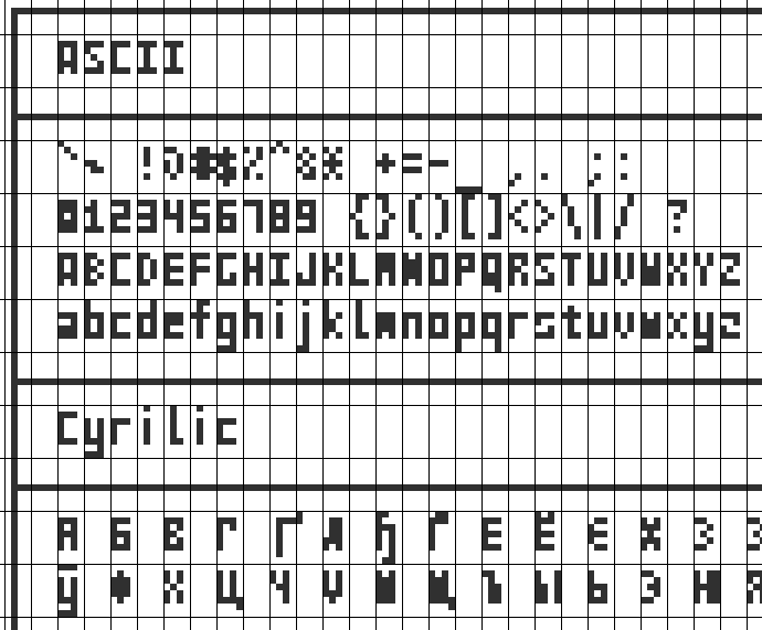
Just map lower case to uppercase and replace any non alpha-num to a black square. This font is not for general use but just to squeeze text messages on tiny displays.
TBH, I see all this pretty useless. While still interesting enough.
I'd say it's probably actually useful if you want to cram a lot of debugging info on a display like this for a small IOT device or something in the field.
Also; if you really, really want the old-skool feel of the Trident 8900 SVGA card you had in your early 90s PC-compatible, or your Toshiba laptop from the same period:
Theres also the wonderful "Arcade Game Typography: The Art of Pixel Type" by Toshi Omigari which has pages and pages of fonts used in arcade games, sorted by style, most of which are 8x8
It looks like it's been iterated on quite a few times. Here's an active descendant project, for anyone that might be interested: https://github.com/sunaku/tamzen-font
I'm glad you linked to one with subpixel rendering.
Considering that when we view text on a modern display we're almost always seeing anti-aliased grayscale pixels with subpixel rendering, it doesn't make sense to me that you'd design a font that doesn't take advantage of that.
Why not even grayscale? Surely a few of the letters could be improved by using a pixel other than pure black or pure white?
I worked on project planning software years ago. We got caught in a loop arguing about fonts and data density.
We were getting lots of clipping of text and I asserted that even a couple more characters on the screen would improve people’s abilities to guess what the entire phrase was. You can derail momentum in project management meetings by having people ask what something says repeatedly. Seen it happen, it’s dumb and we can fix it.
So it came down to a shootout. We put five fonts on a projector screen, at multiple font sizes, stood everyone against the back wall of the fairly average sized meeting room (maybe 70th percentile), and had them vote.
Verdana 13pt won for legibility, even over some of the 14 pt fonts. It also got more characters per inch, so win win. Something in the range of 5-10%.
Then corporate made us change it back because their flagship app used a different font and they wanted them to match. Which made no goddamned sense because they weren’t even used together.
You learn to read it, or at least I did as a child trying to use a small font on the c64 when connected to BBSs, so I could see ascii art without wrapping. It takes reminders like this to realize how awash in high density pixels we are now.
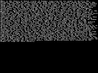
That's not quite the fault of the font. It's the fault of the author who decided to use very small pixels. The sample images are unreadable as presented, but they're a lot more readable magnified 300%. You have to achieve a certain size before it's possible to see anything, but you don't need much detail.
However, given that the size is required anyway, there's no downside to using more detail. This font could be useful for a display with enormous pixels, but it's useless otherwise.
No I couldn't make it out even scaled up.
I'd see a square, or three dots, and even relying upon context of other nearby letters I could reasonably well recognize there's no way to see if that's an [a, e, s, o, n, m] or what.
At this pixel scale I say just blat brail onto the screen and give people one more reason to learn that already well established and unambiguous writing system.
"readable". I'm 45, been looking at screens for 30+ years almost daily now. There's no way I can read that with or without my glasses.
It's truly impressive feat to get it this small. I used to do texts like this, often manually, pixel by pixel. For websites and games, it was all the rage back in late nineties early 2000s.
But only now I start to truly understand,by experiencing first-hand, why accessibility matters. This font is awesome, but terrible for any kind of accessibility.
Possibly. The author mentions a few other uses under "Practicality":
> Once the novelty wears off a "practical" example would be rendering "in-game book pages" that don't look like complete gibberish, or an "accurate print preview" with real text instead of blurry placeholder pixels that don't even look close to being the glyphs scaled down.
There's also the question if "readable" means just seeing the pixels as opposed to recognizing the glyph. Some people may just consider the recognizing the edges of the glyph as enough to consider it as being read but readability is strongly related to the ability to understand the text and its meaning.
The lower case letters can mostly be read just in context. Looking at the characters here [0] 'g' is just a vertical solid rectangle and 's' is two diagonal pixels. 'W' looks more like an 'M' than the actual M letter.
Not that's density, measured in dpi (dots per inch).
You wouldn't say that Super Mario is unplayable because it's too tiny at 256x224. You would just have you 4k TV show big pixels and get on with the game.
It's surprisingly readable if I zoom into the images. On 100% it's too small for me, but a modern computer or smartphone screen is probably not the use case.
I find the all uppercase version to be more or less readable when zoomed in -- although I don't think the Declaration of Independence was really referring to "Nature's DOD" (the D and G are nearly identical) but I find the lower case version to be completely unreadable.
I had a project a couple months ago that required very tiny font: I did want to make a mod for the Binding of Isaac game on Nintendo Switch. The idea is to display some additional info about items that you encounter randomly in the dungeon. You can find final version in my codeberg repo [0].
While pc version has extensive mod support, console ports lack necessary Lua api. So the only way I came up with to implement this - is to draw additional info on the sprite textures. And sprites are tiny - 32x32 pixels. Ok, I can't put a lot of text in such small space, but maybe I can fit item name and then add some simple 8x8 icons for effects.
I started searching for a good font I can use, but ultimately most of the 3x4 and 3x5 fonts I tried had one issue - they're almost unreadable if the background color is not absolute negative of font color. I could've put an opaque black background behind text, but that would hide more art than necessary and even look somewhat hideous.
While trying one font after other I found gremlin-3x6[1], it's only 2 pixels higher, but 5-10x easier to read. And it's under public domain license.
Ok I mostly don't care about height, but width is still an issue - almost all item names exceed 32 pixels and have to wrap around on second line and some need a third line. That I absolutely do not want.
I had an idea - If I can't shrink letters to less than 3 pixels, I can remove space between them. Wouldn't it make harder to read? Not unless all letters have different colors! That also solves the problem when background matches the color of font!
I won't defend that, but at least that will mostly be cached and reused. There is really no excuse for huge pictures like that, especially when they can be losslessly compressed to a fraction of their size.
I work with parolees who often only have government-issued phones with maybe 5GB or 15GB of data per month, which generally only lasts the first couple of days of the month due to issues like that. I come across home pages regularly now that are >250MB of download :(
I'll try and find some. I remember the ones I hit were "magazine" style news sites. Without uBlock they are horrible with huge video payloads in the sidebars etc.
> Nowadays it's often hard to even notice a 4 MB file, especially when you're on a gigabit connection or better.
The images on the page load quite slowly. Wifi is terrible here due to way too many hotspots and way too many different businesses providing their own wifi. And the trunk which it is on is also horrible in it's own right so even when the wifi connnection is ok, it's still broken.
So no, this is not fine.
(ping is between 100-4000ms on a good day and speeds between 100Kb/s to about 40Mb/s (that's bit, not misspelled byte), on a bad day it's None)
This is sometimes so hard to remember. There’s so much content on optimizing for page size — and admittedly, it does matter a lot in some industries like e-commerce and/or if you have users in less developed countries — but quite a lot of situations kind of just let you ignore it.
I work in B2B and we frankly put way more effort in than we should have to optimize bundle size before just making the assumption that everyone has a good connection and we didn’t really need to worry about it.
I think 5x7 is the smallest size where characters are still fully recognisable, which is why it's used on all common character LCDs. Beyond that, with things like this font, reading becomes more of a "recognise vaguely evocative custom glyphs" exercise.
The Atari ST had a 6x6 font (5x5 for most glyphs, 5x6 including descenders) that took surprisingly few liberties with the lower case chars. I'm going by memory, but this looks like an accurate rendition: https://fontstruct.com/fontstructions/show/876150/atari_st_6
Lower case "a", "e" and "i" are not ideal, but the rest look pretty good to my eyes! (The OS used this for icon titles, so there was only ever 1 row at a time. Probably recommended.)
People got by using non-English languages in the 1980s when most computers only used ASCII due to their US/UK origins. Many languages already had such substitutions established, for example in German umlauts can be replaced with a following e, which were sometimes used on signs using block letters where there was no space for umlauts.
I propose that this sort of font be called "decipherable" rather than "readable".
I could learn to read this. I can kinda-sorta make out the example, because I already know the Declaration of Independence. Is it readable the way, say, this text is? Or the PICO-8 font? No.
Many people's handwriting is best described as "decipherable" as well, yes.
A readable font takes no practice to read, presuming you already read the script of the font and the language of the text. A decipherable one can be sort of limped through at first and probably picked up to fluency with experience. Although, as the article notes, this font has homonymous glyphs, there are only a few words where that creates ambiguity, and as few as none where it would be ambiguous in context.
No. Any font takes a lot of practice to read. Maybe the difference is that you define "readable" as readable immediately by anyone who is already familiar with modern fonts?
I'm sure medieval fonts were readable to pepole who wrote them, but when I look at them I need to labor at every letter.
if more than one bit of color was allowed you could make different levels of grey/opacity hint at where the opening in the symbol should be. just as learnable and now it's unique.
taken to a silly extreme, you could compress 26 letters into 2 pixels, 3 colors, and 3 levels of opacity. before even considering a time-dimension.
In my experience you get a lot of density moving to a variable-width font, which is quite easy to write for a Z80 system. For example I've designed a couple with the horizontal size in the first byte of the bitmap:
Looking back at it, my Z80 for this isn't that good, but it was still fast enough to redraw a whole line of text in 1 or 2 frames, I'm sure others can do better.
Which leads to the question: what is the smallest Z80 assembly function which takes an ASCII code as an input and returns one of these characters some way? 3x4 is 12 bits so with a little waste one can fit it into a 16 bit register pair. You could thus encode it into a 96*2=192 byte lookup table but isn't there some procedural generation to shrink that?
I believe a table and a lookup function would be smaller than a function for generating bitmaps: just for a single pixel I've got this expression [1].
[1]: not(c0) and not(c2) and c3 and not(c4) and c5 and not(c6) or not(c0) and c2 and c3 and not(c4) and c5 and c6 or c0 and c2 and not(c3) and c4 and not(c5) and c6 or c0 and not(c1) and c2 and c3 and c4 and c6 or c0 and c1 and not(c2) and c3 and c4 and c6 or not(c1) and not(c3) and not(c4) and c5 and c6 or not(c2) and c3 and c4 and not(c5) and not(c6) or not(c0) and c1 and not(c3) and c5 and not(c6) or not(c0) and c1 and not(c2) and not(c3) and c4 or not(c0) and c1 and c3 and not(c4) and c5 or c1 and c3 and not(c4) and c5 and c6 or c1 and c2 and c4 and not(c5) and not(c6) or c0 and not(c1) and not(c4) and c5 and not(c6) or c0 and not(c2) and not(c4) and c5 and c6 or c0 and c1 and not(c3) and c5 and c6 or not(c0) and not(c1) and c4 and not(c5)
Nah, I am thinking like half a table and half some tricks to generate ... back in the day people were doing crazy crafty tricks to squeeze the most out of the rather limited memory of the machines.
Maybe it's due to image compression artifacts, but I find the first example of normal case output impossible to read on my phone. Even if I zoom in. And I have exceptionally good eyesight. I'll have to try this directly on my desktop, where I imagine the clarity would be much better.
Has anyone ever made the smallest (as in bytes) readable font? How small can the code be to generate a readable font? It could create an SVG, bitmap, or triangles in a shader.
Very nice. I can even read the Declaration of Independence, as archaic and unfamiliar as the text is.
If you are having trouble with it, try this: "Use the force!!" By which I mean, forget that its written in a very small font, don't go looking for the individual pixels, but just relax and read like any other text. Don't look at the letters, look at the words. Your brain fill in the details for you.
This is fascinating. It underscores how information-dense displays can be. For example: think of tiny screens like watches, test strips, or sensor read outs. All of them have tiny screen real estate. Mobile computing, in a practical sense, is also limited by screen size. It's why text-processing heavy work like programming and writing isn't often done on smaller devices. But maybe there would be more room for such use-cases where fonts like this were used. As they would be able to show more text in the same way that people were used to with regular monitors.
Font-rendering limitations also play out in UIs, too. VS Code has a feature where the side-bar can become something like a map of the code document. It doesn't actually show the code though because there isn't the room. But could a font like this show more of the code? Letting you quickly navigate a large module. I'm sure there are more use-cases for this because displaying text is so fundamental to computing.
Readability is an interesting claim. You obviously can't read base36 encoded data with this (like a sha1 hash) or even a randomly generated password because the glyphs don't map uniquely to characters. So the claim is not so much about ASCII but about English. It talks about some individual words being difficult but I suspect even those would be fine with sufficient context, like being in a paragraph. With even more context it's surprising how bad writing can be before it truly breaks down, for example your doctor's handwriting is OK as long as you know they're writing about medicine.
Makes me wonder whether some languages are better at this than others. French, for example, contains some redundancy in its grammar as you have to write pronouns and write the conjugated verb. Spanish gets rid of the redundant pronoun. So is French trading longer sentences for better readability? I wonder what natural language can have the shittiest font?
You'd figure this envelope had been pushed to its limit in the late 80's/early 90's
Nice work! The uppercase is surprisingly readable -- some glyphs don't look like you'd first think they should, but that makes them stand out from the ones they'd otherwise be easily confused with.
> In case you are interested, there are a total of 65,536 4x4 monochrome glyphs. Here is a uber texture atlas that shows all of them with our glyphs highlighted (red) where they are in the table.
So did this font exist all along and was simply discovered?
And same goes for everything we create, but just in higher dimensions??
The upper case is amazing! I basically have zero problems reading it. The text talks about glyph ambiguity. Selecting those well appears to amplify readability.
Neat!
The lower case one takes a lot more adjustment. I did end up reading it fairly well, but never with the ease of the uppercase font.
Interesting. With a bit of work, this would have genuine use for something like a text display on an Atari2600, where the dimensions are significantly limited.
I've used glyphs as small as 4x5 but I've struggled to come up with anything smaller for most characters.
Interestingly coincidental timing with Jonathan Hoefler posting about a trick to compress glyph size by omitting a block and let the eye complete it ... OK, it's taller but I think it looks quite pretty: https://www.instagram.com/p/C4n2BfFrKwH/?img_index=1
if you're in the market for something slightly bigger, I've found this font to be useful on lowish-res (640x480) displays: https://github.com/josuah/miniwi
The size of the characters in pixels is not given in their readme, nor could I find it easily in the config files. Can you tell me how big the characters in its readme are?
The lowercase "s" is only 4 px tall. The "f" and "y" add 2 px above and below, so the total reserved height must be 8px. Then 2 more px for whitespace, so 10.
Weird that the lowercase letters with ascenders are taller than normal uppercase, I didn't notice that. But yeah, the core numbers+uppercase box is 3x5 (with only "Q" violating that). And it's all on a 4x8 grid.
The screenshots could not have been enlarged a bit? And they are bmp??
I find one of the things a repository of a font should do is to put pictures of how this thing looks quite far up in the readme, so that I can quickly see, whether that is something for me or not.
Unlike the flagrant dismissal in other comments I actually find use for projects like these. On some electronics that I write firmware for the OLED screen space real estate is incredibly limited, and when they need to output logs or debug info for developers it can be a pain to fit everything in a way that is usable, especially when there is no input to allow for scrolling or whatever.
For all the discussion here, I feel like the README answers it. It was a fun project with a few use cases.
> Once the novelty wears off a "practical" example would be rendering "in-game book pages" that don't look like complete gibberish, or an "accurate print preview" with real text instead of blurry placeholder pixels that don't even look close to being the glyphs scaled down.
This seems very reasonable. They put it out there in case someone found it usefuo.
> Once the novelty wears off a "practical" example would be rendering "in-game book pages" that don't look like complete gibberish, or an "accurate print preview" with real text instead of blurry placeholder pixels that don't even look close to being the glyphs scaled down.
Low-res or LoD video game textures are a bit of a stretch but could be cool.
Whe I was in high school I had plenty of dull classes to sit through. I’m old enough that there were no phones and laptops to keep entertained.
My parents had a laser printer for their business. I realized that it had a very high DPI and also very little ink bleed. I started printing whole books I downloaded at the smallest font size that I could managed to still read, just a few point. I removed line breaks and printed out whole books on a page or two. I found it incredible how much tiny text I could fit on a page.
In class I would read with a little half folded sheet of paper hidden in a notebook. Sci-fi, Russian lit, biographies, classics. I was never caught, but it’s bizarre to think back that I was reading Crime and Punishment while the rest of the class was learning fake American history propaganda.
> Sci-fi, Russian lit, biographies, classics. I was never caught, but it’s bizarre to think back that I was reading Crime and Punishment while the rest of the class was learning fake American history propaganda.
Sounds possible your teachers figured as much and let it slide.
I did eventually show a teacher and they were shocked. Their older eyes had no way of focusing on the text and they could barely tell it was anything but a sheet with grey lines.
Yes but their bar is “readable” not “very readable by all without effort,” so I’m not sure why y’all find this so usage so objectionable. Yeah it wasn’t easy but I was definitely able to read the example text on my phone as-is/without zooming or anything.
The upper case letters are fine (impressive, considering the resolution), but there's no way I could read the lower case if I didn't already know the text.
Same for me! I could definitely understand the upper case text at 100% resolution on a 24" 1080p screen. The lower case text was terrible and nearly unreadable.
I was able to read the lower case on a 6.7” ~2.8k smartphone screen. I imagine they don’t expect literally every person to be able to read it on every machine. This feels rather nitpick-y.
On a 6.7" display, assuming 16:9, the screen is 5.8" wide. With 2.8k pixels across each pixel is 0.002 inches wide. I'm pretty sure you aren't viewing it at 100% resolution on the phone as each glyph would render as a nearly invisible dot.
But did you read it after reading the upper case? And are you an American?
It's the same text as the upper case version and it's the Declaration of Independence, which a lot of us know pretty well. I initially tricked myself into believing that I could read it until I got past the part that I knew well, at which point I realized that I wasn't reading it so much as using the shapes as a mnemonic to help remember it.
(As an aside, it's not nitpicky to say "I can't read this font that bills itself as the smallest readable font", it's just an expression of doubt as to the advertised qualities of the font.)
- PICO-8's 3x5 font with support for programming characters: https://www.lexaloffle.com/pico-8.php?page=faq
- Ken Perlin has an RGB stripe subpixel font. Unfortunately, the original page uses Java so I can't access it, but https://www.fastcompany.com/1662778/the-worlds-smallest-legi... has more info.
- Dotsies if you're willing to try very strange encodings: https://dotsies.org/
- https://news.ycombinator.com/item?id=33127419 has more examples.