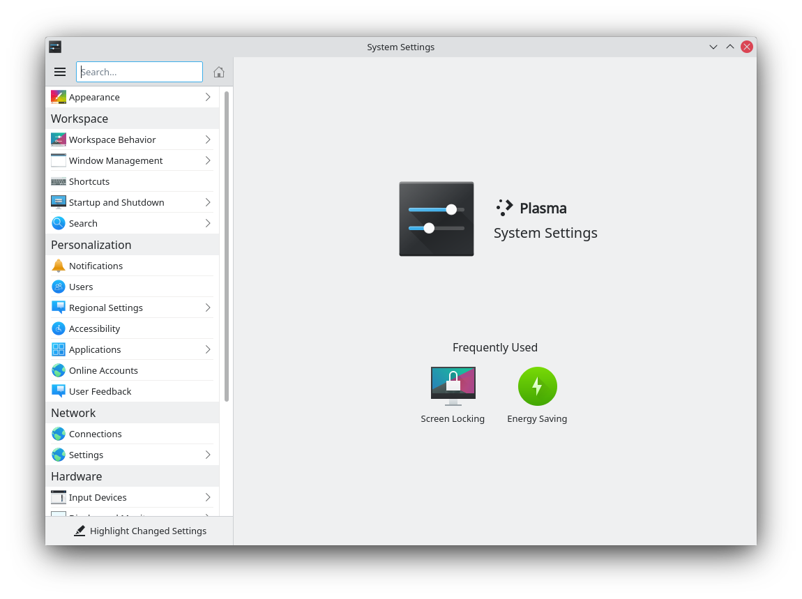
If anyone hasn’t tried using System Settings yet on macOS Ventura, overall it’s…pretty bad. On iOS the canonical way to display a bunch of settings is a table view, because there really aren’t that many controls available to be used on a touch-first device. In Ventura they brought this over to macOS, trying to cram all the old settings into lists of options (which used to be nice little checkboxes, but are now tiny little switches that look pretty bad). In many cases the thoughtful, if somewhat dated, layout of some preference panes are completely lost and bulldozed over with the list of switches. In other places it’s clear that the team was forced to do the redesign and keep all the old options available somewhere, but couldn’t really figure out where to put the stuff, so there’s little push button on the bottom that will show a sheet with the UI that didn’t fit in the list. Of course, any settings that don’t really make sense to share with iOS are now lumped together and hidden from sight-in this case, under the “General” tab.
If you remember how everyone moaned about iTunes and begged Apple to rewrite it, then got Music in macOS Catalina, you can kind of see how the new System Settings app is.
My 2014 MacBook is no longer getting major updates. Apple is still popping up ads for the latest MacOS, even though I can’t install it. I considered buying a new Mac with Apple silicon but the last three MacOS releases have been enormous regressions. At this point a Framework seems to make a lot more sense.
I hated everything about the UX on Big Sur and they seem to have doubled down on their poor decisions. This news destroys the final bit of hope I had that they’d correct the MacOS path the way they did with MacBook hardware.
The idea that someone would switch to the Windows (or linux) ecosystem because of some visual tweaks to MacOS settings is very amusing to me.
For example, have you ever used the system settings panel in Windows? It’s the most confusing, horrible, and neglected part of the OS. For like 15 years they had mashed together settings panels from different versions of Windows without even bothering to make them visually consistent. Ditto for a lot of Linux distros.
I think you’re overthinking it. MacOS has barely changed at all in last 20 years from a UI perspective compared to Windows. Upgrading from an 8 year old intel model to an M1/M2 model is going to feel like strapping on a jetpack.
"Upgrading from an 8 year old intel model to an M1/M2 model is going to feel like strapping on a jetpack."
i did just that, and it simply felt "normal" again after years of increased slowdowns on every macOS update without any noticeable big improvement to the UX.
No. My MacBook Pro is a 2012 pre retina with a decent Samsung evo SSD and 16GB RAM. It has a OCLP’d Monterey install and it is smooth and functional.I dev on this machine and honestly, same hardware runs MacOS better than Windows 10 (212H iirc) in Bootcamp. This is VS Mac building Mac Catalyst, Android and iOS apps. Building my pet PSP tool chain for .Net and Retro68 GCC port for BeOS PowerPC. Nothing trivial.
This is my conjecture, too. M1 is fast, but only because MacOS is ludicrously slow. Apple has their hardware figured out right now, but their software experience keeps me away from using MacOS
There's only been 1-2 major macOS releases since the M1 launch and benchmarks have gotten faster during that time. There's simply been no "years of increased slowdowns".
> There's only been 1-2 major macOS releases since the M1 launch
Consider that the "years of increased slowdowns" probably referred to the years before the M1 was released a year or two ago. Which would make sense, as the comparison was pre-M1 vs post-M1.
Spending a week on Windows will help provide some perspective… it’s hard to remember just how bad things can get when you’re spoiled by MacOS for so long.
I am not too happy with the direction macOS is moving towards, though I do understand Apple’s motivations and agree it is still better than Windows. For reference: been a Mac user ever since I was like 10 years old or so, starting with System 6.0.
I do feel some Linux or perhaps a BSD system with a GUI like WindowMaker might feel like an improvement at this point.
It’s something I will probably try in the coming year.
Apple's OS is becoming more and more secure and while I understand this makes sense for the average user, it brings many annoyances. Also from a developer perspective (notarisation, having to jump through hoops to install software from 'untrusted sources', etc...). This is my biggest annoyance with macOS at this point.
I'd like to have a system that is 'less secure' in which I feel I have more control over my system.
Also it seems Apple is moving apps included in macOS to be more in line with iOS, which is not really something I like to see. It will likely dumb down app functionality.
I think you expressed my feelings as well quite accurately. Dumbing down + adding more (unfortunately somewhat necessary on a mainstream platform) annoyances and hoops.
I used OS X exclusively from 2008 onward, and I switched fully to linux late last year. I managed to make the switch tolerable by learning and falling in love with tiling window managers and minimal desktop environments that are available on linux. I could never stand 'traditional' desktop environments on linux, they always felt so clunky. With Sway (or i3 on my desktop), the operating system just disappears out of sight. All I see is what I want. A little bar with information and system status, a browser window, a bloated text messaging program or two, and heaps of terminals.
Really fast, too, unlike macOS.
My work provides me with a Surface to do my thing. I get to experience both. With that birds-eye view, I can decide that none of my money gets spent on Windows. Xbox, sure. Windows, pfft.
> It’s the most confusing, horrible, and neglected part of the OS.
The worst part is: It's not even neglected. It's been undergoing constant changes, and while they're mostly for the better, the constant stream of changes really highlights how poorly thought out it was in the first place, and makes finding anything an exercise in frustration.
>> makes finding anything an exercise in frustration
That's what I use Spotlight for. Years ago someone pointed that use of Spotlight out to me and I've been using it that way ever since. No longer have to pull up System Preferences and I can find any setting I need immediately.
> For like 15 years they had mashed together settings panels from different versions of Windows without even bothering to make them visually consistent.
Closer to 30 years actually - there are many configuration dialogs which have been virtually or entirely unchanged since their first appearance.
I've been using Macs for nearly 30 years, and over the past few years, I've been switching to Linux, at leasat for personal stuff. At work, I sill try to avoid Windows (and the crappy work-issued Dell hardware). There's definitely a feeling that new Mac development from Apple is more a thing to dread than to look forward to.
MacOS has changed dramatically in the last 3 years alone. This isn’t just UI tweaks, although those are annoying. I have daily driven MacOS for 10 years now. It’s no longer serviceable.
Specifics? I’m not saying you’re wrong — different use cases are different use cases — but I just don’t see anything in the last three releases that changed it enough to make it unserviceable for any previously suitable use case.
Been using macOS/OSX for work since 2010 or 2011. It seems basically the same to me, aside from a couple performance-enhancing releases that really did improve things noticeably. And better/smoother interoperation with iOS and iCloud. I don't see any big differences.
iOS, that's changed a lot. Could we move back toward iOS 6? I still miss it.
I’ve used OSX on Intel since Leopard (10.5), though I have a Jaguar (10.2), Panther (10.3) install on my old PowerBook and Tiger (10.4) on my G4 Mac Mini, and small things changed, but on the whole the OS is the same. I mean, Aqua style changed massively between 10.2 and 10.5, so there are arguments that the UI might have seemed better to some pre Intel. For me, Spotlight, Exposé and Spaces made a massive difference and that is what I miss most when I have to do something on a legacy install. Even Tiger is painful to use because of missing Spaces and Exposé.
I use Monterey at the moment on my main Mac and it’s absolutely fine.
Possibly the lack of spaces? I use Exposé mostly to organise my spaces these days. I use older OSX less and less as PowerPC is only useful to developing the retro68 port. Since I got Sorbet Leopard on the G4 it also hardly boots Tiger.
The one big core OS thing that's changed by my reckoning— and I don't even believe it was within the last three releases— is the hoop jumps required to run unsigned code. I honestly don't see a problem with the move because they do provide a path to execute it when you need to, but it could probably be a little more straightforward.
Just tried this with a pair of AudioTechnica headphones and an Insigia bluetooth speaker and couldn't reproduce it. Tried regular already-paired connections and removing/pairing. Maybe it's driver-specific with something you're using?
Enormous regressions? I could agree on “not great” but that was strong words. Haven’t really had a lot of trouble with the updates. I would say that macos 2014 and 2022 have a lot more in common than 2014 macos and current linux.
Messages basically doesn’t work anymore. I had to disable Time Machine because of the thrash of indexing itself. The UI makes no sense anymore. They removed established shortcuts for… no reason? There’s some kind of pseudo-touch style going on. Like they plan to add a touch screen but didn’t. The iOS-ification continues.
MacOS is a clear second class citizen at Apple. Each of the least three releases has been worse than the one before. I hoped it was the last gasp of Ive but it’s apparently intentional. Or maybe nobody is in charge, which would make more sense.
What's even more frustrating was the removal of 32-bit apps in Catalina and the continued deprecation of OpenGL. So many functional apps where the developers have lost interest are now non-functional. Not to even start on the irritating, vista-like security prompts for apps that are not signed (which in development is a lot...).
MacOS has become less and less pleasant to use in that last 3 to 5 years for me as a developer, because of this. Which is such a shame, because the new Macbook Pro's are really amazing machines, hardware-wise. Great keyboard, Magsafe, no Touchbar, amazing screen and great battery life.
I will be requesting a Linux (or Windows.. whatever) laptop at work if this one dies.
I will take Metal over Khronos APIs any day of the week, if Khronos would be doing the Internet, all we would have as standard would be IP protocol, with everything else as custom extensions.
The Khronos APIs are the ones I have more experience with, and it pains me that all these years it stays as kind of initialiation ritual to go through all the things they miss versus proprietary APIs.
Everyone has to write their own mini-engine with their APIs.
The only Steam game in my library that still works now is Myst.
The list of Steam games that even supported macOS at all was already quite short, but now Portal, Portal 2, Team Fortress, the entire Half-Life series, and quite a few others will no longer run.
The switch to Apple silicon machines also makes running them in a VM tricky. Even though Windows supports running x86 code on Arm hardware, the mix of architectures inside the VM creates new problems, particularly for Steam.
With it, I could at least scan. Image Capture/Preview just produce invalid files. (Samsung M2070w). Now to scan I have to use Linux or Windows machine.
Invalid files as in it creates PDF, but it is not valid PDF and it will fail to open. When trying to scan into TIFF, it will crash.
It is pretty much device specific; an HP MFP at home works fine. The Samsung app was an workaround, but it was pretty obvious that nobody is going to fix Image Capture.
Tascam us-122mkII support was dropped. It is ancient, but it still works and there was a Windows 10 driver. I just got a cheaper Behringer uphoria that uses standard USB audio (or whatever) but loosing the Tascam was annoying.
They're an Objective C developer, so no, I won't. It's a very typical Apple device user response of 'why would you want to do that?' epitomised by Jobs' 'you're holding it wrong' advice.
Not really. The last hold out is the 13”, but that design has not changed since it was Intel based. The 14 and 16” versions have no touchbar and I would guess the 13” won’t either on the next redesign.
Huge CPU hog. Features that exist on mobile are missing on desktop. There’s no timestamps on messages. I’m not sure search even exists. Sync with iCloud only mostly works.
This has not been my experience. No cpu issues, I can see time stamps on messages if I choose, I can search messages, if there are feature differences between mobile and desktop they are not features I am using, and between my Apple Watch, iPad, iPhone and Mac, all my messages are sync’d just fine.
To be honest, the apple ecosystem stuff and how well it works, for me, is one of the biggest benefits of Apple. I walk up to my computer and my watch unlocks it. I can take a call or respond to a message literally on whatever device I happen to be on. For me, I can put up with UI/UX quirks in features like system preferences that I use maybe one or twice a month.
The messages rewrite that happened a version of two ago was the bring it inline with the mobile features - it is much closer now. It seems to still have some bugs though. But, I have timestamps on every group of messages and if I slide to the left I see each message timestamp.
I have a 2015 MacBook Pro. I'm typing on it now. I admittedly do mostly fairly lightweight stuff on it--I do photo/video editing elsewhere although until recently that was a 2015 iMac--but it works fine for that. Certainly not an awful experience.
Why? It’s got 16g of RAM and a blazing fast SSD. I had to get the heatsinks cleaned out once. There’s definitely slowdowns but they’re resolved by reboots which makes me think it’s more to do with software than hardware.
Have you heard of this thing called a CPU? The ones Apple puts in its machines have gotten much faster since 2015. All kidding aside, you have a CPU from the nadir of Intel's slow march into irrelevance. I went from a 2013 Air to an M1.
"UPDATE: This issue has been resolved in macOS Big Sur 11.2. Apple has removed this whitelist completely, allowing third-party firewalls like Little Snitch to reliably monitor and filter any network traffic." - the Little Snitch link
> Apple is still popping up ads for the latest MacOS, even though I can’t install it.
I have this on my 11 inch Air from whenever it was - maybe I can get them for false advertising - because they are saying I can have some great new features if I click the button ...
> Apple is still popping up ads for the latest MacOS, even though I can’t install it.
This seems like a bug they might actually fix? As opposed to the "bug" of showing you those at all, which is pretty annoying but unlikely to get looked at.
Is battery only thing that you think is better on Mac so you mentioned only this one thing?
Lol. I'm really considering getting new Air with M2 but man, battery is one of the last things to compare. It's _nice_ to have long battery life but it definitely not killer feature by any means
If it’s a laptop battery life should be the first thing to compare. The ability to be anywhere and not worry about battery life seems like THE #1 most important aspect.
It used to be, but these days laptops are the new desktops.
Almost no one buys desktops anymore, even though they are obviously a better choice in many regards, including ergonomics, if the thing is to be strapped to a desk 100% of the time.
The batteries on my laptops are pragmatically just a UPS. The time between occasions that I need to use my laptop on the hoof (for more than "two hours") is so long that the age of the battery is a far bigger factor to consider than the software being run. I don't loiter at coffee shops unless I'm on a date, and libraries/offices/hotels have outlets.
Speaking of UPSes, I wish that desktops/servers would just chuck a laptop battery socket on the back. Batteries are the only real difference between desktops and laptops, and desktops need them nearly as much as laptops do.
The 98% would probably be better served with a very light with great battery laptop and beefy, quiet, large screen and good keyboard, desktop but instead end up buying something that's not great for either use case.
Personally, I have a minimum expectation, but beyond that, it moves a lot lower on my priority list, too. I wouldn't accept 2 hours, but once something hits 5-6, it's usually GoodEnough for my case (though, I'm not OP). Of course, I would love 20hr, but the OS, etc. starts to become more important at some point.
I actually just upgraded my late 2012 MBP to Monterey last week using OpenCore Legacy Patcher [1]. Everything works great so far. Your 2014 MBP should be supported as well.
Made me wonder how part-time hobbyist with minimal resources can continue supporting old hardwares while a trillion dollar company cannot.
I was trying to figure out how to do a factory reset, which they call "erase all content and settings". It's available through settings, but not in settings. You have to open the settings app, then in the menu bar click the app name, and click the erase all content and settings button. Searching for "erase", "reset", "clear", "empty", etc in settings returns no results.
Of course, I couldn't tell if it was indeed a factory reset or not - what even is content? Does it include non-user scoped files and folders? Why not just use normal language people are accustomed to?!
There’s a read-only partition that contains system files and default applications, and a read-write partition that contains files and apps you’ve added. The second gets erased, keeping the first.
Would “factory reset” mean reverting to the version of the OS installed at the factory? That is no longer a viable option. “Erase all content and settings” is clumsier language but more accurate.
Factory Reset does not mean to reset the phone back to the original version it came with. Factory Reset is basically erase everything and load the protected partition to "reinstall" the OS (if you upgrade your OS several times, it will use the current OS version.)
Factory Reset term been around for so long and everyone already know the term meaning. Even I remember that term 25 years ago. Apple chose to change the language and this cause confusion. "Factory Reset" and "Erase all content and settings" didn't implies the same meaning. Apple should add a subtitle or a tooltip to indicate that it is factory reset or additional context for us to understand what it does. So why change the term if it isn't broken?
Accuracy is irrelevant when there's a commonly used term though. They could just have "reset" or "factory reset" lead to that settings item, but like with so many things Apple does, it's their way or the highway. Feels like you have to learn Apple English to effectively use Mac.
- Task/ process management is done in "activity monitor" - what the hell is an activity? An event?
- Error logs and crash dumps are found in "console", which is different from a terminal.
There's many more examples too
That's really annoying, because the settings in iOS is terrible enough on the phone. Tons of stuff doesn't make sense, naming is bad, many settings are, in my opinion, placed under the wrong menu item.
Also: it used to be ok-ish to have all settings in one place when apps were rather simple and few. Now it's super annoying to be in an app, want to change something, go to settings, scroll forever to find the app settings and make the change.
As someone who normally doesn't use iOS, it is always a chore to find what I'm looking for. That means that the logic of the hierarchy is not intuitive and to use it, you need learned behaviour.
More and more options have certainly been added over time, often for good reason. But it means that someone who hasn't lived with iOS for a while, when suddenly presented with it out of the box, can be overwhelmed and a lot isn't intuitively discoverable.
I’ve used iOS since the first iPod touch. Basically everything dumped into “General” is misplaced and hard to find, you only find it because it has been there for 10 years now.
My recent example when I needed to set up a proxy - Certificate Trust Settings are under General -> About, at the same time there is VPN & Device Management.
On the admin side Apple tends to group those functions together though. Trusting certificates isn’t a “General” task for most people. It’s typically for the purposes they’ve delegated to the VPN & Device Management section.
I’m not saying that necessarily makes -any more- sense. Given that the VPN settings are much more widely used and used to be available only through the top line settings, and is still also available at the top of the first list of settings.
There are a lot of pref panes owned by a lot of different teams/owners. I suspect the rough edges will get ironed out in future updates as other teams have time to come in and do a re-think/re-write.
I have to say though, iOS does not seem like the best model of Settings that I would emulate. Rather than the years-long, pile-on model that iOS Settings seems to be the result of, someone needs to step back and reevaluate where every setting ought to belong — how best to organize them.
Also, speaking of iOS Settings — Mail setting should be in the Mail app, Safari settings in the Safari app. I have always loathed that iOS 1.0 idea that you had to go to a different place to find the settings for the apps.
I don't think it's too bad, it just needs a bit more discoverability.
I use KDE now as main driver which has a ton of options compared to macOS and they use the same format. What I do find myself using a lot more is the search. Part of the reason I didn't have to do this with the old macOS preferences was just my muscle memory (only slightly thwarted by Apple's changing of the icons). And the other part was that there's simply less to find there.
But essentially I think the scrolling left and right panes are not a bad idea. The old format consisted of a non-scrolling and non-resizable(!) window that would be replaced, and this caused some issues on really low-res screens in the past, at 800x600 pixels (or even 800x480 like the eeePC) it was impossible to reach all the settings on the old preferences.
At least this is now fixed to a format where more controls don't need to be crammed into the same space, it can simply expand. And the number of "menu" options is now also dynamic and no longer constrained by screen space.
But it's going to mess up decades of muscle memory which is not fun :)
> I use KDE now as main driver which has a ton of options compared to macOS and they use the same format.
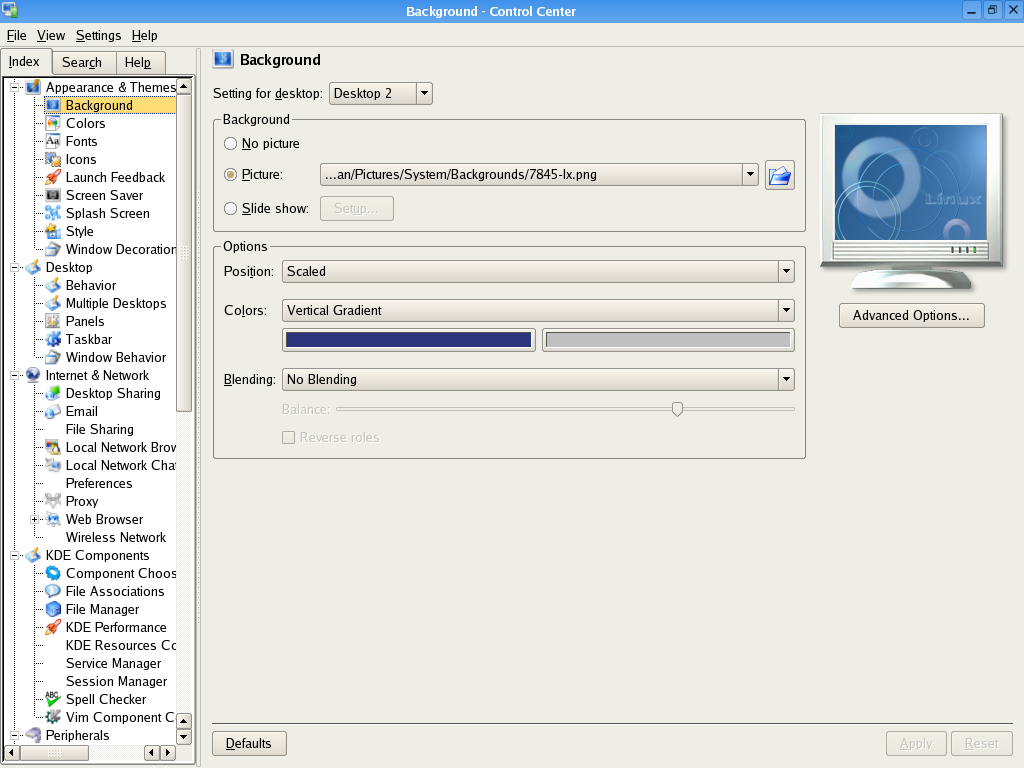
Those of us who remember the old tree-based layout from before Kirigami took over were about as happy about the change as macOS users are about the new Preferences layout in Ventura. It used to look like this a long time ago: https://fedoranews.org/krishnan/review/kde3.2/fullsize/contr... -- it was a lot more space-efficient and going into one sub-section didn't automatically hide all other sections, so it was a lot easier to look for things.
I don't recall if the window in Plasma-era releases was resizable but it certainly replaced one that was both scrolling and resizable. Early 5.x releases still supported the tree-based layout IIRC but it hadn't been the default since the 4.x days, which used that awkward icon-based layout, eek!
> But essentially I think the scrolling left and right panes are not a bad idea.
Until touch/mouse inputs have a widespread support for horizontal scrolling by default, like they do for vertical scrolling (scroll wheels or two-finger drags), I think they are going to remain a bad idea: you have to move your pointer from the thing you are looking at to the scrollbar and then back.
One could say it's a chicken and an egg problem, but displays are already much wider than they are taller, and if you do need them even wider, you are failing miserably IMO.
Apple's trackpads have supported two-finger horizontal drags for ages. If you're on a Mac right now here's something I did that's explicitly designed to be a very long horizontal scroll that you can try it with: http://egypt.urnash.com/rita/chapter/01/
Yeah sorry about that, I meant that both panes scroll independently (but only vertically).
I totally agree about horizontal scrolling by the way, it's horrible. I used to use Siebel 6 which used that heavily. And Microsoft's Azure portal does it too Though in Azure it's more like a 'breadcrumb' thing to go back, you don't normally need it. In Siebel you actually needed it to get to some important fields.
Sounds comparable to the Windows metro rewrite of control panel— an attempt to modernize and make it tablet friendly, but only 80% of the way there, so the old UI had to still be maintained behind the scenes.
From what I've seen, there's not much to re-learn. Everything is in the same place as it was before, it's just that the layout is clunky and does not look that good.
How often are you in system preferences? Literally I am in there maybe once/twice a month. I guess I don’t see the outrage over minor UI tweaks for a feature I rarely use
They massively iterated on Safari after receiving bad feedback.
I really like the version that shipped: I love the much more reachable address bar and use the quick tab switching by swiping (and also the quick tab creation) all the time.
I also like it much more visually – but even if you don’t, it‘s clear that the design is different for functional reasons, not visual appeal. There is a clear purpose behind the changes (moving the address bar to the bottom is the obvious change, making the address bar look draggable and providing the hint of the other tabs to the left or right is also quite important and very much function first.
I didn’t care for the first iteration. I do like the final design. The only thing that‘s weird is that they kept the old variant around as an option. Maybe because the discussion turned toxic and people became unable to evaluate the design based on its merits?
Craig says in John Gruber’s “The Talk Show” chat that the developer beta for this is early and they have a much better touchpad experience in the works already but wasn’t ready yet and hopefully the rest will get improved also
I don't know about you - but the "shelves" UI that current System Preferences uses is - hard to navigate. There's no real rhyme or reason for the shelf location.
At least the Ventura/iOS multiple menus has a hierarchy. Ultimately I use "search" for such large settings to find stuff like 90% the time.
I think the sidebar is a big improvement and I think it is nice that you can quickly get to the network items you need. It's the right hand side that is awful.
I don't think that would actually make sense. I'm sure the backend/business logic/functionality of settings has extremely little in common with iOS, so that cannot be reused with catalyst. And the UI is tweaked and "improved" for macOS (compared to iPad UI). So you don't actually gain anything from using the iPad settings app on macOS through catalyst.
What industry standard? There's no industry standard for this stuff, it's just each OS doing what it wants.
As it stands System Settings now looks different from every other preference panel on the system. I helped ship a sidebar+search design in IINA and we do a far better job that System Settings does. Go take a peek if you'd like to see how this could've been done. (Personally, I think most apps should stick with top tabs, but we–and Apple–are constrained by how many preferences we can show on screen at once.)
There is no industry norm. KDE, for example, follows the approach described in the article. In fact even Windows has some control panels designed that way too (though Microsoft still cocked it up be creating multiple different settings applications each with overlapping utility yet somehow differing support for configurability thus leaving left to Google how to make even some of the simplest of changes).
To me, the iOS Settings app just feels like a structure-less list where I have to use "search" to find anything anyway. (Perhaps my problem is that I have a strong desktop background and I don't use mobile phones much). To me, making the MacOS settings more like a phone would be a big step backwards.
To back up this argument: the redesigned settings app looks a lot like the one in Windows 10 and that one is a nightmare, specifically because it uses a phone-inspired design.
A valid complaint about the System Preferences app is that it is hesitant to introduce new top-level subdivisions (the tabs). They should roughly double the amount of tabs, and introduce new categories in order to group them together better.
I’ll note that I quite like the settings app in Windows 11. Far better than any previous windows iteration. Everything I’ve need since I got my PC a year ago is in there, it looks good, it’s searchable, and I haven’t needed to open control panel a single time.
Totally agree. Every time I open System Preference, I spend several seconds trying to find what I'm looking for. I'm sure that the icons are in _some_ order, but it's certainly not obvious to me what it is.
I very much agree. I recall around the era of iPhone 4 or 5 (?) that I could easily navigate the Settings app without ferreting around looking for the right page.
Now I have found that I can almost never find what I’m looking for without searching.
The macOS System Prefs is also not ideal but I prefer it to the iOS Settings.
This looks a bit like a macOS clone of Windows 11's Settings app.
I was going to say Apple has been moving away from the "every app has a sidebar" UI, but it seems the sidebar has made a comeback now that I think about it. I think this is a good thing in most cases.
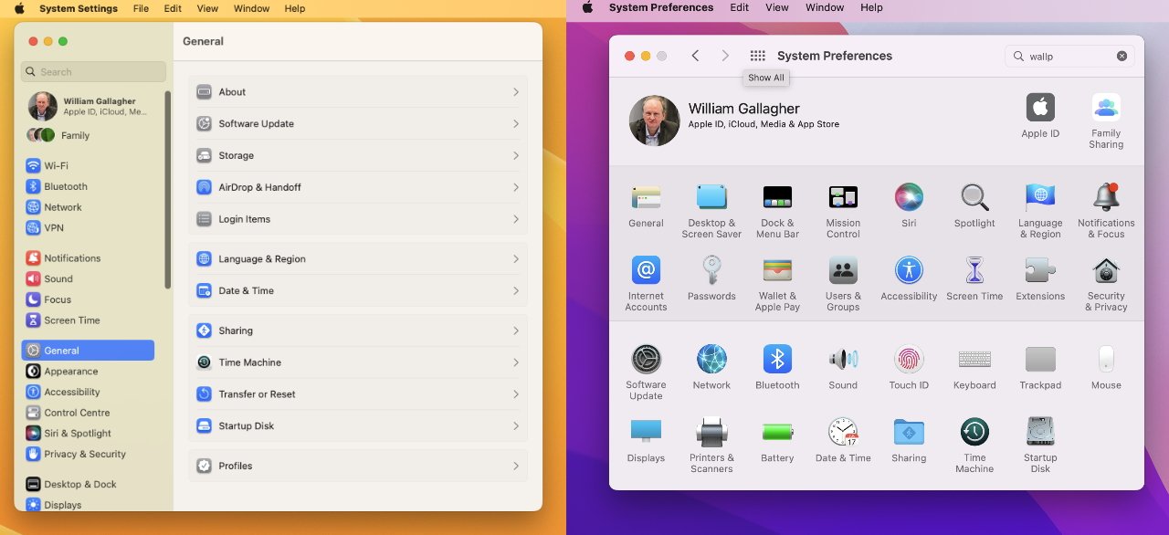
It's a decent concept. Although I'm not a fan of the wallpaper settings. The only option shown is to drag and drop an image into the Settings window. So a person would need to open Settings and either Finder or Photos. Finder and Photos both have options to set the desktop image directly, so if a user is already in there, opening Setting is a needless step. If someone heads to Settings to change the desktop image only to be cryptically told they need to open a picture from somewhere else to drag it in, that's a bad and confusing user experience. It also seemingly eliminates the concept of built-in wallpaper options from Apple, unless they throw a folder in the users Pictures folder, which seems tacky.
I think the main way I change the desktop image is to open the Desktop prefs pane and drag a picture in there. Mostly from the Finder. Or from Preview.
Ah, no wonder I never noticed it - it's buried under "Services" on 11.6.4, which is my current OS. Also it seems to always set the image to "Fill Screen", which is never what I want. So I'd be right-clicking on the desktop and hitting "Change Desktop Background" anyway.
I've found in general over the years, it's pretty difficult to find what you're looking for in System Preferences. Anytime I go to look for "Security and Privacy", it takes me a good few seconds. The icon isn't exactly recognizable. Maybe something as simple as alphabetizing the categories would help. I feel like this has gotten worse over the years but I can't say how.
We got more settings. A lot of categories did not exist before, so we had to cram more options in or chose what's less used and hide it.
For an extreme case think of today vs XP. No bluetooth. No privacy. No location. No login or users. No speech recognition. Sharing was there but hidden. There was no colour tuning, font smoothing was hidden, and half the other graphics options didn't exist.
In today's era people don't dare to change from the default configuration if they don't have to. We all know that if some settings feel like Apple doesn't want it, it will be hell (incompatibility with other settings, subtle hints that things won't work because of that, the option will get back to default magically in some occasions, and so on). Heck lots of people don't even change their Desktop picture anymore.
I just tried to firewall out Apple's app notarization, using Apple's provided IP addresses, macOS's included firewall (pf), configured from macOS's System Settings plus a configuration file in /etc.
Not only my configuration file will be burned down at each update (and rapid security response will probably make it even more deceptive), not only I cannot receive even the courtesy of having my conf file in some "Relocated Items" directory as macOS used to do, but also I notice clearly that app notarization still works in apparently random moments
I just tried that, it works, but weirdest thing to me was always that it doesn't alphabetize within the two groupings, but i guess the top and bottom are just seperations, not really groupings? Can you make the categories more explicit?. The first four I guess are related to UI (General, Desktop & Screen Saver, Dock * Menu Bar, Siri) but then why not make that it's own category? Siri and Spotlight I guess are both 'Search' but same question again, these were all in the first grouping.
There's a "Customize" but I guess that just lets you hide stuff.
There's a striking similarity between the author's mockups from Feb 15 and the redesigned System Settings announced in the beta of macOS Ventura and last week's WWDC [0]. I guess they got their wish!
Just out of curiosity I'd love to see screenshots if they exist. On the ones I've been able to find, I'm seeing related settings grouped with a horizontal button stack.
> System Preferences has gone decades without a redesign, appearing noticeably unchanged as macOS has evolved around it.
The old one allowed you to have a favorites bar and actually ordered the contents alphabetically. I can't find anything on the new one without searching.
Someone reimagine Ventura with title bars added back in. Tired of playing this game of where's the dead-space I can use to drag my window just so I can have an added 30px or so of useable height in a window.
It's this and the lack of draggable (or command-clickable) icons that first made me wonder if I've reached an age (in my 30s) where I'm just not going be as "good at computers" as I was in my 20s. Upon reflection I'm not worried about it, but the NSDocument model (while a bit obtuse at first glance) offered good end usability. The little animation delays and inconsistencies are unfortunate in the light of what used to be readily available.
The issue isn’t people being “good at computers”, but computers getting worse at people. Minimalist design clowns and lazy developers have taken over, and user interfaces have become far less intuitive than they were 10-20 years ago. Couple that with added complexity, and you have a recipe for disaster. Apple is the worst example because they used to be a company that took pride in its user interface design.
I'm 44 and I feel like an old person now on the iPhone. I am constantly tricked into hitting "x" on a search bar instead of sending the action. I find myself typing phone numbers and things into the wrong app like a chat app. I am often staring with a befuddled expression at the screen because I don't know where to go immediately to do what I need to do. (Contacts is particularly bad for this).
On the iPad I always end up with the stupid files overlay thing that is hard for me to get rid of. Usually I was just trying to scroll or drag.
I thought iOS was supposed to be grandparent friendly!
I can't tell how much of this is related to getting old and how much is just saved-up expectations from a more civilized time.
I'm significantly younger than both of you and often encounter similar issues. A favourite of mine was triggering iPad multitasking/overlay windows randomly and having no idea how to get rid of it properly. Another favourite of mine is being afraid of the contacts app because I'm sure it's easy to make accidental calls by tapping a button that looks like it does something else. Perhaps I've just become paranoid.
42 and semi-seriously considering switching back to a computer from the 1990s and a flip phone. Not even memory protection is worth the crimes perpetrated by today's generation of designers.
I recently went on a SheepShaver kick recreating a PowerMac 8600 and it was very enlightening. There are obvious significant usability features in modern macOS. But the simplicity, consistency, and feel were incredibly valuable. There's nothing like it anymore.
It's particularly unnecessary when you can easily get 30px of useable height back just by using widgets of sane sizes. Like, computers have trackpads and mice, no need to make everything bulky fingers-friendly.
Just to be 'trendy' and 'fresh look' some software takes this to the extreme, even inside the same app sometimes the top invisible band is for dragging the whole window, sometimes (large! with lots of emty space) list items run edge to edge putting active area there, playing a guessing game with you. This is just [stong adjective here]!
First thought, for "About This Mac" I usually want the model number and serial number.
Second thought, is it fashionable now to not include a "Cancel" button in settings dialogs?
Many times, I have navigated all of the pages of a settings dialog to change a setting or multiple settings, then realise I liked it better how it was before, and have no idea what the settings were before I changed them.
Just yesterday I wanted to try a new theme in Xfce - change the theme, not happy with it, and no idea out of the 50 themes what it was before I changed it, so now I have to go through every option to find the one that was (approximately?) what it was before.
I'm not sure a 'Cancel' button is the right UI, because settings pages are a confusing mess - sometimes a change takes place right away, other times you need to press the 'OK' button first. Perhaps an 'Undo' action is the better approach, just like making changes in a document?
macOS settings have been instant-apply since at least the first OS X. Sometimes it’s annoying but for many settings it’s the only model that makes sense (like, if you have a setting controlling which WiFi network the computer is connected to, how can you delayed-apply that?).
The concept is as terrible as the Ventura Settings app, and the iOS Settings app. A bunch of iOS kiddies thinking they are revolutionizing the world by putting simple tables on a window. Terrible.
I've never quite understood the gushing over Apple's software applications. I might be in the minority, but they're awful.
Finder (especially Finder, copying a filepath...), iTunes/Apple Music, Xcode, Quicktime, Safari (pre 2022, Safari extremely recently became a great browser).
The vast majority of the core applications bundled with their products I've found painful to use.
The actual desktop and window manager itself is very pleasant.
But quite frankly, I despise the pre-bundled applications just as much as any other pre-bundled application.
So, this might be down to discoverability being such a challenge, but it's actually very easy to copy a filepath in Finder - with great precision too.
There is an element called 'Path Bar' that can appear at the bottom of Finder file panes. You may or may not have this thing hidden, there's an option in the 'View' menu. Make sure the Path Bar is visible and right-click on any part of the path to copy up to that point.
Frankly, I rarely use it since the terminal is so much more powerful for file handling tasks, but there you go. The solution existed just past your threshold to discover it, which is a whole 'nother kind of UI problem. But I find this implementation to be superior to Explorer or any of the Linux stuff.
> But I find this implementation to be superior to Explorer or any of the Linux stuff.
Thats crazy to me. Explorer is 1000x better in my opinion. In fact, explorer and window-pane snapping / window resize rules are about the only things I prefer on Windows over Mac.
Specifically for this use case, you just click the address bar and it becomes copy-able in Windows. No need to edit any preferences to get that feature either.
To be clear, I am saying that this one feature is done better in Finder. Explorer has many cool features, but in this case it's not up to par.
Both examples present us a line of breadcrumbs. Both allow you to interact with the breadcrumbs directly and use them to navigate, or right-click to copy them as a filesystem path. so far so good.
But Explorer falls short here: At no point does the filename you are focused on appear in the trail of breadcrumbs. Not in default mode, nor in the abrupt switch to plaintext if you click a little past the breadcrumbs. In Finder, the focused file appears at the end of the list and you can right click to copy the full path.
Essentially, Explorer is limited to providing the enclosing folder only, which is a kind of stunted quality to this feature. I'd say in the majority of cases, you are trying to grab this path to do something to a specific file, not to an enclosing folder. Copying off of a network share, or some GUI scp/sftp application... those sorts of things. In Explorer, no matter what you are forced to switch modes to the keyboard, to type out the file name.
This is just not the case in Finder. You can grab the path up to the file name from the get go and do your thing, never switching modes to the keyboard if that's how you want to work. For that reason alone the Finder implementation of this specific feature is superior.
And one last thing? at no point did I say you have to 'edit any preferences' about this. You can toggle the breadcrumbs on/off with a single item in the 'view' menu. Some people may have toggled it off, so I thought I'd point it out.
I switched to Linux a little while ago and haven't used Windows 11 at all, but iirc on 10 you can shift right click to copy the path to the file. Sure it's an extra button press, but the functionality is there.
thanks, that is bound to come in handy at some point.
AS an aside, this kinda touches on what I mentioned about discoverability - I sorta go out of my way to understand how to get stuff done on these various OSs and this one eluded me. I was under the impression you would have to install powertoys and use 'send to...' commands to get this done on windows GUI.
You're not wrong. However, my frustration is I remember experiencing the exact same issue in approx 2008, wrestling finder to display a filepath. And again in 2014.
If memory serves, all three incidents had a distinct set of menus, first you had to display the folders, etc etc, to make it as irritating as possible.
Settings has the UX polish of my high-school VB6+Access project.
And you can't uninstall their garbage, either. Siri, Facetime, Messages, Maps, Photo Booth, Music, Podcasts, TV, News, Stocks, and a whole bunch of other junk. This is a work machine, I don't have any need for any of that stuff (and I have even less of a clue why an average Joe would be forced to have Stocks installed).
> Many of the same categories - from General to Sharing, Network to Startup Disk - are faithfully preserved in macOS Monterey much like they were in Mac OS X 10.0 back in 2000.
IMHO, this is really good. One of the gripes I have with Windows is how Microsoft seems to constantly reorganize the control panel, which is as annoying as looking for something only to have trouble finding it because someone moved all your stuff around.
IMHO, there should be a pretty high bar for reorganization, and as much stuff as possible should stay put, under the same or very similar name.
> But my frustrations with System Preferences are that features are continuously being crammed into a format that has outgrown its utility,
I agree with this. It's a problem if they're too hesitant to add to the top level, so shoehorn things where they don't really belong.
> and that the current System Preferences continue to diverge significantly from Settings on iOS.
One of the more annoying things in UX is the instance that everything should work like a phone. Phones have ridiculously limited input mechanisms and screens, which means that a lot of compromises need to be made. I'd really prefer desktop stuff be optimized for the desktop.
> System Preferences has been around from the earliest days of Mac OS X. A side-by-side comparison of the System Preferences from over two decades ago to the System Preferences of macOS Monterey will instantly create the reaction that the two look shockingly alike.
> Everyone has a thing in their life long overdue for a change. It might be a piece of clothing that you're convinced still looks good on you or that pickup line that's more sleaze than smooth. For macOS, it needs to admit that settings... I mean... System Preferences is long (LONG!) overdue for an overhaul.
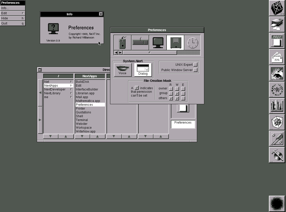
I have to say, Preferences was fine. Sure it isn't great, but it was OK. Meanwhile Finder continues to be a crime against humanity. It boggles my mind how bad it is. Yet, it remains largely untouched since as long as I've been using a Mac (10-15 years).
Do you have any specifics about why Finder is bad? I switched to macs full time 5-6 years ago and while Finder is nothing to write home about, it generally just works and is a fine default?
The layout, how changing layout affects / doesnt affect other finder instances, how window resizing works, trying to show hidden files, trying to show specific folders (~/Library), having to modify settings to show the file path, trying to copy a file path
I honestly didnt even know you could get any of that alt functionality. I just tried it and it also gives you the 'Always open with' option which was another complaint of mine
I'm not smart enough to articulate exactly what about it drives me nuts, but I can tell you that ten minutes with the classic Finder or NeXT's file manager makes the current incarnation of Finder feel like ****.
The one nice and incredibly useful feature about the macOS system preferences is that the Search field actually works and "deep-links" directly to the right page. For instance type "dns" and you get a drop down "DNS servers", "DNS domains", "TCP/IP". Click on "DNS Servers" and you're right in the DNS servers settings page.
(I just hope they didn't mess this up in Ventura, haven't checked yet, but in general I like the new list approach more than the old "icon soup")
I think familiarity is more important that the "optimal UI" when it comes to settings. In other words, improving the settings every year (with something objectively better) is worse than just keeping the same (objectively worse) settings app where at least I know where to find stuff.
Familiarity? I've been using the OS for 20 years and still very often struggle to find stuff there. When you have users that spend their whole day in an app, sure: workflows matter a lot and you can't break familiarity. But a settings app isn't such an app.
I think it isn't a good UX to have to scroll through a list on the sidebar to find the main preference category you're looking for. Having all the preferences categories visible at once on the main screen is a better UX.
Consistent is not everything! Same looking, forced the same concept into everything, whatever the context is and if it justifies better approach in that local situation or not, and especially ''fixing'' already released 'inconsistent' state, already learned (sometimes forced)? No, thank you!!
They did not have to change to the new look that caused inconsistency the first place. This is a toxic kind of practice to reorganise everything again and again, obstucting users. I had to waste sooo much time already in various system 'optimizations' and 'consistency redesigns' forced on me that it costs a lot!
On this level the consistency is a barrier, not helping, corrupting a working situation. It is not a magic wand solving everyhting, it could ruin things! Just think about consistent touch screen approaches, putting touch screen everywhere in the highly practical world of vechicles, causing problems, accidents. Consistency is not paramount. Practicality is.
The flat icons though are not really an improvement. Icons’ role in user interfaces is aiding recognition/recall, if they are indistinguishable color blobs than they have failed, and you’re better off with no icons at all.
I will never understand how Apple doesn't realize bringing a screen limited vertical interface isn't appropriate for a large computer display with a large amount of horizontal space. This interface just sucks to use.
In the sea of comments about design, I've got a slightly different question - anyone knows what that orange wallpaper is/from? It's pretty but Google Lens isn't particularly helpful.
This. You might run into an edge case or two, and the display values might disagree with the actual ones (in case if some of the values are stored in some property list somewhere, that’s used only for display purposes), but ultimately you can change basically everything from the Terminal.
You can but its fairly flimsy and requires a reboot for a lot of them to take effect / reflect reality. Discoverability is a whole other can of worms to figure out what to set.
They are not really CLI tools, but the CLI tools are based on the same APIs that applications use. There are several applications that expose settings hidden in System Preferences (like Onyx, off the top of my head), and under the hood they use the API, not the command line.
I wish UI designers would just leave stuff the hell alone when it works fine. System Preferences has been one of the most consistent parts of OS X/MacOS for 20 years now and I really appreciate that consistency. I know where to find stuff. Instructions and guides on the web remain relevant when new versions are released. Yes, occasionally things move around a bit and icons change, but not too much.
Mac is not iOS and it shouldn't be. I really dislike the trend of taking UI concepts that are great for a smartphone and applying them to a large display.
But how will the design and engineering clowns present “impact” if not by needlessly redesigning what needs no redesign? Notice how things get rewritten every few years now, whereas in the past, software was maintained for years and years? Kids these days just don’t want to maintain stuff, and their corporate benefit structures encourage rewriting stuff instead of maintenance.
To the day I cannot get used to the icon of it. Is it 10 years old? Or more? Somehow this busy gear over gear design is just not characteristic enough, easy to overlook in a busy set of icons. Old one was much better in this regard, it was standing out of the crowd more, not blending in. But they needed some 'fresh look', or 'consistent look', just for the heck of it without functional consideration, argh. They should go paint something or what not, if they are that bored...
However I always take too long to locate stuff in System Preferences. Zig-zag scanning is so inefficient it's easier to just search for stuff: That's a UI failure.
well what do you when you a new hire? you improve/change things right? as a UI designer you can't be hired then doing nothing because 'keep UI consistent' is more important. :-)
If you remember how everyone moaned about iTunes and begged Apple to rewrite it, then got Music in macOS Catalina, you can kind of see how the new System Settings app is.