I think Eirik Bakke deserves a shoutout on this thread. He's the creator of UltOrg (https://www.ultorg.com/) and has literally spent his career pursuing this question with a level of focus unlike anything I've ever seen.
UltOrg is roughly "spreadsheets re-built atop the RDBMS datamodel". The UI supports nested joins, aggregations, filtering, for both display and data update.
The result is essentially a general purpose app that can display just about any Microsoft Access UI that would been written in the 90s/2000s to provide editable views into relational data.
I'm not sure if it's a domain as universal as a grid of cells, but it's a very cool app and, as a friend of Eirik's, I wish him far more visibility than he's gotten for pushing longer on this particular niche than I think most people would have.
This looks really neat and powerful. I think spreadsheets have a lot of deficiencies and that many users abuse them, but that's because there is no widely known alternative/extension. For example, I wanted to create a list of data sources in a particular area. It doesn't warrant any coding, this is just a simple document, but doing it in a spreadsheet is too clunky: I want tags, paragraphs of text, and, crucially, a vertical "heading-tags-link-description" structure. In the end, I wrote a Markdown doc, but now I can't sort or filter! It looks like UltOrg could deal with this, even though it's probably not one of the main usecases. I wish Eirik the best of luck with the project.
Using Org mode [1] and for example EasyOrg [2] does pretty much that. You can use tags, links etc and filter and sort on text and tags. In the case of EasyOrg you would use the Agenda's List view and for the paragraphs to show up in the Agenda they have to start with TODO (or a custom state, i.e. '* DATA My link number one'). The document preview does not support filtering.
Airtable is not really that -- it does not do much/anything in the way of calculations or aggregations. I love it and it's great for creating very structured ways of managing data, but it can't do even very basic aggregations.
This in principle accurate, but the real story is less polished. If you look through the AirTable forums, you’ll see lots of cases where users are asking how to do a thing, and are told to abandon the highly limited scripting and to use JavaScript. This is what I characterize as a learning cliff.
Looking at UltOrg's website, it is not like Airtable. It's not a spreadsheet or spreadsheet interface (though I suppose it could be used that way); it is a much more automated, sophisticated UI for complex relational data. It looks very impressive.
Trillions of decisions have been made off a tool that has poor error handling and data consistency issues. Blame is not entirely on either the user or the software, but the tool is too trusted without validation.
Programmable commands instead of a data grid would be huge improvement to quality but people use excel in many ways. Python is out of reach for most people. SQL would be an improvement as well. I assumed airtable or similar would replace excel over time. But the sunk cost for existing report and the sharablity seems to keep excel in control.
Airtable really ought to be killing Excel, but the SaaS model combined with a stupidly low artificial row count limit (over 50000 rows is listed as "contact us for pricing") means that it will never achieve penetration into weird and wonderful use cases like Excel has.
Like, my default is to throw a dataset I'm hacking on into an SQL database so I can actually query the thing. But no I don't want to upload my 400MB log file. I'll just use grep, or build a CSV and deal with Excel filtering.
Airtable should be awesome at reducing the cost of database-ifying these random datasets to zero. But the sales constraints put it in this niche where it's not the default tool of choice.
You might want to try out Baserow (https://baserow.io). It’s an open source alternative to Airtable, backed by a PostgreSQL database. Main differences are that you can self host it with unlimited rows, it’s modular and it’s made to handle high volumes of data.
I found what Airtable is doing to be deeply attractive. But their costs and their lock in and their pricing model and it's just...
UGH.
Microsoft Access was a good idea with a terrible implementation.
There HAS to be a unfilled niche here.
nocodb looks to be the best answer so far? Because it ties to a backend postgres database, it can be used along side bespoke applications. It still needs development though. I'm watching it like a hawk.
We are trying to answer this with CloudTables (https://cloudtables.com) - which is effectively a GUI for my DataTables library with a Postgres backend. Current work is to address the row limit and allow millions of rows without needing to contact "sales" (me), while also not charging per user (I hate that as a customer). If anyone fancies giving it a go and dropping me some feedback that would be most welcome! There are some rough edges without question that are still being worked on, but I think it has some advantages such as being able to self host with your own Postgres instance.
Access was pretty incredible for what it is/was. I could build a structured database with a nice UI for non-data people, reports, and even more advanced things like automated emails, exports, etc., in 1/10th or even 1/20th the time it'd take to build something similar as a web app.
We had an Access database that managed grant funding for an entire public University and in many ways it worked a lot better than the SaaS app that recently replaced it. Need to collect a new set of data? No problem, give me 4 hours and it'll be ready to use :P.
I'd love to have something like Access but that worked very well as a platform-agnostic web app and could easily integrate with cloud infrastructure.
You used to be able to do that with Access 2010 web databases. Of course, Microsoft has deprecated that in favor of Powerapps and Microsoft Dataverse, but it's not clear that actually lets you join an Access database to a low-code frontend. (It should, but there's a lot of marketing speak that I don't quite understand.)
Access wasn’t even that bad of an implementation. It was amazing not just how broadly access was used but the kinds of users who could do real things with it. A bit like HyperCard.
Access lacks, IMO, better internal programming and more exposure to the fact that you can use pretty much any database you can access (pun intended) with ODBC or ADO.
Make it easily deliverable over network, and you have killer product.
I also think it’s just kinda clunky compared to excel or Google sheets. Maybe if you get used to it it’s ok to work with, but I guess you run into the issue that any friction makes it a hard sell to those who are used to excel.
What do you mean by plain English? Will it support colloquialisms? Regional dialects? How is a Left Join expressed in English, distinct from a Full Join? Will it accept synonyms and contractions? Or will the Query Language require Structure?
Yeah their monetization strategy is extremely puzzling. As a casual user I loved their Chrome extension that lets me grab data and put it into a sheet in a click but it only lasted as long as my Pro membership. All of the advanced features seem to be locked behind a subscription.
apparently grist can handle 100,000 rows, and that's just a soft limit so you might be able to do more.
being able to have an excel grid and a chart view on the same page would probably suit your use case as well. being able to use python for the formulas is a nice touch too.
the free hosted version has almost all features available as far as i remember. there's also a docker version that's easy to get up and running and doesn't have any limitations
> Programmable commands instead of a data grid would be huge improvement to quality...
Would it? At the end of the day, someone else still has to proofread and QA the commands/formulas/program or it's just blind trust that the decision is being made on. Trust (or ignorance) that the creator knew what they were doing and developed it in an accurate way before action is taken on the decision being made. The interface really makes no difference, it's the human component and "process" for creation that needs to be fine tuned. Things like the London whale situation was a process failure where one person had too much power to execute trades without oversight, review, QA, testing, etc. [0] All things that are pretty standard in a software developer's day-to-day but the rest of the world has not realized or adjusted to the fact that they are now software developers too.
[0] Excel wasn't the problem with the London whale at all, they made a mathematical error "modelers divided by a sum instead of an average"
The Reinhart-Rogoff issue was technically an error in Excel, but also an error by the authors for not actually verifying the results before publishing. It didn't hurt that their particular biases were in line with the results.
The technical problem can be addressed with more warnings and safeguards, but they are meaningless if no one uses them.
I hadn't previously read up on the RR issue. But after some surface level research, I would not say it was Excel as an issue. It sounds like the tool did exactly what they programmed it to. It seems like human error or choices they made to arrive at the conclusion they wanted; which seems to be speculated (or true, I only scratched the surface).
> While using RR’s working spreadsheet, we identified coding
errors, selective exclusion of available data, and unconventional weighting of summary statistics. [0]
I'm not a fan of tools giving warnings for these types of "coding errors". Although a warning I can think would be nice is where math just doesn't work as expected. The recent floating point discussion [1] seems appropriate as it's just not very intuitive and as a programmer you need a pretty deep level of understanding to know that the resulting math is likely not accurate. But, it also seems to effect nearly every programming language and is not a quirk of one specific thing.
I'd be interested to read more if you have info outline the actual error within Excel. If there is some 2+2=5 situation, I'd be interested to learn about that. I feel like every time someone says "Excel error", it's actually "human error". It would be like if every car accident was a vehicle malfunction but we all know it's most likely an operator issue.
I think what you're touching on is complexity and how many people tend to trust complexity because it's too difficult to validate and you must know what you're doing if you built something so complex.
Even in a corporate environment, I use spreadsheets to support big decisions every day, the format is as you say universal and easily interpretable, but many people never go that far. They trust that I did it correctly and take the "output" as truth. If I screw up big ($), it might cost me my job, but is it really my fault if nobody else even bothered to check my work?
It's not our fault, our brains are wired to find quick & dirty; simple not small is beautiful. But people also contemptuous of what they understand, and accept at face value what they don't. Michael Crichton, much disparaged in his later years for contentious political stances, had much of value to say in his Gell-Mann Amnesia Effects' "wet sidewalks cause rain" critique of how we parse information.
Still, I'm glad it's transparent in this case and thus exposable. How much more is hidden, guarded jealously even, as though methodology was trade secret instead of, you know, the underpinnings of proposed outcome?
I think that more precision over application of formulas would solve a lot. Arrays are mapped over by copying the code for each array element by dragging it across a row of cells, and the arguments to the formula are automatically mutated based on where the code is dragged to. This can be error prone.
More concrete definitions of where a formula should apply would be good, for example, leave the formula cell in one place and specify that one argument should come from this range of cells and the other from this range of cells, and the output should be mapped to this range.
I don't feel that Python is out of reach for most who are using Excel with vlookups. I do feel that most Pandas code is poorly written and thus not at all compelling to replace Excel.
(My background is that I teach Python and Data Science to large corps.)
+1, the Pandas API is somewhere between mediocre and bad, and results in garbage code unless you use it in a carefully constrained way (which is admittedly true of many complete languages, much less libraries that organically evolved several tooling generations ago)
I liked the way Apple did it in their Numbers clone of Excel - you can have multiple grids on a single page. It makes it a lot easier to have related data on the same page without fiddling with the row/column sizes to suite multiple types of data.
Exporting all sheets as individual csvs in one go…
Recently I’ve just been using numbers because it’s there on the odd occasions I need to access an xslx file and, while everything is a little different, it’s just better.
When I was in university I was working on some biology homework and didn't have Excel, but I did have Numbers! I quickly became annoyed with how smart Numbers tried to be with formatting. It knew better than me what data type some cells were and iirc it was impossible to inform it otherwise. I bought Excel after losing an hour or so of my time.
Apple's productivity and utility software generally tends to be my favorite around. It's a big part of what keeps me on the platform.
Safari? Lightest-weight usably-well-supported browser around, by a long shot. Preview? Outstanding for a bunch of reasons, including that using it is the only time I've been happy to receive PDF files. Pages, Numbers, Keynote? More than enough for everything I do, stable, and I like that I can leave them open in the background for weeks and they're light enough that I forget they're there. Notes? Not having a built-in export function is annoying and I wish I could use markdown formatting, but it's so good at everything else that those haven't been enough for me to switch to something else. Hell, I even like the calculator better than most others.
Are you using it on Apple Silicon? If so, then Rosetta is the reason why Excel are not performant on macOS. Office365 for macOS are using x86 code at the moment, Office team is rewriting Excel to work on Apple Silicon/ARM. They have a preview build out, I'm not sure when they will release the stable version. I recalled they said it should be release in Spring or Summer.
If you have Excel running, open the Activity Monitor and find the app in the list. Then look at "Kind" column, you will see "Intel" listed. So that's why Office365 are sluggish on it.
Running on a 2.4 Ghz Intel chip with 8 cores. The Excel code on windows got a lot more love than the mac code. Probably due to apple's OS and processor architecture changes over the last 20 years, whereas windows maintained great backwards compatibility the whole time.
Took me a while why Office is still using Intel code. Turns out they have "Open with Rosetta" enabled. I disabled Rosetta on those apps and it went to use Apple Silicon code. Now it is snappier than using Rosetta.
Why would you claim Numbers is a clone of Excel? Spreadsheets existed before Excel, including spreadsheets with dominant market share: VisiCalc on Apple II, MultiPlan on CP/M, and Lotus 1-2-3 on MS-DOS. Excel was essentially a rewrite of MultiPlan specifically for Macintosh.
Thanks for posting! I love the topic - I've written before [1] about how I think spreadsheets are the most popular programming paradigm ever, we just don't talk about it much.
I personally think that the evolution of spreadsheets is less about changing the UI, and instead making it possible for spreadsheet users to easily transition to more powerful programming tools in a natural and easy way. So I've spent the past 2 years building Mito [2].
Mito is a spreadsheet extension to your JupyterLab environment. You can display any Pandas dataframe as a spreadsheet, and edit it in a very similar way to Excel. For each edit you make, it generates the corresponding Python code below for those edits. Practically, you can think about Mito as recording a macro, but instead of generating scummy-crummy VBA code, it generates Python.
We currently have two types of users. 1) Excel users from a huge variety of industries who are somewhere in their journey to learning Python - and Mito helps them write Python scripts quickly and make that transition easier. 2) Python users who prefer using Mito because of it's visual interface. I pretty much only use Mito when I'm trying to pivot or graph data - some things really just are better visually, especially when you get code out that you can edit if you want!
We're open core [3], and also sell a Pro and Enterprise versions of the tool with advanced functionality. We've been steadily growing for the past year or so, as the product has improved (first time founder here!).
I might have missed the point but the Mito demo just shows importing a CSV file into a common table/grid of cells? Seems like a semi-shamless plug that 100% avoids the topic of the post: is there a better visual data model than a grid of cells?
The question of "what is a better visual data model than VisiCalc" is just one of the questions we can ask ourselves about how to create Excel 2.0. In the authors original post, they point out that Notion and Coda answer this question not with an evaluation on "cells" and the data model, but rather by extending the model to include a word processor. This isn't a purely visual change, but a functionality/integration one.
There are a bunch of different angles to consider the evolution of a spreadsheet, and, as I say in my response above, I personally think focuses on changes to the UI/display of data miss the point: what's missing in Excel 1.0 isn't a better display of data - IMO, it's giving the modern, powerful analysis tools that us programmers have access to the beginner-end of the programmer spectrum!
Different spreadsheet startups certainly have different theses on this. Subset [1] (the OP) seems to focus on side-by-side grids on an infinite canvas. Monday [2] (also referenced by OP) seems to focus on different "views" for a spreadsheet for project tracking, etc. Mito focuses on allowing you to integrate Python and spreadsheets as easily as possible. Clay [3] seems to focus on spreadsheet integrations into APIs/other data.
(Disclaimer: all the above are just my understandings of these tools, but I haven't used most of them directly mostly am just going of marketing materials... I highly recommend you check them out, though - they all look quite cool!)
My post def was a plug for Mito - I'll try and make my response to the post/thesis more clearly delineated in the future. I think this post is an awesome chance to get feedback on our spreadsheet thesis (and potentially hear back from OP on this thoughts!).
I don't feel that a grid of cells is the best visual representation for data. However, it is a natural representation for tabular data.
Tables are horrible for "visualizing". We didn't evolve looking at tables with hundreds of columns and millions of rows.
Once you learn some pivoting tools and charting, you can visualize things that you would never be able to find in a table of data. (Or if you did it would take a lot longer.)
(Sample size 1, but I teach Python, Pandas, and visualization (Jupyter w/ matplotlib/seaborn/bokeh). I've had clients tell me that one chart they came up with during a class on visualization more than paid for the training. They would have never seen that in the table of data. I've also found bugs in code by visualizing failure patterns.)
> I personally think that the evolution of spreadsheets is less about changing the UI, and instead making it possible for spreadsheet users to easily transition to more powerful programming tools in a natural and easy way. So I've spent the past 2 years building Mito [2].
Following the article idea of spreadsheet as the best paradigm, why you think users should abandon it in favor of other?
Spreadsheets are the best way to represent data, but there is a very long-tail of tasks one might to perform with their data. Requiring all of them to be built into a visual UI pretty much insists you end up with Excel - what feels like 1 billion features, where each user knows <1% of them (and costs millions of programmer-hours to build).
I don't think users can/should leave spreadsheets for the tasks spreadsheets make sense for (basic data munching, pivoting, many formulas, etc). But being able to easily transition your spreadsheet to other tools in a easy/native way is a huge win - and why at least half of our users are actually just Python programmers who use Mito because it makes that transition back and forth to spreadsheet/code so easy!
I don't think anyone should abandon tools if they are working for them :-)
I always encourage and applaud efforts to improve the stats quo, I suspect however that if there were a more efficient way for power users to quickly interact with data we would have found it by now.
In fact, to interact with large sets of data we have found it and it’s SQL. Again for power users. You data geeks are of course an exception and have a completely different set of tools.
I find https://ellx.io/ very interesting, after chatting with its creator on HN a while ago in another next-gen spreadsheets discussion.
At first glance, it's just a web-native spreadsheet where formulas and macros are both JavaScript instead of Excel formulas and VBA. However, it's clever in doing some introspection and automatic functional-reactive lifting in cases where inputs to the formulas are external time-varying inputs. You write something that looks like regular JavaScript, but if one or more of your inputs is actually a time-varying function, then the result is a time-varying function that looks like a regular JavaScript variable but is automatically updated whenever its dependencies change. So you get something like the automatic updating semantics of Excel expressions, which is very different from the semantics of regular JavaScript variables.
I seem to also remember some clever introspection abilities on those time-varying functions, but it's been a while. In any case, it's obvious the creator has thought long and hard about how web-native spreadsheets should behave.
It's also interesting in that you can either explicitly name the cell's result using var_name = expression or else just have a bare expression, in which case an implicit variable name is created, similar to Excel's $A$4 naming of cell results.
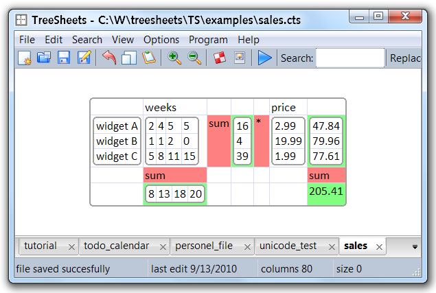
It does have limited calc, but I tend to think of it as more of an afterthought. The scripting is “very incomplete” in the words of the author, consider e.g. https://github.com/aardappel/treesheets/issues/37
“In the days of Excel 1.0 through 4.0, most people at Microsoft thought that the most common user activity was doing financial what-if scenarios, where you do things like change the inflation rate and see how this affects your profitability.
When we were designing Excel 5.0, the first major release to use serious activity-based planning, we only had to watch about five customers using the product before we realized that an enormous number of people just use Excel to keep lists. They are not entering any formulas or doing any calculation at all! We hadn’t even considered this before. Keeping lists turned out to be far more popular than any other activity with Excel. And this led us to invent a whole slew of features that make it easier to keep lists: easier sorting, automatic data entry, the AutoFilter feature which helps you see a slice of your list, and multi-user features which let several people work on the same list at the same time while Excel automatically reconciles everything.
While Excel 5 was being designed, Lotus had shipped a “new paradigm” spreadsheet called Improv. According to the press releases, Improv was a whole new generation of spreadsheet, which was going to blow away everything that existed before it. For various strange reasons, Improv was first available on the NeXT, which certainly didn’t help its sales, but a lot of smart people believed that Improv would be to NeXT as VisiCalc was to the Apple II: it would be the killer app that made people go out and buy all new hardware just to run one program.
Of course, Improv is now a footnote in history. Search for it on the web, and the only links you’ll find are from very over-organized storeroom managers who have, for some reason, made a web site with an inventory of all the stuff they have collecting dust.
Why? Because in Improv, it was almost impossible to just make lists. The Improv designers thought that people were using spreadsheets to create complicated multi-dimensional financial models. Turns out, if they asked people, they would discover that making lists was so much more common than multi-dimensional financial models, and in Improv, making lists was a downright chore, if not impossible.”
I don't think you can improve Excel too much, but you could the ecosystem around it: Microsoft should integrate a package manager. Not something public, but something companies can privately maintain and publish packages to, that would contain common functions for their specific business.
If I could have a way to download a macro to a spreadsheet that would automate database connection for certain data sets, that would be huge, and since it'd be centralized corps could even have critical sheets functions managed by version control.
Mission critical excel spreadsheets run huge sections of large corps, we can discourage it or provide tools to better manage it.
Clearly you've not used an international version of Excel. They translate all the function names, replacing the English ones, and of course not just for display. No, this gets saved in the file.
So in my view, they could improve Excel an immense amount just there.
Then we can talk about how it won't even obey things like an explicit "format this cell as text" command.
there is a reason, why tools like Tableau and Power BI exist. Excel fails at building stable solutions for presenting or modeling data. Actually, it also fails at stably and effectively preparing and transforming data for more complex scenarios.
It is great for freestyle. But people want to use it for more...
Spreadsheet grids are marvelous for presenting many kinds of data relevant to business. Specifically, tabular numerical data (rows of tuples with well-characterized columns). Spreadsheets are great for condensing and summarizing the minute details and aggregates spread across huge numbers of rows, and for highlighting patterns and trends.
And there are other very effective ways to present data. Hypertext, Gantt charts, and pie-charts for example, which Excel also supports.
But we don't use spreadsheet-grids for general programming. Programs (as we write them) are concerned with dependencies and control-flow and semi-structured hierarchies and naming lots of things. Programs are organized as a hierarchy - directories containing files containing the nested-pieces of the program, as text. And some parts of a program (state-machines, data-schemas, GUI layouts, date/control flows) are visualized as boxes containing labels with lines and arrows between them (and more labels). I'm surprised we don't have generic tools for that yet. Attempts have been made.
This is not to mention geometric/photographic/aural data.
I don't think programs are necessarily a hierarchy, though that is a useful way to look at them. There are definitely mutually recursive elements, though these are admittedly limited in size of scope. However, most of the problems with looking at programs as hierarchies come from forcing elements to have a single parent containing element. Instead of a tree, you get a lot more flexibility by allowing elements to have multiple parents (so it is still a DAG, but not a tree since a path from root to the element is not necessarily unique).
For humans, hierarchies are easier to think about and easier to format. But you're right: sometimes you really want to express your structure in a more general graph. And format it more graphically.
For me the most obvious examples are: state-machines and entity-rln diagrams (and, for example, showing how your C-structs point to each other and how you're using std containers and ownership).
Thanks for pointing out that what I really want is a way to create/edit a graph.
You can argue that spreadsheet formulas in cells are also a type of programming, including all the hierarchy you mentioned. Only in this case the hierarchy is not just the functions nested in each other, but also the cells calculating data based on other calculations in other cells.
And while I see the OP explanation on how cells are a great way to arrange data, I would argue that the existing way of programming in Excel is pretty horrible.
Anyone who have ever tried doing something slightly complex with Excel functions soon realized that it is pretty impossible to do certain things without a lot of "magic" involved. Which is why MS added the whole VBScript thing, and even Google Sheets have their JS App Script (or whatever it is called) to provide additional options to program based on data beyond the basic formulas.
It would be great to see more visual programming languages tested in an Excel like data entry environment. Some of the PLC [1] languages come to mind, or even languages like MIT Scratch.
If your data consists of a long complicated pipeline, there might be some useful UX coming out of shader graphs systems from computer graphics. Shaders transform data in a functional way and you can build large graphs that also clearly show the inputs and outputs of a transformation. This might be easier to debug than a spreadsheet. Any point in the pipeline can be output to a visualizer in this way.
It would make debugging, understanding and inspecting the dataflow easier, but it would probably make browsing the output a bit harder so I can't say it's an obvious slam dunk. Might be interesting though.
I have just dabbled with Houdini and what you say (it is not exactly a shader but its procedural interface is probably similar to what you are saying) is spot-on.
Lots of data incoming, a graph of operations, lots of data (and plots, and what not) outgoing.
I think Excel fails when it comes to other natural types of data such as trees, graphs, even arrays or records. It’s terrible at all of them. It’s not relational, and it’s not inductive, has no sum types, or anything.
What it is, is a very good UI to throw tabular data into and modify.
I scanned the comments to see if anyone had mentioned Causal[1] yet. I’d describe it as a spreadsheet specifically for modelling.
I used it to build a cost model for the startup I work at, consisting of around 100 different inputs, and it was rather enjoyable.
I was able to (reasonably easily) insert the different AWS costs for (for example) SD vs. HD video transcoding and see how that affected the costs of encoding and storing video 12 months from now.
I've been thinking about this a ton lately -
I think the holy grail is something that extends the spreadsheet UX with the capability to address much larger data sets, roughly equivalent in power to a Jupyter notebook.
This probably means constraining some of the totally free-form data entry and imposing some kind of discipline onto columns? As well as some way to intuitively group together groups of cell-level formulas into a logical "row", and describe row-level operations, with some kind of rough type checking or duck typing?
But you might want to still retain an ability to lay out the result of computations free-form for invoice and other reporting uses that Excel is still great for?
Better graphical visualization would be nice too and I think that's actually in reach - there are great open source options like vegalite and apache echarts that open up a lot of possibilities for new tools.
You know, despite being quite different than what you described, what comes close for me in concept is the Spyder IDE. They have pretty reasonable data visualization tools when you go to inspect variables. I find it really nice work in. It lets me do the real visualization and interplay between variables in code or in my head and just quickly inspect tables/vectors/rasters to sanity check as I work in real time.
What's missing is the ability to then manipulate those tables and have it backfeed into the code, but I think that honestly you could again get close to that with some basic right-click>generate new column> type in python expression > translate to input into interpreter type of workflow.
I also know there are some python based excel type programs.
I have had same kind idea but then moved on becouse getting user trust the system is very hard and this needs more qui than ai work. But good luck it is definetly those unicorn ideas if it succees.
When NeXT launched their first machine back in the late 1980's, it came with a spreadsheet 2.0 called Lotus Improv. It used what we now call pivot tables as the first class data representation. I never used it but the demos looked very cool.
The key is that you can examine the state of most (not all) "intermediate" variables so not only do you know the inputs, the outputs, but also everything that happened in between in all these different ways.
Your calendar app adds 2 days for tasks? You can just see the cell where it says 2 to make sure that variable is set right. Its amazing, and we are just catching up to it with "always on" variable inspectors in IDEs.
Edit:
That's not the only trick: cells don't have variable names but locations. You don't have to remember the type (they are all cells) or the name of a variable. Its just a location and you click on it to select it.
For myself, I abandoned spreadsheets in favor of the relational database. In fact, I consider spreadsheets to be a phase you grow out of.
Weirdly, I consider visidata to be the best spreadsheet software out there, "but visidata is not a spreadsheet" I hear you cry, I know, that is what makes it weird.
I guess what I really want out of a spreadsheet is row level integrity.
The problem (and the reason for the success) with Excel is that it optimized for ease of use. The five minute out of the box experience is wonderful. However once you start "coding" (and I'll argue that if you using a vlookup or "if" function, you are programming with Excel) it is horrible. Ignores all of the best practices we have learned over the past 60 years for programming (modular, documentation, testing, source control, profiling).
I'm obviously biased given that I teach Python and Data Science. But I think you should optimize towards writing readable code. (From my experience teaching Pandas to thousands of students and seeing it in the wild, most people are using it wrong as well).
(It just so happens that I spent most of the day deep-diving into Excel and how to most effectively cross over to a proper programming paradigm...)
Here's an article and HN discussion about "Representing and Editing JSON with Spreadsheets" that I posted a few years ago about shoe-horning JSON into spreadsheets so it was easier to edit and process. But ideally I'd prefer a collaborative spreadsheet that's also an outliner (which I described in another post as "Google Trees").
"A spreadsheet is then the simplest, most organically natural way of organizing discrete units of information, the easiest way to perform CRUD operations on any type of data."
So... you've basically answered the question here.
"It’s been 40 years since the original Visicalc spreadsheet program was released, and no one has been able to beat them"
There is a reason that columnar workbooks and spreadsheets have been around since humans started writing down numbers and manipulating them... it works.
A "grid of cells" does exactly what it is supposed to do in the most efficient manner possible. The only "innovation" opportunities are making the underlying product suck less, or providing analytics/reporting functionality.
I agree. There may be no better UX alternative than columnar spreadsheets. Excel shines in scenario analysis when, for example, the data comes from your head. I believe Excel has an opportunity to improve when data comes from external sources like CSV dump from a CRM. I would like to see Excel improve the way it allows you to extract data from other systems which would reduce redundant effort and decrease the likelihood of errors.
But it differs a lot by task. The power of the spreadsheet model is that it is minimally acceptable for a wide array of tasks, not that it is usually optimal.
I think that main strength is familiarity and low learning curve. You can easily build and MVP with a spreadsheet. Understand your data, relations, patterns. The trap occurs later when you need to scale it
I did have a sort-kinda Excel replacement idea that I have half implemented, but it was based on distributed data sitting in OneDrive/DropBox/Google Drive etc. with formulas in a derived macro language that looked like Excel but worked like SQL.
It's built around Roslyn to do the evaluations. I did it that way because I wanted the flexibility of being able to run high-level style, predefined macros based around Excel, but with the ability to drop down to scripted C# if necessary.
It was a classic case of overkill. I need a way to do custom data extraction without re-writing the extract every time somebody made a new request. Some of the data had to be supplied by the client. I ended up with a monstrous, hash-based quasi database that runs inside an AWS Lambda.
I only half finished it because it does what I want at the moment (custom data exports for customers) but after I had it working I thought it was so stupid powerful I had to pause.
The main problem I see with something that is entirely distributed, but programmable at the C# level means it's also incredibly unsafe for anybody who is hosting it.
It would need a lot more work to be interactive (batch oriented for safety at the moment) but as an idea it seems like the next logical step from Google Sheets / Excel with a short learning curve for Excel jockeys.
Roslyn is an astonishing piece of tech really. The ability to precompile statements and call them by passing arguments is bonkers, I haven't played with anything like it since being a Smalltalk programmer in the 1990s.
My thought experiment is to jump into a helicopter and have a look at what people and organisations are trying to achieve.
The data in a spreadsheet is not isolated. It comes from somewhere and is usually going somewhere when the work is done (as more data or a decision). Is may even be a real-time flow of data.
If we had a system where data was coming from one or more sources (big data), and then in a process, filtered, combined, cleaned, analysed, reviewed, graphed) then I can imaging a series of tools with a spreadsheet like UI and data flowing between them in an orchestrated way.
Although each tool has a familiar spreadsheet UI, some might, for example, allow data to be filtered but not modified.
A group of people could use this system to achieve some business goal.
After an organisation's data sources are hooked up, then any power users could create flowchart like processes and select which tool to use in each step and then invite others to participate.
In a real system you would expect a real-time flow of data with each intermediate tool automatically updated as new data arrives and then flow onward after a human intervention was made or perhaps just an automated step.
Anyone with access could jump in and get a feed from any point in the system and do their own work with the data.
There might also be some scripts in your favourite language to do additional processing along the way.
What do we leave out:
  - error prone copy/paste
  - the ability to clobber data or formula's in unexpected places.
I think about this a lot. There is a need for more data-driven applications to create graphics that are more “track able” than excel. I have a series of charts that need to be sent out to multiple people (internal and external) each week. Charts, logos, tables, etc could benefit from a pipeline but without needing a data engineer. Right now, we have a standard data download from Bloomberg or another data provider, macros to change the format, access to slice, back to excel where the charts are 75% standard but might need some tweaking. Bloomberg might not classify one company as healthcare but I want to include them so access keeps a list or companies I want. That same Bloomberg output could include companies some of my colleagues would classify as tech companies so relevant for multiple people. No way to see what was done last week or changes made to the chart / table output from one person to another besides new versions of the same excel file (but still no way to see the logs)
Long winded description but hopefully helps describe how important excel is but there is still room to grow.
It sounds like you are looking for Excel's PowerQuery functionality? You should not need to bring the data into Access, or write Macro's to do what you are doing anymore (Macro's were required in older versions of Excel, but not newer ones that have the data modelling capabilities).
This effectively is a data pipeline built within Excel that can either be edited visually or in 'M-Code'.
>No way to see what was done last week or changes made to the chart / table output from one person to another besides new versions of the same excel file (but still no way to see the logs)
Why are multiple columns/pages with the various stages of the data insufficient?
Isn't this just a programming problem? Build an application that accepts the data, produces the result, and has a GUI for managing all exceptions? I've build many of these things.
What seems to be described is a UI design problem. Once the UI is designed, it also needs programmed in some form, but that doesn't seem to be the problem, just a not-particularly-interesting task required in the implementation.
Not all problems that require programming are programming problems. (In fact, most are not.)
I meant "isn't this a problem that requires software development?"
There are always complaints that Excel is a terrible solution to some very specific set of repeated tasks. Every few months, there's a posting about how all we need is a "Better Excel" that would perfectly solve everyone's totally unique 12-step problem.
Such a tool is never going to exist. Thankfully we can build tools specifically for those problems when generic tools aren't good enough. Not every problem is worth a programming solution; there's only so much time and money and paying a bunch of people to cut and paste might just be the better option.
I agree that spreadsheets are still extremely useful, and surprisingly difficult to improve upon. Maybe it's because spreadsheets combine a bunch of the primitives used to build many types of applications - tabular data, persistent data, operations on that data (CRUD, per the article), trivial to inspect the data, and can make various views on the data.
It seems to me that quite a few successful software companies boil down to a spreadsheet with enforced structure to the data and codified operations performed on the data specific to the problem domain. CRMs, accounting systems, project management systems, and ordering & inventory management systems are some examples.
Our product focused on financial projection & reporting (https://www.modeloptic.com/) is another example: Excel-like functionality at the core, and since we've constrained the domain and know how different pieces of data relate to each other, we can automate away a lot of the manual labor that'd be needed in completely free-form Excel.
I’ve also seen that there’s a whole sub industry of companies that build a platform on top of a spreadsheet by assuming a certain structure of the data. Aside from myself, Julia’s Pluto.jl, ObservableHQ, and a few researchers, there aren’t many trying to invent a new spreadsheet replacement with a fundamentally different conceptual model.
One idea is to use columns instead of cells. Each column has a definition in terms of other columns which might also be defined in terms of other columns. If you change value(s) in some source column then these changes will propagate through the graph of these column definitions. Some fragments of this general idea were implemented in different systems, for example, Power BI or Airtable. The main difficulty in any formalization is how to deal with columns in multiple tables.
This approach was formalized in the concept-oriented model of data which relies on two basic elements: mathematical functions and mathematical sets. In contrast, most traditional data models rely on only sets. Functions are implemented as columns. This model gets rid of joins and groupby by making data processing simpler and more intuitive.
It's mostly inspired from how we use spreadsheets on wall street: a frontend for complex data applications (basically a wysiwyg interface with a DAG repl).
Technically, jig is an observable notebook where the cells are spread on a canvas rather than in top/down notebook.
Maybe it's possible to find ways to better represent relational data?
Two interesting approaches:
- Ultrorg [1] attempts to represent relational databases in an excel-like format. You can build a query by editing the header of the table, and then edit the results in place.
- Tableau [2][3] is a visualisation construction tool, where users can describe a graph by assigning properties to rows or columns. The result can be a table of visualisations, for example a scatterplot matrix.
HTTPS://ObservableHQ.com is rows of cells where cells can be code or DOM, input widgets. Cells update themselves automatically like spreadsheets. It's is fairly insane what can done and the information content possible with these interactive notebooks that run normal JavaScript (in a non-linear fashion)
I agree, I think it's a natural successor to a spreadsheet for something more complex. You can even have a section with tabular data (i.e. an embedded spreadsheet), which is what spreadsheets excel at, but it meshes very well with the classical programming paradigm.
Jupyter notebook is a regression from Excel, at least Excel computes the dependencies between the cells. With Jupyter, you have to be careful in the order you evaluate the cells.
And both falls on the floor the minute you want to use a spreadsheet/notebook as a library of functions, i.e it's not composable.
One of the things that bugs me about spreadsheets is that they encourage people to set up very fragile unnamed things, like “the value of row X” or whatever. Then the spreadsheets become gigantic and hard to understand but the owners still swear by their data. Meanwhile in the back of my head I’m thinking: this thing could be totally wrong by now and you have not really set yourself up to see that happening.
If you think of it in terms of energy, where energy is defined as some quantity you want to minimise, then it becomes apparent.
Define the energy as the distance of an atom of data to other atoms of the same subject (row) plus the distance of the data to other atoms of the same abstract property (column). Then choose a model; this defines your atoms. You could call the selection of the model a discretisation because all models become 1s and 0s eventually. If you choose a model where atoms occupy pixels exclusively (only 1 atom per pixel) and the XY coordinates of each atom is the variable, I think you’ll find that feeding it into most optimisers (such as a Monte Carlo simulation) will result in something very closely resembling a grid of cells.
If you choose a different 2D model/discretisation, such as hexagons, you’ll find an abstractly similar result if not a little unfamiliar.
If you chose a higher dimension space for your model/discretisation (3D+), then you may find something uniquely interesting, but good luck mapping it to a solution which is compatible with our traditional 2D UIs.
I actually like the grid of cells. I had an epiphany: It’s just a 2D extension of 1D lines of code we use in every other programming language.
I think this significantly speeds up analysis and model development. I kind of would like this same model adopted by more programming environments. 2D vs 1D lines of code. Particularly now that we have much larger, higher resolution displays.
> But the data isn’t persistent enough, we only get recent commands, and the location is always moving and we can’t easily reference older calculations.
You need a better shell, my friend. To quote my .zshrc
Yes, Excel spreadsheets frequently contain errors that are hard to spot. Sometimes those errors end people’s careers and damage companies. Tools like Quantrix that use multi-dimensional models provide a formula syntax that’s radically less error prone while providing far superior reporting.
There is always something better. But the dirty little secret of spreadsheets is that they are so universal, that some way or another, you can force mostly everything somehow into the grid. The grid is the plaintext for data. It's not always the best, but usually good enough.
Spreadsheets are for general purpose compute. They are glorified calculators, and aren't meant to replace databases, even though some people seem to use them to store lists of records.
Databases are for storing and accessing (linked) records. In the latter case (mostly CRUD) applications tend to have separate views for result sets (rows of records) and single records (eg amazon search results and product pages). This is a better visual data model than a grid of cells (which general purpose database access tools such as AirTable seem to insist on).
I have started building something like AirTable with a 2-pane view but never finished it. Not sure if there's a business case for it, but it sure is fun to think about.
For a while now I’ve been experimenting with the idea of a strongly typed spreadsheet. There is no grid model; instead computation occurs in discrete cells, where each cell can store one value, with ‘value’ defined as in programming languages to include data structures like lists and tables. Each cell gets its own type, and the formula language is type-checked before running, to allow flexible yet error-checked representation of natural data. Alas, I never was able to find a domain where this tool would be significantly better than both Excel and Jupyter… though somehow I’m still convinced that this would be a useful tool, if only I could find the right place for it.
I have in fact seen Inflex already! And I must admit to being quite surprised at seeing pretty much exactly the same UI I had imagined, already implemented. But I suspect there are still some major underlying differences between Inflex and what I’ve been doing. As a Haskeller, my emphasis has been very much on strong typing and associated language features: mine uses a Hindley–Milner variant with subtyping, allowing some information to be stored at the type level (e.g. units) and functions to be automatically broadcast to higher dimensions. The user can explicitly specify the type of each cell, allowing for more control over data modelling. Basically, I want to make a tool such that the user can create arbitrarily large spreadsheets, without running into the scalability problems of Excel etc. By contrast, Inflex seems to have a somewhat different and rather more minimal focus: simply making an easy-to-understand analogue of traditional spreadsheets which solves their biggest problems, without worrying about extraneous stuff.
That being said, I will confess to not having tried Inflex all that much, so I may be misunderstanding it. I would be very interested in hearing your thoughts on this topic.
Inflex is statically typed, it’s pretty much PureScript with more familiar-to-Excel syntax, with row types used for records and also polymorphic variants, which aren’t in PureScript but are in OCaml. Numbers and ordering and comparisons are dealt with via type classes.
You can annotate a cell’s expression with a type signature, though this is not explicitly mentioned or supported intentionally as I’m not decided fully on the syntax. Example: when you make a “table” via the Table button, it just makes a cell whose source code is: [] :: [{"column1":_, "column2":_}] as tables are just lists of records. If you go to https://inflex.io/try (work not saved, this page doesn’t hit the DB whatsoever) you can hit Formula to write code. But all cells are code underneath (hit the triangle).
My next addition to Inflex will be push-pull based FRP, for dealing with time, buttons and external events and outputs. I also plan on having it scale so that cells with large tables are refined into real database rows for more efficient operations. So the goal of Inflex is to embrace the small scale (lists and easy spreadsheet stuff) with a smooth migration path towards more advanced programming, in a coherent whole. But you have to start with the simple and work your way to the fancy stuff, or so I think.
I’ve considered units of measure, but they are complicated from an end-user perspective and complicate the type system, I’m not sure whether they’re worth it over providing very good automated property based testing. That’s an ongoing consideration.
Development is slow in my spare time which is limited, but I’m comfortable going at my own pace. I’d like to roll out a discourse forum to document things, but hosting is quite expensive. It’s worth resolving this, though, because I’m doing a poor job at explaining the product. One is always choosing between adding more polish/features and documenting!
> Inflex is statically typed, it’s pretty much PureScript with more familiar-to-Excel syntax, with row types used for records and also polymorphic variants, which aren’t in PureScript but are in OCaml. Numbers and ordering and comparisons are dealt with via type classes.
Huh, I never realised. I think it’s worth at least mentioning this in the documentation, if only to note its existence.
> You can annotate a cell’s expression with a type signature, though this is not explicitly mentioned or supported intentionally as I’m not decided fully on the syntax. Example: when you make a “table” via the Table button, it just makes a cell whose source code is: [] :: [{"column1":_, "column2":_}] as tables are just lists of records.
I ended up with pretty much the same design, except tables were a primitive type, stored as a record-of-lists, and type annotations were a single colon.
> I also plan on having it scale so that cells with large tables are refined into real database rows for more efficient operations.
Ooh, clever! I like this idea.
> So the goal of Inflex is to embrace the small scale (lists and easy spreadsheet stuff) with a smooth migration path towards more advanced programming, in a coherent whole.
Another thought along these lines: quite a lot of my spreadsheet use involves doing calculations on whole columns. This is really painful in Excel, where I have to manually select just the right areas of my sheet, then write the formula—without disturbing my selections!—making sure of course that I put the result in a place where it fits. And this just gets worse with more data. In my own proof-of-concept, I implement broadcasting of all functions over arrays (à la APL or MATLAB), which makes this a lot easier, and is quite possibly the best UX improvement I’ve found. Do you have any plans to do something like this in Inflex? (I know it already has higher-order functions, but e.g. `voltage / current` is a lot easier to read and write than `zipwith(x y:x/y, voltage, current)`…)
> I’ve considered units of measure, but they are complicated from an end-user perspective and complicate the type system, I’m not sure whether they’re worth it over providing very good automated property based testing. That’s an ongoing consideration.
From my perspective, they’re definitely worth it: most of my biggest Excel mistakes have involved botched unit conversions. (If it matters, my background is physics and chemistry; most of my spreadsheet usage has been for assignments throughout my degree.)
From the implementation point of view, I found units pretty easy to integrate. The most difficult part was probably inserting the automatic conversions: in order to make this possible, I had to structure my inference algorithm slightly differently to the usual pattern, by applying substitutions at the same time as unification, rather than afterwards. (Which ended up having other benefits as well, e.g. the aforementioned broadcasting.)
> Development is slow in my spare time which is limited, but I’m comfortable going at my own pace.
If it helps, I’d be more than happy to help out with development! This is an area I find incredibly interesting to work on, but my own attempt never really got past the proof-of-concept stage, and I consider duplicate development a bit of a waste.
> Another thought along these lines: quite a lot of my spreadsheet use involves doing calculations on whole columns. This is really painful in Excel, where I have to manually select just the right areas of my sheet, then write the formula—without disturbing my selections!—making sure of course that I put the result in a place where it fits. And this just gets worse with more data. In my own proof-of-concept, I implement broadcasting of all functions over arrays (à la APL or MATLAB), which makes this a lot easier, and is quite possibly the best UX improvement I’ve found. Do you have any plans to do something like this in Inflex? (I know it already has higher-order functions, but e.g. `voltage / current` is a lot easier to read and write than `zipwith(x y:x/y, voltage, current)`…)
I haven’t seriously put thought into that use-case. There’s the facility via type classes, but I’m not sure what the trade offs are with that kind of overloading. The same question applies to FRP behaviors and events. Do you explicitly require a map or list comprehensions or do you “broadcast” automatically, and if you do, what are the pitfalls?
I have put some thought into something related which is aggregations. On a given table I want to be able to add a column which implements any mapAccum over the table, such as balance over time. The code generated would be table.accum(state: row: state + row.x) for example. The UI would make it easy to pick common accumulators and folds, but also trivial to write an expression. Your voltage current example would work like that.
This arrays-of-records overlaps a bit with your records-of-arrays naturally. The two are often considered sides of the same coin and I’ve thought about using RoA internally for efficiency, but “broadcasting” to make that nice didn’t occur to me. The written simplicity is compelling, for sure.
> From my perspective, they’re definitely worth it: most of my biggest Excel mistakes have involved botched unit conversions. (If it matters, my background is physics and chemistry; most of my spreadsheet usage has been for assignments throughout my degree.)
Yeah, it’s definitely a valuable thing, I’m just not sure about the trade offs. At some point you have to stop adding features to the language, and that one didn’t convince me enough at the time.
> applying substitutions at the same time as unification
Right, I’ve seen that also on a language we develop at work. Incidentally this is needed if you want to combine two row types and assign a type to the expression.
> If it helps, I’d be more than happy to help out with development! This is an area I find incredibly interesting to work on, but my own attempt never really got past the proof-of-concept stage, and I consider duplicate development a bit of a waste.
I might only have time to discuss ideas and no time to collaborate on dev right now, but happy to swap contact details. If you drop a mail anything@inflex.io I’ll reply via my personal email.
> I haven’t seriously put thought into that use-case. … Do you explicitly require a map or list comprehensions or do you “broadcast” automatically, and if you do, what are the pitfalls?
It’s all automatic. Basically, any function a→b can be used as [a]→[b], [[a]]→[[b]], and so on; functions with multiple arguments work similarly. In the intermediate language, each argument is then annotated with the amount by which it needs to be lifted. (So e.g. if `xs : [Int]`, then `10/xs` gets translated to something like `(/)({10,1}, {xs,0})`.
As for pitfalls… well, I haven’t encountered all that many yet. The implementation is a little unprincipled at this point, but there’s probably some way to make it more rigorous. It’s basically as close as I can get to J or MATLAB in a typed language, and people don’t often have problems with broadcasting in those languages.
> I have put some thought into something related which is aggregations. On a given table I want to be able to add a column which implements any mapAccum over the table, such as balance over time. The code generated would be table.accum(state: row: state + row.x) for example. The UI would make it easy to pick common accumulators and folds, but also trivial to write an expression. Your voltage current example would work like that.
This does sound quite similar to what I’m doing, though perhaps more limited.
> Incidentally [applying substitutions at the same time as unification] is needed if you want to combine two row types and assign a type to the expression.
Hmm, interesting. You don’t happen to have a link, do you? (Though I seem to recall hearing TAPL has something about this… I really do need to read it one of these days.)
> I might only have time to discuss ideas and no time to collaborate on dev right now, but happy to swap contact details. If you drop a mail anything@inflex.io I’ll reply via my personal email.
Sure, that sounds great! I’ll send you an email now.
Excel is seriously killing humanity. No version control, no debugging, brittle support for automation. Excel, to me, is the single most obvious sign that we must get rid of the giant tech monopolies to re-enable innovation in software.
Umm, put your excel file in git repo if you really need to? That's like saying C++ doesn't have version control.
>no debugging
Debug what exactly? If you have vb scripts, then yes you can debug. If you just have formulas.. there is literally nothing to debug.
>brittle support for automation
Ok, but that's also kind of the point. Excel should not be some insane thing where people do way too much. It's a spreadsheet with formulas- and that is what it's goal is. People who use excel with thousands of lines of VB code should literally be using something else 99% of the time.
>Excel, to me, is the single most obvious sign that we must get rid of the giant tech monopolies to re-enable innovation in software.
There is basically nothing to "innovate" related to excel. It's exactly what is needed. If you want to innovate then write your own damn spreadsheet that does some new magic you think of.
Why are you trying to overcomplicate a simple 2d spreadsheet?
>Excel is seriously killing humanity
Excel is doing the exact opposite. You are a fool saying that- excel is so freaking simple yet so powerful. Sounds like you might live in academic lala land and have never worked at a business where there are a billion different types of things to do and simple spreadsheets can generally cover most cases.
You're interesting when talking about Excel's deficiencies. But you ruin your comment with talk about "killing humanity" and "giant tech monopolies". HN is not a place to get swept away by emotion.
Even though current VR/AR interfaces are completely useless for Excel or other data-management tasks (no keyboard support, unreliable controls, lack of development interest), I think in the future there are more embodied / spatial treatments of data access that could feel like an improvement on '2D' Excel.
As the author mentions, the original moniker for Excel was VisiCalc - a visual calculator. There's no inherent reason why 3D spatial representation would be a worse medium for a calculator.
> There's no inherent reason why 3D spatial representation would be a worse medium for a calculator.
The main inherent reason why 3D isn't as great as it seems is that human vision can't see through solids. We don't perceive an entire 3D volume, we just perceive the part of its surface that faces us. We can obviously get more information from stereoscopic vision compared to 2D, but it's not a full other dimension of complete volumetric data. We mostly see a 2D surface with some depth information.
> As the author mentions, the original moniker for Excel was VisiCalc
VisiCalc wasn't actually a moniker for Excel. It was a predecessor. It was the first spreadsheet program, which was made by a different company, VisiCorp, and released in 1979. Excel was developed by Microsoft and released in 1985. Prior to Excel, Microsoft had released an earlier spreadsheet called Multiplan in 1982.
There has been a lot of work looking into 3D visualization, but it really seems like the benefits are pretty minimal compared to the drawbacks. Even 2D visualizations seem to do better when limited to a single spatial dimension for carrying information (i.e., how pie charts are inferior bar charts in almost every way).
I should disclaim that I work on a 3D capture app called Polycam, but in that work I've grown used to the idea that 3D captures are inherently better at conveying some kinds of visual information than photographs are. Like a room with graffiti on the walls. The opposite is also true - 2D photos are way better at sunsets & portraits.
So I guess what I'm saying is that I'd bet there are some undiscovered cases where 3D is going to be better for data representation / manipulation.
That's a great point. I had a VR headset that worked with phone a few years ago, and it was absolutely incredible how 3D still images have the ability to make you feel like you are someplace that you are not, at least compared to 2D still images and video. 3D will certainly give designers more tools to work with in making memorable visualizations which is an important feature for many visualizations.
If the argument is that you need the third dimension to reflect of the shape of the data, you're not going to want to stop at three dimensions when working with stuff like multi-dimensional tensors for machine learning, etc. So any 3D display system will have the same problem displaying a 4D grid as a 2D display system has displaying a 3D grid.
Of course any >2D spreadsheet or data viewing / editing / programming language (i.e. Python / Numpy / TensorFlow / Dwarf Fortress / Minecraft / etc) needs to project and slice high dimensional data onto the 2D screen somehow, because displays and human retinas are 2D by nature.
But if it's a practical question of optimizing for human perception (retinas are 2D), engineering (screens are 2D), usability (you can't see or click on something that's hidden behind something else), and user interface design, then 2D wins hands down over 3D.
Dave Ackley, who developed the Moveable Feast Machine, had some interesting thoughts about moving from 2D to 3D grids of cells, suggesting finite layering in z (depth), but unlimited scaling in x and y (2D grid):
DonHopkins on Oct 1, 2019 | parent | context | favorite | on: Wolfram Rule 30 Prizes
Very beautiful and artistically rendered! Those would make great fireworks and weapons in Minecraft! From a different engineering perspective, Dave Ackley had some interesting things to say about the difficulties of going from 2D to 3D, which I quoted in an earlier discussion about visual programming:
David Ackley, who developed the two-dimensional CA-like "Moveable Feast Machine" architecture for "Robust First Computing", touched on moving from 2D to 3D in his retirement talk:
"Well 3D is the number one question. And my answer is, depending on what mood I'm in, we need to crawl before we fly."
"Or I say, I need to actually preserve one dimension to build the thing and fix it. Imagine if you had a three-dimensional computer, how you can actually fix something in the middle of it? It's going to be a bit of a challenge."
"So fundamentally, I'm just keeping the third dimension in my back pocket, to do other engineering. I think it would be relatively easy to imagine taking a 2D model like this, and having a finite number of layers of it, sort of a 2.1D model, where there would be a little local communication up and down, and then it was indefinitely scalable in two dimensions."
"And I think that might in fact be quite powerful. Beyond that you think about things like what about wrap-around torus connectivity rooowaaah, non-euclidian dwooraaah, aaah uuh, they say you can do that if you want, but you have to respect indefinite scalability. Our world is 3D, and you can make little tricks to make toruses embedded in a thing, but it has other consequences."
Here's more stuff about the Moveable Feast Machine:
Visual is all nice and all, but I really fancy the 'computational' model of spreadsheets which is very easy to learn and apply IMO.
My latest find is the CUE language, which I believe is the first 'typed' version of a spreadsheet (in disguise). CUE is like spreadsheets, but on steroids!
Spreadsheet program with one-click data frame conversion is basically Colab + Sheets. Not sure why Google isn’t putting resources to flesh out this feature.
Between Sheets, Colab/Kaggle, and Google Maps, Google should be dominating the desktop analytics space. They just need leadership with a bit more imagination. Sometimes I feel like these big techs IMPLICITLY don’t encroach on certain spaces occupied by their competitions. Shadow collusion if you will.
I've shifted to Airbase for pretty much anything data sheet related. The ability to have more typical data-flow joins with an easier to manage UX that teaches folks along the way is pretty phenomenal. It grows as you need, but still remains relatively simple.
It's one of my favorite pieces of software from the past decade.
> The ability to have more typical data-flow joins
This is available in Excel too - you can import data with PowerQuery, perform joins, configure relationships between multiple tables, then output that into a chart, table or pivot table. You can even put slicers on to let users interact with the data.
This is entirely automatable too, so if the underlying data changes you can just run the pipeline again.
Bettering a table for data is going to be hard. Calculated fields (instead of $L$123, $Total) could be represented in other ways to bound to cells. As could code. But honestly, with the amount of time people already waste formatting spreadsheets, less options is probably a productivity enhancement.
I guess some Excel users just outgrow the app. It's time to write some code in R or Python, along side with Jupyter-like notebooks. Another option is to use more specialized tools like Tableau.
The table or spread sheet is not very "visual" after all.
Working with jupyter, I'm seriously contemplating around how to bring the best of Excel into a pandas or jupyter workflow. Mostly for exploration but also making reports, statistics, aggregations
(I'm pretty biased since I wrote a book on this, Effective Pandas.)
My take is that if you embrace the limitation of chaining in Pandas it will force you to write better (easier to read, debug, deploy, share, collaborate) code.
I can't look very deeply into your link and see what the courses actually say, from here, so I'm not sure. I think you want to teach me to be better at pandas. That's fine and I learn pandas constantly, but not what I'm talking about. I want to mix in a different way of working with data, getting some of the best features of excel into the notebook workflow.
I also believe that getting to know your data means reading it in a grid, not just looking at aggregations. Both are important, and with aggregations you can miss important things! Sometimes the simplest solutions are the best.
The thing that's missing from "Google Docs" is a decent collaborative outliner called "Google Trees", that does to "NLS" and "Frontier" what "Google Sheets" did to "VisiCalc" and "Excel".
And I don't mean "Google Wave", I mean a truly collaborative extensible visually programmable spreadsheet-like outliner with expressions, constraints, absolute and relative xpath-like addressing, and scripting like Google Sheets, but with a tree instead of a grid. That eats drinks scripts and shits JSON and XML or any other structured data.
Of course you should be able to link and embed outlines in spreadsheets, and spreadsheets in outlines, but "Google Maps" should also be invited to the party (along with its plus-one, "Google Mind Maps").
It should be like the collaborative outliner Douglass Englebart envisioned and implemented in his epic demo of NLS:
Dave Winer, the inventor of RSS and founder of UserLand Software, originally developed a wonderful outliner on the Mac originally called "ThinkTank" and then "MORE", which later evolved into the "Frontier" programming language, and ultimately the "Radio Free Userland" desktop blogging and RSS syndication tool.
More was great because it had a well designed user interface and feature set with fluid "fahrvergnügen" that made it really easy to use with the keyboard as well as the mouse. It could also render your outlines as all kinds of nicely formatted and stylized charts and presentations. And it had a lot of powerful features you usually don't see in today's generic outliners.
>MORE is an outline processor application that was created for the Macintosh in 1986 by software developer Dave Winer and that was not ported to any other platforms. An earlier outliner, ThinkTank, was developed by Winer, his brother Peter, and Doug Baron. The outlines could be formatted with different layouts, colors, and shapes. Outline "nodes" could include pictures and graphics.
>Functions in these outliners included:
>Appending notes, comments, rough drafts of sentences and paragraphs under some topics
>Assembling various low-level topics and creating a new topic to group them under
>Deleting duplicate topics
>Demoting a topic to become a subtopic under some other topic
>Disassembling a grouping that does not work, parceling its subtopics out among various other topics
>Dividing one topic into its component subtopics
>Dragging to rearrange the order of topics
>Making a hierarchical list of topics
>Merging related topics
>Promoting a subtopic to the level of a topic
After the success of MORE, he went on to develop a scripting language whose syntax (for both code and data) was an outline. Kind of like Lisp with open/close triangles instead of parens! It had one of the most comprehensive implementation of Apple Events client and server support of any Mac application, and was really useful for automating other Mac apps, earlier and in many ways better than AppleScript.
Then XML came along, and he integrated support for XML into the outliner and programming language, and used Frontier to build "Aretha", "Manila", and "Radio Userland".
He used Frontier to build a fully programmable blogging and podcasting platform, with a dynamic HTTP server, a static HTML generator, structured XML editing, RSS publication and syndication, XML-RPC client and server, OPML import and export, and much more.
He basically invented and pioneered outliners, RSS, OPML, XML-RPC, blogging and podcasting along the way.
>UserLand's first product release of April 1989 was UserLand IPC, a developer tool for interprocess communication that was intended to evolve into a cross-platform RPC tool. In January 1992 UserLand released version 1.0 of Frontier, a scripting environment for the Macintosh which included an object database and a scripting language named UserTalk. At the time of its original release, Frontier was the only system-level scripting environment for the Macintosh, but Apple was working on its own scripting language, AppleScript, and started bundling it with the MacOS 7 system software. As a consequence, most Macintosh scripting work came to be done in the less powerful, but free, scripting language provided by Apple.
>UserLand responded to Applescript by re-positioning Frontier as a Web development environment, distributing the software free of charge with the "Aretha" release of May 1995. In late 1996, Frontier 4.1 had become "an integrated development environment that lends itself to the creation and maintenance of Web sites and management of Web pages sans much busywork," and by the time Frontier 4.2 was released in January 1997, the software was firmly established in the realms of website management and CGI scripting, allowing users to "taste the power of large-scale database publishing with free software."
in the metaverse, you will have 3d tables, x,y and z axis, you would be able to twist and turn those 3d tables to get different views, join with other 3d tables
UltOrg is roughly "spreadsheets re-built atop the RDBMS datamodel". The UI supports nested joins, aggregations, filtering, for both display and data update.
The result is essentially a general purpose app that can display just about any Microsoft Access UI that would been written in the 90s/2000s to provide editable views into relational data.
I'm not sure if it's a domain as universal as a grid of cells, but it's a very cool app and, as a friend of Eirik's, I wish him far more visibility than he's gotten for pushing longer on this particular niche than I think most people would have.