I'm usually a defender of the single screen on the Model 3/Y, but on this, the author is right: the new UI (v11) is terrible compared to the previous one (v10).
Not only does it hide commonly-used safety-relevant functions behind extra taps in sub-menus (as detailed), it was apparently done to free up space to offer a 'dock' of app buttons - three permanant and three 'recently used'. I struggled to choose three apps I needed enough to fill the permanant spaces - and certainly don't need quick access (when I'm driving!) to Netflix, or games, or whatever is popping up in 'recently used' today. I would like the driver profile menu to be quickly available, but alas that's been hidden too.
It's a total cluster-f*ck that makes no logical sense when considering the need of drivers, and I hope they listen and revert at least this aspect of the UI.
What I really dislike about the "you don't own this, the cloud does" is apps changing without me having a say in it. Spotify is great, but if they decide they want a videoclip-playing-background then my phone at some random moment starts doing that. I feel like it takes some time / attention from me each time something like that happens because now I need to figure out how to turn it off or live with it. And I can't control when it happens, so I'm probably doing something else. This wasn't a thing let's say 15 years ago with the original iPod.
Now imagine this happening to your car. I would sell the car as soon as possible. Cars, like ipods, are tools that should not require extra attention at random moments.
love the way you crystalized this. It's strange to me how bad UX can devolve at the hands of people whose profession is UX. I trust they aren't intentionally doing it. And other factors like ads, "need to monetize", "short-sighted KPIs", all makes sense.
What mechanisms are at play that allow professional UX design teams to fuck up a car display?
like literally i dont want to think when i need to defrost my window going 70mph and yet here we are
The only times I was able to ship proven correct and virtuous designs was a) sneak stuff thru when no one was watching and b) being product manager imbued me with the juice to get what I wanted.
Every other time, good design was sabotaged by yahoos and chuckleheads, unburdened by experience or domain knowledge, yet were somehow gifted with the certainty of "what users really want".
Never attribute to malice that which is adequately explained by the need to sustain the visibility of own necessity.
90% of PR and Web/UI/UX people could be safely fired after a couple of interactions of the design (and brought back 3-5-7 years later when the new or re-design would be needed). Sitting and not doing anything would make them fired, so they invent "new", "innovative" and other bullshit named things to justify their pay.
Eg: my bank, which changed the logon page like 10 times in 3 years. All times with a lavish descriptions of how the experience got even more better. The page consists of a login and password boxes, just like it had 10 years ago.
> 90% of PR and Web/UI/UX people could be safely fired after a couple of interactions of the design (and brought back 3-5-7 years later when the new or re-design would be needed). Sitting and not doing anything would make them fired, so they invent "new", "innovative" and other bullshit named things to justify their pay.
Isn't this most positions and just people in general, in some capacity?
  Business and sales pushing for new features that no one necessarily needs.
  Back end devs padding their CVs with hot tech and often doing refactoring for the sake of refactoring.
  Front end devs adding more bloat for marginal visual gains and messing with the UI/UX.
  DBAs mucking about with indices which will either improve or worsen things when the DB is performing adequately already.
  Ops pushing for using new industry practices which will probably introduce undue complexity into the mix.
  QA being overly nitpicky about bugs or even visual flaws that no one will ever even run into or notice.
  Security complaining about supposed CVEs that automated scanning picked up, but that cannot realistically be exploited.
Humans are pretty curious by nature and like to feel like they're doing a good job, so i can't help but to feel that it's turtles all the way down, regardless in which direction you look - everyone will be trying to follow industry trends and not miss out, keep their skills relevant or just do anything to justify the existence of their own position.
Thing is, technical positions (compared to 'artistic') have the means to show the proof of work, though sometimes it requires 'translation' to manglement-speak and they are not immune from 'I can't see|touch you work - means you are not needed'.
Creative positions... they literally show the [finished] product, and in our sphere it is usually seen immediately - you can't imitate redesigning the home page of yoursuperbank.com, or spend months on it.
But while DBAing, administrating or securing is a never ending process, re/designing is a process with a clearly (well, usually) defined finishing line. So if you want the paycheck - you need to sell the dire need to tweak fonts every couple of months.
Have you ever heard of the field of HCI? Human Computer Interaction was born out of Human Factors, and understanding user behavior through a mixed methods approach i.e. quantitative and qualitative research to understand human behavior.
You are reducing this whole academic field that produces UX designers with the like of UI/visual/graphic designers who never studied or learned how to evaluate designs and study how people use designs (usability testing), which would TRIVIALLY catch and solve the issue in the OP of a severe usability issue with the V11 Tesla UI redesign.
A lot of time design is outsourced to low grade ux designers in other countries who start with design and never test anything in my experience, Accenture, TCS, etc. that churn out these usability design disasters.
If the team is in house, then they aren’t running a legit UX research practice, just focused on aesthetics, minimalism, and cool factor of Tesla in-house and I will bet you money their resume is visual/UI design heavy and HCI is not even mentioned.
UX =\ UI, and you have proven that this misconception still exists and we need to try harder as an industry to call out the dilettante UX teams who are really UI designers faking it to command a higher salary without doing the real hard work to understand user behavior and test designs for usability issues, etc.
I think that the UI/UX conflation is inevitable, as developers should have skills in both areas, similarly to how DevOps is becoming more and more popular (though it also has its opponents). I'd argue that being able to write your code but not knowing how it runs isn't entirely viable, since one might influence the other - same goes for UI and UX. Both should be considered, even if i'd prioritize UX above UI.
> You are reducing this whole academic field that produces UX designers with the like of UI/visual/graphic designers who never studied or learned how to evaluate designs and study how people use designs (usability testing), which would TRIVIALLY catch and solve the issue in the OP of a severe usability issue with the V11 Tesla UI redesign.
Apart from bringing shortcomings in our educational systems to light (e.g. the pace at which the industry moves ahead and the inability of many academic programs to keep up with it), i'm not sure i can agree with the entirety of the argument, because it almost reads like the "No true Scotsman" argument: https://en.wikipedia.org/wiki/No_true_Scotsman
Should more academic knowledge be applied to the industry? Sure! But since that's clearly not happening, it's useful to explore why that is: in my experience, much of the academic research and ideas (model driven development in particular or many approaches to testing software come to mind) never find their way to being applied in the industry, don't get turned into viable products or even practices. Thus, i'd say that it's not like this academic field is maliciously being reduced in that argument - it has simply failed to make itself relevant as a whole, one that would be worthy of consideration (even if it should). That's how we get these UX messes.
Sure, one can talk about outsourcing and how these consulting companies are responsible for the end results, but the blame also lies in the businesses who don't want usable software in 5 years but good enough software in 1 year. Can you really blame them for trying to remain competitive and cutting out all of the non-essential factors just to be the first to market and be able to iterate quickly? I think i can, so perhaps it's useful not to blame some underpaid person who's under the pressure of made up deadlines, but rather the company that wanted to go down this path (both the client and supplier), as well as the whole economic system as a whole. In my eyes it's not that dissimilar to how everyone wants to hire experienced devs, yet no one wants to invest in new devs.
The tone in your comment rubs me the wrong way, maybe because it seems like gatekeeping or elitism. Clearly if the industry was better aligned with sustainability and a friendly approach to HCI, these good patterns would emerge naturally: if a compiler can point out problems with code or plugins do the same with code style, or even Lighthouse tell you about potential improvements to the page structure, why don't we have the same for accessibility and everything else?
Just look at Flutter, something that was touted as a great advancement in interface design, yet breaks not only screen readers (at least up to recently), but also cripples basic browser functionality like right clicking: https://gallery.flutter.dev/#/
Look at "The Website Obesity Crisis", a trend that plagues the entirety of the industry and seems to be like the front end equivalent of the Wirth's law: https://idlewords.com/talks/website_obesity.htm (which also coins the term "Chickenshit Minimalism", as funny as it is)
I don't think the solution here is to point fingers at one another and to claim that person X isn't a true developer because they didn't ignore the economical climate that they are in to pursue creating the perfect UX, or that person Y doesn't fit the criteria either because they didn't rewrite their codebase in Rust with 100% code coverage, or even that they didn't attend an academical institution for an arbitrary amount of years.
As someone with a Master's Degree in CS with the added qualification of a Programming Engineer, i feel like a lot of the things that i learnt were due to my own initiative and caring about it all, rather than some formalized study course. And even so, i sometimes find myself making tradeoffs or sub-optimal choices (albeit well described ones and clearly logged as technical debt) because i enjoy having food on the table, so to speak.
I think we should start with the realization that many industry trends are actively harmful, that you can only work against them in a limited capacity and have to make the best of it: http://www.stilldrinking.org/programming-sucks
Disclaimer: not downvoting your comment, because while i disagree with a part of your argument, i think it's worthy of discussion.
Thanks all great points and I think I was trying to match the tone of the parent comment, sorry if it comes off sounding arrogant or gate-keepy that was never my intention.
The elitism you sensed was just me struggling to articulate my frustration of going through the rigorous academic route, yet in this industry there is a plague of graphic/10-week UX bootcamp designers who are polishing portfolios and getting hired above junior levels and thus dragging down the field of UX design when they make deleterious design decisions in a user interface and are either uninterested in or too inexperienced to run proper usability testing or UX research methods to evaluate unintended/harmful designs.
“The market seems to want generalists, because they seem cost effective, and because most operations are too small to support a team of specialists,” says Steve Krug, a veteran usability specialist and author of the influential book Don’t Make Me Think. “But I think it’s pretty hard to be really good at more than one of the many subspecialties. It’s a conundrum.”
The skillset to understanding user mental models and behavior is a key component of being a great UX designer and allows you to illuminate where harms exist in design and that can be mitigated when design matches user mental models on a user population representative level. Having this skillset and design practice would have easily caught the issue presented in the OP regarding confusing button schemes in the Tesla V11 UI update.
The fact that it was pushed out to Tesla drivers without nuanced user testing by UX professionals (UX researchers if we break it down into specialization), says a lot about the design team at Tesla, or lack thereof. All this has nothing to do with the developers who are simply taking these designs and implementing them, who are typically overworked and focused on delivering features driven by success of measured KPIs.
> The elitism you sensed was just me struggling to articulate my frustration of going through the rigorous academic route, yet in this industry there is a plague of graphic/10-week UX bootcamp designers who are polishing portfolios and getting hired above junior levels and thus dragging down the field of UX design when they make deleterious design decisions in a user interface and are either uninterested in or too inexperienced to run proper usability testing or UX research methods to evaluate unintended/harmful designs.
You know, i can fully understand why someone would be frustrated with these things! Yet, at the same time, getting a degree didn't prepare me for the realities of working in the industry either - that took further years of work. Perhaps it's a bit like someone expecting to learn C++ in 2 months whereas in reality getting to really know it might take anywhere from 2 years to 2 decades (depending on what you actually want to do, be it write your own compiler, write a physics/game engine, or some low level piece of software that should be bulletproof, vs just a package or two for your own needs).
The first step at getting good at something is to be bad at it - personally, i really appreciated being able to work with microservices in an academical setting and learning about the many ways it can go wrong, but even now, in my day job i am still learning a lot, albeit it takes a lot of care to limit the fallout of mistakes. In this industry, new technologies and methods just never seem to run out, so it's a constant process of learning and churn, sometimes without good reason.
I do agree that figuring out someone's seniority and what they should be entrusted with is difficult and oftentimes nebulous, but perhaps that's just because of the rapid pace of this industry and how much of a "Wild West" it is at the moment.
> “The market seems to want generalists, because they seem cost effective, and because most operations are too small to support a team of specialists,” says Steve Krug, a veteran usability specialist and author of the influential book Don’t Make Me Think. “But I think it’s pretty hard to be really good at more than one of the many subspecialties. It’s a conundrum.”
With this, i might have to concede. I still think that having inter-disciplinary engineers who are competent at everything even if not brilliant at any one particular thing is probably a good idea, but there can definitely be a good argument to make about having specialists. Yet, the financial realities of our world will often force our hand in one particular direction or another.
> The fact that it was pushed out to Tesla drivers without nuanced user testing by UX professionals (UX researchers if we break it down into specialization), says a lot about the design team at Tesla, or lack thereof. All this has nothing to do with the developers who are simply taking these designs and implementing them, who are typically overworked and focused on delivering features driven by success of measured KPIs.
Partially agreed! There are usually "known unknowns" (e.g. "we don't know how this piece of code will interact with that other piece, we should probably set up automated tests to catch them diverging over time") and "unknown unknowns" (e.g. "we probably should have been aware of the UX impact of these changes, which totally escaped our consideration"). Maybe people knew about the UX impact, but didn't want to speak up or be contrarian in that particular environment. Maybe they knew, but just didn't care much, since no one would go to jail for shipping bad UX (at least in the automotive industry in the current year, it would be a different situation in aerospace industry). Or maybe no one even considered it for a variety of factors.
I guess we'll never know, but i agree that it's probably telling of what the priorities were, perhaps being a reflection of the greater trends in our industry. I am yet to see the likes of ADA (https://www.ada.gov/pcatoolkit/chap5toolkit.htm) compliance ever be mentioned as a concern in any of the commercial projects that i've worked on, lest it be explicitly demanded in the design spec. But talking about which front end framework or component library to use? Endless bike shedding: https://en.wikipedia.org/wiki/Law_of_triviality
Great discussion! I think we can both agree that in the end, when we are dealing with people's lives at stake, there should be more scrutiny of both design and code across the board. Hopefully in the future there is a consortium of experts from each respective Government body meeting with tech industry e.g. Department of Transportation meeting with tech industry experts from the likes of ACM Special Interest Groups[1], to create a regulatory framework for releasing safe and responsible tech innovations into transportation and other emerging spaces.
That's an interesting distinction to make! That said, i don't entirely agree with all of it:
> So if you want the paycheck - you need to sell the dire need to tweak fonts every couple of months.
You could say the same about addressing technical debt. Or introducing containers. Or a service mesh, or another form of service discovery, load balancing, circuit breaking. Or refactoring your old code. Or adding more tests, or more kinds of tests (e.g. chaos engineering, or even browser automation tests). Or clustering your database, or maybe sharding it. Or rewriting your software in Rust, for stretching this argument a bit further.
Many products out there could be considered "finished" in their current form, maybe only apart from security updates which need to be constant (to address things like Log4shell), or maybe scaling them (though that shouldn't always require constant rewrites, short of a very optimistic growth scenario).
For example, if Skype's development stopped 5 years ago (or before whenever the last redesign happened and new features were added) and it remained "stable", the world wouldn't be any worse of a place or even the product worse off than it is now, at least in my eyes. Of course, many say that it's largely dead and has been displaced by the likes of Zoom or Teams which is perfectly fine albeit probably not very relevant to the discussion - it's not like their updates seemed to help them much in this regard.
Another possible explanation I can think of is that UIUX products are bundled and rushed out for the maximum effect. There are rarely a literal "all-new" hardware product, and there are multiple models for each manufacturers, but websites and UIs are always all-all-new with no staggered releases.
It goes all the way to the top. The power of managers is (among all the other things) somewhat proportional to the size of the structure below them. They probably know they could fire more than half of their people and hire them back when needed, but that impacts their power.
Sometimes a UX team is forced to follow orders from someone above their pay grade. It could be an MBA leading a new feature that wants their button in a specific spot to increase their own metrics. Or someone higher up who "has an idea." Who knows what happened with Tesla though.
I'm presuming no UX team anywhere has stated "We're done here, there's no way we can improve on this UI". Hence to keep busy changes need to be made. Same with Health and Safety requirements, once a team is in place H&S 'creep' is inevitable. I once worked on a risk assessment for a laminator.
Good UX members won't stick around if they believe something is finished. But someone above them is always mucking something up, so there's always a problem to solve.
They should be held accountable along with the decision makers if people die or are injured. The lack of consequences allows these decisions to be made without user testing and can harm people needlessly.
This is exactly why I think there should be an engineering license for software developers in life critical things like this. We don’t allow civil engineers to build bridges that kill people, neither should we allow software developers. If you’re writing angry birds or whatever, you can do whatever. But if your software is in a car, and it kills someone, you should lose your license to practice.
So many things are monitored on a Tesla, it would be interesting to see if there would be any consequences from a black box style recording where you could see that someone crashed 1s after pressing the screen struggling to find the demister.
20+ years of web site ecommerce development experience and what I see is that consistently the designers and the managers and/or product owners (who have the final say and must be suitably impressed) have no access to, or don't bother to consume or understand the site metrics and in many cases don't even have a rudimentary understanding how how their site works (or doesn't work). I've been in so many meetings where the group was ready and willing to kill a feature, or a link or a button and I've had to bring up hard metrics to keep them from killing something that not only people used, but converted more often with a bigger cart. And these are ecommerce sites, so I can only suppose that it is even more so with any site where cold hard cash is not on the line. The trend towards hiding things just to make the design look clean is ignorant and lazy. UX is hard. It should be driven by metrics and validated by observing real user behavior. Anyone who doesn't do that is being vastly overpaid and inevitably eroding the user experience. Nobody should ever have to hover randomly around a screen to hunt for controls, but I see it every single day, and now even on former bastions of usability like core Mac interfaces. How does this stuff get through usability testing? A: It was probably never done, or if it was the aforementioned decision makers never gave it a first let along a second look. Best advice I can give is to never, ever, do a wholesale site redesign when conversion counts. Always incremental, always iterative, always driven by metrics and true usability labs. If someone balks at doing any of this, they shouldn't be in the business, get rid of them or ask for another designer/team.
Yea, lack of mechanism at play as well, I'd guess. I know Elon has spoken about not letting requirements get crazy, but there must be some safety-related UX requirements to check against.
Something I've noticed is that whilst big, glamorous releases tend to be more popular within many companies, evolutionary releases tend to be friendlier toward users.
Products evolving more gradually doesn't entirely solve the issue you're concerned by, but users don't have to take on the full brunt of massive product changes all at once.
There is a difference between releasing the next Instagram UI update and doing the same to a car. A big part of safe driving is the familiarization of yourself with the vehicle. Who wants to relearn their car interface every 3 months?
Who needs Netflix or games on the center console of their daily driver? But yea, I supposes Tesla is betting hard on FSD making attention unnecessary and preemptively deals with driver boredom. Except FSD is no where near trustworthy especially with consideration to other drivers or - Go forbid - if you have family onboard.
Just put an 12" iPad Pro into the passenger compartment it doesn't matter at Tesla pricing range anyway, at least you get one high quality machine with your purchase then.
This seems to be common with B2C products/services. Does your massive redesign piss off some percentage of your consumer-users? Meh, who cares, there are plenty more where that came from.
B2B? Not so much, if you care about those 6+ figure renewals afterwards.
Don't you think there's also a discussion on the "change for the sake of change"? Was there anything wrong with the v10 design, and was it actually improved with v11?
My Samsung S21 just updated to Android 12 yesterday, and with it a new One UI is on my phone. There's no striking difference here, but the size of items in the curtain have been made smaller, and the brightness slider is different. I have no clue why those things changed. The curtain seem to change every two generations at most, usually just changing spacing and size of the items. It's annoying at best, and the only positive thing is that feeling of "something new", which wanes fast.
Why would companies spend budget on this kind of pseudo improvement is beyond me.
Absolutely. This is the "ratchet effect" which is everywhere in software these days. The best you can do is defer clicking the ratchet forward for a while. You can't avoid it forever, and you can't ever turn it backwards.
Many major operating system updates to computers of mobile phones are also "opt in" while not providing a way of downgrading—granted in the case of computers you can often "just" reinstall from scratch, possibly factory reset in many mobile phones has achieve the same?
Granted Tesla is pretty naggy about the updates should you choose to hold off. But as far as I know, it's not limiting any functionality should you choose to do that.
For example the Polar watch app simply says you need to update the app firmware to keep using the app: that's not opt-in.
It nags you incredibly. Everytime you sit in the car, the pop-up is there, nagging to install now, or to schedule install overnight. The way out of the pop-up is a small [x] to close it. And the dialog is right back the next time, waiting until you (or somebody) will accidentally press the other button.
I have it sitting on that screen, nagging me, and, honestly, it's depressing.
You're not forced to. The car will alert you when there's new software available and even download it when you're connected to wifi (which I never am because I live in an apt and park far from my actual apt), but you still need to decide when to schedule the install, because it can take 30-90 minutes to complete. The UX has not yet degraded to the point where Tesla decides 'eh, you don't need your car at 3am to go to the airport/hospital today.'
I do believe there are cases with critical bugs where Tesla can force the update.
I have the v11 update sitting on my car and I'm not installing it until I hear some of this stuff is fixed.
Because a lot of times you want to actually use the new thing for a while to see if it works for you. But with no way to go back, it's a one way door, so you better have access to someone else's Tesla if you want to just try it.
When the only way to fully understand the result of going through the door is irreversibly going through the door and hoping for the best, it is not opt-in. You do not have an opt, you have a guess.
Regardless of the platform and device, updates are opt-in until a critical feature requires the latest version to even work (effectively deprecating the older versions).
Telsa will eventually push an update through to your car over cellular. (or during service, when your car will automatically connect to the tesla service center wifi)
The problem with "data driven" approaches is that they often miss the context.
Which can make their results absolute garbage.
Like data driven can tell you a button is "not used often" it can't tell you that a button is "essential to be fast available in some safety critical situations". (Or for other examples, that a feature is not unused because people don't want it but because it's hidden or bad designed.)
But somehow I still meat people which believe that poorly data driven approaches will yield the best results, which as far as I can tell is complete unrealistic. (Which doesn't mean in any way you shouldn't also use data for decisions, just be aware that data just shows a part of an picture and can often be very misleading.)
This reminds me of my ex gym. About a year ago they put counters on all the machines. After some time they decided most of the machines were not used often enough and should be removed to expand the free weight section (which was comapritavely busy). What the didn't account for was the free weight section was essentially busy with the same set of people who spend all their time at the gym for heavy training.
Myself and quite few others who come by themselves to the gym more infrequently andwere using the machines (you need a spotter for the same exercises on the free weights). Now both groups paid the same for membership, but they essentially removed the ability for one group to train, needless to say I moved to a different gym. By blindly following the data they optised for worse customers (you want people to subscribe but not show up often).
> By blindly following the data they optised for worse customers (you want people to subscribe but not show up often).
There are other considerations. If it costs a lot more to have someone using the machines than to have someone using the free weights, you might be better off with just the free-weight crowd than you are also having the intermittent machine guys. You want customers that are profitable, which isn't the same thing as customers that only rarely show up.
Err... what? Gyms literally live off the customers that just go once in a month or directly never show up. They are dimensioned taking this into account, and they charge factoring this in. If 100% of the customers were body-builders using free weights, they would have to charge them at very least 2x.
My take is that the gym changed course, and instead of having half ghost customers who only reluctantly pay, they choose to go for heavy users who will take space, but also book coaching sessions, buy products and are more than willing to put the money on the table.
If it's really what happened I'd see that as a pretty great move.
>were body-builders using free weights, they would have to charge them at very least 2x.
At same spaces, yes! Good quality barbells and weights, while expensive, keep for over 30 years. Bodybuilding and powerlifting doesn't take much space, so you don't need a large space, and the customer base is dedicated and can often tolerate their gyms being a bit out of the way. Machines, however, like to break and are incredibly expensive compared to barbells and weights.
It isn't about the customers never showing up, it is the machines taking up space on the floor, unused 90% of the time, which stops more of the free-weight crowd from joining because the gym is too crowded.
When people want to join a gym they ask the fit guy which gym they recommend. It's a bit like techies recommending thinkpads or macbooks which gave those respective products massive boosts.
It reminds me of the study of WWII airplane, when trying to figure out where to reinforce the planes. The key was the absence of data was more important than the plethora of data.
"Context" is definitely a word of the decade nominee.
As a non-English computer user, I'm increasingly annoyed by Crowdin-style jumblations. Missed context is the common trope for both - whether the less-used feature do mean the feature is less important, or whether the "Play" on a button do mean "I instruct you _Play_ this media" or "I want to _Play_ this game" depends on the context(the language I mainly use do use separate words for the latter two).
By regulation (at least in Europe) that's a physical button, so is unchanged. But the point applies for fog lights for example. They used to be on the quick controls menu, which was already bad compared to physical buttons, and are now a further click away as if they're not something that you need to use while driving when suddenly entering a foggy area. The new UI is quite bad.
I find it hard to understand why these things are allowed to be more than one button away in the first place. You really don’t want people driving a 2 ton monster taking their eyes away from the road to locate something 3 submenus deep.
Tricky thing about "data driven" / behaviour observation is:
App/icon X may be the most COMMONLY used one.
But it doesn't necessarily make it the most IMPORTANT one, the one I need to reach in a hurry / most easily.
I don't know how to capture, via automated telemetry, "this occasional button I REALLY REALLY need"... so it's just hubris then.
I'm an outsider, I've only entered Tesla's as opposed to driven them, but the UX is such a massive deal-breaker for this old grouch, it's unbelievable. I wish it weren't so but c'est la vie.
It's also subject to an unhealthy feedback loop. Oh, this button isn't commonly used, so let's move it to a slightly less prominent place. Oh, this button's usage dropped, it must be super unimportant, let's move it behind a menu. Oh, nobody ever presses this button, let's get rid of it.
I get this a lot with URL autocomplete. For some reason it decides “news” means “some other URL with news in its <title>”, then out of habit I type news+enter and it takes me to that website, further reinforcing “Yeah he goes to this website a lot, let’s keep that at the top autocomplete priority!”
So now I have to type “news.” before it will fill news.ycombinator.com, because it started showing me the wrong option and I kept inadvertently picking it because it used to give me the right one.
There doesn’t seem to be any mechanism for it to realize “every time this happens he closes that website immediately and goes to a different one that we ranked #2 in the autocomplete search.” So until I retrain my muscle memory I’ll just keep on mistraining the autocomplete even further.
> “every time this happens he closes that website immediately and goes to a different one that we ranked #2 in the autocomplete search.”
This is a disheartening yet frighteningly common problem with UI automation. It doesn't learn enough to actually be aware of the expected result, yet it can't be programmed to behave exactly as you want or need.
Automation in user interfaces should be exactly the opposite. It should try to learn your repeated actions so that you can perform them automatically, yet if the learning goes wrong, the user should be in control at all times and override the automatic deduced actions.
Indeed. What is the largest button I have in my Renault's dash? It's the triangle-shaped hazard light switch. Do I ever use it? I hope not. Do I want it to be that big? Yes, I do.
That's actually one complaint I have about the 1st gen Chevy Volt - the hazards switch is a physical button... on the right side of the center console, over by the passenger. It's not a location that is either rapid to find if you don't know where it is, or particularly rapid to hit when you need them - it's a substantial span reach, unsupported, on a smaller button than I think reasonable. Though, admittedly, I miss the ones on the top of the steering column. That was standard enough for a long time that I still look for the toggle there.
I use them at least a few times a year, though far less than I used to when I was on the interstate a lot more. Any time traffic rapidly drops more than about 20mph, I light up my hazards to let following traffic know, "Yes, you see brake lights, no, they're not just people scrubbing a few miles an hour off - get on your brakes now!" Probably a habit I picked up from truckers, a lot of them do this for the very understandable reason that a big rig doesn't stop on a dime, and even if they will, you're likely to unstack your cargo in the process.
Super infrequently used compared to other buttons, but also not something I really have the time go sorting through menus for when I need it. And neither do I trust the car's automatic systems to turn them on for me.
Though, if I could dream, we'd use LED brake lights to encode braking intensity somehow. The car knows if I'm barely touching the pedal to cancel cruise control and light up the brakes, or if I've just mashed them to the ABS actuation point, but the brake lights don't encode any of this useful info. You couldn't rely on it for car behavior (trivial to spoof, and get rid of tailgaters), but it would be an additional useful input for driving - "Woah, hey, that car in front of you just nearly locked up their wheels, radar data agrees, slow down!"
Actually, I've seen that some cars will rapidly flash the brake lights a few times if the brakes are applied hard. I don't know off the top of my head which cars though.
Is there a good reason for these regulations in the U.S.? I've seen illegally modified brake light flashing under heavy braking and appreciated it. It catches my attention extremely well (which is the point).
Maybe the concern is that in heavy traffic a sea of flashing lights will overwhelm / distract people too much? Or cause seizures? I'm really not sure.
Brake light modulators are many decades old, generally illegal, and therefore aftermarket modifications. The ones that light up like a Christmas tree for feathering the brakes are obnoxious (other than for motorcycles, perhaps), but I'm totally on board with this being standard for ABS situations and similar.
I heard more than a decade ago that Mercedes designed that system but could not pass regulations back then. Plenty of cars do it today so that must have changed.
I've mostly installed them on motorcycles over the years. The combination of a modulator/flasher (several pulses and then solid) and a bright LED tail light makes a HUGE difference in how cars behind you follow - I converted several motorcycles at different points in time and observed the rather significantly increased following distance on each one as I converted them.
I don't know the legality of them, but nobody ever complained on the motorcycles.
This is pretty common in Europe. This may be different because regulation is usually a lot more flexible here regarding car lights (e.g. adaptive headlights) than in the US (although I understand the US is catching up, and there are obviously some areas where the EU has been more strict in terms of daytime lighting and side visibility, mostly for safety reasons).
Most German cars will flash the brake lights when you push the brakes hard, and they will also automatically turn on hazard lights if you brake hard to a (near) full stop (assuming you were going some minimum speed of 50 or 70 km/h).
ABS stepping in is not a requirement as far as I could tell (had this a few times when erring on the side of caution when the light turned yellow). Not requiring ABS makes sense because even if you’re driving on proper roads and your recent German car has great tires and brakes and doesn’t need ABS to decelerate quickly, the truck behind you probably still needs a bit more time and early warning to avoid a collision.
Many dealerships install them on all the new cars on the lot, along with protective films and the like. This lets them have a reason for the list price to be well above MSRP without it being a straight dealer surcharge.
I think Chevy got feedback on that or something, as that's something they changed on the Gen 2 Volt. The hazard switch is now right by the driver's seat, "down-left" from the shifter.
I use it occasionally, when there is a sudden traffic jam, or a potentially dangerous situation. It's not every day, but certainly more common than the fog lamps (and I really don't want that to be less accessible either). In my old car it used to be a big button in the front of the console (not a Renault, but a Citroën). It was really easy to hit, which was great. When I need it is usually not a situation where I can take a second to make sure I am pushing the right button.
Not about the Tesla issue, but telemetry isn’t the issue here. Bad goaling and not being context aware is the issue.
For the type of situation that you mentioned, it’s common to design counter metrics or context dependent metrics. Define the “really important” situation, see how often people can use the necessary button in that time. Define your goals based on that ratio and you are on the right track.
The thing is, interfaces are limited. I think there’s a reasonable discussion around how important different features are, especially when they are rarely used in general.
Again, I’m not too familiar with Tesla, and it sounds like they made choices different than you think they should. But it’s not the approach that is the problem - setting bad goals or bad strategies is at issue.
Think in terms of financial day trading, I always had a panic button that wired to the deepest dark pool to get out of the situation ASAP, even with a hefty cost.
> I don't know how to capture, via automated telemetry, "this occasional button I REALLY REALLY need"
I suppose a way is to correlate use of the button with activity that may indicate an emergency situation. For example strong accelerations, quick movement, etc... Some touchscreen can also sense how strong the push is, and we have a tendency to push harder on important buttons.
Right, and in the original scenario the defogger button would still be unused in critical situations... Because nobody would be able to find it in critical situations.
What might actually be useful is instead of a "recently used", you've got a "used in similar circumstances" or "popular with other drivers RIGHT NOW". So if everybody is suddenly turning on their fog lights, maybe you should too.
That's exactly the point: you want the button you need to be there.
Rarely used buttons may be hard to find and yet very important in specific situations. If car companies really want to use some form of AI in the UI, that's going to be bad in almost all cases, except if they use it to help you find that important but rarely used buttons in those rare situations where you need it.
Of course it should also still be immediately accessible in its normal spot.
> I'm sure the decision was "data driven" based on real life usage.
You're assuming Tesla's end goal is to make the car more usable, and not to maximize revenue.
Their goal is to be transportation smart TV. Sell apps, media, advertising, etc. That's why so much money is being poured into self-driving cars. Americans in particular spend a massive amount of time staring at pavement, and that represents a huge untapped market.
Self-driving cars aren't about the betterment of humanity; the deaths and injuries are certainly horrific in scale, but self-driving cars don't solve the primary problem: our heavy use of low occupancy vehicle trips is not sustainable environmentally, energy-wise, land-use wise (roads or parking), logistically, economically (6+ year car loans, crumbling infrastructure because we can't afford to keep it all in good repair, etc)
Even assuming that you are correct in your absolutely ridiculous assumption that self-driving cars are about controlling the movement of the population, why would you think it would be government control and not control of the company that is trying to develop the self-driving technology?
All the articles posted regularly on HN about governments requesting data on users from companies --- and the latter obediently doing so --- aren't enough evidence?
Why? The government already controls city layout. If they don’t want you to go somewhere, just don’t build a road there at all. If they don’t want you going there sometimes, use tire spikes.
City layout can gently recommend things just as easily as it can force something. Allowing roads to fall into disrepair, not mentioning stuff on maps, putting stuff you want people to see nearby stuff that people have to go to.
I think it's more that big co want us to lease everything so they can dictate the prize. You can't afford a house, you have to pay even for the transport to your non-self-controlled work... All you have is your ass.
Precisely. Unvaccinated? Your car won't allow you to drive to a restaurant.
(If you think this sounds like an exaggeration, just look at how technology is currently being used for government control around the world, and consider how self driving cars will be different).
I'm more concerned with cars taking certain route to pass by a restaurant that is paying for advertisement. But I can understand how the whole covid narrative gave some pople an excuse to feel opressed.
If it's anything like most of the software industry, being data driven means you look for data to support what you wanted to do already, but pretend you're being objective and rigorous.
Uh. Really? On the ceiling? Or have I screwed up my perspective entirely there?
If it's actually on the ceiling, I either know it's there, or I'll be into pulsing my brakes manually before I bother to find it should I actually need it.
That was my reaction too. It took me a few seconds to realise I was looking up at the dome lights, and the object half-visible in the bottom of that image is the rearview mirror. This video confirms it:
On every other car I've been in, any switches in that location I would naturally assume are for controlling the lights right next to it, but evidently no one in Tesla's design chain thought of that...
IMO not an unreasonable placement. The button is quite recognizable and right at the fingertips, unless it's been prone to accidental presses.
The trim of the dash in the picture, as much as luxurious it may be, reminded me of driving a desk, a walnut or ?mango wood desk... sitting in a comfy four-wheeled office chair. Also notable so many buttons on the driver side door, not sure for what purpose.
W203 nailed it. I'm a hazard light trigger happy driver, and I can hit it without looking, but if you weren't used to it you would find it immediately.
This is bad. Maybe it is because this switch is often used in Germany (when you approach a traffic jam on the autobahn you should press it), they though after a few of these incidents one would have figured out.
That one was even harder to find because it's not centered. In that image I noticed what looks like two Chevy bowties on either side of the steering wheel, before I found the hazard light button (spoiler: it's toward the passenger side and looks almost like the other buttons in the area.)
I doubt the move was "data driven". Elon has made it very clear his vision is to make the car automated enough that the driver doesn't need to interact with the UI. If anything, he's intentionally trying to change user behavior and train drivers they don't "need" these controls.
I don't very much trust Elon's vision in this regard, with respect to the near-to-medium term (say, the next 5 years or so). It seems very unlikely that within the next 5 years technology will have advanced sufficiently to enable that level of automated driving in day-to-day traffic.
He might have intuition in this area, but one individual's intuition is a poor substitute for actual data.
Hm, when they took away the defog button did they control for cold/wet/rain? Sure, the defog button isn't used much when you don't need to defog, but when you do, you need it right away!
I'm a big Model 3 fan but I hate the new UI. At least let us use the new docking areas for every possible function.
Up till now the windshield wiper control was the biggest model 3 UX issue. When I took delivery of my model 3 it started raining and I almost had an accident trying to figure out how to get the wipers working. The auto-wiper function sucks big time. But now there's more fairly important functions that are really hard to get to, from annoying (driver profiles) to safety (defog).
> Can you imagine, taking your Honda Accord in for an oil change, and you find out that dealer completely re-arranged your center console?
That got me laughing. :) I would be _convinced_ it's a joke and my friends are behind this and want to give me a treat in already sucking Covid-times..
> I'm sure the decision was "data driven" based on real life usage.
This is also how we ended up with the ribbon interface in Microsoft Office 2007 and beyond, then later other places within Windows (Explorer, Paint, etc). Microsoft essentially collected click statistics across various UIs and used those for decision making to choose which buttons would be big and which would be buried under small icons or sub-menus.
I'm used to it now, but it was jarring and took a while.
To add heaps of salt to the injury - automotive functions like seat heaters, defroster, wipers, energy usage, etc. - those cannot be pinned to the quick access bar. Only apps like Spotify, Netflix, browser,...
It's a CAR, ffs! Tesla, please stop acting like it's a cell phone
Interesting how a software update can make a car less safe without any option for the owner to go back.
Sadly we see such things more and more. For example a 3 year old TV looses apps such as Netflix or Skype which where specifically advertised on the box.
To me, it's difficult to believe this is legal. Compare with: FCC Certification. If you change something that could affect the 'intentional emitters' in your product, you need to re-certify!
There ought to be an option to 'stay' at any 'version' you want. Only permit bug fixes. You know, LTS....
It’s not legal in Australia at least. It would make you eligible for a full refund no matter how old the product is. I’ve used this law to return various things that got software updates that removed or significantly changed advertised features.
Doing it with a car is a whole different level though. I’m pretty sure it’d still fall under the same laws but returning cars is very tricky even when you have a legal reason.
There is no rollback but you can stay at whatever version you want. No bugfixes either though, although that's similar to other manufacturers.
Tesla software updates have in general been good with some setbacks. So the model still seems definitely better than what the industry usually does. A rollback option would be nice as this update shows. It would also give them some extra data on what people actually think of the updates.
Hard disagree on that one. In 2 years of driving this car the updates have been a clear net positive. Even this update with the botched UI included a new automatic seat heating feature that's a benefit. I definitely have criticisms of their UX, particularly around a few features that are used while driving, but they still have by far the best infotainment in the industry and keep improving it.
After an update, my vizo tv started going to a hub so they can show me ads... if it doesn't receive signal for 10 seconds... I would never have bought it as a computer monitor if that had been the case at time of purchase. Even when using it as a tv, that has to be infuriating.
And I'm usually a defender of most interface updates, I know most people resist change especially when it impacts their muscle memory. But I think that change is good for the brain.
That being said, the new interface is terrible. So many things now take 3 taps as opposed to one.
I wonder if Tesla made the mistake of using A/B testing instead of vision-driven design like Apple. (Side note, just finished reading "Creative Selection" by Ken Kocienda of Apple, an interesting read on Apple's approach to design and why it is so successful as opposed to Google's).
Agreed, but heck any appliance. Email client moving sruff around? It should be for a reason, I don't want my daily tasks opting me into their idea of neuroplasticity training.
I would also be irate if my coffee maker or microwave rearranged it's buttons. Any argument that it's "good for you" is inherently hostile.
Think of all of the real good devs could be doing instead of rearranging UI components and especially the wasted time of making vehicle interfaces require more screen interaction for prior one tap actions.
The fact that they've proliferated so quickly without any regulatory intervention is insanity. I'm sure the Musk-loving techbros will disagree, since they only ever have to drive from gentrified bar in SF to gentrified dispensary in SJ, but for anyone who has worked a trade, had dirty hands at the end of the day, or lived in a less than ideal climate, the notion of all-touch controls for climate and other critical vehicle functions is irredeemable.
I agree. I'm really struggling how the latest Podcast app is an improvement over the last one. Last few 'upgrades' to their Podcast have been horrible.
Apple gets a lot of pass on a lot of stuff, but their UI is pretty terrible.
What they're really good at is overall device integration.
It's a quick read and an interesting peek behind the curtain at Apple during the development of the iPhone, with a focus on designing elements like the keyboard and predictive text.
What I took away from it is that the design decisions at Apple are in the hands of a few. The chain of command is small, it takes countless iterations until it "feels" right and you obviously can't consult with too many people when it's a secret project. A/B testing is out of the question.
And if they had tested the keyboards with any multilingual users they'd have found the new ones are broken. They overloaded the Fn key as the "switch language input" key so trying to do any Fn features like Fn+Right for End or Fn+Down for PgDn now has a 50% chance of changing languages.
(Straying a little off topic to provide the following hint:)
There's a setting for this in System Preferences > Keyboard > Keyboard. My recollection is that this was previously a checkbox that toggled the "double-Fn to invoke Siri" function on and off, but as of Big Sur (at least) this is now a popup menu control, where the choices are "Change Input Source", "Show Emoji & Symbols", "Start Dictation (Press Fn Twice)", and "Do Nothing".
My test M1 machine was set up from scratch last year (i.e. no account migration) and has "Do Nothing" selected here, so I can't confirm that "Change Input Source" is the default for new users, but its position as the first item on the menu is suggestive.
i use the caps lock key to swap keyboard languages. it’s a default option in the keys’ advanced settings, and it works wonderfully well (you can still invoke caps lock by long-pressing the key, too).
I was listening to Joe Rogan the other day, trying to see what the fuss was about, but I ended up listening to Carrot Top for 3 hours[0]. They where talking for a minute about wealth, and how once you go over the threshold of never having to worry about money, it doesn't keep getting better. You don't feel much difference between 10M and 100M, apparently. Rogan gave the example of his baller house. He said that no matter how amazing your house is, you might have a mansion with two pools and dining for 200 guests, and a games room designed by Vanilla Ice. But once the glow of the newness fades away, then it is just your house. It is just the same place you go to every night. All stuff has this property.
Tesla are trying to recreate that new car smell and feeling by refreshing the digital dash board and software features. And deploying an old Microsoft trick of rearanging buttons to produce a new experience out of nothing. Instead of fighting the falling attention spans, Tesla hopes to remove the need for them altogether. So you can continue tapping and scrolling while driving.
Take my upvote. Came here to say exactly this. If the author is getting attacked on Twitter I wonder how many of the attackers are Tesla shareholders (or bots for shareholders) vs actual owners. The new UI is a step back and hides often used functions that used to be “one click” off the Home Screen. Changing driver profiles is a great example.
Perhaps the solution is to introduce tactility and permanent consistency into the system, by gasp using a button of some sort. Nah, that's too outdated and not futuristic enough!
I too think the single screen is great for simplicity and making the cost of features I don't care about (many) low because they can just be buried in a sub-menu.
Tesla UI has always seemed pretty terrible to me though. Their use of space, and insistence that you need to see a photo realistic picture of the car you are driving that takes up a massive amount of real estate is crazy to me.
On the other hand, I find a lot of car companies struggle with UI once screens come into play.
Screens are hard. When I made http://www.skylinesort.com, it was a challenge getting everything symmetrical at all screen sizes for the whole animation.
Even apart from hiding important icons, simply redesigning a UI for a car sounds like a questionable idea to me. You think you know your car and where everything is, and suddenly, while driving, you discover that everything is in a different location. Even just that can he a bad idea in situations where your eyes should be on the road.
> I would like the driver profile menu to be quickly available
This annoys me because our Model 3 can never decide who is getting in for a drive. Without fail it trys to adjust the seat to accommodate my 5 foot partner when my 6 foot frame is in the seat.
The removal of the profile icon makes undoing this even more of a chore.
"Data-driven UI design" can easily be myopic and sometimes disastrous. If you blindly follow the frequency of UI actions, you may hide seldom-used actions that are critical for safety in rare moments; or you may overly optimize for pro users and leave first-time users out in the cold.
> I'm usually a defender of the single screen on the Model 3/Y
Slightly off-topic, but out of curiosity: what is your typical defense here? I've seen a lot of people complain about it (and their arguments make sense to me), but I haven't seen anyone defending it. Yet.
>I'm usually a defender of the single screen on the Model 3/Y,
Nothing on earth would convince me there is any necessity whatsoever to having a screen in your car, much less a touchscreen. But then again I'm also against power steering, ABS, and generally any and all electronics that obstruct feeling from the steering column. Don't even get me started on automatics. Cars for me ended in the 80's, everything after that has been gravy. I see Tesla as nothing but gravy.
I'd be curious to hear why/how you defend it? I cannot think of a single benefit.
You lost me on being against ABS. I understand your position being that automation reduces the senatorial feedback, it is an abstraction with loss of information, but in the case of ABS there is nothing a driver can do better than an ABS, no matter how much feedback they have.
Regarding the other examples of driving aids, yes, those are abstractions with some drawbacks, and a top-of-the-curve driver could do a better job without it. But still they could be a net positive because of the benefit they bring to not-that-good drivers.
Screens though, those I agree 100% shouldn't be on a car.
I think drivers education is severely lacking in North America. If it wasn't we wouldn't need to rely so heavily on building $100k armored tank vehicles with .01nm of force behind the wheel that nobody has a chance in hell of repairing themselves. There's no reason Granny shouldn't also be able to catch a slide.
Overconfidence in people who think they know how to drive so they don't trust new fandanled gizmos is also a huge problem.
A human is incapable of performing as well as a modern ABS system which can independently operate each wheel and can adjust hundreds of times per second. Same with traction and other stability assists. Most of these things tend to be unused at highest levels of motorports not because the drivers don't need them but because they're banned so as to make the spectacle more exciting.
Even if you fancy yourself a Colin McRae, leave your electronic assists enabled while driving on public roads.
Irrelevant aside: "Gravy" usually means a nice bonus. Similar to "lagniappe," though I don't know why I'm explaining an idiom by mentioning a far more obscure idiom.
As in: "I made all my money back in the first week, everything since has been gravy."
How about designing cars with visibility behind them?
I notice the kids don’t see hazards (pedestrians) as well on the car with a backup camera as they do in the car that requires you to physically turn around.
The original backup camera was on the Prius because it had a huge blind spot, this fix should have been to th blind spot, not the degraded function of a fisheye lense and a driver facing forward.
I think backup cameras have surpassed the mirrors in a lot of cases. I'm just surprised it hasn't progressed faster and further. Why every car doesn't have the option of an around-view top-down backup system is puzzling.
In driver's ed we were taught to put our right hand behind the passenger seat whenever looking back to go in reverse. As if to reinforce the modal/perspective change.
Similarly, antilock braking systems (ABS) can have real safety effects if you know how to use the system [0] (though it looks like the effects are insignificant on a population level, as a lot of drivers don't know how to use it) [1].
However, I hear the point of the parent comment that the writing prefers an aesthetic/tactile experience of driving cars in the traditional way with minimal assistive technology (though I personally think that modern vehicles typically give you more control over your car).
Also before powersteering manufacturers had to do a compromise between ease of use and available grip. Parking a car with wide tires such as a 70's/80's supercar was a real workout. Hence many cars of that era without powersteering had narrowish tires and thus very poor available grip and emergency braking efficiency.
Powersteering has allowed cars to have much more available grip and it is not a inherently a bad thing although it comes with its downsides too. Mainly fuel efficiency and overconfidence issue.
I agree it's not a necessity, but I simply find that it works very well for me in practice, the vast majority of the time (current UI update aside).
For example, this may not be common, but I find I can glance at the speed/car status section of the screen more quickly than I can glance down at a set of dials in the traditional position, and weirdly the sidways/down glance seems to retain more peripheral vision of the windscreen/road than the downwards glance to the traditional location.
What's wrong with the center console with physical buttons? It's the same thing, except they never rearrange, and you get physical tactility.
>(current UI update aside)
One thing at least I'll never have to deal with is finding a brand new re-arranged center console in my Geo Metro the next morning!
>but I find I can glance at the speed/car status section of the screen more quickly than I can glance down at a set of dials in the traditional position, and weirdly the sidways/down glance seems to retain more peripheral vision of the windscreen/road than the downwards glance to the traditional location.
I think you just got used to it. Tesla adding a touch screen has not magically superseded the tens of millions of hours car designers put into interiors.
I wish these kind of cars with touch screen could be optionnally equipped with controllers on which user could assign and customize whatever function they want. Something similar to midi controllers for DAWs full of knobs, buttons and sliders.
Search 'Akai midimix' to get an idea if what I am thinking at.
I agree, except for ABS and power steering. As much as I think Tesla is overrated and overpriced, human drivers suck really badly at the edge cases. Certainly the vast majority of people can't out brake an ABS in slippery conditions let alone while still having the ability to steer.
> "The problem isn’t really that complicated: originally the defroster icon was visible on the bottom. With the latest December 2021 update it is now hidden behind the temperature indicator. Tapping the temperature brings up a sub-window with the defroster icon."
Even after reading that, I had to look at the pictures again, and read the paragraph again to find where you are supposed to tap. When they simplified the UI, they also removed the degrees symbol and the fan.
Seeing as how 60-70 are both reasonable temperatures in Fahrenheit and speeds in miles per hour, it is not at all clear at a glance what that number means.
> When they simplified the UI, they also removed the degrees symbol and the fan.
This, I believe, is the real point of failure. The value of reorganizing the icons into sub-menus can be debated, but some of the details that were removed in the course of this change appear to have been critical.
There is a concept in UX design called "information scent" – the combination of spatial, contextual, and cultural cues that clue a user in to where they can find what they're looking for. Simply keeping the fan icon next to the temperature display/button might have been enough to make the mental connection for the OP (and likely countless others).
Of course, this is the kind of thing that tends to shake out in user testing, and I'm very surprised that this appears not to have shown up in the testing I would assume Tesla must do with any change to the dashboard, certainly one this fundamental.
I somewhat disagree. My brain does not see a climate control button and think "that button which can control fan speed and cabin temperature probably also controls the weakly-related function of window demisting".
I would have no trouble adapting one I knew, but I doubt that I would find it for myself. And relying upon users discovering where functions are located by randomly pressing buttons is a bad UX/interface for a vehicle IMO.
I agree with all of this, but the assertion that some are making that the window demisting is weakly related to the climate control system seems very odd.
It's literally a function of the climate control system, and is almost always part of the same set of buttons as temp/fans etc in a car with hard buttons.
When you push the demist button, air is directed to the windscreen, by the same system that directs air to your face or feet.
I can understand why people would consider window de-misting weakly related to climate control.
The use of climate control to de-mist a windscreen is pure implementation detail, and I don’t think the Model 3 even uses climate control for de-misting, instead relying on resistive heaters embedded in the windscreen.
Personally I associate climate control and the temperature setting with personal comfort. But de-misting is a core driving control, and sits along side wipers, lights, fog lights etc. I use all those to drive safely, and expect them to be within easy reach of the driver and readily available. Climate I’m happy to have in a sub-menu, because I can always wait to adjust the temperature if I’m dealing with tricky road conditions, same doesn’t apply to de-fogging equipment (which may, or may not, involve the climate control).
> Seeing as how 60-70 are both reasonable temperatures in Fahrenheit and speeds in miles per hour, it is not at all clear at a glance what that number means.
I would not even consider the speed being on the center console so I’d have assumed it would be the temperature either way.
However in all the cars I’ve used that would either be completely inanimate (as affordance as it would be easy to hit when trying to increase or decrease the temperature), or it would lead to extended climate control configuration (e.g. vent speed, multi-zone temps, …).
I’d never think of looking for the defroster there though: while defrosting uses the same hardware as climate control (heating and vents), it’s not actually the same function.
What’s funny is… the center screen is exactly where the speed is, as in the Model 3 there is no other screen. So this is a completely legitimate confusion.
> I would not even consider the speed being on the center console so I’d have assumed it would be the temperature either way.
When I saw it in the article, I actually initially assumed that it was the speed set for cruise control, as it lacked a degree symbol and had up/down symbols suggesting that it can be adjusted in increments. The up/down symbols suggests to me that it cannot be tapped to access other functionality, but that I should tap the arrow to adjust the number.
Cars like the model 3 use resistive heaters built into the windscreen to de-mist, so hitting that button doesn’t always result in the climate control running full tilt.
I didn’t even realise it could be a temperature, as it has no units, and temperatures are in Celsius over here: 70 is just not possible, unless it’s about the engine oil temperature…
> Seeing as how 60-70 are both reasonable temperatures in Fahrenheit and speeds in miles per hour, it is not at all clear at a glance what that number means.
Maybe some brainiac at Tesla thought that you can just accelerate/brake to figure that out. :D
> ...Seeing as how 60-70 are both reasonable temperatures in Fahrenheit and speeds in miles per hour, it is not at all clear at a glance what that number means.
In my view, the actual cabin temp reading is not of such importance to be on the main view panel as such. Maybe just some +/- warm/cold controls. I'm not into measurements, just immediate comfort.
If needed, then, sure, detailed info/climate subscreen.
But defroster/defogger button must be visible, just for the sake of "least surprise" principle!
The manufacturer changing the UI of a car after you bought it should be illegal or at least highly restricted.
I think many of us have been incensed by UI changes in software we use for our daily work, and that's already bad enough; but IMHO this really crosses a line.
There were jokes when Apple changed the scroll direction, comparing it to the steering wheel of a car suddenly working opposite to what everyone is used to; I'm not sure if it's possible to do that with a Tesla or other modern car, but it's disturbing that we seem to be headed down that path. What an absurd reality.
The icons-only UI is also a huge regression; would it really take much extra effort to add a text label? I know people often mention localisation when it's brought up, but much of the world knows English, this is an American car sold in English-speaking regions, and changing the text in software is much easier than a separate part with different printing.
(I drive a 50-year-old land yacht that's received many upgrades, but all under my control; so my perspective may be slightly biased...)
This might be a "feature": make cars so confusing to manually drive that humans become worse at driving, so that Tesla doesn't need to improve its driving software.
I don't actually believe this, of course, but it seems we're headed in that trajectory.
Tesla drivers have called this a feature not a bug for years and bragged that their vehicles can update over the air like a smartphone… while the physical knobs on my Subaru will only ever do what they were designed to do when I bought it.
Well, just like a smartphone, sometimes the latest OS update makes changes that people don’t like. For good or ill, I think the Tesla way is probably the future for most cars and my not-so-smart vehicle UX will be increasingly rare.
I truly believe that UI in software must be done by an external consultant, on a one-time contract basis. Don't hire them full-time, they will fuck it up eventually. It is extremely limiting for a designer to work on the same app, same design every day. They will always try to bring in a new UI every couple years, just to maintain their own sanity. But it's not good for the product and its users. So let designers work on various different products.
>I know people often mention localisation when it's brought up,
How so? If they design something that doesn't fit the screen, etc. in another language - it's just a bad design. Localizations have been a standard process for decades already. They can be quite challenging when it comes to bidi, yet most left to right languages are no issue to even bring the topic.
I would say that most of the customers that buy Tesla more or less expect the UI to change with time. That's why they bought the car in the first place.
- I know I do, love the fact that the car still feels alive and evolving after I bought it.
Then I think the new ui is worse than the older one - but my wife prefers the new one.
It doesn't, and that's a valid concern. But that has nothing to do with what I was talking about - banning automatic software updates. A manufacturer could just as easily make a terrible UI right from the start, no update required, and cause a crash that way.
What would help your concern out are safety standards. I have no idea what safety standards exist for car UIs, but I imagine some exist, and that updates have to comply with them.
> What would help your concern out are safety standards. I have no idea what safety standards exist for car UIs, but I imagine some exist, and that updates have to comply with them.
Not an expert at all but seeing what Tesla achieved so far, I would guess that there is at least some sort of grey area. I always thought for example that wipers control lever would be a mandatory thing but heck, looks like it is not. The same for the SOS button in a clearly visible and accessible place: I have driven a Tesla M3 just once and I came out from there thinking it was not present at all (turns out it's on the roof, at the center).
This works well until your last resort brand just follows the trend.
For instance, I'd bet getting stick shift in a new car in 15 years would cost the price of a Ferrari. That's what it would mean to "vote with your wallet".
> This works well until your last resort brand just follows the trend.
For the most part, competition works well. If there are enough people who care about this issue, it will be worth it for a manufacturer to not follow the trend, to get those extra consumers.
If almost everyone else prefers this way, well, yeah, you're out of luck. But unfortunately, the world doesn't owe you anything. If you're the only one who cares about this, that's just unfortunate.
> For instance, I'd bet getting stick shift in a new car in 15 years would cost the price of a Ferrari
General issues aside, I'm surprised you think this. Driving stick has been around for dozens of years despite the invention of automatic transition. And in many countries in Europe, it's actually much more common.
It works with a healthy support by regulators. I'd back that claim with the amount of cartel like behavior that gets disclosed every so often, and how hard the different nations are trying to come with solutions to the MS/Meta/Google/Amazon/Apple problems.
"Vote with your wallet" is the part that happens after the competition is alive and kicking, up to that point a lot needs to be done to have competition in the first place.
> driving stick
Auto transmission was seen as a luxury for a long time and a lot of EU country favor frugality. Now that hybrids and full EVs are seen as more eco-friendly the change will get a lot faster I think.
Stick shifts will probably stay the norm for many decades more in rural Aftica for instance, but otherwise I don't think it's long for the more developped world.
> Technically, I assume their TOS or equivalent made it clear that they can do this.
Yeah, it'll be written in obscure legalese and say something like 'we will ship updates to improve the driving experience' not 'one day you might be unable to work out how to demist your windscreen while driving at motorway speeds'
> If not, consumers can always sue, I imagine.
You say that like it's a trivial endeavour! And how can one 'vote with their wallet' when they've already bought the car? A car is, for most people, a multi-year, extremely expensive investment; voting with your wallet is useful advice when your local coffee shop changes their recipe.
I mean, there are "solutions" for this, e.g. brand. You vote with your wallet next time, by not buying from them again. If enough consumers are bothered by this, they will change, or else another manufacturer will try to capture that market.
I'm not saying I like this behavior myself necessarily, but the bar for making something illegal should be quite a bit higher than "I personally don't like this". Engineers tend to always be against auto-updates, and yet consumers in general massively prefer this (and there are good cases for it).
> I'm not saying I like this behavior myself necessarily, but the bar for making something illegal should be quite a bit higher than "I personally don't like this". Engineers tend to always be against auto-updates, and yet consumers in general massively prefer this (and there are good cases for it).
Perhaps I missed another part of the discussion - automatic updates are not universally good or bad; the problem is they are not always deployed in a way that benefits the user. I disagree that consumers massively prefer it when the item they purchased suddenly changes, particularly the UI - people build muscle memory when they use an interface, and significant changes undermine that, wasting time and effort and, in the case of a car, increasing personal risk. Think about the consternation caused by the introduction of the ribbon bar in MS Office (not an auto-update per se, but as good as that for many people for whom upgrades were mandated).
Auto updates that add new features in a sympathetic way, or solve underlying performance or security problems without substantially changing the product, are obviously usually a good thing, but that's not what this Tesla update is about.
> Think about the consternation caused by the introduction of the ribbon bar in MS Office (not an auto-update per se, but as good as that for many people for whom upgrades were mandated).
I mean, if that's what we're talking about, you're literally arguing against any change ever.
> Auto updates that add new features in a sympathetic way,
I'm not sure what you mean by sympathetic, but most updates are made because the company thinks it will make the product better, or increase the company's bottom line. Rarely are they deploying a change to actively make something worse.
> I mean, if that's what we're talking about, you're literally arguing against any change ever.
I'm arguing against change for its own sake.
(edit: to be clear, the point about the Office ribbon was a counter to your claim that 'consumers in general massively prefer [auto updates]' when those updates make significant UI changes)
>...most updates are made because the company thinks it will make the product better, or increase the company's bottom line
...and you can't see how those two goals can be misaligned? Stuffing the HN front page with ads would increase YCombinator's bottom line but it certainly would not make HN better for the user.
> The manufacturer changing the UI of a car after you bought it should be illegal or at least highly restricted.
Mandatory user feature flags would be a good solution for that. After installation if you don't opt-in for the new features you get the same behavior as before.
I hope they filed an NHTSA complaint, as they’re describing a software update that will increase the risk of collisions, injuries, and/or deaths if left uncorrected.
US Tesla owners, if your Tesla is affected by this issue, and you believe that removing the one-tap defroster button is a safety risk to your driving, please report that ASAP: https://www.nhtsa.gov/report-a-safety-problem
That's similar to my own thought. An update that affects controls for safety-relevant features - and defrost certainly qualifies - should require prior approval just like a physical update to each year's model would. This update should never have reached cars on the road.
That’s not our call to make when filing a safety complaint. The NHTSA is tasked with evaluating safety complaints from drivers, interpreting the rules and law, and reaching a judgment on whether a response should occur. Our part in the NHTSA process is to file the safety complaint, not to tell them how to do their job in response to it.
For those of you that file a complaint, please maintain your focus on the safety issues the update has created in your driving, rather than verging into specific demands of outcome. “I can’t find my front defroster while I’m driving since XYZ software update” is really great and specific, “so therefore Tesla and NHTSA should do ABC” is unhelpful and does not strengthen your case. No need to backseat-drive the NHTSA, just please do get the safety report filed.
Please try to widen your focus beyond that one single act. NHTSA and other bodies have a general responsibility to ensure safety of vehicles on the road, including preemptive as well as retrospective actions. That's what I was referring to. I see from other comments that you've been made aware (especially by Syonyk) of the relevant standards and procedures. Ignoring them now seems like just a way to pick a fight with someone who probably agrees with you on the general principle.
> No need to backseat-drive the NHTSA
That's an unnecessarily and counter-productively pejorative phrasing (and it's not particularly clever wordplay either BTW). We as citizens do indeed have a right (if not a duty) to express opinions about the regulations imposed by our government agencies. The fact that Tesla's update affecting safety could go out with no oversight is simply wrong. Raising that awareness - not just within NHTSA via a safety complaint - is part of making the wrong right.
I am absolutely onboard with expressing our dismay at how Tesla altered a core safety feature of our vehicle with neither consent, nor an updated printed owner’s manual (which requires a formal recall).
I’m not onboard with telling them how to respond to that dismay. I know everyone will, but it weakens the problem report and muddies the waters. Filing a bug report without also including suggestions on how to fix the problem is a hard-earned skill for me personally, and I expect I’ll always wish it was more widely utilized by tech folks than it ever will be.
> I’m not onboard with telling them how to respond to that dismay.
I agree that a safety complaint is not the right venue for proposing solutions, but when you used the specific words "our part in the NHTSA process" (as if there's no other) and "no need to back-seat drive the NHTSA" you seemed to be suggesting that people shouldn't make such suggestions at all. As I said, please widen your focus beyond that one simple act. Just as NHTSA is not the same as a software company, the "filing a bug report" analogy only captures one tiny part of their mission and operation as a public agency.
Scott Jenson is great. It’s sad that he got so trolled.
I hope the folks at Tesla paid attention. He’s one of the top UX people in the world.
His book, The Simplicity Shift[0], was one of the seminal UX books in my career. I still use many of the insights that I gleaned from it.
It’s a real short read (and a free download, now). It was written when everyone was still using flip phones, and was very useful in doing a brutal UX triage.
Thank you for the link to the book. It reminds me of a product I worked on. The first version was command-driven, because that's what us programmers were used to. When our own sales people proved unable to do a demo without messing it up, we knew it was time to go back to the drawing board. We tucked the keyboard away in a drawer where you would pull it out only when needed, and replaced it with 6 buttons. Those buttons let you pick from a preconfigured menu, which walked you through the process step by step once you selected something.
I work on UX/UI for startups. Have both worked for big tech companies and have many designer friends in big Tech co’s. The pattern I unfortunately see is that many of the larger firms somehow think they need dozens (a few cases: hundreds) of product designers who are all fiddling in the exact same interface. It’s absolutely nuts.
It becomes an internal battle of who finds a more clever way to present a design in a meeting to a product manager. I’m sure all of OP’s complaints sounded like very clever solutions in meetings. But that’s not where your users are.
Please. Keep your design team to a minimum. Design is not like engineering. More designers working on a single piece of software is counter productive.
Another way to think of this is: no one gets promoted for keeping things the same or making small optimizations. PM’s/designers get rewarded for sweeping changes, which is why UI for a given product often gets worse instead of better. The first version was the usable bare-bones MVP, then things bloat as ppl stuff in features, then it all gets swept away in a “refresh” which often buries the most useful stuff that was simple and boring for the PMs — but they forget about new users seeing it all for the first time.
It would be awesome if tesla let us truly customize the UI with some CSS, or at least accept a few themes that they bless. I want to have my energy usage always visible somewhere on screen, for example, without completely blocking the map…
Customization is nice, but it's a nightmare for testing and support. You can't test every combination, and you can never know if you're seeing the same thing the customer sees. Plus it's murder if you have to share a device with someone else. I have enough trouble just with the radio presets between myself and my wife!
I drive often rental cars. A lot of modern cars have a difficult UI. Often are things somewhere hidden, while even on the oldest car, there was just a button.
I've seen initial versions of UIs having been created in a certain way because of multiple valid reasons (people that worked on it really put some thoughts into it), those reasons (priorities of fields, differentiation of informations, speed of entering data, overview of the data, ...) were never written anywhere => the next people that worked on it changed that because of any reason and the result was often worse - maybe by having guidelines/explanations associated to the UI (similar to what is done for the app's code) would avoid that.
I think you’re hitting on a real problem, but one that’s slightly adjacent to what you describe. The size of the design team is correlated with, but not the cause of dysfunctional product and design management. A large team where responsibilities and ownership have clear delineation, and ideas are validated through research, shouldn’t result in cleverness competitions.
There's that, and there's the fact that once you show up to the meeting it's basically open season for anyone with eyeballs to give their hot takes about design as well.
At least in a restaurant, there's not a line of people who've just finished your food who are about to tell you how you should actually cook it.
Thing is, it‘s not just Tesla. Old economy carmakers are taking a page from the playbook by now to skip to the front line — and it‘s exactly the wrong one.
Having driven the VW ID3 a few times, it‘s truly horrible in this regard.
The climate settings (yes, including fast defrost!) are „not available“ until the systems have booted up which takes forever.
Auto-Hold as a critical driving feature which had a hardware button before took me (as an engineer) a whopping 10 minutes to find in the third page of a random submenu.
The voice control is located as a touch-not-press button at the outer edge of a steering wheel so when (not if) you accidentally touch it in narrow turns, the confused useless voice blasts full volume at you while you‘re in the most complex driving situation.
It‘s as nobody had driven or user tested their cars before.
And here I am, an early technology adopter of two decades, feeling like an old man yelling I want my hardware buttons back.
I get your point, but I skipped the details there in order to not water down my story there.
In my city, I‘m just using car sharing anymore and they just have ID.3s. Now, half of them come with the feature on, the others off.
If you let the brake go at the traffic lights because the exact same model of car you took on the other way had auto hold activated, but this one doesn’t and the car suddenly starts moving towards the car in front out of the blue, believe me it feels quite critical.
Put it in neutral or use a handbrake. You are blinding those behind you. Especially annoying in the rain.
Auto-hold is helpful with automatic gearbox. I find it helpful in a car but driving almost any pre-2010 manual car requires mastering the clutch and hill start.
I’d not call auto-hold critical, neither would I call the “defogger” critical for that matter.
The only two critical things in a car would be in my book: working brakes and tires in good condition. Everything else - meh. If it has a minimum 3 wheels and a steering wheel, I’d drive it.
> If you need to take your eyes away from the road, it is a shit ui.
I'd add one more point specific to vehicle (or other safety-related) applications: if it keeps changing, it's shit. I shouldn't have to hunt around for where that control went today any more than I should have to hunt around for where it went the first time. That is why I think touchscreens with tactile feedback don't solve this problem, even though they're cool in general. That customizability is worthless because the controls shouldn't be changing anyway. Just put in real buttons, knobs, and so on.
Can't comment on this specific cost, but ~20 years ago when I worked at Ford I remember seeing a little poster on the wall celebrating how they value engineered $200 or so out of a Taurus by replacing or eliminating a lot of small parts and pieces.
Tesla is bumping up against 1M cars built per year. Saving $10/car can add up to real money.
Depends. SKU count is lower for sure. Wire count is less too. And in Tesla's case (Model S) where there is no real dashboard with a speedometer at all - it really would make a difference.
Didn't found how much Tesla pays for it's screen, but at $300 and even $500 I wouldn't be surprised if it would be still cheaper.
I’m airlifted there isn’t more push back against all-touch interfaces in cars.
Honda put a volume knob back on its 2021+ Ridgeline. Might not have been consumer feedback, but people hated the touch volume control in pre-21 models.
I loathe having to navigate menus and screen to find basic functions. My Honda had touch radio, with access to some set-up options, but daily functions are physical buttons. I like it this way. I’ll likely never buy a Tesla.
Hell, Honda put ALL the knobs, buttons and switches back into the new Civic. They've done a 180 on car controls because they realized everything being touch was bad.
Good move on them. They probably realized they were destroying their own market and that they don’t need to move fast and break things, other brands do that and if something comes out of it they can carefully copy it. The only reason I respect Tesla is for pushing hard on electric. Other than that their offer is not for everyone.
UI is like fashion. Practical matters seem to be ignored, but it's desirable on novelty alone. I fully expect the trend to reverse once it becomes "old and boring".
And, "airlifted"? I've not heard that expression before.
Touch isn’t about design or fashion so much as it’s a cheap way of not having to design or assemble any physical interface at all. A full set of physical switches is a huge amount of cabling, switches that can break, a lot of assembly time.
Want to add a button only available on the 4WD model? Then you have to have a blank dummy button on all other models, or two designs. Want to add/remove buttons on the next model year? Adds a grand to the cost of the car and the physical layout must be done 6 months before production starts.
Touch solves all of these problems. It’s super quick to install. Easy to adapt to different models and between years. Few things that can break.
The downside? Useless when driving. Tesla easily accepts this tradeoff, and will likely continue to do so.
The thing with fashion is you can go normcore if you want, the trends are limited to the extreme fringes of the market. Carhartt jackets, Timberland boots, and Levi's will always be available. Is the same true of UX? No, because a few players dominate the market and have the authority to bend all other players to their whim, even when it's not necessarily going to impact them if they retain a functional, usable, but "antique" looking UI/UX.
I have a feeling that part of the appeal of the touchscreen for Tesla was early on, they were desperate to ship things that had problems which hadn't quite been resolved yet. The automatic downloads enabled them to sell the car with "don't worry, that will be fixed soon and will download automatically".
I guess it is clever in some regards but like others, the touchscreen on my Skoda (thankfully mainly for media) is impossible to use without taking your eyes off the road, which is truly dangerous if you need it for basics.
For the record, the Model 3 does have physical volume/playback controls on the steering wheel, but I do agree with the OP's greater point about not hiding important functionality behind context menus.
I still remember the days when buttons were meant to look like buttons, and that was actually something we specifically aimed for and got [correctly] criticized on when we got it wrong.
Back when Skeuomorphism was in vogue, it was far easier to train users to use computing devices. These days you "just have to know."
And, no, it isn't just Tesla. All the major tech companies have given up on usability (e.g. remember when Microsoft had a usability research lab and improved the products using lessons learned?).
"A skeuomorph is a derivative object that retains ornamental design cues (attributes) from structures that were necessary in the original. Skeuomorphs are typically used to make something new feel familiar in an effort to speed understanding and acclimation."
I think the touch display within Teslas is dangerous. Physical buttons and dials allow me to feel around and not take my eyes off the road whereas a touch display has no such method of feedback. Sure it can vibrate and sure there are voice commands but now instead of pressing a button I know exists physically at location X I need to have a conversation with my car to turn heating on and off or I need to remember exactly where my finger is in space, and adjust that for UI updates and how the UI changes in each submenu.
What if the sun is really, really bright today well now it's harder to see the contents of the display and we're back to conversation mode.
Close your eyes and navigate through the settings menu on your phone down a few menus to toggle a setting. I doubt you could do that first time beyond only opening the settings app itself. Why do we allow this to be implemented in cars where your attention on the road defines whether or not (in a non-trivial amount of cases) you or someone else lives or dies.
Doesn't obfuscating the location of the defroster control run afoul of the NTSB safety regulations since a window defroster has been required safety equipment in all cars since the early 70s?
If your smoke detector manufacturer changed how the test button worked with an over the air update, and as a result you failed to correctly test it, who would be liable?
Much in the same way, if someone cannot figure out how to use their defroster because a UX engineer decided to make it just so, the Tesla owner just drives off with a mostly iced up windshield because, and the Tesla owner gets into a crash because it's 7:00am on a cold winter Monday and they're running late, does Tesla share some liability for changing how basic safety equipment works?
Can some UX person please splain me why hiding things behind menus is such a trend? Even if there is a fixed window and a ton of whitespace (like this car), everyone wants to hide most frequent click targets behind a hamburger or dot or gear or wrench icon somewhere. Why?
It must be "clean" is what I've heard, and there's nothing cleaner than a big empty space with one single nondescript icon behind which everything has been carelessly thrown. The burger menu is a great example of this "pattern"
It’s not enough that I see the burger on my iPad with plenty of room, I also sometimes see it on a desktop. God forbid the user be able to do what they want. Google cloud is my favorite example. For some reason they’ve hidden the button that starts the instance - one thing that you actually want to do. But at least the interface is “clean”.
yeah but at least it is also better than those blades you get in microsoft Azure. Now that is a clusterfuck.
The 'beauty' of GCP is that I can effectively use my ipad's browser to manage some stuff on the go, or keep google cloud open in a small browser window on a secondary monitor, with full flexibility and full featureset. On azure, the pages don't always work, or break, and the app has way less functionality.
The best thing would be naturally a design that adapts better to display size than what they currently have, but I would call it badly optimized instead of bad design.
Because when steps are added the naive engagement metric trends upward. The owner of the temperature control or the hamburger menu can show their boss that people are looking at and using the “product”. More taps, more time. It’s a data driven decision making fallacy.
Users want to spend as little time engaging with the UI but that’s hard to measure. The best way to minimize engagement time would be to just remove everything. But then there’s no data. So the thing that can be measured is chosen.
When people learn the UI the engagement metric trends downward and a new UI is designed which “fixes” the “problem”.
I'm really curious how Tesla tested this update. I'm not a UX designer myself, but have worked with some really great ones, and there's not a chance in hell they would've put anything as drastic of a change as this into a customer product, especially if it has safety implications, without extensive testing.
What? Tesla has thrown multiple serious FSD changes over the fence into vehicles with little more than a few days since the previous releases (multiple changes to phantom braking, being one of them).
Their attitude to testing, safety or otherwise (i.e. braking) has been horrifically lacking, at best.
I'd be surprised if this move saw much more than a User Story from the MMI PM before going into production.
I'm also curious if the designer(s) involved have tested it much themselves, or even drive Teslas at all --- some interesting comments on this recent article https://news.ycombinator.com/item?id=30018763 revealed that Windows' UI designers don't even use Windows themselves.
It would be unfortunate, but not entirely surprising given what we've seen, if the people responsible for these changes hadn't even tried them in their own cars for a reasonable amount of time. I'd say at least 1 year is reasonable, since all weather conditions need to be experienced.
Is it actually hard, or is it just that designers care more about their aesthetic vision (of "cleanliness", as some others here have alluded to) than practical usability?
I would say it isn't a user experience choice its an aesthetic choice. And if he UX team, or whoever is making these decisions, is prioritizing aesthetics over functionality than I really don't know what to say.
Their application is also rather a downgrade. They promised fixes. Lets see. It's not super bad, but definitely a step back.
"Data proven decision" is just an excuse.
I didn't use defrost button for almost a year. Yesterday I had a snow storm and I wasn't able to find defrost function. It's appears you have to swipe up in climate settings of the app to see extra options. Why? Make it at least contextual. If I enable HI heat mode, suggest me these options if you think such option in hot countries is redundant, don't blame data.
Now just imagine an owner is not millennial on Gen Z, they will never find this option.
So with one simple update you turn them from proud tesla owners who heat up the car from snow from a warm sofa to a frustrated blocked by snow user. Even though the hardware is amazing.
Good on your dad! I also got my grandma to use a smartphone and she's even on Signal. But that's about the limit. My other grandma can't use anything that didn't exist in her life less recently than twenty years ago (DECT phones are the most hi-tech things she can use, even a dumbphone is too complicated). My parents as well as most parents I know struggle somewhere between the level of me and the former grandma.
Between age and tech-savviness there is most definitely a correlation, strong enough that I wonder about causation (with exceptions of course, though those usually have an interest and extensive exposure or practice). One exception doesn't make every >50yo a tech wizard who'll know how to explore new design patterns with confidence. I would assume that's why someone downvoted your comment (though it'd be nice if the people that do can give feedback by themselves...)
v11 update was the straw that broke this Tesla owner's back. We just purchased a new EV from another manufacturer and are selling the Tesla.
I'm so glad there are an increasingly larger range of EVs to choose from. In Australia the choices are comparatively limited still, but more and more are becoming available. When we got our Tesla the choices were really Tesla or cars with really limited range.
I used to think I'd get used to the touch screen and muscle memory would allow me to do things while driving easily. Hasn't happened - I use the steering wheel buttons for changing the temperature, but everything else requires taking my eyes off the road for too long.
Test drove the new car and was surprised by how better physical buttons were. The cognitive load to drive it was so much less. After years of Tesla touch screen land, I think I'd forgotten how much easier and usable traditional interfaces are.
So not only that you need special training to ride the Tesla pony, but it's also objectively worse even for those who put in the effort. It's not even like switching to Dvorak, it's like switching to Qwerty in a world where everybody uses Dvorak.
As an alternative viewpoint, I also have a Tesla and a "normal" car, and I don't find the Tesla requires any "special training" or is objectively worse.
Things are in different places in different cars. Switching keyboard layouts would be significantly more complex.
Can you share which car you ended up buying? I was gung-ho on Tesla for a long time, but the lack of physical controls in the 3 is a dealbreaker for me.
I would be downright excited to go out and by a Tesla if I was allowed to pay a bit extra and have physical buttons to control things.
I get that Tesla wants to save money, both in assembly costs and "lower cost = more potential buyers", but there has to be a large market of people who are willing to pay more for a more usable car.
Could third party manufacturers release products that replace the massive LCD screen with an interface that has the same physical footprint but is like, half glass and half knobs?
It's crazy that "electric cars" == "buttons are replaced by touch screens". VW makes non-electric cars that have a lot more knobs, but in their electric offerings they have to flock with Tesla with an all-glass UI, for some reason. I wonder if it's driven by market research or mostly fear-based: "We might look outdated compared to Tesla, let's just do what they do."
There are also some "physics" reasons for this - the source of electric current in an ICE car is usually a 1kWh lead-acid battery - obviously not always at 100% state of charge. Even if the designers wanted to put an awesome infotainment system into such car, the battery won't be able to power it for long before jeopardizing driving-related critical functionality. As an example - keeping Tesla's sentry mode on (screen on and cameras recording), drains about 250W - enough to completely kill a classic car battery in 4 hours
Electric cars, with their batteries in 30-100 kWh range, lift this constraint - so designers have a field day
Maybe the latter plus they also want to have a ton of features, which gets hard to fit into a traditional button layout. But there's no reason an electric car has to be high tech either.
Yeah, the concept of "high-tech" has been conceptually bundled with the electric engine type. I for one hope those get disentangled because the limit for "high-tech" cars looks like a shitty idiocratic dystopia.
Is even having all this stuff on a center console touch screen such a good idea? I drive an old Civic with no touch screens and I know every function by feel—hardly have to take my eyes off the road. Driving my wife's car or parents' car, both with touchscreens, I've occasionally found myself cruising down the interstate at 80 mph tapping through nested menus... I've never driven a Tesla, but I'm skeptical that a giant touchscreen has better UX than the usual array of knobs and buttons, all the more so if I have to use it for basic things like defrosting and the UI is revised on occasion.
Yep, it worked when Tesla was a scrappy startup and had to cut corners when they could. They're an absolute behemoth of a company now, they should at the very least spend some time making an interior that's actually nice to spend time in.
The 2022 Honda Civic is a masterclass in how to do automotive design right. It's a throwback when it needs to be, forward-looking when it should. The interior is beautiful and I predict it will age much better than these all-screen layouts (which may end up going the way of the phosphor display gauges common on many American cars in the 80s)
Tangentially, the tie-breaker that got me to buy a 2020 Ford Escape Hybrid over the competition in that size-range (2020 Toyota RAV4, 2020 Honda CR-V) was on how much I liked its dash, and its smart choices of hard buttons vs touch-screen.
I particularly liked that the Escape had hard play/back/next (and a screen off!) buttons, and good use of screen-space. The CR-V wastes precious screen-space to always-present app shortcuts, as well as precious dashboard vertical space for just the volume/power button. The RAV4 has a bunch of function shortcut physical buttons around the screen which I think are also a waste of space: once you're in Android Auto/Apple Carplay, there's little reason to go back to the car's apps.
I think we're still in a pit of bad car dashboard design, after a precipitous fall into touchscreen madness. Tesla's the worst offender, but I'm pretty impressed by Ford's design.
≥If you have two buttons, there is a third ‘object’ created, the decision a user must make on which button to tap. This cognitive load is invisible and rarely discussed but it can be a real source of confusion.
I was just making this argument on a kde mailing list about the kburgermenu. It hides the main menu, that I've been using for 30 years, behind a burger. It adds a surprising amount of cognitive load, and you don't need to be a UX professional to feel it. To their credit, the digikam team have so far resisted hiding the menu by default, but the first day you accidentally press ctrl±m will be a bad one, when you notice that menu missing.
And it is becoming fashionable now to drop the main menu altogether. Why, to save 10 pixels? Darktable and rawtherapee both have a lot of awesome features, but no menu bar. So they each have there own ideas on how best to reimagine the UI, and then you have to search the internet to learn how to do the equivalent of File ≥ Save As.
It's cool to be sleek, stylish and unique. But not in dangerous machine interfaces. FFS. I even heard that Musk got rid of the yellow/black striped safety tape from his factories, because they didn't fit his aesthetic aspirations. And I honestly don't know if that is a myth or not. Given this latest evidence, it is believable.
What is interesting is the fact that so much research, and expensive lessons in engineering and design are now ignored so easily. I wonder if it stems from a deeper societal phenomenon of denigrating the past? The younger generations, caricatured in the media as angry Greta Thumbergs, seem to have declared their undying enmity towards an generation they blame for their apocalyptic fate. So they also reject, instinctively, symbols of those people, the visible signs of the past, and the lessons handed down.
This may be a meandering rant, but I do feel that there is a real problem in UX and UI that is hurting us all. And fixing that requires some questioning of the root causes. Why did we collectively forget good UI paradigms and accessibility best practices?
- this hasn’t caused serious accidents (edit: which I’ve heard about)
- for all of Tesla’s (and other automakers’) focus on automating driving, they haven’t picked the much lower hanging—incredibly valuable—fruit of automating more non-driving tasks drivers must/likely will perform
- availability of basic safety-related controls isn’t regulated in a way that would have blocked this UI change
- the touchscreen-ification of car controls hasn’t attracted the same level of revolt and vitriol as has flat design on those same screens (guess what looks and feels like a button?)
> - this hasn’t caused serious accidents (edit: which I’ve heard about)
We aren't going to hear about it unless someone files a lawsuit or otherwise makes a big attempt at publicizing it. It's something that we might hear about a few years after it shipped after a dozen or so people die in situations where literally everything else but the UI are eliminated as causes for the crashes.
I drove a Tesla in December for the first time, too; but it was before this update.
I wasn't blown away. I rented it for a medium-length road trip, and was looking forward to autopilot on the highway. I found the features really lack-luster and difficult to use. You had to enable separate autopilot features individually, and they constantly disengaged for various reasons. My newish Honda honestly provides more of an ~~autonomous~~ driving experience with just adaptive cruise control + lane-keep assist. The control center was surprisingly complex and obtuse, and I missed carplay.
The experience made me really excited about buying something electric in the future, but I doubt it will be a Tesla.
You probably can't rent one right now to try, but I purchased a Hyundai Ioniq 5 and I think this car is the one to convince drivers of the EV future. It's just futuristic enough to be interesting and fun and traditional enough to be safe and comfortable.
Assuming vehicle manufacturers even need context switching (apparently they do...) I'd love to see an innovation to use OLED pushbuttons[0]. Some companies make these specifically for automotive applications even though I don't think any brands are using them at the moment.
You can make the physical button/key show any icon you want, and it can change so you can have menu-style systems without losing the physical pushbuttons.
I think this sort of thing would be nice for replacing the Touch Bar on previous generation Macs with a row of changable keys.
I don't think it solves the problem of touch screens in cars though. The benefit of dedicated physical buttons in a car isn't just that they are physical. It's that you can use them without having to look at them. If you don't know what the button does (because it's changeable) then you can no longer simply use it without looking.
It's probably still better than a pure touch screen though.
This. I'd be pretty surprised if (among those here who drive their own car at least weekly) anyone takes their eyes off the road to press defrost, volume, next track, change fan speed, temperature etc
Honestly, I think this would be worse than Tesla's screen. The oft-repeated benefit of buttons is that they allow a kind-of muscle memory to build up - so you learn to change ccommonly-used settings without taking your eyes off the road.
In contrast, this would offer tiny screens, presumably in locations even more distant (considering the range of locations buttons appear in typical cars) from the windscreen than the Tesla screen is, and by switching their purpose, you create the neceessity to examine them before pressing?
I don't know if any of them specifically require a certain number of presses or such - I've never had an "old style" knob climate system that would automatically turn the blower to max in the defrost position, though that certainly helps the process. But neither have I ever run into a vehicle where the functionality is actively hidden. Scan for the defrost logo, front and rear, interact with the proper controls. To remove this obvious behavior from a car randomly speaks to an insane level of disconnect between the designers (who mostly operate on the concept of change for the sake of change, because any change makes it look new) and users (who, generally, would rather things stay where they were).
I don't care if my car UI wins international design awards for Excellence in Minimalism (ExMn) or something. I care that I can use it to make the various systems do what I want, or put them in a sane "Automatic" mode that then does reasonable things with them. And, further, I very much do care that they don't randomly change on me between trips in the vehicle.
Someone linked the SAE standard in a different comment, but that and the law together basically say nothing about how to turn it on. It only says that you must have one, and how effectively it must perform when on. Then again, both of those are from the late 60s, when computers in cars were still unheard of, physical controls for everything were the norm, and perhaps common sense prevailed a little more...
It’s pretty important. The windshield will sometimes fog up suddenly while driving. The driver needs to utilize extra care and pay more attention looking out a partially fogged windshield at the exact moment that they are forced to go through menus in a touch screen.
My car radio has this as well: I have dedicated volume knob with mute push, next and previous track buttons, and a Home button that takes the nav system to the Home Screen. It’s minimum, sufficient, and I would really regret not having them.
Some vehicles do have hard buttons overlayed on top of the screen.
The Range Rover evoque for example has a pushable wheel that sits on top of a screen (with a cutout in the center), so the part within the wheel will change based on the context.
My husband just upgraded his P100D to a "Plaid" so I took the P100D as a hand-me-down instead of us trading it in or selling it. I had been driving a "Volt" and was happy with it.
This is the first car, in my 42 years of driving (I'm 59) that I had to read the manual and "study" the UI before I could use it. And I still have trouble adjusting the temperature, etc, while I'm driving. It's way too confusing. I suppose I'll get used to it, but it's too much time with my eyes away from the road.
If I say anything about this to Tesla "true believers" (or even the folks on Hacker News!) it's always my fault.
For what it's worth, I often use the voice interface for a lot of things like temperature. I don't want to take my eyes off the road to turn the temperature up. Now, that comes with caveats (needs data connection, ugh), but I generally prefer that to my old car with physical buttons for temp now.
I’m as big a Tesla hater as anyone, but you should know this is pervasive with new cars. My 2021 Outback for example has garbage UI, plus lots of smart features, so also has a steep learning curve.
It’s not your fault. I find Teslas so confusing that I am visibly anxious to approach them and ride in them as a passenger. In an emergency, I would rather land a plane than try to operate a Tesla.
The Tesla that crashed in The Woodlands, Texas, is frightening in this respect. It seems like the occupants couldn't figure out the manual/emergency door latches, and so died in the battery fire.
I own a Tesla, but the attitude of the Twitter/Tesla bros makes me ashamed that I do.
They seem to genuinely think that mocking anyone who dare criticize the almighty Elon is a justifiable action. Instead, it makes them, and by extension all Tesla owners, look like children.
I've had my Model X for a year, and so far it's been in service for a total of 14 days. Of the 18 (!) issues my car has, they've only managed to fix 8. (!!)
And it's not because they're mysterious, complex problems. They just don't give a shit. They pretend that obvious issues are normal, or blame software for hardware problems, anything they can do to get rid of me.
I would never recommend a Tesla to anyone, now. I've never hated a car more.
Technology apologism has got to stop. Watching people defend the butterfly keyboard's consistent failure, try to justify vendor-locking GPU features, explain away Windows' lack of meaningful updates, listing all the reasons why the iPhone shouldn't load the apps you want... it all drives me insane. At least with open source the attitude de-facto is "this software sucks, how can we fix it?". Even if the overall user experience is poor, improvements come from interested parties instead of a FAANG employee who's pager just lit up with a "rewrite x" alert.
> They seem to genuinely think that mocking anyone who dare criticize the almighty Elon is a justifiable action. Instead, it makes them, and by extension all Tesla owners, look like children. And it's not because they're mysterious, complex problems. They just don't give a shit. They pretend that obvious issues are normal, or blame software for hardware problems, anything they can do to get rid of me.
Insular groups and cults do not handle criticism well. Those who go against their dogma will be expelled, often not by the leaders, but by the members themselves. They serve as an immune system that keeps the leaders immune from being seen through a critical lens.
It would be one thing if Musk were as much of a genius as they all believe; instead he's e.g. arguing that Tesla should ONLY have cameras for self-driving, no sensors or LIDAR.
"For several years, Autopilot incorporated radar, and for a time Tesla worked on developing its own radar technology. But three people who worked on the project said Mr. Musk had repeatedly told members of the Autopilot team that humans could drive with only two eyes and that this meant cars should be able to drive with cameras alone.
They said he saw this as “returning to first principles” — a term Mr. Musk and others in the technology industry have long used to refer to sweeping aside standard practices and rethinking problems from scratch. In May of this year, Mr. Musk said on Twitter that Tesla was no longer putting radar on new cars. He said the company had tested the safety implications of not using radar but provided no details."
Just for maximum clarity, I'm fairly sure what they're saying is the car was in the shop for only 14 total days so far but it needs to be in the shop for 30 total days for the lemon law to apply.
The mere CONCEPT of a car manufacturer being able to push UI changes to the car that I drive is equally disgusting and terrifying. I will never, ever own a Tesla or any similar garbage.
Not sure why it's the problem when update is an improvement.
Lets say tesla pushed an update that let me schedule start charging and stop charging at a certain time. That saves me $600-800/a year.
Or a special controls for noise of the car for kids.
There are good examples and bad. Last tesla update is not good, even it's not horrible, and let you customize many things.
Whether a particular person objects to a particular update does not affect the validity of a general rule that safety-related changes should require oversight and/or consent. Those rules exist to protect all users, and even other drivers on the road who could be affected when unintended actions or unnecessary distraction cause an accident. Maybe you haven't been burnt yourself yet, but regulating such changes is what keeps you from getting burnt next time.
I fully agree. Hiding those icons is terrible. I would go a step further d say it’s a safety issue. The defroster is usually needed very urgently in most cases. No one would expect the icon to be hidden and in the moment of need taking eyes off the road to find it could be dangerous.
The entire concept of everything being a touchscreen is an absolute cancer to all automobiles. People are taking the Steve Jobs "I hate buttons" mindset into a space where you NEED to feel around, you NEED to be able to adjust a dial, push a button, slide something around, etc. With a touch screen, you get no feedback from feeling around - you have to take your eyes off the road, and do the equivalent of looking at your phone for a second just to do something as simple as turn on the defroster.
On a car with as much technology as Tesla has, is a defroster icon even necessary? Can't the car know the windows needs to be defogged/defrosted and just turn it on for the driver.
This isn't like temperature, where somebody has a preference to see. Is my windshield clear of fog or ice? No? Turn on defroster.
If it works as well as their automated wipers you’ll probably still want the button.
Tesla has to do everything differently, including replacing rain sensors that every manufacturer uses with a camera based AI that works less well than any car I’ve ever driven.
That's a very good point, but there really isn't a reason to not have both. The button can be a bit hidden at that point if it's considered a "backup".
It does if you have the AC on “auto”. There’s also another UI element that displays “defogging limited by settings” if you make manual adjustments and it detects the need
That's interesting. I keep my A/C on "auto" and it doesn't seem to detect a fogged up windshield. This mostly happens on colder days after a workout at the gym. I'm hot and sweaty and I get in a cold car and the glass fogs up pretty quickly.
I'll have to make sure I have it configured correctly and see how the car reacts next time. I've also not seen the "defogging limited by settings" warning; then again, the text is so small on the warnings I might have seen it but not been able to read it.
This is absolutely unacceptable. I wish the relevant regulatory body would pull out the type approval for all Teslas until this update is rolled back, it's that bad.
If you own a Tesla, file an NHTSA complaint and say as much to them. They could well do so tomorrow if they can find sufficient rulings already on the books about this and enough legitimate owner complaints are filed.
(I don’t like my advice here, now that I’ve had something to. File a safety complaint, not a feature rollback request. They’re more likely to listen that way.)
The fact that Teslas have been permitted on US roads at all since Autopilot rolled out is clear proof the regulatory body isn't functioning as it should.
Teslas should be illegal on US roads until Autopilot is removed, renamed, and retooled, and significant oversight is put into place in Tesla's production and software release processes.
Ten years after I bought it Toyota warned me about the possibility some third party service people might've installed an improper part which could cause a problem. Tesla sometimes ships their cars from the factory with pieces of wood in them they got at Home Depot.
"Move fast and break things" is an absolutely intolerable attitude for a car manufacturer.
When I was a student in SoCal, I hardly had to use the windshield defogger. After I moved to Texas near the gulf of Mexico, I had to use the defogger regularly in the winters. I have now moved to Switzerland and the defogger button was very handy, especially when exiting the Gotthard tunnel to the other side of Alps, when the temperature drops down from 20C to negative 5 to negative 10 all of a sudden and everything fogs up.
Some buttons really need to be hard-coded and presented to the driver properly for safety reasons.
Another interesting omission with my 3 is that the headlight fogs up and then ices over. There is no headlight cleaning / defogging system in this car, I have to pour warm water to make the headlight function properly.
This kind of BS is why I have lost interest in ever buying a Tesla. For a long time, I was very enthusiastic and convinced others they were great.
Then Tesla proceeded to demonstrate time and time again that no one that purchased their vehicles actually owns them. In fact, Tesla can upgrade and modify the car without permission, and they have repeatedly done so in ways that would terrify me. Either love that modus operandi, or don’t buy their vehicles.
I don’t want my vehicle’s controls to change — ever - without my explicit consent. I thus never expect to own a modern car, because it seems that every manufacturer is now guilty of these kinds of shenanigans. They have all lost my business. It’s the aftermarket for me.
> Then Tesla proceeded to demonstrate time and time again that no one that purchased their vehicles actually owns them. In fact, Tesla can upgrade and modify the car without permission, and they have repeatedly done so in ways that would terrify me. Either love that modus operandi, or don’t buy their vehicles.
I think the most egregious example of this is that paid upgrades like FSD don't transfer with the sale of the car. Those features are pinned to accounts, and you can't sell them. That way, Tesla gets to double dip by forcing both owners to buy the same upgrade.
Been working in UI for about 10 years now. Using my moms Tesla for the first time last year I had so many issues (chief among them is every icon is so small) and was tempted to write them down but assumed that Tesla must know and be working on it. Maybe not?
Saw the last update hasn’t addressed any of the foundational issues and now it seems it’s created a few more.
I drove a Tesla before this update. Even then, whoever designed the UI had never adjusted basic controls while driving.
Also, the rear left door was misaligned from the factory.
Musk may deserve praise for dragging the auto industry into the electric era, but I'm not buying that thing.
Edit: thinking further, I think we can call it the "designed by nerds in California" disease.
Tesla is designed for the tech commuter on a freeway. Also in an area with a relatively mild climate and flat. They have no idea that the weather can change in 10 minutes as you go around the next hill. Even the turn signals are so smart they can't cover some situations more complex than a 90 degree crossroads.
Smartphones and laptops (especially Apple's) are mostly designed for a tech dude spending most of their time in a climate controlled office.
Iphones shut down when they're too hot/too cold. What if you have no choice because that's how the area you're in is?
The Apple laptops with the emoji keyboard were never tested outdoors, or they wouldn't get killed by the tiniest speck of dust.
Big knobs for varying things. Push them to toggle things. Important shortcuts — the aforementioned defogger being one of them — on the real buttons inbetween.
Physically rotate the whole unit to control direction and a physical flow control switch for every vent to allow per-passenger comfort.
I love the design, but I personally find it less intuitive than conventional hvac controls like this, because Audi had to squeeze things into 3 circular LCDs.
While I am not a BMW fan, they got the interfaces almost close to perfect with their MINI Countryman cars. The screen is a touchscreen one, but, touchscreen is optional as there is a physical idrive controller, with shortcuts, and it works with carplay as well. All important stuff, defroster/AC/seat heaters are physical buttons! I love it.
Every time I think I ought to test drive a Tesla in order to do my due diligence for an electric car, I read another thing like this. Or it's autopilot crashing again. Or more reliability issues.
I think I will hold out for a more traditional design. My Bolt's touchscreen isn't terribly obnoxious, and it still has physical controls for a lot of things, including the defroster.
If only it could charge faster on road trips, max is 50 kW. Typical is 40.
I have 3 cars. One has carplay, and I have a Tesla... I'd a thousand times over prefer tesla's UI over carplay. It's easier to play Spotify music. The experience is a lot better. The maps are better. Those are the two things that matter most to me and it's lightyears better than car play.
To each their own. I had a Tesla Model 3 Performance. The navigation was nice because of the big screen. Spotify never worked correctly for me (couldn't even see my playlists, for whatever reason).
What Tesla doesn't do well is voice control, including text message integration. Like, in theory that exists, but the text message integration failed for me after a couple weeks and nothing I tried could make it work again.
And no other apps supported by CarPlay, either. Things like Podcasts, different flavors of navigation apps, etc. You either get what Tesla offers, or nothing. Usually nothing.
And it's not like you can't have both. Tesla fans are good at telling me why I shouldn't want CarPlay, but that's just apologizing for Tesla. Other manufacturers offer CarPlay in addition to their own infotainment. Both my non-Tesla cars even put their own app in the CarPlay interface to make it easy to navigate around.
I don't. I just do one or the other. If I'm listening to podcasts then it'll play over bluetooth and I can control it with the onscreen controls. I don't jump back and forth between podcasts and spotify
Depends on the specific car (and frequently the trim level, as well). A lot of manufacturers have tightly integrated infotainment and you can't do a retrofit if nobody makes the right trim panel to allow it. Gone are the days when everyone used DIN or 2DIN.
There's no harm in trying one. Outside of the minority of cars with reliability issues, they're great cars IMO - and that's coming from a life-long 'car person'. Once you learn to use it appropriately (as in, what it's capable and not capable of, and that you do need to stay engaged in the driving process despite it) even Autopilot is pretty useful too.
When I informed my spouse that there wasn't windshield wiper controls on the steering wheel stalks, she pretty much immediately struck Tesla from her future car purchase plans.
> The model 3 does have windshield wiper controls on the steering wheel stalks.
Well, you can push the button on the end of the left stalk to trigger a wipe - and that causes the controls to appear as a "card" on the screen if you want to set the wipers manually.
The button acts as a mist setting/washer fluid while opening a panel in the touchscreen UI to then tweak auto/high/low/off. Tactile controls, that can be operated by feel without taking your eyes off the road, are important to both of us. Voice commands for higher functions/problem spaces makes a ton of sense. It's why I never overrode the safety lock in my care that disabled the touch screen when it's moving more than 10 mph. If the cars voice system or Google's voice system can't get it, it is probably high level enough that it can wait until I stop. If it's low level/time sensitive enough, I want a dedicated input.
I fully expect my first electric car will, when it arrives, be a Hyundai or Renault/Nissan, or somesuch from a company that builds cars which happen to have an electric drivetrain, rather than whatever this shit is.
I hear you, but many 'added value' features in a car need to be learned to some degree. You can just choose to drive to without these - and it's a good basic car if you do.
The one possible upside is that GM will have to keep subsidizing the price to make them competitive, which means $25K will be normal. For people who just want a runabout second car to do daily driving and never visit a gas station, the slow DC fast charging and 258 mile range isn't a deal killer.
They do need to get the spontaneous combustion issue fixed, though.
Didn't Chevy have to issue a recall of all of the <= 2021 models this past summer? During which they couldn't be parked inside, charged above 90%, or below a certain point (else there was a risk if fire.) I think some (all?) We're also supposed to park at least 50 ft away from a residential structure.
A software update to address the issue nerfed battery life to 80%, though I think they've still promised to replace the batteries too.
Everyone I know with a Bolt doesn't do any of these things. They also didn't go get the update.
The batteries only have the problems if 2 different manufacturering defects happen to occur in the same battery.
What I really want to see, but don't expect to happen, is removable batteries for all EVs. Chevy now has to eventually change the battery pack on all Bolts. While they are in there why not install an adaptor that accepts some hypothetical standard battery blocks that can be interchanged at battery swapping stations. Then long charging times can be skipped. No need for the battery to be owned by the car. Make it more like a cash refund for recycling bottles business model.
be confident – an electric car has about the total-cost-of-ownership co2 footprint as a diesel (sic!). I ride a bike or go by foot. Rural germany, however.
I refer to 'Pedelection – Verlagerung- und Klimaeffekte durch Pedelecnutzung im Individualverkehr', Institut für Energie- und Umweltforschung Heidelberg, 2012
I didn't do the research my own. You's is more recent, though.
What is your source ? This is very much against what I read many times, unless you have the dirtiest electricity grid and the cleanest diesel production.
This is exactly why I’m so happy that the Lucid Motors UX team decided to have a dedicated screen on the left side of the car for the most common controls; not to mention a few physical switches for HVAC, music, and cruise control.
I have zero tolerance for a dynamic UI in a situation that doesn’t require it. Knowing how to do basic operations and what the state of the vehicle is should be, short of a recall, a one and done affair. Consistency/predictability and safety go hand in hand.
> It’s the context and the severe consequences that make it far more impactful than a poorly designed phone app.
Tesla is making their "two ton death machines" (to quote Elon himself) even more dangerous by making the controls unintuitive.
The "yoke" is what turned me off ever buying a Tesla motor vehicle. The designers have been allowed to run rampant, with nobody keeping their "experimental interfaces" in check.
I'll wait until Toyota makes an all-electric car. It'll be simpler, cheaper, and "just work" in the sense that I won't have to hunt around for basic controls just because some dingbat in California thought it made the dash look "cleaner" or whatever.
> The "yoke" is what turned me off ever buying a Tesla motor vehicle. The designers have been allowed to run rampant, with nobody keeping their "experimental interfaces" in check.
In check? I'd be willing to wager some money that the yoke was Elon's idea, or heavily encouraged by him based on his questionable sense of what is 'cool'. The Cybertruck is to me the next step behind The Homer (https://simpsons.fandom.com/wiki/The_Homer).
They also seem to design everything as if you’re going to press downward like some iPad in your lap. That’s wrong: since the screen is completely vertical, there’s a good chance your finger won’t accurately land on the spot you’re trying to reach. The area recognized for each button needs to be a lot bigger vertically, including the area above and below the icon/label. (The Apple Watch has a similar problem; when you try to press on it when tilted on your wrist, it is a lot harder to touch vertically-narrow buttons.)
What I want to see are very “tall” buttons WITH BORDERS ON THEM that are large enough to still hit when my finger slips down a bit, as it often does on such a display.
The worst part is that the car is smart enough to be creative with touch controls and submenus, but not smart enough to automatically and reliably turn on the defroster when needed.
Is auto-defrost such a hard problem for a company that pretends to make self driving cars? Maybe it is, but if that's the case, don't make life harder on the driver by hiding the controls.
Slightly related, just saw on Youtube video about Model 3 dashboard replacement which adds display behind the steering wheel. I was quite surprised to find out this kind of modifications exist and how well it seemed to fit there.
This is not just limited to Telsa these days. Virtually all application / operating systems developers have become infected with the "let's change the user interface" disease. A long time ago, it was pretty much bog standard for all applications to have menus up at the top of the screen. Letters were underlined to indicate the keyboard shortcut, as keyboard users were still considered to be a significant part of the common use-case.
These days I'm lucky if there are keyboard short cuts for half of the functionality an application has. I'm now forced to stare at icons that don't give me a visual hint for what the keyboard shortcut might be. My iPhone expects me to know about brand new unguessable gestures just because I was forced to upgrade from a perfectly fine iPhone SE to a 12 because the screen died. An iOS update last night made my streaming music app stop working when the screen is locked and I had to infer what settings to change because all the help entries on the topic were for when settings were in different places.
I wish discoverability of user interfaces was still a thing, but clearly I am deemed to be in the unworthy of consideration minority. It's sad that things have gone so far backwards over the past 20 years that younger people don't even know what they're missing.
I hate to say it, but I think auto safety regulations will now have to incorporate basic interior functions as accepted e criteria. Corporations are too greedy and will compromise safety for money at any time (presumably app buttons could be a revenue stream, and that's why they want to promote it)
Which specifically requires: photos of the instrument cluster to be filed. Has Tesla violated their certification by altering the instrument cluster without going through the appropriate 103 certification process?
The document also inherits from SAE J902A, which I can’t view as it costs money, even though it’s US law. Does J902A require a button to always be present, such that use of submenus for said digital button would be illegal under federal law?
I like how pretty much every post here contains multiple people asking for new regulations. Thank god the HN crowd is not in charge of legislation because soon everything would be illegal.
I had a similar experience. I'm a ux designer, and I drove a friend's Tesla for the first time recently. Going in, I already hated the trend of touchscreens taking over vehicle control panels. But I didn't quite anticipate how difficult the Tesla experience was.
I kept worrying that I was going to crash because I couldn't figure out how to do anything. Or if I did know how to do it, it took concentration and significant cognitive load to do it. Changing climate control settings, any audio setting more advanced than volume up or down, etc.
Even shifting into forward or reverse was difficult because you have to swipe forward to go forward and backward to go in reverse. While this may be intuitive on a purely touchscreen interaction only level, it is 100% backward from the standard shifter layout of literally every other car on the planet.
On a different note, the driving experience was also a bit unexpected. Normal driving was actually kind of tough because I didn't get used to the single pedal regenerative braking in the short time I drove it. It was hard to keep the car at a steady speed.
But it's still very fun to drive overall, mostly because of the insane acceleration and torque.
I agree on all that but the regenerative braking. I got used to it in minutes, much faster than I expected. But maybe that's because I'm used to drive manual and it resembles motor braking?
One thing I really don't get some companies put in electric cars(, even sometimes without option to turn it off!) is creep. It's an abomination that has no place in an electric car.
Despite living in Europe and having some great car brands - that we are somehow loyal to - I was considering buying a Model 3 to my father. The UI and the single control screen is a huge turn off - he can't operate it. it's really bad. So bad, that he is actually unwilling to learn it - it's more like a hassle than convenience. So.. Tesla 3 is a no-go.
I have no idea why Tesla tries to revolutionize the user interface of cars at the same time with their powertrains - as if they don't have enough risk on their plate. There is a reason every car built in the last 50 years looks drives roughly in the same way: it's a highly tuned design language that has evolved incrementally alongside the drivers, so that everyone can get into any car and drive it, without risking to find out the brake and acceleration pedals are reversed.
How does a radically new interior design help Tesla and their long term growth targets? Is it much cheaper to manufacture? Does it give drivers that learn the new paradigm a phenomenally better experience (no, it does not)?
If my opinion has any relevance, they should stick to improving performance, range and efficiency, price and vehicle reliability. Just leave the damn dashboard be already, a UX revolution is a turnoff for an bitter old fart like me, not a selling point.
Reminds me of Google's icon redesign. Is it just me, or does it feel inevitable for behemoth organizations to converge towards UX anti-patterns that sacrifice functionality for style?
That, and companies that size have people with bullshit jobs who feel the need to do an unneeded "overhaul" for the sake of putting that in their achievement list and get a promotion.
God I adore having an all-analog dashboard. Everything takes a single action. Everything can be done by touch. Instead of freezing or blowtorching the car trying to hit some goal climate, the air is always the exact temperature I want when it hits my face. There is no screen to wash out, no vent motors to break. It's glorious.
I think both are a bit cluttered, but at least the first one contains useful icons.
What on earth do those 4 icons in the middle of the new UI even mean? My best guess of their meanings is "Phone, Audio, Radar, More" but that doesn't seem right. Also how am I supposed to know that "random number" refers to temperature?
I really want a cyber truck when they're available, and the lack of buttons is the only thing making me question it.
Has anyone used an API or something to build physical buttons and knobs?
I'm still mad at the lack of physical keyboards on smart phones. Sometimes it feels like every innovation of the last 15 years has been a step backwards.
I’m in the same boat. I’ve felt the author’s panic when on the highway in a rental car with a shitty touchscreen UI and I can’t imagine paying money for a car that forces that on me in the name of … apps? I really want driving my car to be about driving my car, guys, not about what kind of bs you can fit on the screen while ignoring the basics.
It is ironic to me that carmakers are so enamored with the smartphone experience that they want it to take over the dashboard, when we are explicitly disallowed from using them while driving for safety reasons.
> Sometimes it feels like every innovation of the last 15 years has been a step backwards.
A step backwards, for which party in the exchange?
The past 15 years have seen vastly huge improvements in the ability of user interfaces and such to collect widespread behavioral data that can be mined for prediction products! That you're upset with thus and such change, as noted by your interaction with the device and accelerometer data, is really important for better predicting what will sell to you!
But, yes, the past 15 years have seen a turn of consumer tech against the consumer. Now, the question isn't (shouldn't be?) "What can this thing do for me?" - it's, "What am I giving up by using this thing?"
> Sometimes it feels like every innovation of the last 15 years has been a step backwards.
That's because most of our recent consumer tech "innovations" don't first serve to make users' lives better, but to make shareholders wealthier. Users are an afterthought or acceptable collateral damage.
The redesign is generally fine, but they definitely moved a few features to places that are less convenient. It's not a major issue for me, but I do find the climate controls more annoying now. They haven't done another update yet, so fingers crossed that they incorporate some of this feedback.
On the other hand, I'm one of those luddites that thinks that having to operate a touch screen while driving is by definition bad design. I dread the day when I can't operate my car by touch anymore, so the more people complain about these things, the better my chances when buying my next car.
Over the years I gradually got to be a fan of Tesla cars (virtually, never owned one), and then back to indifference. Design decisions are mind boggling, in no particular order:
- yoke "wheel"
- no turn stalk
- gearbox on touch screen
- centered display with no HUD or smaller driver panel
- this update
- increasing amount of complaints about car quality
> Most importantly, in 99% of cars on the road today, I don’t need to RTFM to turn steer, accelerate, brake, use the turn signals, or turn on the damn defroster. That’s why these things are standardized. There are lots of things I will likely need the manual for but not these basics.
cough cough vim users...
In 99% of text editors I don't need to RTFM to open, save, find/replace a string, or exit the damn editor. There are lots of things I might need the manual for but not the basics.
Haha, that's fair. But also, is this the case in 99% of "modal" text editors? Because that's why these things are the way they are in vim.
There's nothing different about the modality of operation of a Tesla. You could switch the touchscreen to a physical console and not lose anything, but modality is central to how vim operates, and becomes more valuable as you get used to it and need it more.
Absolutely terrible UX (and bugs) after the new update. A few additional annoyances:
- When holding the steering wheel in the 10 and 2 position, my right hand covers the HUD and lane change camera
- Rear cam now has significant lag and stutters, so you never know if you are actually about to hit something (no, I don’t think it’s caused by the cable issue in the recall, came with v11)
- The infamous temperature control pop up covers the cam and HUD as well
All these electric car companies putting everything into touchscreens is the height of stupidity. What's the first thing you're supposed to avoid when driving? Not everything needs to have the sheen of being hi-tech. Sometimes a knob or a switch is the best choice. Double true in cars.
Fuck. Screens. In. Cars.
I know my buttons and dials by heart, I reach and touch and control them without looking at them.
I used to be able to fire off SMS messages on my phone while driving, without looking at the screen, because I knew my contact list and keyboards had that little dimple for feeling where 5 is (like your numpad does, if you're not too hipster to go without).
Sure, sometimes I got it wrong and texted something weird or to the wrong person, but by far, it was successful.
Maybe it's just me, but I've still not been successful in learning how to write on a touchscreen keyboard, sure, I can type a message or using that swipey kinda thing, but I still have to look where I'm touching, no tactility, it's terrible.
I'm 100% convinced this fad will pass and you will only see screen-only UIs in low-end cars. Premium cars will all have physical controls for the most important features.
You have more faith in humanity than I do, friend.
But I hope you're right, while I find it difficult to convince myself that a touch screen is cheaper than physical buttons, it probably is a premium product in this brave new, software defined world.
Why aren't insurance companies enforcing the equivalent of UL listing for human factor engineering in cars?
Cars will not be self-driving for a number of years, so trying to evolve the UX/UI before that happens is setting up for disasters.
I guess it will take what all safety laws do, people have accidents and getting injured or dying because of the flaws. And inevitable lawsuits and more intense regulation than would have applied in the first place.
The rivian generally seems very neat but even they started going down this road. If you want to adjust the directions of your vents, it through the touch screen
On a tangentially related note. Do people really use the deFROST feature to deFOG their windows? If the fog is on the inside, turn on AC (note, this is not equivalent to saying "make your car cold"). The AC will reduce the humidity of the air and get rid of the fog (works quite quickly in my experience).
P.S. I am of course aware that heating the windows will also get rid of the fog, it just seems like an unusual solution to me.
Hitting that button on any modern car (like say my 2018 Volvo) will turn the fan on max heat, directed at the windshield and side windows. and also enable the AC. IIRC a 1998 Camry I drove had the same functionality.
Confirmed in the ‘98 Camry manual: “Turning the air flow control knob to wind- shield position turns on the defroster− linked air conditioning. At this time, the ”A/C” button indicator comes on regard- less of whether or not the ”A/C” button is pressed in. This is to clean up the front view more quickly.”
Like the manual, I have always just called that functionality ‘defrost’, never defog.
I’m not going to defend any of the design choices, but you know what’s dangerous? Operating a 2000kg machine at high velocity without having RTFM.
Edit: I'm also not exclusively blaming the author, I think when controls change Tesla should have a responsibility for retraining the vehicle operator. Obviously a painful user experience, but at least it would be a disincentive to move buttons around for no reason.
Is this update also happening in Europe?
I would assume that there is a certain legal minimum of actions that have to be accessible to a driver via universally recognizable icon. Literally every car I ever saw have this defrost button, anti-fog lights, emergency lights, etc.
I have a hard time believing the safety car features hidden somewhere in menu would pass Eu car regulations.
My Volvo has a panel screen. The defroster is still a button, thankfully, as that's crucial to be able to hit instantly. The rest of the climate control is behind a button on the screen and requires to look and see what it's doing. It's infuriating and actually feels pretty unsafe compared to twiddling a knob. Honestly I expected Volvo to do better.
Tesla has an unhealthy obsession with minimalism[1].
As noted elsewhere even in this conversation, the ability to locate a control via touch alone allows drivers to keep their eyes on the road (I realize that "where your eyes are pointed" != "where your attention is focused", I'll leave the research to others whether there is sufficient scientific evidence for this reason for tactile controls).
Additionally, physical controls might still be operable even in circumstances where the touch screen is rendered inoperable, and arguably can be made more durable than a big piece of glass.
It's commonly believed that the reason that Tesla cars only have a physical emergency hazard light button is because of US regulations (SAE J910 from Jan 1966[2]); the design minimalists at Tesla have moved it to the center of the ceiling console on the Model 3, to the point where there are many forum discussions of owners asking where the button is. IMO this pretty much proves the "minimalism gone too far" theory, if a critical safety control cannot be located by a nontrivial number of drivers. Similarly, the emergency brake in early Model S and X is a gesture on the shifter (direction control stalk), which is completely non-discoverable without RTFM.
I love Tesla. I've owned a 2015 Model S and a 2018 Model X. I sold the latter yesterday in anticipation of my new Model X that will be delivered in two weeks. My point is, I'm a fan.
That said, I'm concerned about my new Model X because of reports that they've removed even more physical controls (this time, they've removed the shifter) and are depending either on heuristics or touch screen interactions to set the direction that the car will go. The steering wheel has become a yoke (my uninformed guess is that this is more of designers trying to minimize the fact and appearance of driving controls and trying to visually convey the idea of a self driving car).
One weird note: For wanting to get rid of so much clutter, why haven't Tesla designers incorporated a HUD?
Perhaps the most important lesson here is: HAVE A UX DESIGNER. The world is full of people who will fight very hard for bad designs. Make no mistake, you UX WILL be designed, and you can either have a professional do it, or one of the thousands of people who chimed in to defend Tesla's perfectly-bad interface here.
Strange how he spends zero time discussing the UI which he actually used: the voice control, which i treat as the primary interface to my car and my house.
I get that he really wants a button as a guest in a car. But as an owner of a car, I would loathe 10 buttons I never want to push.
As a counterpoint, I loathe voice control, I just want to push a button.
I'm not saying this just as an counterpoint-for-the-sake-of-arguing, I don't use voice control on anything - phone, TV, home automation, car, etc.
I know many people like it, and that's great, but I do not think at this point it has eclipsed hard buttons in things like vehicles where it should be considered the primary interaction method.
Voice control tech is still very patchy, especially if you have an accent or a speech defect, or if it is not capable of handling colloquialisms or you calling a feature by a different name as intended. All of these things are common enough in practice, and the last thing I need when I am driving is to have to bark a command thrice to get what I need activated, and then bark more commands to undo whatever the car actually did by misunderstanding my commands.
Yeah. While every other manufacturer uses cameras and light reflection, Tesla proudly touts an often broken AI model for recognizing rain. It is a huge source of complaint - the auto function doesn't work with any degree of reliability for many users.
Pretty well. The only challenge I've ever seen on my cars (Nissan, Jaguar, multiple Audis, not at the same time) is when its standing water on the windshield and often grey mornings, when there's not much light to trip the light reflection aspect. But that's a small price to pay. My current Audi has variable intermittent wipers (i.e. there's off, intermittent*, steady, fast, where intermittent has three settings in itself) where you can toggle between timer-based intermittency and rain sensor-based (that toggle is via the MMI console, the rest is on the stalk).
I’m surprised more automakers haven’t adopted something like an Elgato Stream Deck where physical buttons can be mapped to custom icons for each desired function. It seems like it would be much safer while also allowing for new changes as software updates happen
I asked my teams UX designer what he thought about Tesla's change. He told me a story about how he tried to pull a similar stunt for his client, he thought it would improve the "sleakness" or some shit. He got fired...
everything goes in cycles. one day it will be hip again to have physical buttons for everything, and a bunch of cars will be release with innovative buttons with direct access to the function, no need to use the screen!
I just hope that someone will sue the f.. out of Tesla for changing UI and getting rid of standard icon image. Oh well, not my problem and I will never buy "smart" car until there is nothing else available.
I'll chime in on this thread that as a model Y owner, I quite like the v11 update. Yes the defroster is annoying and the user profile thing is quite annoying. But it also fixed some things that drove me nuts.
personally i have never been a fan of the aesthetics of large computer screens. i find that at home they tend to dominate a scene, and similarly this happens on the dashboards in teslas, which is a shame because they have some pretty nice design hiding behind that big hulking computer monitor.
physical switches are best when on the go. a good example of this is the original ipod clickwheels (and even their touch sensitive replacements) which were way easier to operate in the car than competing audio players that hid everything behind menus.
I was lucky enough to also experience this insane UX nightmare. Driving in a snow storm unable to locate the defrost or tire pressure gauge is frustrating and dangerous.
i was so excited for the holiday update this year but it completely ruined my model y driving experience. had one of my UI designers presented to me an interface mockup including multiple black icons on a black background, i would have made them present these designs to the entire company so that they could be laughed at and mocked by everyone. such design sins are so bad they must be confronted with public ridicule and shaming.
It seems like the real problem here is people living in colder climates, not the user interface? If people moved to somewhere warmer like California then this wouldn't be an issue.
Reading the author tweet he comes across as silly. Not surprised at the negative reactions. I don't like the Tesla update but a Tesla UI is a huge improvement over other vehicles
New UI is not good compared to the old one. But I'd take a Tesla UI any day of a maze of buttons
> but in a car with lives at stake, they can’t be so cavalier
Oh man, my hair will go white soon if I have to tell people who keep making these kind of statements : either show this is causing accidents or lives with numbers or you’re talking out of your intuitive ass.
I agree with the rest - the new interface isn’t as intuitive and multiple interactions is required for various things that needed one tap before. It’s definitely worse and I hope it gets better.
What’s not intuitive to non-Tesla owners is that Tesla owners use the voice command extensively to get things done. Here’s a few of my day to day usage:
- Turn on recirculate
- Lower the temperature
- Play song X by Y
- Navigate to supermarket
- Fold the mirrors (for when parking in tight spots)
- Turn wiper high (no longer use this as the auto setting is almost perfect as of late)
You initiate the voice command by pressing a physical button on the steering wheel under your thumb. For majority of what I’ve listed above, you’d have to take your eyes off the road to either operate a physical button or tap on awfully unresponsive touchscreens in other cars. So as far as I’m concerned, I’m more road alert in Tesla than I’ve been in any other car. Add autopilot in the mix and nothing else comes close.
Using voice control for music is pretty neat, for all the rest it sucks. It doesn't understand the most basic variations on the exact commands you need to use.
Ye, kind of baffled me too - it seems to use Google tech to recognize your voice which is almost perfect. Google assistant already does an amazing job with understanding natural language variations, I think Tesla is doing their own thing after getting the stream of words from Google.
Which has also another issue: it doesn't work without an internet connection. And somehow the antenna/radio in the car is so bad I can have 4G or wifi in my phone inside the car while the car itself has no connection and thus no voice control at all.
What's not intuitive to Tesla owners is that owners of other cars can do every one of those things via voice too, with the possible exception of wipers (but I'm more than happy with the stalk and actual, functioning rain sensors that you yourself admit they're only just beginning to get right after ten years since they started mass-producing cars).
When iPhone came out in mass production, its battery life sucked compared to the cheapest phone out there at the time (and still fires in comparison), it had connection drop outs all the time, didn’t allow the flexibility of most smartphones at the time and that’s just from top of my head. What it did have was a platform that had a huge potential for evolving well past the rest. If you don’t agree, go read the news articles and forums around that time (with posts just like yours).
Thus your point about rain sensors is moot - they run vision software to detect rain. It can improve essentially forever and at no expense to the customer.
Your ICE car may have a better rain sensor or auto headlight whatever now, but for a car that may be the most expensive investment, you will be stuck with whatever capability it came with, much like the feature phones of the 2000s.
"It can improve forever". Or as long as Tesla cares.
Tesla owner attitude to a safety feature: "it doesn't matter that yours works great out of the box, and this one doesn't work, is one of the most complained about features and has been for years, what _really_ matters is that it _can_ be improved!"
If another manufacturers rain sensor was so faulty (because that's what it is) as Tesla's, it'd be repaired and replaced and no expense to the customer either. What's more is that it's a simpler system, that has worked reliably for 20+ years, and is a "solved problem", unless Tesla thinks there's some new rain situation that we're yet to encounter. Inventing a needlessly complex system that fails to do what a simpler, cheaper system does reliably and saying "oh well, you just don't get it, it can at least get better!" is cognitive dissonance.
No they don’t. If you insist, tell me which car does all those and does it like Tesla (recognizing all accents, works snappy, doesn’t require training, etc)
Does activating the voice control cause music to stop/decrease in volume? This has always really bothered me — if I’m jamming to a song the last thing I want is for it to stop/drop away, and if the car is creating the noise shouldn’t it know pretty damn well how to separate my signal from the noise?
It completely stops everything else playing. I think they need multiple microphones to do the signal separation (like Homepod and Google Home do) but I'm not sure if the car has multiple microphones inside (new Model S and X certainly do as they have active noise cancellation for outside noise).
I wonder whether I’m an outlier here. The engineering investment to make zero-disruption voice control seems relatively minuscule, at least compared to all the other big-league AI/ML they’re up to. I’d rather have that than… just about anything.
I am very surprised by all the negative comments regarding the Tesla UI. To me if you have any sense of taste, Tesla is the only option for you. All the car UIs are awful. Cars today are almost as bad as phones were before the iPhone. Tesla's UI is not perfect by any means, but at least it's not disgusting like everyone's else.
You are showing Tesla interface from 2012. Do you want to compare it to Audi UI from 2012? Even on your screenshots "Back" button is absolutely awful on Audi.
Edit: By "awful" I mean not just how it looks, but also how it works.
It might look pretty, but having used one for a few months now I’m pretty dissatisfied with the overall feel. Would prefer if they ripped the whole screen out and put a small clock in with some push buttons and dials
You might be thinking of the UI as of a month ago. They've updated it last month and botched both the look and the experience, that's what this thread is mostly about.
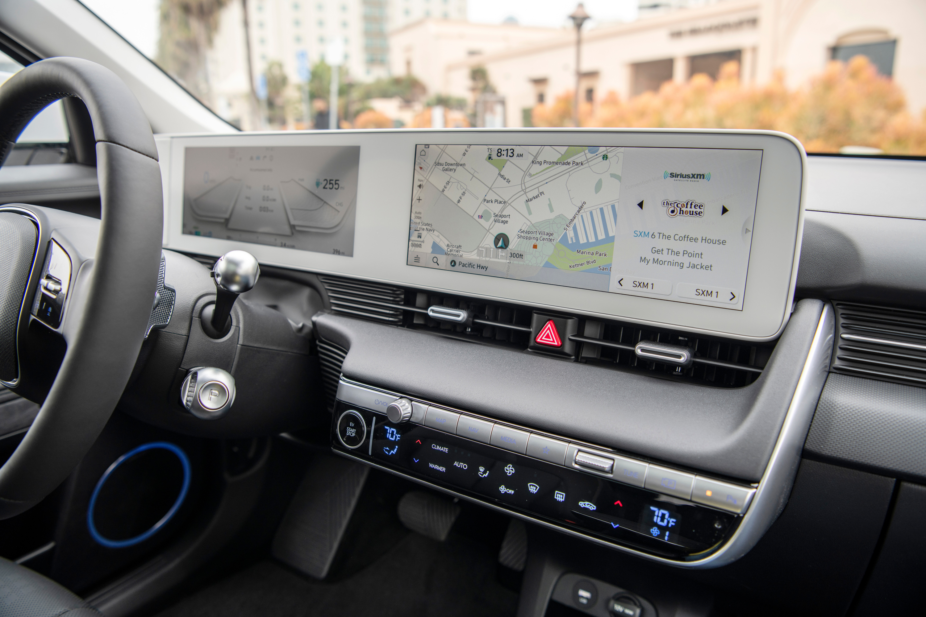
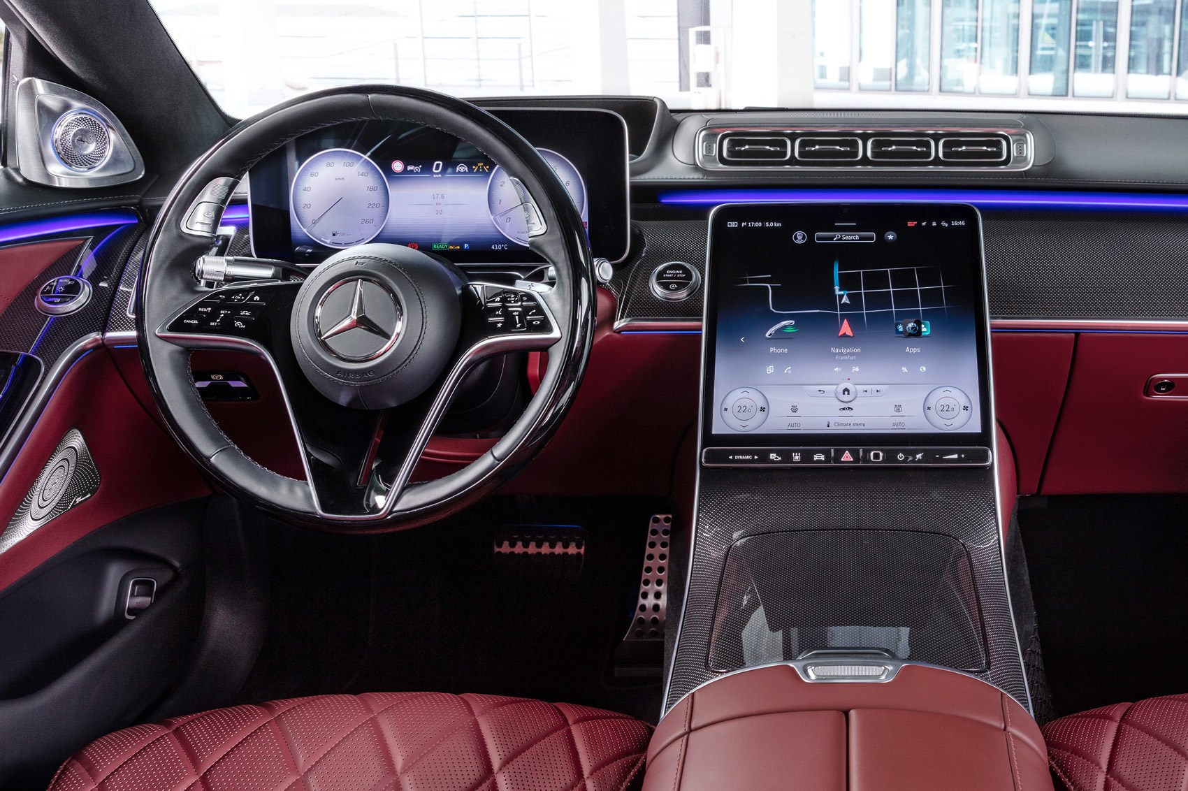
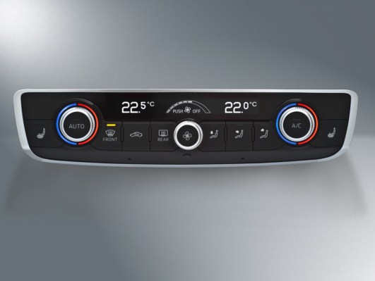
Not only does it hide commonly-used safety-relevant functions behind extra taps in sub-menus (as detailed), it was apparently done to free up space to offer a 'dock' of app buttons - three permanant and three 'recently used'. I struggled to choose three apps I needed enough to fill the permanant spaces - and certainly don't need quick access (when I'm driving!) to Netflix, or games, or whatever is popping up in 'recently used' today. I would like the driver profile menu to be quickly available, but alas that's been hidden too.
It's a total cluster-f*ck that makes no logical sense when considering the need of drivers, and I hope they listen and revert at least this aspect of the UI.