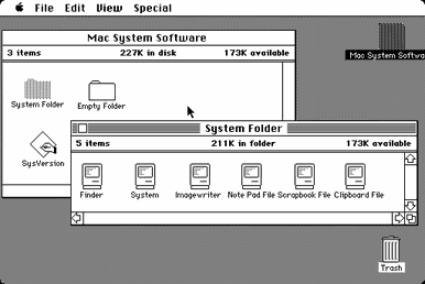
It's crazy how deeply embedded the old Finder is in my subconscious. I opened the app and instantly noticed several differences from the original, even though I haven't run the old System 7 Finder in, what, twenty years?
Things I noticed:
- Command-W doesn't close a window.
- No animation when opening windows.
- Dragging outside of the close button while still holding the mouse button (uh, trackpad button) down should revert it to the non-pushed state until the cursor re-enters it.
- Obviously, the fonts shouldn't be anti-aliased. The metrics on Chicago look weird too.
I am so filled with nostalgia right now I don't know what to do with myself. I loved the System 7 Finder. It's one of the things that got me into UI design and pixel art.
Nautilus (GNOME Files) used to have a spatial mode, I was rather perturbed when they didn't bring it forward for GNOME 3. Obviously Apple killed the spatial finder with OS X, though it's always had the quasi-spatial mode with the pill button (remember that? I'm a little miffed about that one too, especially now that they've gotten rid of the dedicated full screen button that gave it the boot to make me hold Option every time I want to zoom a window instead of full screening it).
Fun fact: Nautilus was written by a company founded by Andy Hertzfeld and many of the initial employees were also alums from Apple's original Macintosh team.
Unfortunately the browser view has a habit of coming back - when you connect to a new network drive, or insert a USB stick, or just randomly. If there were a defaults bool I could set to turn it off forever, that'd be wonderful.
It makes sense to me that the sidebar is incompatible with spatial browsing. It changes the size/shape of the window, and the items there are a list of aliases that don't exist in that space.
Lovely little project. I saw a few little discrepancies too - I guess that's fine, but when I read "functional recreation" on the project site, my mind registered "fully functional recreation".
It's been a while since I used a classic Mac, having defected to Windows in the 90s and not returning until the 2010s, but I'm pretty sure (?) I could:
* drag the bottom right corner to resize the window
* drag the scrollbar thumb to scroll
* drag a rectangle inside a finder window to select multiple items (see below)
* click the top right corner to "maximise" (kind of) the window
Regarding dragging rectangles, I remember my awe as a kid when I first saw a GUI system (a Lisa being demoed at an Apple expo in the early 80s) and I rushed home to write a "drag a rectangle" program on the Apple 2 (a ][ or a //e - my Dad was a dealer for a while) with game paddles :) Hence why I think you could do that in the old Mac finder.
FWIW HN does not support markdown (or any markup other than emphasis really), so "lists" are really a bunch of paragraphs with a starting marker, and thus you have to leave a blank line between list items.
Yep. Weirdly, felt the same. I immediately tried to resize the window from bottom corner, use arrow keys to select, and then command arrow-down to open the file, and command-I to get-info. They didn't work, but that's okay. It's weird, the window was close enough in my memory to invoke those old navigation mechanisms and expect them to work even though I haven't used a classic MacOS in a very long time.
The author notes that they mostly re-created it from screenshots and having an OS9 box running, so I expect they just missed the more subtle behaviours.
Now I was going to say you should report these issues on the project[0]'s bug tracker, but it looks like the author has disabled the bug tracker.
> A smaller, more secondary reason for creating this was to sort of observe how a Classic-era app might run on today’s hardware. As our hardware gets beefier, it seems like our software gets chunkier. If we could port yesterday’s software to run natively on today’s hardware, how might it perform? Very fast, I’d imagine.
This reminds me of a small personal project I decided to take on a couple years ago. I did it both as an experiment in performance and for nostalgia's sake.
I bought as pristine an example as possible of Apple's last machine that could run Mac OS 9 natively, a PowerMac G4 (the 2003 MDD vintage). I upgraded the CPU and RAM as much as possible (dual 1.25 GHz G4, 2GB RAM), and replaced the hard drive with as fast an SSD as the system could handle (don't recall which SSD model at the moment).
In short, I was astonished at the "snappiness" of the system. Boot time took no more than 15 seconds. Shutting down took only about one second. The system entered sleep mode near-instantly. Opening and closing windows within an app happened as fast (or faster) than I could react to it. Opening and closing classic apps themselves was at least an order of magnitude faster than what I would consider reasonable analogs from today.
I already had a decent amount of disdain for how much time I spend on a modern Mac/iOS device waiting for the system to catch up to my inputs, but it got worse after having done this experiment. A simple example, but which pains me near-daily, is the creation of folders in the modern Finder. After typing cmd+shift+N, I often must wait an amount of time that must be on the order of several hundred milliseconds before typing the name of the folder (if I don't wait, the first couple characters I type will be missing from the folder's name, which is yet another time-sink to go back and fix the missing characters). And this is on an iMac Pro! I tried this exact test on my old-but-quick PowerMac G4, and I never had to wait nor lost any chars no matter how quickly I attempted to type the command and the subsequent folder name.
Classic Mac OS always perfectly queued any number of input events and executed them in order exactly as expected, regardless of how much the system was lagging. None of the input would be silently discarded or mishandled like it is today. You could easily do something like this:
>type command-N to create a folder
>type its new name "abc"
>type command-O to enter folder "abc"
>type command-N to create another folder within folder "abc"
>type its new name "123"
>type command-O to enter folder "123"
>change mind and type command-W and command-delete to put folder "123" in the trash
>type command-shift-W to close all windows
>type "Macintosh HD"
>type command-O
>type "Applications"
>type command-O
>type "Adobe Photoshop"
>type command-O
>type command-N to create new Photoshop document
>type command-S to open the save dialog
>type command-D to navigate to desktop
>type "abc" to select your new folder
>type command-O
>type the return key to save the new document
It doesn't matter whether the system was able to keep pace with your input. You were guaranteed to have a new folder named "abc" and your new Photoshop document already saved inside.
Now in OS X (I'm sorry, "macOS"), you need to pause at every step and wait until it's done executing before doing the next. Otherwise your input will be lost in the multithreaded abyss.
I don’t think it’s macOS that’s dropping your keyboard events, rather, they’re being forwarded to the old application or nowhere at all while you’re transitioning.
Yes, but that's kind of the point - the system as a whole loses events, it's no help to the user to abdicate responsibility for that. Especially if there's no way to fix it without redesigning the system.
>A simple example, but which pains me near-daily, is the creation of folders in the modern Finder. After typing cmd+shift+N, I often must wait an amount of time that must be on the order of several hundred milliseconds before typing the name of the folder
If it helps, I might have a solution for this one - if you have Dropbox installed, something about it causes delays when creating new folders or right-clicking anywhere in the Finder. I used to get beachballs for a half-second when creating a new folder, but after doing a clean install of macOS & not installing Dropbox, everything is snappy.
But I totally agree with your main point. I have a Pismo PowerMac G3 and was similarly surprised at its UI speed compared with modern machines. (I'd love to try again with BeOS or Haiku on that machine sometime too...)
Sort of. Dropbox does add menu items to the right-click context menu on the Mac, and icons indicating whether a file has been synced or not. But if I understand correctly, it does this by installing a kernel extension:
"Traditionally, Dropbox operated entirely in user space as a program just like any other on your machine. With Dropbox Infinite, we’re going deeper: into the kernel—the core of the operating system. With Project Infinite, Dropbox is evolving from a process that passively watches what happens on your local disk to one that actively plays a role in your filesystem."
I think Apple discourages the practice now. There used to be a lot of UI enhancement apps for Mac OS X (called haxies, managed by an app called APE - Application Enhancer). But they were a source of system instability & occasional kernel panics.
Some of us run an old OS on old machines because it just works.
I got an old Thinkpad for an experiment with coreboot. I found it sexy, so I upgraded it like you did.
It feels "snappier" than anything else I have tried. All I need is SSH, and a confortable keyboard, so has become my work computer! No maintenance, no distractions. Just ssh.
I highly encourage everyone to do the same experiment you did, to realize how poorly we are served by current offerings. (or maybe I am just in retrocomputing. I don't know. I just like it)
Calling geeky things “sexy” feels like trying to justify liking the geeky thing by giving it a different name. I understand why you do it.
What I don’t know is how your project relates to both older computers and older operating systems, because this sounds like something ideal for an operating system much more modern than the popular Windows 7 that is used a lot today: Centos 7. Setup for that purpose, fast and powerful, while being perfectly reliable and having modern ease of use through systemd. I have a similar idea going on another laptop with a minimal Debian 9 installation (takes a little more setting up, but I can install more CLI programs outside your SSH use case).
And from that comes me wondering why you think the older hardware has a benefit. I sure find the lack of IPS screen noticeable even when the screen for the most part just displays text on a black background. Since the CLI has the best HDPI support out there (increase the font size), you could even take advantage of a high resolution screen.
What I do find especially good in your case is how you show how long hardware can last when not skimped on. An old thinkpad has great build quality, and for the most part there is no reason to stop using it. The best way to reduce waste is to not waste at all.
My "favourite" (well, it's really a bit depressing) example is that I can boot AROS (an AmigaOS API reimplementation) in its Linux-hosted form on Linux, into Workbench (Amiga desktop) using a startup script that then automatically starts an Amiga GUI based text editor called FrexxEd on my laptop in less time than it takes a near pristine terminal-only Emacs install to start on the same machine.
If this was some incredibly primitive editor it'd be one thing, but it's an editor with a bytecode compiled C-like extension language build in, as well as AREXX support, so it's fully programmable.
> A simple example, but which pains me near-daily, is the creation of folders in the modern Finder. After typing cmd+shift+N, I often must wait an amount of time that must be on the order of several hundred milliseconds before typing the name of the folder (if I don't wait, the first couple characters I type will be missing from the folder's name, which is yet another time-sink to go back and fix the missing characters). And this is on an iMac Pro!
That is very odd. I tried this a few times now on my 4 year old MacBook Pro and it was instantaneous each time. No delay. I wonder what may be causing the delay on your side. iMac Pro is after all absolutely state of the art.
FWIW I absolutely see that issue on a 2010 MBP running Cap'. If I quickly type M-S-n "foo" I end up with either a folded called "untitled folder" in edition mode (all selected) or a folder called "o" in edition mode (caret at end).
I only upgraded to High Sierra a month ago, and it was probably good that I waited, as I've seen no negative consequences so far. It's lightning fast, even with APFS and the other changes it brought.
I’ve learned many things throughout this journey. One of them is that modern user interfaces are absolutely gigantic compared to the user interfaces of the earlier days.
I mean, I guess it kind of has to be that way, in the age of high DPI monitors and bad eye sight, but WOW. Run Classic Finder just once and you’ll see what I mean.
Classic mac os ran at 72 dpi, compared to the modern 1x dpi of 96 to 110, so those controls were actually much bigger on screens of the day.
It looks like the link is undergoing some problems:
RuntimeException (500)
Failed to read /var/www/bszyman-dc/user/pages/07.feed/listing.md: Unexpected characters near ": '/blog'" at line 3 (near "items: 'page.descendants': '/blog'").
The zoom button (option-click the green traffic light button, or double-click the title bar) in the (current) macOS finder is still supposed to do that, if Finder's in its "spatial" mode (turn off the toolbar and, optionally, switch to view "as Icons"-- back in the day, there was a window control that did this in one step).
It's actually broken in current macOS, though-- using the zoom button on a Finder window ends up forcing some of the content underneath the title bar where you can't reach it. Guess that shows how much attention Apple's putting into the "little details" of their operating systems these days (very little, it seems).
i find that fascinating... this is the kind of thing certain builder philosophy would say "no user would ever notice", but users do notice and it bugs them.
meanwhile, we can also get an insight into the internal social dynamics of a corporation by looking at it's products. the people who cared about this type of 'little detail' have lost influence inside the organization - they are not being hired, not being promoted, not being retained, and not being listened to. but those kind of people did used to be there. so what happened to them?
its kind of fascinating, like some kind of corporate sociology based solely on research of artefacts left behind by the corporate culture.
It's been broken since at least 10.9.2, in early 2014, as that's when I reported it to Apple (#16701760), and probably a lot longer than that, as it was duped to a much lower numbered bug (#10295866).
I also miss the destructive button being on the opposite side of the window from the non destructive button. In many ways, classic Mac OS was more thoughtful and usable than OSX.
Microsoft and NeXT both had to throw out some good ideas and break existing conventions so that their user interfaces wouldn't have to come with royalty payments to Apple. Since GUI design and GUI IP law were both relatively immature in the 1980s, it was virtually guaranteed that we would end up with regrettable fragmentation instead of a coalescing of all the best ideas.
I absolutely love the idea (fitting more data on the screen, ala Tufte), the execution (brings back memories of trying MacOS on an emulator) and the design (flat!! yes!!)
I don't understand why flat design gets such a bad press.
One of the best thing I have ever used was a classic windows phone. Efficient, organized, straight to the point.
Maybe it is just part of a retrocomputing trend, but I really like that.
> I don't understand why flat design gets such a bad press.
Classic MacOS isn't flat design, there are hard borders all over the place and (by today's standards) subtle cues of dimension throughout.
Flat design gets bad press because when it is done poorly, usability suffers greatly. I love the iPhone—and I like many aspects of its current UI aesthetic—but the UX design is woeful in many places, with countless problems that arose when the dumped the "classic iOS" appearance.
Most critically is that unless you're an experienced user of iOS, it is no longer obvious what (or where) is tappable. Buttons used to be obvious through design, now they are just text on the screen, sometimes in a different colour. Sometimes they're on the bottom, sometimes they're top-left, sometimes top-right. This all used to make sense when there were title bars and arrow-shaped back buttons that visually reacted when touched; now it is an ambiguous mess.
I wonder if they do it on purpose to create a “moat”. The more time you've invested learning what's clickable, where to force-touch, etc., the more resistant you'll be to leaving the platform.
I think you're using "flat" here to refer to an absence or rarity of fake 3D effects. Today's flat user interfaces go far beyond just eschewing those visual effects and remove almost all visual cues about what elements are interactive, what kind of interaction they support, what state they are currently in, and what the borders are between active and passive parts of the screen. Classic MacOS doesn't have those problems.
The screenshots you link to are flat in the sense of lacking 3D effects - I only see a single pixel wide dropshadow around windows. But they're not flat in the sense of being lifeless and unhelpful: There's clear highlighting of the active window and selected desktop item. The scrollbars in the first screenshot are not flat by nature, but flat because the content they enclose is currently entirely visible and consequently scrolling is disabled. The large blank spaces on the screen are accurately conveying what you can do to them (nothing), and they avoid cluttering the display to the point that everything else would need extra highlighting and color to be distinguishable as something that can be interacted with.
my favorite example of this is Outlook showing the attachments to an incoming email in a tiny little window that is kind of invisible, with a scroll bar that is also kind of invisible, so its hard to tell if you have one attachment, or two, or three, or whatever. just by glancing, you would not know.
if you work in a job where you go through 500 emails a day, this can be a problem.
If I may, I wrote something a few years ago about why flat design is detrimental to user experience. A lot of folks have told me that they've found it helpful in gaining some perspective.
Thanks a lot, a very interesting read. I agree with you, affordance is a problem as different generations use different tools.
There is also a cultural aspect to it. Recently, I had to find icons to represent the concepts numerical minimum and maximum. This was hard, and not just because the space was limited. I settled on Chevrons (like v ^ ) while fully aware it was not standard.
It is just a way of setting a convention, and hoping your users will catch up to it.
That's interesting. I hadn't considering the cultural aspect in the context of icons. It's often a frame of reference when color is being decided, but icons—that's a good one. Thanks for expanding my brain here.
I wouldn’t call OS9 or before flat—sans compositing, sure, but the interface is skeuomorphic and textured: the file icon still has a corner bent, the window has a rough texture to indicate draggability.
Note, I’m not a designer, Skeuomorphism is probably not the right word, but it’s certainly not flat.
Not a designer either, but except the titlebar MacOs classic look flat to me. A bit like BeOS, but I have never really used either of them - only on emulators.
> but except the titlebar MacOs classic look flat to me
Classic MacOS didn't have the gratuitous visual noise you may be used to from the Windows Vista school of design or even the Windows 95 faux 3D borders on everything, but it's hardly flat, except for the stuff that you actually can't interact with. And that's the stuff that is supposed to be flat looking. The button outlines in classic MacOS are always obvious, even when they're only a single pixel thick, and things that aren't buttons never look like buttons.
One of the things that I missed for quite some time from the classic Finder was the ability to drag Finder windows to the edge of the screen where they would shrink down to a tab you could click to instantly access that folder or hover over while dragging objects so the folder would expand and allow you to drop objects into that folder.
However, the sidebar and spring loaded folders now offer functionality that is largely the same.
> It will really (probably poorly) perform Finder operations on your computer’s file system.
Ha! Given how horrifically bad the OSX Finder has always been at file management (not to mention its numerous unfixed bugs), I can't imagine how it could be much worse.
I believe that the abandonment of the Finder interface by Apple (both old and new) is having a devolutionary effect on computing. Generations of people are learning to use computers without understanding the differences between a folder and a file system, with little skill in maintaining a hierarchical system for organising their material, and so on.
Also, the fact that, today, you can't open a folder full of files and have the Finder window auto-size to fit the content (in list view, for example) is an indicator that Apple just doesn't seem to care about keeping this paradigm.
And thats a pity, in my opinion, because it makes stupid users. Being able to fundamentally organize ones cache of documents on filesystem is a key first step in gaining computer literacy, since very few computer systems out there achieve anything without a folder and a few files in it.
So, I'm quite encouraged by the effort to rebuild Finder - if we had an open source Finder alternative out there, which works to exceed the features of the built-in Finder, I'm quite sure I'd contribute to it. The devolution of Finder, and of filesystems in general, is personally a pet peeve of mine - there is nothing more frustrating than having to explain the concept of organising ones data to a user who really should know these things already - but don't, because Apple (and others) have decided the user doesn't need to have control over the fundamental building blocks of their system.
This deleterious effect, devolutionary in nature, of 'technologically refined simplicity for the sake of the user' is a real issue. I expect to see more examples of its negative effect in the coming decade ..
Things I noticed:
- Command-W doesn't close a window.
- No animation when opening windows.
- Dragging outside of the close button while still holding the mouse button (uh, trackpad button) down should revert it to the non-pushed state until the cursor re-enters it.
- Obviously, the fonts shouldn't be anti-aliased. The metrics on Chicago look weird too.
I am so filled with nostalgia right now I don't know what to do with myself. I loved the System 7 Finder. It's one of the things that got me into UI design and pixel art.