I think one of the best points of this piece is referencing the iconic U sticker that nearly all Uber drivers have on their windshield or passenger window. When I've taken an Uber in an unfamiliar city (the bulk of my Uber trips basically) and I'm on a busy street corner, seeing the unmistakeable black-and-white sticker lets me know quickly and simply that I'm hopping into the right car, or where to start walking if it's 100' away.
What will the new Uber car sticker look like from afar? A circuit board? A community college parking lot pass? There's no way it will be as obvious and instantly recognizable as a big U sticker. In fact I can't even imagine Uber drivers will swap their decals out, ever, so it'll create a rift in the overall brand (drivers with U stickers, website/app with the new brand) and increase overall confusion with passengers.
It's interesting that they let the passenger pick the color. 2 passengers in the same area might both pick the same color and try to locate their driver based on that information alone. Uber knows which pickups are at the same place at the same time and could choose the colors that minimize confusion (some kind of 4D map coloring problem!)
You know, you could just disable colors already picked in close proximity. For maximum distinguishing power, offer primary colors first, then secondary and tertiary colors, and then differences in brightness/saturation.
Unless you're dealing with several dozen cars arriving at once, it should be reasonably distinct, and even if for some freak reason there is more cars than colors, it'll still help sorting through prospective cars more quickly.
You could also do this automatically, but offering the user control over it may help them feel in charge and/or remember the color they picked better than just assigning one.
Good point! However, is it important for people to feel in charge of their color? Right now, requesting an Uber is 3 steps (open app, set pickup location, confirm). Why add a 4th step and require another decision? I value simplicity over getting to choose my favorite color (n=1).
See, you don't have to make it a separate step though. It'd be something that is initialized with a sane default, and allows you to change it if you want to. A button with the colour the light will be that you can click to open a modal dialog displaying your options. Someone suffering from dicromacy may choose a colour that is more distinct to them.
If you don't care about the color the light is, you'd simply confirm without changing anything.
Another nice tweak would be coloring the app based on your chosen color whilst you are waiting for the ride, making the connection obvious. That should be a fairly simple matter of shifting hues.
Like in Android contacts, when you add a new one it chooses a colour (maybe randomly, I'm not sure if there's a system for it) but you can change it if you want.
I mean it's a general interaction design principle. Provide sane defaults, offer customization. As a corollary, if you need to prompt for data, think long and hard about whether you actually need that data.
Hrm, thinking about it, it'd probably also be neat if it tracked what colours users who do choose pick, and then use that information to deduce their favorites. If any of those are available, it should pick them automatically. Even if I went out of my way to pick orange every time, it'd be nice if the app remembered that and picked orange for me, thus eliminating a step.
It may be worth displaying available colors as smaller squares next to the button like this:
Oh right, I forgot some states do this. I even used to live in Alabama, which has the same policy. Coming from Ohio (where I grew up) I always thought this was oddly impractical.
Weird that it's allowed; here in The Netherlands, it's forbidden to have any kind of light in or on your car that's not defined by the standard (e.g. 2 headlights, turn indicators, break lights, etc.).
I don't get why they didn't just do the reverse – have the user's phone screen switch to a random color and tell them when to hold it up so their driver can identify them on the street. You'd still have to do the secondary confirmation with names like you do now, but in terms of just finding the rider it'd be much easier for the driver.
I actually wrote about something extremely similar back in 2014 [0]. Great to see that they came up with the same approach on their own, and that they simplified it; I'd assumed that the LED would be colour + nickname and not just colour.
That's exactly what they do now. Identifying a color on an LED is easier than reading the license plate of a car across the street or distinguishing one green sedan from another.
They do that, but tag numbers are hard to read at night and from a distance. I'm in Seattle, the color bars are nice (though they should auto-assign them).
This is why I believe that this rebranding is one of the worst since New Coke. It not only fails to help the brand. It actively hurts it.
When you're trying to create a logo or brand, the first step in the process is to determine the "values" that are associated with a brand.
These values force a company to ask what are we selling?
Is a Corvette dealer selling you fuming gasoline, smudged glass, and cold steel? No, they're selling the open road. Sun on your arms, with the wind sweeping through your hair. The dealer isn't just selling an engine, some wheels, and a few chairs.
What they're selling, what they're really selling, is freedom.
Now look at the most recent U-logo for both Apple and Android:
First, it conveys identity. It shows me a high-contrast single symbol (U) that strongly identifies the brand. A customer can see that symbol a handful of times and come to instantly make a very strong connection to the company.
Second, this logo immediately conveys the brand's values. Somehow I can tell that this is a premium product, probably in the "aspirational luxury" category: a treat for the middle class, a luxury for the haute middle class, and a necessity for the upper class.
Why does the brain automatically know this? Because the logo draws on a language of visual metaphors that are embedded in our culture, and thus our advertising. See all the following logos:
High contrast black and white is a symbol for accessible luxury. The U renders it nearly universally recognizable. I understand the desire to tweak the branding, given the more market-diverse offerings, but throwing out what is quite close to a perfect brand for this nonsense reeks of corporate mismanagement.
Did you see Steve Yegge's OSCON '07 talk on branding?
I'd post a link but it was originally hosted on blip.tv and no longer exists online.
It's by-far the most influental talk about marketing I've come across covering the 'New Coke' branding kerfuffle as well as a lot of other great examples (ex Southern Bell's rebrand to AT&T).
The message, a brand is essentially an immutable const identifier in the minds of the users. Once people establish a firm perception about a brand, it sticks for life. Diluting a well established brand by turning it into an 'umbrella brand' does nothing but erode its value and confuse the users. Once the damage is done, it can't be undone.
Was it just me, or was the uBar advert at the bottom of the title really oddly placed. It was almost as if it were going to be part of the article. How the brand was becoming associated with crap software too.
Meanwhile that was totally just a horribly placed ad for the site ...
Absolutely. I'd trade what we're stuck with today for simple, self-hosted images and links (no trackers, third party scripts, creepiness) in a heartbeat. This is advertising done right.
I guess. But damn, I'm so used to not seeing ads that I spent maybe 10 seconds wondering how the image was relevant to the article. "Maybe UBAR is an Uber side project?", I was thinking. Then I saw "SPONSOR" ;)
Obviously, in this case, it would not change anything since it is just an image and a link.
But on the regular web, disabling js does have a lot of benefits (no tracking, faster browsing, etc...).
I'm never one to judge a rebrand immediately, as so many people were quick to do here. These things have a tendency to grow on you.
But after living with the rebrand for a few weeks? It sucks, and it made me realize how all the things I used to like about Uber are disappearing.
The simplicity was one of the best parts of Uber: you picked your service level, then ordered a pickup. That was it! These days, they've added a lot more friction to the process, and instituted carpooling rules. Never mind that surge pricing is almost always in effect -- I guess they're having a hard time retaining drivers?
Ultimately, all Uber has long-term is a brand: their business model will be commoditized the day autonomous cars are integrated into a fleet management system. And they fucked up that brand: they went from a recognizable brand identified with the letter "U" to an unrecognizable glyph that looks more like a video game than a ride hailing app.
The implied - not sure it was ever stated - aspect of their branding was that the experience was about YOU. Getting the car, handling payment, not having to worry about all the details makes YOUR life easier. Their deals with Hilton and United to have a car ready whenever and wherever furthered that in my mind.
So while the "U" meant "Uber" I always interpreted it a little bit differently.
I also liked the tagline "Everyone's private driver."
It felt very luxurious just to read that when opening the app. Now it feels like a game. But all this is just fluff and will soon fade away as long as they keep up the awesome service.
I get it -- but it undermines their brand value, which is all they have. I avoided taxis because it was a high-friction transaction. Uber has been great because it is very, very low-friction. But they've introduced enough friction that I tried Lyft for the first time, which is a pretty bad sign. Also it's a lot easier to find drivers on Lyft anymore while Uber is on surge pricing half the time anymore...
For the record, it's happened more than once now that I look through my app menu and see the new Uber icon and have no idea what it is. Takes me a second to think about it and remember this 'rebranding'.
It's one of the worst things they could have done at a time when they need a strong brand the most.
I was sober and honestly thought the new logo was my uber app being updated. And the square meant the update was paused. Absolutely terrible rebranding. The U was recognizable and iconic.
I keep the Uber app in a travel folder on my iPhone. The small form of the new logo looked a lot like an app that was in the process of updating. For a few days I thought some app was stuck updating, and was about to uninstall it, until I realized what it was.
Yes I had no idea it changed. I went to get an Uber the other night and after 10 minutes of looking for the app I gave up and went back in the house. I left my glasses at work and was frustrated.
I'd have thought it would result in a fractional but statistically significant drop in use in the short term. At Uber scale, that's probably not pocket money, and probably does involve someone in analytics having a very awkward conversation with Kalanick.
Touch icon layouts aren't designed to encourage you to read the text below before selecting an app. If the big "U" isn't there but the big "lyft" still is, they've probably just lost a ride.
About two weeks ago, I found myself in Manhattan, needing to get to a specific airport hotel near jfk for a 7am flight. I'd never used Uber before, so I downloaded the app - I knew nothing about the rebranding (which had happened at the time) but I found myself with a somewhat bewildering array of options - uber, uberx, uber black, uber pool, something else. Multiplied by choosing the type of vehicle?
I had no idea what I should choose and I was in no mood to track down what to the designers and implementors meant by the various choices in the matrix.
(Took the subway to something close, got out, got in a cab and got there for $20 total)
I wish there had been a more scripted experience: where are you going? What's your timeframe? Do you have luggage or need to impress someone? Do you mind acting as a carpool dummy? Do you want conversation or quiet?
Just as software wizards are in other contexts, that would be useful for a new user, but frustrating for a power user who knows exactly what they want and the quickest way to select it.
The experience of a new user in your app can turn out to be a pretty critical moment when it comes to retention. Having a flow specifically for new users is common and does the job of easing them into whatever necessary complexity exists in your default state.
Maintaining one consistent front-end is obnoxious enough from my biased personal experience with the UI/design aspect of building a web app... but I agree that it's probably a weak point that they offer so many disparate options but they are probably just gathering data with what works/what doesn't. Just guessing. I would imagine that eventually we'll see some (more? I don't know if its happened already) closures of the individual Uber product lines
Yeah, it's really not easy to get there. But once you have all the options in your head it's really the fastest way to get what you want as it is. If you don't want to choose just take what they have chosen as the default option and base your Uber experience on that. Different cities offer different of these options and I found that without special requirements the default option is usually the most reasonable one for "getting there fast, cheap and not too uncomfortably"
Basically, designers have to put up with the same management bullshit as developers, except with significantly less respect for the difficulty of their craft.
Yeah, I think that was the bit where, when animated, the logo works. But rarely will a sticker on a car be animated, at least in this decade.
That said, designers often over-worry about logos initially. If you put enough marketing power behind it and the company is still on a growth curve, the logo will eventually become associated with the brand and it wont matter whether it was obviously a 'U', a Chinese coin or a ghost ;)
EDIT: The question now is, is uber on such a growth curve that they can still get away with this. My gut says 'no,' but only time will tell.
It's not that the logo doesn't matter. It's that the specific shape of the logo doesn't matter. As long as it's unique and recognizable, over time it will come to be associated with your brand. As an example, think of car emblems. What does 4 rings have anything to do with Audi? The roundel with BMW? The bowtie with Chevrolet? Of course, these all have a historical significance, but there's no direct tie between the shapes and the name. It could just as easily be Audi's roundel and BMW's bowtie. But yet all are distinct visuals intimately tied to the brand.
Not much at all, or when you're bored, and have time to waste.
Does it look clean, professional and trustworthy? You have decent vector images of it? No negative associations? Just run with it, there's better things designer time can be spent on.
I think there's two reasons for changing it afterwards. It is starting to clash with the visual design of the site around it, and needs some touch-ups, or your company is moulting, and shedding it's past skin.
Just wanted to say that Uber is used by the mass; It's not really a product for techies. So a lot of my friends thought that Uber has been deleted from their phone (as they weren't able to find the icon) and then went ahead and ordered a cab from the competitor.
Am I the only one that sees the icon and thinks that it looks like an abstract drawing of the sphincter or the underside of your anatomy? Must be tortured remembrances of goatsee videos from years gone by. Perhaps there is a tie in with all those grindr ads. Personally I find the combination of moms, puppies, and sphincters a bit disturbing.
I've never, ever in my life seen a rebranding or redesign that wasn't widely complained about. How can we differentiate between this kneejerk reaction that all humans seem to have to changes in a UI/design they are already familiar with, and actually bad redesigns/rebrandings?
Ok, so supposedly the redesign is based on the idea of "bits and atoms". The atom at least seems to be based on the textbook image of a circular nucleus surrounded by lines of orbiting electrons. (Let's ignore the fact that the lines in the logo are pointing in totally nonsensical directions.) The "bit" though...why a square? A bit is a unit of measurement - it has no physical representation. Another circle would be just as valid. Maybe they're thinking of pixels? (Though those aren't always squares either...)
Even if you can get past how pretentious the whole concept of the design is, it all falls down anyway once you realize that they're just making shit up.
It's also not a theme that is unique to their brand at all. So you connect cyber and meatspace, ok, well what tech company in the last 20 years couldn't say that?
Huge shifts like this are confusing to consumers. Companies like Starbucks understand that you can be fresh without looking like you're going through an identity crisis. Luckily for Uber, what people really care about is the service they're getting, not the logo for it.
Maybe I'm just reading the wrong authors, but so much of the writing on design today let plain bad design slide because it has the right look/people/brand/tech/image. Eli Schiff's writing is maybe a bit more vitriolic than necessary at times (IMHO) but it's a very refreshing counterpoint.
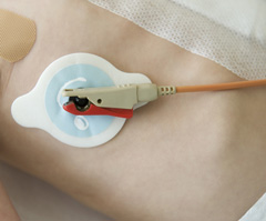
The first thing that came to my mind when I first saw their new icon was electroencephalogram stickers[1], or maybe those stickers that hold on heart monitors in the hospital.
Fun fact about those leads: the clips that hold the leads to the electrode pads are of many different specifications, i think specific to the manufacturer, so you can't change the lead (and so the monitor) attached to a patient without replacing the pads.
Hence my slightly comical experience of sitting in an ambulance during a transfer from my local accident and emergency department to a specialist cardiac hospital, topless, having my electrodes replaced, then going through the same procedure after the ten-minute drive to the destination!
If someone could disrupt that, that would be great, thanks.
It is fun bashing uber but I am not sure this is quite as bad in all respects as this article makes out. In particular I like the black square icon, it is bold and unique. Their Android and ios icons though are pretty bad. Too bad they couldn't have stayed with the bold black square for those as well with some way to ensure it has good visibility.
The logo of the app looks like a Chinese bank logo. A lot of Chinese - and to a certain point Vietnamese - banks have logos with square inside a circle, since that's how Chinese money used to look like.
When Uber updated, I wondered what is that Chinese bank app doing on my Android.
> Maybe take a closer look at where Uber's capital is sourced from
Eeh, I don't think it's deliberate, they just didn't really think it through. It's not a bank and it's not, majorly, for Chinese audience. In Chinese culture, these round coins with square hole inside are a symbol of money (and luck, but mainly money), even on religious statues and the like. It's not a good fit for a taxi app.
Right but for them it would just be an abstract but still recognizable design. For the rest it's the U in Uber that's a classic recognizable design. Their new icon seems like a major shift and while I don't particularly like or dislike it I think they could have done a bit more with the U before throwing it out entirely.
OP likes it too, unless he's being sarcastic. Really, it's hard to tell sometimes.
> The bit makes for a great favicon, and reminds us of the great work of early modernist painters. Left, Kazimir Malevich, Black Square, 1915. Right, Uber Favicon, 2016.
> Of all the brands based on squares, Uber's is the most exciting.
The comparison of the solid black square to famous art, and a description of the level of excitement about a brand "based on squares" where the brand is exactly only a square: those are the sarcastic components here.
These might even be interpreted as parody ("here is a great work of art by Uber, which is comparable in insight and execution to this work by a lesser known artist.")
it's the same everywhere for designers; they study, work, and spend their lives designing but at the end of the day are subject to the whims of a business unit or product owner. it doesn't take any training or thought at all to know what you like or dislike.
but i agree with the author, this fiasco and even more so, the yahoo! logo redesign my mayer are just colossal crap theater. i actually don't know what's worse, doing it over a weekend and crowing about it or taking 18 months and then crowing about it.
I don't know why you would comment something so "simple" (if you actually read the article, if you didn't then I'm wasting our time) when the author clearly (albeit sarcastically) points out that "Obviously designers have no right to comment unless they were in the room with the Uber designers during the design process". Surely you should come up with a stronger rebuttal than simply paraphrasing _his_ sarcastic comment?
I think he has every right to point out that the design is bad (I think it is too) but to me many of the phrases reads like he knows that the designers behind the logo also thinks it was a bad design, and that the designers suffered during the process. He shouldn't speak on behalf of the design teams thoughts or processes and stick to commenting on the final result.
Maybe I just read some of the sarcastic parts too literally.
> "Obviously designers have no right to comment unless they were in the room with the Uber designers during the design process"
I think we can all agree, that when it comes to the quality of a logo or visual identity, the end customer is always right. If people paying for Uber services can't recognize Uber, or get negative associations with their visual identity, no design process can make up for it.
"The Uber brand guidelines were sure to make clear that they doesn't want their logo to be urinated on or to be associated with condoms or sex. Because there was a real danger that might have happened."
I see ads for Uber on Grindr all the time. What's that about not associating the brand with sex?
Do you remember the time that Marissa Mayer said, referring to Adobe Illustrator, "I’m not a pro, but I know enough to be dangerous" and then "helped" designing the new Yahoo logo? by that time, Mayer's (micro)management style had already resulted in the Lead Yahoo Mail Designer quitting the company[1].
This time it seems that, because of Kalanick's micromanagement of the Uber logo design, Uber's Head of Design has left the company[2].
A non-technical co-founder shouldn't write code, right? So I don't understand why a non-designer co-founder should design a logo.
This is a common problem in marketing. Given marketing unseen soft skills it's common for people to feel they can be great contributors. I've literally had an occasion when a exec waited til marketing left the building and held design/programming staff back the night before a launch to implement his messaging, look and feel which had been previously discussed and rejected. And no joke, he had the gall to criticise the marketing team for the launch when it didn't get the traction expected. My jaw still hits the ground someone can be like this.
While not normally as bad as that example, executive input is acceptable at some companies, typically from those people we've all seen whose confidence clearly outweighs their ability (though to be fair some people give great commentary too). In areas like brand its very difficult to 'prove' bad suggestions right or wrong as measuring impact/result is difficult given so many variables, and for what you can measure you'd have to run the alternate to truly know results, which is unrealistic. The other one I see is sales management get promoted to run marketing as many operations/finance leadership dont realise how different the skillsets are, assuming 'selling is selling'.
For this, life is a bit easier in the performance marketing channels vs brand type channels. I've found the best solution is, rather than fight the political fight to keep them out, simply build what they want (assuming digital campaigns) and A/B test their campaign version. Afterwards be sure to present the results at a suitably high/wide level. Its win/win as if they contribute good work the company benefits from their insight which is great. And if they are the manager sticking their untalented nose in repeatedly, after several presentations (all done in a genuinely friendly manner) the bad internal press tends to keep them quiet, at least for a while.
And to be fair, some marketing people are not the best themselves and probably deserve micro-management...
I understand your point with regards to your last sentence, but that doesn't justify bad management.
I think the main point here is that, as you said, institutional marketing/design/UX success is not as easily measurable as other endeavours. You can A/B test a landing page but you can't really A/B test things such as logo/corporate identity.
"For me, I’m using our recent successes as a chance to take time off to rest, reflect, and recharge. I miss being there for my kids and I’m making a decision that enables that. Soon, I’ll be ready to take up the next challenge and it’s going to be great."
What part of that implies that he left because of the redesign ?.
You are right, in the announcement he does not imply that. In my previous post I have written "it seems that" where maybe it should have been "it seems to me that".
However please consider that:
1. he made the announcement just a few hours after the logo was presented to the public
2. according to numerous reports in the press, Kalanick closely managed the redesign.
For these reasons I believe that my claim is not completely unfounded.
> It felt wrong for Uber’s global and local brands to revolve around the color preferences of a rich, white guy in California - even if that rich, white guy in California is the CEO.
It took me like 30s to figure out the change, and I haven't had any problems with it since.
Not sure this is going to topple the company. I think this is a case of, "I do this for a living so it's super duper important". The branding redesign probably isn't as important as this author claims.
I assumed the backwards 'C' was the incomplete progress bar. First I thought Uber is updating. Then when I realized it is the new icon, I thought it is meant to signify urgency of "your cab arriving."
In no universe did I imagine an atom or a bit there. Why does the bit have a tail that makes an atom a backwards C?
Pixel art on city landscapes would have conveyed their point better, and would have looked better.
Not to detract but it's a somewhat similar issue albeit probably will never elevate to the same level, but LastPass also just went through a logo redesign and it's equally rather puzzling.
Considering things like that the three dots simply look like any number of other menu icons, especially on android where you can have three of those ellipsis type of icons in one view sometimes; I'm not sure that was all that smart of an idea. In case you didn't notice/realize it like I didn't, that's a cursor at the end of what are supposed to be three hidden characters. It's just an odd choice in my opinion.
>that's a cursor at the end of what are supposed to be three hidden characters
That was immediately obvious to me. I'm neither a designer, nor have I ever actually used their product. I think it's an excellent logo because it is instantly evocative of how you use their product.
Amen. E*Trade (I completely forgot they are "ee asterisk trade," not "eetrade") sued them over the lovely asterisk, so now we're stuck with this thing that looks like the "action!" movie clapboard device.
The big blobby square indicating how many profiles match under the dots is distracting. Maybe my eyes will stop flickering to that once I adjust, but it's not an improvement over the asterisk, in my mind.
I get the idea, but it just seems to messy, especially by incorporating a UI element indicating where the cursor is into your design.
I am confused. How's the app logo nowhere on the homepage? Did they go with UBER, black square, and the weird backward C thing all at the same time? In addition the font for Uber front page does not match the Uber logo once you log it (where the U seems to have a little curve to it). Get it together, people!
Huh, haven't noticed that yet. This re-brand is so thoroughly weird in every way you could imagine. The original Uber site that I remember had a mark of professionalism and gave me a luxury limo vibe (though I knew it was just people's cars). This site has a more bubbly, AirBnB vibe, for better or worse I guess. I personally thought the professional vibe was better for their product.
There may be some snark, but it's entirely appropriate. I think it's a piece written for designers, who regularly have to deal with micromanagement from talentless, egotistical people. Except in Uber's case, things were ten times worse than usual.
Indeed, I'm not a massive fan of Uber, but the continual snark against both Uber and Wired in the piece made me dubious about taking the critique seriously.
"All in all, it is remarkable that the Uber team produced what they did given the circumstances–truly a testimonial to the patience of Uber's Design Director Shalin Amin and former Head of Design, Andrew Crow, who not so inconspicuously departed the company immediately after the redesign."
Is there a difference between "head of design" and "design director"? They seem to have been at the company at the same time - correct? Just can't understand what the difference between these two positions would be...?
How much a branding has actually impact in a product like this? Uber is pretty much the only option for ridesharing in my country, and I guess in most countries in the world. I guess you can harm the brand a little by doing some redesign or something, but I think in the end it doesn't matter that much. The most important thing is that the product works, for a good enough price. I personally at least don't care a bit what the uber icon on my phone is, and I doubt that majority of consumers do.
It's not insignficant. For one, the app icon looks completely different now. I had thought for a moment that I had uninstalled uber inadvertently before remembering their brand redesign in the tech press. For those not following the tech press, they probably had a harder time figuring out how to call an uber app.
They destroyed their brand in one fell swoop their new logo is entirely new. The good news for Uber is though that they are so essential and ubiquitous there's no danger of this impacting their business.
In the past year, I have had several drivers bring up, of their own volition, their dissatisfaction with the fact that tipping Uber drivers is uncommon. It is quite clearly stated in Uber's app and website that there is "no need to tip". I'm not a cheapskate, but I don't carry cash most of the time, and their veiled reminders/requests made me uncomfortable.
It probably sounds strange, but the ridiculous logo change on top of the changing driver culture have made me remove Uber from my transportation-method choices.
Funnily enough, I used Uber three days ago and didn't notice any chance at all. But after I read the article I checked the Uber logo on my iPhone, and there it was, the new logo staring at me.
Many people think the term arose because of the dominance of French in diplomatic circles, but I t's actually quite apropos; "lingua franca" is an early medieval term that essentially translates to "language of the Western Europeans" ("Franca" in this context is not modern France, but a term for historical Germany -- everything north of modern Spain, essentially). In the day, lingua franca was a patois consisting of bits of various languages that all traders in the region knew and could communicate in, though it was too mutable to be a stable language as such. Not unlike English, actually!
I had always just assumed it meant "French" so you got me reading (thanks!). Wiki seems to indicate the original lingua franca was based on the language of the Franks and mostly used in the eastern Med.
It helps that English adapts to the current zeitgeist relatively fast and can kind of act as an ombudsman for the spreading of news concepts and ideas to other languages.
Yes. The author obviously has an axe to grind, implying Kalanick is an "elitist", "drooling idiot" who picked the logo "impulsively", "doesn't know what his own intentions are", and "shouldn't be in charge of Uber's brand" (all actual quotes from the article).
Flagged this submission for gratuitous negativity and for being a hit piece on Uber and some of Uber's employees, disguised as design critique.
Design critique is fine but this piece is riddled with personal attacks on Uber employees and political attacks on Uber as a company. You must realize this as well, as you changed the link "Uber is publicly struggling with its image" from a gossipy, political piece [1] to a more balanced piece [2] a few minutes ago.
You are mistaken. I have not changed any links. Those links were and are both there still next to each other.
Even if the article were some sort of political argument (I guess one could interpret it that way in the sense of internal design politics and management) it should not call into question its validity.
Id say your article was very informative and non bias. Of course your views are there but the information about per country palettes and whatnot was very depthy and rigorous. You did due diligence dont feel bad.
It's the title of a blog piece. There are no rules that it's required to be hyper-descriptive. Nobody is being deceptive. Did you really think the article related to some sort of nuclear meltdown and Uber?
When I hear the words "company" and "nuclear meltdown", my first thought is something catastrophic and immediately bad happening. Founders dying, sudden regulatory changes, stuff like that. And I'm going to guess that most people thought the same. "Oh crap, what happened to Uber?"
A freaking logo redesign does not qualify. Less so when it's brand new and nobody even has the logical basis to make an educated guess as to what its impacts might be.
So yes, clickbait. The headline wrote a check the article couldn't cash.
"Atomic meltdown" does sound overwrought, so we replaced "atomic" with "design" in the title. If someone suggests a better title we can change it again.
The first time I saw Uber's new logo, I said "wow, I have no idea what this is," which is absolutely the opposite thing you want a customer to think. You might say "oh, but it says Uber right underneath the icon on my phone." Which is accurate, but many customers wouldn't recognize the logo on the car without additional text, which COMPLETELY misses the point of having a logo in the first place.
The shell in the Shell Oil logo represents an actual sea shell. The founding family were originally sea shell importers and pivoted to oil in the late 1800s. (The story is told in Daniel Yergin's book on the history of the oil industry.)
The new logo is also far too busy to be clearly seen in an outdoors setting. People interacting with this logo will be looking for it on cars, not letterheads.
Successful in what regard? Financially? artistically? It was completed? A critical internet community criticized it? Successful is a very broad term. You may be correct, i just have no way to prove you are
Meh, it looks good to me. It still says Uber underneath the icon. It took me a couple more seconds of confused scanning the first time I went to order a cab after the redesign, but that's not too bad. And the logo looks more mainstream, less like some elite chauffeur service, which is good. I don't really see any problem. And this article doesn't ever really give much aesthetic critique. It's just a weird, bitter hit piece about someone else's imagined motives.
Im left to question what ubers motive was. No use of a U. Not simular to any logo in the past. Logo easily can be confused with other applications. I dont think uber had ill will but I dont think they thought this through aside from "rebrand time". Really, this article just says what many people are thinking
Not sure the lack of a U is a big deal. You may be right they just thought "rebrand time", and that would be a shame. I'm a designer. I love good design and good reasoning. In this case, I see a new brand identity that looks OK to me, nothing special, but not completely thoughtless either. Could have gone a lot worse. Subjective.
Whatever. My reason for commenting originally was that I find this kind of blog rant ugly. Real passion for design usually manifests in articles about things the author liked. Negative critique is ok, but it needs to be calm and measured and make interesting points about the design itself. This one basically just attacks people
"Leading up to the Super Bowl, Uber’s Twitter feed was all puppies."
Does the writer not get that the "Puppy Bowl" was on at the time? Animal Planet's special show is very popular alternative to the "Let's not compete with Super Bowl" lull on TV.
What will the new Uber car sticker look like from afar? A circuit board? A community college parking lot pass? There's no way it will be as obvious and instantly recognizable as a big U sticker. In fact I can't even imagine Uber drivers will swap their decals out, ever, so it'll create a rift in the overall brand (drivers with U stickers, website/app with the new brand) and increase overall confusion with passengers.