I am impressed by how quickly the notebook goes from raw data to interesting patterns. Nice.
If I wanted to be picky about statistics (I generally do), I'd note:
1. Equating enforcement-related statistics with usage-related statistics is a dangerous thing to do. For example:
a. The rate of non-CRACK incidents in TENDERLOIN is probably low (disproportionate with actual use) due to the focus limited police resources put on crack.
b. I would bet that the high rate of WEED incidents in INGLESIDE / BAYVIEW vs, say, MISSION, is due to police using weed enforcement as a weapon against gangs (and minorities). I mean, people smoke a lot of weed in the Mission.
2. Putting "AMPHETAMINE"-related crimes under "METH" is inaccurate, as is putting "OPIUM"/"OPIATE"-related crimes under "HALLUCINOGENIC".
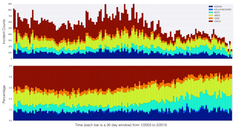
This is an awesome exercise in data visualization. It's most striking to see how crack use was essentially flat until 2008, and then it started a steady decline. Looking at the charts, I would venture to interpret that the wave of gentrification following the market crash had the effect of disproportionately displacing crack users.
I wonder what this same study would look like across the bay, in Oakland.
Looking at this chart and being a bit assumptive, is it safe to say crack use has declined and meth has increased?
Maybe meth isn't really a new epidemic with a new user group, crack users just transferred to meth. Basically, those looking for cheap escapist drugs targeted at the very poor have moved onto a new product.
I'm curious which one is worse for society and the users?
Only partially. The total number of meth incidents (light blue, top chart) looks like it was up a little bit in 2014, but by nowhere near as much as the drop in crack, and is down in the last few bars. Meth has grown proportionally, but only because of the drastic decline in crack and heroin.
Meth is quite possibly the most dangerous drug in existence. It's cheap. It's almost as addictive as heroin. It makes people aggressive, impulsive, and even violent for hours.
Now, don't go trying to convert meth-heads to doing crack. They're both very harmful.
> It makes people aggressive, impulsive, and even violent for hours.
Source?
Meth is an amphetamine like Adderall. I'm pretty sure using a strong stimulant just increases the negative (and positive) attributes already in people.
This sounds like the nonsense about bath salts making people murderers.
People love conflating mental health issues with the drugs people take.
*Not that I'm defending meth users, but I doubt that needs to be said.
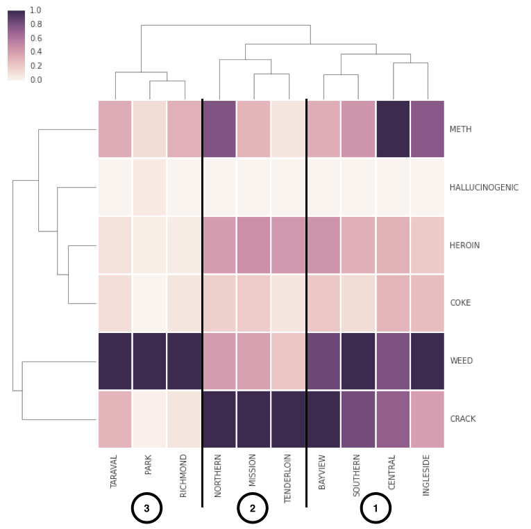
The colors are to normalize the different districts. The darkest color is always the most prevalent drug in that precinct, and the other colors in that column are relative to that drug.
The brackets are presumably an explanation of how the "clustering" was done, though with such a small data set it could have been done manually.
Are there any resources on how to properly format raw data t make it most useful for display on a map? I'm hoping to do a crime map for my city and haven't quite found a good place to start.
Many of the online universities have 'data management' sections as part of their statistics or big data courses. Often using Python/Pandas. Just google'ing for Pandas tutorials will also get you started.
Look into d3.js if you want it in a browser, there are a lot of examples. You'll have to re-format the data probably which might be annoying on a large data set, but I think there are tools out there.
The Presidio is considered federal land. So if I'm not mistaken, the crimes reported there wouldn't go to the city database, but a federal one. This is a guess, but seems likely to me.
If I wanted to be picky about statistics (I generally do), I'd note:
1. Equating enforcement-related statistics with usage-related statistics is a dangerous thing to do. For example:
a. The rate of non-CRACK incidents in TENDERLOIN is probably low (disproportionate with actual use) due to the focus limited police resources put on crack.
b. I would bet that the high rate of WEED incidents in INGLESIDE / BAYVIEW vs, say, MISSION, is due to police using weed enforcement as a weapon against gangs (and minorities). I mean, people smoke a lot of weed in the Mission.
2. Putting "AMPHETAMINE"-related crimes under "METH" is inaccurate, as is putting "OPIUM"/"OPIATE"-related crimes under "HALLUCINOGENIC".