It'd be nice if there was support for multiple versions of characters and ligature support. But still, pretty damn cool.
Edit: Seems like they have a new version of the tool on PaintFont.com which does have support for ligatures!
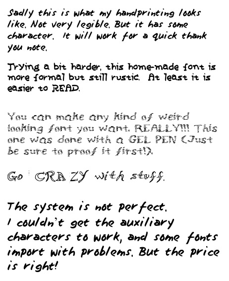
Edit2: Just tried it in my lunch break. Worked perfectly :) Doesn't look much like my real handwriting due to the uniform spacing, but definitely fun to use.
I've always wondered if that's possible: a font file where if you type the letter 'A' for example, one of five versions of the letter 'A' is chosen. And so on for other letters so that a bit of randomness is imparted to the "writing".
It is! Doing it right is the hard part since opentype is limited to very specific kinds of substitutions, so you don't get nondeterministic random, but you usually get something that appears random-enough. The canonical example of actually nondet-random is the font Beowulf[0], by letterror, i don't know that i can do it justice here, research it a bit to really get the story.
Two contemporary examples: Bello Script[1] and Trixie HD, although lots of people are really pushing opentype's features these days in novel ways.
A buddy of mind wrote HandPlot for AutoCAD (way back in the day). It'd jitter the HPGL/2 output to mimic a drafter's pen drawn technique. The visual "draft" effect encouraged dialog, whereas the precision of normal plots shutdown discussion. (Looks like it's now a built in feature called Visual Styles, hmmm).
I've always wanted to do the same for hand lettering. Any one who's done drafting on the boards knows what I'm talking about. People used to take great pride in their unique lettering. Somehow parlaying that into one's design/contract drawings would be awesome.
I looked at PostScript and TrueType, but couldn't figure out how to randomize the letter forms. I never looked at OpenType.
sadly, this was only really possible in Type 3 fonts which were basically 100% postscript interpreted at the glyph level. this made it possible to do things like actually generate a new instance of a glyph each time it was printed at the expense of printing being incredibly costly. If you find interviews where people talk about using beowulf, they all remark how it basically put their printers' cpus to actual work and that files would take forever to output.
opentype only allows for simple substitutions, but in many cases, those seem to do the trick if you programmatically generate a substitution map based on a target language's corpus. i think there's a robofont or typecon session where they talk about this and the practical limitations of how many gsubs most opentype engines can deal with before they stop altogether. very cool stuff and mega-niche, but it's cool to see how people play with constraints.
Absolutely. It's something cognitive. The mind is more creative when there's blanks to fill in.
I played around a bit to see if I could style HTML+CSS to look sketch / toon / hand drawn. Precisely what I thought Balsamiq was doing. Wouldn't that be awesome?
Alas, I didn't get very far. I chopped a hand drawn box into 9 GIFs (upper left, upper middle, upper right, ... lower right) and attached them to a DIV. A lot of work. And the long edges could only be stretched, vs repeated. And I couldn't fathom a way to "owner draw" (old Win32 dev here, sorry) other widgets like dropdowns and scrollbars.
If there was a way to access each widget's vectors, then a hand drawn style is totally feasible.
You can actually achieve pretty good results without even using different versions of letters. I did an experiment with this a few years ago when I was playing with an idea of a tool to produce artificial hand-lettering for comics.
Here's the basic algorithm:
1. Generate two maps of low frequency noise. Perlin noise would probably work well, but just blurred noise will do. If we're thinking in terms of blurring, the radius should be on the order of x-height/2. Call that scale "S". One map is for X and one is for Y.
2. Convert the text to Bézier curves.
3. Process those curves, subdividing any long curve segments until they are no longer than S.
4. Now, process the curves again, and for each point, look up the corresponding point in your two maps. Displace the point's position according to the map value, with maximum distance somewhere on the order of S/4.
5. Render the new curves.
The parameters would need to be tweaked (I'm reporting them from vague memory), but that basic outline can provide surprisingly convincing results when applied to a handwriting font. Note that I did not mention what order of Bézier curve to use. You can get good results even by converting to polygons, but the segment length will need to be shorter.
This is really neat, but the main reason I type as much as possible is because my handwriting is awful. I'd gladly use a service that made my scrawl a bit more legible.
I believe you can work on your handwriting the same way you work on drawing.
I learned to write pretty much by myself after my parents taught me to read and I didn't practice the m's and the o's exercises in 1st class (since I already _could_ write). This ended up in a horrible handwriting, which a lot of teachers criticized without offering any solution.
At the age of 14 I received an old metal dip-pen and I loved it but I didn't like the outcome, so... I started practicing, writing alphabets, letters, words, sentences, just for the pleasure of using the pen and finding the right shape for each letter. It is still a work in process though as I sometimes change the way I shape one or another letter and I still from time to time write down a couple alphabets.
I'm not claiming my handwriting is now fabulous, far from that, but I'm at least not ashamed of it and would gladly use it as a font (where appropriate).
I don't know, I have two old dip pens (as well as ink for them) and yet whenever I use them it seems I just smear ink everywhere and make huge blubs on the paper.
Anyway LaTeX has beautiful fonts, so I wouldn't worry too much about it yet.
Dip pens can be really touchy. I use a fountain pen a lot. Paper quality becomes extremely important; a ballpoint will skip over rough weaves in poorly made paper, but a pen with a nib will catch on them.
Why, then, would anybody use anything other than a ballpoint? For me the writing experience is smoother with a good nib pen on decent paper, and I hate cheap paper anyway. Even good ballpoints aren't great here; the only exception I've ever seen are these ceramic tipped ones: http://www.leevalley.com/US/gifts/page.aspx?p=70130&cat=4,53... As a result of poor-to-mediocre ability to write, my cursive degenerated terribly for years, becoming a terrible illiterate scrawl that even I couldn't read. After I started playing about with fountain pens, I discovered that it was actually a legitimate way of writing, and faster than printing everything everywhere.
I've been using disposable fountain pens from Bic for a while since I lost my nice one. A good place to start for people who want to casually try it out before dropping a few hundred dollars. :)
its ok bro, we're all key-board people here. our handwritings SUCK! Heck the best part about a computer science college was that most of the work was on computers so no more writing! :P
I had a theory based class last semester (no computers at all), and haven't had a real class in which I can't type everything in 2 years. During the midterm my hand started cramping because I hadn't written anything longer than a sentence or two at a time in years.
Love your sites! They are very well done. I'm curious as to how you are creating the fonts. Did you use a programming library or did you dig into the font format specifications yourself?
Also, this is just a minor suggestion, but I would love to be able to map a non-standard character (such as the copyright symbol) to my signature.
That was what we did first. But a lot of people asked us to bring back myscriptfont.com because they did not understand this "create template" stuff .....
Back in the 1990s there used to be computer magazine ads for this. The ads included spaces for you to hand-write various letters and numbers. Anybody remember that? Mail it in and they mail you back a font.
I made a font like this once. I can't remember what tool I used, but I drew the characters with a mouse (at the time I did a lot of drawing with the mouse, so mouse writing was nearly as good as pen writing). It use to be online even just for the hell of it. Now I'd probably have to look in the backups.
The big problem I had with my font was that some characters were quite bigger or smaller than others, despite it "fitting" into the same size box. I wonder if they managed to fix that some how
I don't really care for the template model; it won't look like your actual handwriting because most people don't write individual letters in little boxes the same way they write sentences.
I would be really impressed if the template consisted of a set of phrases you had to transcribe, and then it asked you to confirm the letter choices if there is doubt, and created composites where there are more than one of the same letter in the sample.
In the additional letters, the small ñ is missing (Capital Ñ is in the list). It's a very used letter in Spanish. (Additionaly, the Ç and ç are missing they are used in Portuguese.)
I don't know how this can be solved in the general case. Maybe add 10 free letters and ask the user to supply the unicode number, or type/copy the letter in a text field of the web page.
I was going to post a link to an image of this font in vim, which looks quite funny, but then I realized that I don't know if I want everyone on the Internet to be able to copy my handwriting.
Idiot teacher. I get not wanting to have students use laptops in the front of the class, but as long as you don't copy from others how you produce your college assignments shouldn't be the teachers decision.
Anyway if he ever saw my handwriting he would change is policy - it actively scares people.
Though I don't get why you would want to, I have seen far more beautiful handwritting elsewhere (it is certainly prettier than mine, but that isn't saying something).
Edit: Seems like they have a new version of the tool on PaintFont.com which does have support for ligatures!
Edit2: Just tried it in my lunch break. Worked perfectly :) Doesn't look much like my real handwriting due to the uniform spacing, but definitely fun to use.