> Here's another crazy idea for shutting down your PC or Laptop - Press the Power Button.
You can thank Windows for this. Back in the day when we went from DOS to Windows, this notion of a "proper shutdown" was introduced, and God forbid you press the power button, or bad things would happen.
I'm not positive Windows was the first to do this, but I think it's safe to say it was the one that started this habit for most people.
And now, it has became so engraved in our brain that it's nearly impossible to un-train. I to this day never use the power button on any device to shut it down out of uncertainty that I don't know what will happen[1] if I do.
In the very rare cases I need to reboot or shut down my macbook, I'll press the power button: it pops up a standard 4-button dialog with [Restart] on [SPC] and [Shutdown] on [Return]. Also available are [Sleep] and [Cancel] (on [Esc]).
Was that an actual 'closes circuit when depressed' button or was it a switch? Either way, flipping a power switch unexpectedly is bad. Lots of video game consoles had power switches. You shouldn't flip the power switch on a modern computer either. But giving the power button a press is safe in every single device I own or am aware of.
Eeh, I don't know, kids today. Back in my day, when I was young (and it weren't even that long ago neither), the hallmark of a "proper" computer was that you couldn't just switch it off...
Interesting point you picked out - I didn't think of doing this either, in my tests with 8 I was annoyed at how difficult it was to get to a shutdown menu.
I think the real trial for the OS will be whether people will be able to re-learn these basic metaphors that Windows has fostered up until this release. I think we'll see something very interesting happen with the consumer uptake in the short-run, but in the long run I feel they've made some actual forward-thinking decisions.
Maybe, after this change (and ones like it) has been accepted for a few years, people won't be terrified of their power buttons and flag keys anymore.
I use power buttons all the time and never had any serious, or maybe just any, problem with it whatsoever. It also makes 100% sense: press button to power on, press button again to power off. Just like in the analog days.
Moreover, I'm pretty sure he means only the smart power button on the machine itself as opposed to the switch on the power strip beside the machine. I assume that flipping that would still do Bad Things. And so the situation is still a bit confusing. Uh and you don't want to hold smart power button down too long either... See, it's really easy and simple to understand...
That's a security mechanism. The idea being that malware can impersonate the login dialogue, but they cannot capture Ctrl-Alt-Delete as that is trapped deep in ring 0, in the kernel, beyond the reach of your average keyboard hook. Thus, Ctrl-Alt-Delete is there to ensure you are indeed giving your credentials to the real McCoy.
And whatever you do, don't hold the power button down for [random amount of time][1] just because Scott said it was safe to start using it for a regular shutdown again!
[1] where random amount of time is best-guess 'more than 5 seconds', but depends on hardware implementation and varies widely in practice
The AmigaOS, since the beginning, had no problem to deal with power off-s. That's only when I arrived on the PC that I felt very strange to have to do a software shut down instead of pressing a hardware button. Nonsense.
This is not exactly true. It's true that you wouldn't break your OS install by switching power off at random times, but if you had something in the middle of writing a file to disk, then it was sure as hell going to leave that file half written.
For sure, there was no "software shut down", but the issue with that was it put the burden on the user to be careful about when they shut it down if they were saving stuff to disk. The floppy and hard drive lights (if you had one!) were there, and as long as you trained yourself to not turn it off while those lights were on, you would probably be fine, but it was far from a sure thing.
I adored the Amiga, and it was way ahead of its time in a whole lot of ways, both software and hardware, but this wasn't really one of them.
for a hone machine where the tower is out ofthe way, I don't like poking around under the desk to find the button. start the machine with mouse click or slam a key, and sleep with power button on keyboard.
> There's a bunch of folks who have said that you have to "swipe up" or "slide away" from the Login or Lock screen to log in. Some websites have even suggested you disable the lock screen. That is stupid and wrong cough NBCNews cough and you shouldn't turn off the lock screen. Just press any key. Or just start typing. Or click the mouse. Or ANYTHING. You don't have to "swipe up" to log in just click or press anything.
All these people aren't stupid. They're coming up with these crazy ideas because they don't know what else to do.
One task of good design is to make it obvious what I can do and how I can do it. No one likes to discover, 3 months later, that you could do a 3 finger pinch with a middle finger wiggle gesture to do what you wanted. I shouldn't have to sit there and try all the combos of what I can do.
In older versions of Windows 8, swiping up was indeed necessary. And, in fact, there was an affordance (of sorts) to let you know that that was what you were supposed to do: if you did anything that was not a swipe-up, the screen bounced up slightly, revealing a little bit of the login screen underneath. After seeing that, it was a little more obvious what to do.
Now, obviously that was still a pain in the ass and Microsoft wisely axed that requirement for mouse-based computers. Now I think things are much better -- yes, there is no affordance telling you what to do, but if you do literally _anything_, then you get what you wanted. That's not too bad.
Any interface has to take into account a variety of "cognative styles". Some people, when they don't know what to do, start exploring and discover what to do. But people just freeze and do nothing until they discover the right thing. If you making a mass-market UI, you have to take both styles into account, especially when you are talking about entry-points and exit-points.
Nice to see someone thinking constructively about W8. Too many people have just been nit-picking, and I think failing to see what W8 represents: a radical first-step in a long-overdue next step in the evolution of computer UIs. People like us should be applauding Microsoft for their audacity, not obsessing over the details. Change is always complicated. W8 is just one step, one which Microsoft will continue to evolve. People complained when DOS was being replaced by Windows right?
It had to happen eventually. Windows 7 and OS X 10.8 are really nothing more than highly-polished iterations of the basic WIMP GUI. Apple has done nice work with iOS but seems loathe to rethink OS X beyond tossing in a few multitouch gestures. Enough has changed in computing technology, from processor power to network connectivity to interface technologies to the whole suite of activities people use computers for, that WIMP is really starting to show its age. And even more will change over the next 20 years - we should prepare ourselves for departures even more radical than W8. The WIMP desktop isn't the pinnacle for UI evolution. At least, let's hope it isn't! It is pretty clunky.
Microsoft, now in the weaker position to Apple, is the company to usher in that shift. We should be glad we have a Microsoft in 2012.
Do you mind pointing out what radical first step Windows 8 is taking. The metro interface stikes me as an adaptation of smart phone interfaces, and the desktop is a minor change to the old desktop system.
I see W8 as a reaction to a new world of computing: more powerful computers, a proliferation of device formats, ubiquitous connectivity, a dissolving desktop-cloud barrier, pervasive social/identity services, mass-consumer computing, mostly for a whole emerging range of novel, non-traditional computer tasks.
The WIMP desktop is a legacy product from the days of computers as workstations and computer-users as skilled specialists. The desktop is very static and rigid. Windows only move when clicked and dragged, only change size when their edges are pulled. The desktop can become as cluttered as you want with multiple windows and desktop folders and icons. This made sense in 1995, but now computers are far more powerful, and graphical display techniques are better too. W8 is fluid and dynamic where WIMP is sluggish and static. Tap or click on a tile and a whole new screen flips up, filling the screen. Even compared to iOS, Metro is far more dynamic, mainly due to its radically simpler design language. The basic fonts and block colours of Metro can squish and stretch and dynamically resize in a way which is largely impossible with the carefully detailed chrome of iOS.
This fluidity also extends to the way the tasks flow into one another in the OS. Talking mostly from my experience with WP7, it’s remarkable how wall-less the OS can be. The way you can move from a messaging thread to your messagee’s contact card, simply by tapping their name, and seeing all their latest social activity on Facebook, is great. Ideally, Metro is wall-less - the opposite of iOS’s carefully segregated app ghettos. The platonic Metro ideal is that all the parts of the OS flow seamlessly together (it remains to be seen how successfully Microsoft can pull this off - also this quite different model may be difficult for developers used to iOS to get their heads around and take full advantage of).
Furthermore, visually the Metro frontend is clearly the cleanest and simplest consumer OS ever. It's a massive decluttering effort to display only relevant info, and much much easier to understand than any previous OS. And Microsoft is aiming to make this design language uniform across phones, tablets and PCs, and their web presence. It has the most common net identity services baked in - and the whole platform is tied together with Windows ID, and all your files and info synced seamlessly across all of your Windows devices with Skydrive. So, for example, if I made an account on a W8 PC, it would prepare all of my contacts from Facebook and my calendar appointments because it knows me from my Windows phone. The aim as I understand it is radical flexibility - you can shift seamlessly from device to device and the environment is consistent throughout - it just works. Also part of the idea with Metro is to dissolve the web/desktop barrier - instead of just accessing web services through a browser and some dedicated programs (IM, torrent clients etc) and perhaps some desktop widgets, the web is baked in to the skeleton of the OS. Which makes sense.
Not sure if I'm explaining this well... As I said, it remains to be seen whether Microsoft makes good on this potential. I’m just trying to articulate what I think Metro represents, what I sense is possible here. And trying to do so without just sounding like Microsoft PR :)
It seems like maybe a lot of people are offended by W8 because it's too simple and potentially interferes with the quite complex workflows I assume average HN readers do with their computers. But for the average user, I think W8 is going to be great. Computers need to be democratised further - right now, the vast majority have almost no idea how to use WIMP. It’s just too complex. OS X is just as bad - in some ways even worse than W7! The value of W8 will be through hiding 95% of the compexity of computers from the average user, while preserving the technical backend for more advanced users. Normal users get a massively more approachable experience, allowing them to think less and spend more time doing the stuff they really want to with their computers. Advanced users can still go deeper (unlike Apple, which seems intent on locking down their entire system at the expense of advanced desktop users - and without giving any real gains in useability to justify it!)
People forget, I think, that Microsoft focuses a lot on useability. Metro is the result of a lot of hard work thinking how to make computers more useable. Apple focuses on products that wow people. But from my experience with the iPad, it seems Apple thinks less about useability than people might expect (non-resizable thumb keyboard, I’m looking at you...)
I think W8 is best seen as a transition product, making the first steps away from the old WIMP desktop. So yeah, right now, they haven't tinkered with the old desktop much. But a split is forming: between the simple easy-to-use frontend of the OS and the technical backend. Expect this split to become more coherent in W9.
I think what you are saying here is largely in line with how I view Microsoft, they are providing a well polished product to the masses. What my point was, while Windows it is very well designed and polished, it does not have anything radically new. I'll try and go over each of the examples you brought up:
>Tap or click on a tile and a whole new screen flips up
This functionality predates window managers. Granted, most mainstream systems do not work this way, there are still actively maintained window managers that do, such as xmonad and awesome, as well as all smartphones I've seen, even the wii does this.
>Even compared to iOS, Metro is far more dynamic, mainly due to its radically simpler design language. The basic fonts and block colours of Metro can squish and stretch and dynamically resize in a way which is largely impossible with the carefully detailed chrome of iOS.
iOS/Windows hardly represent all of computer interface (in terms of content, not market share), and simple design is hardly a new concept.
>Talking mostly from my experience with WP7, it’s remarkable how wall-less the OS can be. The way you can move from a messaging thread to your messagee’s contact card, simply by tapping their name, and seeing all their latest social activity on Facebook, is great.
I am not fammilar with the specific thing you are refering to, but it sounds like a single feature in the messaging app.
>The platonic Metro ideal is that all the parts of the OS flow seamlessly together
It would be more radical for the ideal to be that different parts should not flow together. Speaking from my experience with Linux, OS 'flow' is not something new. I use a relativly uncommon window manager (officialy supported though), yet I can still use all of the standard Gnome widgets without issue, the centralized package management system makes installing new apps (even from 3rd parties) easy, including dependencies. The entire office suite is highly integrated with its other components (IE you can import a spreadsheet graph into a presentation, where you can edit it almost as much is in the spreadsheet program). One of the core principles of UNIX is that apps do one thing well, and you do complex things by having the apps talk to each other. I hope your right and Windows goes in that direction.
>the whole platform is tied together with Windows ID, and all your files and info synced seamlessly across all of your Windows devices with Skydrive.
Nothing new, cloud computing has already started taking off, the chrome book is the obvious example, but smartphone have already pioneered much of the way on this one, and Ubuntu ships with desktop integration to Ubuntu 1, facebook, twitter, IM and email,(and probably others I don't use). It had these since at least 10.04 back in 2010.
>I think W8 is best seen as a transition product, making the first steps away from the old WIMP desktop. So yeah, right now, they haven't tinkered with the old desktop much. But a split is forming: between the simple easy-to-use frontend of the OS and the technical backend. Expect this split to become more coherent in W9.
Again, non-WIMP systems have been around since before WIMP, and there have always been actively maintained ones, modern ones (I am writing this post from one such system). Besides, it still has icons (bigger even), a pointer, and I would imagine it still has menus. It also still has windows, although they are now managed by a tiling WM, not a composting one. Again, this is a change in Windows I am very exited about, because it will make it more like my computer already is.
>But a split is forming: between the simple easy-to-use frontend of the OS and the technical backend.
This split has been forming for a long time, I have yet to meat a non-technical user who knew anything about the technical back end. W8 just makes the gap wider.
Don't get me wrong, I think Windows 8 has the potential to be a great OS (after 1 or 2 service packs), but windows isn't in the business of bringing new computer concepts into the world, it is in the business of polishing and packaging existing concepts and bringing them to the masses.
What I don't like about Windows is that the frontend is treated as an integral part of the OS, which (I suspect) is why we don't see the level of novel designs we see on Linux, where it is standard for distributions provide a menu on the login screen to select the desktop interface you log into. This allows people to easily install to desktop interfaces, try them out, and if they don't like them log out and back in to one they do like. I don't expect the average user to do this, but it allows development to proceed on all fronts, and provides room for new ideas to be tested, and the good ones find there way to the default desktop.
Also, please tell me they changed the green color blocks since the developers preview.
Hah, I haven't hear about these green blocks, and actually I haven't tried any of the previews! I've been stuck with just my iPad for a few months now.
I think feature by feature is the wrong way to think about W8. Perhaps these features aren't all brand-new, but I think the depth and thoughtfulness of integration is. Also I think you are underestimating some of the changes - particularly the social/identity integration, the inter-device seamlessness, the visual overhaul, and the input-mode flexibility. No matter. I would also argue that the most important thing is that this is hapening in the mass consumer space. Like it or not, Linux doesn't mean anything to the average computer user (not to say Linux isnt important - I checked out some videos of Unity and Gnome3, looks really cool.)
Anyway, my point is here that its the whole package and the way its tied together that matters - and then the impact that complete package has when unleashed on the masses. This is potentially a computer experience that makes OS X look like arcane calculus. I think it will really only start to make sense as the public gets hold of it, and as devs start to understand and make the most of all the new possibilities. Definitely my experience with WP7 is that you only really understand it by using it. There's something about the whole package that just feels right - the way all the bits of the OS mesh together. It still feels exciting after months of owning my phone. My iPad in comparison frankly feels pretty but dull. The only problem is that 3rd party development is a wasteland - nobody seems to care enough to think through how to make an app that makes sense in the WP7 environment. Hopeflly W8 will start to shift that balance.
Honestly I think you might be the wrong market for W8. Sounds like you are a pretty serious computer user. Although I have heard good things about W8's desktop, and hey who knows what Microsoft has planned for W9. By the by, Linux is sounding more and more interesting the more I hear! Still, for most people its jut too weird and hard no?
My point is not that Microsoft is not doing an amazing thing with W8 (I'll wait until service pack 1 to make that decision), but rather that they are not doing anything new. I'd be amazed if you could find an example of any technology that was new when it hit the mass market.
It's good to see an article that focuses on more than the usual changes people obsess about in Windows 8.
These "not bad" changes in Windows 8 also underscore a recurring problem with software: people are forced to choose between "take the good and the bad" or "nothing", they can't just take the "good". Software updates are too big and bundled when the reality is that a lot of components could sensibly be upgraded by themselves.
Changes in Task Manager for instance could have been folded into any version of Windows to date, and if a few programmers had access to the right source code I'm sure they could have added this at least to XP. Yet they can't, and Microsoft won't, and users of any version other than 8 are kept from a perfectly sensible improvement.
Rather than charging $200 for an "upgrade", sometimes I think it would make a lot more sense if you could pay Microsoft $10 for the "new system utilities package" (which would update your Windows XP Task Manager alone, and whatever else falls into that category). In other words, don't restrict access to the truly useful upgrades just because no one wants Metro.
Upgrading a bundled application does not fragment the platform. In Android you see things like totally different device sizes, new APIs that some phones can handle and not others, etc.
Best idea I've heard to date regarding Windows 8. I would pay to get the Win8 desktop improvements on Windows 7: task manager, file transfer dialog, file explorer ribbon, etc.
Why not just get Win8 then? You want them to create two product lines because you want to keep the start button?
Furthermore, when someone does send you a link for a Win8 app you won't be able to run it. Or if you want to developer a Win8 app then you won't be able to.
I've been using Win8 since the release preview as my main desktop machine and as a desktop OS it's almost strictly better than Win7. The Metro UI is just a curiosity at the moment as I don't have a touch screen, but Win8 is still a better desktop OS than Win7.
Changes in Task Manager for instance could have been folded into any version of Windows to date, and if a few programmers had access to the right source code I'm sure they could have added this at least to XP.
Got any facts to back that assertion up? For all we know, the task manager changes couldn't have been added to Windows 7 or Windows XP. Maybe there's a new API that allows them to get these sorts of detailed statistics and present them to the user.
Piecewise marketing would be a disaster, but charging the standard price and letting people disable the pieces they don't want, that would be nice--- and to a large extent, Windows XP and 7 did exactly that -- you had Classic mode, which disabled all the UI cockups and kept the fucntionality improvements.
Windows 8 is the Digg of OS. Complete redesign for no purpose at all.
And the fact they HAD a start menu interface until the final release (it was in the beta/candidates) is just a bigger insult.
W8 is actually usable once you add back in the start menu and have it go immediately to the desktop via a 3rd party program. Why microsoft didn't allow that option when they original did, is clear demonstration of them being obstinant.
Once again the lesson is - if you must change your product:
     1. change it gradually
     2. give an option for the old way
From my perspective there seems to be a very clear purpose: unifying the interface across platforms, which is one of the disadvantages they had when compared to Apple. With Windows 8, they will basically have the same UI for desktops, tablets and phones.
Even hotmail.com's look has been revamped into outlook.com; and not only that, but Microsoft went as far to even update their logo from 1987, to match their new tile approach.
Were all these changes necessary? Time will tell, but strategically it seems to make sense to unify the desktop experience (where they are dominant) to grow 2 of their new market segments: windows phone and tablet (surface).
It's crazy how much a lead Microsoft had with personal computers in the 80s and how far they've fallen. Once arm starts becoming powerful enough for desktops, Windows is pretty much done and the days of the wintel tax are over. We're almost there, give it about 3-4 years.
Did WP7 sell poorly because of its interface and styling - i.e. because the product itself was bad? Or did it sell poorly because iOS and Android are monoliths and MS was late to the smartphone game and - dare I say it - didn't put their full weight behind WP7 because maybe they had their eye on a more distant goal and maybe WP7 was just a warm-up for their full product-line revamp?
Do you really think Microsoft is so stupid that they would expect WP7 to become an instant runaway success against their competitors, without putting even a fraction of the necessary effort into pushing it? They're realistic about their products. How do you know that Microsoft didn't achieve all of its internal goals that it set for WP7? Visible market success is only one possible goal for a company as large as Microsoft, especially with a small and isolated product like WP7. And Microsoft has clearly been driving towards it Metro-revamp for a while now (Zune HD, WP7, W8). They're a big company after all and I'm sure they do analyse likely long-term trends in technology and make plans for how to navigate the future. WP7 is only one move in a long-term maneuver.
So true. I have a WP7 and love the hell out of it. I can't stand using my girlfriend's iPhone - it feels clunky and designed for an elementary school child. I have several friends and family that also love their WP7 dearly.
WP7 is a great OS. Unfortunately, it has been stigmatized and beat down because A) Microsoft B) Not Apple, and C) poor marketing/strategy
I've worked with two ex-Microsoft developers, and they've led me to believe otherwise.
Neither of them worked on the Windows team, but they were around when Vista was released. From their descriptions, management seemed very confident that Vista was going to be a resounding success. Apparently a lot of the rank-and-file developers had serious doubts about the product, and management didn't want to hear it.
Granted, that's anecdotal and things could have changed since then. Somehow I doubt it though.
From my perspective there seems to be a very clear purpose: unifying the interface across platforms, which is one of the disadvantages they had when compared to Apple.
I think it's quite the opposite. OS X has a very different interface from iOS. Some of the visual styling is similar, but for the most part the similarity ends there. Everything with any meat on it - the basic shell interface, the user interface controls and their behavior, even the machine's basic capabilities - is markedly different between the two platforms.
That's part of why iOS started eating up WinCE's market share when it came out. WinCE tried too hard to be like Windows and its user experience suffered as a result. A bicycle and a motorcycle serve fundamentally similar purposes. But I think we can all agree that it would be wrong to jump from that observation to the conclusion that it would be a good idea for them to have the same controls.
The unification is textbook. Sort of. Right up until their users needing the jarring transitions over into classic Windows.
Windows 8 is clearly a platform intended as part of a migration from classic Windows UIs and APIs over to their (née) Metro Windows 8 environment.
This strategy is high-risk. Will their partners and the customers come along to Metro and Windows 8, or will the partners and customers continue to use classic Windows UIs, APIs and tools? And this obviously hinges on whether Metro adds enough stuff to pull customers over to it; whether to the Metro portion of Windows 8, or to the Metro Windows 8 RT ARM boxes.
This is about as big an in-your-face platform migration as has been tried in recent memory.
This is about as big an in-your-face platform migration as has been tried in recent memory.
That's what a lot of people said when Office introduced the ribbon UI concept. It's just a waste of screen space. Menus were fine. It's reorganising for nothing. It'll be a huge retraining code. I'm moving to OpenOffice RIGHT NOW!!111!eleven!
But it turned out that Microsoft's usability guys did know what they were doing. Power users, who were the only ones really making use of a lot of the more obscure menu options anyway, adapted (and realised that their old keyboard shortcuts did in fact still work). The remaining 99.99753% of the market seem to have found that Office apps got easier to use. I don't know a single person, outside of power users, who actually tried out the ribbon-style Office for more than a few days and didn't come to prefer it. And I don't know a single company who spent the much-prophesied fortune on retraining their staff to achieve that result, either.
I'm reserving judgement on Windows 8. I think some of the incremental UI changes in Windows 7, notably the new-style task bar and jump lists, were significant improvements. There were also a few very careless retrograde steps, like completely nerfing the folder view in explorer in about fifteen irritating little ways that were working just fine before. On balance, I do prefer working on my current Windows 7 machine to my previous Windows XP one. If they can build on the improvements with Windows 8, and perhaps correct a few of the long-standing and/or relatively recent irritations as well, I suspect Win8 as a desktop OS will do just fine. If they move too much around without a good reason, break lots more little things without the new top-level UI really being much of an improvement in practice, and make it feel like a dumbed-down UI that is to tablets as dumbed-down Windows gaming now is to consoles, then I suspect Win8 as a desktop OS will be a failure and Microsoft will pay an extremely heavy price for it.
But such is the nature of progress. If everyone plays it safe, nothing ever changes, and sometimes changes really do make things better.
Unlike your suggested "few days" - It took me two years to finally make the migration to the ribbon UI concept, but now that I have - it's hard to believe that I ever used the "menu" UI. For those who love keyboard shortcuts, there is still a keyboard shortcut (discoverable) for all those ribbon options.
In many ways, though - you are right. The transition to the Windows 8/Metro environment is a lot like the transition to the ribbon toolbar. Something that is despised by pretty much everyone at the start. The question that remains is whether people (who make the transition) will love Windows 8 as much as they love the ribbon toolbar.
That's all fine for Microsoft's business strategy? But what does Win8 bring to the table for me, the consumer, that I couldn't have already gotten by using an 3rd party app on win7/xp?
With Windows 8, they will basically have the same UI for desktops, tablets and phones.
What makes you think this is a good idea? They are different devices with different use-cases. Why would you want the same metaphor across all of them? I don't try to drive while I'm sitting on the toilet, and I don't flush the driver's seat after I've parked the car.
The plan was always to remove the old start menu. Early builds still had some functionality, but as soon as MS heard that some people were taking advantage of the vestigial code, they made sure to remove all of it on the next released build to remove temptation and avoid getting people's hopes up.
I've been using Windows 8 for months (always upgrading to the latest version), and don't have any problems whatsoever. In fact, I'm certain the thing actually runs way faster than Win7.
This is because I've basically got everything configured like Windows 7 (I don't really use the Start screen), but the Win+(key) combination is what makes the difference.
Take a typical almost-every-day activity for instance: checking the weather report. On Win7 (unless you had things specially configured for this event), you'd have to go online via a browser, find a suitable website, and wait for results - quite possibly having to physically type in your location if the site couldn't get it automatically.
On Windows 8, I just press Windows + (the letters w e a) and the search instantly finds the Weather app - I've got it open in less than 0.3 seconds, and the app itself fetches the data in just a few seconds. This kind of stuff works straight out of the box, and wasn't possible on Win7. It shows that even desktop-only users like me can make at least >some< good use of the RT apps.
I'm not sure if you've tried OS X but it seems to me this feature is similar to the Dashboard which is a screen where widgets like weather, stock info etc are displayed. Activation is just a two finger swipe on the trackpad.
I can four-finger swipe, or move to my hot corner (or, more typically, F4) - what two finger swipe gets you dashboard?
(Note - I use Dashboard a dozens of times a day for one function - I have eleven international clocks running to help me keep track of what time it is when I'm IMing or SMSing one of my international colleagues.)
It works better in Win 7 than Vista, but still not as good as OSX or Unity. The Windows 8 version looks nice, but I don't know yet how good the final version is. If it works well it will probably make people like the new full screen start menu a lot more.
It's not really about search. If you had a weather app installed already, Vista and 7 would do the same. But I guess it's nice that there's a built-in weather app now?
The overall feeling of Windows has changed dramatically with 7 and now 8. Before it felt like a very enterprise and cold operating system. Now, it actually feels refreshing, futuristic, and dare I say hip? Great job to the Windows team for this amazing feat.
As for Windows 8 itself, I feel like the Task Manager alone is something worth upgrading for.
I had a very similar experience with Gnome3. After months of complaining about how they completely ruined the UI and all the other flames (enough to motivate me to switch to a tiling window manager), I logged into it to see what was going on, and it looked really cool, and seemed more productive than the old Gnome2.
I suspect I would have had a simmilar experience with Windows 8 if not for its horrid use of green, but that was an early developers preview, and I will be shocked if they haven't improved the cosmetics for the general release.
I'm an avid Win+{Key} user, so I won't have problem adapting. My family, though ... I'm not so sure.
I'm a Windows developer, and I confess that I haven't tried Windows 8 yet. I'm usually eager to try new OS's and learn new things, but this time I'm not. I think it's a sense of dread about having to spent several hours learning an environment that just seems tedious.
I guess it's not really important. Many companies and consumers will stay for Windows 7 for a while and Windows 8 will enter the markets primarily via tablets. By the time Windows 8 SP1 or Windows 9 we'll see how that strategy worked out, and they'll probably tune the experience to make it an acceptable desktop operating system (either on real desktops or docked x86 tablets).
That said, I have used Windows 8 out of curiosity for some weeks (as a UNIX user since 1994), and I have to admit that I quite liked it. I didn't really use Metro, except for checking Facebook and Twitter every now and then. Of course, I am not a regular Windows user who has learnt usage patterns over the years, but I think there's also a lot of inertia.
Microsoft has a 90% desktop market share. How many new PC's are sold every year? Win8 sounds like a solid product so I think the adoption rate will be good. Is there really a really to ask for Win7 on a new PC after Win8 is released?
I've been scouring the internet for an MSDN iso to go with the key. On certain ocean-theme based web sites I see people activating Windows 8 by the automated phone option. Assuming this is legitimate, is it a bug from Microsoft's side?
Strategically, since this represents a paradigm shift I can't help but have this sneaky suspicion that MS is going a bit lax on pirates. I mean, they are trying your new PC OS, aren't they? Once you've got them converted, you can milk them in the future directly (when they buy Windows phones/tablets) or indirectly (when they recommend the entire Windows eco-system to their family/friends by bragging about how they got their copy and how awesome it is).
Even without a paradigm shift, it is not uncommon for companies to try and become the market with loose piracy protections. If I recall correctly, Microsoft and Adobe are on the record saying they would prefer people pirate their product than use a competitors.
>Many companies and consumers will stay for Windows 7 for a while
The company I work at is just starting to upgrade to Windows 7 (from XP) to our 40,000 employees, starting with the IT Department. I'm sure we're not the only ones who have been hesitating.
Same thing happening here. There are so far a total of 12 Windows 7 installs in the building I work in (not counting the test machines), 18 across the entire campus, and less than 400 world-wide... out of over 100,000 employees.
I mean this article is targeted at what, the top %15 or so of Windows users? Look at how long this article is! For us!
In all honesty, how the hell can someone not just say "By a mac pa/ma" at this point. I mean the recent patent thing makes me want to spit in Apple's eye, but wtf Microsoft. Who can pretend this is a reasonable alternative for anyone who isn't pretty computer literate?
They are obviously betting on the merging of tablets and laptops in the future, but seriously, this shit better have a 30 minute tutorial and 30000 minutes of M$ tech support budgeted in.
I wouldn't say the article is insane. It's positive in nature, but Scott Hanselman has always struck me as an upbeat guy who isn't prone to overt cynicism. However, I noticed that the article does focus on working around Win 8 instead of with it, so (unintentionally) it's not a huge endorsement.
> how the hell can someone not just say "By a mac pa/ma"
The median household income in the US is just under $50k. Mac's are not priced for the masses.
More to the point, Windows 8 is bound to be less confusing to the average Windows user than a Mac. Aside from the Explorer ribbon, UI changes to existing, mainstream functionality — whether you like them or not — are mostly cosmetic.
I haven't used Widows 8 for any significant amount of time, but I can't help feeling that this is just a repeat of the Gnome3 debacle that went on in the linux side of computers. With the benefit of hindsight, the Gnome3 predictions seemed way overly appocolyptic, and it now seems like an interface that would be easier to learn for someone with 0 computer experience.
Having said that, it looks like both Gnome3 and Windows 8 were designed with ease of use as a higher priority than workflow efficiency, but with that argument, we should move back to the command line.
BTY, as someone who uses the compute 8+ hours a day, I use the Awesome WM with a-lot of command line apps.
If, like my family, 90% of what they use their PC for is Word, browser, Outlook then they wouldn't need these tips or care about why you would want to use them.
They'd never need a menu option to shut down Windows because they've already been using the power button for the last 10 years.
I love seeing useful keyboard shortcuts being added. I've always used various Window key shortcuts whenever I use Windows. I even use the context menu key. But I wish the Window key was more like the Cmd key in OS X. That is, I wish it was a modifier key that can be used in key combinations, and ideally have it be the primary modifier.
When you have 3 different modifier keys, this increases the number of key combinations exponentially vs 2. So take for example a cross platform IDE that is keyboard shortcut friendly, with lots of actions you can assign to keyboard shortcuts, like Eclipse. In the Windows version you only have shortcuts that can be a combination of Ctrl and Alt plus another key. With OS X (and Linux), you can have any combination of Ctrl, Alt, and Command plus another key, giving many more possibilities. I miss the lack of context menu key support in OS X, though.
As a UNIX/Emacs user, a side benefit of having Command as the primary modifier key in OS X, used for many of the typical actions, is that typical OS X keyboard shortcuts don't generally get in the way of UNIX/Emacs keyboard shortcuts, which use Ctrl and Alt as modifiers exclusively. I can use Emacs keyboard shortcuts right alongside OS X keyboard shortcuts in the same application (I'm accustomed to both; for example, I might paste with either Cmd-V or Ctrl-Y, depending on whether my right hand is on the home row or not). But I don't expect that most Windows users would benefit from that particular aspect. However, I think having an extra modifier key, available to applications, would benefit a good portion of Windows users.
> But I wish the Window key was more like the Cmd key in OS X. That is, I wish it was a modifier key that can be used in key combinations, and ideally have it be the primary modifier.
I disagree; the entire point of the Windows key is that it isn't interpreted by applications. It provides instant keyboard-driven access to OS/shell functions (i.e. cross-application functions), and I love it.
Linux (really X Window and window managers, I suppose) could benefit from using that key in the same way; Ubuntu's Unity does so to a limited extent. Imagine having useful keyboard-driven system/window management that's guaranteed not to conflict with any of your applications. (If that already exists, someone please clue me in, I'm less familiar with Linux than I am with Windows.)
My experience with Linux is that the Windows key is used exclusively by window managers. Most of the mainstream window managers have windows-like keybindings, so they inherited the WM/app confilt from Windows.
If you explore some less mainstream WMs, you will see a completely diffent standard of key-binding, which uses the windows key in all of its commands.
For example, ALT+F4 would be WIN+SHIFT+C
And ALT+TAB would be WIN+j
The only time I ran into a problem with an app conflicting with keybindings in this system was when I ran windows in a virtual machine, and my window manager kept thinking I was giving it commands when I used the windows key.
> I disagree; the entire point of the Windows key is that it isn't interpreted by applications. It provides instant keyboard-driven access to OS/shell functions (i.e. cross-application functions), and I love it.
I get that, and I understand what Microsoft is doing, but I don't think the two usages are mutually exclusive. So it can be used for all it's current functions, but individual applications could assign shortcuts to Win + [modifier key(s)] + [key] or even Win + [key] (providing warnings if it conflicts with an existing OS/shell shortcut). Users should be able to override existing OS/shell shortcuts for something else if they want. I understand that this means that if Microsoft introduces new Window key shortcuts in future releases, this could potentially conflict with existing application and user assignments, but I think the benefits make this worth it. As it stands, Microsoft is wasting the full potential of the Window key. Maybe there are some guidelines they could establish that would leave things open enough for future releases (e.g. applications shouldn't assign Win + [key] combinations, it must be Win + [modifier(s)] + [key]).
In OS X, you have some cross-application functions using the Command key, but applications can use the key too, and when there is the possibility of shortcut configuration, users can choose whatever [modifier(s)] + [key] combination they want. Granted, many of the usages of the Command key are for in-application shortcuts, but I don't see the huge benefit to isolating a single key for only cross-application functions that is worth giving up a potential modifier key. I'm ok with using multiple modifier keys for new cross-application functions that may come in later OS versions, or sorting out conflicts that may arise. I'm ok with the "cheese" moving a bit, and I think those who aren't wouldn't be heavy keyboard shortcut users anyway.
Maybe there is the possibility for this in Windows already, but I just haven't seen it? Apparently One Note has it's own shortcuts that use the Window key, but that is a Microsoft application, so they may be using private APIs or something.
I haven't been a heavy user of a Linux or X11 GUI in a while, but back when I was, in Gnome/KDE/etc you could assign the Window key to whatever you wanted, and it was mostly unused by applications by default, so I was able to assign it to window manager functions, etc. The defaults of Gnome/KDE seemed to be mimicking Windows. If I went back to Linux, I would try to setup an arrangement more like OS X, or at least come up with something more comfortable for an Emacs user (e.g. Ctrl-V should do page down, not paste; I have setup OS X to act that way through a 3rd party app). The beauty of Linux is that you can configure things how you want it, and you are not stuck with what the OS designer thought was the best idea. I haven't used Ubuntu Unity, but if that happens to be restrictive, there are plenty of other window managers that aren't.
I must admit I feel the same way about Fn keys on laptops: that's another modifier key I could be using that is limited to only a handful of functions.
Quoting from the article: "It's initially confusing but I have been using it every day all day since it was released and have got myself productive again." In other words, it's just like learning to use a different OS!
I don't think cs702 is saying that. I'm guessing that he means it's like learning something completely different. My parents and my in-laws already had a ton of grief with changing from Office 2003 to Ribbon, when it came out; They also had trouble with XP -> 7. When they use my wife's MBP, they also have trouble. I'm pretty sure it's not going to be easy for them to use 8.
Change is good. Has to happen sometime. Can be difficult to get used to but thats not a reason to avoid change, just to think about how to smooth transitions.
No, but they should follow the GNU/Linux model of desktop UIs: have them be a seperate program and allow the user to choose which one (s)he wants to log into, and allow the user to install one from a third party, as apposed to having it be an irreplacable part of the OS.
I believe (weakly) that OS X treats window managers the same way Linux does.
> No, but they should follow the GNU/Linux model of desktop UIs
Not to completely dismiss this but … have you noticed how much extra burden this places on developers and how this is almost always cited as one of the reasons why the OSS desktop experience isn't as good as OS X? There are many parts of the desktop experience which require more than cursory integration and that becomes a much harder problem to make generic and plugable.
> There are many parts of the desktop experience which require more than cursory integration and that becomes a much harder problem to make generic and plugable.
Do you mind mentioning some examples. My desktop runs Awesome, but I make extensive use of Gnome widgets and programs. The fact that these work out of the box without issue, despite the fact that they were developed to be part of the Gnome desktop, seems to suggest that the standards work fine.
Besides, thinking back to when I used Windows, I cannot think of an application/desktop integration that does not work on Linux.
I always imagined that OS X had a "better" experience because it had teams of developers whose job it was to make it have a better experience for the user. Also, never liked the OS X experience, icons don't automatically un-clutter in folders, it is difficult to tell the difference between what is and isn't running, and I still cannot figure out how to reliably rename a file without using the terminal.
Ignore the article ? It's just tips on how to use Win8 effectively, meant to help you get started with it. If you don't plan on using Win8, okay, you can ignore it.
Besides, of course he's not gonna bash the product, but Scott usually won't lie to your face about how good something is if he thinks it's crap.
Sorry I should have put "ignore the positive tone of the article".
I have used Windows 8 for the last 6-7 days and regardless of this information, it's still a pain to use. The learning curve doesn't go away that easily.
Yes, I like the change from 'this is new, lets reject it'
The 'new interfaces' generally (Windows 8/TIFKAM, Ubuntu Unity, Gnome Shell) seem to me to be making less functionality manifest, and hiding a little more. I have not tried Windows 8/TIFKAM yet, but I use Unity/Gnome Shell much of the time.
"I am a web guy SO much more than a desktop guy so if you look in my Taskbar on any of my machines you'll see mostly web browsers, text editors and shells. I live off my taskbar and I'm ALL about HotKeys. If I can avoid touching my mouse at all I will."
I think a significant number of more ordinary computer users do use the mouse a lot more.
If you use windows regularly it is easy to learn/remember. Win+E.xplorer Win+D.esktop Win+left move win left. Start there then learn a new one every few days, soon you'll be a power user ;)
The Win+arrow keys work in Win7 and are fantastic for developers, especially for those that work with multiple displays. Whenever I have to go back to Vista I miss those hotkeys the most.
I'm pretty sure podperson wasn't talking about himself. The main problem with Win8 seems to be that it's going to be difficult to learn for not so technically versed people, e.g. at least 80% of their userbase. And no, it's not true that they will just 'stay on win7'. a) They don't even know what version they're on anyway, b) they will just buy whatever is in store. I expect a massive wave of complaints to store support and OEM support hotlines, possibly enough to give some traction to easy-to-use preinstalled linux distros.
From a usability standpoint, Windows 8 seems to be one of the easiest full desktop OSes I've seen, the windows key takes to to a large icon screen with all of your programs, and you click on the one you want to run. I think that some of the decisions made to accomplish that goal hurt productivity for more experienced users, and those experienced users experience that as a hard interface. I had the same reaction when I had to use windows 7 after years of a tiling window manager and the terminal.
As someone who is spent the last 20 years of my life on a computer for a minimum of 10 hours a day, I can confirm that Windows 8 stumped me for 5 to 10 minutes while I tried to figure out how to invoke the login screen.
While I am so thrilled that this power user enjoyed his experience, mine was infuriating for the first two hours and made me feel stupid. Those with dramatically less patience and investment in personal computing will probably feel the same way.
Perhaps this is a good experience for all developers to have at one point or another. I'm sure the majority of everyday users feel like this all the time. It's good to gain some perspective once a decade.
I have zero patience, want complete tasks with the minimum of fuss, but if found if stopped trying. To wrk things out with W8 and instead just tried to do them how thy should work then I was able to complete tasks so damn quickly.
It was quiet a shock because I am used to investing time in learning tools ( openindiana and VIM I am looking at you) and totally expected to go into the experience expecting the same, but I found myself just thinking about the task at hand and not so much interacting with a computer.
This is a classic example of solving the vendor's problem rather than the user's problem. A unified UI is scratching MS's itch. They have a problem with tablets eating away at their pie so they sacrifice usability because they don't want to have to write two different OSes, or rather two experiences. They already tried this when they brought the mouse to a phone, now they do the reverse.
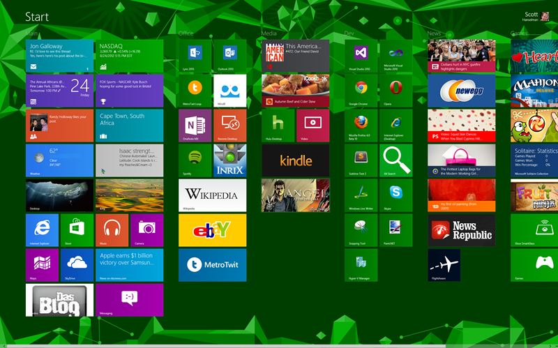
Now you have a bunch of icons without text labels, how do you know what does what? Obviously the 3rd party apps are clear if you use them, but the main Windows apps aren't clear. For example, what is that purple icon next to the blue clouds? (And what are the blue clouds? Weather? or is the Sun weather?)
1) Compared to a normal desktop, where most of your functional navigation is crammed into a small bar (which has pop-up cascading menus filled potentially with stacks of small application shortcuts, and lots of folders) a full screen of evenly-sized tiles with prominent identifying symbols seems okay to me. Maybe even an improvement, once you factor in live-tile info display. And certainly it seems far simpler to use - it only has one level of depth - click on anything and you're in an application.
2) Metro does look a little odd with such a tall screen. It makes more sense on a widescreen laptop or tablet display. Also he chose a pretty garish background.
3) Also remember most of these icons are legacy. Will look better when more of your apps are Metro-ised.
4) And of course Metro looks best - really only makes sense - when seen and used in motion. Metro is an extremely fluid, motion-heavy OS - traditional WIMP in comparison is as heavy and immobile as a pile of rocks.
5) Purple icon is maps. Blue clouds are skydrive (cloud service.) Sun is weather (once you've used the app once, local weather conditions are displayed on the tile.)
>> Compared to a normal desktop, where most of your functional navigation is crammed into a small bar
This is a taste thing. Myself, I'll take the crammed bar over the grid any day.
Even though I'm primarily a Mac user these days, I'm a Luddite when it comes to Windows - I still prefer the look and feel of Windows 2000 over its successors.
I love that they managed to fail to fit 5-letter section titles without ellipsis, preferring to have part of the work in a giant find and to save room for vast tracts of empty space.
I'm always surprised at how many of my non-techie friends struggle with keyboard shortcuts; it seems to be deeply counterintuitive to me, some of the contortions that people go through because, cognitively, they wont or can't devote space to the shortcuts. I have a sneaking suspicion that the sort of fearful respect with which they treat computers is the norm. Anything that makes using a computer simpler is IMHO a good thing; if it increases the utility f computers for the 99% at the cost of messing with the expectations of the 1%, well that seems like a reasonable trade off to make.
Just installed Win 8 in Parallels on an rMBP and I have to be honest, I don't hate it as much as when I tried the preview release in a window on an iMac.
Some of the tips in this article are great and the more you dig, the more you find they actually HAVE improved a lot of things in the 'old' OS as well (this seems to get ignored/glossed over in alot of reviews, especially the negative ones).
So far, Metro/Win8 is just a toy without touch. I honestly can't see myself getting much work done here but it seems to keep out of the way enough.
Ultimately (for me), would I use Windows at all unless I had to for work? And would I replace OS X 10.8 with Win8 as my primary OS? Quite simply: hell no. You'll have to pry this rMBP out of my cold dead hands (not just because Retina is such a game changer visually - I still MUCH prefer the speed, power, efficiency, apps and overall experience of OS X. It's no competition IMO).
Whether Win8 is a winner on touch devices like Surface, time will tell. Metro/Win8 is nice enough but there are next to zero apps for it. I'm also still not convinced having the 'old desktop' on a tablet really is what people are going to want. Obviously it's a stopgap until Win8 takes off but is it really much of a selling point? Anyone who has done RDP or Citrix from an iPad can get an idea of what it's like (I've used it enough times to know): It's OK in a pinch, but shoot me if I had to use it to actually get serious work done.
Microsoft have definitely thrown a Hail Mary here, not long to find out if it will work...
> I'm also still not convinced having the 'old desktop' on a tablet really is what people are going to want
Just a note that ARM tablets running WinRT will not have the desktop, except for few Microsoft programs, specifically office. So, we really don't need to worry too much about the old desktop on a tablet problem. For tablets like the surface pro, running Win8 x86, I don't see why using a mouse would be a big deal if you are power user-y enough to specifically get the not ARM version of the tablet.
I really didn't like idea of mixing metro with normal desktop style of work. Now, after two weeks of using it on work and at home, I can just say that it works great - metro doesn't interfere with desktop apps, I'm using them like i did on win7, and win8 is better with regular desktop style of work in every way!
Startup/shutdown speed is also totally awesome, even I basically don't power off my computer, never.
So, now, when there's no much metro style apps, win8 as desktop OS works great, and in about one year when Store fills up, it'll be even better.
Other things I really like that are much improved over win7: HyperV inside OS, ISO Mount, multi-monitor support (taskbar, wallpapers), cloud integration, copy/delete/move dialogs with speed graph, task manager.
So I guess windows 8 is fine for super-experts who know all the shortcuts, as well as for the completely new. But I expect both categories make up quite a small proportion of the userbase.
This seems a more common trend. Windows really was the exception, where they aimed to please neither professionals, nor "average consumers", but this mythical "poweruser".
They didnt exist, Microsoft created them. And that was not a good thing. Many of them had a beaten wife syndrome: they became experts because even doing mundane trivial tasks, like burning a cd, organising your documents, installing software, required "poweruser level skills". Now they are afraid of change. They worry, they have to relearn all they know. They prefer to stick to the man they already know. Sure, he may beat them, but after all these years they know where its going hurt, and what his triggers are. Who knows how much more another man will beat them?
Im glad Microsoft is cleaning ship, and i understand that the windows "power users" will need counseling. I dont like the walled garden future though. But wouldnt it be great if my mom buys a new pc and she was actually capable of doing things with it, like she can with her ipad, without needing the assistance of a power user?
So, there i stand: death to the poweruser. They have to either man up and get professional, or lounge in the casual area, but lets not have them keep things back. From people being scared of shortcuts or powerusers dismissing linux because they have nightmares of terminal commands. Grow a pair, or embrace the new usability for casual users.
>Im glad Microsoft is cleaning ship, and i understand that the windows "power users" will need counseling.
I think the subtext of these posts is that time will tell if they're cleaning ship or just filling it with a whole new generation of powerusers around a system designed primarily for casual use. That's nothing to say if casual users find it useful either. Ultimately the whole casual/power user is sort of a false dichotomy. On a long enough curve, all users are powerusers for their case.
I agree that time will tell if they were able to clean the ship succesfully. But all the complaining about how radical the changes are for powerusers at least suggest they are honestly trying for once.
I like the curve analogy. It seems to suggest that good UI is like a partial ordering of usecases, where there is a clear relationship between complexity, position on the learning curve and popularity of the usecase.
From that perspective one might say the traditional windows desktop starts off its learning curve with too much complexity and puts system maintainance tasks too far down on the curve.
What I don't like is that Windows is forcing users into a specific interface paradigm. In the Linux world, most distributions offer a wide variety of desktop paradigms, so when Ubuntu wanted to switch to Unity, users were just a couple of clicks away from logging into Ubuntu Classic (Gnome2), or if they don't like any of the ones that come pre-installed, they can easily install others. That way, you can have one computer with a "traditional" interface (Gnome2, qvwm...), an innovative interface (Gnome3, Unity...), and different types that just never got mainstream attention (xmonad, Awesome ...)
Besides giving users choice and creating competition, this allows people to experiment and inovate with new systems with much less risk than Windows model of forcing people to use their latest and hoping for the best.
If you pander to people who are scared of change you will move forward so slowly you might as well stop. I feel that Microsoft haven't pushed hard enough for change.
I'm tired of all the people complaining about change. I love Unity on Ubuntu. It took a little getting used to but it didn't stop my computer from being functional. I could do everything I could before just in a slightly different way.
Change is awesome and all you bitches need to stop tripping on some old bullshit.
You in the minority of people who actually give a shit about the thing that sits in front of them in the office and find it interesting.
The rest of the planet just want it to work just how it always did and piss off at the end of the day so they can go home, cook dinner, dig holes in the garden, watch television, build LEGO with their kids and play golf.
Our job as software engineers is to SERVE those people unconditionally, make their lives less laborious and to reduce the burden of their jobs. After all what else is technology for?
Marketing driven change does nothing but enslave people further and demand more attention. Incremental changes and improvements are much more useful as they allow people to adapt slowly without having to deal with life-changing events every few years.
To hell with everyone who doesn't see it this way - you are doing a disservice to humanity.
That way there would no progress at all. When Windows 95 came out, there was a huge bunch of folks that wanted to stick to Windows 3.11 because Windows 95 was a big change. There was even an animation at boot-up that pointed to the Start button saying 'Click Here'. If we listened to those folks, we would not even have a task bar that no wants to switch from now.
Also, see the below:
The Macintosh uses an experimental pointing device called a 'mouse.' There is no evidence that people want to use these things. -- John Dvorak
That depends on how you define progress. If you are talking about efficiency of getting things done, then I would say the move to GUI/mouse based interfaces as the standard is a step in the wrong direction. As is the to a composting window manager. I'm not saying there are not uses where these systems are more efficient, but for most cases they are less efficient.
However, these are examples of improved usability for inexperienced users. For example, typing "cp -r important /mnt/thumbdrive" is more efficient than opening the file explorer, copying 'important', navigating to 'thumbdrive' and pasting (especially with tab completion), however it is far easier for a new user.
In the same way, it looks like Microsoft is again trading productivity for usability. Unfourtuantly, it is very difficult to avoid the trade-off, because productivity comes from the interface making commands as short as possible, and making the feedback contain as little non-content information as possible. Where as usability comes from making the input verbose/forgiving (which requires repetition) and the output needs to provide information on how to use the interface, which takes away from the ability to output content.
For example, vim is a highly productive editor, there is 1 line at the bottom for non-content information, and the input is short and (necessarily) cryptic. You also have gedit, another plain-text editor, however, instead of the cryptic key bindings, it has a slow and easy interface. So "ESC /foo/bar/g" becomes "(hand to mouse) Search>>Replace (hand to keyboard) foo (hand to mouse) (mouse move, click)(hand to keyboard) bar (hand to mouse) (mouse move, click) (mouse move, click)"
Or, if you are good with key commands, geddit has "^H, foo TAB TAB bar TAB*7 enter ALT+F4", still slower then vim, and it takes up more precious space.
The difference with Unity on Ubuntu is that they still made it easy to use Gnome2. For that matter, they made it easy to use Awesome, and I can almost guarantee a tiling window manager will never become the default window manager. The other benefit to this system, besides user choice, is that while the current system is in widespread use, people can still improve the old/different system, and the systems can steal ideas from each other, and everyone ends up with a better product.
As someone who primarily runs Ubuntu Linux and Mountain Lion, the interfaces and screenshots in the article definitely look pretty neat. I haven't had a chance to install Windows 8, and I definitely don't like the ideas about restricting the platform more. However, from an interface perspective, am I alone in thinking that it could be a positive change? (Maybe I am jaded from going through the Ubuntu Gnome -> Unity transition)
I haven't used Win8, so maybe I'm completely off-base here, but from the article it sounds like removal of the Start Menu has made it difficult to do a lot of things without either typing in commands or memorizing special key combinations (see, for example, the section called "Run Power User or Administrative Tools - WinKey+X is EVERYTHING").
So, how does anyone get anything done using Win8 on a tablet that doesn't have a keyboard?
Just out of curiosity, does anyone try to get things done with a tablet? With the exception of pen-based note taking and drawing, all the activities I do on a tablet are consumption based (reading, web browsing, etc.) and easy to accomplish using Windows 8's metro interface. With that in mind, I think the added keyboard shortcuts really help clean up the interface for tablet users while giving desktop and notebook users a fast way of getting things done.
But to answer your question, I think the real plan is that you don't try to do your work on a Windows 8 tablet without a keyboard. Instead, you get a lightweight, convertible Windows 8 tablet. That way, you can have your cake and eat it too.
Actually, you can even get around the need for shortcut keys for admin tools if you really need to. Admin tools can be added to the start screen from the settings menu on the home screen: Settings -> Tiles -> "Show administrative tools".For other applications, if you don't want to interact with the tiles, you can hit the Win key and just start typing to search for applications, just as you could in Win7.
I especially liked the "Disclaimer: I don't work for the Windows Team" line. Nowhere does he say anything about Microsoft proper, just the Windows Team.
Just wait, in 6 months, we'll see that Mr. Hanselman was paid for this pro-Metro blog post. By then, the positive spin will have made us all forget the past two months of anti-Metro postings.
I really love the improvements in Windows 8 that have been made to the standard desktop applications.
It's just a shame that they bolted on Metro and then force feed it to you by making it your start menu. The metro interface is truly unintuitive. I feel more at home on in OS X than I do in Metro, and I hate OS X.
I wouldn't be surprised to see some pushback from "normal" Windows users that return new machines because they expected "windows" and got "some sort of tile OS".
windows 8 is particularly bad on a 30 inch monitor when running its native metro apps in full screen with no ability to re-size anything.
this may work great for a 10 inch tablet screen but its a serious problem for any modern professional workstation/content creation setup.
i also had issues (explorer freezing) with my external USB3 drive even for simple things like copying files back and forth.
it seems like with each iteration of Windows the basic file copy operation gets slower and slower. all this on hardware that's current. (win7 experience score 7.9)
i'd rather be focused on making cheese instead of figuring out who moved it where.
How likely are people using a professional workstation/content creation setup to use metro? Until their creation/development/productivity apps are developed and optimized for the type of machines they use (large monitors, etc..) as metro apps, they'll continue to use them in the desktop as they always have. I think the only time I really see the metro/start screen when I'm in windows 8 is when I'm developing metro apps, everything else I see in the desktop.
Actually the Windows RT apps (metro apps) are REQUIRED (if they want to be in the store) to support split screening and they change their orientation to do so as well.
Once in a while I will throw out a useless and nonconstructive comment:
Isn't it super cute to see these windows "power-users" at work? Pretending that their new OS is for anything other than their grandma checking their email? And look at all you "hackers" congratulating Microsoft for an improvement on the dumbest series of operating systems (per dollar spent on it) of the last two decades. Awww, the intellectual poverty is really adorable.
You can thank Windows for this. Back in the day when we went from DOS to Windows, this notion of a "proper shutdown" was introduced, and God forbid you press the power button, or bad things would happen.
I'm not positive Windows was the first to do this, but I think it's safe to say it was the one that started this habit for most people.
And now, it has became so engraved in our brain that it's nearly impossible to un-train. I to this day never use the power button on any device to shut it down out of uncertainty that I don't know what will happen[1] if I do.
[1]http://www.aeropause.com/wordpress/archives/images/2008/11/a...