> Put a hook on the x to distinguish it from a times sign
This is counterproductive IMO, because it makes it look like a chi. (The article notes the problem.) That seems more likely to cause issues than the possible ambiguity with the “times” symbol (“×”). If you need a multiplication symbol, use the middle dot (“·”) instead.
I make my x's with a backwards c and a c, like Computer Mondern and lots of fonts https://i.ibb.co/8LPsJKsj/image.png - doesn't look much like a chi or a times sign
No one in the target audience is using × for scalar multiplication.
I think it's important to consider audience. If I'm working with the intent that what I write is legible to folks who only have a basic understanding of math, I'll usually use the multiplication symbol (NOT the letter x, but ×, intentionally in the middle). Someone with more advanced knowledge of math, who may be more inclined to think it's an x, because my handwriting is shit, I will typically use the dot operator. But then there's the whole other audience where I need to define what the dot operator does. At that point, I'm probably pulling up something like LaTeX, because, again, my handwriting sucks.
Funnily enough, when I write for the purpose of math, my numbers are more legible than when I just write down a number. For some reason, I code switch in my handwriting. Kinda obnoxious when I'm filling out forms.
sure, but in that context there's no ambiguity (and technically, it's not the "times" symbol, that's the cross product symbol). We don't really use "x" in vector maths, it's all "a", "b", "v1", "v2", etc =)
(at best you might use a .x subscript for 3D graphics but when did anyone ever do that by hand)
In Sweden, with scalars, we used vertically centered dot, but even that is pretty uncommon since most of the time, two letters or a letter and a number are mixed and then it is left it out altogether.
There’s an old joke about “mathematical maturity” meaning being able to write a lowercase zeta, but I took enough classes from professors that would confuse xi and zeta that it probably doesn’t matter that much.
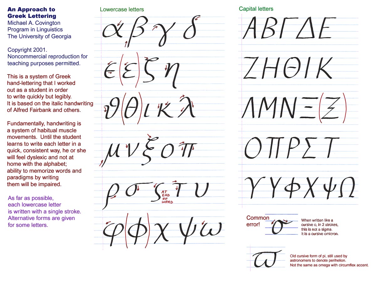
This is a good resource, and pretty much what I tell students in my classes. I take great care to explain how to write symbols, and I also give multiple pronunciations of the Greek letters.
Students with math and physics backgrounds are fine with Greek letters and other mathematical symbols, but the biologists in the class are mystified. They also get terribly confused when I reuse symbols for different purposes.
What I've discovered is that the students who have trouble with mathematical notation and reasoning got derailed when a teacher, in an early grade, said "let x be the unknown". That is a phrase that never comes up in other contexts, and I think it throws them off track. Many find it difficult to get back on-track later, so they memorize and sleep-walk their way through other mathematics classes until the system no longer insists that they take them. A shame, really.
> got derailed when a teacher, in an early grade, said "let x be the unknown"
I don't have the experience to know myself, but I imagine that there are various triggers of early mathematical derailment. It would be interesting to see a list of common causes.
Personally I find it hard to internalise canonical notation. Like f and F in probability theory, which is which again?
> I imagine that there are various triggers of early mathematical derailment
I have come to believe that the main trigger by far is the attitude of society. Of parents, family, friends, tv stars, heck even many (non math) teachers. "I wasn't good at math haha" is such a standard phrase to hear, and parents telling their kids that they don't need to worry if they "don't get it" as if it's some mystical topic that only a few gifted can unlock. Plus the uncool stigma attached to "math nerds", folks who simply have an open mind to try to "get it", turns out that it isn't actually that hard. At least when talking high school math or some basic college classes.
> Personally I find it hard to internalise canonical notation. Like f and F in probability theory, which is which again?
Probability theory's notation isn't very canonized. The typical usage, f for PDF and F for CDF, is easy to remember from the calculus notation of uppercase being an integral of the lowercase.
I found this little pocket mathematics notation book when I first studying undergrad in this used book store in Boston. it literally carried me through Calc, Linalg, stats, dynamic programming, stochastic processes, game theory, economics, etc.
I ended up copying it by hand along with every exam and test notes over my entire degree into one little moleskine notebook. its a god send any time I have to remember how to do something or learn something new.
There are two other phis with the (non-mathematical) Greek letters earlier, but unfortunately fonts vary in which one they display as \phi or \varphi: φ (U+03CD), ϕ (U+03DC).
I find these quite interesting and I would be very surprised if these were not the actual common way of writing in cursive learned in school?
When I was growing up in Bulgaria my first 7 (I would write the 7 crossed by default for example, the Z as well) grades were in a school where we learned German (and Russian as a secondary foreign language) and I remember distinctly handwriting practice in German using more or less the same ways outlined in this article. Is this way of writing cursive not common in the US/UK?
Reading Greek is easy for _most_ Bulgarians (inventors of Cyrillic if you didn't know that) as you can imagine. Them being a geographical neighbor and the close historical ties etc.
The "z" in particular with the crossbar wasn't a thing for any version of writing I learned, and they're missing the leading/trailing tails for most of their versions of the lowercase letters. Even in printing - I learned to write an "l" as a vertical line with a tail to the right, so it's different from 1 or I without a cursive loop.
Funny enough in "digits" section: "Put a loop on the 2 so it doesn’t look like a z" - The looped version is identical to a cursive uppercase "Q".
ISTR the origin of Cyril and Methodius (the two monks that created the precursor to the cyrillic alphabet, can't remember the exact name of that alphabet ATM) cannot be pinpointed as either Greek or Bulgarian because no such documentation has been found. They surely were Byzantine, though.
Cyril and Methodius didn't create Cyrillic. That's a very common misconception. They created the Glagolitic[1] alphabet which was a precursor script. Cyrillic was developed later by their students and other scholars in the Preslav Literary School[2]. They named it Cyrillic to honour the brothers, but the brothers themselves didn't create Cyrillic.
EDIT: Sorry, I misread what you wrote. It's late and it's been a long day. You weren't saying the brothers created Cyrillic. As for whether they were Greek/Bulgarian I cannot say. I've read different opinions on that throughout the years. Definitely Byzantine, but anything else I cannot say.
Your snark comment is out of place since if you knew something about Cyrillic you'll know that most letters have 1:1 mapping with their Greek counterparts. And since Bulgarian language does use Cyrillic the jump to Greek is quite short. You could argue that there's a bigger difference in pronunciation of letters between English, German and French which all use the Latin alphabet than between Cyrillic and Greek.
I was once taking a real analysis class and there was a very gifted student in my class. She pulled out her notebook one day at a study session and I noticed it was kind of unusual - the pages were very large, and made of a somewhat thicker material, with a slightly rougher texture. Ink also seems to set onto its surface slightly nicer, and it doesn't really bleed through onto the other side either.
She explained to me that it was actually a kind of notebook specifically for artists, and that she much preferred it to the normal plain paper notebooks you typically get.
I bought one myself, and I had to agree with her - it was a much 'nicer' experience to write on it - diagrams could be way less cramped, branch out without hitting the edges. The tactile feedback due to the thickness of the paper was also nice - in a way, it felt like the "mechanical keyboard" of paper notebooks.
Never switched back again after that, and many people I work with have found it curious and nice to work with too.
Part of me feels that there may be more than just a gimmick to this. In the way that it's been shown that pen and paper help for understanding versus typing, I wonder if "the niceness of the pen and paper experience" would have an additional tangible positive effect, too
This is famously how Maryam Mirzakhani worked as well. Huge thick A2 sheets where she doodled and did computations; she said she disliked the cramped style of normal notebooks.
I used plain for a few years but it has some problems. I now use faint lined paper. Usually Muji notebooks. I leave a blank line between each statement. The lines are handy if you want to make something readable and well aligned which is fairly important. Scans fine.
My kids were forced to use heavily marked blue squared paper. They had problems writing and reading. I pointed this out to their mathematics teacher and said that it may be detrimental and got a diatribe of “what do you know”. Such a bad attitude. I had an answer to this which was embarrassing to him.
I assume most middle school teachers specify how papers should be organized in binders and labeled with names, dates, etc; but below was my method I developed halfway through college:
Top Margin use: left - name, center - class, right - date
One binder per semester; a divider for each class; handouts, tests, etc were hole-punched and placed with my notes in chronological order.
If my notes didn't make sense as I was copying down what the professor did, I would rewrite my notes later that day while figuring the problem-solving process out and making the notes/arithmetic easier to follow.
This method also applied to non-math-related classes.
I love engineering paper too! My weapon of choice is this pad: https://www.rspaperproducts.com/products/95182/ I have not tried the Tops yet, I think because I saw somewhere it was thinner? I like the slightly thicker paper the buff pads come with, and it plays nice with my fountain pens.
Worth nothing you don't need squared for mathematics. Not even slightly. Most of the stuff is written in English with a few lines of other stuff between.
I don't think I needed squares for any of my notes. Graphes that I drew were just approximate. The squares are great for indentations, lists, tables, etc. My notes always looked sharper on engineering paper than regular ruled paper.
Agreed. I did a pure math degree where most of my classes involved copying down 2-3 pages of axioms/proof per lecture, and I settled on mead letter size college ruled spiral notebooks, and yellow note pads for scratch work. Wide ruled led to too much wasted space, graph paper was visually busy and led to awkwardly spaced letters, dot paper just didn't really work. Smaller paper sizes didn't end up holding enough information per page, spiral binding was best for being able to rip out and toss pages, the perforation was nice for the occasional hand in sheet, and I had no need for a nicer quality paper.
Also I always kept Pentel Twist Erase III mechanical pencils with 0.5 mm lead, Hagoromo chalk, and a 4 color set of chunky expo markers in my bag.
I switched to plain white when I was ca 20 years old and never looked back. I need to use plain white since then and I am so used to it that I find lines or grids slightly offensive to me and it throws me off from layouting. You can get used to anything.
Grid or lined, placed underneath thinner blank paper (heavier paper won't let the lines or grid show through as easily, if at all). Keeps the final presentation neat while giving the structure you may need to keep things aligned.
Squares are pointless unless you're drawing graphs, but lines are very handy to have. Without lines my writing moves on an angle and the size of everything becomes inconsistent and usually too large.
I like squares because they allow me to align things vertically.
This is especially useful when maintaining two margins to write in as well as for indenting, blockauotes, or sometimes maintaining parallel lists or columns.
Also, when I look at the prices on amazon.se it looks like they cost around 5-10c each, a bit hefty for a student.
Another note, it was actually surprisingly difficult even to get a hold of blank paper notepads in Sweden in the 90s. At least cheap enough. The cheap ones were all lines or squares.
Even today for students constrained financially, they can print out a dot grid on blank printer paper, perhaps in a faint blue or grey to recreate the effect.
You get a nice mix of benefits of blank paper and graph paper.
that's right with mechanical pencils written on a proper writing surface with plenty of arm/elbow space with real erasers for completely removing noise from mistakes.
It's incredible to realize how many of the habits mentioned in this post that I've unintentionally picked up while studying applied math. Even after graduation, I still follow a lot of these 'conventions'.
A friend related to me that at a maths seminar recently, the speaker "accidentally reused the letter z. and saved himself by erasing the crossbar from one set of z, and naming them zed vs. zee"
Crossing the Z is a good one. I cross 0 but understand the point with phi. Something that’s not mentioned is y (lowercase) and how they can look like a 4
I never used to cross my zeros until I was spending some time writing a lot of diagrams that had both O (for oxygen) and 0 (for the numeric label). It got very confusing!
I never took a real chem or bio class, but more than half my degree involved classes where 0 and ∅ were extremely frequently used. Thankfully no math or CS professor is stupid enough to use the letter o as a symbol or variable name.
I started crossing the Z in college because I was tired of messing things up because I confused a Z for a 2. I only crossed the 0 when Os showed up and it could be confusing. Similarly my 1s would get the hat and feet if I felt like it wasn't clear what it was.
I can't say I ever had trouble with y and 4 looking the same. I use the open 4 but the y has one less angle and it sits lower. If anything a y is more likely to look like a v if you can't see the descender clearly
I always cross my zs in maths to distinguish them from 2s, but in some countries they cross the 2s to distinguish them from zs, so the ambiguities remain.
I started crossing Z, 7, 0 and generally writing in as unambiguous a manner as possible in my math homework because I was afraid of the teacher reading it wrong and taking points off.
I used to work in a field that used \Sigma for covariance matrices, and pervasively needed discrete summations which also use \Sigma (and often with an understood index set, so the \Sigma appears without clarifying adornment).
I ended up writing my discrete summation \Sigma's with a little serif on the bottom, and ordinary \Sigma's as in OP, with 4 quick back-and-forth strokes.
\times denotes the cartesian product (to my knowledge) universally.
If 3rd-semester calculus is when you introduce a general definition of continuity (I am not from the US, wouldn't know how the programs usually work there) on either metric or topological spaces, the cartesian product starts to appear quite a lot I guess ?
Typically in the US, the calculus sequence is one semester differentiation, one semester integration, and a third semester of three dimensional and vector calculus. The × symbol is used a lot for vector cross products in the third semester. Typically these courses don't involve proofs. Serious students frequently take a portion of this sequence +/- matrix algebra in high school as AP courses or dual enrollment where the school cooperates with a local college to share their exams and get official credit. They are technically considered to be college level courses in the US. I think a lot of the content in them is covered in A level further maths or IB HL math or whatever your local equivalent is.
This sequence is followed by differential equations courses for the physicists, engineers, and most mathematics majors. Then every college has a mechanism to generate mathematical maturity in their first or second year pure math majors - sometimes it's a proof focused version of linear algebra, sometimes it's a specific Introduction to Proofs course, sometimes it's a discrete math/set theory course, sometimes it's groups/rings or real analysis but slowed down a bit at first. This gates the upper level pure mathematics courses, where most programs require one semester each of algebra and analysis and some number of elective courses.
A general definition of continuity typically doesn't arise until a topology course or a second semester real analysis course. It is entirely possible to graduate from most mathematics bachelor's programs in the US without taking either of those courses.
In my experience it would not be typical to use a wedge to represent a cross product. Typically a wedge is used to refer to the outer/exterior product, which in three dimensions would correspond to a bivector as opposed to the vector you get from a cross product.
Wikipedia says it’s more common in physics, and we mostly used it in that context (e.g. fluid mechanics) rather than pure math. It was pronounced “veck”, IIRC.
Most important to me was something not mentioned here: to make i/j les ambiguous, I but effort into explicitly add the right swoop at the bottom of the i, which allowed for the j to be a straight longish line dotted at the top.
This is remarkably thorough! But it's missing one very common case: lowercase a vs. u (or v). If you're trying to make your handwriting more legible, don't skip this case-- figure out a way to be intentional about it because it's so common. :)
Here's mine:
My u's have the little curved tail to distinguish them clearly from v's. And then, to further differentiate a vs. u, I deviate from the norms for fonts and make my handwritten lowercase a look like a half-height uppercase a with a curved top.
Honestly I only really use about 1/4 of the tips in this cheat sheet. But, the a vs. u trick is where I actually make the most impact by being intentional about my handwritten 'font' (with l/i vs 1, t vs. +, and x vs. × being the runner ups).
And the main reason I don't use the 'a' that fonts like this HN font use is that can look a lot like a 2 with the loop when drawn quickly (and I draw my 2's with loops so that they don't look like uncrossed z's or equal signs with an 'I failed to pick up my pen completely ' diagonal) ;-P
I changed the way I wrote my y's (now very curly) and z's (now crossed) in college while studying math after realizing I was making silly mistakes changing y's to x's and z's to 2's.
I came up with similar rules over decades (I still write sometimes mathematical symbols), and I have to only take care of my "u" vs "n" and "r" vs "v", and write these pairs especially slowly because in my handwriting (especially u and n) look the same.
But for all the others I’ve developed similar disambiguations.
I've seen Greek computer scientists write Omega as an underlined O. Much easier than trying to approximate the printed letter Ω but still unambiguous, unless you use underlining to denote something in your formulas.
While we're here, any suggestions on what works better for writing math to a digital whiteboard? Wacom type tablet with no display, or an ipad type tablet with pen?
This is a very personal choice. A Surface-style tablet pc works best for me. The accuracy difference between an "active" Wacom pen and a glorified piece of plastic is noticeable. Display-less Wacoms have a much steeper learning curve before you produce good handwriting.
A display is much better for this. I recommend Samsung tablets, as the Wacom stylus they use can't awkwardly run out of battery on you in the middle of a class.
I would imagine something where you can see the immediate results of what you're writing under your pen to be better, otherwise you'd have to be facing the board somehow and not the class
I’m European and write it as a cross as well, although others don’t. For some reason I feel that “)(” is just an entirely different shape topologically, not an “x”.
It's writing the strokes that feels wrong, not simply the appearance. If I wanted the curvy appearance, I would still want draw the lines as two roughly diagonal crossing lines.
nice writeup, I always like taking extra care to view the actual motions a professor uses when writing the symbols on the board as it can sometimes be non-obvious the order or direction to start in.
would also love tips on making right curly brackets not be the bane of my existence. I don't get it, I write a right one basically for every left and yet they feel so different!
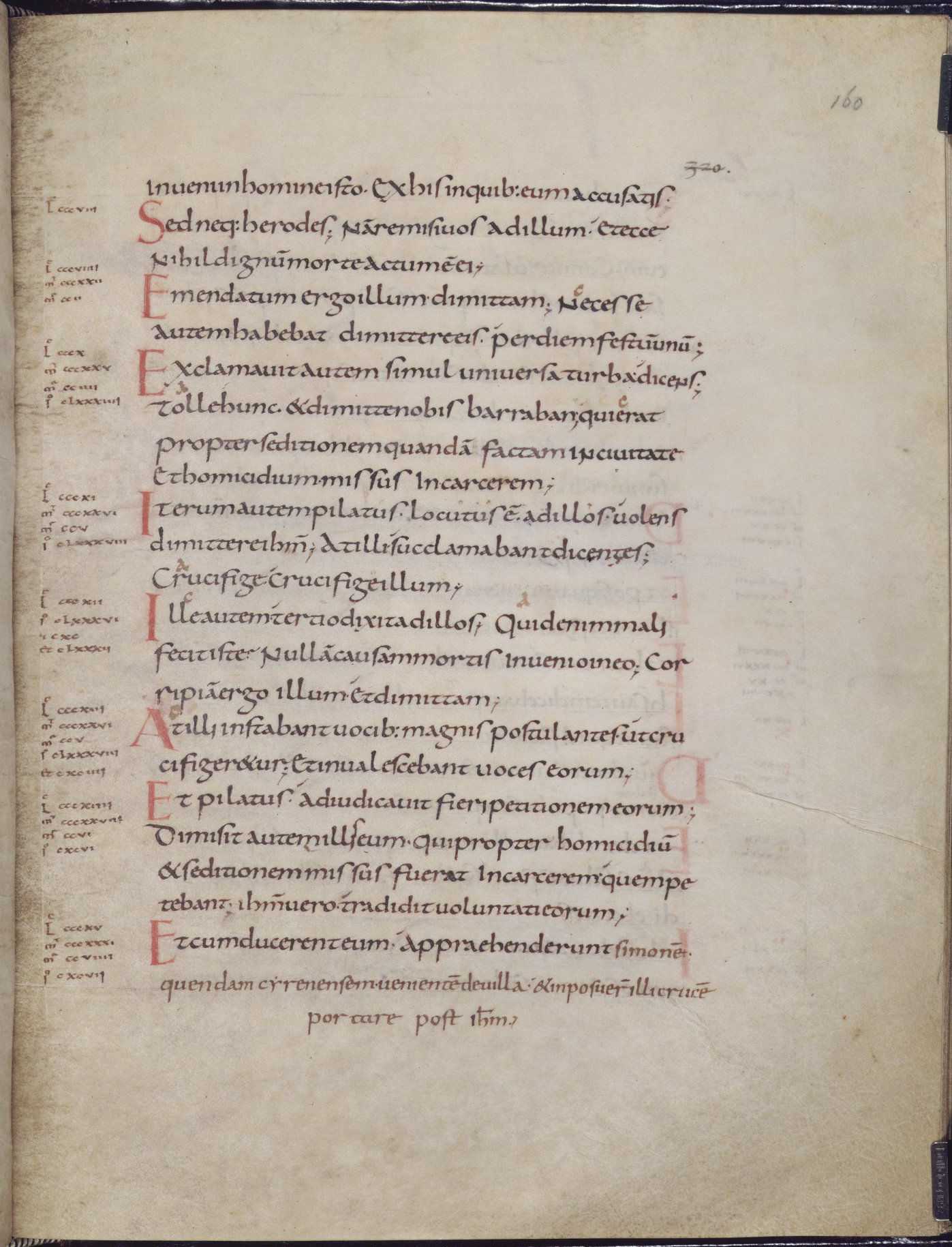
The original Carolingian lowercase "l" from 1200 years ago had a small right hook at the inferior end, which made it easily distinguishable from other similar letters, like uppercase "I".
Unfortunately after the invention of printing there has been a bad fashion in serif typefaces that made lowercase "l' too similar with other letters, by replacing the traditional hook with a serif identical to the serifs of all letters that end on the baseline, so that the only difference from uppercase "I" remained in a triangular left serif added to the upper end.
Even worse, in the 19th century, after sans-serif typefaces became popular, most of them have simplified lowercase "l" even more, making it almost identical with uppercase "I".
Nevertheless, while many of the typefaces used today follow the bad styles of serif or sans-serif designs with hard to distinguish lowercase "l", there exists a decent number of typefaces which have returned to the original form of lowercase "l", with a right hook at the lower end, which is easy to differentiate from any other letters. I am using almost only this kind of typefaces. Examples are Palatino Sans and FF Meta, but there are many others. Also all recent monospace typefaces intended for programming have such lowerspace "l" (being a narrow letter, in monospace typefaces lowercase "l" also has a left slab serif at the upper end, to expand its width).
In handwriting, the best solution for lowercase "l" is not to make it cursive like suggested in the parent article, but to make it with a low right hook, like in its original ancient form.
> The original Carolingian lowercase "l" from 1200 years ago had a small right hook at the inferior end, which made it easily distinguishable from other similar letters, like uppercase "I".
It might help a little. "Easily distinguishable" is dramatically overselling things.
I, capital and lowercase, also has a serif hooking to the right at the bottom of the stroke. Look at the first line beginning with a big red I.
It says "Iterum autem pilatus locutus ẽ. ad illos volens".
The line above it says "Et homicidium missus In carcerem;".
How much difference do you see between the capital I in "In carcerem" and the lowercase L in "pilatus"?
It's easy to distinguish lowercase L from lowercase i because L is taller. Capital I is only slightly different.
(I should note that wikipedia's page on Carolingian minuscule also includes an image of a page of written Slovene. I couldn't really use that as an example, because without any knowledge of Slovene I can't reliably identify the letters. But I think that goes to show that the alphabet by itself doesn't reach the level of perfect unambiguity.)
I'm interested to see that all Ses look the same. At some point we got word-final "s", but this was clearly not that point.
Perhaps this is because I am used to it, but for me the lowercase "l"s from your example are impossible to confuse with any other letter. For me the hooks are very visible and clearly distinct from any other kind of stroke termination.
The serif at the lower end of capital "I" is bilateral symmetrical, besides having a flat termination, so it looks very different from the asymmetric and curved right hook on lowercase "l".
Also in my handwriting, I write lowercase "l" with a right hook and uppercase "I" with serifs, making them impossible to confuse.
It is true that unlike the capital "I" that starts the row immediately below, your "I" happens to have a shorter left serif, either because it has become erased due to the age of the manuscript or because it has been poorly written originally.
Despite this defect of this particular letter, which is not a frequently seen defect, I still cannot see how the right serif could be confused with a right hook. The letters would have to be much more degraded for the difference between an orthogonal serif and a curved hook to become invisible.
I agree that the differences between the 6 narrow alphanumeric characters "1IJijl" are small so they are more likely to disappear when the letters are partially erased, but when the letters are intact and they have been written with the right distinct shapes they can still be distinguished easily, in contrast with some typefaces (usually sans-serif typefaces) where they are intentionally made more similar than they were traditionally, which has been a very bad idea, so such typefaces (e.g. Helvetica or Arial) should be avoided.
chuckle I'm teaching high school math, and I have students who are jedi knights of making ambiguous mathematical signs. They make their "1"'s with a long top serif, which make it look like it could be either a "1" or a "7". A "4" written with a curly hook on the bottom can be mistaken for an "8", etc etc.
Not to mention a glyph which is maximally ambiguous between "T" and "F" so that when grading true/false questions, could stand in for either :-)
If the students would put half as much effort into learning the material as they do in trying to trick teachers they would get straight A's ;-)
I'm probably too much of a stickler for high school. If I had students try to trick me with T/F confusion I'd immediately announce a "round towards the wrong answer" policy and watch 'em tidy up right quick.
Some european students threw me when I started grading in university though. Their 1s look like my 7s as you describe, but they cross their 7s to disambiguate.
The blog writer has particularly bad handwriting, and maybe that's why he needs these tricks. I've seen a lot of math handwriting, and seriously his is among the worst. Maybe he was drawing the letters with a mouse.
Mostly unrelated, but I wish the field of math would step away from greek letter notatation and just make variable and function names readable as programmers do. I know there are historic reasons, and I'm sure that mathematicians' time is so valuable that they can't be bothered to write more than 1 character, but it's a real barrier to entry in my opinion.
The use of the Greek alphabet is mostly driven by convention. You get used to it. They aren't just sprayed around randomly wherever you look.
As for your code, urgh. A mathematician would carefully define what the function and operands are and the domain of each. More, and I'm vasty simplifying here as I don't have LaTeX available. I don't know what your code does so I've invented some words.
Let f(x,y) represent the rate of change of doodads where x is the number of doodads and y is the amount of doodads per gronk.
The code is unclear because it has single-letter variables instead of names, exacerbated by being in Greek, which mathematicians reached for because they were using single-letter variables, and ran out of them, and weren't bold or imaginative enough to break from convention. Then they used up the best of the Greek letters too and moved on to things like Gothic. This is stupid.
No they didn't use them because they ran out. You know nothing about mathematics clearly. There are conventions to keep it concise. Some definitions of simple things would be unreadable if you used longer names. Consider the quotient rule:
> they can't be bothered to write more than 1 character
You try handwriting all of your code and let's see how long until you start abbreviating everything.
Mathematical notation is all abbreviations. We used to write mathematics without abbreviations. It was absolutely horrid. Try reading some 13th century mathematics, translated to your language (e.g. Fibonacci https://archive.org/details/laurence-sigler-fibonaccis-liber... ), and see how much of it you understand without the benefit of symbolic notation. We would even write aaa instead of a^3.
The point with mathematical notation is that it can all be sounded out and it's extremely general and abstract. Generally, x is not a measurement, a quantity with a unit, a meaningful anything. It's just a number, and x is a better name than front_server_count or whatever thing you're programming about.
A massive amount of day to day pure mathematics work is still done by hand, on paper, whiteboard, or even chalkboard (and there's a preferred brand of chalk). Of course it will all be typeset before sharing, but mathematicians typically think by writing by hand, not think by typing.
the vast majority of mathematical equations/terms would become completely unreadable if you replaced single symbols with descriptive terms. You are going to have to internalize what the symbols refer to anyways to understand the formula, and once that is accomplished any additional description is a waste of space and cognitive bandwidth.
We did try it. We tried it for a couple of millenia. It was much harder to understand and our collective mathematical output as a human species was much slower than it is now.
You know when you go to a foreign country, ask for a particular thing in a restaurant proudly in their language that you picked up on Duolingo the week before and the waiter starts talking to you quickly in their language and you lose it completely.
We are just that waiter. You didn't learn the language or get the prerequisite skills. So do that or don't bother. It's not easy and there are no shortcuts.
Even if i agreed with you that full words/phrases were easier to parse, any gains made here are easily offset by how much harder and laborious it is to manipulate them on paper
It's only a small part of the barrier to entry, though. I could write Einstein's equations out in words, and most people still wouldn't be able to do GR.
This is all very well but surely all mathematicians/engineers/scientists (n that) have considered this both for themselves and had it mentioned when being taught in relevant subjects, or simply noticed.
Who on earth screws up writing rho with a p? Yes, I know that someone will but they need to write the symbol properly.
Zed and two? RLY? (Crossing your Z is a Germanic thing for me, which is why I do it - I grew up in W Germany). Despite that, you would be in no doubt if I wrote a 2 or Z, because I know how to use a fucking pen and I am able to write.
To be fair, I come from an age where cursive means something!
We are heading into an era where being able to use a pen or pencil will border on arcane skills. Calligraphy isn't hard nor is ensuring you get your message across.
Cross your zeros but leave your Os alone (or dot them if you like - I do sometimes). Cross your zeds if you like. Write Greek letters as they should be - a lower case rho starts from the bottom right and is written in a single stroke - it never looks like a "p".
x (eks) is two curves and not a diagonal cross. Multiplication is . or adjacency of symbols, however it might be x depending on context.
The given advice is don't slash the zero. I disagree. Phi is fatter than tall - its not hard to be precise, which I would hope a mathematician might manage.
In the end can you write or not? If not, use a keyboard. Nothing wrong with that per se ...
I found your comment quite agressive, and a bit out of place.
I, for one, do have trouble getting others to read my handwriting (on boards mostly, on paper it's ok). I'm left-handed, and the system of traditional writing education you seem to value so much has left people like me unattended for most of recent history.
And it is not the kind of mentality that transpires from your comment that would have helped anything change as --thankfully-- it did.
> Zed and two? RLY? (Crossing your Z is a Germanic thing for me, which is why I do it - I grew up in W Germany).
Crossing z's was something I picked up naturally in the states in High School Algebra, for the reasons listed. It's not a matter of "can you write or not"—that a very weirdly dismissive line of argument—it's a matter of "how can you provide the most information redundancy so that when you're scribbling notes quickly you and others can decipher them later".
This advice in this article dates to 2007, so it's not a modern cope for the terrible handwriting of modern college kids like you seem to think.
> Who on earth screws up writing rho with a p? Yes, I know that someone will but they need to write the symbol properly.
That's literally the point of this piece: to provide help to people who are new to these symbols so they can both recognize the difference between them and write them distinctly.
Are you somehow under the impression that every just intuitively picks up the distinctions between these symbols?
This is counterproductive IMO, because it makes it look like a chi. (The article notes the problem.) That seems more likely to cause issues than the possible ambiguity with the “times” symbol (“×”). If you need a multiplication symbol, use the middle dot (“·”) instead.
reply