I was actually talking with some friends about just this recently.
Particularly, I speak Russian as well as English. In Russian, we actually have two separate words for blue: one for light blue and one for dark blue. They are completely different colors. My idea was that this actually changes how Russians view colors as compared to English speakers. Good to see my idea has some scientific backing :).
I personally am in a particularly odd position: I learned Russian first but still learned English at a very young age (5) and have since used it more. I'm not entirely certain how this has affected my view of blue, but I think I see it more like English speakers (e.g. not differentiating between the two blues intuitively) than Russian speakers. This probably says something about my relative comfort in the two languages.
Another interesting thing is that for the longest time I did not even realize that the difference was so fundamental. I just took it in stride. When I thought about it, it was a little weird: there is actually a different set of colors (rather than just shades of color) in the two languages. The fact that I could go from one set to the other without noticing is rather interesting as well.
Japanese has something like that, too. See, Japanese didn't always make the blue-green distinction[1]. Because of this, certain items get described as 青い (aoi - green/blue) even though modern Japanese contains a word for green. So both clear blue skies and green traffic lights are still called 青い.
The article states that most world languages do not actually make a distinction between blue and green.
To me this seems completely foreign, which is an interesting insight on how much I take my language for granted. I can't even imagine thinking of blue and green as the same color, just like most Russians can't imagine thinking of синий and голубой as the same color (blue).
While I was brought up in a Russian family (we still speak Russian at home), I went to an English school from the first grade, so for me the difference between синий and голубой is much less ingrained than the difference between blue and green. I think this just shows that while Russian is my first language, English has really become dominant, for better or for worse.
There's an old study claiming there's actually some logic in how the distinctions progress:
"According to Brent Berlin and Paul Kay's 1969 study Basic Color Terms: Their Universality and Evolution, distinct terms for brown, purple, pink, orange and grey will not emerge in a language until the language has made a distinction between green and blue. In their account of the development of color terms the first terms to emerge are those for white/black (or light/dark), red and green/yellow."
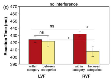
The results from the article -- that you are faster at recognizing across-category changes than within-category changes -- also hold for Russian speakers and the two blues. See:
Winawer, J., Witthoft, N., Frank, M. C., Wu, L., Wade, A., & Boroditsky, L. (2007). The Russian blues: Effects of language on color discrimination. Proceedings of the National Academy of Sciences, 108, 7780-7785.
Moreover, if you make people do a verbal task at the same time -- say, repeating a word aloud -- it makes this effect go away; but having people do a spatial task at the same time doesn't.
You are talking about goluboj (голубой) and sinij (синий). Interestingly, to me they are not completely different: goluboj has always been just like "light sinij", even though Russian has remained my only language for about 20 years.
In Hebrew they also have голубой-tcheleth, and синий-kahol; but the threshold is significantly closer to the lighter part, so there could be said to be no direct correlation between the words. It is so up there, I'd bet, they do actually think them different colors. Так вот.
> one for light blue and one for dark blue. They are completely different colors.
I initially thought you were referring to what we call "celeste" [1] in Spanish but after looking it up in the dictionary I found out that is not an entirely different color after all. "celeste" is actually defined in terms of blue, and I quote:
"1. loc. adj. azul más claro." which translates to "a lighter blue"
No, they are actually completely different colors. Moreover, there is no word that encompasses both. It is similar to the distinction between red and pink in English. (I don't think you would normally refer to a pink shade as red unless you were being very technical or something, and I can't think of a word that intuitively encompasses both reds and pinks.)
Looking around a bit, I found an interesting paper on the exact topic I was thinking about[1]. It turns out that the exact difference does affect color recognition, but the effect is "eliminated by a verbal, but not a spacial, dual task".
Of course, I think this is really the same effect as in the original article. The only reason it's important for me is that I experience it directly by knowing both languages.
Interestingly, Finnish had no word for pink (it was called light red, though a case could be made for roosa). There is one now (pinkki), but that's a loanword from English.
>No, they are actually completely different colors.
We use two different color names for dark and lighter blue in my language two.
But I find it hard to believe that Russians consider them "completely different colors".
Red and Green are completely different. Black and white. Orange and purple. The two colors for "blue" variations? Not so much.
And surely Russians can understand that, even if they consider the two different colors by name, because it's inherent in the concept of darker/lighter, or shades, etc.
(see also the answer of "cema", below).
I would guess that a Russian painter for example instinctively uses the exact same process of obtaining the two hues of blue from primary colors as a British painter...
When I think of pink, the first thing tha comes to mind is the "hot pink" used in breast cancer awareness and "girly stuff." This color is a mix of red and blue, putting it just shy of purple. I think magenta is the more correct name for it, but I'm more likely to attach pink to this color than to light red. Native English speaker, but there are probably other factors influencing our perception of colors.
Yes. Pink to my eyes is a kind of watered down red. Do you consider it any more different? Ie the kind of difference you get from purple vs yellow, or red vs green?
I have an opposite situation as a grown up learner of hungarian.
Hungarian has no "red", they have "blood/wine/redhead color" (vörös) and "sigarette pack/punk hair/paprika color" (piros).
As a foreigner I kept confusing them cause they do not map directly over the red names I know. I am _still_ not sure if darkness is all there is to the difference.
See this video related to what you just said. It is a clip from a BBC documentary about how a tribe has different color names than us and how it affects their ability to find an odd color out - http://www.youtube.com/watch?v=4b71rT9fU-I
I have the feeling that most HN readers have their colour perceptions affected far more by the limited spectrum of an RGB LCD than anything else.
For instance - I challenge anyone reading this to tell me what colours are not represented well on their screen. The spectrum is wide and 3 channels is really 'tolerable' rather than 'good' coverage. In reality there is a vast range of violets, reds and green-yellow-orange in the world that are represented as muddy-blurs of other colours rather than themselves on screen...
Nobody seems to make the same fuss over quality of colour and the visual spectrum on computers as say, audiophiles do about miniscule differences in what they hear. I'm not quite sure why this is.
This is true, but irrelevant. The human visual system adapts to reconstruct what it believes a surface color is, based on the colors of the overall image. Classic example:
So in truth, yes, the LCD spectrum is limited, but you can still achieve an overall "look and feel" regardless of the smaller gamut. Our perception of any specific color is dominated by other colors around it in the scene.
Thats a slightly separate point. Your mind sees colour in many different ways. One of these (at a higher-level) is as shapes and relative-tones as you describe. Other parts of the brain and the body work at a much lower-level however, which is why (for instance) people innately enjoy natural-sunshine and get depressed when sitting inside under lightbulbs (https://en.wikipedia.org/wiki/Seasonal_affective_disorder is one, well researched side of this).
Vitamin D basically IS presence of/lack of colour - because it is only produced when certain wavelengths of light ('colours') are present. As well as vitamin D there are also many other chemicals in the body which need certain wavelengths of light to be produced. See for instance web.mit.edu/dick/www/pdf/286.pdf (an 1980s but reasonable article not written by quacks)
That's an interesting thought and cheers for the link. I guess I tend to think of colours as only within the visual spectrum, and my understanding was that the chemical reactions were from UV and above, but I can see now that's kind of arbitrary thinking.
I agree with nopassrecover. Could you please provide a citation to research that demonstrates that we innately get depressed when not exposed to sunlight because we can't enjoy color differences as much? That seems to be a pretty audacious statement, and I've never heard it before.
To respond a little - I was trying to use "innately get depressed when not exposed to sunlight" as an example of something well researched showing that light affects people physically in ways that are not just 'seeing shape and contrast' (which sillysaurus' post seemed to be stating was the be-all and end-all of colour and vision).
Its a slightly different point to 'enjoying colour differences', which of course we do. Compare a sunset in real life (even behind a window) with that in a photo - for instance....
>To respond a little - I was trying to use "innately get depressed when not exposed to sunlight" as an example of something well researched showing that light affects people physically in ways that are not just 'seeing shape and contrast'
It could not be light as such though. It could be warmth from the sun that makes people depressed when not exposed to sunlight, or vitamin deficiency (some vitamins need sunlight to be usable).
Beware, though, that the effect shown in the video is much stronger than the one described in the article. Several of the comments suspect that the Himba tribe actually has a genetic difference that causes the linguistic one and not the other way around.
This is interesting because in Arabic colours are presented very differently than in English. I'm not sure about other languages but in Arabic colours are a bit more "looser" for lack of a better term. There are more shades of red for instance because Arabs were used to different shades of red in their horses and deserts. The colours are less defined for instance "the colour between red and brown" (as many horses are) or "the colour of ash" are used instead of "the colour red / grey". Colours also have properties and traits which define them (some colours are strong or thick and others are weak).
Perhaps any HN Arabic grammarians might be able to discuss this further.
Perhaps I've been warped by machine learning but it seems obvious to me that labeled color differences would be easier to distinguish. Since each time we used the word we would be training our brain to discriminate between color input patterns whose differences are not stark. Colors with no labels would not get many opportunities to be learned, but for the called out colors, on each use it would strengthen the connections between which ever set of associated neurons.
Language is not the only thing to train this difference. Hobbies and jobs should be able to as well. I suspect artists and photographers perceive subtle color gradations better than non artists; audiophiles, dancers, and musicians can pick out tempo and pitch much more readily, blind people can pick out echo patterns, engineers perceive catastrophic corner cases where normal people see an idea and a botanist sees a whole world where I just see grass and trees.
Much of 'evolutionary psychology' is based on really complicated mathematical models fit to very small samples, or no sample at all, expanded upon by lengthy blocks of meandering prose.
Just-so stories are a literary genre, not a science.
"Having a word for blue seems to make the color ‘pop’ a little more in our minds. "
A lot to digest in this article. The quote above reminded me of 'categorical perception' of musical notes among musicians (without perfect pitch) and the rest of us. Professional musicians seem to 'bin' frequencies near a tone centre into notes with sharp divisions between them.
This is very interesting stuff. I’m a native English speaker but also grew up learning French and other languages; to me, colour categories seem to be pretty much an arbitrary matter of convenience. There is no inherent distinction between light blue and dark blue in English, just as there is no distinction between pure and impure code in C++. You can introduce it artificially, it’s just that the language puts them in the same category.
Also, English may have only 11 “basic” colour categories, but there are loads more colour words than that, and you can get basically as specific as you like.
I also have a suspicion that I’m a tetrachromat, because I distinguish various red-orange colours that no one else seems to. Since I’m male, though, that would only be possible if I had two X chromosomes and the right mutations on both sides of my family—possible, but unlikely.
So if this is really true, I wonder how we should name colors for maximum usefulness? For instance, which set of names will help us tell colors apart better, "red orange yellow green blue violet" (http://en.wikipedia.org/wiki/File:Color_star-en.svg) from the RYB color model, or "red yellow green cyan blue magenta" (the six labeled angles on http://www.had2know.com/images/hsv-color-model.png) from the RGB model?
I suppose, for one thing, that it depends on whether we want to describe colors we often see in life (lots of blue sky, not many purple things) or the spectrum of colors evenly for looking at art.
As you might imagine, the print industry put in a lot of research over the course of the 20th century to ensure that e.g. Coca-Cola's cans come out the same color no matter which factory makes them. As such there are a number of mathematical models, called absolute color spaces, that can be said to name any given color within its gamut precisely. Adobe RGB and sRGB are two that are RGB based.
A different way of doing it are systems like Pantone that has no particular mathematical model; Pantone basically numbers swatches according to some arcane formula and can work with you to precisely reproduce any color you happen to want. If you want a color that isn't represented in their swatches they'll just add another one to the end of the list and do something horribly complex behind the scenes so they can tell you, or more likely your ink vendor, what to look for and what an acceptable color match is. These swatches are frequently named as well as numbered; somewhere on that list is Coca-Cola red, and you don't get to use it. This leads into a bunch of very strange IP law issues that I am not in any way able to talk about knowledgeably.
CIELAB and CIEXYZ are reference color spaces designed to encompass every color an average human can see, and these can be used to define the above standards. CIELAB is probably the best known of these. One of the odder things about CIELAB is that there are colors in gamut for it that no human can see (for example, a color that stimulates only the medium wavelength cone cells).
As a matter of professional practice people who care about this use Pantone PMS references. Photographers, particularly digital ones, tend to just use sRGB or Adobe RGB and look at you funny when you talk about Lab spaces. And virtually no one else cares enough to distinguish between pinkish red and reddish pink in a formal way.
I used to work for Sun Microsystems a very long time ago, and I remember that there was a Pantone colour called Sun Violet or something that was "the" colour you should use in all logos.
This isn't the same thing. The Radiolab episode is about the physical interface to color and the above article is about words changing the meaning of color. Strangely, in none of the comments here or on the article does anybody mention the Sapir-Whorf Hypothesis, which covers the linguistic aspects of this story. While there is some debate about the validity of linguistic relativity in the general case, it's basically a "nope."
"or [i]n the article does anybody mention the Sapir-Whorf Hypothesis"
The name "Sapir-Whorf Hypothesis" may not literally appear but the whole article is obviously about it:
This question goes back to an idea by the American linguist Benjamin Whorf, who suggested that our language determines how we perceive the world.
There have been other recent discoveries in favor of the hypothesis posted here as well. I've felt for a long time that Sapir-Whorf will be rehabilitated; it doesn't make sense that something so fundamental as language wouldn't have cognitive effects.
No worries. I actually went and looked for the post I was thinking of that last touched on this, and found that we'd both already commented in that thread.
The show specifically talked about words changing the meaning of color. In fact they used the same japanese example mentioned elsewhere in these comments. Did you perhaps listen to one act instead of the whole thing?
Thank you for the link. I've just finished it and it was utterly enthralling. If you were interested in this article then please do listen to this - exceptionally well researched, beautifully put together and genuinely enlightening.
This makes me that we really are but neural networks running on massive CPUs called brain. We need training data to accomplish much of anything. And the training data is the result of the analysis from previous generations, especially our parents.
The difficult one with the green squares challenges us to find the difference between 4FBB0E and 5FC004. It's a pretty substantial change in the red value (though totally invisible to me). They cover themselves in ochre, right? So they're probably more sensitive to red.
Also, they screwed up producing the video. The first time they show the green squares, the different one is in the top left. The second time, it's in the top right.
For those interested in learning more about the subject, I would recommend Through the Language Glass by Guy Deutscher. It deals heavily with the relationship between language and color as part of exploring the overall relationship between language and culture. (This particular experiment is one of the topics he discusses.)
Koreans are familiar with the colors yeondu and chorok. An English speaker would call them both green (yeondu perhaps being a more yellowish green). But in Korean it’s not a matter of shade, they are both basic colors. There is no word for green that includes both yeondu and chorok.
Naming things changes our perception of the world. This is know from centuries ago, zen master, buddist, they know this.
In the video, the Tribe need to see the difference between greens because they must know the difference between a poison leaf and a one good.
Each culture evolves to name the important things to them
Wow, interesting. Hard evidence that language affects our low level perception of the world. There was always speculation, that different languages influences the way we "think", but I haven't seen such a black-and-white proof yet.
The effect is very well established in hearing, where we learn to hear phonemes of our language and lose our ability to recognize phonemes not in our native language.
This is fascinating. By teaching our kids to use our culture's color words, we are training them in a specific classification skill, so that when they see a color, the name of its class comes to mind.
Particularly, I speak Russian as well as English. In Russian, we actually have two separate words for blue: one for light blue and one for dark blue. They are completely different colors. My idea was that this actually changes how Russians view colors as compared to English speakers. Good to see my idea has some scientific backing :).
I personally am in a particularly odd position: I learned Russian first but still learned English at a very young age (5) and have since used it more. I'm not entirely certain how this has affected my view of blue, but I think I see it more like English speakers (e.g. not differentiating between the two blues intuitively) than Russian speakers. This probably says something about my relative comfort in the two languages.
Another interesting thing is that for the longest time I did not even realize that the difference was so fundamental. I just took it in stride. When I thought about it, it was a little weird: there is actually a different set of colors (rather than just shades of color) in the two languages. The fact that I could go from one set to the other without noticing is rather interesting as well.