Haiku OS in my opinion solves this better by basing everything on default font size (in pixels). Eg it defaults to 12px, I used 20px for a 3840x2160 monitor. Some GUI widgets scale based on this. All text (when using be_default_font) scale based on this. Spacing / layout depends on this. The key difference (compared to a global x1.5 scaling factor) is that developers of each app decide how to use this information, so different parts of the GUI are scaled disproportionatily. Sloppy apps ignore this, but the devs are quickly notified. So you end up with text larger but GUI widgets can grow dis-proportionatily, so you can fine tune what is 125%, 150%, etc. Eg. ScrollBar can be 125%, toolbar 150%, text 233%. Haiku has had this since the beginning (even BeOS in the 90’s had this). By 2024, almost all non compliant apps have been fixed and support this.
What Haiku needs is font setting per screen/resolution for multimonitor support. This way you can support mismatched monitors with different factors.
“The horizontal base unit returned by GetDialogBaseUnits is equal to the average width, in pixels, of the characters in the system font; the vertical base unit is equal to the height, in pixels, of the font.
The system font is used only if the dialog box template fails to specify a font. Most dialog box templates specify a font; as a result, this function is not useful for most dialog boxes.
For a dialog box that does not use the system font, the base units are the average width and height, in pixels, of the characters in the dialog's font. You can use the GetTextMetrics and GetTextExtentPoint32 functions to calculate these values for a selected font. However, by using the MapDialogRect function, you can avoid errors that might result if your calculations differ from those performed by the system.”
The real issue is that people want to be able to smoothly drag windows across monitors. This requires that each window be able to switch to a different DPI scaling when its "home" monitor changes. Something must also be done to deal with a single window being displayed across monitors with different resolution (which is what happens while dragging) though hardware scaling is probably acceptable there at some minor loss in quality - the "proper" alternative is to render natively at both resolutions, but applications might not natively support that.
This works seamlessly on Windows. My 1920×1080 15.6-inch laptop display is at 125%, and my 3840×2160 27-inch monitor is at 175%. Move a window between both, and the size automatically snaps to whichever monitor contains more than 50% of the window.
That isn't seamless - windows has many different was to handle HiDPI, and for a few of them, the window will violently change size as it moves across and will look completely wrong on the "unmatched" monitor, to the point of being completely useless on that monitor (way too big to see anything or way too small to read anything).
What Wayland is doing is making it so the window looks the same size on all screens, with the source matching the primary or highest dpi monitor, and the composite scaling the content to match other monitors. This makes it equally useful on all monitors, at the cost of non-primary monitors having lower clarity.
macOS handles it well by cheating: a window can only be shown on one monitor at any given time. Only while moving a window will it temporarily be allowed to be seen on two monitors at once.
This is similar to how Win32/GDI layout guidelines (pre-win 10) worked.
Windows says reference font dpi is 72 and reference sizes for buttons, list, labels, etc is specified at 96 dpi, then you're supposed to use actual dpi/ref_dpi and scale things according to that.
Then you set DPI scaling per monitor v2 in manifest.xml and catch WM_DPICHANGED message and recompute scale factors and presto, perfect dpi scaling across any monitor at any fractional scale.
Say your UI had a one "pixel" wide vertical line. At some point, resolution becomes high enough that you need to draw it two device pixels wide. What do you do at scales in-between?
Do apps start drawing their lines wider if the default font size goes up? When? Is it consistent system wide?
further, the “pixel” unit widely used today is quite far removed from physical pixels on consumer devices and is more similar to an abstracted “point” unit - for example, apple alone supports devices at 1x, 2x, and 3x resolutions (or pixel densities)
> So you end up with text larger but GUI widgets can grow dis-proportionatily, so you can fine tune what is 125%, 150%, etc. Eg. ScrollBar can be 125%, toolbar 150%, text 233%
Who’s the “you” in here? If it’s the end user, I don’t think it’s a better solution for the general population.
> Sloppy apps ignore this, but the devs are quickly notified.
Anything that increases friction for developers is bad. The API for HiDPI should be so seamless that the only thing developer does is to provide higher resolution bitmap icons.
Imagine what web app developers need to do when their users switch from a regular display to a HiDPI display. They do nothing; the browser knows how to scale on its down. And that should be the bar we are aiming for.
Basically gtk-hint-font-metrics=1 was needed with Gtk4 on non-HiDPI displays to get crisp text. Thanks to the change from 6190 above it is already automatically applied, when appropriate depending on which display is used. Mixed setups with multiple displays are common and Gtk4 cares about. The whole topic caused a heated issue before - because it depends on your own vision, taste and hardware.
Apple avoids trouble and work by always using HiDPI displays. Attach a MacMini to a non-HiDPI display and you could recognize that the font rendering is awkward.
Apple also avoids the issue by always working with integer scale in software. For a fractional scale, it is downscaled by hardware. They also do not have exact percentage scale (for example: their 175% is actually 177.7778%, because it better allocates the pixels, i.e. use 8 pixel block on the display for each 9 pixels in framebuffer).
> Apple avoids trouble and work by always using HiDPI displays. Attach a MacMini to a non-HiDPI display and you could recognize that the font rendering is awkward.
You may personally find the output awkward, but typographers will disagree. They didn't always have high density displays. They did always have superior type rendering, with output more closely matching the underlying design. Hinting was used, but they didn't clobber the shapes to fit the pixel grid like Microsoft did.
I feel like youre arguing a different point here. I agree with the other person that hooking a macOS machine to a non-HiDPI monitor makes for an awkward (Id call downright bad) font experience, due to them having removed subpixel anti aliasing a few versions ago. It was so jarring to me that I took closeup pictures of the pixels, and they were all rendered really badly on a 1440p screen, to a degree that you can't claim that typographers would disagree.
https://news.ycombinator.com/item?id=17476873
I agree that there's substantial qualitative difference between sub-pixel antialiased text and the plain render. The former takes advantage of greater lateral resolution and perceptual differences between the primary colors. That said, I wouldn't consider the absence of that technique jarring. I intentionally change bright-on-dark text to greyscale antialiasing[1], to counter the halation[2]. All the links to images in the thread and the Reddit post you linked are dead, so I can't see how the text rendered for you. Did you by any chance experience this on a MacBook connected to an external monitor, where you had the system set up to render type better on the built in screen[3]? Your point holds though, they don't optimize for 3rd party hardware. I was a bit quick to jump in, thinking you were referring to the difference between their flavour of sub-pixel antialiasing and Microsoft's ClearType[4].
There's more than two variants that you can be a fan of. I for one find both cases that you describe blurry, and can only stand truly clean, non-rescalable bitmap fonts.
Do you know, that with a good font (properly hinted, or with good autohinter), you can have identical results as with bitmap fonts? Antialiasing is not mandatory for scaled fonts, and snapping to grid is the raison d'etre of hinting.
If anything, bitmap fonts on older/crt monitors were as fuzzy as the scaled ones, and on lcds, too jagged, so that hunted their readability. For me, enabling antialiasing actually improved their appearance.
But then, I always disliked the X11 bitmap fonts as ugly; the Microsoft's MS Sans Serif was about the only bitmap font I could tolerate (nowadays, it is truetype too).
> Attach a MacMini to a non-HiDPI display and you could recognize that the font rendering is awkward.
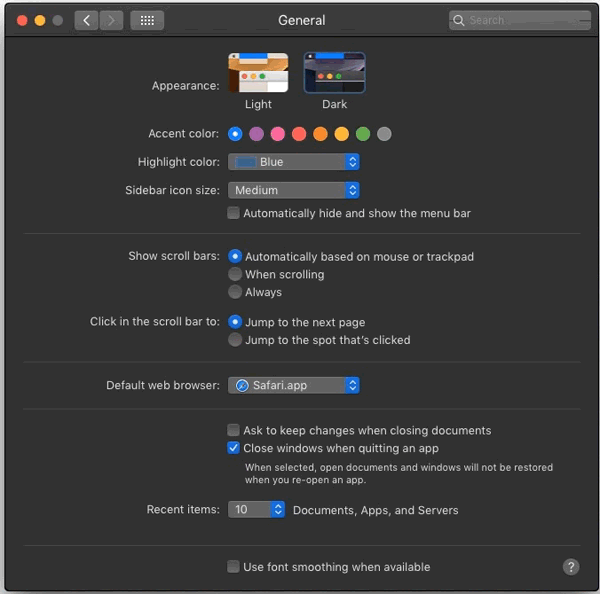
Ironically for "always expose relevant options through system settings" Apple, you can still access font smoothing via command line, e.g. "defaults -currentHost write -g AppleFontSmoothing -int 3". You can use 0-3 where 0 disables it (default) and 3 uses "strong" hinting, with 1 and 2 in between.
If hinting makes the fonts "too thin", your display gamma is probably misconfigured. That kind of artifact is a common side-effect of graphical operations being performed in the wrong gamma space.
I don't see how that would affect a screenshot—the difference is clearly visible in screenshots. Furthermore the differences between Mac, Linux, and Window font rendering are widely discussed on the internet. I think I just prefer the way that Apple chose to render fonts.
Yes, there is an issue with freetype where the gamma is different between otf and ttf fonts. otf will apply the gamma automatically, but for ttf you have to force stem darkening at the current time.
i always disliked hinting aswell, but thankfully one can just disable hinting on linux, and then fonts actually look fairly similar to what osx did(~10-15 years ago)
Full hinting is a must-have if you turn AA off and use fonts that were designed to be hinted to a pixel grid.
Fonts have several distinct periods where they were designed expecting that renderers would function a certain way. File format notwithstanding, one size does not fit all. You really do need to match your font to your renderer's settings.
You can also match your renderer's settings to your font, and have it different for different fonts, via fontconfig. But actually using that is pretty advanced.
that may well be, but for me, I choose no hinting, with AA activated, and if a font does not look good, I simply do not use it.
IF i specifically REALLY wanted a font that required hinting to look good, I would make a special config for that particular font, but I would need some serious advantage to bother doing that
Why not use slight hinting then? FreeType explains it as only using the vertical hint but not the horizontal one and they recommend this as working well with cleartype fonts and pretty well with non-cleartype fonts.
Reading it up, heated issue is putting it midly. That was a complete shitshow, with two gnome devs - and one from redhat specifically - not accepting the obviously awful font rendering as an issue and continuinously insulting the reporters. God I hate those type of Foss devs.
And then on the other hand you have finally a seemingly great solution, despite their sabotage. So, yeah gnome?
I read the post using Firefox on Windows, and even though I've been aware of the font rendering controversy for a while, I was actually shocked by just how huge the difference was between the crisp, properly rendered text in the article and the font rendering in the "before" screenshot.
Not surprising as the Firefox devs invested a lot of effort into high-quality, gamma-correct subpixel text rendering that worked well with hardware accelerated compositing. One of the reasons I stuck with it.
Reading through one of the GTK4 issue threads, it seems that one problem with early versions was an insufficient gamma correction strategy.
Yeah it's definitely an improvement, but even with the "after" screenshot I can't imagine voluntarily using this % scaled rendering. I'm going to turn into a bitmap font absolutist.
Bitmaps are great in terminal windows, but for apps like browsers where they can't be used easily, that's still fine because you can work around it.
Simply turn off anti-aliasing, and use a period-specific font that was designed for presentation without anti-aliasing such as the MS core truetype fonts (e.g. Verdana, Arial, etc.) It will look fine IF you have full hinting turned on.
As a long-time developer against GTK (I started using it back in the 1.x days in the late 90s) this is really awesome to see.
I enjoyed the side-by-side comparisons of the old vs new renderer, and especially the idea of homing in on particular letters ('T' and 'e') and extracting them, that really made the improvement clear.
Cool stuff, and many thanks to the developers who keep pushing the GTK stack forwards.
The "old" renderer feels so new to me, that I'd like to see the comparison against GTK+ 3.0 with pango <=1.42.
P.S. Since pango 1.44 some letters at some positions became blurry and some letters are more close to the previous one than being in the middle. Actually the later issue might be needed to prevent the first one, in theory. In practice, there might be other constraints, which force the corruption.
He means utilizing GTK. In sweden its common to say "Utveckla mot xxx" Develop against, when talking about using a framework or library. I bet they say the same thing i Other germanic languages.
I'm curious - when you were doing research into the mechanics of hinting options, did you stumble onto any relevant discussion around allowing custom pixel geometries to be defined, to enable hinting on modern OLED / WRBG displays? There's a good thread on the topic here[0], with some people referring to it as 'ClearType 2' on the MS side [1]. On the oss side I know FreeType theoretically supports this[2], but I can't quite figure out how relevant the FreeType backend is to this most recent work.
It would be nice if monitors exposed info about subpixel geometry as part of their EDID data. An alternative would be to capture it in a hardware database.
AIUI the trend has been towards GUI frameworks dropping support for subpixel AA altogether, since that simplifies so many things[1], so I'm not holding my breath for the current limitations around unusual subpixel layouts being fully resolved on any platform. Apple made the switch to greyscale-only AA years ago, Microsoft is mid-transition with their newer GUI toolkits ignoring the system Cleartype setting and always using greyscale AA, and the GTK renderings in the OP are greyscale too. They're assuming that people will just get a HiDPI display eventually and then greyscale AA is good enough.
Even on a screen with not-particularly-high DPI, grayscale AA is fine. Subpixel AA was a brilliant idea for the displays of 2005 (72-96 DPI), but it came with lots of downsides (like color fringing on dark backgrounds, or for users with astigmatism). Grayscale AA drops both the benefits and the drawbacks, but even at like 100 DPI, the difference is very marginal.
At 110 DPI (27 inch 1440p) it's not that marginal for me. Even looking somewhat closely the difference is quite obvious. Subpixel AA is much more readable if the font size is small, and still looks sharper for most interface fonts.
Color fringing on dark backgrounds is yet another artifact of anti-aliasing being done with a misconfigured gamma. Regardless you can configure subpixel rendering to minimize these fringing effects.
I'll repeat my wish for a mass-production Bayer matrix TV to offer alternative firmware/a special mode where it goes _very_ dumb (though an optional overdrive setting (assuming it's an LCD) as a toggle or slider or so would be welcome; it's a massive pain to DIY and shouldn't get on the way of anything but FreeSync/VRR) and claims to be a monochrome panel at the true native resolution & bit depth on DisplayPort.
You'd want to render to that grid; then apply bayering fused with color mapping.
No need to transmit 3x the data over the cable. And with a hint of sufficient software support (I think the high DPI stuff might (almost?) suffice already!), I'd actually prefer such a screen over a traditional vertical bars of RGB (or BGR, as I'm currently suffering; sadly the thermal design of the screen won't allow me to safely just rotate it to"wrong" landscape) LCD monitor... provided both have the same number of subpixels.
Probably bonus for a 4th deep cyan pixel color in place of a duplicate green to get a wider gamut. Or something similar in spirit.
A device like this would allow hobby developers to bring the software/driver support up to "daily driver, no regrets" levels.
Similarly I still wonder why no OLED seems to have shipped a "camera-based motion/pan/defocus self-calibrated" burn-in scan& compensate function where you just every ~100 hours move a cheap camera on front of the screen following the on-screen movement directions, to mechanically create an opportunity for the cheap sensor to be calibrated, and then use this freshly calibrated brightness sensor to map the OLED panel and make up for that the exact burn-in is very hard to simulate, but is required precisely to compensate/pre-distort without leaving visible residuals from incomplete/imperfect cancellation between the pre-distortion and the burned-in pattern.
For one, subpixels aren't just lines in some order - they can have completely arbitrary geometries. A triangle, 3 vertical slats, a square split in four with a duplicate of one color, 4 different colors, subpixels that activate differently depending not just on chromaticity but also luminance (i.e., also differs with monitor brightness instead of just color), subpixels shared between other pixels (pentile) and so on.
And then there's screenshots and recordings that are completely messed up by subpixels antialiasing as the content is viewed on a different subpixel configuration or not at 1:1 physical pixels (how dare they zoom slightly in on a screenshot!).
The only type of antialiasing that works well is greyscale/alpha antialias. Subpixel antialiasing is a horrible hack that never worked well, and it will only get worse from here. The issues with QD-OLED and other new layouts underline that.
The reason we lived with it was because it was necessary hack for when screens really didn't have anywhere near enough resolution to show decently legible text at practical font sizes on VGA or Super VGA resolutions.
Subpixel AA is still more readable for non-HiDPI LCD screens, which are still the majority of desktop monitors sold today. It did work well enough for people to be using it for so long, and the situation with screens on desktop has mostly not changed.
It also works great with almost but not-quite HiDPI screens such as commonly available and cheap 4K 27" monitors. You can scale them at 150% and with ClearType it looks as good as super expensive 6K Mac screen.
In fact since cleartype effectively triples resolution I guess you get quality of 12K display?
It does not triple resolution. Subpixel rendering can only be used to smooth full pixel lines - this introduces color fringing on the sides of font glyphs, but one that can sometimes be ignored when the smoothed lines are thick enough to distract.
If you used subpixel rendering to render lines of fractional pixel thickness, it would just appear as a single-pixel line of the wrong color. The same happens if you render line thicknesses up to 1 1/3 pixels wide, but offset to not match any pixel boundary.
At the same time, subpixel antialiasing can only be used with a specific subpixel layout, in the direction sof the subpixels. For regular desktop LCD panels, this means smoothing of vertical lines only, making characters like "o" look funky and uneven.
With that in mind, a 4k panel with subpixel antialiasing does not look anything like a 6k panel with greyscale antialiasing ("super expensive mac screen" is not relevant, apart from display technology differences not related to resolution or aliasing).
I agree, although this isn't as noticeable as it is on a true low dpi screen. In the monitor market anything higher resolution than a 27 inch 4K tends to be ludicrously expensive, and won't be an option for most people. With Windows having pretty functional fractional scaling, I doubt anything higher than 4K will ever become mainstream, since at the distance you are using your desktop monitor, more resolution is of limited value.
Subpixel AA does not have significant benefits over greyscale AA on 1440p or similar displays, and it always have all the downsides. If you're rocking a large 1080p display and never share your screen (including screenshots), sure.
As the field of view taken by pixels decrease (DPI only has meaning when combined with distance to retina), anti-aliasing becomes less and less relevant. But until then, greyscale remains the lesser evil.
I was a bit puzzled that the images were so blurry compared to the surrounding text. Then I realized that the 1px border around the before/after images forces them to be scaled down from an otherwise correct width of 600px to 598px.
While not solving the blurriness completely it, removing the border with the inspector helps a lot.
I think the remaining blurriness comes from the images using grey scale hinting rather than subpixel hinting (the hinted pixels are not colored)
You can, if you are in the target audience. I have a monitor running at 200% scale, and the scaled screenshots do not show much difference. Scaling the browser tab to 50% does reveal it.
> Various font-related flags I found in solving for blurry fonts on wayland
Is there an environment variable to select Wayland instead of XWayland for electron apps like Slack and VScode where fractional scaling with wayland doesn't work out of the box?
Wow, I just tried those environment variables, and it makes a remarkable difference for the smoothness and fullness for every font. I'll probably be leaving this setting on until something breaks when it gets fixed, and I inevitably spend too much time trying to figure out why it's broken after forgetting what I changed.
I don’t have anything expert to add here except this is somehow a shockingly difficult problem.
When I boot into windows, the fonts especially in some applications look horrible and blurry because of my high DPI monitor. Windows has like 10 settings you can try to tweak high dpi fonts and man none of them look good. I think my Linux boot on the same machine has much better font smoothness and of course the MacBook is perfect.
Somehow most windows systems I see on people’s desks now look blurry as shit. It didn’t use to be this way.
I really don’t understand why high dpi monitors cause (rather than solve) this problem and I suspect windows has some legacy application considerations to trade off against but man - windows used to be the place you’d go to give your eyes a break after Linux and now it’s worse!
I realize I am ranting against windows here which is the most cliched thing ever but really come on it’s like right in your face!
The perfection of font rendering in macOS is one of a handful of things that has spoiled me and makes it difficult to switch to Linux.
I guess we all have different issues we care about, but I'm always surprised when I have to point out how awful Windows is with fonts and people just shrug and say they didn't notice. For me it's painfully obvious to the point of distraction.
I don't think it's the high DPI screens themselves that cause this on Windows, rather the fonts have changed.
I'm pretty sure they used to be bit mapped, or had excellent hinting. Now that high dpi is common, maybe they figured that wasn't needed anymore. And indeed, on my 24", 4k monitor at "200%", windows is pretty sharp if I start it that way. If I change it while running, it becomes a shit-show. But when running at 100% on a FHD 14" laptop, sharpness is clearly lacking.
Regarding the Linux situation, yes, it's subjectively better on that same laptop. But it depends a lot on the fonts used. Some are a blurry / rainbowy mess. However, on Linux, I run everything at 100% and just zoom as needed if the text is too small (say on the above 24" screen).
Not sure this is shockingly difficult, especially when for a lot of Windows apps you can already deblur the fonts by clicking a high dpi compatibility setting of a given exe file
I’ve literally never had that compatibility setting make a difference in the cases I tried. I am sure it does something in certain cases where the blurryness has a certain root cause but not universally
Interesting, works for a lot of apps for me, (note that there are 3 options, sometimes enhanced is only one that works) though usually some toolbar becomes too small
I wonder if we'll ever abandon resolution-based rendering for screens, instead using a PPI/DPI vector-based system?
Since the 80s I've been wishing for a 300/600dpi resolution-independent screen. Sure, it's basically like wishing for a magic pony, but I was spoiled by getting a Vectrex[1] for a birthday in the 80s, and I really liked the concept. I know the Vectrex was a different type of rendering to the screens we use today, but I still find it fascinating.
I wish for this too. You can get tiny screens with that kind of pixel density. My ebook reader is 300ppi and my phone is almost 650ppi!
It saddens me when I see people measuring things in pixels. It should all be measured relative to the font or perhaps the viewport size. The font size itself should just be how big the user wants the text which in turn will depend on the user's eyes and viewing distance etc. The size in pixels is irrelevant but is calculated using the monitor's PPI. Instead we get people setting font sizes in pixels then having to do silly tricks like scaling to turn that into the "real" size in pixels. Sigh...
> The font size itself should just be how big the user wants the text which in turn will depend on the user's eyes and viewing distance etc.
So software "pixels" are relative units now, but you would have them get larger or smaller as the user moves closer to or further from the screen? (I think I'm not quite getting it, sorry.)
We're wishing for a screen with such a high pixel density it makes pixels a completely irrelevant implementation detail of the screen itself. So nobody would be setting their font size (or anything else) as some number of pixels, they would in fact set it in a real physical unit like cm/inches and that choice merely comes down to personal preference, eyesight and how far you are from the screen.
These comparisons should be presented with a dynamic switching of identically sized images with identically placed text instead of placing slightly different images side by side
The new renderer definitely looks better, but the letters still have something fuzzy about them. They don't feel crisp. Is this due to the font or due to the rendering?
The fuzzy is just an artefact of parts of the font not lining up with the monitor's pixel grid. There are ways to deal with this, but they can distort the font in other subtle ways, so no solution is perfect.
In any case, it makes much less difference (almost none practically speaking) on hi-dpi displays.
One of the reasons web designers have issues with text looking different between Windows and MacOS is that Windows' font renderer tries to force things to align with the pixel grid more, reducing a sharper result but slightly distorting some font characteristics. Apple's renderer is more true to the font's design, can can produce a little fuzziness like you see here. It also makes many shapes look a little more bold (at least on standard-ish DPI displays). A couple of old posts on the subject: https://blog.codinghorror.com/whats-wrong-with-apples-font-r..., https://blog.codinghorror.com/font-rendering-respecting-the-.... Differences in sub-pixel rendering also make a difference, so where people have tweaked those options, or just have the colour balances on their screens set a little differently (intentionally or due to design/manufacturing differences) you might see results that differ even further for some users even on the same OS.
For some reason, FreeType broke proper grid-fitting and now requires environment variable FREETYPE_PROPERTIES=truetype:interpreter-version=35 to activate it.
It's not quite right to say it broke proper grid-fitting, because that depends on what the fonts were designed and hinted for. The old one matches Windows 98 hinting (and therefore that era's core fonts), and the new one matches ClearType's hinting (and therefore that era's core fonts).
> The idea is that we just place glyphs where the coordinates tell us, and if that is a fractional position somewhere between pixels, so be it, we can render the outline at that offset just fine. This approach works—if your output device has a high-enough resolution (anything above 240 dpi should be ok).
So it just requires 6x more memory, GPU power and HDMI/DP bandwidth and prevents usage of large monitors ...
Honestly I'd love it if Linux just implemented a solution similar to what Apple does, which is rendering everything at 2x and then downscaling it to screen's native resolution. (So my "3008x1692" on a 4K screen is actually rendered at 6016x3384). Modern GPUs are strong enough to do this without breaking a sweat, and the result is very crispy and functional. Fractional scaling could still exist as a fallback for older systems.
This is what GTK used to do. It's less battery efficient for an inherently less crisp option though. It also gets less seemingly crisp after rescale for for the much more common "slightly higher than normal dpi closer to 1080p" type monitors (e.g. the 125% in the article) you don't typically find in Apple setups.
Of course that's why subpixel rendering is all a bit moot on Apple devices. For a long time now they've just toggled the default font rendering to the equivalent of "none none" in this article and relying on the high quality screens the devices ship with/most users will plug in to make up for it.
That's what GTK used to do. The result looks much worse than fractional scaling, is much less crisp, uses a lot more battery, and means games run a lot slower.
It is much more crispy for general graphics, with much less problem handling rounding errors and getting lost in antialiasing and fractions that you don't have a place to put into, since hardware does that for you globally for the entire framebuffer. It uses the same amount of battery power when done right (i.e. not using GPU, like GTK did, but the output encoder, like Apple does) and for games, compositors nowadays support overlays with exact virtual resolution and scaling, as the game needs.
How is it much more crispy? If every widget supports fractional DPI correctly, the output will be bit-for-bit identical between the two different approaches.
That said, the GPU and output encoder options chosen by Gtk3 and Apple have a major flaw: accelerated scaling is usually only available in sRGB colorspace, so you get either gamma-incorrect scaling or you need to fall back to a non-accelerated codepath.
> If every widget supports fractional DPI correctly
That is a big if.
> the output will be bit-for-bit identical between the two different approaches.
It won't be identical. When you do it on widget-by-widget basis, you eventually reach the end of your surface, so you may need to paint your antialiased pixels, but the space is beyond your surface.
When the framebuffer is being considered as one global surface, the scaler will do the antialiasing for you outside of your surface, so you won't hit this problem.
Another thing is Apple scales; they limit the error caused by the antialiasing to a group of pixels, either 8x8 or 9x9. The error caused by fractional scaling won't spread outside of this group.
But for the sake of argument, let's say that these errors are not noticable and we can ignore them.
> the GPU and output encoder options chosen by Gtk3 and Apple have a major flaw: accelerated scaling is usually only available in sRGB colorspace, so you get either gamma-incorrect scaling or you need to fall back to a non-accelerated codepath.
This could be output encoder specific; I'm not aware of such limitation, so I'm looking into Intel docs now (TGL ones, volume 12: Display Engine), cannot find any mention of it. Would you have any pointers?
Or do you mean specifically GPU (texture) scaling? I'm not that familiar with GPU part, but I would be surprised if that was true, when the hardware today considers LUTs for the buffers.
For older hardware, or for ARM SBCs, that could be very well true.
---
In the end, both approaches have their pros and cons: with the encoder scaling, you won't be ever pixel-perfect in fractional scales, just good enough; but with software managed fractional scaling, you are over-complicating the already complicated code, so it won't be bug-free, and in the end, might consume more power (and CPU cycles on your CPU!) than the brute-force approach of encoder scaling that is being offloaded to dedicated hardware.
> This could be output encoder specific; I'm not aware of such limitation, so I'm looking into Intel docs now (TGL ones, volume 12: Display Engine), cannot find any mention of it. Would you have any pointers?
> Or do you mean specifically GPU (texture) scaling? I'm not that familiar with GPU part, but I would be surprised if that was true, when the hardware today considers LUTs for the buffers.
To scale in linear RGB colorspace, you first need to do a colorspace transform on the entire buffer, then scale, then do another colorspace transform. I can't find any device that does this in a single step correctly, except for some rare GPU extensions.
> Plane scaling is [sic] supports both linear and non-linear scaling modes. The scaling mode is programmed in the PS_CTRL. In HDR mode, scaling and blending operations are generally performed in linear mode.
To be limited to sRGB would mean, that the hardware is pretty much limited to SDR. That would make it unusable in mainstream market today; just good enough for low-end SBCs.
Qt6 has had fractional scale early on and still supports subpixel AA. Qt5 near the end of its life got fractional DPI scaling support on X11, but not on Wayland. KDE generally seems to handle scaling better nowadays compared to GNOME.
What Haiku needs is font setting per screen/resolution for multimonitor support. This way you can support mismatched monitors with different factors.