I love this, it's got that "technical correctness is the best correctness" vibe going on big-time, and it will probably change the way I see that slice of the world.
Butterflies loom weirdly large in my life, at one point many years ago my grandmother decided that butterflies were my wife's "thing" (they aren't, we're not sure how this happened), and so for many years we got butterfly-themed gifts from her. It was merely odd, so we just rolled with it, but now we have various butterfly tchochkes around, all of which, a brief survey reveals, are in the dead pose.
> at one point many years ago my grandmother decided that butterflies were my wife's "thing" (they aren't, we're not sure how this happened),
This is a wild shot in the dark but do you:
1. Live near Westminster, Colorado
2. Have had your grandmother visit you several times
3. And each time your wife took her to visit the butterfly pavilion?
Can confirm, I could never forget this article since I read it a long time ago and have developed a habit of always checking every butterfly depiction I see if its in a dead pose.
Another annoyance of "fiction tropes taken for reality" happens in movies and games, where people have become so accustomed to seeing camera flaws that some start to believe the presence of those flaws indicates "realism"... Even when the truth is the exact opposite--unless the player-avatar is supposed to have inferior mechanical eyes.
For example, Depth of field, lens flares, chromatic aberration without wearing glasses, etc.
Unless the fidelity of the material (be it visual or audial) exactly matches that of the real world[0], there is no truly accurate depiction of reality you can convey to the observer—and with any lossy representation you have to make choices as to how to represent it. You will have adopted a “look” whether you want it or not; it is very much part of your creative effort (the less of it, the more work and creative choices are left up to the observer to filter). Basing your look on the preexisting and familiar is good because your work does not exist in vacuum; your observers carry common cultural baggage in context of which it is perceived.
The look furthers your creative goals—conveys a mood or a feeling, focuses observer’s attention on what you consider important, etc. Here, fidelity works against you. All the figurative flare—be it compressing dynamic range, selecting your color palette, artificially lowering the frame rate, adding motion blur, film grain, lens artifacts and literal flares, etc.—lowers it selectively.
That particular kind of flare can absolutely be misplaced, sure. For example, cartoon animation styles is an example of another extreme but quite well-established look, and arguably incompatible (the fidelity is already very selective from the get-go). Less extreme is 3D animation, where lens flare and the like can sometimes look uncanny.
The case of dead butterflies, similarly, exists in cultural context. In some (most?) cultures, the symbol of the butterfly would represent something very far from death. However, once the awareness of the difference between a dead and alive butterfly is widespread enough, then one simply must adapt and adopt that new context because you are risking the dead butterfly to be interpreted as an intentional statement.
[0] Which is not going to be technically possible for some time, and likely not at all even in theory due to the good old map-territory conflict.
A bit of a nirvana fallacy there. This isn't about limitations in technology, nor (directly) about artistic choices to set a mood.
What I'm annoyed at is the combination of (A) things which are not technological limitations that are deliberately simulated and (B) how I've seen them tie into factually false beliefs about "realism" among the audience.
Consider: "Oh, I got one of those new e-books, and it's about Romeo and Juliet. Some of the text contains ink that is blotted or runny, which makes their relationship extra-realistic."
I get what you mean, and I would have probably agreed a few years back, but I believe the matter is slightly more complex than that.
First, even with your book example, which I do agree is cheesy, still—this is part of the message. I’d not be surprised if such an ebook existed, though it definitely wouldn’t be for me (even if I liked the genre).
Second, part of my point was that simulating technological limitations has its uses. If you want to convey a mood, obscure unnecessary detail, etc., you have such tools at your disposal that will not look weird to the audience[0] and that resonate with the larger cultural context—which none of us exist outside of.
[0] Unless someone else like yourself is in said audience, I suppose :)
I am not sure most people would notice 24 to 30 fps increase, but let’s say it’s 60 fps.
You may be wrong in thinking they are confused. To paraphrase, the audience is always right. If they are confused, then you’ve failed.
As I wrote above, what we see is anchored to our previous experience and cultural context. The ways it is broken inevitably attract attention to themselves and detract from the story, at least in the beginning, so you have to do it carefully and generally avoid breaking expectations unless that serves to achieve the desired effect. Otherwise you’d just be self-gratifying and compromise the message, making it subordinate to the medium.
By the way, breaking these expectations can go both ways. You can go higher fps just as well as you can go lower. Once you veer off the default, which way you go is not automatically better than the other; it all depends on what your creative goals are.
It doesn't make them look worse, it makes them look too realistic: I think this one is an inversion of the trend, in that people expect movies to look like movies, not like reality.
Something similar happens with loudpeakers. Some people got so used to the distorted, boomy bass that was ubiquitous until recently, that they insist that speakers that don't distort have "no bass".
Depth of field is a human eyes thing too. Though I'm with you on lens flare and film grain added just as stylistic flourishes rather than to convey "this scene is camera footage". It's like deliberately adding simulated compression artifacts.
Imagine you record audio with perfect fidelity and extreme dynamic range. Now, you have the tiniest and the loudest sounds captured; how do you go about conveying this work?
The answer is compression, equalization, all those tricks. And yes, that lowers fidelity, and yes, you will have to make choices as to what’s more important to focus perceptive attention.
Similarly with video: many fidelity-lowering tricks serve a purpose. Film grain, aside from conveying a mood, can mask excess detail in shadows and highlights, the detail that would detract from the story you’re telling. A headlight flare can bring attention to the coming car; if your hero or villain is in that car, that’s useful. Panning over a fleeting sun flare, you momentarily focus on the environment and can use it to bridge attention between subjects or scenes.
It’s all a complicated dance, and it all exists in time, inseparably from both the immediately preceding material and the larger current cultural context.
> Imagine you record audio with perfect fidelity and extreme dynamic range. Now, you have the tiniest and the loudest sounds captured; how do you go about conveying this work?
If you're Christopher Nolan, you just release it that way, and let your audience smash the volume-up and volume-down keys over and over throughout the movie.
Yeah, quite tricky if things happen in quick succession, a pin drops and and explosion follows (if your home audio can even reproduce the requisite decibels).
Apparently one of the issues with VR and “3D movies” is that your eyes expect to be able to focus on anything: but you can’t; only on what the director set everything to focus on.
Interesting article. I think (to take it perhaps too seriously) the butterfly used in designs of cushions, earrings, etc. is more a cultural icon than it is an attempt at accurate biological description — it's something analogous to ♡ vs. a realistic depiction of an actual heart.
For whatever reason, we've come to think of butterflies as looking the way they do in insect collections, and I don't think even knowledge of what the dead and alive specimens look like would make me want to draw it any other way. A 'dead' one just looks more butterflyish!
I also have a feeling that it has something to do with the (more cultural than biological) distinction between moths and butterflies. For some reason, the latter are considered examples of exquisite beauty and the former usually an ugly (even fear-inducing) nuisance. Drawing butterflies in the classic 'butterfly' shape is a way to make this difference clearer — even if it's entirely inaccurate.
That should be the right take, if it had no other connotations.
For instance heart becoming ♡ is fine I think because we otherwise don't deal with raw hearts and they're only part of whole.
It would be another issue if used the equivalent of the zombie emoji for "human" or a steak image for "cow"
I guess it comes down to how much we care about butterflies, how often we see them, and how much we don't want them dead. I can see why people looking more at butterflies in their daily lives could be bothered, and also how that's probably a lost cause as 10x more people massively never leave cities.
> zombie emoji for "human" or a steak image for "cow"
I think a better analogy is Vetruvian Man [1]. In fact, I think it's a pretty good analogy because it shows a human splayed out in almost exactly the same unnatural way that canonical dead butterflies are. Personally, I don't find either one particularly disturbing. Each serves a purpose IMHO.
"I guess it comes down to how much we care about butterflies, how often we see them, and how much we don't want them dead."
For me it comes down to how much we care about reality, vs. catering to our fantasy conception of what reality is.
Fantasy in general is awesome - if you are aware that is is fantasy. But too many people mixed both concepts and this is bothering me, not particular butterflies.
I think nobody thinks, a real heart looks like ♡. But people do think, butterflies look in real life, like when they are dead. It is a quite trivial thing here, but the same happens with much more important things as well.
It’s not fantasy, it’s an abstract idea represented by that visual symbol. The ♡ symbol, for example, pictorially represents a naive understanding of a heart, but the connotation of love— itself not accurate— is the real message. We don’t say someone had a “♡ attack” merely because we’re don’t think the symbol is accurate enough, it doesn’t jibe with the real meaning of that symbol. We also don’t assume MacBook Pros are fruit storage containers. Those symbols are *everywhere * in our lives.
But the ♡ and the apple in Apple are clearly abstracted. Those butterflies in the article look real. That makes the difference to me, because it brings a wrong conception of reality.
But it's not any specific facet of their form that distinguishes it from communicating an idea vs something physical about the represented object -- it's the context and the intended message. Nobody puts a butterfly decoration on a pillow to say "there's an actual butterfly on the pillow," or say something about that butterfly's physical disposition. They're using the idea of a butterfly, generically, to evoke appreciation for the intricate beauty in natural patterns, life, warm months, spring, symmetry, insects, and/or any other connotation inherent to butterflies which will probably change based on the context and specific representation. When deployed for communication tasks like that-- as emoji are-- they need to evoke the idea of something rather than portraying an actual instance of that thing, so having an immediately recognizable form, most importantly its profile or silhouette, is far more important than physical accuracy. In fact, physical accuracy often requires more visual complexity, increasing the cognitive load to parse it, which makes it worse at its actual job for little to no benefit.
Even heavily abstracted symbols may need to communicate a specific physical disposition. Consider the door-open indicator on a car. It's not a physically accurate-- it doesn't need to portray anything except "this is a car, this door is open"-- and it would probably be less effective if it tried to be. But since the physical disposition of the door is important and you're not just evoking the idea of a car, it must be included.
For illustrating stories about a butterfly, or using a photo to reference a butterfly doing something specific, or trying to illustrate something else about the physicality of butterflies, then sure... that physical accuracy is important. But the author doesn't make, or even seem to understand that distinction.
Yeah, semiotics is a pretty neat topic even if the available literature skews dense. How well a designer wields those concepts to solve communication problems without words is one of the things that distinguish novices from juniors, and juniors from art directors.
'Nobody puts a butterfly decoration on a pillow to say "there's an actual butterfly on the pillow,"'
But it seems implied to me that it shows a living butterfly, if the butterfly seems realistic otherwise. I don't want a picture of a dead butterfly on my pillow, if I know only a dead butterfly looks like this. Most people don't know, so they are not bothered. That's why this symbol works the way it is - it would not work, if everyone recognizes it as "dead butterfly".
> Most people don't know, so they are not bothered. That's why this symbol works the way it is - it would not work, if everyone recognizes it as "dead butterfly".
Yes-- symbol meanings are even more malleable and imprecise than English words, and on top of that, each of us interprets it through our distorted lenses formed by life experiences, cultures, priorities, successes, traumas, etc. Without being able to design for individual people, you can only try to design for specific groups or communities, and you always risk alienating people for whom the message lands differently. To get a little more info about some more involved communities' usage of these symbols, I did a quick google image search for some related terms, like "Lepidopterist Symposium" and "Butterfly Expert," and got these references:
I didn't see anything indicating the people in these photographs were unrepresentative. In this situation, I'm pretty confident that very few people see "dead butterflies" when they see a butterfly symbol that references one-- even people that absolutely know the difference.
I agree with your point, and think it's also a complicated approach. The best way to put it could be that people having more knowledge of the world is better.
For context, some people probably don't really have an image of how a heart is shaped. There was half of a joke about city kids who thought cows were purple because of the chocolate brand [0], and they probably never saw a cow in actual life nor really registered the colors in the books. And IMHO the best solution would be for them to see cows, and the pigs, and so many more animals everywhere.
I kinda see the butterfly in the same way. The common icon being dead isn't great, but if we look at it as a symptom of a greater issue (I think we agree on this point) getting people to care more about butterflies in general would also solve the icon problem -- I'd actually want to see butterflies in the middle of cities. There would need so many things to change, but it would be for the better. Otherwise it becomes an endless battle as new icons are created everyday.
PS; this also reminds me of the wheelchair icon and the fight to have it rolling instead of static. And I was moved by the pitch for this idea, while also thinking "there's so few people in contact with wheelchair people in everyday life, will that message ever get a wide enough audience ?"
I don't think this is a great analogy. The popular "heart" is rather abstract and does not directly depict anything biological. The popular "butterfly" is very concrete and precisely depicts something biological, namely a dead butterfly.
Taking the article, again, perhaps too seriously: Just because a symbol has gained cultural currency doesn't mean we need to accept it as is. We can change. We can fight our immediate symbol associations. Personally I think we should.
Ha, I forgot about that. Perhaps I overreached. IIRC that's rather speculative, though, still a bit abstract, and certainly not close to what we use it to represent today, so I don't think it helps the original analogy.
Great post. I've drawn butterflies before (both professionally and as a hobby) and never once realized I was drawing their "dead" state. Nice tidbit that I'll keep in mind for the future.
in spanish i've adopted the portmanteau word muertiposa for this phenomenon, from muerto/muerta 'dead' and mariposa 'butterfly'. if you're gothy you might prefer that the butterflies embroidered on your backpack be dead
the underground high school newspaper i wrote for was called 'the crucified butterfly'
I think this must be a local sub-culture word, as a Spaniard I've never heard "muertiposa" and google search for "muertiposa" literally returns me no results.
True, but when searching for it there's no results? Like I expected that to be a thing in some sub-community and adopted by GP. Otherwise, wouldn't it be more accurate to say "I/we've created"?
I think "adopted" works fine. You can adopt a manner of speech the same way you can adopt a habit. The practice you adopt can be preexisting, but doesn't have to be.
There was apparently a debate in wiktionary's early days over how (and whether) to license their content. They ended up licensing it, which seems wrong to me.
a word isn't copyrightable under at least usa copyright law, but a definition can be if it involves enough creative expression, which i think most of them probably do
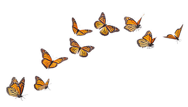
This is one of those things where now that I know about it, I see it everywhere. People stick butterfly images on all sorts of things, and 99% of the time they're in the dead and mounted style.
There's a good reason for it. Although you can see the hindwings on most (but not all) butterfly species when they're resting, this isn't the case with most moths. So, in collections of lepidoptera (butterflies and moths), entomologists adopted the practice of spreading the wings so that you can see both pairs clearly. It might not be natural but it's more helpful for identification purposes.
Yes, it's a bit like those paintings of galloping horses made before the invention of short exposure photography showed how horses really look when they gallop. I suppose it's down to laziness - people could go out and take photographs of butterflies feeding at flowers, but no, they just copy a picture from a field guide and hope most people don't notice.
It doesn't look like a living animal that way. It is a nice icon or image, but not a nice picture of an animal.
Although maybe that is the point, insects are gross so humans maybe prefer the non animal like picture of it. Many don't like the actual body of a butterfly, they just want the colorful wings so drawing it in a way that makes you not see it as an animal could be better for that reason.
You do feel the difference even if you don't think about it. Art is all about details we don't think about but it really feels much better when the details are there. Did I think about the lack of shading details in graphics 15 years ago? No, not at all really. But if I look at graphics today it looks so much better, our brains really notices all those unnatural details even if you can't point them out.
I never felt butterfly images looked particularly good, just looked like pasted in stills. Until I read this article several years ago I didn't know why all the butterfly images looked bad, but now I do. When I look at videos of butterflies they do look like animals that move around, they don't have perfect angles and wings flaps around in different directions so you don't always have symmetry etc, it is a massive difference.
Note, the difference isn't that the particular pose is "dead pose" or whatever they say in the article. The problem is that they use the exact same pose for every butterfly all the time with a perfect angle, that makes your brain identify them as fake stills. You don't need any particular skills for your brain to see that, you just aren't really aware of it. When I see drawings of other animals and insects I don't see the same thing, they are drawn in all sorts of poses and positions and the artists make sure the angles aren't perfect to make them feel natural, but apparently artists don't treat butterflies like they treat other animals instead they seem to be drawn and animated like falling leaves.
Posts like this are great because once I know about it, I'll be seeing it everywhere. It'll drive me mildly nuts but it's also like I'm in on a big secret.
A similar example is scissor icons and emojis that wouldn’t work in practice (finger holes that would clash if you tried to close the scissors). Don’t have a link now but since I read the article concerned I can’t unsee non-functional scissors.
This isn't fully accurate. Look at https://www.youtube.com/watch?v=UUZmkw6YY0o#t=33s to see a butterfly in flight that does approximately manage the t-pose (the camera isn't at quite the right angle, but it's clear to see that the forewings are very forward and basically in t-pose). So butterflies in flight _do_ get this pose, from certain angles.
Thank you, I came here to say this. It seems like in many species of butterflies, the tips of the wings come relatively far in front of the head at the "apex" of the "downstroke" of the wings during flight.
In the butterfly lifecycle, the caterpillar lives its own life, but then at its end shrouds and digests itself, to the point where only the rudiments of the nervous system persist. Then the butterfly itself grows out of this reduction of self to an egg.
In the face of this astonishing life-death-life-cycle, we're complaining that butterfly wings should be depicted in their natural orientation?
Butterflies are awe-inspiring, frightening and amazing. But not mainly for their pretty wings.
Every living thing dies - yes, even us. But perhaps these words will persist in the internet archive, as dead wings sit in dusty drawers, to one day inspire :)
I remember reading this through HN a long time ago, and finding that it made solid points, and sharing it with several people over the years. However, I have wisened over the years and feel that I better understand what is worthwhile being pedantic about. Visual cultural representations of things don't have to look like the thing they are showing (the heart symbol doesn't look like a real heart, emoji don't look like real people or things).
That only dead butterflies have their wings in the orientation most commonly represented is a fun piece of trivia, but IMO not worth caring about beyond that.
It isn't just a question of their visual representation in culture. Many major taxonomic works on Lepidoptera only provide illustrations of species in the pinned-out format. This is even more of an issue with moths than butterflies as moths show such a huge diversity of distinctive postures and wing configurations -- tucked up and folded away and overlapped in all kinds of unlikely and bizarre morphologies. I can think of so many weird examples, but to take one, check out this lasiocampid moth I found in Borneo some years back: https://i.imgur.com/auo2t9l.jpeg
If you manage to find that species in the standard work to consult, the eighteen-volume Moths of Borneo[1], you'll only see images of a pinned-out specimen, which makes it look like all the others. The motivation for this was to provide a standardized format for the formal visual depiction moth and butterfly anatomy, principally for taxonomists who will be working with dead specimens, and where the actual delimitation and description of taxa is done mostly using microscopic characters. But how moths hold their wings gives very valuable diagnostic information for both field ID and broader questions of classification, that would be very useful to see in a standard reference. This is increasingly recognized and I know of several recent large monographs and ongoing surveys that emphasize including photographs or illustrations of the in situ appearance.
Natural usually looks better than obviously fake, so it is worth pointing it out if you want quality. It is like how fake round drawn breasts doesn't look as good as more realistically drawn ones, but it is much easier to draw round balls than the more nicer real shapes.
So for these butterfly images they would look a ton better just by not having perfectly angled T-pose wings. Just varying that a bit and never having perfect angles would get you almost the same pictures but looking much more natural.
I feel like the objectionable part is not that its unrealistic, its that its dead, which is kind of morbid.
> the heart symbol doesn't look like a real heart,
As a fun trivia fact, it might not look like the organ but it does look like an acient form of contraception (Silphium) which seems more symbolically correct anyways.
Butterflies are 3D, this depiction is 2D. Whether it's an accurate depiction depends on the viewing angle in addition to what the butterfly is doing - here's some photography of monarch butterflies, including a few side shots that would have the wings swept forward if it was viewed from behind: https://www.neurotraveler.com/home/2022/9/20/bif-butterflies...
That butterfly isn't T-posing though. The butterfly T-pose you see in human created images has that black line holding up the wings be perfectly perpendicular to the body.
See this for example, they drew the butterfly as a bunch of T-posing sequences, it doesn't look like that when flying at all, it T-posing in one image would make sense but they do it for every image usually which is really off:
Saved You A Click: Butterflies are often drawn by illustrators like dead specimens, with their wings pinned far above their head, when living butterflies do not hold their forewings very far forward of their head.
Butterflies loom weirdly large in my life, at one point many years ago my grandmother decided that butterflies were my wife's "thing" (they aren't, we're not sure how this happened), and so for many years we got butterfly-themed gifts from her. It was merely odd, so we just rolled with it, but now we have various butterfly tchochkes around, all of which, a brief survey reveals, are in the dead pose.