I'm sorry, but this is a perfect example of the difference between design and eye candy. Often, people wonder why I spend $50,000 a year going to design school, when I can learn how to make things that are just as shiny by reading psdtuts.com.
The difference is that style is only skin-deep. It's superficial. It's an added bonus on top of design. Design, on the other hand, is the core of the product: how it functions. It's the soul: what story it tells.
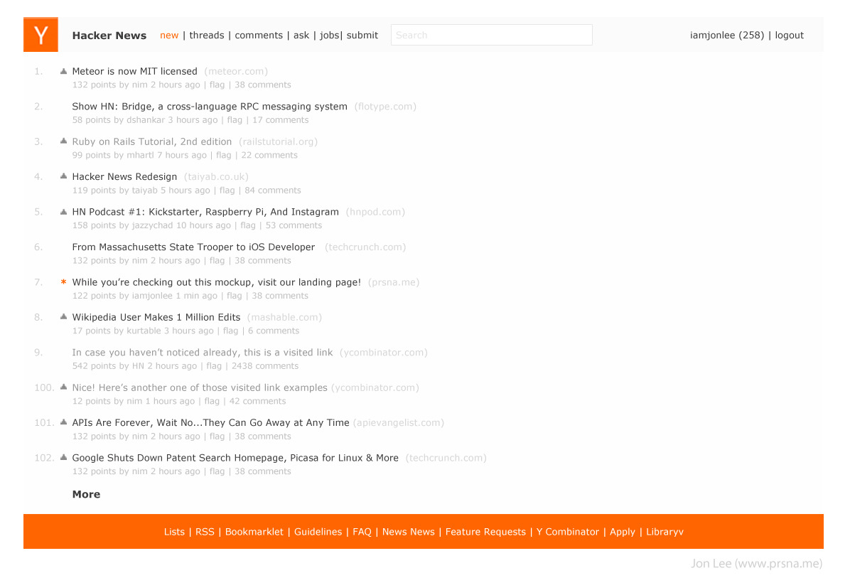
Your redesign, while prettier, does nothing to improve the user experience, or to tell a story. Sure, it's easier on the eyes, but it's a much worse design, in that it makes the user experience worse. It's now harder to read: less information is on the screen. (11 story as opposed to 25, on my screen.) The information hierarchy within stories is less clear. The eye has to jump around more to get the secondary information (poster / point count / comment count / time posted). The flag functionality is simply gone…
You did a good job making it look better, and should be commended for that. But as for the design, try again.
PS: Take this as friendly critique. Take it in, learn what you can, try again. Rise, repeat. Don't be discouraged, but realize you have a long way to go. You'll get there!
I kept reading down the page hoping to see the reasoning behind the choices made, but was disappointed to find none.
This is why I disagree with the notion that style is only skin-deep. It's an integral part of UX, but only when considered within the framework of UX. The points value is now shaded in 3D: Why? The rank is now an orange circle: How does this help the user?
The best visual design is always based on UX. Do users consult the rank often? If not, the orange should be reserved for something else more demanding of the user's attention. Are the point totals interactive? If not, the 3D shading should be saved for use as an affordance somewhere where there is interaction. It's questions like these that turn a pretty visual design into something that not only looks but works great.
> This is why I disagree with the notion that style is only skin-deep.
Semantics, but I think you are agreeing with your parent that there should be something deeper than the gloss applied in this redesign. That design must go more than skin-deep. Arguably the word “style” could refer to paint jobs, so your statement was fairly confusing.
I fully agree with your comments regarding the bizarre amount of visual attention demanded by the rank numbers here and the points’ affordance of clickability (and said as much on a comment there).
Whilst I don't want to pick on the OP, this is such an important point. Its all too often that 'design' gets confused for 'eye candy'. This doesn't just happen on websites, but in all design based professions. And this is a bit of a case in point.
The HN audience tends to want high-information-density, not necessarily visual joy (or for that matter extra sugar for clarity of new users). Its a very different thing to design than a website-shopfront. Generally I think it works very well as is....
"As is" is still lacking. Reading these comments across almost the entire width of my monitor is not good design. You do get information density, but my belief is that in the case of reading paragraphs, information density is secondary to readability.
All of these things may be true, but the biggest usability issue facing HN right now is load times. HN has undergone exponential growth even in the short time I've been here, and the site hasn't kept up with it. Given that we're all programmers, perhaps we should take it upon ourselves to dig through the source and see what we can speed up.
Am I missing something? I don't see any noticeable difference between this and the current design.
It's now harder to read
I find it immensely more readable than the current design, which to me is a left-justified wall of dense, unnavigable text. The low-contrast colors of the secondary information make it hard to pick out information quickly and increase eye strain.
Schooled designers are very sensitive to fonts. While he sees a world of difference because of that font change, you might see almost the same design. Because they study them deeply. They see them from another perspective, more like the story behind them. I've worked with many designers from Art Center in Pasadena and this has happened to me many times, where I need to make a further effort to understand them, and viceversa.
Here are some thoughts on why I made mine this way:
1) Hacker news is read by hundred of thousands of people every month- to adapt to a completely new design would wreck the user experience the users have come to expect.
2) Your patterns and icons, while I appreciate the gesture takes focus away from the headlines. The most important thing should be the headlines on hacker news. That's how it was designed to be. Everything else should pale in color compared to it.
3) As SeoxyS mentioned, I designed mine as to not disrupt the functionality that everyone's used to. What I did was "design" the page to improve readability. I made the background color behind the text a light grey so it's not as gloomy as the current site and used a dark grey font rather than the black on current site to improve faster reading. Black on white is always tiring on the eyes, which is why I tried to adapt different shades of grey.
4) I don't like HN's top nav bar right now because it takes focus away from the logo. The logo should be consistent with the one found and recognized on YC's main site. A logo on the site should be loud and clear. I made the top nav bar a darker grey so that it would give focus back to the logo.
5) The selected links are now orange instead of white. By having tiny accents of color, it adds the kind of eye candy that you want but nonetheless tied in with functionality. UX comes first, then UI. You can make something pretty after think about how you'll first make it user-friendly.
6) To improve eye candy, I gave the bottom nav the bright color of HN to really lighten up the page. I felt that otherwise there would be too many grey areas.
7) I moved the search to the top and yes, this does change what the users are used to, but in my opinion a good change. I've read many posts where people (including myself) have had a hard time finding the search button. To move it to the top nav will adapt to web standards.
Normally, I'd make the search larger and start right aligned at the end of the top nav bar and instead move the username + logout link above it, but I felt that it might be too disruptive, so I sacrificed what looks the best for a better experience (this is important).
The main text is too light and low-contrast: it looks like it is frightened of being there and trying to run away and hide! (and so the most big and powerful thing on the page is the footer, which does not seem the right priority...)
RE: 6) The orange, in-your-face footer is very distracting. My eyes are attracted to it constantly, and away from the articles (which as noted by the other commenter are too low contrast). My $0.02
"Design, on the other hand, is the core of the product: how it functions. It's the soul: what story it tells."
I find it ironic that this submission is near the top of the front page at the same time as this (excellent) essay about startup culture (among other things) is also on the front page:
The design of any website is supposed to be a reflection of your company culture. It needs to make the people you're trying to attract feel comfortable and at home. Sorry to be blunt, but this redesign does the exact opposite of that, for me at least.
Please don't take offense at this because it isn't meant toward you as a person; I fully support people doing redesigns of sites and posting them, but in this case I can't help but feeling like "dear god no." If you watch Rocky IV, the reason it's so easy to root for Rocky is that he's a product of his community, whereas the other guy is a product of some cold and unfeeling scientific process. Hacker News is a community, so you want a website that feels like something that a community would make. This redesign just doesn't do that.
How can you criticize the design, then, without taking it for a drive to test the functionality? I think this guy got it pretty damn well. I've seen other submissions on this page, including the one you link to, that fail in a major way: the damn up/down buttons. I don't know where the down buttons are going to go, but the current ones (and your linked ones) are too small and close together. On a small screen or with a clumsy (read: touch) interface they are very difficult to use. Designs that preserve them FAIL badly- not because they look bad, but for the very reasons you state: the function suffers for the looks.
And what's the point of the huge margins on the one you linked to? Can't we make better use of the space somehow?
I think the OP has a helluva nice looking start to a website redesign, and I hope he doesn't get discouraged from the hivemind criticism I'm seeing on this page.
I hate the assumption that higher information density is always a good thing. White space is important, for aesthetics, readability, and usability. HN in its current state is far too tightly spaced.
Another thing I think the current HN design does well is act as a filter or repellent. Hackers can typically deal with an unattractive interface, whilst the average person would be turned off and leave the site. Those who stay on the site do so for its content, they don't need any extra convincing to stay.
I think you're a little too harsh. The comment bubbles are helpful.
Your eye might need to jump around more because you're not used to the new design yet. Sometimes an article might say "discuss" which just means 0 comments. This would make that much clearer.
You might say you shouldn't have to "get used to" a good redesign, but after using a website for years, almost everyone would need to overcome old habits.
HN might be designed to compact a large amount of data in a small area, but reading tiny letters isn't exactly good UX.
I think you're missing the point here SeoxyS. I just put an initial concept out there for everyone to see and maybe get a flavour of how a redesign/reskinning of HN may look. I understand there's a lot to be desired and I haven't sat down yet and put the time into fleshing everything out properly, hence this will probably be iterated on a thousand times.
I appreciate the feedback, and will definitely take it into consideration.
I wouldn't call it eye candy, exactly, but I do think that most HN design submissions are little more than illustration. But I also think that design is much more closely related to engineering than any primarily superficial discipline. (Such is my experience after an undergraduate in physics and a master's in architecture.)
Both engineering and design are instances of the same type of problem solving process. But because design is focused more on qualitative and subjective elements, its state space is much larger and, I believe, its design solutions (or attractors) more fuzzy. Because of this, design and engineering actualize themselves quite differently in real life, often requiring different skill-sets.
And I think that because the web and application design disciplines require more engineering-thinking -- architecture, for example, must also consider spatio-temporal qualities -- most design-thinking is delegated only to the most superficial facets of the process. What would really help understanding is for more designers to push into the engineering side of things, and more engineers into the design side of things.
> I'm sorry, but this is a perfect example of the difference between design and eye candy.
You are absolutely right. Eye candy can quickly become eye straining.
Hacker News is successfull not only because of its content but also because of its design. It's simple and pragmatic, as it should be. I always need only seconds to read the headlines of the whole page.
Although I agree with what you're saying sometimes spending more time on eye candy than the actual design can be useful.
Eye candy doesn't help the user with navigation or add functionality but it can make a website look more professional and in-turn more trustworthy.
For e commerce websites getting the users trust is an important consideration and I'd argue eye candy is maybe just as important as the design.
Of course in the case of Hacker News I wouldn't like to see this kind of redesign implemented and would prefer the focus of the site's design to be solely on improving it's functionality and usability.
Hi SeoxyS, if you have time do you mind critiquing my side project's design on this page? It's a website for students to find buyers and sellers of used textbooks (usually other students).
So far the best. The 3 most important things are the largest: comments, link to story, upvote (though I would've moved upvote to the right of story link--but that's just me, I don't believe in upvoting anymore).
I think of a "story" as a narrative: a sequence of events involving characters. In an epic story, there's a hero, a quest, thresholds, guardians, a special world, obstacles, tests, allies, a shadow, a return etc. Could you elaborate on what "story" means in terms of design?
For people those who do not have bandwidth problems. Resolving the story in Readability like distraction and ad-free style which include comments in bottom would be great. Also Commenting is hard to follow on HN.
Totally agree with your critique, but maybe you can enlighten me.. whats the advantage of even having the post numbers? Seems like unnecessary information.
i've been trying out some of the hacker news style extensions, and this one suffers from the same problem as the others -- when you're reading comments, and the comments are centered without a background color for the content div, you can't figure out how deeply nested comments are. it makes it difficult to figure out which comments are top level and which are responses.
That's a good point that's worth addressing. What do you suggest? Left-aligning the content to the window border or something else? Pull requests to the repo on github welcome!
Also the current design makes the headlines the most contrast (black), which really is the main information on the page. In his "design" he has all kind of visual and distracting garbage, like the orange numbers (why, why???).
And yeah, insane spacing between the lines makes absolutely no sense.
The striped header is not more visually appealing than the current plain one.
I believe this is not a good redesign, and I'll try to explain why:
- Where should I click to go to the comments page? If I have to click on the little bubble on the right of each article, it actually makes my user experience less pleasant than with the current design. (Did OP read "Don't Make Me Think"?)
- No flagging button. Did OP voluntarily omit it? If so, why? If not, where would he put it?
- The scores of the articles look likes buttons, what should I expect when I click on them?
- Knowing the number of comments of an article and its score are both important to create a certain "I need to see this" factor for readers. Putting those numbers respectively on the far left and on the far right does not help this at all.
I really agree with SeoxyS here. This redesign does not improve the current HN experience, and it actually makes it more complex by displaying the information in a way that does not look bad but does not actually help browsing the site.
I would suggest OP to think (or learn) more about UX. That's a very good thing to do on a Friday night, and even though a lot of this knowledge can come through working with a different focus (think about your user) and common sense, there are good books to get you started.[1][2]
Sorry, but I don't like it. I do like the top header and the color scheme in general. The texture in the header looks snazzy, in a good way.
The space wasted by the listing of stories is very excessive. That's the meat and potatoes of the site, yet I see 10 stories in the first screenfold vs 24 now. Why dedicate so much space to the wide "XX points" label? Is it even clickable (why would it be?) Arguably upvoting a story is more important and is actually actionable, yet the up vote "caret" looks way less clickable. The comment count balloons are jarring in their size and contrast and their random placement on the right side is distracting. When I glance at the page, I notice this jagged curve of gray dots, yet it delivers no useful information (other than how long the headline is, which is not useful).
So I think it's all about the spacing. When I look at that page, is the headline list easily perusable end parsable? I don't think it is. It is more spaced out than the current design, but it is surrounded and squeezed by these loud new elements. Think about the negative space created by the three new columns before the headline--I think clutters up the headline list.
Compared to the current design, this is a worse design. While the current HN design could use improvement (IMO text is too tiny), it does have a striking simplicity and focus on headlines that I love.
I apologize if I come off sounding harsh, and I certainly don't have design chops myself to pull off something like that (though I'd like to at some point in the future...)
I understand you won't get nearly as much "karma" for linking to website in a comment as you would if you hit the frontpage, but now I had to go looking for your article in the long list of articles on the newest page with no real gain.
All fairness, this is perhaps my favorite HN redesign that I've seen. I'm a fan of the white space, and the far more readable text.
I don't know why we're numbering the posts on HN, so I won't critique it on the redesign, but I think you could safely drop that as an artifact and then, perhaps, the 'points' section wouldn't look so large.
The only thing I flat out dislike is the number of comments floating out to the right. It's a ragged-right design, and it bugs the crap out of me (though it might just be me).
On the whole, I'd much rather be using that site than this one though, and that's gotta be the benchmark for success. I don't think it's perfect, but I definitely agree that it's a big improvement.
Redesigning a popular site is a good way for up-and-coming designers to show off their skills - but it's important to consider the target audience and their priorities. Yes, HN users want speed, but mentioning page load times and moving on shows that you haven't really thought about that. We want to get into the meat of HN (which is the conversations) as fast as possible. Everything that gets in the way of that is bad.
1) Spacing - designers love adding extra space, and on first glance it looks beautiful. But too much space slows down browsing speed.
2) The numbered articles - more eye catching than the actual content. A user reading that page will have to spend concentration on not looking at the numbers.
3) The same with the bubbles around the comment counts and upvotes. Those values are important for HN readers - but not as important as the actual topic.
It looks good, although I also like the current, simpler design. One thing I really like about your mock-up is that the link to the comments page has a much bigger click target. I lost count of the times I wanted to open the comments page but missed the target by a couple of pixels because it's so darn small (only 7pt).
If I were you, I'd drop the leftmost number (1, 2, 3 ... 20) which looks totally useless to me. I'd also move the points number right below the upvote button so that everyone can immediately tell what it is. No need to repeat "Points" 20 times in every page.
Also, screenshots like this should be in PNG, not JPG.
Looks pretty... unusable and, no offense, not well thought out...
- Items that deserve no attention are bright and draw the eye
(e.g. numbers in front of questions, what's the use, so you can refer to them in a chat?)
Should be muted at best, perhaps even removed.
- Repetition of the word Points unneeded. Takes up valuable space and adds nothing
(note that I've never used that info either in deciding what to view, but some may)
- Upvote button large, I like but does not need an attention-grabbing color
(at least not until I hover over it).
- Title is still too small in the new design.
- "Posted by" is redundant and could be removed as well, or replaced by "By"
- "Time since" indication which I use as my 'click-trigger' for repeat visits throughout the day
I'd like that to be more prominent than the Posted by, i.e. at the from of the line
- The comment balloons at the end make no sense.
Appreciate the larger target, visually intrusive due to positioning
Sub-optimal in terms of mouse-movements required. I'd put them at the front as well.
The question you need to ask yourself is, "Does my design add value?"
The top comment already sums it up perfectly - Design is not about making things pretty or looking nice. Design is about function, design is about value.
I won't deny that the design looks good. I'd say it looks 'prettier' in certain ways, but if its not more functional or doesn't add more value to my experience on HN, what good is it to me?
Here are some thoughts on why I made mine this way:
1) Hacker news is read by hundred of thousands of people every month- to adapt to a completely new design would wreck the user experience the users have come to expect.
2) Your patterns and icons, while I appreciate the gesture takes focus away from the headlines. The most important thing should be the headlines on hacker news. That's how it was designed to be. Everything else should pale in color compared to it.
3) As SeoxyS mentioned, I designed mine as to not disrupt the functionality that everyone's used to. What I did was "design" the page to improve readability. I made the background color behind the text a light grey so it's not as gloomy as the current site and used a dark grey font rather than the black on current site to improve faster reading. Black on white is always tiring on the eyes, which is why I tried to adapt different shades of grey.
4) I don't like HN's top nav bar right now because it takes focus away from the logo. The logo should be consistent with the one found and recognized on YC's main site. A logo on the site should be loud and clear. I made the top nav bar a darker grey so that it would give focus back to the logo.
5) The selected links are now orange instead of white. By having tiny accents of color, it adds the kind of eye candy that you want but nonetheless tied in with functionality. UX comes first, then UI. You can make something pretty after think about how you'll first make it user-friendly.
6) To improve eye candy, I gave the bottom nav the bright color of HN to really lighten up the page. I felt that otherwise there would be too many grey areas.
7) I moved the search to the top and yes, this does change what the users are used to, but in my opinion a good change. I've read many posts where people (including myself) have had a hard time finding the search button. To move it to the top nav will adapt to web standards.
Normally, I'd make the search larger and start right aligned at the end of the top nav bar and instead move the username + logout link above it, but I felt that it might be too disruptive, so I sacrificed what looks the best for a better experience (this is important).
I do give you props for trying it out, that's how we all push forward to improve.
I think that it looks good, but I think that you could change how you display the number of points each post has accumulated. The design of the site does not seem to fit the culture of hacker news. Look at the current website, it looks like it was hacked together by a programmer not a designer.
I think that a redesign of hacker news would include a bit of the old site's spirit.
just my opinion please excuse my grammar
It seems to me as though most of the critics here dislike the decreased information density more than anything else. This is a problem easily solved; make the text smaller and decrease the space between elements.
On a broader topic, though, many of the commenters appear to view style and substance as opposing forces. O hackers, can we not have both the functionality and the form? The presence and organization of information does not fundamentally conflict with rounded rectangles, smoother fonts, CSS buttons and all the other jazz that populate our startup pages.
Arguing that the ugliness of the current design improves the quality of the user base is the online equivalent of wearing coke bottle glasses because it makes you look nerdier. Let's present our services as both sexy and smart.
> I know Hacker News is all about fast load times and minimal bandwidth usage, hence the lack of much graphical work in the current version.
Actually, I believe that the simplified design of HN as it is currently helps ward off the typical Internet surfer looking for new links to click on. The last thing HN needs is to attract users who only post pictures of animals.
My single piece of design criticism for HN would be to provide a hi-res upvote triangle image (heck, why isn't it pure CSS?) for retina display devices.
My single piece of design criticism for HN would be to provide a hi-res upvote triangle image (heck, why isn't it pure CSS?) for retina display devices.
I don't think HN is about fast load times and minimal bandwidth. Yahoo YSlow and Google PageSpeed reports recommend that ycombinator.com use HTTP compression, minify HTML and JS, and use HTTP caching for static resources.
1. With your redesign, you've brought a submission's point total into the limelight. Instead of the way it is now where the two main actions are to read an article and upvote if you like it, you're throwing in a third factor. You're saying 'this is how many times this story has been upvoted, and you should take this into consideration when deciding whether to vote on this story. Oh, and if you decide to upvote, the button is to my right.' You sort of create a problematic association between point score and the decision to upvote.
2. Orange seems to be a highlight color, so using it for the story numbers doesn't make much sense. The number a submission is on the list is maybe the least valuable piece of information on the page.
3. The comment bubbles are a nice touch, but they're placed in a bad spot. Look at the current HN homepage now and you'll find that all the comment links stay relatively consistent along a vertical path. It's easy to scan down the page to find the story with the most active discussion. Now imagine viewing your redesign and having to dart your eyes to the end of submission titles of greatly variable lengths just to get to the comment number.
With that's said, I do like the direction you took it in. With a few tweaks, it may turn out to be a really effective design; so keep playing with it!
Hey, don't let the haters get you down. It may not be everyone's cup of tea, but it shows courage (if not naivete) to muck with a beloved icon.
My advice for anyone has been for years to abolish the word "redesign" from your vocabulary. Seriously. Most redesigns just swap a set of known and familiar problems with unknown problems. Also, as you can see, any dramatic change just pisses people off.
Why do all these redesigns have serial numbers ? what purpose do they serve ?
Submissions to HN move up and down dynamically - remove the serial numbers and show (302 points..25 comments) which should be CLICKABLE. This will bring front and center the only two things that people judge in deciding to read a submission. Plus it will make it easier to click on a mobile device.
Indeed, he added the serial numbers because he was thinking in design elements not in functionality. It's very common practice of designers who don't do much UX.
- The red list numbers are essentially glorified, distracting, bullets
- Why does "x Points" look like a button? The word "points" also does not need to be repeated for each item, or needs to be deemphasized in favor of the number.
- Comment links are all over the place and look like a river of grey blobs running down the page.
- Article titles need more emphasis than the previously mentioned elements
Regardless if you like this design or not, I think HackerNews does need some kind of redesign. I can remember when I first started reading there were a lot of things that just weren't intuitive to me. I always wondered why a site for "hackers" and "coders" seemed so basic in features and looked like something from the 90's. Particularly, the login and password reset seems kind of difficult to use. Is there no RSS feed? How do I know when someone replies to one of my comments? Looking at my profile I have no idea what that stuff is for... "Max visits" "minaway" "delay"... ?? I still don't know what that is. I get the speed and simplicity idea but I think there are some user experience issues that can be solved while still having speed and simplicity.
Maybe I'm the only that feels this way, but just my thoughts. Maybe there is a good reason to the current design?
There are documentation pages which explain the features you're asking about. Also, search now works. This may seem really unfriendly, but perhaps friction is sometimes a good thing? RTFM and "use search" have been the grumpy welcome of hacker communities for many years, so I guess that's something that has carried over?
I'm oddly attracted to the existing design of Hacker News. It suits the community and purpose of the site well. It's aesthetically spartan, yet functional.
SIMPLE COLOR SCHEME: it's very simple with just one prominent color and the rest black, white, and shades of gray (I count the cream background in this).
INTUITIVE: The front page is a list of links sorted by some measurement of popularity or quality. While you may not notice this upon first glance, it's something you appreciate, and you at least take away "better stuff gets pushed up".
EFFICIENT: You can immediately see the number of comments a story has before you click through. I tend to migrate more towards stories with lively discussion, rather than the highest stories in the sort.
FAST: The whole front page is 29 KB, and I can do an uncached load in 1 second. There are only 3 images which collectively amount to less than half a KB.
Not a commentary on this particular design, but rather just a general thought: I would argue that the very utilitarian design of this site is actually a feature rather than a deficiency to be corrected. Generally the point of design is to send an unspoken message. For a store, you want to send the message of "we're safe and professional and welcoming", so rounded corners and soft gradients and open spaces are of much utility there.
On the other hand, for a site designed for self described "hackers", I think having a very utilitarian as-simple-as-possible not-trying-to-impress-you design sends the message that "appearances don't matter here, the content is the focus"
Nothing personal, but you are missing the most important point of existing design - it's the information density and the lack of any whitespace whatsoever. Whatever the redesign it needs to preserve 20+ stories per page, it's a must.
I like the current HN design. It's simple and elegant to my taste. I'm not a fan of eye candy (for the sake of it). Minimalist approach of HN is why I like it and what distinguishes it from others. In short, it's the focus on content, rather than design elements.
But there are a few things I would change:
* Replace the triangle image with a caret.
* Remove the points to avoid the popularity bias.
* Remove the comments count to avoid the flamebait alarm.
* Move the search on the top.
* Tone down the color.
1. Everything is bloated. The comfy header, myriad bubble quotes, and excess space make HN look like a daycare for those that have an unhealthy obsession with Wordpress and Dora the Explorer. The precise, technical vibe that exists with the website simply isn't there.
2. The bubble quotes are deal-breakers. They take up plenty real estate, are identical, and don't line up vertically. Your eyes are more attuned to the "wave" that's going on in the right than the stories themselves.
3. Taking a second look I half-expected the HN logo and login button to be circular.
#1 change I want for HN layout: infinite scroll.
#2 change--drop the numbers for the articles. Unecessary.
#3 change--make the comments click area larger.
I feel HN does need a face lift. What with it showcasing the designs of tomorrow everyday and all!
I agree with kijin, the numbers besides the posts seem of no use. We need to use the space so as to get as many posts as possible in the view without scrolling, so I wouldn't mind narrowing the distance between the posts either. Maybe a hover can magnify the post a little.
Posts that link to URL could have some distinct style or something.
I don't get what is wrong with current HN really. The site is not meant to attract customers or be beautiful - it is a news submission aggregator. The focus needs to be on maximizing information density while maintaining clarity. Titles, upvote icons, and comment numbers are sufficient to get that across, so adding "flair" will only detract from that appearance.
Also, I hate sites with huge title bars like that example. It pushes the actual content further down the page. Sure, this isn't 2002 where having 90% of your content in the initial view of page the isn't as important anymore, especially on a site like HN, but still maximizing for information density makes a users life easier.
I like all of it but the bubbles. I find those distracting. I do care about the comment count/links more than the points though. If it were me (not a designer) I'd stick the '114 pts' right of the arrow, no bubble.. and use the current points bubble (which looks like a button) for the comments link. This would actually severely improve my mobile experience where I often hit the article instead of the comments link.
I honestly don't think HN needs a redesign in that sense (if at all). The mockup proposed here is a nice design for another kind of application, it's kinda safe and soft.
My bet is that HN would benefit more from a data oriented redesign where users see the stories and their stats more like a work sheet than a pretty web page. Dynamic data is what users would be interested in, not bubbles and double spaced rows.
I actually like this design, it's clean. The only thing I don't like is that each row is doesn't seem to be vertically aligned. The index number and number of votes are vertical-middle aligned. The article title seems to have too much padding at the top. Then the number of comments speech bubble seems to be bottom-aligned with the article author.
If it was all middle-aligned or top-aligned I think it would look pretty cool.
I like it, but it feels like the gmail redesign with too much space. Some people like that, I'd prefer to see a maximum number of articles on one page.
+1 I really hope this trend of adding uber whitespace is short lived. On a site like this, I feel like the designer's goal should be to get as many links on the screen as she can without me feeling the site is overly cluttered. Solving that problem by blasting me with whitespace frustrates me.
A few people have mentioned information density as being important. I've got the 'Stylish' chrome extension installed with a userstyle for hn which looks like this:
It is easier for a user to scroll down a long continuous list than to hop back and forth between two columns. This is particularly true for ordered lists (as is the case with HN).
The only thing I strongly dislike about HN's current design is that comment line lengths are far too long[1].
A lot of things people said are right. While reading the post, I hoped for something very clean. But it's not. There are elements and bits that are unnecessary and/or redundant. All already mentioned in previous comments. And the solution doesn't need to be "eye-candy". Just go for better type choice and a effective color palette. Basically, a no fuss, no frills solution.
First impression (5-7 seconds): no, this does not work.
In the current incarnation the page has just the right font size and just the right amount of vertical space. Strictly speaking it is a bit tight, but since every other line is grey and in a small font, the spacing of the headings becomes perfect.
The new design is prettier. But it negatively affects the usability of the site.
Nice design but it doesn't add anything to the site experience for me. The header seems too big for orange. I used the option to turn the color of the header on HN from orange to white to further simplify the look of it. I do kinda like the number of comments bubble though. I'd love to see a link on the 404 pages.
It seems the site is distracting me towards the design elements, and I can't focus as much on the content. At the very least the text font should be larger and make the comment bubbles smaller. Everything else could be smaller, too. The focus should be the content not the design itself.
*How about something a little more mobile friendly?
At the very least, a pad on clickable areas would be much appreciated (seeing the comments on a post or upvoting takes a lot of skill to hit that link with a finger point).
The vertical 'information density' will drop a bit but people don't have much trouble scrolling.
There are other functional things with HN that need improvement. For instance, when you edit a comment, and hit update, you should be taken back to the post. Although I have to edit my comments to fix typos, maybe editing comments shouldn't be allowed at all?
Been reading the feedback here and on my blog over the last few hours, and I have to say I agree with most of it. This was intended to be an initial concept that was going to be iterated on again and again, so I guess I have plenty to do to make this better!
I like the design of this website; it's fast, easy to use and works both on my laptop and mobile. It's also something I'm trying to achieve at my startup, http://lion.co.uk though I'm still not there yet.
Like the design over all but one change I would make is to remove the post numbering eg. 1 through 20, and then integrate the upvote with the points button and likely do the points button in the style of the post number. eg. orange on white.
Much harder to scan the headlines, which is the main job to be done.
I always appreciate people putting their thoughts out there and I hope that Taiyab will not take the criticism here too literally but instead will try to learn from the input. Nice attempt!
I guess with HN it's a good idea to stick with the old design. A new (fancy) design would only attract more mainstream users which is not in the interest of HN in the first place.
What's most telling about this situation is that something that is clearly not that good nor interesting is at the top of HN. Perhaps this is just 'good' inasmuch as its HN bait.
This is great. Seems like it's too fancy. And some people would not like it.
And the comment bubble is distracting.
Give it a change. I might gonna use it.
Your design is nice but not very mobile device friendly. and theres no point in putting the post position in orange background, its unreadable/invisible.
I find the number of comments are a better indicator of how interesting an article is than the number of points. I don't even look at the point values.
One of my observations about software and websites has two parts and is seemingly paradoxical: design matters; and design just does not fucking matter. For every one beautiful polished friendly UI you can cite that made it's owners wealthy I can also point you at another app/site which is ugly/painful and yet it also made it's owners wealthy. I love design, I do -- but fuck design. You're right and you're wrong about it. Make something people need, that does something that matters for them, and get them to pay for it, whatever it takes, and you're gold. Plus I increasingly suspect that "design" matters most precisely when what you're providing is ephemeral or not really needed. I don't know about you but I sleep better at night thinking I'm providing something people need or that materially improves their lives, and not just hawking a commodity pig with lipstick. There are hipsters but also housewives. There are artists but also managers. There are problem spaces with dozens of pre-existing software solutions which are all friendly, effective and pretty -- and you want to stand out from them, so that's hard. And then there are other problem spaces with no software solution, or no affordable one, or nothing that runs on the particular platform a certain segment of customers wants, etc. You're free to pick which of these opportunities to take a whack at addressing.
Design sometimes matters a lot; but often design just does not matter much.
Automate someone's pain away and get them to pay you for it. There are lots of opportunities out there with this quality. Don't worry too much about design.
>Often, people wonder why I spend $50,000 a year going to design school, when I can learn how to make things that are just as shiny by reading psdtuts.com.
Yeah.
During several years i visited HN from time to time, frowning at the old-school layout. And promptly left.
Until one day, i matured enough, and realized that simplicity is elegant.
Though, i dislike the low-contrast browngray background. It's annoying for reading.
Make the layout user-customizable to each login. Let users choose. Is that too hard?
The difference is that style is only skin-deep. It's superficial. It's an added bonus on top of design. Design, on the other hand, is the core of the product: how it functions. It's the soul: what story it tells.
Your redesign, while prettier, does nothing to improve the user experience, or to tell a story. Sure, it's easier on the eyes, but it's a much worse design, in that it makes the user experience worse. It's now harder to read: less information is on the screen. (11 story as opposed to 25, on my screen.) The information hierarchy within stories is less clear. The eye has to jump around more to get the secondary information (poster / point count / comment count / time posted). The flag functionality is simply gone…
You did a good job making it look better, and should be commended for that. But as for the design, try again.
PS: Take this as friendly critique. Take it in, learn what you can, try again. Rise, repeat. Don't be discouraged, but realize you have a long way to go. You'll get there!
--
Note: Check out this redesign, which I think is quite effective, and is installable as a extra stylesheet on the current HN code: http://akhun.com/seo/skitch/Hacker_News-20120420-180413.png