The tone and level of entitlement of some comments is astonishing. Thunderbird is a free and open source tool, used by many (including me). The least we can do is to be a little nicer.
I love thunderbird but I don't understand their update schedules.
I just now got an update (thought it would be to 115) but it's to 102 [1].
In the release notes of 102 it says it was made public only 5 days ago (and they say 115 is coming soon). And seemingly it can't update to 115? Am I missing something here?
The janky versioning is because Thunderbird releases are tied to ESR (extended-support release) versions of Firefox.
- "Thunderbird Project version numbers for releases match to Mozilla Firefox ESR numbers. Thunderbird also provides consecutive betas between the ESR numbers, for example 92-101, which match to Firefox (non-ESR) beta numbers. Future Thunderbird (ESR) releases upcoming are 115, 127, etc."
That threw me for a loop. I went to download 115 and got 102.
I've mostly stuck with webmail (Fastmail for personal, Gmail for work) but would love to get back to a local client. So I'm willing to give the new Thunderbird a shot, but it's perplexing when they advertise 115 and give me 102 and it's really unclear how to get the nifty stuff they're advertising.
As the maintainer of CoreJS (Denis Pushkarev) said:
Maintainers are the unsung heroes of the software world, pouring their hearts into creating vast amounts of value that often goes unappreciated. These unsung heroes perform critical work that enables all of modern technology to function – this is not an exaggeration. These tireless individuals dedicate themselves to writing new features, fixing bugs, answering user inquiries, improving documentation, and developing innovative new software, yet they receive almost no recognition for their efforts.
I think it's reasonable to criticize a piece of open source software, especially one backed by a non-profit, but not to be entitled or mean-spirited about it.
They spent 1000 credits on an iDevice with basic, inflexible, proprietary software that "looks good" and expect flexible, powerful, portable, free and open source software to look the same too.
I agree in the abstract. But as I have seen lately, devs (or dev advocates) are pretty snowflakey.
Probably because I think the "average" open source dev has more or less "lost the plot?" A whole lot of trying to beat Steve Jobs at his own game and far less "lets make solid software that works well for people all the time."
I was prepared for disappointment, given the sad direction most desktop applications have been heading in the past decade. But admittedly, it looks pretty dang good. Looking forward to giving it a test drive!
It hit me that they may be listening to their users more than most desktop app developers when I scrolled to the section about display density. The overwhelming majority of modern desktop apps have exploded the use of white-space and grossly reduced the information density of applications. Mind you, I suspect I will personally want an even more dense setting than their current densest option. But having density settings demonstrated front and center gives me hope.
I'm also concerned that I will still want a traditional three-pane split view (folders at left, message list at top-right, message text at bottom-right). Many desktop users do not run their mail client fully maximized, so a horizontally-biased window size should not be assumed. I run Thunderbird on the left half of a single monitor, meaning it's taller than it is wide. A three-column view will probably not use that space well.
I'm guessing this is not an Electron app. If I am right, that alone deserves praise.
Yes, I have a 3:2 lappy and a second monitor in portrait. Forced widescreen layouts are a no-go here. Thankfully the article implies new options, rather than "Dieter from Shprockets" knows best.
Putting the search bar front-and-center in both the application and this announcement, I hope the backend implementation is now able to keep up?
The one use case I switch to my mail provider's webmail UI for is search. I mentally sigh a little bit each time I realise I have to search through my email. Thunderbird's search has been among the worst I have ever come across, sadly. Functional search would be a killer feature. As it's running locally, heck, give me regex. Trivial to implement and would be a huge improvement already.
Yeah. It's been terrible forever. Either returning far too much, far too little, or both.
I've often just resorted to grep on an export of mail directories to find that one email.
I even once imported the mails (ugly bash and Ruby hacks) in meilisearch to actually find stuff.
It surprises me that it's possible to have a search experience that's worse than manually grepping through directories.
I have always wondered this. When a site like "MAterial for Mkdocs" can implement such a featureful search (with autocomplete, spellcorrect and such) in a browser for a website, how could it be this hard for a desktop application with several orders of magnitude of resources at its disposal?
As a relatively new TB user, I thought it was me who was "holding it wrong" lol. Searching for my employer's name and it only returning my career portal applications but not actually their emails (that were from their domain, with their name appearing atleast twice in text) was baffling.
I'm very hopeful about this new version. I can already see one of my U/X gripes fixed in the screenshot.
The only issue I have with TB search is the setting for the results presentation: why is there not a preferences option to set if the results show as list or in the current default 'verbose' view?
switching to list view manually seems so inefficient
This looks good! It has not reached my distribution yet, I hope this refreshed UI will be more convenient than the current one (which has done its job for the past 20 years but has some quirks like not having a straightforward way to follow a mail thread to my knowledge - well, it has but all the mails need to be in the same folder but sent mails are in the sent folder and received mails are in the received messages folder)
Just jumping in to say I'm also incredibly happy to see this change (and the other expected improvements).
Thunderbird currently looks dated, and I'm glad to see it brought into the 2020s.
Sometimes current users can be dismissive of UI changes, so it's good to see fellow users who are happy. Moreover, let's not forget the new users, who were previously put off by the dated UI.
I guess I'll be that dismissive current user. I don't like random UI changes in a tool I use as frequently as a mail client. The new icons don't look too bad, even if I dislike their flat nature.
I don't think TB looks dated. It looks functional. Which is exactly what I want from a mail client. If I want something that looks modern but is dysfunctional, I'll just switch to Outlook.
just gave it a test, the design additions are introduced gently. Defaults for listings are on the familiar view. Menu quick actions exist to go from compact to normal to more padding.
I had the 2-line message header view on my wishlist for a long time. Thunderbird did pretty great.
Thanks, if I'm honest I had skimmed over that setting before, not understanding its purpose. (It also looks like they're now introducing a unified inbox, which is what I wanted.)
> I don't think TB looks dated. It looks functional. Which is exactly what I want from a mail client.
This.
For better or worse, I've rather come to view "modern" flashy UI aesthetics as being indicative of poorly performing software. It's not fair, I recognize, but in my personal experience, it's a reasonable heuristic.
> all the mails need to be in the same folder but sent mails are in the sent folder and received mails are in the received messages folder)
There is a simple setting somewhere that allows you to have all sent emails be saved in the Inbox. Right now I'm not where I can look up the exact setting for this, but I'm sure you can find it without looking too long. I've been using it this way forever, all my threads are complete and easy to follow.
FYI, Thunderbird 115 is getting released tomorrow (July 11). Right now, if you visit the Thunderbird website [1] or try to look for updates within the application, you won't find this release version available (you can always get the beta release from the website).
I would advise against installing the beta for anyone considering it. I was in the beta for 2 years (mostly because it's quite challenging to get out of the beta), and the quality of the beta releases leaves a lot to be desired.
Aaaah. So that's why I wasn't finding anything, I thought I was going crazy. That landing page seems to hint that it's currently available ("Upgrade to version 115 and experience the future of Thunderbird!").
I’ve been using the beta for some weeks, and it’s fantastic. snappy fast, and makes me feel in control.
I’m not using (and probably never will) any of the non-email features like the calendar, or the chat. But they are relatively hidden away, so they don’t bother me.
Calendar in the mail client is very useful since invitations are sent by mail. You click accept, the recipient knows you did and the event is added to your calendar.
But indeed if you don't use it it does not get in the way, which is perfect.
I also receive pdfs via email, but I don’t want a pdf reader in my email client.
It’s perfectly feasible to write an email client that hands off received events to a calendar application and receives the response to send back. It’s all icalendar components under the hood anyway.
Putting everything together in a single monolithic program that handles email, calendar and contacts is a design choice, not a technical requirement.
And yes, I do use the workflow that your descube receiving and sending calendar events. But Thunderbird’s design is annoying because it’s a all or nothing situation: you can’t just use it as an email client and use some other calendar application.
did they fix the problem where the calendar account must be the same as the email account? My email is on zimbra but since the zimbra calendar is isolated, I use a google calendar from another email account because I can use it with reclaim.ai, share calendars and use it on my phone.
I read mail first on my phone with K9 (the old UI) a few times per day and accept invitations there to put them on my phone, which is always with me. Then I download mail with Thunderbird a few times per week. I use my domain providers POP3 servers. Yes, they bundle a mailbox with each domain. It's also IMAP and webmail but POP3 is better for my use case.
Same here. I want to "receive" each message exactly once, not have it synced automatically all over the place. I only handle my email from either my desktop computer or my laptop, with a simple script to copy it all back and forth whenever I switch the device I am using.
I was on call for my jobs for decades and never had any problems with this method, however it was before smartphones became common. I do not handle email on my smartphone, ever.
This made me remember that for a while I used unison to sync the Thunderbird mail directory of my laptop with my EEEPC netbook (remember those things?) because a cheap 1 kg small machine was perfect to carry around on one week vacations, just in case... Then smartphones happened and killed that use case.
My mail stays on my computer, backed up locally and encrypted to a remote location.
I lose the ability to access old messages from remote but it never was a problem in almost 17 years of self employment. Before that, I already had about 13 years of downloaded emails, from the times when web mail was not a thing. No need to upload my old messages to Gmail, if this is even possible. I just kept using a local mail client. For my personal mail I remember some emacs clients, Netscape Mail (bundled with the browser,) Outlook Explorer then Thunderbird. I might forget something.
Yes, before I ran my own mailserver, I strongly preferred POP3 for this reason -- it let me get my email off of a server that I had no control over and onto a machine that I do have control over.
But after I started running my own server, I prefer IMAP so that all of my email is in one place regardless of what machine I'm using. And it still lives on a machine that I have control over.
That's a disadvantage to me, because I pay my email provider in part for the reliability of not losing my emails, and also because I tend to access my email from several different devices and I want to make sure everything is synchronized. What's the advantage of downloading them all locally?
The reason in the reply of yetanother12345 plus that I don't need to access my mail from multiple devices.
When I'm working I always have access to my laptop with the complete mail archive.
When I'm not working I don't need the mail archive. Access to the latest mail in the POP3 server is enough. Proof is all these years since 1994. Furthermore I didn't have any access to my mail when away from my computer up to my first Android phone in 2011. Nothing bad happened to me and to the vast majority of people, which were handling mail in the same way pre smartphones. I mean: no access when on the move.
BTW, when I send mail from the phone I BCC myself so I'll download the message for permanent storage later on.
Not the guy you're asking, but I prefer POP3 over IMMAP for the exact same reasons as you pay a third party: "reliability of not losing my emails, and also because I tend to access my email from several different devices and I want to make sure everything is synchronized"
The difference is that with the third-party approach, the third party is really a risk factor of unknown magnitude (even if trusted and paid). With the "local" approach you are in full control.
I hate that "modern" nowadays equals "looks like VS code". Give me a menu and a toolbar with clearly associated keyboard shortcuts, I don't need a second dock (or even a first, i'm not on Mac). Tabletified webuis are inane for power users.
As a designer + developer, it always frustrates me to see a design not translated into code well. If this is built using css, there really aren't any excuses for not making this look as slick as the visuals. Especially when the design doesn't appear to contain anything which looks especially difficult to recreate.
It's difficult to overemphasise how much this kind of thing gives users of your software confidence. The common assumption is, if it looks good, it works well (and the opposite).
Product Manager here. The answer is because we are tied to the ESR release cycle we have to release at a certain time (we are working on changing this). So we're shipping all the work that is done and stable. There is still work to be done to the front-end and as much as people want to trivialize it, it's not so simple. To make the changes we did, we had to rewrite a very complicated front-end with some code that has been there for 20 years and had entire systems built upon it. We are going to get to what the mockup showed. But we're going to build it right, and that means rewriting large pieces of our codebase. We'll ship the remaining stuff when they are ready.
Designer mockups and the actual end result don't always end up being the exact same for various reasons. Nothing a little CSS won't change, from what I can tell the biggest difference is the contrast on the panel edges and the background on the read/unread/selected messages.
The road map does state Q4 2022 as a target so I imagine the work has just taken too much time already and the version 115 deadline wasn't made.
If the UI platform you're using supports themes, this can usually be fixed with that. Provide one default theme that looks perfectly polished, and another more compact one for power users.
Which do you default to for someone coming from years of Thunderbird usage? How in-your-face is compact mode toggle in the ootb experience for a fresh install? And sadly how many people are going to be new to Thunderbird these days?
If I got the 'polished' version as part of the normal update cycle I'd be upset that my tight, space-efficient and incredibly responsive productivity app had decided to use a design language that reduces information displayed. The point of email is to communicate information and I now have to interact with the UI more than I did before to get the same amount of information.
The launched version hits the density that Thunderbird has been for about a decade and is what I'd prefer (ie the compact mode might be better for those being upgraded).
Best is to ask them in my opinion. After the update: „we have a new design, do you want to use it or do you want to stay on the more compact design? You can change it any time in the settings menu <placeholder>“. The dialog should have pictograms of both designs.
>"If I got the 'polished' version as part of the normal update cycle I'd be upset"
Thanks! Glad you mentioned it! On Linux the Thunderbird update is just one among many other updates in an update batch, so usually it will just be installed with the rest of the updatable items. I will have to pay attention now, so I don't install this unwittingly.
> "The point of email is to communicate information"
Deserves repetition.
> have to interact with the UI
This interaction is a cost, and you pay. I like mine cheap.
For Windows they're not pushing current 102 users to the new design yet. This matches some of the previous rollouts where the auto-upgrade branch is treated a bit more like 'stable' or 'ESR' might be in Linux and Firefox ESR.
I'm seeing a density picker right on the announcement page. I don't think you need to use the calm, whitespaced version of the theme if you don't want to.
Yeah, agree with this. The design was miles ahead of what has actually been shipped. It's a shame, I feel like it could've done with more time spent on development to translate the designer's vision into code. They haven't even tried to port over the shadows on the messages (and have instead gone with an ugly thick border), the left sidebar has a different background colour to what was in the design, they're not using the shorter date/time formats, it generally feels much more cramped and less polished than the design. Even the selected folders are styled in an inferior way (using a de-saturated grey background instead of the blue-tinted light background and left border).
I don't want to take away from the work that has been done here, but like .. just copy the design? You can take screenshots and compare to the design until it matches. It looked amazing, I feel bad for the designer because their vision has really been lost in what's been implemented.
Which is not that much of a problem for Thunderbird, which is released for Windows, Mac OS X and Linux, but not IOS. And the Android version is actually K9.
I don't think it's a world apart. But the borders are darker in now than in the mockup, and the message card view is way denser. But I'm sure they'll refine these things.
Wonder what the hard-drive footprint this takes now, my version; 60.9.1(32-bit) takes 126MB and i consider that bloated for what it is. At the Thunderbird 60.9 release mark; Pegasus footprint was 30MB, Opera Mail was 38MB, Sylpheed was 28MB, even the Bat was only 50MB.
I run Thunderbird portable from a data pen, which is why this metric is important to me (i realize it won't be for the majority of users).
Edit; Okay i know i could buy a bigger data pen, but i also do weekly backups to the cloud and am limited to 7mbps upload, 2g takes 40 minutes, so every bit i can shave off helps. But i want to emphasize i realize it won't be important for the majority of users
> Edit; Okay i know i could buy a bigger data pen, but i also do weekly backups to the cloud and am limited to 7mbps upload, 2g takes 40 minutes, so every bit i can shave off helps. But i want to emphasize i realize it won't be important for the majority of users
Curious here: so you continuously upload your Thunderbird executable to the cloud? Why? Most upload+sync solutions worth their salt (FreeFileSync, Syncthing) have competent diffing algorithms that don't upload the same file twice.
Over the years i have run into OS problems that require format-reinstall, which used to take days to get normality back. So i moved everything i could to portable software on a USB pen drive, browser, email, graphics, 3d, text editors, PIMs, i even have xampp server mostly running portable. All saving data locally where possible, encrypted.. then i just back up everything periodically and i know my entire work-flow can continue on a new OS, or even a different PC with little interruption.
I have looked into Sync software, and i use this for local backups, but I'd only trust the cloud with an encrypted file container, which i have to re-upload each time.
I'm glad they aren't spending dev cycles trying to optimize on-disk footprint. 2TB SSD go for $100 and 4Tb go for $200. Nobody installs so many different software that the software itself, even at 200MB, could take up any significant percent of the storage.
At this point, whenever something says "maximize your freedoms" and does not explain further, I think it is adding spyware or otherwise restricting my choices. Decades of US policy doublespeak, I guess...
Sorry but they announced something, hyped users (including me) and didn't deliver (yet). I understand this is a lot of work and it's free software, but it still doesn't feel right and has nothing to do with being senior UX designers. They already announced and showcased a very good looking version of Thunderbird.
FTLOG yes please this. The best thing about Thunderbird IMO was the dense column view combined with ability to sort a folder by sender, which is for some reason impossible in most other clients.
I’ve found it odd not everyone uses it this way. There’s no better way to blast through an inbox that has let 500+ pile up, and can through and organize it.
One feature I’ve always dreamed of was a column for sender domain, which could be used to sort as well.
I really don't understand this. It already looks a little too clumped to me, what's the benefit to further putting things closer to one another? It's not like you're doing some kind of additive transformation and you need to quickly jump between lines, each email is its own thing and you can only read one at a time. If you need to find specific ones you can always categorize them or use the search functionality. I'm just confused by statements like this.
Being able to quickly scan a large list of emails without scrolling is practical and useful. All whitespace achieves is aesthetics, which are meaningless beyond initial adoption.
My work email rarely exist in a vacuum, they exist in the context of all my other work emails.
The ability to actually cross reference and get work done quickly should always trump aesthetics. These modern “spaced out” UIs are infuriating, they achieve nothing other than requiring more scrolling.
> Being able to quickly scan a large list of emails without scrolling is practical and useful.
Conversely, why is scrolling considered evil? We can agree that emails are documents. In real life, on your desk, do spread out all your documents so you could see them all at once? Or do you have a stack of them and view them one by one? You can still cross reference by putting documents side by side, just like you can with multiple emails open in separate windows or monitors.
Admittedly depending on the amount of emails and the speed at which you work through them you might benefit from seeing many at once, though there's other ways of dealing with that issue.
> All whitespace achieves is aesthetics, which are meaningless beyond initial adoption.
I don't think whitespace is all about aesthetics. Personally, it makes it easier for me to read and focus on things. It gives individual things more value, rather than them being "just another thing in a gigantic list", easily blending in and showing no significance.
> Conversely, why is scrolling considered evil? We can agree that emails are documents. In real life, on your desk, do spread out all your documents so you could see them all at once? Or do you have a stack of them and view them one by one? You can still cross reference by putting documents side by side, just like you can with multiple emails open in separate windows or monitors.
Do you inspect your store's inventory by having one page per SKU or do you get a listing with each SKU summarised into its title?
I think the distinction here is really that some people (myself included) deal with so much email, that they need tools to deal with it in bulk, and others in this thread apparently do not. Maybe they're dealing with emails one by one as they come in, maybe they just don't get that much email.
Spacing is useful for me because it helps each individual piece of text stand out from the others. Too dense and it all looks like a jumble to me that I can't easily scan visually. Too much whitespace I agree is bad for the reasons you described. But everyone has different taste here. The ideal scenario is an option to change spacing.
Apps that have too much space don't always work right when you "snap" them to 1/2 or 1/4 of the screen (sometimes the navigation components take up the entire window and the content section becomes unusably small)
You can see entire subject lines when performing bulk operations like archiving email where you want to keep some that are still relevant in the inbox?
each email is its own thing and you can only read one at a time
That's not true. Majority of my interaction with inbox is scanning through dozens of automated e-mail notifications and spam in search of the one I'm interested in. Most of the messages gets deleted or marked as read without ever being opened. And no, you cannot solve this with filtering, there's just too many edge cases.
The way I use Thunderbird is I have the top section on the email list and use the arrows to quickly jump to the next email and read it from the preview window on the bottom half of the screen. Since my screen is only so big the denser display suits this better. I do like to be able to see all the emails I have to get through on one screen.
Either way it's just my personal preference there's no need to understand it.
Long time Thunderbird user. Love it, donate monthly, open source is important, blah blah blah. Having said that, does anyone else notice how the text editor in the email message body has a bunch of weird issues?
For example, edit a previously sent email with a list, and in the new message every list has a space at the end of each element. Try to delete the space and it deletes the last character. You have to use shift-arrow to select the space and delete it. What is that?!
Another example, sometimes I paste from a rich-text source that has a table and it immediately converts the body to plaintext or something awful. Can't Ctrl-Z to undo, and I've already written a bunch of text that I don't want to lose, so I copy my text and paste into something plaintext and start the message over.
In general I avoid pasting into the message body because of these type of weird issues. What component is that? I haven't gotten around to filing a bug yet because I've never tried to explain these issues to anyone else before!
I like the new look, and even though it doesn't look as compact as the old layout, it might actually work better on a small screen.
While the old list looks more compact vertically, it really doesn't use horizontal space well. It also wastes a lot of space for the message header, eating away precious space from the email content. Hopefully the message header can be configured to scroll with the whole email content in the preview.
The old list really doesn't work with a vertically split preview on a small screen, but the new card list looks perfectly viable for that.
I played with the beta for a bit and while it's a marked improvement over the old UI, it still feels remarkably old and outdated to use.
1. There still doesn't appear to be a threaded email view. Emails are grouped, but I don't see a way to view them in a thread. Just one at a time
2. Rich text emails that are just text look remarkably bad. They're just black text on white background with limited padding. If you use dark mode, it still displays with a white background; many email readers have moved away from that
3. If you click an email group, it opens a summary view instead of an actual email. In order to open the actual email, you have to expand the group by clicking a tiny arrow
4. Having a landing page for an account still seems odd. It just means I have to keep the account open and click Inbox instead. Each of my 4 accounts have about 30-50 folders each so my sidebar is basically impossible to navigate unless I switch to the Unified folder view which has a separate list of issues
5. Going back to #2, if I reply to such an email in dark mode, the quoted text appears as black on dark gray.
6. The composer definitely needs some love
Basically, it still requires 3-4 clicks to do a ton of things that other clients can do in 1 click. Postbox, which forked Thunderbird like 15 years ago and I used for close to a decade, is also looking dated at this point but is much easier to use than Supernova.
Some of these things can be improved or changed, but I couldn't find a good combination that created an experience worth switching to.
It's unfortunate because I had been planning to switch to Thunderbird from Spark v2 since it was announced last year. Instead, it prompted me to re-evaluate Spark v3 which seems to have resolved most of its early issues. I'd prefer to use OSS, but not at the cost of productivity.
Negativity aside, it does look much better than it did previously and I can see the makings of a worthwhile client in there. It's just not ready for me yet.
Lots of people find unified folders extremely useful.
They’re completely pointless for me, because different email accounts represent different contexts for me.
But there’s a lot of people who’ve created a gmail account, a hotmail account, have a their ISP account, etc for no particular reason other than the fact that they created an account when these services came by.
A unified folder is extremely useful for such people.
I find them very useful as long as there is a way to make it immediately obvious which account a particular email is connected to (like FairEmail does, for example).
As long as there is a way to disable it, or there is a unified view along with the individual email views. I quite like unified views considering I have three email accounts I need to view, and I don't see the downside of this view as long as when I reply, it automatically replies from the address it was sent to.
> as long as when I reply, it automatically replies from the address it was sent to.
In my experience this is NOT always the case. I handle multiple accounts using unified view, and I've had a _lot_ of "accidents" where I replied from another address than the email address that the email was sent to.
Meaning: an email sent to me at one email address may get a reply (possibly with the email text quoted inside) - from a totally different and unrelated email address. Without me actively selecting a "different" reply account.
For a while it seemed the rule is that you reply using the account you used the last time you interacted with the app (the "last active" account -ish). It really seemed to be the rule, not the exception. I'm not sure if this was/is "by design" or "a bug"
T(hings like t)his is one of the reasons I use email/Thunderbird less these days. The cost per time unit has increased and the risk of uncontrolled events likewise.
Of course account switching is desired in some situations, so this should be possible. With some minor difficulty - at least some sort of minor deliberate action should be needed like click a list to change sender email address away from recipient email address. It should not be default behaviour.
Mail.app offers a unified inbox yes, but it also lets one view inboxes per-account. Just click the disclosure arrow next to the inbox in the sidebar, which displays each account’s inbox of individual viewing.
Mail folders are all shown under sections dedicated to each account in the sidebar.
I guess the only real purpose of a raspberry pi would be to turn it into an light email server, but even a raspberry pi zero is too much powerful for my taste. I'm still not willing to pay to host my emails, and I don't have anything sensitive enough that warrants something else than gmail, even if I really want to.
Also I really wish there were more ways to allow me to "trust" certain domains and to filter mail manually, on top of the usual spam filters. Gmail filters are nice but their UX could be better.
Also there should be ways to give my email address in a way that is automatically trusted. For example, some optional passcode in my email address would look like:
john.WORK9643@domain.thing
john.GIRAFFEBANANA@domain.thing
This already exists but is not mainstream.
The email protocol could also have a "friend request" feature to "ask the email client" to whitelist a domain. That way, no email would land in the inbox unless it's from a domain the user approved. Those "trust request" would discourage spammers or websites you give your address to you unsolicited emails.
Anyone have an opinion on how Betterbird[0] compares to Thunderbird? I've installed it recently to circumvent a recent design change in Thunderbird but have a hard time assessing whether it's a worthwhile long-term alternative and a project worthy of support.
I'm sad that sync did not make it this iteration, but hopeful that it will next time. I love using Thunderbird again. I long switched off of dedicated e-mail clients and forgot what I was missing. I have had to retrain myself to not open a new tab when I'm expecting an email. Not to mention, browsing mailing list threads is impossibly better: it has a nice threaded view that you just can't get in any web interface I'm aware of. But proper sync would be nice to have, seriously. I would really like if it could sync account credentials, personally, since I have a decent number of machines and a handful of e-mail accounts, but even if it didn't it would still be useful to have some form of sync for preferences.
I'm sure some people don't like the redesign. Personally, I think it's alright: it is a bit more on the "modern" side in some regards, but it's still reasonably pleasing to use, and still not too white-space heavy, and that's all I really care about.
I've been watching some of the behind-the-scenes videos they've put out lately about design decisions and areas of improvement. Pretty interesting stuff. UI design is not easy when you have such an old product and so many different types of users.
Once they pointed out some features I had no idea existed (like the unified view for mailboxes) my experience was notably better.
I don't think looking for a majority of email users is worthwhile, as the majority of email users are not going to use anything other than the webmail from their provider, and maybe the one built the in to their device.
As for thunderbird users, I'm not so sure. It seems those who feel they'd use thunderbird if the UI was different in this thread still seem to be unsatisfied by these changes, while those who like the UI the way it is are asking for the new UI to be optional
As the guy who made a close to pixel perfect office2003 theme for Tbird back in the 00's this feature has sentimental value to me and am very happy this has finally landed.
My understanding is that part of the goal with this UX rewrite is to move from XUL to HTML/CSS as XUL is increasingly unmaintained as Firefox has made the move for most (maybe all by now) of it's UI years ago
As I understand it, Thunderbird is essentially Firefox turned into a mail client. So whatever FF is using. There's probably still some XUL left here and there, but only because they haven't gotten around to replacing it yet.
Actually, Thunderbird was never on XULRunner; it always relied on linking all of its code into libxul. For some strange reason, many of the C++ string APIs are different depending on when you linked into or outside of libxul, which meant it was a lot of chore to maintain a build that worked on XULRunner, and the project was never completed before Mozilla killed XULRunner in favor of embedding stories that never lasted more than a year or two.
I think it is really impressing to see that they upgraded the interface while maintaining backwards compatibility.
I have been running the Beta for a couple of months now, but I had to modify settings to keep up with the design changes.
One thing I haven't found out is how to disable tabs. I think it is strange that you can switch between calendar, contacts and mail using the left menu. But the switcher opens new tabs instead.
Just curious, does anyone of you know if it is possible to use Thunderbird as a library, somehow? Or is the UI too intertwined with the "mail engine" (i.e something managing IMAP, mbox, maildir, email indexing, etc)? I would be interested to experiment with my own mail client, if I can rely on an existing project like Thunderbird that would make it way simpler to get started :)
i am very skeptical that this new UI is really better. I will give it a shot, but seriously, things should just stop changing things just for the purpose of changing it
Has Thunderbird still proper support for local mailboxes? I recently tried this, and all I found was local folders in maildir or mbox-format. But this won't recognize new mails added to them, making it useless for this demand. Did I miss something, or was this really removed at some point?
What do you mean by "new mails added to them"? I have Thunderbird set up with old emails I imported from Outlook Express in local folders and it seems to work fine. I don't really add new emails into them very often but I'm pretty sure it's fine?
I mean another application than Thunderbird is adding new mails to the mailbox. Which is the classical purpose of a mailbox. In my test Thunderbird had not recognized the new mails, and I'm not sure whether I just did something wrong, or Thunderbird does not have this ability anymore. After all, they don't offer local mailboxes in their account-settings anymore.
I have Thunderbird to thank for allowing me to migrate the GMail accounts of several clients whilst retaining the original timestamps. You'd think a behemoth like Google would be able to handle this but Thunderbird is what you need for this.
One huge problem with open-source "hobby" projects is that they tend to not have designers when they need them. A dev sets out to build something, and then after it works asks a designer to help clean it up.
If you want a polished and "nice" application, getting a designer involved before you code is key. Retrofitting designs to dev work is going to be spotty at best.
It sort of looks better, but it doesn't look "good" by modern standards. It still looks like Frankenstein... but at least he's got some lipstick that matches his nails.
It's a tough spot, and you see it all the time when dealing with things built without designers.
Given that 115 is on the left and 102 is on the right (with left generally meaning "old" and right generally meaning "new" when laid out like this), along with 102 IMO looking like a more modern and nicer app, I actually assumed that 102 _was_ the update.
This might come off as quirky or weird but one of the things I miss the most about "iCal" (Calendar.app in macOS) is the infinite scroll (year, month, and week views). Fastmail's calendar has the infinite scroll on the month view, but not any other views.
I usually hate "infinite scroll" on say a timeline feed, but for calendar, it is exactly what I need as I very often move between months when I'm looking at my calendar.
Is there an extension in Firefox that'll bring the infinite scroll to calendar? Anything on the roadmap officially for that UX?
I looked through the new features list, but couldn't find the "conversational" threads feature which was on the roadmap for Q1 2023. Is this will coming or am I just missing it?
Will there be a way to show search results in list view by default, instead of the useless “most relevant” view? Everything else about Thunderbird is pretty great but this is so annoying.
Side note: does anyone know why it costs so much to make a donation?
I'm an avid Thunderbird user and I like to support the team making it, but drives me crazy that sending them money costs 8%. So if you give them $100, they only get $92.
From these comments I can only assume that the Thunderbird project is going to have a lot of new contributors in the near future. :) Create the future you want to see!
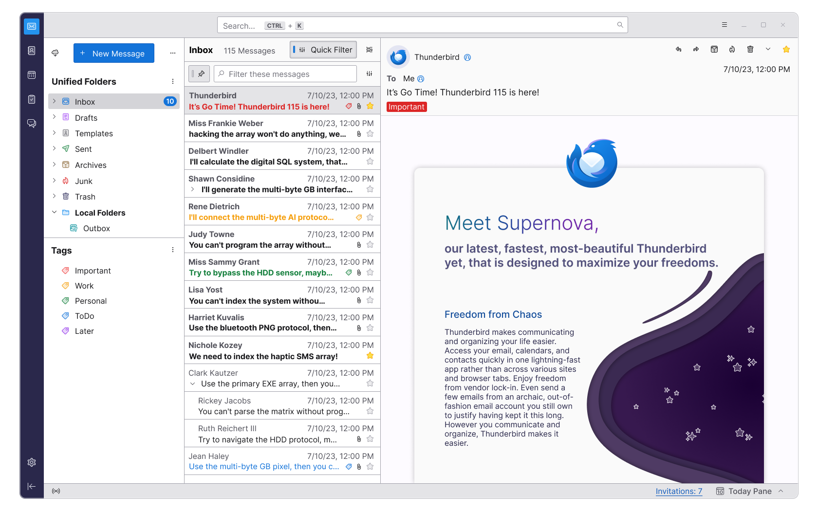
> More than just a refreshed set of graphics, Supernova introduces beautiful icons with a more consistent visual style unique to Thunderbird. Our new designs remain sharp and pixel-perfect at any density setting.
Translation: We break with the established platform look&feel to follow the brave trend of replacing easily identified colourful icons with vague monochrome silhouettes.
Pointless complaint with no actual observation of the new look and feel, Thunderbird is still just as colorful as it was before. The focus here seems to be on making the icons more consistent across the application as opposed to some of the issues they had before.
I can't believe how janky this still looks after a UI overhaul. Text is misaligned in lots of places, the icons are fuzzy, spacing and padding is inconsistent even within the same areas, there are 3 sets of 3-dot icons in the sidebar in two different axes. It's just careless.
Most users don't care about the alignment and spacing and so on in isolation, but they do get a sense of quality from the overall impact. This stuff really matters in aggregate.
Agree. The differences between the mock-up [1] and the finished version [2] are both quite small, yet make a massive difference in the perceived quality.
The first one looks like polished quality software while the second one looks like some junky app made by a solo dev on his free time that doesn't care how it looks like
I like the second one better. Much better contrast and less useless whitespace. I can't see what's wrong with it but I'm also not experienced in UI/UX.
Edit: Also the icons are much better in the second one. The first one has all monochrome icons which makes them much less useful for quickly scanning for the folder that you are looking for.
I think the second one lacks polish in terms of the styling of the UI components. The mockup was really pretty and its use of color and borders/outlines, while the current version seems to have heavier outlines, leading to an overall clunkier appearance. I'll run this by a couple of my UX friends to see if they can express what I'm talking about in more professional terms so I can provide coherent feedback to the Thunderbird devs.
But the things you mention are specifically the things that I think works better in the second one.
I can maybe agree that the first one looks more "polished" but at the same time I actually feel a but uneasy looking at it because my brain has to work harder to discern the UI elements due to the lack of colors and low contrast. Although the lines are heavier in the second one, I find it much easier to filter out the data that I am looking for.
Also the first one wastes screen real estate like crazy. I can only see 7 emails in that one, whereas the second one shows 14. I want all the emails that I receive within a single day to be able fit on a single screen so I don't have to scroll. Frankly, I think the first one sucks.
Fair enough, I suspect that there's no correct answer here short of doing extensive user studies and/or adding a lot of custom theme or UI configuration settings that the team certainly does not have time to work on. still, the UX/UI professionals are professionals for a reason, and it can't hurt to get their opinion specifically.
I appreciate you doing this. I'm keen on the heavier outlines and squashed message list in 115, versus the mockups which I loved. But you feeding that back professionally and constructively, etc, may be productive; it's not healthy for us or the maintainers, for us to be an angry mass of users.
Compare the two, and you'll see that it's not really the case. The first one has a narrower sidebar and much more space for the actual e-mail message. The main difference is that the e-mail list in the first shows twice as much in the preview, while the other shows twice as many messages.
I've been using Thunderbird for a couple of years, then I went for Icedove for a while (but honestly, I used mutt more during that period) and then back to Thunderbird since 2018(?) and honestly I don't get what is wrong with the UI? At least compared to Icedove it feels very modern and fresh. I've also tried Apple Mail for a couple of weeks but that felt it was lacking both in functionality and UI experience compared to Thunderbird. But I'm just a simple user that want's to use a couple of Imap-mailboxes together with GPG and S/Mime, office administration and/or computer gaming is not my department.
I've been using this MUA in both Linux and Darwin environments and it is way above the Outlook/Office 365 experience that some hostile environments force upon its users.
You can participate in the Thunderbird UX discussions on Topicbox (and also through email) and provide your suggestions/critiques at https://thunderbird.topicbox.com/groups/ux
In my experience most communities like this are quite unreceptive to feedback – both in hoops you have to jump through to give it, and in terms of attitude from maintainers. I haven't engaged with the Thunderbird feedback process so this may be unfair to them, but it's a broad perception I have and so I think organisations that do want the feedback or do want first-time contributors need to push hard to make that happen.
So, image you're the new hire and you are welcomed to this massive code base with thousands of files, each thousands of lines long, without some clear separation of concerns or "basic modern best practices".
And the first thing you do, is tell everyone how shit their code looks. The same code that pays for yours and everyone else's paychecks.
I've no idea why you're asking me this, nor what point you're trying to make with your story. Can you make it plainly please, so I can understand what point you're trying to make?
I have engaged with it. They definitely aren't receptive and development moves excruciatingly slowly, but I wouldn't attribute that to being negative so much as strictly limited resources.
Thunderbird is what it is; if you find it useful in its current incarnation use it (I do), but don't expect it to noticeably improve at the rate we've come to anticipate from other open-source projects. Even though Thunderbird is very popular by common open-source metrics for whatever reason it just doesn't move very quickly.
Which is an advantage, not a problem. I do not change my user behaviour regarding email often (if at all), so I really have no need or desire to see the tool I use for email changing (at all).
Every change brings with it a cost that the user must pay.
Strongly disagree. Multi-line rows in particular have been missing from Thunderbird (and ONLY Thunderbird) for 20 years.
That is not an exaggeration, Outlook had them 20 years ago. People expected this feature, 20 years ago. I myself posted in the bugzilla issue 20 years ago.
I mean, I get that. It has to be the very rare open source project where the major bottleneck is insufficient opinions, especially of the very common "strident and underinformed" variety.
I had MITMed my robot vacuum and discovered that it, like a disaffected teen, hung out in a chat room all day. I created a little python library to send it some XMPP messages so I could work around the app's terrible scheduling and put some commands in a cron file. And then I open sourced the code, because why not share?
It was a happy day for me when that robot died. Then I had a legitimate reason for archiving the project and never dealing with a user request/opinion.
I like how you conveniently left out that you're using a retina display until maybe your fifth post complaining about this. It's possible that none of the developers can afford to buy a $2000 laptop for testing. If the icons are obviously fuzzy on your machine, grab a screenshot, post a bug on the bug tracker, and let it be. I assume also that you are already a substantial monthly donor. If not, then I think all this complaining comes across as rather entitled.
I'm not going to write feedback because I'm not a user looking for it to be solved. My original comment is critiquing the process that has lead to them shipping software that doesn't meet modern standards – something entirely within the remit of Hacker News discussion.
My "retina" display is actually a 4k monitor, a very commonplace and cheap piece of hardware, maybe even the norm nowadays for software engineers.
Not sure about the criticism of marketing screenshots but I also have a 4K monitor, they're absolutely indispensable for staring at code all day and cost less than $100.
You can find resellers for brands like UPERFECT all over eBay. The one I used was https://www.ebay.com/itm/313794877980, it looks like they've raised the price since then but I have that exact monitor in front of me and it was definitely $70 when I got it.
That account still sells 4K monitors starting from $100, I only have a sample size of one so I'm not sure whether their descriptions are accurate but they're pretty non-specific so chances are you'll get a brand-new product even if they say "Front/back surface scratches or other scratches issue".
My experience with UPERFECT in particular is that their monitors reproduce sRGB extremely well. I haven't checked the specs for "HDR" mode though, because Windows doesn't properly support HDR.
Speaking only on the 3-dot icons part - I actually quite like it the way it is.
The visual metaphor is an ellipsis, and accordingly I expect the three dots aligned horizontally to be a continuation of (and hence pertain to) the buttons/options along the same row as it (which it does).
Similarly, I expect the three dots aligned vertically to pertain to options that are in the same column (which it also does).
It's a subtle visual cue that helps me understand what the button is for, and without it I would need to spend more time figuring out what container each button is in (which is a harder task, given that there aren't always visual dividers between containers, or changes in background colour).
Your professional input may be desired. Though I did not contribute to Thunderbird either (, yet?).
Thing is, your critique may result in guidance to make part of these changes according to your skillset!
But I am just a hopeless dreamer in the good of many things.
I think if the team are shipping it in this state then either: they don't have the ability to notice the issues on the core team, or they see the issues and ship it anyway. Feedback like this is unlikely to solve either of those cases.
This isn't complex stuff either. I'm not a designer, I don't even do frontend/UI work, I'm basically just a backend engineer. If I'm spotting this stuff on first glance at the main marketing screenshot, which should be the best possible case, then this stuff must be glaringly obvious and pervasive.
You might have a particularly good eye. I saw none of these problems in the marketing screenshot.
I only see one ... icon in the entire screenshot, nothing is fuzzy, and all text looks aligned. The only weirdness is a misalignment between the sidebar header and the main window header, but those don't need to be aligned anyway.
At least it is a step in the right direction. Let's hope they will continue the journey and gradually improve it. "Just" aligning margins, paddings and font sizes should be a much easier task.
> Most users don't care about the alignment and spacing and so on in isolation, but they do get a sense of quality from the overall impact. This stuff really matters in aggregate.
Red Letter Media has a great phrase that rolls around in my head to describe situations like this (they use it for media analysis), "You might not recognize it, but your brain did."
Where you might not be able to point to a problem, but you instinctively know something is off.
After 20 years I'm still amazed they finally got multi-row listings working. I honestly never thought I'd see the day.
New Thunderbird development is glacially slow, but to their credit they have kept the software functional and fixed any security bugs over the decades. And of course, it's free.
But I can guess how the kebab and ellipsis menus are going to open... Granted, if they don't actually open that way, and don't apply to the sections they're in, then that could be a problem.
Good software doesn't need to look good, though. Looking good is just a bonus. I don't care in the slightest how it looks because it's still better than the alternatives.
If software doesn't appear "trustworthy" people won't use it, particularly if it's holding sensitive personal data such as email. The worst UX is people never using the software.
Design plays a big part in how people perceive trustworthiness. It implies effort and understanding. The reason people spot fake products on AliExpress is not because they're intimately familiar with the legit versions, but because typically there are numerous design aspects that are just slightly weird.
People using Thunderbird are not basing its "trustworthiness" on the alignment of ellipses.
Given the laundry list of issues they need to resolve, and as apparent from this thread the choice by UI experts to complain on HN instead of leaving feedback, I'm absolutely fine with them prioritizing other issues which are easier to address and have far more of an impact on their users.
Does it still crash with lots of mail? I have mail filters and get like 500 mail a day. Always crashes. It gives me the option to wait or kill the app. I blame the mbox folders.
Can you switch the thunderbird mail storage to Maildir? I've got Maildir on the server, but locally it stores in a regular Mailbox and builds an index file.
It's possible, I was able to use the method listed under (2) at [1] but it was a few hours of fiddling/restoring backups and even a "102% completed" message before I got it to work. I don't have my notes from the but I believe it involved a second profile at one point so probably pretty similar to method (3) in the end.
I like it! Definitely looks better than it did. I can see some more work needing to be done, but this is definitely a huge step in the right direction.
No it is exactly one version ahead, the number is just bigger by 13.
Firefox ESR 102 is based on firefox non-esr 102 and ESR 115 is based on non-ESR 115. There are no ESR versions in between.
Thunderbird major releases match up with Firefox, in terms of dates and version numbering. However, Thunderbird releases major versions less often. Hence the discrepancy.
As I recall the team has been jumping the main/release branch by larger numbers as beta moves through more polish effectively making release the long-term servicing/ESR branch so 115 will start to be offered tomorrow.
As a long-term Thunderbird user, it saddens me to see the direction in which this client's development is heading, and I am seriously considering making a change. There are a few things I am discontented with, like the rather amateurish look and feel of the app. On top of that, there are many basic client features missing, such as templates (drafts are horrendous) and send later functionality (right now, I think I'm using about 2 add-ons, each of which is awful to use).
It looks like the web version of Outlook. This is not a compliment.
Can I disable the search bar wasting that space? I can count on the fingers of one hand how many times I've used email search over the past 2 years. Three times, for the curious.
Can I disable the preview pane like I can now?
What's "unified" about the folders? What's being "unified"?
I've never tagged an email in my life, but there's the tag panel, taking up loads of space. Can I turn it off?
Sidebar "menus" should be considered a criminal act. Where's the menu bar? Why is everyone determined to force the metaphor du jour onto their applications?
I appreciate that they have maintained information density. otoh I think they should try and stick as much as possible to the looks of the OS where thunderbird is running - you are building a desktop application, not a website.
Of course it's pretty hard when not even microsoft seems to know what Windows should look like.
OneNote was the first one to go from a full office program to be some Modern-UI program, and I have to say that the lost of features is concerning. Like now, you can't easily integrated excels in onenote.
Yet, even with those limitations, it is still the mot powerful note application out there. So... I still use it.
I imagine that it will be a similar situation with the rest of the office suite.
This is only half true. They are still going to provide a hybrid application that will be usable offline. And there is a huge benefit: there may finally be feature parity for all platforms including Linux.
Microsoft positions Outlook for big corporate customers. They often need extensibility in their clients. Preferably you implement them only once to run on any client (web, Windows, macOS, Linux, mobile, ...)
First, I don't think they'll be able to. I have had the displeasure of using their web Outlook client and it was absurdly buggy for a software company of the stature of Microsoft. I can only imagine how terrible the web version of a complex software like Excel will be. Not to mention the poor performance. There's no way they will lose all of their finance customers like that... but, it's Microsoft, so... who knows.
Second, Office hasn't really looked like Windows for like... the past 20 years.
> I can only imagine how terrible the web version of a complex software like Excel will be.
It's actually not that terrible, but I believe it's nowhere near feature parity. Not to mention there is a galaxy of add-ons that still need to be rewritten from scratch to work on the web version, and a lot of people cannot live without them.
Excel is a classic case of 80% of users requiring 20% of all functionality, but that 20% being different for each user. Still, Microsoft made it very clear that the future is web-first.
For my part, LibreOffice Calc does all of what I want Excel to do, although not quite as smoothly. But I'm much happier donating to them than paying Microsoft.
If you don't have feature parity, you really are in trouble, because then you are competing with Google Sheets, on which actually competent engineers are working.
It's not the competence of the individuals that makes the difference. Microsoft is also full of Very Smart People. Organizational structure and ego management strategies drive the engineering choices that lead to bad software.
Sorry, but imo Office/Microsoft 365 passed Google's options a while ago and have only gotten farther ahead. Either work for my needs, and I'm shifting to self-hosted OnlyOffice, but MS is definitely ahead on this one.
Microsoft Outlook is already a web app at its core: "The point here being that Mail and Calendar are native Windows applications, whereas the new Outlook for Windows is essentially a web app at its core, from what we can tell."
Native is dead as it seems, at least for he Microsoft Office Team.
Someone correct me if wrong but "outlook for windows" is not the same as "office outlook". The first one seems like it was created to fill the hole of outlook express and the mail app that came out later. i.e. the free email application that windows ships with.
> The latter is actually pretty good - been using it for a couple of months
You must be using a different New Outlook than me. I've been conscripted into trying it before the mass rollout to the rest of my company. It's so slow and missing so many features from the Old Outlook that it's only really usable for the most basic tasks.
Users can't run macros or create macros in the office webapps. Seems like a major step backwards in usability.
> Although you can't create, run, or edit VBA (Visual Basic for Applications) macros in Excel for the web, you can open and edit a workbook that contains macros. Any existing macros will remain in the workbook, and you can open the workbook in the Excel desktop app to view and edit the macros.
IIRC, there's work on a JS/TS capable macro API that can be used in the future. I will say, the effort MS has made to feature parity for Office's web interfaces is pretty impressive. I also say this as I've been planning to move my personal usage completely to self-host options (NextCloud, OnlyOffice, etc).
Thunderbird, for better or worse, has always had its own unique look. The reason is pretty simple. They don’t have the resources to create a “universal” design that works across OSes.
And multi platform capabilities are one of the top goals for Thunderbird.
I think it makes sense that they accept they’re unlikely to achieve a decent OS specific look and therefore they’re focused on creating its own unique style.
Information density can be very overwhelming and a factor for stress. Often a lower density is totally enough and less stressful to use. Providing an optional "compact mode" for people with smaller screens or who prefer denser layouts would be my way to go.
I’m interested to know where this idea comes from. Is there a good reference you recommend? My anecdotal experience has been that low density websites like Medium are more stressful than higher density websites like Substack/HN because I have to do more work to read the text on the page.
I agree with you. Low-density desktop applications cause me more unease because there's more need to scroll to make sure I didn't miss something. It's especially egregious when the designers make the scrollbars invisible (appearing only on hover or use), meaning there's often no indication of more content available via scrolling. It breeds the habit of ritualistically scrolling each pane to make sure you're not missing something.
There's something psychological about the appearance of a low-density display as well. I can't quite explain it, but it causes me a bit of displeasure because it feels wasteful. There are so many pixels available but they aren't doing anything for me. I don't know why this causes me discomfort, but it does.
Finally, it's important for an application like a mail client to not lose sight of the fact that the way people use email varies. I personally use dozens of folders, meaning the density of the folder list should be as compact as reasonably possible so that I don't need to scroll.
I don’t know. Not an UX expert. But I think the key is the right amount of information. Too much and not enough is both equally bad.
But we have much bigger screens than many years ago when thunderbird was initially designed.
Laptop screens stayed mostly the same sizes, so it makes sense to adjust density to the device type you are using or the window size. This is already done for smartphones, mobile websites usually have much smaller paddings. Same is usually done for iOS vs iPad apps.
There's some memories I have, mostly applicable to text/terminal applications... that productivity generally falls off when you have more than a dozen or so actions on the screen at a time. That people are usually better off with sub-menus or other contextual menus over too many options.
I find the UX for GMail, for example to be particularly good, not perfect but very very good for the task. The biggest issue I have with gmail is really folder and rule management.
That's not really comparable though. Medium and substack have one main item: the text (and its headings) while a mail application has the mail content, the subject, replies, timestamps, etc. and you can see a long list of email in a pane plus a list of folders, then you have the actionable items (reply, send, find, etc.). There are more information and actionable items on the list that in an article read in a browser.
Since we have mouse wheels and touch screens scroll bars transformed mostly away from interactive UI components to scroll position indicators. Good components dynamically get bigger when you hover over them with your mouse or long press they on a touch screen.
Scroll indicators are fine if they stay visible. The default on mobiles and macOS is that the scroll indicator disappears once you stop scrolling. There was a webpage where I couldn't tell that an area was scrollable until I found out by accident, at which point I enabled the scrollbars to always show on macOS as I didn't want to get tripped up by that again
> "Since we have mouse wheels and touch screens ..."
Oh, how I hate that use of "we"! Please realize: "YOU" does not equal "EVERYONE"
Personally (sample size 1) I use several different PC-like hardware units for productive work, as well as personal use. These units have different hardware/software/OS in general, but some applications are used cross-platform: Email is one. Hence the need for Thunderbird in the first place. I have been using it for no less than a decade and probably much longer - iow as long as I remember.
The fact is that none (0, zero) of the total amount of hardware units I personally use _at_all_ "... have mouse wheels and touch screens" - not a single one.
I am not a robot! I exist, and I'm a core user of that product (which has become increasingly annoying in multiple ways during the years - way too narrow scroll bars are actually a good example of the dev team undermining usability - but there is no feasible alternative).
It seems the team is operating from some assumptions about user preferences that generally does not include (the likes of) me.
(ADDED: which would be fine if my demands were higher than their aility to deliver, but that is not the case. I only ever use the very basic core functions (read, write, folders; not even search) - no UI features added the past 5-10 years have been relevant for me. All of them have cost me time/productivity as anything new in the UI (no matter how minor) requires a breach of habit and a new learning loop, even if just to ignore said new feature.)
So, for the past couple of years my personal use of email has been on a steady decline. I just tend to avoid that kind of activity when/if I can.
ADDED: Don't preach me webmail in replies please. I did write "there is no feasible alternative" because that was exactly what I ment to say. Same goes for "just join the dev team and make a change yourself". I have actually considered these, but then: There IS NO feasible alternative. And that is the singular reason I still have Thunderbird installed even if used sparingly these days
Just be curious why are people still using email client other than web based one? Gmail or outlook 365 is quite good, and I think most people will have one web browser opened always.
Because I like all my email in one place basically. I don't want to hunt for tabs whenever I'm looking for specific mail account, mentally all my mail is behind one icon separate from my browser, and they all look and work the same.
Also maybe not Gmail but aside from that IMHO Thunderbird offers better UX than all other browser mail apps.
1. Threads are collapsed into a 1-dimensional list making moderately complex discussions hard to follow.
2. Deleting many messages is very slow. With Thunderbird I can mash <Delete> while scanning subjects and pause for a second to see the actual message body. I get a lot of email that I need to sort through or be aware of so my morning generally consists of quickly (15min) going through up to 100 conversions and getting quick status updates or just deleting uninteresting threads. For whatever reason doing this in GMail is a complete slog. (I'm not sure why, they have the <y> shortcut to archive and have a preview pane but it is just way slower, maybe they need to precache a few messages on either side of the current one?)
3. Threads are based on subject meaning that unrelated messages get grouped together. (Apparently this was changed in 2019 (https://workspaceupdates.googleblog.com/2019/03/threading-ch...) but I've definitely seen this issue for at least a year after that announcement when I stopped using GMail)
I do admit that most of GMail is pretty good. But for me these limitations are enough to really impede my workflow. I've found that Thunderbird is the least-bad option for me. However Thunderbird's performance is quite poor. I do have 350k messages downloaded locally but even opening my empty inbox sometimes causes lockups. IIUC this is because Thunderbird is mostly single-threaded but apparently there is progress slowly being made here. For example composing messages used to frequently lock up for a few seconds but I haven't seen that in a couple years.
> 1. Threads are collapsed into a 1-dimensional list making moderately complex discussions hard to follow.
You can disable this - it's called "Conversation mode" and you can turn it off. Many of my colleagues have it off as they find it unusable due to their workflow (they often end up with threads with 50-100 emails in them & conversation mode makes it painful).
(Be aware that Conversation mode is required for some tools/plugins/extensions to work though.)
Because you have more than one email address? Or because you want to work offline (e.g. connectivity on trains is bad)?
I am more curious why people are still using the very limited web based ones and one for each address, when much more capable and universal local clients exist.
Outlook.com only loads successfully about one time out of ten for me. Same as MS Teams web app. I've tried all the recommendations around third party cookies, no dice.
Gmail has weird limitations around non Gmail accounts. You can only add up to five, and they get checked randomly - sometimes only once an hour but mostly around 20 minutes. There's no way to force a check. This is a ridiculous limitation - imagine having to wait that long for an email log in code, for example.
If I only used one Gmail account there would be no reason to use Thunderbird. Now I have something like 7 or 8 email addresses across several businesses and a real, reliable email client is vital.
They are great for managing multiple email accounts in the one place. Also for me, browsers are kind of ephemeral - I open and close them quite a bit. Whereas I have Thunderbird open constantly in its own separate workspace.
There's also the local backup point that others have mentioned.
I don't want my mail managed by either of those two. Many other providers use Roundcube but that's quite "meh". But the killer feature for me for Thunderbird is that I can force everything to be plain text email, both sending and receiving.
Just be curious why are people still using email client other than web based one?
So that my emails are truly mine. I pull them off the server straight away for anti-tampering and reducing attack exposure should the provider be compromised. I can then compress and backup my emails. If my provider should falter I can change providers and still have all my emails, even pushing any of them back up to the new server should I have such a need. The same logic applies for my contacts. When a web-only provider goes offline, so do all my emails and contacts which feels too much like corporate capture to me.
Gmail is good? I am not seeing it. It's a weird 90s gui which is hard to discover. For my use case both round cube and afterlogic webmail lite are better than gmail. I don't use my company account there. (My rspamd based spam protection is better too)
The interface won’t randomly be changed from under you every couple of years?
On a more serious note, am I using my desktop so very differently? The idea that a web app could even come close to competing with a native app for me simply doesn’t compute.
I use Thunderbird for work, for legal reasons (can't move sensitive data to the cloud) and also practical (no mix up of private mails and work). Additionally, Thunderbird has chat, which I use for our internal system.
But will E-mail on the whole ever get features like other chat platform? Even conversation view is not good on the eye. Quoting is ugly in long Email body.
Maybe only protocols are getting updated!? I think email is only still here because its a form of identification.
Most companies and groups are moving towards Discord, Slack, etc. for a proper discussion.
> Most companies and groups are moving towards Discord, Slack, etc. for a proper discussion.
That must be right. I got let go from my last job because I refused to use 5+ different instant messaging software and instead stick with email. In hindsight, I guess I should have been wiser.
email works between companies because it's based on standards whereas messaging companies are all trying to lock us in to their particular system so they can "win" and that ensures that we cannot "chat" to people with some other software.