Sometimes you don't want to be "literal" or photorealistic --you want to portray a scene or subject "artistically" and you take liberties in order to highlight and de-emphasize other less important aspects.
That said, some of the examples are funny, like where a shadow going up some steps stops short so as not to "overshadow" another subject[1] --whose shadow in turn seems to be perpendicular to the main shadow.
[1]Madonna and Child Enthroned with Saints” (detail)
The paintings in the article are mostly 15th century, which is only early renaissance. The understanding of light in painting was still somewhat limited in those times. I think in the case of almost all of these paintings it's more a matter of technical competence rather than artistic intention (exceptions include "Madonna and Child Enthroned with Saints" where I reckon the shadow ends early for compositional reasons). It's interesting to look at this to get a sense of the various ways people can get something wrong before someone gets it right.
> The understanding of light in painting was still somewhat limited in those times.
I'm confident even cavemen saw and comprehended shadows against a wall.
Btw, do any of the "humans" in these paintings pass the "not the real thing!" test? It is a painting and in every instance it is clear the correct shadow would mess up the composition.
Next stop an article on "How poets have gotten grammar wrong all these years".
It can't be that hard to sketch what you see on a sunny day or in candlelight and start to make sense of the rules, right? Getting perspective to look right in paintings seems like it should be a more challenging invention than how shadows behave around corners, walls, and other objects. Getting the sizes and shapes of the shadows correct would be another matter, however.
So I am willing to assume that if a shadow fails to climb up a wall, it's because the artist thought it looked better without the shadow on the wall.
In "Polittico di Sant’Antonio" the cut-off shadow is at the edge of the painting, so I imagine that one might have just been an oversight from the painter. But in general, it is pretty difficult to get shadows right when you're not painting from life since you don't just need to understand how the basic rules work, you also need to be able to imagine how it works and apply it.
But more generally, being among the first to figure things out isn't easy. Nowadays you can look at photographs and paintings like the works of 19th century academic painters and say "this is how realistic paintings are supposed to look", but back in the 15th century all you would be able to see is other people doing it not quite right. I feel like it takes a bit of genius to be the first to do something right, and frankly the average artist isn't that smart.
I'm of course no art historian of any sort, don't even play one online. However, yes, perspective, proportionality and light were being paid more attention to in art at that juncture in art. Often, in current and historical naive and current and historical primitive art, we see the same issues with bad perspectives and bad shadow treatment. That said, in many cases the artists knew but did not care and had a different focus. Still I agree that in many cases the artists didn't want this "interference". Just as today your roadside artists may not include all the municipal electric wires or all the trash or cloud shadows and so on in one of their paintings when capturing an atmosphere or panorama.
Linear perspective was "invented" in 1415 and codified in a 1450 book, at which point the concept started to spread but still wasn't widely understood. A lot of the paintings in this article have extremely wonky perspective as well. This was a transitional era in art history when formal rules for realistic painting were being developed but weren't necessarily widely or correctly used.
As an amateur artist myself, I've often fudged shadows and shading to emphasize or de-emphasize certain things. Often I'll make slight "token shadows" to at least have enough to say "here it is" if somebody fastidious complains, but I'm still happy to downplay a shadow if it fits the intended narrative of the work.
Those actually judging the art of the times probably didn't really know or care, as the illustrations were often done for social reasons at least as much as decorations. As the canon of "shadow science" increased, there would be more pressure to also please professionals who may judge your work and pass on the word. "Don't hire Bob, hire me, for he does shadows wrong. Here, I'll show you using candle light and these books...".
Pleasing customers and pleasing artists are often different things. Bach pleased artists much more than "customers" and thus made a middle-of-the-road salary despite being a musical genius. Mozart was arguably the same way, as he had some trouble keeping up with short-term fads.
Interestingly, many shadow inaccuracies appear in 3D video games, due to a combination of rasterization hacks to approximate light transmission and rendering (player shadows appearing withing stage shadows, shadows appearing above players standing below a platform), and deliberate artistic liberties to make games easier to play (Mario Sunshine's level shadows are cast from the sun, but tree and player/enemy shadows appear directly below characters to make it easier to judge jumps).
That's pretty old 3D rendering tricks causing those overall though. Like I fail to see recent games doing those at all.
Overall, shadows aren't the hard part nowadays, it's light that is. Global illumination and light bouncing back around that is. Though shadows ARE very expensive still.
It's getting better, but correct shadows cast on dynamic objects are still a relatively recent thing. Can't test now, but i would bet some modern titles still only do shadows on static geometry on lower settings.
I think these artists work in kind of similar way that a renderer work. They would fill in different areas of the painting an move on to the next. Almost painting by numbers style. Therefor you get idiosyncrasies and disjointed artifacts
Getting shadows right is incredibly complicated. You need to figure out the silhouette of the object from the perspective of the light source, then project that silhouette over the geometry the shadow falls on, then draw the perspective of that projection from the point of view of the “camera”. So it is a perspective of a projection of a perspective. And to add to that, objects occlude each other, and you might have multiple light sources. Since most artists probably start with a composition in the 2d space of the artwork, there’s never really a coherent 3d space to place the light sources in or figure out those projections in. I don’t think you should expect anyone to get it right in a complex scene unless they are drawing from reference.
> Since most artists probably start with a composition in the 2d space of the artwork, there’s never really a coherent 3d space to place the light sources in or figure out those projections in.
Highly skilled artists don't just think in 2D — they really do imagine the 3D scene that they're painting. It's hard to relate to but people with a lot of drawing/painting experience can "feel the form", as they say, when they draw. But it's true that figuring out the lighting is still difficult even then.
I do want to point out that if you look at talented painters from later in history than the early renaissance, they don't make nearly as many mistakes as the ones in the article, although of course the lighting of imaginary scenes is still always approximated and simplified.
It's a skillset that gives you a very different way of perceiving the world. I find it difficult to describe but "feeling the form" feels close to my experience while drawing. When I haven't drawn in a while and I pick up a pencil my first few sketches are always stiff, awkward, and cartoonish. It's like I'm drawing an emoji or a logo or something. Then after a little while I remember how to feel the form again and I start to be able to articulate the shape and the weight of an object and translate that convincingly to the page. It really isn't thinking in 2D, per se, it's thinking in...flattened 3D maybe?
To your point about painters from later in history, I think once linear perspective was codified and became more widespread it made the process of projecting shadows much easier for artists. In a lot of renaissance artwork you can actually map out the perspective lines to find that the artist was working with multiple incompatible vanishing points, hence the wonky spatiality of many of the paintings from that era.
Took art class in college a few years ago for kicks. One of first things is learning to see lights and darks. Spend 3 hours a day for several weeks in a pitch black room with only a single source light. Eventually working to drawing a curtain in charcoal. You don’t try and draw a curtain.
No form to it. You just have to draw lights and shadows as you “see” them. At end you have a well drawn curtain.
After awhile your entire perspective even outside of class changes. You naturally see lights and darks. Not just objects.
You can get a taste of this at home, for anyone else wanting to experience a new perspective. Find a nice photo of a person, probably a 3/4 body shot (album covers are great too), black and white helps but color is just fine too. Flip the image upside down. Now sketch what you see without flipping the image or moving your head around, focus on what you see in front of you as it exists. Don't rationalize it or think about the grand act of drawing a person. You are just sketching the dark circle, or a curved line.
It's a common technique when learning how to recognize lines, shapes, and shadows. The simple act of flipping an image upside down is enough for your brain to turn off it's automatic recognition magic that keeps you from seeing primary forms.
Do it enough times, and like other visual artists, you start admiring a lot of things people take for granted about vision.
I took an art elective in college. One of the exercises they had us do was to find a black and white face in a magazine, cut it in half down the center of the face, tape it to a piece of paper and mirror the face on the paper. To get full credit, when the paper was hung up on the wall across the room, the professor could not tell which side was the magazine picture and which side was your drawing.
That's right. I remember being told to flip a painting I was working on upside down. Walk 30 feet away...
It was a great trick that took me out of the painting that I had been doing from my "mind's eye". I saw it for the light and dark areas that is was. It allowed me to see how I could rebalance it (regarding the lights and shadows). Very cool.
Yes exactly! You give yourself a new perspective to solve the problem.
If you have ever seen a professional digital artist draw, you'll notice them flip the canvas repeatedly. You might think they're crazy how much they flip it, but this really does help turn off that part of the brain that got too used to the drawing. Too used to the auto correction magic our brains love performing.
This technique forces them to see that the curve they just drew feels off, even when their brain with the image right side up refused to see it.
I can totally see why digital artists would get value from this!
I work in VFX and have found that after watching a shot on loop a few hundred times (over weeks) it can be quite helpful to watch it 'flopped' (horizontal mirror), which seems to be able to give nearly a whole-new perspective (on the effects-content) in many cases.
Sometimes you can get too carried away with drawing exactly what you see. Once I drew a person based on a photo I had on my desk, only to realize that since I was looking down at an angle to it, the drawing was all distorted. :)
An art teacher told me what is kind of obvious: things aren't outlined in the real world. Painting a still life — the apple is in fact simply defined by where the apple color ends and the bowl color begins.
To be sure, when we start sketching we would probably find it convenient to make a little arc on the page that delineates the boundary of the apple but by the time you move to finishing the piece (if realism is what your going for) a line of any thickness delineating the apple should be gone.
Your art teacher was correct. The problem is that humans start off with a linear approach to drawing. The first drawings they do as children are done with lines, and tones are usually an afterthought.
Although unnatural outlines seem to be popular in photos - the usual sharpening algorithms don't make boundaries around objects clearer, they just add white halos.
I always found this very objectionable but noone ever seems to implement warp-sharpen when they can do unsharp mask.
yup! people draw with "Shortcuts" instead of putting the actual value of things on the page... my favorite exercise was dividing a canvas into a 1" grid and taking a 1 inch brush and filling in each square by mixing the correct color one at a time like a raster, you end up with a really true to life pixelated painting.
You have stated the problem exactly. However, in practice a painter employs a fair amount of 'bodging' (favoring appearance over exactitude). For example, it is not entirely unusual to discover that a landscape features more than one implied sun. In 3D rendering this would be done with light-linking, whereby different objects are exclusively light by different lights. Physically impossible, but visually convincing.
In the time I worked on computer graphics (late 90s to early 2000s) I had lots of fun learnign to render basic lighting effects in OpenGL using shadow mapping which includes a clever application of the depth buffer. It was also enough to convince me that techniques short of ray casting would always be ugly hacks.
I am actually really impressed with the current state of the art for real time rasterization: cascaded shadow maps + global illumination or even just screen space ambient occlusion. I feel it comes close enough in most scenes. At least when the purpose is to look pretty and not stand out as obviously wrong while playing a game. The cases where it fails are mainly the pathological ones such as caustics.
That said, it is still amazing how big the actual gap is between this and ray tracing when carefully analysing a complex scene.
Eggs make excellent light studies. No shape complexity, texture complexity can be ignored, and depending on the surface they are placed on the colour complexity can be adjusted.
This is a subject I have some expertise in as I teach oil painting, digital painting, drawing, compositing and 3D rendering.
What the article missies is the real reason that artists have avoided hard-edged shadows since the renaissance.
1. The silhouette of an object plays a large part in our ability to clearly perceive it.
2. This silhouette is defined by sharp edges (more exactly, two neighboring regions meeting to form neighboring regional contrast).
3. The hardness of a hard-edged shadow interferes with our perception of this silhouette. This is a particular issue with self-casting shadows, such as those cast by the nose onto the face.
This is the reason that painters and filmmakers generally favour the so-called golden hour (early morning or early evening) when the light is low on the horizon and the shadows are soft-edged.
To quote Leonardo Da Vinci:
``An object will display the greatest difference of light and shade when it is seen in the strongest light. . . . But this should not be much used in painting, because the works would be crude and ungraceful.''
Of all the subjects I teach, shadows cause the third-most trouble (the first being perspective, the second being anatomy). Common student mistakes: using black to darken the shadow (yuk), using default light settings in a 3D render (too hard-edged), in compositing, not matching the source shadow with the composited one, in digital painting, not changing the size of the brush as they model the shadow.
Pen and ink artists, most notoriously in comics, often lean into hard shadows for composition, turning one shape into another with a chiaroscuro effect, or using false shadow shapes to indicate form. Extreme examples often come up in Alex Toth or Frank Miller panels, but every cartoonist working in black and white struggles to create theatrical staging, and while many take the route of extensive hatch lines to describe medium values, there's an urge to simplify for efficiency. Frank Frazetta also did a lot of ink work before his well known fantasy paintings, and it shows up in some characteristic decisions about what he simplifies. "Framed Ink" shows off a lot of these methods, using a rough ink style to emphasize the composition.
Since the appearance of digital color, the common approaches to ink in comics have toned down because the painting process creates a competing value structure. The mixture of hard and soft shadow creates some jarring effects, so ink lines made "for color" are used more often just to describe form.
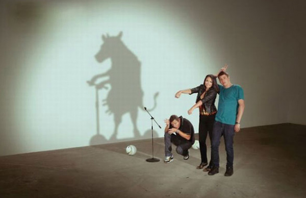
Shadows as a concept are, let's say, much more flexible in my mind now...
It might have something to do with alternately being told that some of my real photos were obvs fake, and that some of my realistically-rendered (per spec) shadows for product marketing needed to change in the fake direction, in order to fit the needed composition better.
After that I decided that all shadows would go in the cow direction whenever I felt like it, no matter how the scene was actually modeled.
Lots of comments about how they are probably doing it for artistic reasons, or as reasonably and ignorable approximations, which are almost certainly correct. But it is much funnier to read the headline as inter-field shit talking.
“Wow painters have been screwing this up for centuries. It only took a couple decades for programmers to figure out ray tracing. Git gud art scrubs.”
Yet another example of how literal interpretations are increasingly the default/expectation. Light/shadow only works one way -> so they obviously got it wrong.
I was told by my art teacher in high school that they intentionally didn't go for total realism as that was imitating God's work or some religious reasoning (they cared more about the story/theme than the execution). I never really bought into that reasoning 100% as they seem to get really detailed with the furniture and clothing for instance, but then fall flat with the perspective/shadows.
> I was told by my art teacher in high school that they intentionally didn't go for total realism as that was imitating God's work
I heard this story as well and always suspected that it was an urban legend. I heard the same story about a Buddhist painter who intentionally added a poor brushstroke to every painting, to reflect that everything is imperfect and changing. Neither story makes sense in the context of Christian belief or Buddhist conviction. A Christian would have to be incredibly arrogant to think they had to take special measures to avoid rivaling the work of God — it would be hard to call such a person Christian. Similarly for the Buddhist. If they believed that everything that can be experienced has a certain characteristic, then it wouldn't be necessary to impose that characteristic on their artwork.
> they intentionally didn't go for total realism as that was imitating God's work
This is not true. Renaissance painters generally did strive for realism in perspective, anatomy etc. Sometimes they failed because it is really difficult. (After the invention of photography artists just use photo references which makes it a lot easier.) Sometimes they let artistic considerations take priority. In historical and mythological paintings they didn’t stive for realism in subject matter and overall impression, but they did strive to get the physical details correct or better than reality.
I'm not even sure the article is self-consistent. It seems to argue early on that shadows don't climb walls from the floor, only to insist later that they do. I must have not read the article closely enough.
Caravaggio and Rembrandt came up with some pretty impressive shadows- so it always depends on the renderer.
What even the greatest renaissance painters really could not do well is children!
Yes. You get a really good intuition if you can play around with a sophisticated renderer, and experiment with light sources, camera settings and so on. It’s great for both intuiting the physics and the visuals. You can answer so many questions of why something looks the way it does.
OMG no no.
1. in the examples, painting with the correct shadows would clearly create disturbing elements so I guess ancient painters have a good sense of composition, or modern MIT guys do not.
2. When evaluating paintings their function must be taken into consideration. It is a portrait? they probably strived for photorealism. It is painted on a church? it tells a story and has symbolism. A mathematically congruent shadow that ends in the wrong place sends an unwanted message so it must go.
3. if greeks managed to get the earth diameter by looking at shadows, many painters were able to grok visually how shadows behave. Assuming that they don't because background elements are not consistent is an assumption.
so it is interesting to study when background elements like shadows and details are not rendered or incorrectly rendered, but calling it "getting is wrong" is sign of rather childish pseudo-rationalism.
The purpose of the artist with patronages is not to be a camera but to reflect a more attractive vision of the subject. Also paintings aren’t photography so the artist has more liberty to alter details to better fit a composition
My main issue with shadows are that they are so hard to color right. You need the exact same color but you then need to add black, but I can’t get that right. Reflections and such usually is given away from the scenery.
I don't recommend adding black to get shadow colors — you're not going to get pretty colors if you take that approach. Shadows have a bit of a color of their own. What you need to do is think of the bounce light in the scene, and I'll use an example to explain.
First of all, if you've got a sphere in deep space, its shadow side is going to be pure black, since there's pretty much no light bouncing around, and so there's no light to be reflected by the shadow side of the sphere. Now let's take an indoors scene: Imagine a room with red walls, a white floor, a single neutral (white light) ceiling lamp and a white sphere in the middle, what color is the sphere's shadow going to be? In the red-walled room, the shadows of the sphere would be subtly red — especially in the parts of the shadow where it's facing the walls more than the floor. That's because the light you see in the shadows of an object is light that has already been reflected from other surfaces in the room. This reflected light, in the case of the red walls, is red.
Of course in a more complicated scene you just approximate it. For an outside scene, you usually want to make your shadows only a bit darker and move your shadow color's hue a little closer to the color of the sky. But colors are difficult, you learn through experience really.
The surface reflects light it scoops up from the visible hemisphere around it. If some of the hemisphere is sky, then the light cast onto that surface will be tinted blue.
I'm not sure if people have access to it, but here's an example from an airborne imaging spectrometer that is flying over a partially-shadowed domed building (on the Caltech campus):
Figure 4 shows the dome (really a cone) - note the shadow at top-right.
And figure 5, panel C, shows the contrast-enhanced light reflecting off that dome. You can see that the shadowed portion in the upper-right of the dome is bluer than the directly-lit stuff. (The directly-lit stuff is more golden, from the direct sunlight.)
Well… an oil painter would not add black. Rather they would add the complementary color. This would darken and also neutralize the base color. A digital painter could achieve the same effect with a simple multiplication (add black via multiplication blend mode).
As you imply, the outcome is not always realistic. The reason is that the shadow would be tinted by the environment light. This is particularly apparent in desert environments or very sunny environments where the shadows can be a saturated blue.
As the other reply said, yeah, don't just add black.
An art teacher would tell you to paint from real life and look into the shadows and try to perceive the colors that are there. Paint those. Don't treat it as a chemistry problem.
But if you're wondering why Maxfield Parrish painted orange rocks with indigo shadows it's because in the absence of direct light (in the shadows) ambient light will fill in. And the sky, as an example, is a giant blue ambient light reflector, the grass a giant green one.
I think people forget that the artists painting from life did not have static shadows and lighting to paint, but likely had to imagine or try to remember them later after painting in the live figures.
The art of the shadow: How painters have deliberately ignored perfectly reproducing reality in favor of doing whatever works to tell the desired story for century.
Your take is easy cynicism and you appear to have ignored the entire point of the article. Right off the bat the author says it isn't about criticizing the painters -- it is to show how even though some shadows are terribly wrong, they don't stand out as jarring to casual observers, and gives some insight into how our brains interpret images.
If errors of this magnitude were made in other aspects, say in face symmetry, the spacing of the eyes, etc, the resulting images would be not just uncanny valley territory but would look terrible.
I've definitely seen it get reflections/lighting/shadows wrong. In exactly that sort of "this is an unusual perspective and it can't actually do the math" way.
That said, some of the examples are funny, like where a shadow going up some steps stops short so as not to "overshadow" another subject[1] --whose shadow in turn seems to be perpendicular to the main shadow.
[1]Madonna and Child Enthroned with Saints” (detail)