Oh, top nostalgia from the 1990s/2000s online. These buttons meant a lot to me. I think I said this on some of my old comments, but I learnt programming because I built a very popular website about a topic/fandom that I was very into back then.
There were a lot of websites about that, but only a few were really popular. The structure was very basic: header, left sidebar with links, centered content, and right sidebar with small chatbox, polls, random quotes, and affiliates. The affiliates was simply that: a link to another website in exchange of a link to your website. They started using text links but they usually evolved to 88x31 buttons, first simply JPG then animated GIFs.
Being in the affiliates section of the top websites (again, only for this subject) was the best. I remember spent hours and hours (translated into days adn weeks) designing my buttons in MS Paint (yeah, pixel by pixel) so I could convince the webmaster of the popular website to include mine, because a lot of the time they decided based n the button and not the website itself.
Anyway, sorry for the long rant (maybe younger people will learn something today), but as a lot of people I miss the old internet and I could talk hours about this!
It’s a tangent, but I remember watching The Matrix when it first came out and in that scene where Smith is looking out the window telling Neo that they choose that current timeframe for the simulation as it was humanity at it’s peak, I thought it was a little ironic as clearly things were just getting exponentially better all the time.
I mean, a lot of things have got better, but we lost a lot along the way too. The web certainly didn’t live up to its early potential (or more accurately, we just tossed it for something way inferior that was less hassle).
I guess really it’s just surprising to look back at that scene and think there’s some truth in it.. especially given that now it’s 2022 and we’re all flying round Mars in our self-driving Jetson cars.
> The web certainly didn’t live up to its early potential
Oh, but it could have been far, far worse. We almost lost the web to Adobe/Macromedia/Flash. And then almost again to activeX.
At least we still have the open, accessible, extensible web standards. Only that the top-layer: the applications and sites built have been embraced by a few monopolies.
I'm rooting for WASM (because of my dislike for JS) but I'm also cautious for one of the FAANG taking wasm and re-trying the old flash/activeX trick again, but now with a "only runs on android" or "requires azure certification" angle via WASM.
What will probably happen is the even older “Best viewed on Google Chrome” gambit. I.e. web sites will technically all be viewable with what are technically open standards, but they will all change so fast, and there will be so many of them, so that the only browser anybody can realistically use is Google Chrome. And if a network can be only accessed with the product from one company, then that company controls that network.
I do. I wrote quite some.
Then dynhtml happened through JS. Nothing like the JS we have today. Loved it.
But both java applets and JS was mostly open. I recall you could open most applets and get the Java code or some form of it, rather easy. But it might simply be that concealment wasn't important back then. Idk.
Hah, same. Here the topic was Harry Potter. I had learned basic html (no css, using <font color= or imagemaps liberally), and wanted to create a school others could "attend". A copy of other sites. You could do "assignments" and earn your house points etc. But since I only knew html, how you did it was to fill in my form, which then submitted to some cgi tool online and sent me an email. Then I would manually edit my html to reflect new stats, and upload it over ftp.
Luckily I had only like two close friends enrolled at that school!
Ha, my topic was Harry Potter as well! And yes, doing an online interactive Hogwarts was the dream back then (and processing manually cgi forms was the only way we kids were able to do it). Finally almost 20 years later we'll get Hogwarts Legacy...
That's not one of the sample buttons? I was once at a modern "junk art" museum, and came across a light-switch under repair. It took several seconds before I realized it was not an (intentional) exhibit piece.
Old "Under Construction" icons could make a whole category by themselves; I think I've seen at least a hundred of them, some being really creative, just like some 404 pages.
> These buttons are an historic example of advertising in the earlier days of the World Wide Web.
These were not “advertisements” as we now know the term. No, these buttons were mostly put up by users themselves, on their own web pages. Yes, ordinary users used to have their own web pages, mostly without paid advertisements. These buttons, when they linked to commercial products, were unpaid product endorsements.
They were not unusual. In the 90s and early 00s, websites were littered with banner ads, popups, and toolbar downloads. They may have been unusual in the very earliest days of the web, but it didn't take long for sites to monetize with ads (was normal by late 90s).
Some of them were advertisements as we know them now.
In particular website authoring tools would add these unprompted as self-advertisement.
That was part of the joke of "made with GNU emacs" or whatever, that you were manually adding the same advertisement the "Made with Microsoft Frontpage" users had foisted on them.
Those kind of “self-advertisements” were, first of all, relatively uncommon, so much so that they were annoying and lampooned when they appeared. They were also not what we now normally name “advertisements”. Is “Sent by my iPhone” an advertisement? Strictly speaking, yes, but the word “advertisement”, in normal language (and assuming a web context), means a banner ad or similar. These buttons were not paid banner ads, is all I’m saying.
It wasn't uncommon, most websites made by these popular GUI tools retrained these banners,
You're using some narrow definition of "advertising" that doesn't match common use. You don't need to be paid to be a walking billboard.
When the program you were using inserted these it was analogous to license plate frame advertising today[1]. Consumers don't get paid for those either, but it's advertising for car dealerships.
There was also a culture of voluntarily inserting these, but that doesn't mean some of them weren't product placement or advertising.
Part of what gets me about relics from the Geocities era, apart from the eye-catching and charmingly amateurish maximalist aesthetic, is that personal webpages were a space in a way a Twitter or Facebook profile just can't be. A profile page where you can't change the background, font, font size, font color, sidebar content, overall layout, etc, is to a webpage as a prison cell is to a home.
Still, webpages can't compete with the shareability and "virality" of social media by default; it's what made them popular. The simplicity of use is also a prerequisite; there's millions of people who can't write a line of HTML or CSS, and 99% of them never will. I sometimes daydream about some service that will somehow combine the best of both worlds. Total customization with viral sharability, and without requiring technical skill. Maybe something like that's already been made; maybe we can learn something from why it failed.
a space in a way a Twitter or Facebook profile just can't be
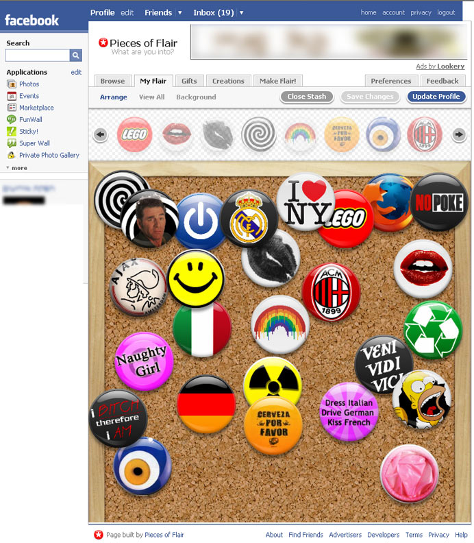
I can't speak for Twitter, but Facebook in its early days was incredibly personalizable. Not to the extent of GeoCities or MySpace, but you could do all kinds of things with your profile page. "Pieces of Flair" was my favorite: http://www.krembo99.com/wp/wp-content/uploads/2008/05/200707...
Then one day, Facebook went corporate, and all of the customization stuff disappeared. I imagine a lot of small businesses ceased to exist when that happened, because people used to sell different Facebook customizations.
It seems to me that if it was easier for ordinary people to add custom CSS to their browsers, a cottage industry could be made for skinning people's social media feeds.
I don't remember this, so if they indeed binned that pre-2009/10, then FB winning the majority had not even started outside the US, I think. (at least in Germany FB was still kinda growing and not completely widespread when I signed up, we had other stuff).
I miss it too, but the web is much larger and more complex now, despite how it looks from a user pov. With all those customizations and widgets also opens doors to injections and other vulnerabilities that companies simply don't want to worry about. They're too busy competing with other social media platforms that also don't have those vulnerabilities.
I think you're describing MySpace. Anyway isn't it good that it's difficult or expensive to make a pretty website? Otherwise the likes of me can post things that look good, just like government agencies and people who give a shit do.
I'll just tell you to reject pandemic protocols and vote against established politicians and try absurd and dangerous pseudomedical cures.
Isn't it better that me and my ilk have to design our own websites and hence signal our shittiness by having shitty aesthetics?
I thought for sure "life" would be over by now but www.netaddress.com still looks like a 1990's website. There's some info about payments so I dunno if it stayed free, but it's crazy that it looks like you can still login if you have an account.
My father still has and uses a juno email account. It bothers me immensely. I know another guy who still has an active aol email too. Lgr did a video where he signed onto the old aol walled gardian browser homepage before it was killed off.
It’s funny how seeing those two numbers (88x31) together instantly triggered some really deep-rooted memories.
I wish I kept I copy of “Sky’s Obervation Deck”, my crappy little Geocities page about Star Wars (I think…), proudly part of some random web ring, and surely with its share of <blink>.
Another coincidence: I recognized the domain you linked from the license of a Firefox extension I use. Google Images Restored. I just wanted to thank you for creating that extension, I use and appreciate it daily.
The sentiment is there, but there's just so much wrong in this article, I can't believe it. Beginning with the fact that HTTPS certs DO provide security, exactly in the cases the author dismisses: someone who man-in-the-middles the connection, at any point between the server and the client, can't tamper with the HTTPS connection undetectably. It either requires a compromised server or domain (so you can sign the tampered content), or a compromised client, to accept a tampered content.
Reminds me of a recent pondering of mine… there used to be all these “powered by Apache”, “powered by PHP” buttons that were very similar to the type of buttons in the site here. But they were vertically shorter, and you often saw them used as a block to let people know some stuff about the website, sort of like “User bars” (think that’s the right search term) for stuff in a forum signature.
But despite having at some point bookmarked a similar site/page that had hundreds of these little images… age and link rot and fragile bookmark services of old have long since lost the link , and now I don’t even remember what to search for to even find such little images, there was at least a few generally accepted nouns for them … perhaps the collective HN wisdom remembers these little images and can help me find them or just want to share more early internet stories about these kinds of images.
This was where I found my passion for graphic design. Making signatures and userbars in a cracked version of Photoshop started me on a journey that included me getting my degree in GD, working for major international clients, starting my own business, returning to an inhouse position, and then leaving the field after 5 years to get paid 25% more as an entry-level web dev with no relevant qualifications.
In a Usenet sigs, it wasn't unusual to see a phone number, DoD number, or a statement that one is speaking only personally and not for their employer. More than one person had "ICBM coordinates" in their sig.
It was a different time.
One thing I'm glad has gone away is signatures that include a quote from someone famous (or net.famous), along with attribution. I'd skim a post, see the name of a person at the bottom, and associate that identity with that name, sometimes more than the name of the poster. At one point I was doing email and Usenet in Emacs, I wrote a feature to deemphasize sigs: https://www.neilvandyke.org/sigbegone/
The sig community contributed heavily toward my career path. I learned a ton of things due to sigs from hosting and developing plugins for PHP forums, web design, working with relatively advanced Photoshop techniques, basics of various 3D modeling applications, etc. I still have some of my old sigs somewhere and they're pretty awesome little artifacts from my youth.
I look back very fondly on this era. In retrospect, it seems like the internet was a much more optimistic, much less cynical place.
On a similar note, does anyone else find that new forum software UIs aren't nearly as nice and easy to navigate as the forum software of the early 2000s?
I hated it on traditional forums, where it inevitably got to the point where the comment was "meh, i dunno" and then the person's signature was 150px high, and the forum engine only display 10 of these at a time. Minimal interfaces with quality indicators like Hacker News or old Reddit are so much more useful, and the sub-threads are much more visible because of the tree structure.
Another comentor said "You'd have enough time to go eat breakfast, mow the lawn, take a shower, and then come back to it being only 58% done." and apart from mowing the lawn it's actually true.
I was always wondering about weird dimension choice. Why on Earth they are 88*31? Okay, 88 is divisible by 8 and 8 is bits per byte and we can bit-map one row to 11 bytes maybe, using gif paletted compression. But why 31? Why not 32, which is at least a power of 2?
Yes! The first one my eyes landed on was a mod for Quake called the "Killer Quake Patch". KQP was an amalgamation of what felt like 100s of other Quake mods all compiled together into one megapack.
Horribly unbalanced but side splittingly funny when you'd take your friends head off with a the disc from the Xena TV show.
I like to promote FOSS among my colleagues, so at a time we ended up playing a lot of Quake 3 Arena, because of the ioquake3 project. We had such a good fun, and the game just blazes on modern hardware.
I was online during that era but "88x31" does not ring any bells. Is it significant at all or just some arbitrary size? What about the number of animation frames? 88x31x10?
Please correct me if I'm wrong, but I believe that 88x31 was done because Netscape distributed similar buttons for webmasters to include on their webpages if it was optimized for the Netscape browser. Buttons which were arbitrarily 88 pixels by 31 pixels. But then as those buttons propagated, other webmasters started creating other buttons that fit in with the original Netscape buttons; copying the same dimensions and styles.
Then it became an odd ad-hoc standard of that era of the internet, where you'd include 88x31 buttons because it was cool and popular. While others would be advertising their page based on how cool the buttons looked, and making them fit that standard 88x31 buttons so they were more likely to be included.
88x31 in numbers doesn't ring a bell for me either, but seeing those buttons, I remember being them everywhere. Some were more common than others (HTML validated, XHTML validated, Netscape, optimized for 1024x768, Apache, ...).
Exactly my question. It doesn't go cleanly into any of the common widths from the time. Common powers and multiples are way off. My guess is it was an arbitrarily chosen size on free hosting like Geocities, that fit into their default layouts and frames.
It's only significant in the sense that so many of them were made to that same size. It was an arbitrary choice for the first button image (Netscape Now?), then everyone else copied the size and format.
"Campaign against Frames" A quick google search lead to this https://tintara.tripod.com/FramesSuck.html It is interesting to see what are now basic html features used to be contested.
They were very commonly used in 90s websites. Typically, you would create one html page for a Nav bar on the left and multiple html pages for your content that would appear in a content frame. In creating a link on the nav, you'd have to specify to render the content in the appropriate frame.
They fell out of favor in the early-mid 00s due to issues with proper rendering on various screensizes and browsers. In addition, web crawlers could not know whether a page was supposed to be rendered within a navigation context or not, so you'd often find google linking to content pages but without the navigation frame included, leaving users stranded on the page.
iframes solved these issues to a large extent, along with better, more powerful CSS.
Frames were (and to an extend still are) heavily abused for advertising and other purposes. You could, for example, hide the real URL of a page. The user would go to the page, the page would contain the frameset, and the frames would just load content from wherever. Really broke the promise of the URL bar, which would suggest that the page you're seeing belongs to the URL displayed.
Many of my colleagues still use WinRAR, and it grating to me. ZIP is built into Windows for many years now, and 7Zip is very similar to WinRAR if someone likes that kind of interface, or context menu integration.
Man, this brings back memories, along with webrings, guestbooks, etc. I even made a few for my own sites, long lost, I don't even remember what my sites were, was just a young teenager. But boy do I remember that I made a few of these.
I was oblivious how much hate there was for Netscape at the time. Possibly because I was on a mac and all the memes were anti-Gates (some things don't change) and anti-Microsoft.
Wow, RealPlayer... I remember streaming an Internet-themed "radio show" over 28.8k modem. The hosts sounded robotic because of the compression, but it worked.
There were a lot of websites about that, but only a few were really popular. The structure was very basic: header, left sidebar with links, centered content, and right sidebar with small chatbox, polls, random quotes, and affiliates. The affiliates was simply that: a link to another website in exchange of a link to your website. They started using text links but they usually evolved to 88x31 buttons, first simply JPG then animated GIFs.
Being in the affiliates section of the top websites (again, only for this subject) was the best. I remember spent hours and hours (translated into days adn weeks) designing my buttons in MS Paint (yeah, pixel by pixel) so I could convince the webmaster of the popular website to include mine, because a lot of the time they decided based n the button and not the website itself.
Anyway, sorry for the long rant (maybe younger people will learn something today), but as a lot of people I miss the old internet and I could talk hours about this!