I think that these four characters are being used:
  U+2581  LOWER ONE EIGHTH  BLOCK
  U+2594  UPPER ONE EIGHTH  BLOCK
  U+258E  LEFT  ONE QUARTER BLOCK
  U+1FB87 RIGHT ONE QUARTER BLOCK
(Sorry, no actual glyphs, HN is gobbling them.)
Notice anything different about the last one? It was added in Unicode 13 in a new block. This means very much reduced font support, and if absent, it generally means the use of a fallback font, which is very likely to mean a wider glyph, which means that the right edge of your box is displaced and probably the wrong thickness, and in some environments (though no proper terminals) anything following it will be offset too.
I use Triplicate as my monospace, and yeah, it lacks U+1FB87 RIGHT ONE QUARTER BLOCK, so this technique looks awful.
It gets a little worse when you consider line-heights. Some fonts design these things to fit line-height 1, others their default line-height, I think. The concepts are a bit fuzzy and implementations inconsistent and I don’t actually know the full details of what I’m talking about. Still worse, in browsers I don’t think the font’s proper preferred line-height (if that’s a thing?) is actually exposed, so you can’t actually get the correct result (the closest you’ll get is hard-coding the font metrics and hoping that font gets used, but that’s never guaranteed). But the end result is that you might get your box not neatly lining up in a terminal and probably won’t get it lining up in a browser, either squished more than it should be or with gaps, and in either case it’s going to be visually unbalanced in quite a disconcerting way, whereas the regular box-drawing characters are more likely to line up due to more care and even if they don’t the gaps (or maybe-visible-with-the-wrong-sort-of-antialiasing overlaps) will be balanced.
Conclusion: stop trying to be fancy, block element support isn’t good enough and the technique’s failure modes are quite bad; just stick with box drawing characters and no clever backgrounds, because that will work much more consistently, and wastes less space too.
You can just use U+258A LEFT THREE QUARTERS BLOCK and inverse colour settings. I use U+258B (LEFT FIVE EIGHTS BLOCK) in my editor that way (inverse of what you'd "expect", to get 3/8th's instead of 5/8ths)
Hmm, good idea. Wonder why a couple of the redundant-with-inversion ones made it in and others didn’t. Could be some historical reason, could be just “we had a few spots left over in the block of 32”. Can’t be bothered looking it up.
Certainly do this rather than using U+1FB87. SGR 7 to reverse colours and SGR 27 to cancel reverse, hopefully it’s pretty universally supported by now. I definitely expect it to be better supported than U+1FB87 in the chosen font.
To get these "drawing" type glyphs to look good and avoid unwanted gaps etc, terminal emulators generally just ignore the font and use their own custom rendering instead.
Conclusion: Demand more from your terminal emulator, including direct support for more of the Unicode drawing characters.
It's weird to me that in 2022 terminals are largely limited to text and text-based hackery. You'd think more terminals would support actual graphics, even if a bit limited compared to a full-blown windowing system.
I wonder if anyone remembers the alternate text plane that allowed Norton/Symantec, Central Point Software, and moused in FreeBSD simulate a "pixel-accurate" mouse cursor in a text mode display (often 720 x 480 addressable as 80x25 using 8x16 glyphs that were last bit extended to 9x16). There was a little-used secondary code plane function in VGA where 512 characters could be displayed by sacrificing half of the colors (foreground color intensity bit 16 colors -> 8 colors). The secondary code page would be used as a raster bitmap to overlay the regular code page glyphs with the mouse cursor shape. Ultimately, the mouse cursor was typically 1-4 magic characters. One could code a double-sized cursor to use 4-9 characters if they so chose. The extra unused characters could be used for pixel-granular thermometer, progress bars, extra drawing characters, and UI elements like radio buttons and check boxes.
    /* segment:offset -> linear = (segment << 4) + offset */

    volatile void *text_base = (volatile void *)(0xb8000) /* B800:0000 to BFFF:000F is 32 KiB */

    /* In VGA, bg bit 3 is a blink bit by default depending on Attribute Mode Control Register bit 3 */
    /* In VGA, fg bit 3 is a secondary character code plane if font A and font B pointers are different */

    void put_char(int ch, int fg, int bg, int x /* 0..79 */, int y /* 0..24 */, int video_page /* 0..7 */ ) {
      size_t offset = video_page*4096 + (y*80 + x)*2;
      uint8_t* p = (uint8_t*)(text_base) + offset;
      /* Modern compilers should turn this into a 16-bit memory access without worrying about endianness. */
      *p++ = (uint8_t)(ch & 0xff);
      *p = (uint8_t)((bg & 0xf)*16 + (fg & 0xf)));
    }
I remember pixel-accurate mouse cursors in Norton/Symantec products around mid-90s, but at that time they were using 4 characters in the 128-255 range to render the cursor - you could actually observe that by displaying a file with all 256 characters on the screen and then moving the mouse around.
Yes, I was thinking to this when I've read the OP. I have source code I wrote in the 90's that was displaying text boxes with the border on the actual border of the characters, without any color bleeding. But I was just using the normal mode (256 characters, just redefining some in the upper 128 block). On VGA, by default only characters in a specific range can be used for horizontal line drawing, as these are the ones that get the 9th bit extended...
I've actually reused this code a few months ago for a prank (UEFI network booted Linux containing DosBox running fullscreen in the framebuffer, to display a fake OS installer).
I think you could also replace the font with its inverse so that foreground and background are swapped. Disable blinking and you lose high intensity background but keep high intensity foreground (more useful).
First glance is impressive. I’ve spent a lot of time in ncurses for a security appliance we make, so I have to ask: how does Textualize compare to ncurses in terms of a) richness and b) complexity?
We create some fairly complex and feature rich forms for managing transfers in this appliance, but ncurses isn’t always the friendliest beast - we’ve managed to make it simpler to use with a lot (a lot!) of component-like functions to get to the level of abstraction we need, but one wonders about the grass over yonder fence.
I'm surprised to hear someone is developing current ncurses applications today in a commercial context.
At a former "disaster recovery" startup I had written a little ncurses tool for handling data transfers from pools of external USB drives customers would ship us to seed their off-site backups. This was something like 8 years ago now, and it was already a situation where literally nobody else in the company, new or existing hires, wanted anything to do with maintaining what was really a small ~1000-line C+ncurses application. I was on the systems/platform/backend/OS team and it was just a weekend hack to get us going with something ops could interface with via putty.
I can't imagine how much more difficult it is to find anyone with ncurses familiarity today, and few people seem interested in wasting time learning such antiquated tech. In hindsight I feel like I never should have written that tool in the first place, instead letting one of the front-end devs just make a REST API and web doodad for the whole thing. At least then it would have been familiar territory for practically every engineer they hired.
Funny thing about writing security products: one tends to work with a lot of things most people don’t want to touch (SELinux and SecComp come to mind; yeah, they are part of my job).
As I noted in another comment, using a TUI starts us off with a smaller attack surface and fewer dependencies, which makes it easier to scrub things down even further with relative ease (relative). It may make tooling and programming tougher, but it simplifies the overall job of achieving a target level of security.
I tried creating a Textual app recently and found it lacking in functionality. However, I have been following the "css branch" development and think it touches on basically all of my pain points. So I think it's worth a look once that drops next week.
Took me a while to understand how he was able to "push" the lines to top/bottom/left/right of a character until I re-read the article, biggest take away for me:
> Unicode contains one eighth vertical and horizontal blocks which are fantastic for displaying terminal progress bars with apparently higher "resolution" that a single character.
That kind of box drawing was pretty common on 8-bit character map systems, like Commodore 64 and I'd guess also on game consoles, like Nintendo Entertainment System.
Yes, but the point being that having a two-colour per character restriction and box drawing with lines on one edge was common.
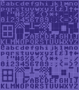
E.g. here's "PETSCII" [1], the Commodore character set, and as you can see there's a number of characters that provides different thickness "borders" on the left/right/top/bottom.
Here's a page with a number of "PETSCII" images using the same method to have borders in images with the other colour firmly on one side of the line [2]
As for modern usage, here's a tiny image from my personal terminal text editor, which uses the same method with unicode to get a shaded transition between the line numbers and the main display area [3].
When you had just 256 unique 8x8 pixel characters to draw all of the game graphics, you tried to use as few as possible. For drawing a thin line rectangle, you need at least 4 characters. Which are exactly the ones mentioned in the blog post.
I don't have domain expertise here at all but I'd like to hear the other side. Trapezoid estimation I believe I learned when I was 15 or so as part of standard coursework.
I would find it remarkable if all these accomplished scientific experimenters and scholars first encountered it here
Not impossible but I think Occam's razor would suggest there might be domain specific nuances to the implementation that makes it special.
On the other hand I've certainly encountered a ton of stupidly obvious techniques in my 30 years of programming which I thought were unremarkable only to discover people have developed a special language and narrative history of attribution to it.
You swim through the jargon presuming it's profound and enlightening but then ultimately get disappointed. It's an emotionally impactful experience so I tend to remember it.
That example is just one that sticks out in my mind particularly brightly. I'm a mathematician, and I have a particular distrust of people who name things after themselves, in large part because of the culture -- people who cite your work might choose to name it after you in recognition of your/its significance. And I still dislike that, because for example, Noether's Theorem isn't a unique identifier. The Trapezoid Rule, on the other hand, is named perfectly.
There's some interesting discussion on stackexchange at [1], the comment I link to reports on some investigation they did. Apparently, the Tai of Tai's Model misinterpreted other people's use of the trapezoid rule, found that misinterpreted version to be faulty, re-invented it, and named it after herself. One assumes that it was an honest mistake, but it's a damned shame that it didn't get caught in review.
That's different. That has the same problem as the first image in the article: the background colour protrudes beyond the border. It also looks much worse than the box drawing characters.
I like it! Reminds me of the time my woodworking professor told us it was impossible to make dovetailed joints in a spiral because you wouldn't be able to fit the last piece in unless the joints on both ends face the same direction instead of one of them pointing sideways.
Of course for my dovetailing project, I had to make a little frame with spiral dovetails, to show that it could be done.
Spiral is probably not the best word, sorry. Let me try to explain it another way. (It would be so much easier with a picture!)
So a dovetail joint has two pieces that slide together at the corner. Because of how the wood is cut, one side of the corner has a fancy zig-zag showing on the outside (tails) and the other just has boring parallel lines (pins). [0] You have to slide the piece with pins into the piece with tails.
So typically if you're making a dovetail box, each side of the box would either have pins on both ends or tails on both ends. This is so that the last piece has both joints pointed the same direction so both ends can slide in to the rest of the box.
You end up with two sides of the box showing the zig-zag tails and two sides showing the boring pins. [1]
But I figured out how to assemble the box so that each side showed tails at one end and pins at the other.
The thing is, if you draw boxes in a terminal, you are targeting users that don't care too much about graphical user experience ie. users who feel comfortable and happy with a CLI interface. Users who care about colour bleeding don't even try such things in a terminal.
You're implying (or assuming) that users who use terminals don't care about visual perfection or design or something. I'm not sure what makes you think that way, I certainly answer "yes" to your question about whether bleeding would bother me. We care about visual warts just as much as in other environments :)
Maybe I'm seeing it too much black and white -- CLIs vs GUIs, while there are intermediates like TUIs.
Why I think that way... I always had the feeling that people opting for CLI alternatives more look at the formal content, less so the way it is presented.
I prefer terminals because I can express my commands clearly through them.
I prefer polished UIs because they help sharpen my focus away from their flaws and into my work.
I prefer command line tools with polished UIs. I enjoy color highlighting. I run my editor in 256color mode.
I wish a restricted set of CSS was available through libncurses via ESC[ commands, with optional downgrade via term cap to Unicode characters like these one-eighth ones, so that we didn’t all have to suffer quite so much “UI is optional” default neglect from command line tool designs. (One that includes features for terminals newer than decades ago! Like tables, and borders :)
When I was using MS-DOS, boxes were typically done with line-drawing characters that are basically the same that can be used in terminals nowadays, i.e. with color bleeding. But then I learned that it was possible to avoid that, by creating some custom characters (still staying in text mode on an EGA/VGA) to have the lines exactly at the border of the character boxes. It was looking much better, and I still believe that.
Now, I'm not saying that my eyes hurt when I see boxes with color bleeding in a terminal. I've seen so many in years of TUI under DOS that I find them to be absolutely normal. But when I see a nicely done TUI, possibly in an unexpected or creative way, I find it more pleasing to use. It is the same as for a GUI: why not keep Windows 3.1 window decorations, if those details are not so important? The fact that it is in a terminal or not does not make any difference.
Aesthetics are medium-agnostic, they are valid both for TUIs and GUIs.
Yes, the content has less distractions and is more legible when it has solid uniformity and consistency. Bleeding colors create a distraction and may run up against other content, potentially degrading legibility.
Personal anecdote, I’ve spent half of my youth in turbovision-like interfaces and never experienced anything like what you described, never even thought of it before this thread. Not that subj is bad, but to me it feels like a strange problem to solve.
Same here for turbovision interfaces and similar. I've never found them bad. But when I've seen that an alternative was possible by changing the VGA character generator, I found that more aesthetically pleasing.
> it feels like a strange problem to solve.
Seen this way, why bother creating nicely-looking GUIs? It would be the same strange problem to solve.
Alternatively, you need a controlled interface that constrains what users can do and provides responsive, comprehensive validation, but you cannot use a GUI because of the excessive attack surface.
It is easier to code a relatively more secure constrained TUI login shell with ncurses than with a full GUI library.
There’s definitely a set of cases in which CLI users would care about this sort of thing. For example, if you’re using Vim or another editor and want to maximize usable screen space.
It's the Ruby source of the editor the screenshot is of. There's no full box there, but the border between the line numbers and the main area uses this "method" of using one of the characters with blocks along the edges to create a border with one colour between two different coloured regions, using U+258B (Left Five Eights Block). I took my inspiration from that from my C64 days. This is a decades old method.
Ah cool. It took me a while to understand. So the problem it solves is: you can start a new colour without being constrained to the grid of the fixed-width characters. That way you can save a bit of space.
It doesn't show a problem. It shows using the technique in the linked article to get a border without the background colour showing on both sides of the line.
The github repo [1] is wildly out of date, and it probably won't even run on other peoples systems at the moment as one of my experiments with it is to keep the editor itself as tiny as possible and leverage other tools for as much as possible. As such, it relies on bspwm for multi-window support, and on rofi for file-selection, theme selection etc., and helper scripts not in the repo. It's currently smaller than my Emacs config used to be...
More so than the editor, which I'm kinda treating as my config more than a finished app, I'm gradually splitting functionality into a bunch of gems so that the editor itself will feel even more like just configuration...
Here's another screenshot [2] showing part of the integration with Rouge for syntax-highlighting, and showing how it's rendering comments by recursing into Rouge's Markdown mode, which again recurses into Rouge's Ruby mode. The "LayeredLexer" class it shows is used to enable that.
EDIT: It's my main editor, by the way, and it persists open buffers, and shares them between the user interfaces using Drb. Currently I have 1969 buffers open...
Thanks for the elaborate explanation! Ps what do you mean by perstisting the open buffers, are they at any time in sync with a file, or are the buffers shared via another mechanism?
The editor is client-server using Drb (I'm considering changing the use of Drb; Drb is very easy to get running but you get little control over the interface; it's a bit too good at being transparent)
Originally I did it as a quick way of ensuring I didn't lose data when I started using it, as Drb will forward exceptions as well, so the backend just won't crash, so as long as you don't do anything which corrupts the buffers you're good. Instead the frontend may crash (and throw me into a Pry repl, where I can query the backend and make sure I can recover the buffers), and I can just restart the frontend on the same buffer and keep working. (In practice it mostly crashes when I am using it to edit itself)
As an extra precaution I made it serialise all the open buffers to disk regularly. So I can just shut down my machine and next time I open all the buffers are still there (like Emacs etc. it'll warn me if the file has been edited since the buffer was opened).
Eventually this also gave me multi-frame support "for free" in that splitting the buffer vertically or horizontally just spawns a new instance of the editor and attaches to the same buffer (and then you can open whatever you want in it)
Doesn't this also imply that if the CLI experience were able to be improved graphically enough, people who care about that sort of thing would be more open to using it?
If someone wants to design apps for people and prefers writing CLIs, having a wider potential set of users is helpful to them. For a maybe unrealistic example, a lot of people complain about the proliferation of Electron as a solution for cross-platform GUIs due to the resources it requires, but developers still use it because it makes their job easier. Maybe putting more effort into GUI frameworks that don't use so much memory is one way to mitigate this?
I don’t think so. Electron is only useful because it is basically a browser plus some local features, so your gui code stays mostly isomorphic. If you step away from it, you lose this benefit. Many existing desktop gui libraries are already memory-friendly and in abundance, no effort required.
In theory, one could use a special protocol to support some gui library in it “natively” rather than at html-like level. If interested, take a look at gtk-server for example (not as a library example, it doesn’t fit here, but as an idea/inspiration).
It is very difficult for me to get in sync to this line of thought. CLI's are to hard to interact with, GUIs consume too many resources, so let's go back 30 years in time and use TUIs and improve them by e.g. other unicode chars? Why not just use a simple GUI framework instead, tkinter enters my mind?
Eh, not really. Main advantage of terminal stuff is near-zero dependency and working over SSH, if in addition to that it's pretty (in "more readable" way), why not ?
Web UI in comparison is always sluggish, usually required extra login method (instead of just sshing into client, or having CLI client with credentials saved) and in modern days require hundreds of megabytes of deps to even make the JS to run it
Iirc you can ssh-forward a port to a remote localhost-only web server and visit local http://localhost:port to use it. Something like `ssh -forward 2345:2345 -exec “http-server -p 2345 /path/to/mysite” myhost`, but with real options instead of my pseudo ssh cli.
Don’t get me wrong, I’m not fond of the modern web either, but setting up something like a chat-like shell in a browser-over-ssh sounds like a pretty straightforward and lightweight job.
That totally breaks the flow. I often spends hours working remotely over ssh+tmux, running Emacs, htop, etc. in a full-screen terminal. Having to suddenly switch to a Browser just to interact with a pretty UI is a terrible flow-breaking trade-off. (OT: and anytime I have to bring up a browser I for "some reason" end up distracted from what I was doing.)
I do wish terminal graphics support was a little better. A terminal (like iTerm 2 [0]) that supports inline graphics allows your terminal to display plot etc in a graphical form without having to exit it. In MGR [1] this was the _only_ way to display graphics, even interactive, and I think it had a lot of merit.
I wish there was builtin support for webapps that was at least as integrated as X forwarding is on ssh. Basically what I'm imagining is some standardized way of tunneling http in unix sockets, and then ssh setting up the sockets and some env var. Then when application connects to the socket ssh client would open new browser window similar to PWA.
There are many flaws with such approach, webapps being often crappy being of course one of them. But the redeeming factor is that practically all the tech already exists, this would need just minimal glue to make it reality, while many other approaches are more of a pipe dream.
I always think, these guys are wizards, when seeing their backtick and pipe laden commands.
When i want to access a codebase via ssh, i simply boot vscode and search for ssh connect. Then I see the complete tree in seconds, can change files, can search with regexp, whatever without stackoverflowing (literally and figurative). The command to build (compile/link) and test is usually just typing make or so in the ssh terminal.
As alternative to scp, i simply right click a file or directory that i want to transfer without thinking about slashes, root dirs, credentials etc.
At this point, I am 95% convinced that the reason web UI's are oftentimes perceived as sluggish is the easy access to custom animation/transition on the web platform. As a result, developers tend to overdo animations, or set the transition too long, resulting in a subpar experience.
An advantage with the traditional box characters is that you get consistent 0.5 character margins and paddings.
In the example, there's obligatory 1 character vertical margin and horizontal padding (or vice versa). If you want consistence, you have to add one character of vertical padding and horizontal margin, or if you allow "rounded" (missing) corners, I suppose you could have margin in all directions and no padding.
Actually, Unicode "Symbols for Legacy Computing", U+1FB7C – U+1FB7F ('LEFT AND LOWER ONE EIGHTH BLOCK', 'LEFT AND UPPER ONE EIGHTH BLOCK', 'RIGHT AND UPPER ONE EIGHTH BLOCK', 'RIGHT AND LOWER ONE EIGHTH BLOCK'). But support may vary, as this is a relatively recent addition (based on a proposal from 2019 [1]).
That said, there is more to this approach, as it actually solves two problems at once: corners and the surrounding white space required for boxes with a background fill. And there are no compatibility requirements (as compared to using the new Unicode range.)
Any full box in the terminal takes up two full rows top and bottom, and two full columns left and right, this is no different.
It's a clever trick actually, though it doesn't compose the way the traditional box-drawing characters do. Good for one (1) box, where you want to be able to set the background without bleed.
I'm talking about how it looks if the box partially covers other content.
A 1-dimensional, 1-sided horizontal example would be if you have abcdef in the background partially covered by ABCDEF in the foreground. With a vertical bar in the middle, it looks like
abc|ABCDEF
However, with this new technique it looks more like:
abc |ABCDEF
(approximation, notice the space; also this example assumes a different stacking as used in the article, which brings the problem in the x-direction which is convenient in this example)
I'm not quite following your meaning here - it's terminal characters, there's no way to do alpha blending, right? So putting any character on top of another character would always replace it.
> For those who want to use a GUI, b̵u̵t̵ ̵d̵o̵n̵’̵t̵ ̵w̵a̵n̵t̵ ̵t̵o̵ ̵s̵a̵y̵ ̵t̵h̵e̵y̵ ̵u̵s̵e̵ ̵a̵ ̵G̵U̵I̵ but work on minimal headless servers over ssh or in docker containers
For me the main benefit of TUI programs is working with ssh and tmux. Also, they just tend to work better than gtk and qt stuff. My IRC client never lags or crashes, unlike my XMPP and Matrix clients.
Also, even though they may support a mouse, TUIs almost inevitably are very well keyboard driven, and typically do a better job of it than a GUI, particularly web GUIs.
It can be done with GUIs, of course. You can also have bad TUIs. But "out of the box", the TUI tends towards better keyboard navigability than GUIs, so are more likely to get something usable "for free".
I find it very easy to get "trapped" in GUIs where your keyboard falls in to a focus pit that it can't get out of.
Electron apps seem to be especially bad at keyboard navigation. A decade ago, the kind of breakage you'd see in GUI apps when trying to use the keyboard was mostly the lack of shortcuts/accelerators and nonsensical tab order - but it would still be usable in principle. Now I keep running into apps where tab navigation doesn't work at all, or where Enter/Esc doesn't do the expected thing in modal dialogs.
Modern Windows apps also suffer from this kind of breakage.
For example, the calculator. If you use the mouse to press a button while entering a calculation (for a trigonometric function say) then when you press enter to get the result it just presses that button again. This is contrary to the Windows design guidelines and, more importantly, it isn't useful.
It's like the apps have been redeveloped by people who never use a keyboard.
I use poezio in tmux over ssh full-time for XMPP. Works great.
I know remote desktop stuff exists for GUIs (from RDP to VNC to X tunnelling), but ssh (or mosh) with TUI apps can provide a great balance of functionality and reliability that I've never found with any of the remote GUI solutions.
Not all CEOs of tech startups have the time to write code. Fortunately while Textualize is still in its development phase I have plenty of opportunity to get my hands dirty.
Oh, so this is something unimpressive being used to disguise an advertisement.
I've designed such interfaces, and drawing boxen is superfluous to the point I realized it's not worthwhile. Regardless, this solution seems obvious for anyone who actually had this issue, and I'm doubtful there were many.
Notice anything different about the last one? It was added in Unicode 13 in a new block. This means very much reduced font support, and if absent, it generally means the use of a fallback font, which is very likely to mean a wider glyph, which means that the right edge of your box is displaced and probably the wrong thickness, and in some environments (though no proper terminals) anything following it will be offset too.
I use Triplicate as my monospace, and yeah, it lacks U+1FB87 RIGHT ONE QUARTER BLOCK, so this technique looks awful.
It gets a little worse when you consider line-heights. Some fonts design these things to fit line-height 1, others their default line-height, I think. The concepts are a bit fuzzy and implementations inconsistent and I don’t actually know the full details of what I’m talking about. Still worse, in browsers I don’t think the font’s proper preferred line-height (if that’s a thing?) is actually exposed, so you can’t actually get the correct result (the closest you’ll get is hard-coding the font metrics and hoping that font gets used, but that’s never guaranteed). But the end result is that you might get your box not neatly lining up in a terminal and probably won’t get it lining up in a browser, either squished more than it should be or with gaps, and in either case it’s going to be visually unbalanced in quite a disconcerting way, whereas the regular box-drawing characters are more likely to line up due to more care and even if they don’t the gaps (or maybe-visible-with-the-wrong-sort-of-antialiasing overlaps) will be balanced.
Sample (remote since HN is gobbling all these Block Elements characters): https://temp.chrismorgan.info/2022-10-16-hn-comment-33217918..., also try copying it to your terminal to see if it differs from the web layout technique.
Conclusion: stop trying to be fancy, block element support isn’t good enough and the technique’s failure modes are quite bad; just stick with box drawing characters and no clever backgrounds, because that will work much more consistently, and wastes less space too.