I had no idea about the css unit “ch” and now I want to see what it does to my minimalist pages. I wonder if I want a media query for a different count for mobile.
Also I’m not sure you consciously meant this but I like how your comment recognizes, “wait, I don’t have to fix everything myself. It’s healthy to delegate and enable others.”
Probably not what you think— ‘ch’ specifies length in terms of the width of a ‘0’ character in the element’s font, not in terms of actual character count.
Given fonts aren’t all monospace it would have been impossible to achieve the latter, so I expected and am glad for the former. It is an approximation based on one character. And for monospace it is character count.
This reminds me of the Reveal Codes mode of WordPerfect. Ah, the good ol' days!
This would be a GREAT way to edit content per structured-content schemas like DITA and Docbook. I would totally go for an editor view like this that shows all markup, dimmed, so that I could edit with confidence that the editor is not mangling, munging, and mutilating my markup.
Any chance of making this kind of view work in, say, TipTap or ProseMirror ?
Really brilliant ! It's the only quine I know off that anybody can understand easily. If you haven't seen it the author also wrote a text adventure game in the console!
https://secretgeek.net/console_log
HTML & CSS are in many ways antithetical to brutalism, as they are sugar coating over the true function of the interface. We should expose only the HTTP API, with the minimum structure
in the response back to make it human and machine readable.
That is a true Brutalist web. None of these colour schemes, layouts or pretty views, just pure information, delivered at speed.
You do realize that brutalism applies to architecture and means that you expose the structures but that you can still decorate over that with rugs, curtains, tapestries, and such? Brutalism doesn't necessarily mean drab, spartan minimalism.
Actual Brutalism embraces the idea that beautiful forms can come from purely functional design not obfuscated by baroque, purely decorative structures to embellish or superimpose skeuomorphic references to building structures from bygone eras. (e.g. decorative columns.) The buildings should be designed to accommodate many people, but the small, modular elements should focus on the human scale. All of this stems from a utopian idea that scaling production can provide functional, beautifully designed buildings for use by all people, rather than just the privileged few.
While the style is polarizing, and there are obviously examples of shitty brutalism out there, I'd say it often accomplished its goals. In my experience, well-designed brutalist buildings are easy to navigate, have large open spaces, have lots of little nooks and crannies to foster human interaction, and have really beautiful forms.
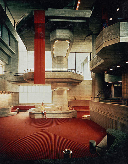
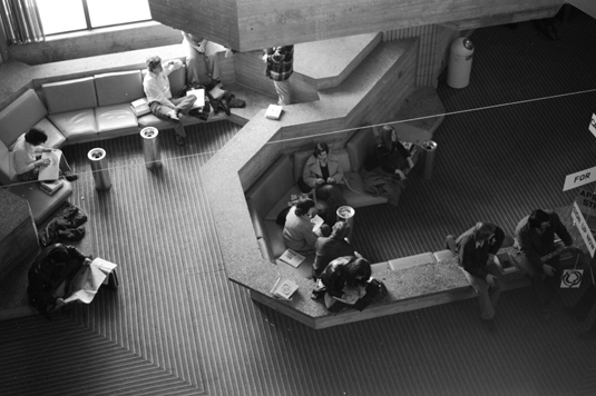
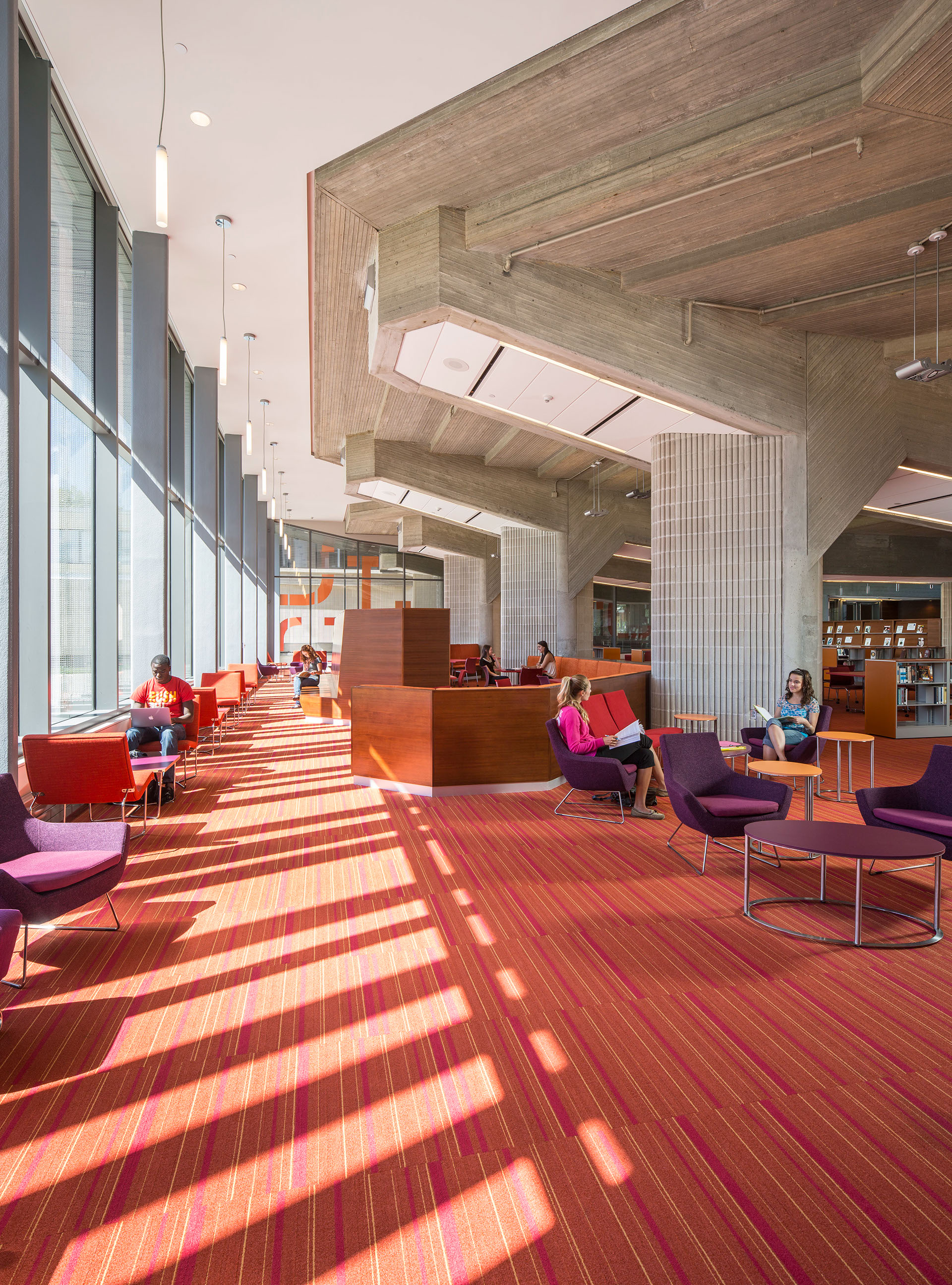
Old images of the Umass Dartmouth (then Southeastern Massachusetts University) library:
(though the architect really should have done more to accommodate laptops in that space!)
This quine is rather the opposite of brutalism. Every single page element adds purely decorative :before and :after elements and monospace font not optimal for paragraph text that hinder its function just to reference an aesthetic from a bygone era. Adding decoration to a functional object to make it "brutalist" is conceptually kind of ridiculous. HN is far more brutalist than that page. Its structure is clear, functional, and largely unembellished.
Examples of brutalist websites: Craigslist, Skimfeed, Reddit.
Early Google, Twitter, Facebook also, use archive to take a look at how simple and purely functional they were vs. the bloated mess they are now. In fact, the whole web was that way in those days. Made by engineers for engineers.
Where are you seeing "an aesthetic from a bygone era" in the linked page? Are you really grokking what's going on with the content, or ? Undergirding the brutalist claim is its quine-ness. Like buildings in the brutalist tradition that "showcase the bare building materials and structural elements"[1], the content of the page reveals its structure. In fact, no part comprising its structure or building materials (such as they are) is left unexposed. It displays everything that is essential and displays nothing that is inessential.
It would be one thing to say that this sort of thing—i.e., taking it to its (brutal) extreme—is overkill and that that's what you find unappealing about it. To call it "the opposite of brutalism", on the other hand, is silly.
I love the images of the old design. Honestly I feel like the modern form is less friendly. As humans we relax better when having something protecting our back, and the modern layout leave you feeling exposed.
When done right brutalist building are in my mind the most relaxing and comfortable. Sadly it's not something we really build anymore, and certainly not as regular homes.
Definitely agree. I keep seeing sites like this called Brutalist, but they’re more akin to high tech postmodernism. With the closest architectural equivalent probably being the Centre Pompidou. Which is all about exposure of underlying structural and functional elements for purely aesthetic purposes.
I contend that the appeal of Brutalism lies entirely in its name, people are just mesmerized by that word, you hear it dropped much more than any other school of architecture. I don't know how to look at stats on wikipedia, but I'll bet that page gets more attention than its cohort.
Brutalist buildings are generally very unpleasant to visit.
I'm an art school guy from a very Bauhaus influenced design program. I spent more hours learning about visual aesthetic and communication than computer science majors spend learning related math disciplines. As a toddler-aged child of college students, I spent many hours in the pictured library and loved every minute of it. I loved the big open spaces, pops of color against the gray, the coversation pits, balconies, and the shapes... the core structure wasn't all right angle boxes. It spurned my interest in design.
Your contention is an artifact of superimposing your taste onto everyone else. Good brutalist buildings are captivating forms based on the altruistic, if often problematic and shortsighted ideologies of modernism. They're striking, unusual, and completely unique. I completely understand why some people consider them hideous, but asserting people only like them because of the cool name is complete garbage.
It's more for editing HTML than presenting it. The idea is to use a monospace font because the sizing is consistent enough that elements can be overlayed on top of a textarea. The textarea avoids the complications of things like contenteditable or whatever that attribute is that I'm thinking of. In that Codepen iteration, the tags aren't exactly selectable, but it's written in such a way that they could easily support click events. I do still want to get it to a 1.0 state eventually.
Love this! I hadn't seen it before. A year or two ago I gave my personal website a similar brutalist style, but it's frankly a lot more hacked-together than this because I didn't use some of these clever CSS tricks. Maybe time to refactor...
I don't know much about code and what this page accomplished, but I'm browsing the page on a mobile phone and is hard to read, maybe accessibility should be part of the challenge too.
I’m browsing this page on mobile as well and found it easy to read, so it may be that understanding what the page is accomplishing is an important aspect to finding it readable.
It seems like the tags can't be selected, so you can't copy the page source from the HTML itself. That still distinguishes the page from its source code.
I just tried selecting using iOS and had no trouble selecting tags, although I did notice that the behavior was “different.” Did you try selecting with a ctrl-a or with a mouse or something else? You’re right at it is not identical, in several ways, but I’m not sure it ought to be, either.
https://github.com/secretGeek/html_wysiwyg/commits/master