Hacker News new | past | comments | ask | show | jobs | submit login

That data is available if you bother to look for it.

https://files.taxfoundation.org/20220119175430/The-Top-1-Per...

Despite the top 1% total share of income decreasing since 2007, they still pay the same percent of all taxes.

Thus the tax burden on the top 1% has increased over time.


Why pick 2007, except for the fact that it clearly looks like an outlier?

It looks to me that the general trend for the top 1% of earners has been a slight increase in both income earned and tax paid


Looking at 2007 was a peak in both income earned and taxes paid. Comparing it to today, income earned (as a %) decreased, yet taxes paid (as a % of total) is about the same.

So we can at least say from 2007 to now, tax burden increased.


Probably not a good idea to pick an unusual year as your baseline if you want a reliable conclusion.

The trend of both graphs appears to be a modest increase over time, obviously with annual fluctuations.


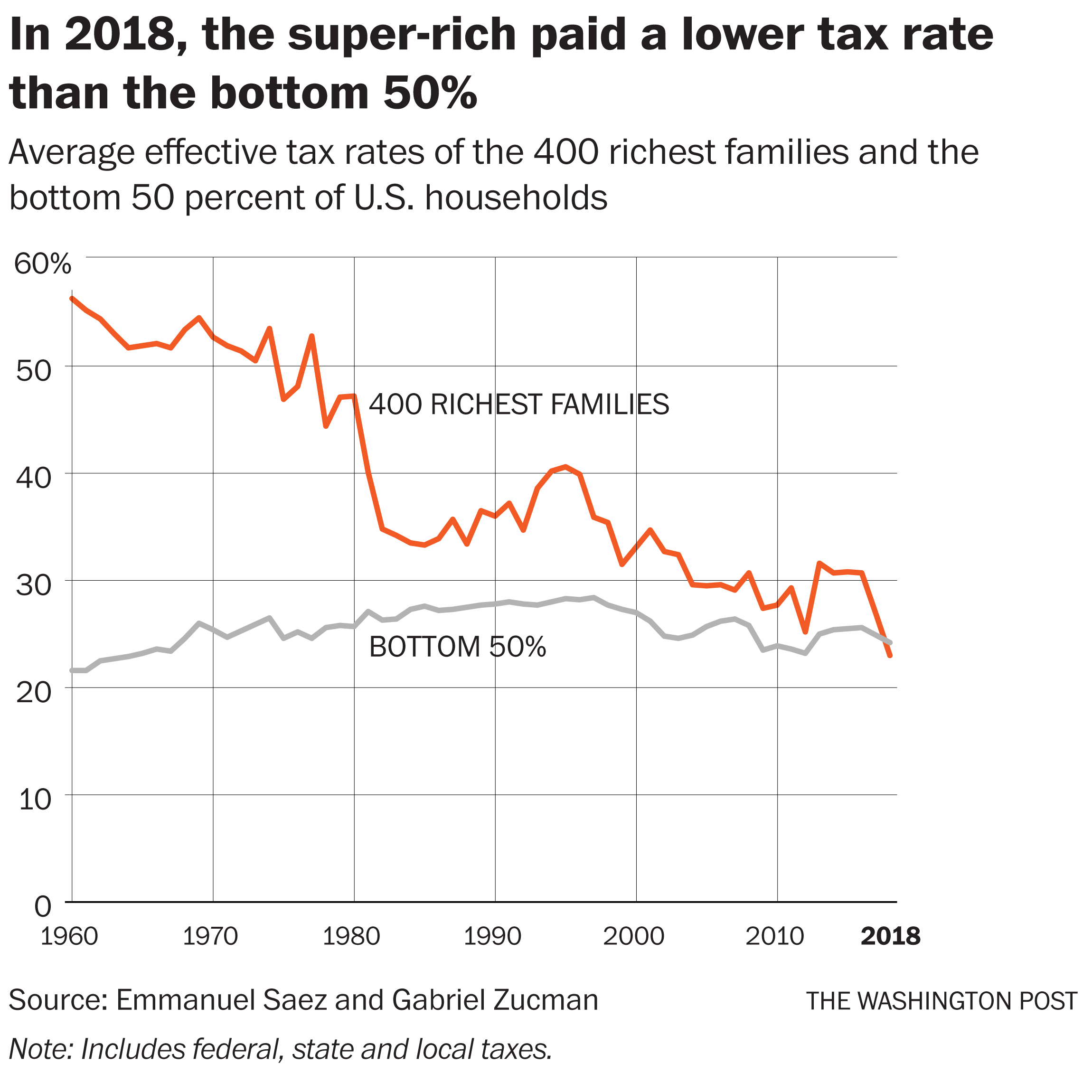
The tax burden for the top 1% _income_ earners can totally increase while the tax burden for the top 1% wealthy decreases (they earn from dividends, not work)


It’s literally in the data link I posted.

The top 25% saw their tax burden increase, the bottom 75% decrease.


According to your link the share of Income of the bottom 75% also decreased. Than it is not surprising to see their tax burden decrease.

Also, the trend seems to be the other way around: Tax rates of the top households have continuously decreased.

[1] https://www.sltrib.com/opinion/commentary/2019/10/07/david-l...

[1] https://static01.nyt.com/images/2019/10/04/us/tax-trump-weal...

[2] https://www.washingtonpost.com/business/2019/10/08/first-tim...

[2] https://arc-anglerfish-washpost-prod-washpost.s3.amazonaws.c...


Guidelines | FAQ | Lists | API | Security | Legal | Apply to YC | Contact

Search: