Wow...love the intelligence in this interpretation.
I suspect this will likely become apart of the imagery associated with our loss, like the Shepherd's Hope poster became associated with Obama's campaign.
I made a few wallpapers [1] with this in case anyone wants one (sorry for the poor vectorization, I'm working and I had to make this fast).
Imgur seems to compress jpegs a bit hard, so please feel free to ask me for less compressed images.
The different images are for the different resolutions & styles.
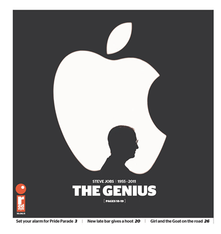
(I am not the creator of the original image, credits go to Jonathan Mak)
That's a lovely form factor. Kern the numbers more evenly, the distance between the "1" and "9" is far more than the distance between the "9" and "5", and the "2" in "2011" is far closer to the "0" than the "1".
I tried an Apple logo variation back when Steve's illness was first announced. It's not as subtle as Mak's, but this seems to be the time for this sort of thing:
Considering he stepped down on the 25th, this post is on the 26th, and it is titled "Thanks", I'm inclined to believe it is not an accidental misconfiguration.
I put it up at www.bitkeeper.com, if you need a copyright stuck on there or whatever, let me know. Very nice logo, I like to think that Steve would also have liked it.
I love the design. I took the liberty of using it in an iMovie project called "In Memory of Steve Jobs" that I wanted to post to the guys on HN, who I hope will appreciate it.