I've yet to come across an instance where antialiased is better than using subpixel hinting.
In addition, I think it's crazy that the browser would allow a site designer to alter such a highly OS- or even machine-specific setting.
Heck - there's even special tuning wizards in most OSes to configure the subpixel hinting perfectly for a specific monitor.
Dear designer, turning that off for everybody just because you didn't manage to configure it correctly on your machine is egoistic and, IMHO, plain stupid as you make everyone suffer for a thing you should fix at your end.
However, since then I acknowledge there is an instance where it does make sense.. any text on black. In OS X, at least, the default rendering of type on a black background bleeds horribly, so I've swallowed my pride and started to use it in situations where it makes sense. It's particularly noticeable with Helvetica, I've found.
There's a number of tech blogs linked here regularly which use anti-aliased html5 fonts that end up looking spidery/ghostly and really hard to read. I have to use Readable or text highlighting just to read them.
Campaigns like the OP that raise awareness are very much needed, there's no downside to them.
The downside is that the argument is not very effective.
Those designers believe that anti-aliased fonts look better and no tirade will convince them. It’s just ineffective to try and convince them that anti-aliased fonts should not be used. It’s the wrong argument.
Here is what the argument should be: Most users of the web (nearly everyone not using XP and everyone using Internet Explorer 7 and XP) have anti-aliasing turned on by default. There is no need to worry about them. Additionally, the property designers are using to turn anti-aliasing on doesn’t even work for many browsers. It’s mostly targeting users of Chrome or Safari and XP. That’s a really small subset of users and the benefit of enabling anti-aliasing for them is doubtful. Most other websites won’t be anti-aliased for them, the one that is will likely stick out and somehow look “wrong” to them – not because anti-aliasing is objectively worse but because they are just not used to it.
Who will be very angry is everyone who explicitly disabled anti-aliasing. That’s a small minority, for sure, but I don’t see how the benefits are worth that tradeoff in any way.
>This is what we see by default. Some people like it, most don’t. (from maxvoltar, on the default webkit rendering (subpixel-antialiased))
Unsubstantiated claim is unsubstantiated. I, for one, find that I can read more quickly with OSX-style text rendering, and efficiency matters to me.
As to the "high contrast movement" OP, I find the lower contrast easier on my eyes. And I have friends who have to wear sunglasses to read books / computer screens because of the high contrast. It's a horse apiece.
As to the "high contrast movement" OP, I find the lower contrast easier on my eyes. And I have friends who have to wear sunglasses to read books / computer screens because of the high contrast. It's a horse apiece.
External monitors, at least, have contrast controls as well as brightness (I wonder why laptops don't).
The closest I've seen has been "Shades" for OSX - it just puts a colored transparent layer over everything (by default black) that makes the screen darker. Handy at night, when the lowest setting is still too bright, though it does make the not-blackness of on-screen black stand out.
Totally, absolutely agree. Apple's website actually forces antialiased text through that CSS rule. I wrote a userstyle to force it back to how it should look.
There's a second problem that's popping up lately: font-face on the body text.
System fonts have been painstakingly hinted to make them more readable on-screen. Most web-embeddable fonts don't have appropriate hinting or are just plain bad choices for body text. Hoefler & Frere Jones (one of the most respected foundries around) haven't released embeddable fonts because they've been working on it for years.
The result is fuzzy text at small/medium text sizes. It's huge pain to read. It seems some designers forget that good typography is concerned with readability too.
Some true facts that you might consider before passing that over-generalised statement:
-There are a number of fonts designed specifically for screen reading.
-Some of them happen to be preinstalled on our computers.
-Not all default fonts installed on our computers are meant for screen reading. Not all web safe fonts are either.
-A huge number of web fonts off late have been designed with screen in view. e.g FF Meta, FF Tisa Web Pro and so many others.
-There is nothing wrong with using font-face for body text.
Examples: Every article on trentwalton.com uses font-face (uses Typekit for webfonts) and works great in terms of readability. Please do not mix the poor aliasing on Windows with a problem with web fonts.
Core fonts don't necessarily equal good web typography. Arial, for instance, is pretty mediocre for the web. You could say the same about Helvetica (it is still better designed than Arial).
As for web fonts, Adobe and other foundries have large collections of gorgeous fonts specifically designed for the web.
Arial might not be a good typeface, but as a font it's pretty damn well hinted for screens.
Except for Minion Web and Myriad, I haven't seen a really legible web font from Adobe that is usable at 11-15px. Heck, even Typekit uses Georgia/Arial for long copy.
Because Helvetica looks so bad on Windows, a good compromise for a CSS font stack is something like:
font-family: "Helvetica Neue",Arial,sans-serif;
Helvetica Neue (a minor reworking of Helvetica from 1983) is a Mac system font, but few Windows PCs have it. So Mac users get nice fonts and everyone else gets Arial.
Many CSS font stacks list Helvetica after Arial, but that is silly because nearly all computers (like 98%) have Arial, so Helvetica will never be selected. :(
Mark Hurrell has blogged some of his testing on Helvetica font stacks (including Neue) at http://blog.mhurrell.co.uk/post/2946358183/updating-the-helv... which is worth a read. Current recommendation is to specify sans-serif but with additional specifications for Linux:
"[font-face] also raises new issues, including poor onscreen display of non-hinted fonts. And because hinting is tedious, time-consuming and widely believed to be nearly obsolete, 99% of all fonts, even commercial ones, are non-hinted."
>designers need to think of elderly users with bad vision
There are plenty of us young folks with terrible low-contrast vision, too :) I've personally got HN turned up to 175% zoom, and even that's a bit on the low side if I want to read the text of self-posts.
IMO, this is an important distinction -- I once heard a friend indicate that, because their app was targeted at people aged ~20-30, accessibility wasn't an important focus. I thought that was a very short sighted decision.
The author's focus on just 2 things, contrast and font, are not only overly simplistic, but are not even universally true for all people. For my eyes, reading high contrast black on white all day causes eye fatigue, while HN level of contrast (and the contrast on my site) causes less fatigue. I have no idea what percentage of people feel that way, but clearly some do.
I am a huge proponent of designing web sites for readability, and discuss my thoughts on optimizing site design for reading here:
So many sites have too much clutter or layout problems that using Readable or Readability has become a requirement for me. For anyone not sure which to choose, I reviewed the latest versions of them here:
The black-on-grey is hard to read for me, especially at default zoom. I'm bumped up 4 steps (just checked) which gives a bolder text.
Garrett Hardin (the Lifeboat Ethics / Tragedy of the Commons guy) actually had several of his books published with a deep brown ink on cream-colored paper, for maximum readability (c.f. _Stalking the Wild Taboo_ referenced here: http://books.google.com/books?id=jT-pl1LQTIIC&lpg=PA101&... ) Note that that particular reviewer didn't care for the effect.
HN _does_ have a simple layout that's highly amenable to resizing, to its credit.
You mention black-on-grey. Are you referring to HN or my site, www.filterjoe.com? My site is close to the color of a faded paperback novel, a yellow/beige. HN looks halfway between beige and grey on my monitor - so I'm guessing you're referring to HN. I've noticed that the higher the resolution is on a monitor, the easier it is to read lower contrast text.
I've noticed large color variance on different monitors. When I first started my site I went for very low contrast link color with no underlines (trying to reduce links as a source of distraction) but some people on some monitors couldn't see the links at all. So I put back in the underlines.
And yes to color variance on monitors. Early-gen laptop screens were horrible for accurately rendering subtle shading differences.
My stylesheet explicitly highlights links, and at least for a while there would add a yellow background on mouse hover, bolding on click. This was really useful especially for distinguishing closely-placed links, or links partially obscured by other page content.
I like your site's readability. I also like the body font. It might be my default text font, dunno. But it seems that the lines of <li> elements are oddly compressed.
Both font size and line height are smaller for comments and list items. Are you saying you prefer more line height (without font size change)? Or do you generally prefer both line height and font size in lists/comments to be identical to body text? Or perhaps something half way in between, with line height just nudged up a little but not as much as body text?
It started out promising. Then the author states, apparently without irony, that "aesthetics are important but aren't the ultimate goal of design", making particular reference to people reading with tiny screens, when his/her own site is quite unusable on a small screen!
I normally keep my browser windows at half the width of my screen, around 700-800 pixels wide (give or take). Just looking at the "page" where the author discusses aesthetics, if you've got a narrow window, a few letters and words are cut off on the left, and while you do get a scrollbar to move to the right, everything to the right of the original view is plain white. (On my screen, the cutoff actually runs right through the "reading tiny screens" text and icon, for added irony.)
That's all fine but doesn't go far enough, focusing only on contrast problems (related problems to contrast are using shadow engraving style on small fonts and clashing foreground/background color schemes).
A really big problem on many sites is the length of lines.
It is very difficult to read text that has too many words per line.
A recent abysmal nightmare is Apple's decision to make Mail.app (and other apps) in 10.7 oriented towards full screen as if it was running on vertically oriented mobile, but on large wide screens. Small font sizes here and we have scan lines with up to 30-40 words in some cases, which is complete insanity.
Count the words per line. If the average is much more than 12, either your columns are too wide or your fonts are too small. Here on HN is a typical example with around 24 words per line on top level articles. Bad design, but very typical on the web. However, it is at least manageable, many sites are far worse.
HN is called out as a site with poor contrast (the text in a self post). I do find myself frequently tilting my monitor back to improve the contrast of posts here, but I think only on the downvoted ones, which, I suppose, is the point.
But now, looking up at the now-clicked-on story link, I see that visited links have rather low contrast, too.
Propaganda by photoshop clone developers who don't want to design opacity layers into their interfaces.
In all seriousness, if everything was high contrast, everything would be SCREAMING AT YOU FOR ATTENTION. Webdesigners: use your personal judgement when identifying what should be high contrast (higher visual recognition priority) and what should be lower contrast (lower visual recognition priority) and all will be well.
FYI: the HN example on your site actually makes perfect sense. The high contrast content is almost always the thing I consider most important. Index: Titles of threads, Subpages: Comments.
Also see http://24ways.org/2007/typesetting-tables which shows a very nice way of adding structure to a table using contrast, instead of making everything scream for attention equally. (Additionally, the site used a different layout when this article was written in 2007, and currently it seems 24ways is a good example of low-contrast crappy readability :) )
It's not just contrast that makes text legible or not, there are many other factors:
- Width of the text area
- Line spacing
- Font-size
- Correct use of headings, paragraphs, emphasis etc
...
Actually low contrast is a great tool to have. You can't have high contrast all over the page otherwise various elements will be shouting for your attention. Controlling the volume of your copy is just as important as the factors I mentioned above.
I can't (read won't) take these guys seriously because they commit one of my biggest design 'sins". They use tiny typefaces in places which can barely be read (at least by me) on a standard 13 to 14 inch laptop screen.
you know what they say - "People in glass houses should not throw stones"!
Yeah, I have a minimum font size set on my browser (necessary because my eyesight is bad and virtually every site wants to use font sizes that I simply can't read) and this site looks like crap as a result.
Redux of this comment thread: "But it's not perfect!" enumerate minor flaws. sneer.
Sometimes it's worthwhile to tackle one issue at a time, especially if it's something many people (designers) a) don't care about b) don't want to do c) possibly don't understand.
So yes, perhaps they fall down on graceful degradation / progressive enhancement, but to be fair the target audience is exclusively web designers. In that respect they are playing well to the audience, which in turn makes it more likely that they'll get their point across.
As for "large text is too hard to read" & "I can't read centered text:" seriously? Deep breaths, everyone. ;)
I Find it strange they're only talking about contrast and not line-height. That's the real dealbreaker for me. I am personally constantly changing line-height on other websites much more than type colour.
I've gotten into the habit of modifying the CSS of web sites I frequent to improve the readability and usability in general. I do this using a plugin for the web browser. For instance, this is how the HN home page looks like:
http://i.imgur.com/WaTQq.jpg
This is the most perfect design because it's tailored to my needs.
One of the big disappointments I've had with Chrome so far is that there's no way to set default font sizes (within the browser UI itself). I suspect there may be configuration settings .... hrm .... no "about:config", damn.
I'll try the userContent.css trick next. I've long forced all sites to use both my preferred fonts and sizes. Most comply reasonably well, though some (overly specified) designs break.
And that's for a guy who's been surfing in his 20s-40s, with good vision, though I'm just starting to feel the need for reading glasses. My parents are in their late 70s, Dad's got glaucoma. I've had to push up the contrast and zoom settings in his Mac account, for which he's grateful (the Web is one of his primary outlets / connections to the world now).
Sites designed on large, high-contrast Mac monitors, viewed on smaller, lower contrast devices, suffer the most. HN definitely could use a contrast improvement (I'm viewing zoomed up a couple of clicks right now, couldn't say just how much).
The real key isn't just sizing fonts (and setting contrast) appropriately, but to design pages which resize and rescale gracefully. I can live with the first if the second also occurs. Far too often it doesn't.
This CSS fix for YouTube removes a lot of functionality like the search form but since I can search youtube using extensions and the browser address field this isn't a huge issue.
There's nothing wrong with my eye sight. I don't mind wasting some vertical space to get better readability. Modifying the css is very easy and doesn't take much time.
There is such a thing as too much contrast when it comes to text. When typesetting it is advisable to never use pure black for text because it simmers on the page. I normally design the base text on the page to have between 15% and 30% brightness because it makes it more pleasant to read.
There is a place for light gray text. It is all about maintaining a hierarchy of information. Some text should be hidden away and harder to read because it is less important than the copy around it.
Their script went wrong towards the end, with the following text on the dark gray background with the fist on it:
"Usability expert Jakob Nielsen has shown many, many times that reading on the computer screen is harder than reading printed material even without making the font illegible. And mobile is worse.
.. and many have written about why gray text is a crime here, here, here and here...
There was an article that did well on Hacker News a few months ago that said while high contrast is good, it shouldn't be 100% contrast. Instead, you should very slightly hint toward the theme color. So if you have a bluish background, your text could be #112 or something. I've followed the advice since and it definitely makes things easier on the eye vs #000 everywhere.
You're not. I confess I made a Safari extension just to be able to read those comments that are greyed-out cos they're not interesting enough (and it was a nice test case to start with).
The non-javascript fallback display is somewhat broken but at least it works. With javascript enabled the site is stuck on the second slide (Opera 11.50).
And then there is the part where the site says "Content ≠ Illustration". Well, yeah, you first. And by the way, centered text is hard to read. And I can't use my browser's back button nor does the site provide such a function. And dear god, it gets even better on this slide:
Let's put an end to this low-contrast, light gray nonsense and use typography for its purpose:
MAKING TEXT READABLE.
AGREE? LET'S CHANGE THE WORLD TOGETHER!
Never heard about all uppercase text being hard to read?
This might just be an elaborate joke or sarcasm, if so, I do not get it.
Whenever I see a piece like this on Hacker News anymore (one that is going to provoke discussion), I am expecting a comment like this one. One that is equally as provocative in itself and taking the opposite stance.
People upvote these comments and they tend to make it to the top. This says something about HN.
What's wrong with comments like these ones is that they are being overly aggressive and argumentative for the sake of being overly aggressive and argumentative. Sure, being critical of others' opinions is a good habit to have, but disrespect is not.
In this comment, you tell the other site users to not waste your time on this and that this might just be an elaborate joke or sarcasm. That's pretty harsh for something that someone wrapped up together in their spare time and evidently put effort into it. Whether or not you agree, at least try to find the light in the piece of the work.
I know that a lot of people would be more inclined to read and accept an answer if you made it into less of a one-sided argument. Acknowledging both side and taking time to point out the strengths before the weaknesses go a long way and add to the overall politeness of the comment.
I think that, despite making some mistakes of its own, the content of the article is still valid and raises some important points. I did find it irritating that they used small, light coloured text on a dark background in places, as I find this very difficult to read (and am hardly alone in that).
However, I think there are bigger fish to fry than quibbles like that. On any given day, there's at least one article on the HN front page that I actually cannot easily read, and frequently it's black text on a white background, plenty of contrast, just far far too thin on my display. I suspect the significant difference between font weights in browsers between OS X and everything else may be to blame.
I also don't understand why people feel the need to use giant text everywhere- that's just as hard/annoying to read as tiny text. I'm with you on all points.
Interesting you say about high contrast, all the examples are black on white. Do this mean all content related websites should be white backgrounds and black text?
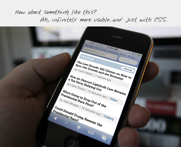
http://andyrutledge.com/images09/newsSite/images/iphone_nyt_... -- in here lower-contrast is used properly, I think. Low-contrast allowed to hide the low-priority details allowing the brain to quickly navigate through important, high-contrast titles. Not all text is important.
On a side note, it's ironic that mobile versions of sites are usually far less readable than regular versions, at least on my Droid X. On a regular page, I can set the zoomed-in text size to large in the settings. Mobile sites tend to make text tiny and un-zoomable, decreasing usability, which defeats the whole purpose of a mobile site!
You should not forget about compatibility, i.e. make sure the site works across various browsers and platforms. Why I'm talking about this? I can't use the lt/gt arrows to view more examples. The compatibility problem translates as an usability problem to the user.
edit: Also, the tooltip text went missing after some actions/time.
I followed the links in the credits to the two designers who made this site (http://richard.gazdik.name/ and http://www.kirowski.com)... to my surprise, both sites were using tiny low-contrast text. Huh.
So glad you use Reeder in your example ... I bought the Reeder app on Sunday and the low contrast thing really put me off (among other things). The app looks really sexy, but sitting there reading tons of articles when you're struggling with the low contrast headlines, can get tiring.
That said, it's a good suggestion, but the giant letters make this site hard to read on my 1024x600 netbook screen. And they did mention readability on smaller screens.
OmniWeb's site preferences feature is my weapon of choice against illegible Web pages. My default colors often make the hard work of the Web designers look totally ridiculous but then again, I'm reading the page to read, goddammit.
I'm guessing the reason this got up voted so much was because this site was featured as one of the offenders. It is pretty hard to read the text on a sunny day on my phone. Maybe the revolution could start with HN?
Can you think of any well done websites with high contrast designs that aren't just black text on a white background? I was thinking the same thing but I couldn't think of any good examples off the top of my head--and to me that's a bit of a let down because all this time I've thought the text and style you use on your website can be an identifier of your brand or website. I mean if I could clearly read a site written in dark purple or something, I'd remember that.
I don't agree that it's good reasoning, and indeed most (or all?) early monitors used to be green/amber/white-on-black because it's easier on the eyes.
It's not a common problem I know but I have countless floaters swooshing around in my vision so for me staring at a mostly white screen all day is absolutely horrible and a great way to give myself eye strain.
-webkit-font-smoothing: antialiased;
in your CSS (http://maxvoltar.com/archive/-webkit-font-smoothing)
I've yet to come across an instance where antialiased is better than using subpixel hinting.
In addition, I think it's crazy that the browser would allow a site designer to alter such a highly OS- or even machine-specific setting.
Heck - there's even special tuning wizards in most OSes to configure the subpixel hinting perfectly for a specific monitor.
Dear designer, turning that off for everybody just because you didn't manage to configure it correctly on your machine is egoistic and, IMHO, plain stupid as you make everyone suffer for a thing you should fix at your end.
/endrant