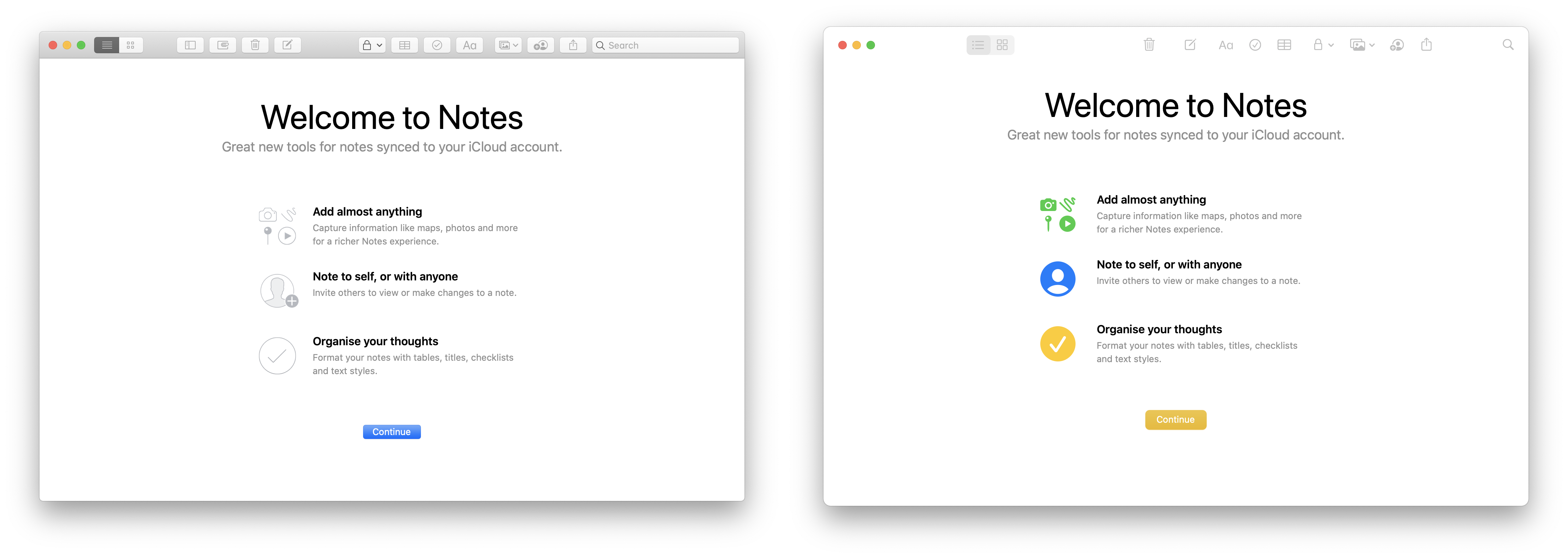
I'm not a designer so I might be missing some of the terminology here but I really dislike the move towards "buttons that don't look like buttons". Have a look at the old and new Notes app for example. In the old one it's very clear just visually where on the screen you can click to make an action like creating a new note or changing the font. In the new design all those actions just float in the top ribbon without any separation from the background or from each other. Seems worse to me.
I think the term is signifiers, I think coined by Don Norman (The Design of Everyday things), basically every object has affordances (the things you can do with it) and signifiers are the thing that communicate these affordances to the user. Apple has decided that usability is less important than making the whole bar one colour because they have totally lost the fucking plot. Apples whole design team should be fired into the sun.
I think this "highly polished" visual first - usability second approach has cognitive overload for the user. In my view desktop interface must be designed around mouse pointer interaction which is precise and demands clear separation of UI. Here we have clear focus on content area which is in harmony with touch based interaction. There are two options in my mind: 1. Design team follows marketing brief - do it like iDevices ASAP. 2. Apple will introduce touch as a part of desktop experience in near future. Personally I don't find this design appealing or easy on the eyes, but I am interface designer and obviously I have personal bias.
Amazing how far we have come from the decades of macosx where they all looked pretty obvious that a button was a button. This obsession with flatness and completely undiscoverable user interface components without wildly flailing around the UI just to get things to appear (scrollbars, delete buttons on lists in iOS) is so stupid and I hope will disappear soon! Windows 3.11 looks like a work of art by comparison where you had to learn one way of controlling the UI and it worked everywhere.
No wonder people who didn't grow up with computers (elderly grandparents) find touchscreen tablets so baffling from the plethora of bizarre swipes and gestures and not knowing that touching some undecorated piece of text is actually a button and has a side effect. It's stupid.
The plot is really clear to me: The road to iOS look and feel exact match.
There are millions of iOS users that now will look at macOS UI with more familiarity and confidence. And like any business goal, it is far more important for them than any usability perspective (not that they don't care, but...).
Apple Silicon will help break this barrier even further. The two OSes will also share the same apps.
This is also what Windows 8 and Chrome OS tried, even hard, and failed, more or less miserably.
Ironically, the new Finder looks a lot more like the Windows 10 file explorer to me.
> This kind of design has been validated on enumerable sites and app.
Has it been validated? It's certainly been adopted by innumerable sites and apps, but I seriously wonder how much A/B testing has shown that it increases or maintains usage of the features.
I agree with the idea that the content should be emphasised. Unfortunately the extreme UI padding goes in the opposite direction for me.
The fat toolbar in Safari is a good example. I care about the web content but now I have to give up part of my window real estate to the meta concern of the browser controls.
This used to bug me about Gnome 3 and it's sad to see macOS heading in the same direction.
I think that tweet is referring to a Windows-specific issue, where many windows have no visual border so that when one is on top of and offset from another, they run into each other. That makes it difficult to see or select a window.
In Big Sur the icons are visible. You just need to understand the design language that in a bar of icons, the icons are buttons.
My Windows 10 desktop at work drives me nuts, it’s extremely hard to identify the delineation between overlapping windows. There is a setting to highlight windows borders, but restrictions policy prevents you from selecting it.
This is the exact reason why I absolutely hate flat styled UIs. I find it difficult to see what the different types of elements are, what they do, what their state is, wether they're actual elements to begin with… It's a step backward.
Good point. In non-flat widget themes. the distinction between an "active" widget you can interact with and a background element is given precisely by the 3D look of active widgets. This is a simple and intuitive approach, whereas "flat" themes offer no real alternative.
I keep hearing this point brought up, but I haven't seen a good case for flat widget elements being confusing. In this very form I'm typing in, all the clickable elements (hyperlinks and submit button) are flat, but different styles immediately distinguish them from non-clickable elements, even if these styles vary between web pages and browsers. It's never been the case that GUIs consistently used 3D appearances to denote clickable widgets. 3D elements add a lot of visual clutter for complicated interfaces, which is why those "flat UI sucks" posts only show <10 GUI elements side-by-side. Google "Word 95" and "Word 98," both have a flat menu bar, though Word 98 has the addition of flat toolbars which helps readability.
> I'm not a designer so I might be missing some of the terminology here but I really dislike the move towards "buttons that don't look like buttons".
I wish people would put this common criticism in perspective though.
Maybe the buttons are a little harder to recognise in flat design but not a huge amount. And maybe it makes them look at little better.
Everything about software design is about tradeoffs and not everyone is optimising for the same thing. I don't think any commercial product is designed with 100% usability for every design choice, if that's even possible.
The actions bar redesign looks good to me. It's obvious they're buttons to me. It looks cleaner, more modern and less cluttered than before to me. Having the buttons not draw your eye too much can be good if they're rarely used because your focus is drawn to more important parts of the UI.
Not keen on the poor contrast white on mustard coloured button though.
What would you give out of the 10 for the design before and after? Is it really so bad or just a little worse for you?
It's also harder to know where you can drag. Which bits of the title bar can I use to move this window around? If I try that next to the expanding search field, will it work?
Without edges on the buttons, you no longer know where you can click. The affordances thus have shrank to the edge of the images themselves, reducing usability, especially for people who have motor control issues.
> Without edges on the buttons, you no longer know where you can click.
I don't see the issue. It's obvious to me by looking that they're buttons and users aim to click in the middle so if they miss by a little it's likely going to work if you mean that.
Even if it was an issue, it sounds like a very small one and a tradeoff for a cleaner look. Nothing is perfect.
It is sometimes not easy for those of us who are used to technology to see the struggles of others who are not. I know that my parents have had a hard time identifying flat design buttons such as these, not realizing that there are buttons until I pointed them out.
The buttons do highlight when you move over them, so it's entirely clear if you hit them if you would click. Or is that not what you mean by the 'affordances' of these buttons?
In the case of the tool buttons in macOS windows my feeling is that this is really is splitting hairs. Literally everything that is not the same color as the toolbar itself is clickable. The frustration or the supposed 'cognitive overload' is purely theoretical.
Ah then that would mitigate the issue a bit. It would obviously be better for pointe targeting purposes if the button edges are visible ahead of time so that users know where it's acceptable for their pointers to land, but having them show up when the pointer hovers over them would help some.