Wouldn't you think it would be interesting to the analysis that prior to the Great Recession point, the LIUR growth rate for 55-61 segment was notably higher than any other segment on the chart? And that in the post-recession era the absolute recovery is on par with the rest?
At least they provided the raw data to make merging all four sets together quite simple:
Anecdote time...my mom is 68, has a high school education and was able to land five different jobs over the past five years. She's picky, so she ends up quitting them, but after 15 years running the office for a wholesale seed distributor she ran a small store, ran a restaurant, was a picker in a pharmaceutical fulfillment shop, etc etc in a relatively depressed town in Ohio. They were just supplemental income $12-18/hr, but jobs are out there for women in this bracket if they want them. She decided she didn't want them and retired two years ago. Now she farts around the house and agitates my step dad.
Edit: The question really should be why was that segment on fire for the previous years. BLS chart for a longer time scale:
Yeah it’s like there’s a generation or two of ass-kicking women working their way through the brackets. They started hitting the low one on the 70’s and filtering into the 55-61 bracket in the mid 90's. Maybe they just aged out around the time of the recession.
I suspect this age group is one that is relied upon for care (some would say it's a societal expectation/burden) - either daycare for grandchildren or caregiving for aged parents. The need for both of which would increase when extended families are stressed by economic conditions. Sort of mindboggling that this barely even gets touched upon as a hypothesis in this economic analysis (maybe I'm missing it in the article, rereading now...)
This is what I immediately thought about. In my case, I was thinking about grandma taking care of children of drug addicted parents, which there are increasing numbers of ever since the Great Recession.
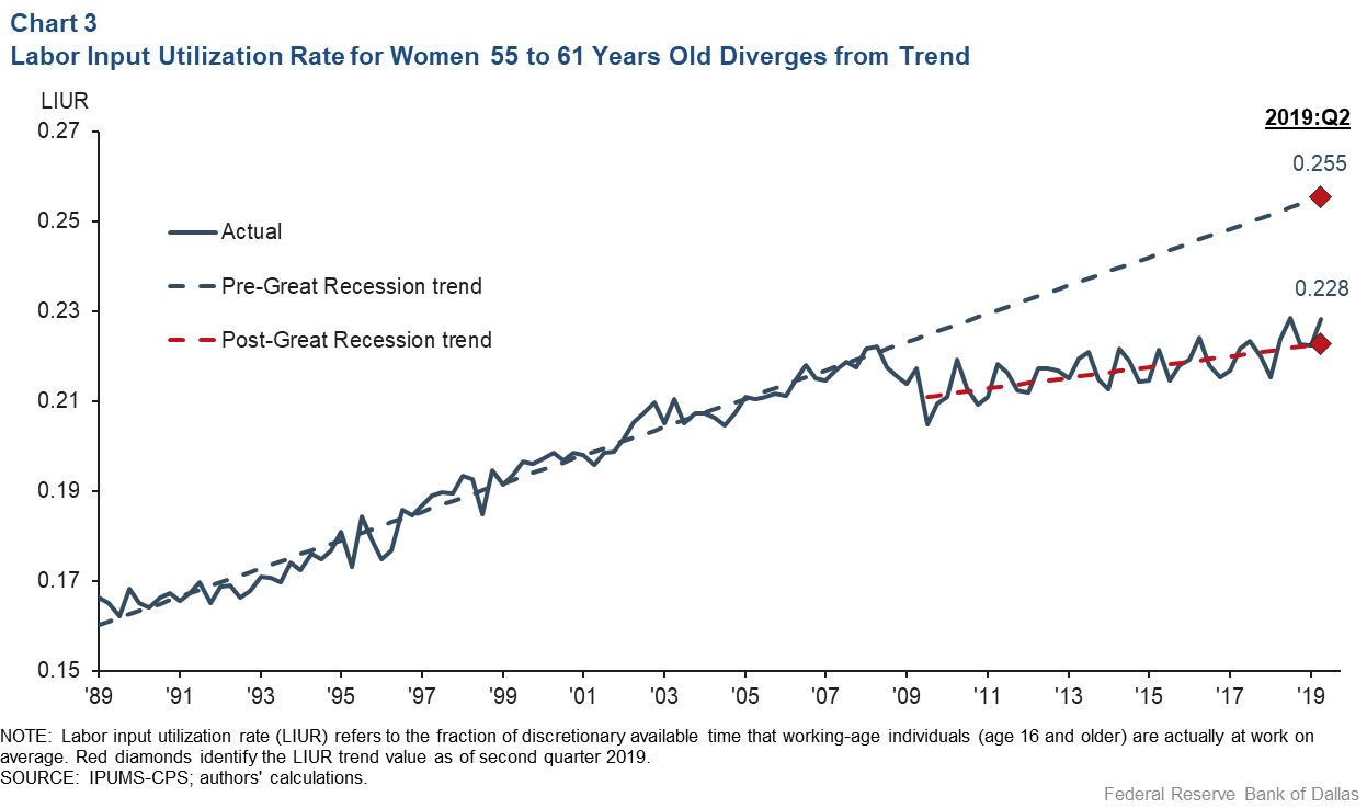
Chart 1 is interesting. It shows "labor input utilization" (that is, how much people are actually working) finally almost catching up to long-term trend after the 2008 crash. Maybe now we can get some wage inflation!
We have been. Real (inflation adjusted) median household income has been going up in recent years, from ~$57k / household in 2014 to ~$63k / household in 2018:
I may be reading this wrong, but it looks like that chart (combined with the OP charts) says that median hourly income is just a hair over where it was in 1999. The trend is positive, but it looks like the median income is basically going up because people are working more hours (i.e. and not because of significant wage inflation).
"The share of available time devoted to
work is the LIUR, calculated as the total
number of hours that the working-age
population (16 years of age and older)
was actually at work relative to discretionary
hours—100 hours a week on average
per working-age individual—that that
population could have devoted to work.(3)
The numerator—hours at work—excludes
hours paid while on vacation or on various
leaves that do not contribute any labor
input to the production process."
"3) This number of hours of time available to work per week for each member of the working-age population has been conventionally adopted in the literature by rounding up the figures documented in “Response to a Skeptic,” by Edward C. Prescott, Federal Reserve Bank of Minneapolis Quarterly Review, Fall 1986."
"4) Notice also that, by construction, the labor input utilization rate (LIUR) overcomes one of the limitations of another commonly used labor market indicator, the employment/working-age population ratio, which measures the number of workers on payroll, regardless of the number of hours they are at work. This alternative indicator could provide the false impression of a tighter labor market in circumstances in which two or more part-time workers have replaced several full-time workers, even if the total number of hours worked remained unchanged."
On one hand, the rise indicated women who had careers in their lives entered their 55+ years and brought the average up. Before then it simply wasn't an option as a woman even if you wanted one.
On the other it can indicate increased participation due to scarcer financial resources necessitating labor.
Its the difference between having to work and wanting to. Both are a kind of slavery because both are eliminating individual personal choice in the matter.
If you want to work but cannot because of societies prohibition on your gender entering the labor market you are slave to your husband who is allowed to earn a living when you cannot and are thus made wholly dependent and indentured to them.
I suppose that's true. In that interpretation, it could also be an indication of the boomer generation occupying the upper reaches of the economy and preventing others from rising.
The second interpretation is just depressing, and I suspect it is the more dominant effect.
Whoa. That is one of the most dramatic charts I've ever seen.
Anyway, from the linked paper:
"Conceptually, the LIUR is the measure of labor input adopted in balanced-growth theory and inspired by evidence suggesting that, in many economies, key macro-economic variables have grown at a common rate for long periods. One of the most intriguing features of that evidence is that the resulting secular rising trend in the average real wage has typically failed to induce any noticeable trend in the share of available time that the working-age population devotes to work.
"The share of available time devoted to work is the LIUR, calculated as the total number of hours that the working-age population (16 years of age and older) was actually at work relative to discretion-ary hours—100 hours a week on average per working-age individual—that that population could have devoted to work.3 The numerator—hours at work—excludes hours paid while on vacation or on vari-ous leaves that do not contribute any labor input to the production process."
Could someone go into some detail, explaining the LIUR? I get that it's "available" hours divided by hours worked, but...
* "One of the most intriguing features of that evidence is that the resulting secular rising trend in the average real wage has typically failed to induce any noticeable trend in the share of available time that the working-age population devotes to work."
What "secular rising trend in the average real wage"?
* "100 hours a week on average per working-age individual"
Should we celebrate or protest when the LIUR increases? If real wages are increasing, but LIUR isn't, then economic theory asserts that labor has maxed out its working hours and cannot work more to capture the higher wages? Or has maxed out its preference for those wages in favor of something else?
> Should we celebrate or protest when the LIUR increases?
By itself the metric seems pointless. For anyone looking at it. Participation does not imply utility or value - wartime nations would present extreme LIURs but building bombs doesn't translate into economic prosperity. Likewise, if people aren't working because there is no work to be done or because they value their non-GDP-influencing activities by choice that is only a good thing.
It looks like the kind of metric a C level fawns over to masquerade what looks like productivity when it doesn't actually have to be.
Just last night I was talking to two friends in this age group about their career situations, which match that of others I've spoken with in the same boat. They are exhausted from their primary career, probably have enough money that they could retire, but what they really want is some kind of work that will get them out of the house a few days each week and put a few coins in their pocket, but doesn't need to be a "career" any longer.
Pure speculation on my part, but I'm led to wonder if there just aren't sufficient employer accommodations being made to this age category. When I think about people I know - some have stuck it out and been miserable, others have just left for early retirement. So whereas millennials are asking for and getting remote work, the late boomers / early X's might be wanting to simply work less but are faced with no real choice.
Especially if your primary goal is the social factor and the "having a schedule for a few hours a day"-thing (which I completely understand) and getting some money out of it is secondary, I guess a lot of people in that demographic might just opt for volunteering.
True, it completely fails to pay any bills, but depending on what you do, you might get some everyday benefits out of it and it's a lot less annoying and exhausting than many jobs you could do elsewhere. Plus, nobody bats an eye if you decide to go from one volunteering gig to another after a few months, after all you're doing it for free. Switching jobs is more of a hassle.
As far as I can see, this kind of working hours isn't accounted for in these charts and I see that group as prime candidates for deciding that none-paying but nice, meaningful work is better than pushing numbers for another few years when you could make do without it.
Could you please review the site guidelines? One thing they ask is Don't be snarky. Your point here could have been the kernel of a more substantive and fine comment, but we definitely don't need swipey one-liners with ideological overtones.
Unemployment has become a bullshit political statistic designed to exclude minorities, which became the racist standard Under Clinton with the introduction of "discouraged" workers (not employed and not unemployed!). A much more meaningful number is the employment population ratio, age 25-54, can you see the big difference Trump made? I knew you couldn't ... https://fred.stlouisfed.org/series/LNS12300060
Having all of your population employed isn't even necessarily a good thing. You can see low participation in the metered labor market when individuals are prosperous, well off, and self sufficient enough to avoid the rat race. It only means more poverty when lower employment means lower wealth.
Women aged 55-61 had been growing the percent of their daily life spent working from 17% to 21.5% but something happened in 2007 and the growth trend slowed drastically so that today they spend only about 22.5% of their life working. Had the trend continued they would be spending 25% of their lives working, today.
The "unemployment rate" is a nearly meaningless number that gets re-defined and manipulated by whoever's talking to make whatever point they want to make. It's nearly useless for figuring out how many people aren't working that could, or how many people want work but can't get it.
U1 to U6 are very carefully defined. "Unemployment" is U3.
You can argue that U3 is not that informative of course. Especially since the labour structure is changing (much more casual work, "gig economy" effects) and that therefore a particular U3 over time doesn't mean the same in terms of people's lives. To argue, though, that it gets "re-defined and manipulated" simply isn't true.
Agreed. Figures of “number of people in full time employment receiving monthly pay for more than six months” would be far more useful. A few big categories to cover most of the market, would be enough to get a real insight into the current situation.
The UK has “record low unemployment”, but very low productivity and a lot of homelessness and poverty. From personal experience it seems pretty clear that the explanation is mostly that the unemployment rate is far far higher than stated. But the stats are so meaningless and fudged that you can’t show it.
Much harder to fake a list of employed people and say “look at all these jobs” than to provide a list of “unemployed people” with the assumption that everyone off the list is not unemployed...
Correct. I find that most meaningful information you can derive from such numbers is inter-national, i.e. comparing countries over periods of time wherein internal indicators don't change (and that's already a tall order, but consistency is better at supranational levels such as OECD etc).
It allows the comparison of "labor structure", how national economies tend to behave in that regard. It shows correlation with socio-economical policies, e.g. from the more 'socialistic' regimes to the more 'individualistic' ones.
For instance you'd find that Germany and France have implemented vastly different economic structure since the turn of the century, and the German way consistently produced ~1% more growth with half the average unemployment rates; however productivity isn't higher (France is a weird champion at that), so for all its choice to massively reduce working hours comparatively to other countries, as well as de facto institute massive unemployement (about twice as much as comparable economies), France isn't losing too much on the comparative front — what it does to its population is another matter though, as the French show up as one of the most depressed and most pessimistic country on Earth.
So these numbers are like relative fiat money to me; the actual face value means nothing, what matters is how they fare between each other, and what economic policy underpins each currency. I could take physics analogies of "relativity" but I guess the word alone is enough in that field.
I suppose the 'rich account' of labor structure above, from sophistication to hours passing by morale and national policy/strategy is also enough to read that no, no "KPI" will cut it if we are to discuss complex matters. I'm sometimes appaled that we take very specific studies and then paint a whole world by deduction, without context, as it ever got us anywhere. Perception and opinion at its worst.
That would be assuming the French labor market is efficient at selecting candidates for productivity, but given the general rigidity of labor laws in that country, the fact that productivity is pretty much a bad word culturally ("bad Americans capitalists greedy for more money at the expense of the average worker" kind of rhetoric) thus generally not trained (unions protest) let alone praised (most popular philosophers/influencers tend to be left-wing)...
I think that's a pretty wild assumption to make. I don't know what supports it.
Another angle: many studies tend to show that overworked people fall in productivity past some point, whereas generally "balanced" individuals in terms of workload and pressure and work/life balance etc. tend to perform great. It shows at the highest levels too — think athletes/sports with too-busy seasons, how we tone it down a notch to preserve performance, think how sleep deprivation is the worst you can do to productivity, etc.
Women in that age group probably have a higher fraction of “hobby workers” than any other demographic group —- people who don’t really need to work (since they’re already wealthy enough and their husbands earn far more anyway) but choose to work a few hours a week just for something to do.
If times are good and families are wealthy, the number of hobbyist workers in the older female age group increases. If times are bad, these women might be forced to work more hours or even full time in order to make ends meet.
It makes sense that their LIUR is flat compared to other groups.
The category is only six years wide. The oldest people in it entered the category in 2013; none of them were of age in 2008. Your thesis only makes sense if you state that the Great Recession induced/exacerbated employer discrimination against this particular group of people.
It doesn’t say that at all. Different demographics are not employed equally across all sectors of the economy. In all likelihood, women of this age group were employed in precarious positions which crumbled during the recession. Due to their age, retraining might not have been a viable option, so they stayed home. None of this requires discrimination at all.
This is more likely, especially when considering that women, like minorities, are likelier to be the first to be laid off as a recession gets underway, and the last to find full-time, full-skill employment after it ends.
Considering that the sources you cite and the source your debate openent cites disagree on the facts on the ground, y'all have some work to do if you ever want to understand eachother.
The source cited by your opponent claims that 80% of job losses in the recession were for men's jobs. If you analyze your sources, they disagree with this claim. Respond to that if you care to make any progress.
That’s one way to look at it. Usually the answer is simpler, this is where you have divorced and widowed women who need additional work to survive and pay for healthcare until social security and Medicare kicks in.
When I worked in a social services agency in the early 2000s, this was one of the growth demographics for food stamps and Medicaid enrollment.
Aren't those husband also hobby workers by same measure? They don't have to work strictly speaking and definitely could work less and still survive. But they choose to work more, because they derive self-satisfaction from it. If times are bad, these men might be forced to work more to make ends meet.
As a corollary, they are likely spending a lot of their free time as unpaid babysitters for relatives and their own children.
This is typically the age when women become grandmothers, and, unless they were highly paid in their professional life, the babysitting will typically be more valuable too.
This range is also Special in another way, because 401k and IRAs don't kick in until exactly 59.5 years, at which the LIUR of this cohort likely drops dramatically and may account for muddying up the data or not adhering to the trend.
At least they provided the raw data to make merging all four sets together quite simple:
https://imgur.com/a/Quw4tFg
Anecdote time...my mom is 68, has a high school education and was able to land five different jobs over the past five years. She's picky, so she ends up quitting them, but after 15 years running the office for a wholesale seed distributor she ran a small store, ran a restaurant, was a picker in a pharmaceutical fulfillment shop, etc etc in a relatively depressed town in Ohio. They were just supplemental income $12-18/hr, but jobs are out there for women in this bracket if they want them. She decided she didn't want them and retired two years ago. Now she farts around the house and agitates my step dad.
Edit: The question really should be why was that segment on fire for the previous years. BLS chart for a longer time scale:
https://www.ssa.gov/policy/docs/ssb/v72n1/v72n1p1-chart01.gi...