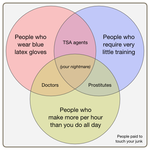
It may not technically be a Venn Diagram but I still think it is a legitimate way to represent something - and do it better than the author's alternatives.
You have to look at the chart differently but I don't think this makes it a bad graphic.
Each intersection is a way of representing what the two intersecting groups have in common, rather than demonstrating what the groups are.
The question is, "What do doctors and TSA agents have in common?" and the answer goes in the intersecting region.
While not technically a Venn Diagram I think it is still a useful graphic.
"Venn diagrams or set diagrams are diagrams that show all hypothetically possible logical relations between a finite collection of sets" http://en.wikipedia.org/wiki/Venn_diagram
There is nothing wrong with showing Venn diagrams of property's of something. It's really just another set.
PS: Numbers are abstract ideas not physical objects. So, Venn diagrams where really designed to show relationships between ideas.
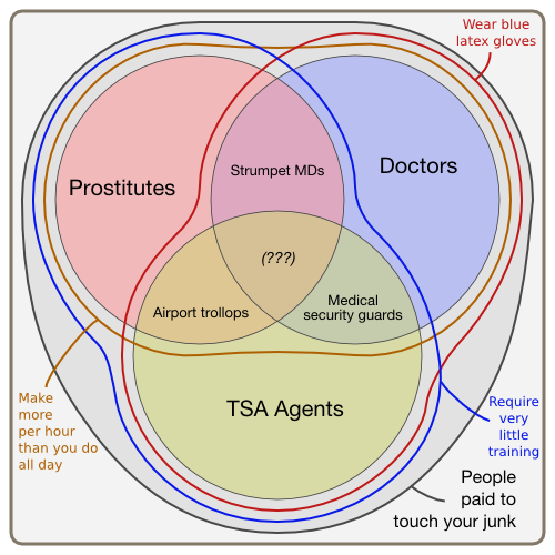
I think you're right, the whole "problem" he's addressing stems from the fact that someone called the original graphics a Venn diagram when they shouldn't have. However, I do think that one of his alternatives is actually quite good, and does convey the same information as the original diagram: http://eblong.com/zarf/pic/thod/venn-inside.png
This article takes something simple and elegant (if incorrectly labeled) and turns it into a sad tortured example of how to get yourself picked on in high school.
This article takes something funny and turns it into an insightful article without being a bitch about it (I found it quite humorous). You're all hating too much.
I accidentally up-voted the GP, but I agree - it's well written, and makes a fair point which I think isn't too pedantic.
Although he mislabels http://eblong.com/zarf/pic/thod/venn-wtf.png 'Strumpet MDs' and 'Medical Security Guards', should be reversed.
Good Lord, my entire life and livelihood are things that would have (and in some cases did) get me picked on in high school. This made me laugh; if it doesn't do the same for Joe Public, then it's his loss, not mine.
I suspect he doesn't care much about the storage space. JPEGs make the edges of the lines blurry or noisy - they're designed for things like nature photographs, not sharp hard edges between single-color areas.
The original image is a proper Venn Diagram if you think of the diagram representing various properties of professions.
The only correction you need is to replace "Doctor" with "other properties of doctors", etc, to be technically correct -- though i much prefer the original.
To this end: we can (WLOG) make the degenerate observation that a property of all doctors is that they are doctors. Then the original chart just shorthands away whatever conjugation of "to be" is proper in the outermost bubbles, and does indeed map properties of the various groups.
It's still not a Venn diagram. A Venn diagram labels regions, not points in the regions. The diagram could be made correct by placing little dots in the intersection regions to show that these are points in the intersection, whereas the outermost categories are sets of properties. But it still wouldn't really be a Venn diagram :)
I laughed out loud at the bit about "probably something from Bruce Schneier". Really funny stuff overall. If you didn't like this, you need to relax and have more egg nog.
> De Morgan's law. The union of two properties is the intersection of the sets of people who have those properties. (And vice versa.)
De Morgan's Law!!!!!!! I first learned about this in a Moore-method point-set topology class in 1995, and I have been trying to remember the name of this property since. Thank you, thank you, thank you!
You have to look at the chart differently but I don't think this makes it a bad graphic.
Each intersection is a way of representing what the two intersecting groups have in common, rather than demonstrating what the groups are.
The question is, "What do doctors and TSA agents have in common?" and the answer goes in the intersecting region.
While not technically a Venn Diagram I think it is still a useful graphic.