I live in a townhome that is attributed to Pei and Harry Weese (most assume they are mostly a Weese design) and while I love it’s brutalist nature, the aesthetic is very controversial, you love it or hate it.
But what amazes me is 2 things. First they are very livable. They would be considered tiny now in the US (sub 900 sq ft originally, with finished basement 1300), but it never feels cramped. The design and size lead to extremely efficient resource utilization and minimal maintenance as well.
Second, this place was targeted at middle income families. It was designed to compete with the suburbs being built at the time. Can you imagine a builder now paying for innovative design?
In any case I wish more people could live the lifestyle this home allows.
> Second, this place was targeted at middle income families
There's a random apartment building near downtown Pittsburgh that was designed by I.M. Pei [0] -- a little nicer than others in the area, but by no means a luxury building. It's indeed refreshing to see "normal" buildings for "normal" people designed by famous architects, even if the building itself isn't flashy by any means.
I.M. Pei's architecture is beautiful, geodesic structure in the best possible sense. 102 is also a ripe old age (although far be it from me to say what is a fair time on this earth).
Architecture is wonderful as you get to live on through these incredibly beautiful buildings. I look at the stuff Zaha Hadid built and I feel like I can almost see her in the buildings she made. Great architects resonate through their structures.
I rather found it beautiful. Brutalist architecture has its own beauty - to be honest about materials, unapologetic forms and it’s unwavering stability. Also, I’ve been to the Dallas City hall and it is such an insane building, imposing and looming over you as you enter through its facade.
In particular the interiors of brutalist structures don't get enough appreciation. Boston City Hall — not done by Pei — stands out in that the exterior is quite ugly but the interior is utilitarian and soothingly cavernous.
Unrelatedly, my grandfather lived in one of the Kips Bay Towers during the 70s when he was working in New York as a graphic designer. I have a soft spot for them.
>In particular the interiors of brutalist structures don't get enough appreciation. Boston City Hall — not done by Pei — stands out in that the exterior is quite ugly but the interior is utilitarian and soothingly cavernous.
As a resident of Boston who's had to travel to city hall many times on Business, I wouldn't call the interior "soothingly cavernous". Perhaps it was initially and has been modified since, but I find it dark sized to make both the visitor and the worker insignificant. Most open space is unusable and appears to have no purpose, but the spaces that are in-use, are somehow cramped and lifeless.
I strongly disagree. I feel that honesty about materials is bullshit. It's like saying painting should look like paint on canvas and not like mona lisa.
This is one of the things the greek - again - got right. Lot of the elements in classical architecture of stone buildings are there just to look nice and some of them even just copy elements that were necessary in wooden construction but were replicated in stone as well because they look nice.
That's not to say simple shapes cannot be pleasing. But making concrete look like concrete really isn't an achievement to speak off. It can be a stylistic choice of course.
Oh man, turns out Dallas has four I.M. Pei buildings! Fountain Place, at least, seems to be as close to objectively cool as possible: https://en.wikipedia.org/wiki/Fountain_Place
The Louvre pyramid itself is a beautiful structure and it is certainly a sight to see.
That being said, its placement in a courtyard surrounded by strikingly beautiful and unique French Renaissance architecture is a testament to modern arrogance. It does not complement the theme or contribute to the panorama, but instead steals the view and obscures the art already there. It was highly controversial and divided Parisians against each other. Clearly the man had talent, but it's a little disgusting how proud of where it was placed.
These matters of taste are subjective, and the more someone believes in the righteousness of a given aesthetic opinion, the less you should listen to them regarding matters of culture.
Controversy is difficult to quantify. But millions of people cheerfully photograph themselves together with the pyramid each year, which leads me to believe that those who smile seeing this building far outnumber those who scoff and yearn for the "striking beauty" of the brutal, decadent monarchy that built the original Louvre palaces in order to project dominance.
We live after the end of aesthetic teleology. There is no more objectively defensible aesthetic criteria. There is only a morass of yawning subjectivity, and hopefully a critical perspective regarding the ways and reasons that power utilizes the sort of rhetoric you perform here.
> There is no more objectively defensible aesthetic criteria
Oh, come now. There are lots of designs everyone would agree are objectively ugly. But they rarely get built these days. So if it seems like everything is subjective, it's because everything we see has passed the not-objectively-ugly filter.
There are entire schools of designers devoted to producing work that contradicts popular taste, and cultural consensus around design changes super fast. There is also a huge gap between the taste of elite practitioners and the general public.
Comme des Garçons is one of the most ubiquitously respected fashion houses, and the legendary designer who heads it had a show at The Met recently. Here is a look from their couture runway this year:
You could poll 20 HN readers and ask “is this objectively ugly?” And you might find total consensus. But almost everyone who devotes their life to the field of fashion design would at least grant that this look is typical of the style that made Comme so important, and would certainly deny any kind of “objective” characterization of it as ugly. Many, many brilliant, highly educated people would say it is beautiful.
There is no fact of the matter. People liking IM Pei’s pyramid doesn’t prove it’s beautiful any more than people hating certain critically respected brutalist buildings proves they’re ugly. There are no intrinsically ugly buildings.
With just about anything, with time you get used to it: be it eyesore, noise pollution, bad relationship. You let it be, after a while. With regards to photos, it’s neither here nor there. People will take photos of anything. If it were a big pile of cow dung in the middle there, people would still photograph it.
I’m indifferent to it, personally. De mortis nil nisi bonum.
I tend to agree with the obituary described about what I.M. Pei's explanation:
  He argued that his glass pyramid was merely an updated
  version of a traditional form, and that his redesigned
  courtyard had been influenced by the geometric work of the
  French landscape architect Le Notre. It was rigorously
  rational, in other words, and in that sense classically
  French.
> but it's a little disgusting how proud of where it was placed.
Also, I.M. Pei himself considered JFK Library the most important commission of his life[1], not the Louvre Pyramid.
What he merely said was he didn't think he made a wrong choice in designing the glass pyramid. And there were quite a bit of background info and context in his choice in the wikipedia article.[2]
The explanation is fine by itself, however Le Notre did the Versailles gardens and they look good and are in harmony with their surroundings. The Louvre pyramid is ugly and is in disharmony, which defeats the purpose of architecture. The explanation makes it feel like an even bigger failure somehow.
The louvre was not built in one go, but continually augmented and remodeled over the last 900 years or so. To me the pyramid is just another step in the process.
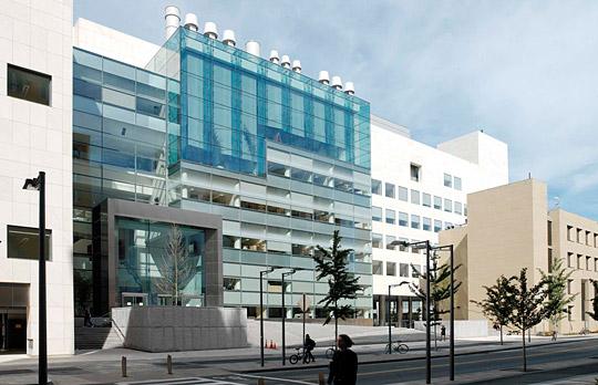
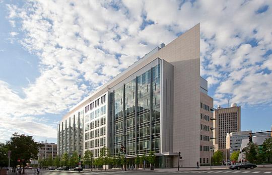
I know him through the buildings he designed at MIT: Buildings 54, 66, and E15. My favorite fun fact to tell visitors is that building 66 (chemical engineering) is a perfect 30-60-90 triangle.
Woah, I had no idea he designed the Green Building. It was always my favorite architecture on campus (light years better than the Stata Center), much to the disagreement of my peers.
> Woah, I had no idea he designed the Green Building.
He famously had problems with wind: The Great Sail was placed in order to break up wind off the Charles, which (by Bernoulli effect) would lock the doors at the bottom of the Green Building.
The funny part was: The Hancock Tower on the other side of the Charles had pretty much the same problem, but was too tall for remediation-by-artwork. They had a devil of a time redoing the windows in that building.
Anyway: 66 was always my favorite. Living in EC, it was always fun to show visitors the sharp point of that building.
The Green Building is quite nice in most ways, but there's also the famous story about how it was built "on stilts" parallel to the Charles, so because of the wind coming off the river nobody could open the doors...
The legend about how the nearby Alexander Calder sculpture was placed to block the wind is apparently untrue, but the revolving doors on the ground level are very real.
I'm not a fan of Brutalism in general. But there are some pretty good examples on the MIT campus including the group in east campus. I also rather like the Stratton Student Center on west campus by Eduardo Catalano. Other examples like McCormick are not great.
I don't know if Green Bldg is my favorite, but I definitely agree that Stata [0] is not a great building. It might look interesting to visitors, but it's super difficult to navigate, and it doesn't have that stature that says "important science is being conducted in this building", unlike its neighbors 46 (neuroscience) [1] or 76 (Koch) [2].
Stata made some aesthetic sense in isolation. My understanding was that its unusual look and big price tag was justified by the argument that it would be the northeast entrance to the campus. But it's had various problems both in terms of usability and in terms of various problems with the structure and associated elements.
But then with all the other construction in that area, including some very big buildings, Stata now gets almost lost amongst its various neighbors.
If you want to see the most impressive candidate for an IRL Bond villain HQ, I nominate Mr. Pei's Miho Museum [0]. The art is pretty good for a private collection, but the real gem is the building/compound itself. It's incredible.
RIP legend. You literally put your mark on this world! One of the building he designed in Singapore is "The Gateway"[0]. Every time I am around the area, I can't help but be in awe.
After moving to Hong Kong, I lived near the Bank
of China Tower and I would see it every day. I never failed to be awed by the striking design until the day I left. It always felt like it, and the HSBC building close by were competing for wow factor.
Sad. I went to the MIT Media Lab and he designed the building I was in. One of the absolute most breathtaking buildings I've ever had the pleasure to be part of. Will miss his work. Hope some new whippersnapper takes the torch.
But what amazes me is 2 things. First they are very livable. They would be considered tiny now in the US (sub 900 sq ft originally, with finished basement 1300), but it never feels cramped. The design and size lead to extremely efficient resource utilization and minimal maintenance as well.
Second, this place was targeted at middle income families. It was designed to compete with the suburbs being built at the time. Can you imagine a builder now paying for innovative design?
In any case I wish more people could live the lifestyle this home allows.