It drives me crazy when fonts look at the old convention of "strike through zero" and for some reason decides they need to be different from the convention and allow the strike to pass the edges of the zero circle. "Anka/Coder" in the linked article is guilty of this.
When the strike passes the edge of the circle, it's no longer a zero, it's a Danish or Norwegian "Ö" (Ø). It's been a part of their alphabet for centuries.
The whole purpose of the "strike through zero" is to stop it from being mixed up with Omega. By badly thought out design and a need to be different for no reason, you just returned to square one, because the font is now unreadable for anyone that knows or works with the letter Ø.
Personally I'm a fan of the dotted zero since it looks clean and doesn't get confused with an O or an Ø. I guess it could get confused with a theta but how often does that show up in variable names?
(Lowercase ‘θ’ is quite common to indicate a vector of parameters. I’ll admit, though, that few people are ~courageous~ adventurous enough to use the actual symbol in their variable names rather than the string ‘theta’.)
need to be different from the convention and allow the strike to pass the edges of the zero circle
For what it's worth, the first machines I ever did any work with had the zero with the slash through it. That's because the output was to a teletype which printed the letter O, then went back a space and punched a / on top of it. They also used a capital P for a question mark.
Some printouts were horrific to read because a blank space was represented by a "b" with a / through it, not an underscore.
So I think that for computing the 0 with a slash extending outside the line predates the 0 with the slash entirely inside the line.
I'm not sure when or why the 0 with a dot in the middle became a thing. I first noticed it around 1989 on cheap (for the time) VGA cards.
> So I think that for computing the 0 with a slash extending outside the line predates the 0 with the slash entirely inside the line.
For computing, sure. But the Danish letter pre-dates computers, likely by centuries, so the point still stands that an effort should be made to separate the two if at all possible. In your case it wasn't so much a choice as a result of technical limitations.
So you're reading a number and then -blurp- your mind goes "Danish" or "Norwegian" letter?
Context doesn't come into play?
I mean - I can understand such confusion if you are dealing with some kind of multi-character random code or such (ie - a "confirmation code" for instance), and the site is primarily targeted to Danish or Norwegian users; in that case, the confusion would be valid.
Much like such codes in "English" (maybe "Latin" might be a better description?), without having a distinguishing mark for the zero, and depending on the font used - where a zero can look like a capital letter "O". Was that "0" or "O"? That can be an issue, depending on the language of the users, etc.
But aside from those particular cases, which aren't very frequent, most of the time you can infer what is meant by what, based on the context of the surrounding characters and the information that is likely being conveyed.
I'm not sure one should get too upset by such a minor thing...?
> So you're reading a number and then -blurp- your mind goes "Danish" or "Norwegian" letter?
Yes.
Once you become really fluent in a different script, I find that misuse of it starts to become really annoying.
Before I had any proficiency in a language using the Cyrillic alphabet, if someone replaced say an A with a De (Д) or a W with a Sha (Ш) in an English text, I'd have no trouble reading it. Now, this kind of thing always trips me up and I've heard from several native speakers that they absolutely hate this kind of thing. To the people doing this to lyrics of metal songs in particular: please stop.
If I had to have a guess at why, I'd say if you are fluent in English but not a Cyrillic language, then your "System 1" autocorrects such mistakes to the the closest English word without you noticing. Once the other letters start to mean something, you consciously notice the mistakes as such. (For an example of the mental "autocorrect", did you notice the repeated "the" above? h/t Scott Alexander.)
Same idea with that game where you have words written in different colours but you have to read the colour instead of the word, so if "blue" is written in green you have to read "green". It's incredibly annoying in a language that you know, but really easy in a script/language that you don't know.
It absolutely drives me up the wall when I see uppercase lambdas used for A.
For example, the car company Kia styles their name KIΛ, which makes me think "Kil". Or the monitor company AOC writing it ΛOC.
And recently I've been watching an anime called Aldnoah.Zero, which stylizes its name as ΛLDNOΛH.ZERO. That one is particularly aggravating because the lambda is right next to an L!
Naive Danish speaker here. It is really jarring to look at, and is completely indistinguishable from ø. It is not that I cannot infer its meaning from the context, but it just stands out as a typo on first look and is really distracting. It surely would prevent me from using the font.
Not the same thing; A-F are expected in hexadecimal and thus don't look out of place. I don't understand what you mean with O, font designers usually make sure that there are visual cues specifically to make it easy to distinguish those two glyphs.
> Good thing Danish doesn't have A through F, or you wouldn't be able to stomach hexadecimal.]
Hexadecimal requires being able to identify 'A', 'B' etc. as 'A', 'B' etc. It happens that they're assigned a different value/function then for their alphabetic use. The point is that there isn't another numerical symbol that is easily confusable with 'A'. (Of course there's l33t '4', but the two symbols are pretty distinct in most typefaces.)
tldr; Being able to be used to represent a numeric value isn't the same thing as being easily confused for a different symbol, with a different value that also represents a numeric value.
Of course, but I'm assuming anyone using hexadecimal understands what the glyphs represent when they're used as part of a hexadecimal number representation.
But the issue under discussion is being able to just do basic discrimination between characters – a necessary first step before associating them with their relevant value (e.g. as the tenth element of the sequence of natural numbers).
So the issue with say, ∅ vs Ø,ø (where the first is a 'slashed zero' and the second two are the Scandinavian letter glyphs, is not (in)ability to assign the correct value in the given context (e.g. alphabetic vs hexadecimal) but in being able to discriminate which symbol it is to begin with.
Now you're talking about Unicode issues, basically.
"zero" and "oh" are in fact the same symbol, just like A is the first letter of the Roman alphabet, and the number ten in hex, and just like a slashed circle is the empty set, the Scandinavian letter, or the slashed zero in computing.
In Unicode, we have multiple versions of some symbols which are dedicated those specific uses; there is a dedicated empty set, dedicated Scandinavian Ø and so on. ASCII already splits the O symbol into a dedicated 0 digit and O letter. Those being different codes allows font designers to play games with styling them differently.
OP doesn't like the fact that in some fonts, the slashed computing zero has a stroke that extends past the boundaries, because then they experience an Ø (zero) vs Ø (letter) crisis. I say, it's exactly the same crisis as O (zero) vs O (letter); just suck it up like the rest of the world.
OP claims that it's "no longer a zero"; but according to whom? There is no standard that the slashed zero of computing must not have a slash which extends outside of the oval. the slashed zero is an ad hoc concoction in computing that fontographers style in their own way. The font I'm typing in now renders ASCII zero as having a dot in the middle. Maybe there is a script somewhere in the world where that looks like a letter; oops!
I agree there could be such a rule; whether a stroke touches or crosses another one is significant. These are totally different characters, after all: 由, 田.
In western writing, we don't fuss quite that much. For instance the horizontal stroke of A sometimes extends outside of the frame. The top may be squared off or round.
What do you mean? 0 'zero' and O 'oh' are not the same character, either historically (the characters have distinct origins - with the Roman letter O 'oh' coming from Greek omicron, itself coming from Phoenician ʿayin; and the numeric character 0 'zero' coming originally from a dot notation in India (so dotted-zeros, which you mention using and I also prefer, are nicely appropriate) which eventually 'widened' to a hollow shape, adopted by Arabs and transmitted by them to Europe.), nor in terms of their encoding. But this isn't at all an ASCII innovation: the symbols were historically distinct and in fact have completely different origins.
So 0 'zero' and O 'oh' are not the same symbol. A is really the same symbol, whether in alphabetic use or hexadecimal, but 'means' different things in different contexts. (Even the alphabetic 'meanings' of A/a are not very consistent in English, in terms of representing sounds, and are influenced by context, so that a in cat and a in father don't 'mean' the same thing, in terms of representing sounds.)
To be fair, OP probably isn't actually using the Scandinavian Ø in contexts where it would be confused with ∅ (slashed zero), though in theory I suppose some language might support it as part of variable names etc.
But certainly I get irritated with fonts in which I (capital 'i') and l (lowercase 'L') look identical, as they occur in similar contexts and so increase cognitive load.
[Postscript edit: I was thinking that there is no visually similar character to a dotted zero, but then I remembered what upper-case theta (θ) is Θ, which does look awfully like a dotted zero.]
> So you're reading a number and then -blurp- your mind goes "Danish" or "Norwegian" letter?
Yes, because my native language is Swedish, so I frequently come across this letter.
> Context doesn't come into play?
Would you use this argument against someone that said zero and the letter O are too similar? I doubt it, and I suspect your casual approach to this is based on the fact that you never encounter this letter.
I don't mind it, using an image for zero that is exclusive is of course preferable. But seeing how common the "slashed zero" is, I think the least we can do is avoid making it more confusing than it already is.
In designing Luculent (shown in the original article at http://app.programmingfonts.org/#luculent), my approach to was to use to reversed slash on the zero. It's somewhat unusual, but I did it precisely to avoid any ambiguity with the letter Ø that you point out. I could also have used a dot instead, but then that starts to look like an uppercase theta, Θ, at low resolutions. Squaring the zero a bit also helps.
> allow the strike to pass the edges of the zero circle
That's what pretty much everyone does when whiteboarding.
> When the strike passes the edge of the circle, it's no longer a zero
When a second stroke is added to the oval, it's no longer a zero to most people, other than programmers.
When no such stroke is added, it's also the letter O to most people; far more people than just Danes and Norwegians. Nobody is jarred by the appearance of a letter in the middle of a number. The ambiguity is embraced in informal English, where zero is pronounced as "oh", like 007 being "double oh seven".
> "When the strike passes the edge of the circle, it's no longer a zero, it's a Danish or Norwegian "Ö" (Ø). It's been a part of their alphabet for centuries."
You can't please all the people, all of the time. There are ~21 million people living in Scandinavia - and for them, that could indeed be somewhat of an issue. What about the rest of the planet?
> "By badly thought out design and a need to be different for no reason, you just returned to square one, because the font is now unreadable for anyone that knows or works with the letter Ø."
Out of curiosity, what would you consider to be a better design?
I'm surprised that the list doesn't mention consolas. It ships default with visual studio and it's so good that I use it on arch Linux as my terminal font and with intellij. It was designed with programming in mind and has some nifty characteristics like a slash through zero. This list also misses out on 'operator mono' which is a well thought out font for programming.
Hi, I'm the author of programmingfonts.org.
Operator Mono certainly is pretty. I always loved consolas on Windows (honestly, it's the only thing that rendered properly on Win7). That said, I can only include fonts that are freely available, or where the owner of the font allows me to (in the case of Input Mono). I have tried for a few others, but haven't been so lucky there. So, no proprietary or otherwise commercial fonts. I do try to feature them on the blog though.
Well, there is no way to get a list of installed fonts via the browser, but I have thought about adding an input so you can try installed fonts. I just don't have enough time to tackle all the ideas I have!
Have you looked at the licensing of the Lucida family of fonts (particularly Sans Typewriter and Console)? From a quick check it looks like just the old bitmap fonts are available for redistribution, and all the scalable varieties are proprietary, but I'm also seeing some contradictory information, so I'm not 100% certain on that. If allowed it would be a great addition to the site.
I have looked at it but have not found a suitable variant. All I find are commercial versions and “The fonts are not redistributable”. Honestly, I doubt bitmap versions are useful for most people.
It really is beautiful. It's a variant of Deja Vu, as I recall, and its hinting is perfect on my display. The feature I really needed, though, was good Unicode coverage, especially for math and logic symbols, and Hack has that spades.
Some that have ligatures state it after the year they cameo out.
For fonts that don't have ligatures on their own you could use something like Ligaturizer. This adds ligatures based on the Fira Code font to any other font. These ligatures are taken verbatim from Fira Code though, so some will not match perfectly with their non-ligature counterpart.
That's what I feature on the blog, but you'll notice the right-hand side of app.programmingfonts.org is interactive. That's kinda hard to do with static images ;)
I don't think the author needs to go to such lengths just to support some proprietary fonts, specially considering that there are great free and open options.
Though Inconsolata was inspired by Consolas, I wouldn't consider it all that similar. For example, the digits in Inconsolata are much closer to the Franklin Gothic model. Also, Consolas has excellent hinting for Windows, while Inconsolata was originally designed with no hinting at all. They're not drop-in replacements.
Seconded, Inconsolata at small sizes looks awful on Windows.
I'm surprised that so many of these 'programming' fonts do not have dotted or slashed zeros. For a programming font, that's a must-have requirement for me. I edited Droid Sans Mono, so that its zero had a slash, and now I use it as my go-to font for all my IDEs and terminals. However after browsing this lot, I'm tempted to give Go Font a try.
Although Consolas is beautiful on Windows (and is one of my favourite monospace fonts), Inconsolata for me looks very good on Windows 10 (as I remember it didn't quite look as good on Windows 7). In fact, because the font is slightly thicker at lower font sizes, I find it easier to see and use -- so it's currently my default font in PuTTY and VS Code, for instance.
Lucida Console isn't too bad either -- it's very legible at small font sizes. On some of my work and personal systems I also have Lucida Sans Typewriter[1] (IIRC it was bundled with Office), which is taller and subjectively slightly better looking than Lucida Console
That still doesn't make it free & legal to distribute as a web font so that it displays to people who don't run Windows (or otherwise have Consolas installed), so it would be more than legally dubious to include it in this site without express permission from MS (or who-ever they licensed the work from, if it wasn't created internally).
Yeah, I was redesigning my website and decided to use system fonts. When I added the system don't for monospacw text, I was amazed at how nice Consolas came out.
I actually did a quick hack a few weeks ago to build an "elimination" style tool for making decisions. The code is here [0] and the tool is here [1]. Might be able to adapt it to something like this.
That would be neat, browsing through several dozen fonts to find the right pick is a bit overwhelming, although one can argue it's a self-imposed burden.
Great site, but one request: Please make the up/down keyboard arrows switch to the prev/next font (rather than just scrolling the list of fonts). That way I could keep my eyes on the code window to really feel the change.
Currently, having to visually bounce from code window to font selection window and back slows me down and makes it harder for me to compare fonts.
I think it would also be good to mark them as you look down the list, then filter the list and work down it again, marking more until you are left with just one.
Yes, something this would be very useful for actually comparing the fonts. Google Web Fonts has something similar, you can select a bunch of fonts from the long list, that you like from first glances, and then compare only that selection with sample texts.
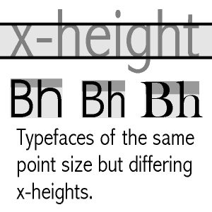
For this list of programming fonts, I could first select (mark) a bunch that just match my general taste (shape, weight, x-height). Then I would be able to easily switch between my selection/shortlist to inspect more detailed differences such as how numbers are aligned with respect to brackets and operators, or whatever.
Currently it's a bit hard to do if you have to keep a mental shortlist of fonts you like enough for further inspection, to remember which ones to check back on (especially if you see some names for the first time).
Regardless, it's a really cool site, great resource, and already the comparing mechanism is pretty nice!
One of my favorites is PragmataPro [0] (with powerline glyphs) and I'm sad it's not there. I guess they can't use proprietary fonts. PragmataPro was so weird when I started using it but it has grown on me and now I have a hard time switching to a terminal that uses something else.
In any case, if you're like me and you look at the terminal screen for hours on end every single day, find some font that won't tire your eyes and is optimized for your screen. If you have to squint or double-check letters or numbers because they're unclear, increase the size or switch to a different font.
Huh. Not to sound cheap, but it really seems unnecessary to me to spend 60 Eur for a font, when I already have really good fonts like Inconsolata in my reach for free. Is font really that important, do you think? This is an honest question, please don't think I'm sarcastic.
That's an average price of a AAA game, right? And what kind of utility do you get from that?
Just did a quick check... I bought it in Sept of 2012, 2323 days ago.
$70 / (2323 day * 6 hrs/day) = $0.005/hr
Did I get my money's worth (and mind you, I paid less than that.. I'm just going by today's prices)? I think I did. It all depends on how you value things.
Not trying to make any value judgement of my own here, but I think the parent was more referring to the marginal cost/benefit of a $60 font compared to some of the free options available.
I also second PragmataPro. I've been using it for 5+ years now.
The ligatures are fully optional, and the font comes in several variants for software that doesn't allow to select features.
It's a slab serif, condensed. You have to like the style. Some people prefer the opposite (wide with ample interline spacing).
It packs quite some columns on the screen while still being perfectly readable and basically every glypth is hand-tuned for small pixel sizes. There's not much else comparable designed with that amount of care.
The closest font on a stylistic basis I've seen is Iosevka.
Agreed, I don't get the ligature craze recently. They look ugly, and sometimes, they don't accurately reflect an operation most of the time, for instance when you use operator overloading.
PragmataPro does come without ligatures though, and that's what I've been using as my main font for over a year now.
> There's nothing wrong with the original IBM VGA console font
Oh boy... Don't get me started on this. Those semi-consistent application of serifs, wide vertical traces and the overall MDA-ness of it drives me nuts. It's not like IBM didn't have anything better to choose from.
disclaimer: I make the 3270 font, which is based on the 3270 terminal font, which is the better thing I mentioned in the above paragraph.
I took a look at 3270 font, and I definitely strongly prefer IBM VGA. I don't care about semi-consistent serifs etc - I'm not a font designer. But it's very readable.
Which, again, just goes to show that this stuff is all very subjective.
It is. A lot of my strong feelings for the IBM MDA/EGA/VGA font comes from its 80's-ness and its origins. Also, at the time I first saw them (first on CGA, then on MDA) I was an active user of 3270's terminals and I wondered why would they do that if they had the choice of using something cleaner. I understand CGA dictated wide vertical stems (because NTSC) and that probably influenced the choice for MDA (it was already used in other pieces of equipment, IIRC) for consistency but...
I've been using DejaVu Sans Mono for quite some time. It's a nice font. It used to be the default monospace font in KDE, until they switched to Noto Mono. Autohinting setting for fontconfig makes it look better for me:
    <!-- Making DejaVu Sans Mono more slim -->
    <match target="font">
      <test name="family">
        <string>DejaVu Sans Mono</string>
      </test>
      <edit name="autohint" mode="assign">
        <bool>true</bool>
      </edit>
    </match>
I'm in the same boat, every time one of these threads pop up I try a few different fonts recommended here but I always end up going back to DejaVu. It think it looks pretty good, it has good Unicode coverage, it's supported out of the box on most distros...
It's weird because I can be pretty snobbish and opinionated with a lot of programming-related stuff (I use a very expensive keyboard, a large 4k screen, a heavily customized editor and window manager etc...) but when it comes to fonts I really have a hard time finding a real improvement with some of the very expensive fonts people are recommending in this thread compared to good old DevaVu.
I would be very interested to read an article that would explain in details what makes certain fonts better or worse than others, especially for programming.
Had a look at iosevka - it definitely seems nicer than many of the others, but it still feels too vertical when compared to DejaVu in my opinion. Is there something that sold you on it?
I've also switched to iosevka after many years of dejavu sans mono. I really like the brackets of iosevka, and its italics. I also appreciate the customisability of it, and the fact that the font itself is in some ways built rather like Computer Modern via METAFONT (and that it uses a Lisp-like language to do so).
Well, it certainly is more vertical. The increased x-height allows it to be readable at small sizes (and fit more horizontally) which looks great in the terminal and editor, but maybe a bit odd on the test page.
Well, a week later and I think I'm a convert. I didn't like the look at first, but after using it in my IDE and actually typing with it, it's quite nice.
Same here. I always check out some new fonts when a conversation like this appears on HN, but in the end I never found real improvements. I did, however, start testing Ubuntu Mono the last time I compared fonts. Ubuntu Mono is pleasant to look at, like DejaVu, but it takes much less horizontal space, which helps a lot with dual side-to-side text editors.
Personally, I also happen to really like the weird round corner shapes of the lowercase "u", "n", "p", "q", etc in Ubuntu Mono. It's both friendly and interesting but not out of place. But I know opinions can vary greatly.
Conversely I like almost everything about Fira Code, except the weird serif-ed lowercase "r" looks so out of place to me it kind of spoils the entire thing.
But then again I think if I tried Fira for a week or two, I'd stop noticing and no longer care. It's so very subjective.
Yeah, I've gone through several of these programming fonts but something feels nicer about DejaVu Sans Mono, perhaps it's the visual smoothness compared to say Anonymous Pro - I wind up installing it on Windows machines even.
My favourite for a few years now is a commercial font, Triplicate. It’s a true serif monospace font; every other monospace font I’ve encountered that is labelled “serif” is actually a slab serif. It has a proper italic face as well, which is a less rare, but it’s a functional italic face rather than ornamental.
It comes with some interesting variants, most notably Poly which is not fully monospaced, adjusting the widths of characters like i to be a little narrower, and W to be a little wider. I like to use that for code display.
Ah yes, I had forgotten about that one—it’s definitely the closest font I’ve found to Triplicate, and its serif style is partially slab and partially true serif (to a similar degree to Triplicate, really).
Oh yeah, I forgot to address the other point: Go Mono doesn’t really have true italics. One or two of its letter forms are adjusted (double decker a to single decker a), but apart from that it’s just sloped roman. Look at the Triplicate specimens to see the difference, if you want. The whole shape of the character changes.
You and I have very different definitions of beautiful and ergonomic - I don't like their table formatted pricing and I don't like that I have to scroll down to get to navigation.
Okay that one is gorgeous. It has this appearance that somehow reminds me of code examples in my old uni computer science textbooks. I'm not sure which particular ones, it just has that feel.
Even though it's a reasonable price for a commercial font, I can't really justify spending $99 on a coding font just for writing code. I might get tired of it after a few weeks. But if I were to write a programming book, I just might consider it for print.
Do yourself a favor and try to design a font from scratch using FontForge (free tool). Let us know what you learn from the experience, how long it took to perfect it and what was the end result.
I think a lot of these fonts deserve a little blurb about their history and purpose. For example Liberation Mono (version 2+) and Cousine are fundamentally the same font available under the same SIL Open Font License https://en.wikipedia.org/wiki/Liberation_fonts#Distribution
Personally I use and recommend Liberation Mono / Cousine at 9pt / 12px. I've been using this font for years so it's just ended up what I'm the most comfortable with for both reading and writing.
That's a good point. I usually have a little blurb like that on the blog, but I have been trying to integrate more info about each font into the test drive thing. There are lot's of "family relations" like that between fonts.
I loved traipsing through the different fonts to see what they did. I discovered some font-features I wasn't aware of:
* bitmapped + ligatured fonts - you can have both!
* sans-serif normal, serif italics - Italicized words were serif-ed. "Latin Modern Mono" is an example. Also, Donald Knuth made that font - did you know Donald Knuth made a font?
I realize that most programmers use monospaced fonts, but I personally find proportional fonts to be much more readable and pleasing to my eye. I would be really interested in a similar font comparison that included proportional fonts that are suitable for programming.
Right now my favorite is Trebuchet MS. This renders beautifully on the high-DPI displays I use, and it has easily-distinguished glyphs for the common mistakables like Il|. Its tilde is not very good though, so I used a font editor to swap in a better one.
But I'm always interested to hear about other options!
When I do have to use a monospaced font (e.g. in a terminal window), Liberation Mono is my favorite. Definitely worth a look if you like monospaced fonts.
Verdana used to be my go to proportional font when I was doing Java. Helped with long variable names and long horizontal lines. My buddies thought I was nuts, but I found it very legible.
These days my eyes are dimming, so I dislike skinny fonts. Now I use DejaVu Sans Mono in _bold_ exclusively. Every now and then when HN does a programming font post, I try out different ones, but I always end up going back to DejaVu Sans Mono Bold.
Like you, I'm not as young as I used to be. So I'm with you on the skinny fonts! One of my biggest pet peeves is web designers who think font-weight: 300; is a good idea.
You might take a look at Trebuchet MS. One thing I like about it is that the strokes are nice and fat. At least on my high-DPI displays; haven't checked on a low or medium DPI display.
Coincidentally, I wonder if the license allows it to be downloaded and installed on other OSes, like the old "Microsoft core fonts" package that included Verdana.
>Coincidentally, I wonder if the license allows it to be downloaded and installed on other OSes, like the old "Microsoft core fonts" package that included Verdana.
> You may install and use an unlimited number of copies of the SOFTWARE PRODUCT.
> You may reproduce and distribute an unlimited number of copies of the SOFTWARE PRODUCT; provided that [they're verbatim, include the EULA, aren't distributed for profit]
> You may not rename, edit or create any derivative works from the SOFTWARE PRODUCT, other than subsetting when embedding them in documents.
> You may permanently transfer all of your rights under this EULA, provided the recipient agrees to the terms of this EULA.
So you can distribute and install them. You have to take some care, but you don't need to involve Microsoft, and you're not bound to the systems they were originally intended for.
Man, Verdana gives me flashbacks of late-'90s messing with html. If it hits the typical 20-years fashion rota and gets cool again, I'll feel really old. It's the flannel shirt of fonts.
I'm curious to know how you started using proportional fonts for coding. All of the tooling for writing code defaults to monospace, so what started you coding in a different style?
For me it was efficiency of reading. It is proven that proportional, serif fonts read significantly faster (17%) [1] or [2] (6.1%). Also, in my opinion, scanning is much faster.
This makes sense: our eye uses the top and bottom of words to ‘key’ the word. Use proportional and you add information to this system.
One of the early proponents of using proportional fonts for code was Bjarne Stroustroup - his "The C++ Programming Language" books all do that, and he briefly explains it in the intro as being more readable, and urges the readers to give it a go. I wasn't convinced, personally, but the idea was already around then.
> All of the tooling for writing code defaults to monospace...
Do you have an example of such tooling? One that I'm familiar with is Google's coding standards, which are obsessed with lining things up in ways that only work in monospaced fonts. Is that the kind of thing you're thinking of, or something else? Thanks!
I also use proportional fonts. No problem with coworkers in either JavaScript, Ruby, Python, Elixir. I'm using DejaVu Sans Book on Ubuntu in Emacs.
People are always puzzled when they learn I'm not using a monospaced font, think it's impossible but agree that it's much more readable. Then keep using their monospaced fonts.
Actually, nobody likes to read books or blog posts printed with monospaced fonts, right? There is no reason to do it with code.
Alignment like this
   short        = 1
   much_longer  = 2
is lost but it's not really important. I think it's also against Python's style guide and for sure it doesn't survive the Elixir formatter (I checked this now.)
I spent many years lining things up. I would write code like this:
  foobar(firstArg,
         secondArg,
         thirdArg);
(For the sake of discussion, assume that those arguments were too long to just put it all on one line, so you would naturally want to use multiple lines.)
Then when I realized that 'foobar' wasn't such a good name, I had to re-align all the code:
  doTheRealThing(firstArg,
                 secondArg,
                 thirdArg);
At some point, maybe 20 years ago, I got really tired of this.
So I thought, "what if I just use indentation instead of trying to line things up in columns?" Which led to this:
  foobar(
      firstArg,
      secondArg,
      thirdArg
  );
And when I renamed the function, I didn't have to move everything around any more:
  doTheRealThing(
      firstArg,
      secondArg,
      thirdArg
  );
Instead of every line changing, only one line changed. [1]
After I adopted this style, I noticed that the code editor I was using at the time supported proportional fonts, so I got curious and tried one - I think it was Verdana.
And sure enough, the code was just as readable as it was before.
If you don't line things up in columns but instead just use indentation, then a proportional font works just as well as monospaced.
[1] Some will say "just ignore whitespace in your VCS diffs, and this won't be a problem." But I want to know about whitespace changes, just like I want to know about any other change.
Not a fan of proportional fonts for coding, but the point about refactoring affecting indentation is well worth reiterating. If you have ever dug through source control history, you know that there's value in not touching the lines unnecessarily. Unfortunately, most common coding styles that advocate lining things up do this wrong, such that a single rename can affect several times as many lines that are completely unrelated.
This does force you into a style where lists of indented things require a new line - not necessarily bad, just an observable side effect, and can cause problems if you share a codebase that maintains a different style.
Very true, if you are working on an existing codebase, you ought to follow whatever style it uses.
Interestingly, one of the reasons sometimes cited for using alignment is that it reduces the number of lines of code needed for a statement or expression. But as often as not, I've seen that backfire because the code gets pushed farther and farther to the right, eventually resulting in more lines of text instead of fewer.
I posted an example from the Rust/Servo code in another comment:
It was about 25 years ago that I stopped using alignment, and the editors I was using didn't have that kind of auto-formatting.
But there was more to it: I realized that I didn't like column alignment any more. It didn't make the code any more readable, and in many cases it made it less readable.
A more recent example of a group that abandoned alignment is the Rust and Servo teams at Mozilla. Their code style used to look like this:
I would suggest that using elastic tabstops¹ is the only reasonable system for doing that. Sadly, the industry seems to be stuck in a local maxima where the simultaneous jump to both using proportional fonts (which would be better) and using elastic tabstops for alignment (which would be easier), constitutes too large of a distance to bridge in a single leap, and either one by itself isn’t worth the effort.
Of course, if you already have made one of these two jumps, it should be a no-brainer to make the other one as well.
I think it's even worse: the big problem with elastic tabstops is that you can't just adopt them on your own. You are requiring everyone who reads your code to use them if they want to see it formatted properly.
Proportional fonts are different. Anyone can use them without interfering with readability regardless of the fonts and editors that others use. If you look at my code, you will never know whether I wrote it in a proportional font or a monospaced font.
> You are requiring everyone who reads your code to use [elastic tabstops] if they want to see it formatted properly.
It is not quite as bad as you make it sound.
While editors which haven't yet implemented the elastic tabstops mechanism may not align some text properly in files where tabs were used with elastic tabstops, the problem isn't that bad. All leading tabs (indentation) will be okay, and the chances of text not aligning correctly diminishes as the width between tabstops increases.
Verdana and Optima are my go to fonts. Have used proportional fonts since 2010, with close to no problems, save the occasional newbie who aligns assignments or types.
My first test on a monotype font targets similar characters, especially at small sizes: 0O 1l ~- }) …
There is no tilde in Lucida's snapshot, but I would rate the font very low on the readability of the other characters. The other parameters (serif, form of the "g", etc) are of no importance to me if the first test fails.
Ah, I mentioned it a little while ago in another comment thread. Microsoft bundled it with older versions of Office and Windows, and is included in their TrueType Font Pack[1]
Something not in the list that would make a good addition is iA’s (makers of the popular iA Writer app) fork of IBM Plex Mono. They took Plex and redesigned some of the more quirky, IBM-brand glyphs such as loosening the tight radii on the descenders of ’t’ and ‘j’, and built some fairly novel duospace and quad-space versions: https://ia.net/writer/blog/a-typographic-christmas
Having them side by side, you can see that they contain the same vertical amount of space. Inconsolata's glyphs are smaller, but they're still in the box of the same height.
It does seem that the "font size" only refers to the height, though. The width is clearly variable.
To anyone who actually understands this properly: is the above correct or is that just an artefact of how the website renders the text?
A font’s dimensions at a given “font-size” are actually completely up to the designer. Something like x-height can only be determined by rendering and then measuring. Editors tend to be full of character measuring code. x-height also doesn’t say anything about the length of descenders and ascenders. Some fonts are exactly the same size though, there a bunch of variations of Courier to be used as a replacement (for licensing reasons). If they’re not designed to the same dimensions you cannot be sure text will fit on the page with the other font. And if they’re the same size they can still look larger or smaller by a wide margin. It’s a wonderful world :)
What you’re noticing is the variation in “x-height”, that is, the height of the middle part of the lowercase letterforms, not counting ascenders/descenders.
Width can always vary. Combinations of greater width and x-height make the letters look bigger.
At least, that’s the way I’ve always understood it.
- how much code can one fit on a screen, still maximum legibiilty?
- Is there a lighter weight variant from which one can steal ()[]{} ? Essential for Lisp programming, nice for every language.
My current winner is Roboto Mono Regular, with brackets borrowed from Roboto Mono Light. The font disappears on me (attitude takes bandwidth) and one would never know I played with the brackets till one goes back to another font, and it becomes obvious brackets on a Retina display have no business having the same weight as body text.
Very interesting. I've never heard of this idea of making some specific glyphs thinner, but it makes perfect sense. I'm curious, is this something you discovered on your own?
It might be nice to include some detail as to the features provided by some of the fonts on the font list, if it can be done without making the UI too busy.
I'm thinking indicators for things like: true italic provided (instead of leaving the OS to use false italics), true bold provided, programming ligatures (as seen in those like Fira Code), ... Perhaps filters too.
Maybe it's changed in the last hour or two, but for me it does indicate when ligatures are present -- in the list on the lest, under the name of each font there's a line giving name, date, and some features -- one of which is "ligatures".
Fonts with ligatures are indicated as such, but I’ve yet to add all the other metadata. I do have the data, just need ideas on how to surface it in the UI with too much clutter. I also have to add search, keyboard navigation, etc. I’ll probably have things to do here well beyond retirement ;)
This is what I've been using the last year as well. At first I felt silly paying for a font but I really like it - having cursive fonts in VsCode does seem to help with my comprehension and breaks up the monotony a bit.
I quite like IBM Plex Mono as a programming font... https://github.com/IBM/plex would be nice if the page has a way of making suggestions of fonts to add.
If you like that font, you could try out the mono version from iA Writer (a famous writing app) which they have released recently, it's based on plex but looks a bit better imo!
Browsers tend to use their own inbuilt font rendering code, which can be different from the OS. I know for a fact that some of the fonts shown at app.programmingfonts.org do not render that well inside apps on Windows 10.
The `Allow pages to choose their own fonts` option was enabled. However, a customization in my userContent.css prevented the font changes to be applied:
    pre {
        font-family: "DejaVu Sans Mono" !important;
    }
Starting Firefox with a new profile showed that the site works correctly.
I am fascinated of how important font is for some, I tend to stick with the default font and not think about it. The only time I have really noticed a font is libre font (or what its name was) after installing LibreOffice, I did uninstall LibreOffice and bought MS Office instead because of that font
The font was a big part of the reason. Maybe having a font where the spacing between some letters looks like a space between words say a bit about how the UX is prioritized. The money difference between LO and MS Office isn't much when you don't upgrade every year
Some fonts can be very annoying for those with astigmatism — especially when using contact lenses instead of glasses since they aren't always matching your prescription.
I like opening multiple tabs with different fonts and switching back and forth to make the differences more obvious.
I've been experimenting with a variety of fonts in Sublime Text 3 on Linux, and I keep coming back to the default, which is apparently called emilbuS Mono, and looks like Bitstream Vera Sans Mono.
I pretty much standardized on Fira Code over the past few years, although the ligatures seem to delay rendering a bit.
But overall I like that lowercase letters have nice, readable descenders and hints on HIDPI displays, and that my editor now looks exactly the same on Windows and Mac.
Good catch, I'll update the link. Both the Mozilla and the foundry's repo seem to have the same font, it kinda makes sense to link to the Mozilla one in this case.
Slightly OT:
Iosevka Term Light is my favorite font for the terminal. It looks pretty on a HiDPI screen. Also, it’s the only font that wouldn’t break box-drawing Unicode glyphs for me, e. g. those used by the tree command.
It'd be good to have details of unicode coverage on this site, i.e how many glyphs in various major blocks are covered (e.g greek, cyrillic, box drawing, mathematical symbols etc).
The problem here is that the information isn’t always available. If the docs don’t mention box drawing characters, or powerline symbols the font may still have them. Also, a lot of sources mention the number of glyphs but not the Unicode ranges that are covered.
This is interesting, but I would like a more 'guided' tour, maybe backed up by some usage data, as well as some statistics about readability and so on.
It's hard for me to imagine that I would choose a font based on usage data and statistics: "25% more coders use Inconsolata than Verdana, and they suffer 3% less eyestrain as a result."
How would you even measure such a thing? A font that works well on a low-DPI display may not be the same one that looks great on a high-DPI display. And one person's eyes are not my eyes.
I look at a font, try using it in my work, and either I like or I don't like it. Even if I do like it, I will probably find some flaws in it and fix them in a font editor. Or maybe I don't and just live with it.
I always enjoy comparing notes with people about what fonts we like to use. But this seems like personal preference, not science.
I put together a list of my own, including screenshots with a small code snippet. Might be helpful as this list does include some that are not listed on programmingfonts.org: http://charlesleifer.com/blog/monospace-font-favorites/
I recently found a font named "NSimSun" when customizing the windows console, and I am currently using it for programming. It looks like a serif font but it has finer details like a non-monospace font. I think it is because it was made for asian text, and each latin character does half the width of an eastern character.
It feels unsupported overall, but I set it up in the terminal and text editors and I am happy with it, It looks like a proper font, and not a dumbed-down-to-align-to-pixels font.Also there are some missing glyphs like áéíóú, but maybe if more people use it, MS will improve the font =)
http://programmingfonts.org/list contains licensing information for each font, but I agree that it would be nice to see on the Test Drive page as well.
Another thing I should integrate I guess. However, just as a general note, you can safely use every single font featured on app.programmingfonts.org for yourself.
It's machine first, so human readability falls. Though there's the benefit that you will newer wonder what the letter is at all as they are so distinct.
The Terminus font doesn't seem to render properly there. Possibly it's just my browser but I use that font all the time in the terminal. Here it looks glitchy/aliased or something.
It's one of the reasons why I still haven't fully switched to VSCode. There doesn't seem to be a way to disable antialiasing in VSCode to make this font look good, as far as I can tell.
Seems worth plugging nerd fonts if someone has not done so already. It’s a great place to get patched fonts like this (most of them support ligatures for
Instance and are based on a lot of these fonts) https://github.com/ryanoasis/nerd-fonts/blob/master/readme.m...
This is a great resource, but doesn't come up with anything that beats Monaco for me.
Does anyone have any known good reference sites for going about creating your own font? I've thought about this a lot yet never had the time to do. I think creating my own would be incredibly cool!
Kudos for including BPmono. I have been using it as my favorite programming font for 10 years which somehow gets no attention when people talk about their favorite fonts.
I've tried many of the more famous ones but the clarity is simply good.
Fonts seem to be a very a personal thing. There are demonstrably better and worse fonts, but at the end of the day, I would guess the there are half as many “best” (is favourite) fonts at my workplace as there are engineers.
That said, I have to check those out you mention (never heard of any of them). Thanks.
It would be nice to see some Unicode things in the example, like arrows, various math symbols, etc. I am looking for a good programming font with the support of math symbols.
It's a fantastic bitmap[2] font and I find that I use it on all my low-DPI screens. I think it reads a little better than gohu, but agreed: there's no love for tiny fonts on OP's link...
Lots of old school fonts aren't available in a format that browsers understand. A TTF version of Terminus is in there though. IIRC there was something wrong with the Gohu font files , I'll have to look if that's fixed nowadays.
When the strike passes the edge of the circle, it's no longer a zero, it's a Danish or Norwegian "Ö" (Ø). It's been a part of their alphabet for centuries.
The whole purpose of the "strike through zero" is to stop it from being mixed up with Omega. By badly thought out design and a need to be different for no reason, you just returned to square one, because the font is now unreadable for anyone that knows or works with the letter Ø.