I've been tweeting this today but I think it could be useful to repeat it here: my CSS demos are only experiments. The goal is to test all those new possibilities, show the power of CSS3 and, basically, having fun. They aren't intended to be used in production and actually you shouldn't. Most of them are not accessible and not cross browser…
The author has been doing some really innovative stuff with CSS3 and declarative styles/animations for awhile now so I don't see the problem with these experiments. They're fun, they teach new things, and they're given away for free. Where's the harm?
So I will get lightboxed even with my no-javascript browsing habits? I liked that most sites simply serve the direct image url to me. Lightbox is an annoying eye-candy.
A lightbox is really just an implementation of a 'modal dialog / window' - which is useful, because it demands the user's attention before it can be dismissed.
Being able to produce such a window in web applications could be useful in many situations - we don't need to limit them to image display.
The fact that 'lightboxes' have been abused / over-used, isn't a reason to dismiss the technology.
I don't mind it if it's snappy and the image loads almost instantaneously, which is what I got when viewing this demo. Typically, with javascript, I'd have to wait a few seconds for the loading-wheel to spin until the image finally loads. Not that I can't wait a few seconds; it's just annoying.
Worse is when there's a series of images being displayed in a lightbox and because the whole thing "needs" to be centered and the navigation is not absolutely positioned, the next and previous buttons move around on the screen.
Yeah, I forgot about that one, which is by far the most annoying. Often times I have to scroll down a page just to get to the nav buttons. Down with lightbox!
These are all criticisms of bad implementations of lightboxes. Used correctly, they can be quite useful. The trick is to realize that you're interrupting whatever other workflow the user is considering on this site.
For example, a lightbox that fades when you scroll the page might be less invasive.
But the initial page load takes longer because it loads the full size images along with the thumbnails. That could be a deal breaker with a large set of images.
Given the limited amount of data that can be displayed on a screen at one time, you should never have to wait. If the loading-wheel is spinning long enough to see, I consider that a bug. Yet a stuck loading wheel is pretty much synonymous with ajax. I see it literally everwhere I go. What gives?
You turn javascript off to get rid of lightboxes? I can kind of understand that, but you're also turning off lots of functionality in modern websites/apps. It's like blowing your leg off because your little toe annoys you.
A lightbox is actually just a modal window which elegantly responds to user interaction: the user wanting to view a larger version of the image. I actually think it's way more elegant and userfriendly than a hardlink to the image which distracts you way more from your browser experience than a lightbox.
You're really not the least annoyed by having to ping-pong back and forth when watching an image gallery, with whatever eventual content reloading that may be implied?
I could respond to this with "in a lightbox gallery there is no reloading or ping-ponging either, and I don't even have to hold ctrl/cmd to open images in new tabs, so it's even smarter", but, instead I'll just point out that with this superb CSS-only solution you can open images in new tabs if you want - the best of two worlds, without involving javascript :)
That's the number one feature I want in a Lightbox: for middle-clicking and ctrl-clicking to open the image in a new tab, rather than running some slow-as-molasses JavaScript animation that pops up a modal box and completely screws with my expectations of how a web page will behave.
This CSS-based lightbox actually looks like the first good Lightbox I've seen, in terms of usability.
Dont like how when i press the back button i get a history of pictures i have viewed. If i am at liberty to choose whichever picture i want then i dont need the back button to preserve my selection history. When i click back, i want to go BACK to the site i just came from.
I assume this isnt some bug or some flaw, and that it can probably be coded to behave differently, but as things stand that would prevent me from using this particular lightbox.
It's not as elegant as, say, the lightbox window providing you with the URL to link to, and does cause annoying issues with the browser history.
That said, it's a lot cooler and more robust for site owners who might be looking to provide linkers with a little more context than serving a standalone image.
I don't ever use mine (Logitech G5) because it not only has side-to-side actions, but many times when i try to middle click, the wheel will scroll. I know this is probably my own coordination, but I find I really have to press it perfectly perpendicularly. Maybe there have been improvements in middle-click technology in the past few years.
If she can use a computer and browse the web, she can learn to use the mouse she owns.
[Note: props to your grandma]
Edit: Wait, maybe you're referring to a mouse that has the wheel but the wheel isn't a button? In that case, the GP could have said "right click, open image" rather than "middle click". Same thing.
My main reading device for HN and subsequentially this demo is my ipad. Tabs or middle-clicks aren't available, not even a right-click. For this platf orm lightboxes are great as long as they fit the screen.
Not true. A back button is meant to "go back to previous state". When you click a link, then back, you will go back to the previous page or position on the same page depending on the link you clicked.
Similarly, if you enable a lightbox and your page goes behind a modal image, hitting back will behave exactly the way it should, i.e. take you back to your previous state.
I'll go one step further and say that a lightbox implementation that doesn't do this should be considered broken since it breaks user expectations. This does raise the question of judging a user's intent when he presses the back/forward button while there is something modal on his screen, but let's save that for some other time.
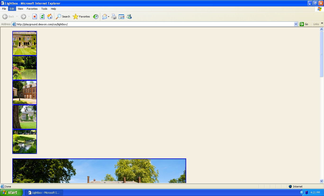
  1) Open the demo page
  2) Click image
  3) Click 'X' in top left of image
  4) Click different image
  5) Click the 'X' in the top left of image
  6) Click browser's 'back' button
  7) Observe how you're staring at the image, not the hacker news page you came from.
The problem is that clicking the 'X' should pop the image off the stack, not just add another page ("#home") to the stack.
Opening an image then hitting back works as it should, though.
Here's another demo to reproduce the "broken" back button:
  1. Go to http://en.wikipedia.org/wiki/Hacker
  2. Click the "Innovation" link in the ToC on the right
  3. Click the "Entertainment" link (you can just see it) under the "Innovation" one.
  4. Click the back button.
  5. Observe how you're not taken back to Hacker News.
Now imagine this is a really long page of FAQs, with a "Return to top" after each question, and the same ToC at the top (something a clueless user probably sees everyday [I know I do on O2's site all the time]). You can see how it begins to look like a browser implementation problem.
Maybe the browser should automatically pop all "#<identifier>"s associated with a URL from its history stack if a user reaches the original URL again (via backs or clicking some in-page link, doesn't matter); I don't know. But I honestly consider this a browser implementation problem, not a web developer problem. I think anything we've been doing till now has been to mitigate this and we shouldn't have to.
The solution is not to change browser behavior, that's fine. Just remove the hashtags from the images so the URL doesn't change when you click on the picture.
Does that make it "broken" or just incompatible with your expectations? Would other non-technical users have the same expectations? It's possible other users will want to go "back" to the image they last visited.
Consider if this was done just HTML 4 and no CSS or Javascript. You would click a thumbnail and a new page would be loaded with a full size version of the image. You would then click a "close" button that would take you to the page with the thumbnails again. If you hit "back" you would go back to the image.
The way the page currently works follows the "stack" of what I actually visited by clicking links. If I want to reverse my workflow after visiting all 5 images and closing between them, I personally would expect the back button to go through all 5 images. From this perspective, doing the same effect with Javascript that doesn't update the stack might surprise me if after clicking 10 links on this page, a single click of the browser back button skips 10 steps of my workflow and returns me to HN.
I understand your argument, and it makes sense; however, I disagree.
The user clicks the image in order to see it full-size. The lightbox overlays the page that the user is on. The user is not conscious that they are navigating to a new page, or even just a part of the page that they weren't at before (to the #image). Though the workflow is in actuality following a link, the user is not aware that they are following a link, so the back button functionality doesn't work as expected.
Links are well understood by everybody that uses the Web. They change the page that you're on to a new page, or a new part of the page. Lightboxes were invented so that the user doesn't need to leave the page, or the part of the page, that they are on.
So in my mind, lightboxes that don't behave like lightboxes and instead behave like links are broken.
I don't have any experience with developing lightboxes but couldn't the 'X' button just use javascript to go back in the history (instead of directly hiding the image). Or is that how most lightboxes work but because this one cannot use javascript it is not possible to do so?
Does it make sense for a user to have to go back through the entire stack of photos they viewed to go to the page before they arrived at the lightboxing page? Not at all. There is a distinct difference between usable states and modal images. With states you want the rich navigable history and the other you want to open it and close it, but not page through it.
Actually, it does exactly what I ( an Android user ) expect the back button to do and what I've wanted every lightbox to do. Sometimes the css for the close button is wrong, or the js is messed up and the close button doesn't work. The back button closing the lightbox is exactly what I want.
I like the particular use-case you suggested, but I'm going to play the devil's advocate. If I close the lightbox, I do not expect the lightbox to re-open. I know there's mixed feelings on this one. Thoughts?
I consider lightbox functionality to be related to the layout of the content, and hence logically a part of CSS rather than javascript. In CSS3 world, I like to use javascript for the tasks not related to the layout: such as making ajax queries, manipulating user inputted data, etc.
Is there a case for relying on javascript for functionality such as lightbox?
If you want to do something other than show a bigger version of an image (like fetch extra data about it for captions), just CSS won't cut it. Remember that "lightbox" isn't just the effect, it's a UI control.
I am unable to make up my mind here.
As atlbeer says, following is the standard breakup of responsibilities:
- HTML = Content
- CSS = Style / Design
- JS = Interaction
As argued elsewhere, lightbox straddles JS and CSS domains.
I was thinking that in CSS3 world, we should have slightly different breakup of responsibilities (subject to resolving performance issues)
- HTML = Content
- CSS3 = style/design and changes in style/design
- JS = interaction other than purely style/design changes
I see that this breakup may lead to confusion in some situations. (Though I still find it more appealing for lightbox example)
So, let me make up my mind when I have more experience with CSS3 :-)
Minor reasons: less performant than Javascript solutions (the transition is sluggish and jittery in Chrome for me) and the fact that I have to click a little target to shrink it back, whereas most Javascript solutions will let me hit Escape or click elsewhere on the page to shrink it back.
Major reason: Separation of concerns: CSS is for appearance, Javascript is for behavior. They don't work well trying to do the other's job. This is touched on by the shrinking problem I mentioned above - it's easy to watch more events to make the behavior of Javascript functionality more flexible or more user-friendly, but not so much in CSS.
That said, it's a toy demonstration of transitions; it's cool that the bear dances, even if I wouldn't take him on Dancing with the Stars.
I also noted the sluggishness that you point out. Do you know the reason? Is it something that could be corrected by changing some parameter in the CSS?
Lightbox functionality encompasses the JS domain (since user is interacting with the page) as well as CSS domain (since the change that is happening on the page is purely of style/design).
So, the breakup which you have given does not unequivocally argue for the use of JS.
Interesting to see this is possible, but this is beyond what I would want to use css for, how far will "look ma! no javascript!" go? Seing the logic in a jquery click handler seems at least as readable / maintainable as a bunch of css rules for the same reason I prefer to have more logic in java in android applications than in various xml layout and manifest files.
It's easier to optimize a description of what the results should be than to optimize a description of how to calculate the results. If you say "give me the first 10 prime numbers", that's easy to calculate efficiently . If you write out the Sieve of Eratosthenes, then that's harder to make efficient.
Similarly, it's easier to optimize CSS rendering than it is to optimize arbitrary JavaScript programs.
hmm, good point, I hadn't thought that this would be for optimization purposes. but is it premature optimization if the css way is fuglier and the js way is fast enough to get the desired framerate on modern browsers? would like to see some stats.
  - respect my back button [1]
  - allow me to click outside the picture or press esc to close the lightbox
  - allow middle-click to open the image directly
[1] We can argue about transitions and correct behavior all day, but this implementation is different from other lightboxes I've seen, and thus it is "broken" to me.
Out of curiosity, what is the point of a "light box"? I tend to open lots of images into new tabs while I'm reading articles, and it's really annoying to have the rest of the article go black when I do.
Unfortunately, lightbox-style galleries still behave inconsistently across hardware/platforms/browsers and often break. And, you're right, many people find them annoying. But as a developer who recently converted a portfolio site, I can tell you that it tremendously simplifies the code needed to present a gallery of images, making a portfolio-oriented site much more easy to update. Also, clients tend to go ga-ga over the slick eye candy (thus decreasing the demand for Flash, so it's not all bad).
Very neat, I checked out the other stuff you've got on there and it's pretty sweet.
Seems like a lot of people have missed the point that this is just a hack to see if a light box in JUST CSS and HTML could be made. Because theres no JS or actual logic, this demo just leverages the browser to maintain the state. It's a necessary side effect that the back buttons behave this way, and it could be coded to behave differently, but that would defeat the purpose of the exercise.
It's done by using the :target selector. Targeted images are lightboxed. There is a link in the lightbox that resets the target to dismiss the lightbox. Crudely:
This is actually quite nice because it allows permalinks to the lightbox items. This makes for a rough browsing experience if you need to go back, but I like the detail that lets you link somewhere that someone can actually find in the future vs. "go to this page, then click here, etc...."
The unseen: Clicking an image kind of works, thanks to the anchors. The browser will scroll down to that image, just like the TOC links on Wikipedia articles.
Slow, like all lightbox implementations. And the flash of the background color is likely to give someone a seizure. (Ok, I'm being facetious there, but it looks jerky.)