Wow! What a surprise to see this here. I made this 10 years ago, when the display ecosystem was much different than it is today.
In 2008, if you were using a device with an LCD screen, it almost definitely had a rectilinear R-G-B subpixel arrangement. Nowadays devices have all kinds of exotic subpixel schemes (and are usable in many different orientations!) so its usefulness is a bit limited if you're on a mobile device.
Love your other projects too by the way! Especially the serial terminal.
At our lab we needed another workstation and the IT-Department took ages to give us one.
So we modded an old surveillance CRT into a Terminal with your circuit and connected it to the existing PC.
Now two people can work with one Workstation. It is still used to this day (albeit more because of the cool factor).
I would imagine that the bigger problem is increased resolution. Less so on the desktop, but even there 4K displays are far more common than they used to be.
Resolution is not really the problem. When it comes to that, assuming the RGB horizontal rectilinear subpixel arrangement that dominated the lanscape, having higher resolution just means you could pack more text onto a given screen.
But if you were to send militext to, say, a pentile display, it comes out as unrecognizible mess. It'd also not work with CRT displays, even vertical mask Trinitrons, because, albeit the phosphors may look like subpixels, they're actually "just" sampling points along image lines, traced out by an electron beam, and each digital image pixel would cover several phosphor pitches and not change apruptly.
Obviously one could decode it. The law cares about intent, so while you can probably get away with doing it once or twice, if it became a standard thing it would quickly stop being fair use and become just a distribution channel.
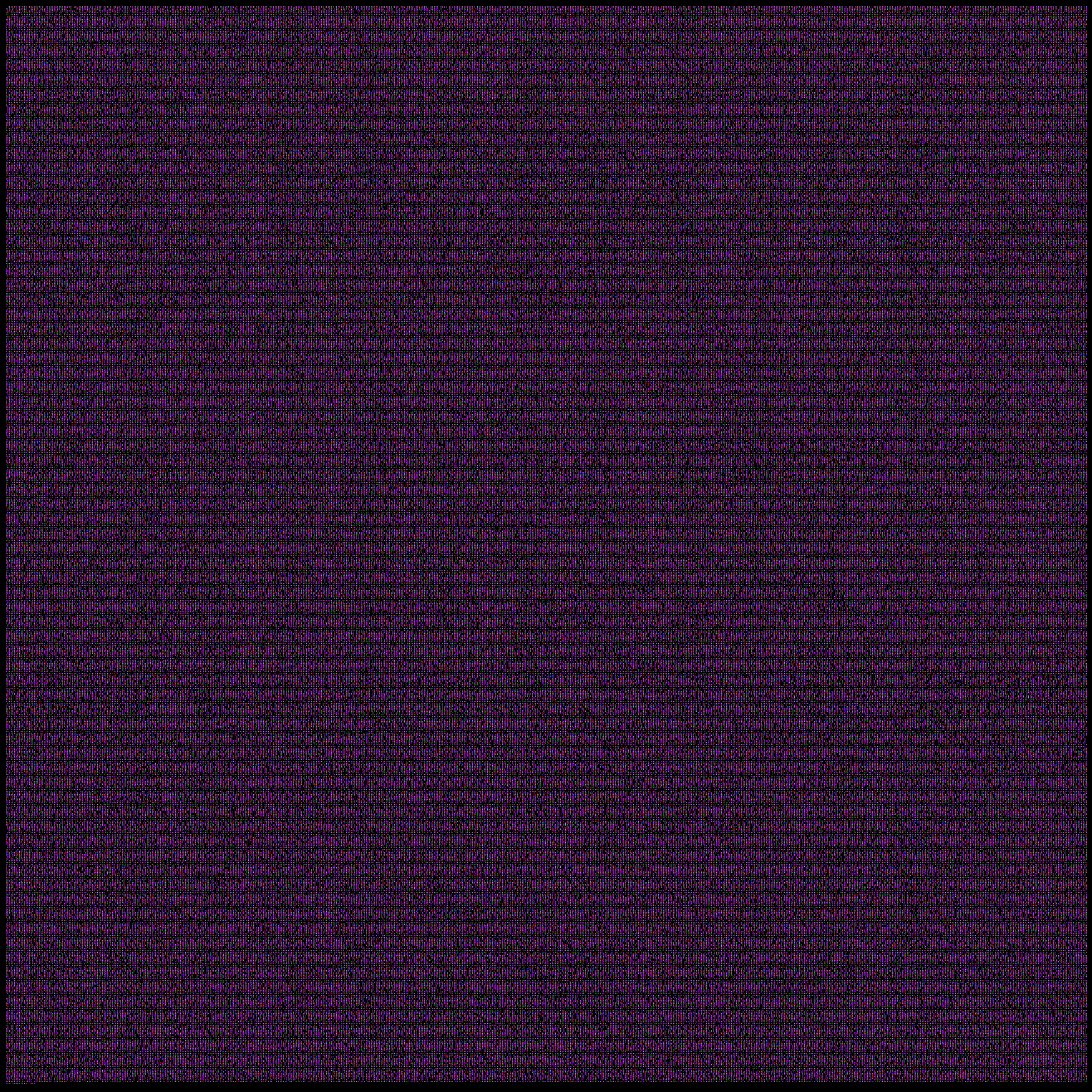
If you stare at this it looks mostly purple, laced with a green webbing. There is a distinct pattern to it which is more or less uniform across the image.
Wow, that really doesn't work very well (obviously) if you're running a portrait setup. It's surprisingly legible once you get the orientation right, though.
Makes me think of a related font, dotsies [1]. It's not necessarily meant to be displayed at 1px wide, but it would be possible. The intro/tutorial on that page is a pleasure to go through, in a mind-bending way.
I picked it up briefly to familiarity. You can learn to read it very quickly ("read" here meaning you no longer need to refer to the key so you can increase your reading speed just by reading more). If you're going to learn it consider learning dotsies v3[0] instead. All vowels plus y, and only the vowels, touch both edges which fixes the main issue, that you can't tell abcde apart.
Since no one has presented a version of the dotsies bookmarklet, which is actually necessary to use them in practice, I'll go and make one with the proper mapping for v3.
If there is one already, let me know.
Actually, looks like all the permutations in the bookmarklet only allow you to use glyphs in Dotsies.tff, and there are some possible glyphs missing. I'll have to edit the font file.
I just now spent about an hour reading the homepage's article that incrementally introduces dotsies characters. It went surprisingly smoothly and effortlessly, though my reading speed was fairly slow compared to normal.
I'd say it's a fun exercise for anyone at all interested.
It's 3 pixels tall (not including ascenders and descenders, which are another two pixels each), and uses the full range of colors available instead of just black, white, and the 6 fully saturated colors. I think it's much more legible.
This reminds me of a trick that was is used on Apple II computers to achieve 560 pixel resolution on a monochrome monitor, using the 280 pixel "high res" mode.
Why these strange numbers instead of 160 or 320?
The high res mode in these machines is funny. 280 is divisible by 7. Each scan line is encoded by 40 bytes, which provide 7 bits of resolution, so 280. On a monochrome CRT, these correspond to B&W pixels: on and off. What is the 8th bit of a byte used for? It will shift the group of 7 by half a pixel. Thus, sort of, you have 560 positions: you just can't use all 14 positions freely in any one byte slot.
On a color CRT, things look like this: the pixels alternate between two different colors, and the 8th bit shifts to a different set of two: purple-green versus orange-blue.
(The alternation between colors means that, since each byte contributes 7 places, successive bytes are coded opposite.) I.e. two successive bytes in "purple-green" mode coding 14 pixels: PGPGPGP GPGPGPG. If adjacent P and G are on, we get white.)
(As if that weren't bad enough, the scan lines are not consecutive in memory. If you start with a black screen and fill the memory with 1's, the screen will turn white in a kind of "venetian blind" effect consisting of a superposition of two interlacings of different period lengths.)
Interesting! I hadn't found anybody else doing this back when I "typeset" my thesis in a subpixel font. I even build my own tool in Processing for designing the font. A part of my graduation was making an installation of our thesis for the exhibition so people could "read" my thesis. I build an installation with a LCD screen, a USB microscope and a projector. You can find it over here: http://www.thomasjonas.nl/project/a-new-aesthetic-for-text (sorry mobile users)
The thesis was about how the aesthetics of tools/technology can influence the aesthetic of art, so I thought this installation was a pretty fitting idea.
This is melting my brain. On my main monitor, and on my laptop, the green and blue pixels seem to be deeper into the screen. The text looks like it's set in acrylic at a 30° angle off of the display. And they move when I shift my head from left to right.
As cool as this is I couldn't look at this all day. I'd start making allusions to Elder Gods (fhtagn!) by 2 pm.
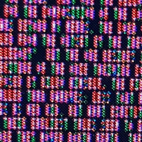
For those interested, here's what I was able to read from the twitter avatar:
    Pro Tip: You can add more
    than 140 characters into
    your twitter avatar. For
    example, here are 156 of
     them. Just make sure to
    include all links in the
    main text ;-) Also, hand
    out magnifying glasses!
Thanks! I was trying to decipher it on iMac with a 5k display (? 5120x2880) and an attached LED Cinema Display (2560x1440). MacOS does a good job dealing with the DPI so that they appear the same size (but one is clearer than the other). Using a magnifying glass, I could almost make out the text on the lower DPI screen, though blue was almost invisible, and I could not seen anything other than a colored bar on the high DPI screen :)
Interestingly, neglecting the image encoding overhead, storing plain text like this is surprisingly efficient: One character is 1x5px in size, it seems that the colour palette is quite limited, at least less then 42 colours (I count like 5-10 colors, is there any reference?). This means an ASCII character can be stored in less then 7 bits of information.
I don't know how you get less than 7 bits here? Assuming 8 colors it would mean 3 bits per pixel, 5 pixels per character, for a total of 15 bits per character. So it is about half as efficient as ASCII with more limited character set.
I'm pretty sure the theoretical floor on storage size required is the minimum number of distinct characters in the charset, otherwise you no longer have a unique identifier for each character. Based on that I'd imagine that it's literally impossible to fit a charset of 64+ characters into less than 7 bits.
Not quite. If they're all equally likely, then yes you need 6 bits for 64, and 7 bits for 128 chars.
But you can get that number down significantly if your characters are not all equally likely, then you don't need as many bits. The actual theoretical lower bound is the Shannon entropy, for English text you typically need only 0.6-1.3 bits per character, see https://en.wikipedia.org/wiki/Entropy_(information_theory)
Sorry, I wasn't clear about the statement I was making. You are of course right about being able to store text consisting of multiple characters from an N-bit charset at much less than N bits per character.
What I meant was that the single-character representation isn't going to go below N bits per character if there are at least 2^N unique characters.
If you want them all to have the same length, no. But even in practice this is not the case anymore, e.g. the most common encoding UTF-8 uses 8 bits for the ASCII characters and then 16/24/32 bits for the lesser used code points. And there are some exotic UTF-5/6/7 variants as well: https://en.wikipedia.org/wiki/Comparison_of_Unicode_encoding...
Well, this seems certainly straight forward from an information theory angle of view:
- Each pixel represents one bit.
- Hence, we should try to increase information entropy.
That's all there is to it? Certainly not, since we are creating something for human consumption. There are a couple of other factors:
- The way the eye processes patterns: lateral inhibition [1]
- The way the eye processes colours: photopic vision [2]
- The way the brain interprets patterns
- The way the brain can actually interpret ingoing information.
I don't have an answer to all of these. But is pretty certain that maximizing entropy of a binary pattern is not equivalent to optimiziung reading speed.
Sub-pixel rendering was often used on low-res monitors as a way of achieving smooth fonts. The idea was to anti-alias the edges of the glyphs by filling in individual R, G or B pixels to give a smoother edge, hence the font was more detailed than your screen resolution.
In the world of early mobile phones and portable games consoles it was an important technique for getting smooth fonts on low-res LCD displays.
In 2008, if you were using a device with an LCD screen, it almost definitely had a rectilinear R-G-B subpixel arrangement. Nowadays devices have all kinds of exotic subpixel schemes (and are usable in many different orientations!) so its usefulness is a bit limited if you're on a mobile device.