A valuable spare-time student exercise that will benefit the world: Rewrite these pages, perhaps every single one, and turn down the vitriol by about fifty percent.
Let me break down this page: A TITLE IN ANGRY ALL CAPS. A paragraph stating the misconception. Three paragraphs of ranting about the badness of the misconception without actually explaining what is bad about it. A list of sub-misconceptions, again without explanation, but with a helpful WRONG next to each one, in case you needed more shouting. Then another paragraph of throat-clearing. Then, finally, some explanation.
Everyone gets enraged by idiots at one time or another. But capturing that rage in print is rarely productive. Rage tends to be repetitive and soon becomes grating. Fortunately, there is good stuff here; it just needs editing and rewriting, possibly over a nice drink in a relaxing place.
Agreed. Even ignoring the vitriol, the format makes this page very unpleasant to read.
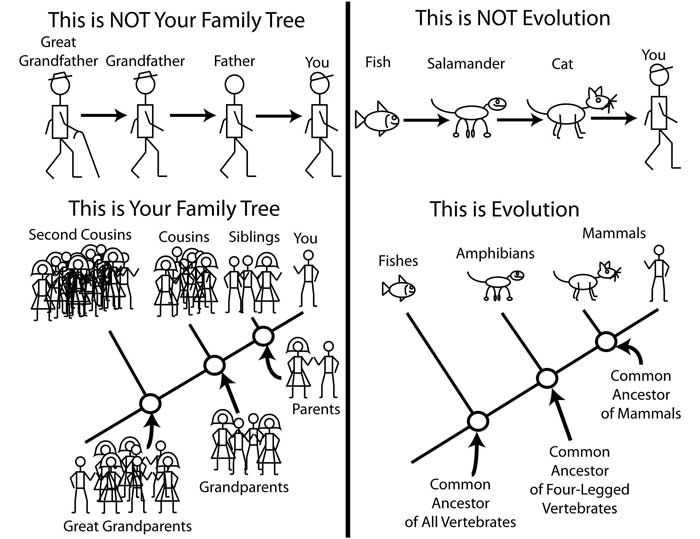
I liked how Florida Citizens for Science did it: they held a contest in which entrants were encouraged to draw stick figure cartoons illustrating a misconception many people have about some aspect of science. Here's one of my favorites:
True, the page turned me off so much that I had the patience to look at only one "misconception": Why is the sky blue? What the site states is not that the textbooks are wrong but they could explain it in simpler terms. Well, then, misconception is too strong a word for that. And I think the simpler explanation had holes in it, too, e.g. "air is made up of blue particles, etc."
I don't see the problem there. The author writes first clearly: "This one isn't purely a textbook error. Still, it involves misconceptions on the part of authors." He wants to point that it's not a misconception to explain that the sky is blue because of "wavelengths of light, Tyndall effect, and Rayleigh scattering" the misconception (in the approach to the presentation, not in the facts) is to explain only that single effect on that level and not mention that all the materials with which we are surrounded also have own colors because of the similar behaviors of atomic particles. That is a valid and important insight. And the misconception (again in the presentation, note again that he writes about school books) is not to mention that the air actually always has colors only that we don't register them because a lot of it is needed. I think it's good to point to all this.
On the other section of that site I say this below:
"Sorry if the following is a bit contentious at times. I wrote it in an attempt to get some things off my chest. If you keep watching this site, I'll probably clean it up and make it sound a bit more professional"
But then I received constant numerous requests to keep it just as it is. Only a tiny percentage of responses were hostile. I decided against any change. Also note that this was a 1996 page written for Lynx text-only browsers.
I knew that one and I still find the Beaty's texts much clearer than the relevant Wikipedia articles. Some time ago I've read in Wikipedia about what lifts the airplane. Then I've read his text. His one is significantly clearer.
I've just checked his markup: AFAIK he doesn't use anything bad (never specifies Comics Sans or whatever). If you saw problems try checking the defaults of your browser, I have a slight impression you haven't adjusted these. You should be able to configure the default font etc. and even styles in most of the browsers.
Well then it's your problem! Allow me to claim that if it looks bad to you it's because you were lazy. The possibility of changing the defaults in the browsers is really there because tastes are different. All the pages without "styles" allow you to see them better than the others where the style is forced on you, once you adjust the default style. You set that only once for all such pages you're going to see. It's worth, much more than applying something every time you come to some such page which is what your suggestion was.
How can anybody know your personal preferences? I also can't teach you how you should set them as I don't use the same browser as you. Try to remember: not everybody uses everything you do.
I don't understand what your problem is, apart from not knowing to use your browser. You've asked for a tool, you've received the answer -- it already exists, you're not accepting it again and again.
Ah, you hit on my central philosophy: all content, no esthetics. Whenever I have free time, I add more content (hand-written in HTML, via a telnet terminal from wherever I happen to be.) See the FAQ:
I base this suggestion on a sample I visited:
http://amasci.com/miscon/eleca.html#frkel
Let me break down this page: A TITLE IN ANGRY ALL CAPS. A paragraph stating the misconception. Three paragraphs of ranting about the badness of the misconception without actually explaining what is bad about it. A list of sub-misconceptions, again without explanation, but with a helpful WRONG next to each one, in case you needed more shouting. Then another paragraph of throat-clearing. Then, finally, some explanation.
Everyone gets enraged by idiots at one time or another. But capturing that rage in print is rarely productive. Rage tends to be repetitive and soon becomes grating. Fortunately, there is good stuff here; it just needs editing and rewriting, possibly over a nice drink in a relaxing place.