I put up a couple of hundred icons that I'd drawn previously up with a public domain license. Here are the download counts and royalties from the last 10 months for reference:
http://i.imgur.com/clNZWUk.png
> It feels good as a designer who's not able to easily contribute to the open source community.
You would be surprised how helpful it is to simply offer design insights for free. A lot of projects are maintainted by programmers who have zero design notions and who are not even aware of the little things.
Offering a free mockup to an open-source project is also very valuable.
I've tried with mixed results. Some OS projects have been super grateful for tiny things such as favicons and logo vectorisation, but in my experience most tend to acknowledge but not implement work sent on spec.
After a quick search I've just discovered opensourcedesign.net which I'll definitely look at contributing to. This would be great for designers portfolios http://opensourcedesign.net/jobs
It's a tough nut to crack. Open source contributors tend to want to dive in and make the one patch they want without engaging in any design or feedback process. Installing that process means someone has to take up managerial duties. Most projects stumble along with a "one coder army" who expedites these processes by assuming anything they can't do on their lonesome is out of scope, and all feedback, patches or design ideas are strictly suggestion. Switching to a team management approach when a project gets big is a big source of friction since it's rare to have a strong solo dev who is equally capable at giving up direct control and delegating. Usage of a project is often mismatched with development energy, creating unbalanced workloads.
So the tendency ends up being that a lot of projects just stay small and go out of their way not to grow, even when they address a problem that demands more scope than they have.
My suggestion given all of that is to not give up, but focus your design energies on the inspirational: if you produce mockups and prototypes that are hugely compelling, someone will come out of the woodwork to realize some of them: you may not know which ones or when, but you're giving them footholds in approaching the problem.
Yes, I've not tried submitting pull requests or forking code so I don't have any experience of the etiquette or protocols needed like developers must have in spades.
Very interesting point about inspirational mockups, definitely food for thought!
You do need to purchase the font to use it to make the logo.
Forcing an open source project to pay roughly $200 for a one time use is a bad decision. Using such a typeface in a logo is a poor choice because that mean you can't embed it easily for free on the product's website (let's say to use as the font of your titles or to use text on the logo instead of using an image). The problem with embedding a font on a website is that by doing so you are not "using" the font but "redistributing" it.
In the end they used Arvo which was a really good choice, they were able to easily use it all over https://pugjs.org
Little pictograms for buttons are often extremely vague and open to interpretation.
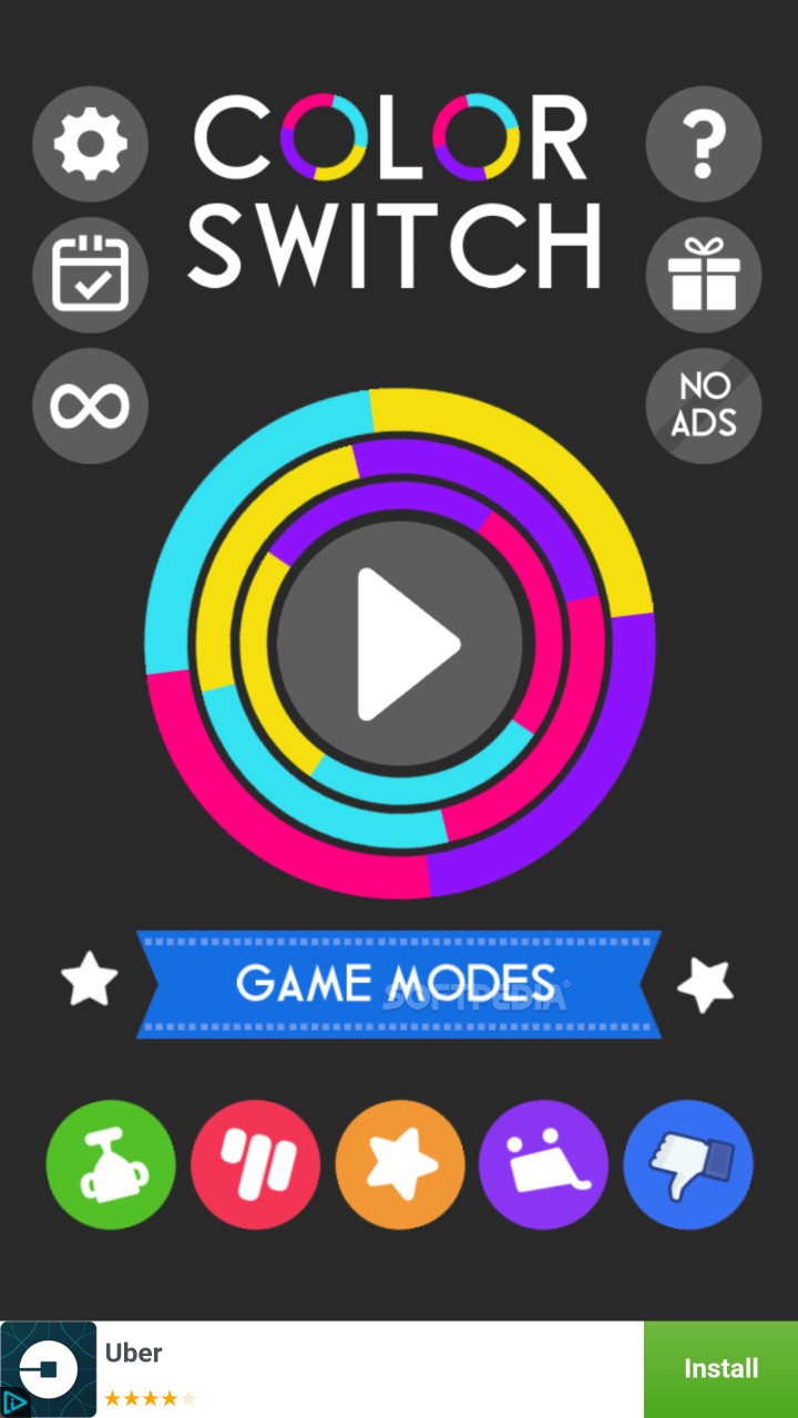
Eg. Heres a random game where upon opening it I was immediately confused
http://mobile.cdn.softpedia.com/apk/images/color-switch_1.jp...
(also the icons are all animated / rotating, making it even more confusing, made this game menu stick out in my memory as an egregious example)
Some designers seems to love the minimalism of if though, from an aesthetic reason, I assume.
Imo Text is the clearest thing you can put on a button to tell the user what that button does 'save' 'load' 'new game' etc. Yes, it will need to be translated, but thats simply putting in more work for a better product.
That really depends. Can you imagine photoshop's interface if it were all text? This is an extreme example but more generally I think text is better for discoverability but icons are better for visual memory and thus better suited for buttons in applications you use often.
On desktop there are always tool tips. On touch interfaces this was not yet figured out.
As a counterpoint, here are Zendesk's icons with no text: http://imgur.com/a/wzCO0 -- can you guess what those do?
Of course, this is about the worst example of iconography I've ever seen so here's the same with the labels left in: http://imgur.com/a/CyqA6 and I'd even go so far as to suggest that given their choice of icons they should just get rid of them and make it text-only.
But those are product logo, not icons https://imgur.com/a/4kAKt. They don't serve the same purpose - logos are brand assets and are suppose to be distinct, otherwise they can't be trademarked.
I "understand" the icons... support is one box leaning on another, guide is one leading another, chat looks like 2 speaking at each other, and talk looks like a phone.
But wow are they horrible. I agree, they really should go with text-only.
I disagree. I mean, yes, the icons look much, much nicer, but the text I can understand much easier.
For example, desprite owning an iPhone myself, after looking at that comparison, I just realised that I had actually never used (nor really knew what they meant) what the "do not disturb", "timer" or "calculator" icons were. I've always navigated to calculator and timer from the apps on the home screen (and have never used do not disturb).
I'm not saying that Apple should change the icons, not at all. Just that I don't think this is a refutation of the idea that text is best at all. If anything, it shows that text is much more descoverable and understandable, if a good bit uglier (and less compact).
I do think that icons are the right choice for the iPhone, and once you learn the icons there's no problem (as long as they don't get changed!), but its not as clear cut as you seem to be saying. I'm forever confused by non-standard various unlabelled icons all over the place. I also have no idea what most of the articles in the linked article mean (eg the washing machine/clothes icons -- I still don't know what they mean when I see them on clothes!)
I think Apple Mail actually strikes the right balance here.
There are icons, but they have text below them by default. If you want a cleaner interface once you are able to easily identify the feature by the icons, you can right-click and turn off the text.
It's like training wheels for the UI. I used the text labels until I no longer needed them, and now I only use the icons.
it also shows that an icon has to be iconic to work. play, fast forward and rewind, the camera and the calculator, i knew. airplane mode, wifi and bluetooth, i knew but could easily imagine people confused by. the crescent moon, the lock with the arrow around it, the flashlight and the dial i honestly didn't know, and would've had to tap them to try to figure out what they did.
you can't just make any picture iconic, it's not something an app can force.
Also interesting they recently updated all the icons / art for Android. I really dont like the new ones compared to the old ones. Its a jarring change. They are all line drawings now, rather than filled shapes.
On the other hand, I find myself suffering from "icon blindness" sometimes - it is usually after working for some time, but at some point, I just don't process them very well. Command-tab window switching (MacOS), for instance, is something I end up staring at a lot, trying to figure out which one I want.
But then I tend to interpret text much more quickly and without having to think about it than with icons, as well. I'm just a word person. Probably why I'm generally happier typing at the command line than poking and clicking at buttons.
I'd take the text-only iPhone, myself. Stark is fine.
I like the text only version a lot. The top icons could still be graphics as they are more gauges than icons. The cognitive load of a million different icons, mostly different per application is too much in my opinion. I would include this under design cleverness vs usability.
Symbolics Genera used an all text approach. Experimentally testing of text vs icons would be very interesting.
Android has toast messages baked in. When you long press something, it can display a small tooltip at the bottom with the message. Toasts disappear automatically, and they are dismissable with another touch event.
iOS doesn't have the equivalent by default, but Stack Overflow shows that this behavior is achievable.
I guess poor use of pictograms in mobile and wep-apps is becoming so common these days it made my original comment a bit lopsided.
Ive used a lot of programs like Autocad, Photoshop, 3DSmax, Ableton, Reason, Cubase and so on. Icons + tooltips are a great solution in that context.
When you are just starting off you use the tooltips, later you know what each symbol means, and after more experience you can perform all your most common tasks with keyboard shortcuts. Autocad is particularly good for that. You can make an entire drawing with just the keyboard, it makes sense because youre making an accurate measured drawing so will want to type in all the dimensions/angles anyway.
The UX idea wasn't bad but the arbitrary grouping and the deep nesting ruined it.
They did not give enough thought to the user workflow and mental process to locate things (i.e. Why inserting and deleting a row had a completely different workflow at the beginning)
What they didn't give a thought too, was that this wasn't a new product and you can't drastically change things like that when you have a large existing user base that rely on your product day in and day out. They functionally broke the product for most of their users; I've never heard anyone in the word place compliment it, it's universally hated. The only people who seem to like it are designers, who frankly tend to come off as clueless to what real users just trying to get a job done actually want.
Icons and text are exactly the same thing. They're both language; visual forms that mean something.
We're more used to text, because text has a lot of nice properties as a medium for language so it has become pervasive. It's generally low dimensional and has high composability. For low bandwidth mediums it's ideal, because it's also low bandwidth.
But that doesn't mean icons aren't a language and aren't just as useful as text. They just have different strengths and weaknesses. Icons are higher bandwidth and higher dimensional (a tiny 32x32 grayscale image has 1024 dimensions!). But they're also very dense. What could take a large amount of physical space to describe with text, might only take a small 32x32 space with an icon.
All that to say, I don't disagree with your assessment of the situation. But I don't think it should be viewed as icons vs text, as if they're two completely different things. It should be viewed as a general problem of effective communication. Text can be just as bad. Imagine reading "subtract b from a and divide that result by q" versus "(a - b) / q". The latter is a more efficient language which most everyone will understand. Better to use the latter.
What if instead of writing "save" and "load" the designers wrote "serialize game state" and "deserialize game state". It means the same thing, but clearly "save" and "load" are better. Why? More people will understand them, and the extra information communicated by the verbose alternative isn't necessary.
Just as in a lot of situations an icon, if generally understood by the UI's target audience, can be a better alternative than writing "save" and "load".
Nope. Icons are direct visual analogs of the things represented. There's just one layer of abstraction: thing -> picture of thing. An icon, at least in principle, looks like the thing represented (or at least like some important property of it).
That's feasible for "save" or "center the text", but starts to get pretty damned hard when it's something like "Earl Warren's opinion in Brown v. Board of Education".
Western text, by contrast, is a visual representation of the phonemes in the verbal representation of the thing.
Thing -> audio of word representing thing -> phonemes making up that word -> text.
There are at least two more layers of abstraction involved, with all the additional power that implies. The word "horse" has virtually nothing in common with a physical horse.
Another important difference: a literate person can immediately write down any word that can be spoken, and any other literate person (who has learned that same character set) can immediately reproduce the original spoken word.
(I'm assuming, arguendo, that we're using the IPA alphabet or some other character set that tries to cover all the world's phonemes in an unambiguous manner).
Icons, by contrast, have to be designed. Good ones take a lot of thought and artistic skill to create, and even then they are notoriously prone to misinterpretation or outright user bafflement.
'Text can be just as bad. Imagine reading "subtract b from a and divide that result by q" versus "(a - b) / q". The latter is a more efficient language which most everyone will understand. Better to use the latter.'
The latter is still text. It's just using a different written language. It is a compact representation of "subtract the second thing from the first thing and divide the result by the third thing". How on earth could you represent that using icons? It seems like it would be quite a challenge.
> Icons are direct visual analogs of the things represented.
Counter example: The universal icon for "play", as in to play a movie, is a right facing arrow. It is not a visual analog of anything, since playing a movie is an entirely abstract concept.
The same is true of rewind, pause, and most other controls on a VCR.
Having two icons next to each other, one that looks like a "+" and the other that looks like a "-" indicates a set of controls for increasing and decreasing. Again, these are icons that are not visual analogs of anything; they're entirely abstract.
The fact that a lot of icons are visual analogs is merely for convenience sake. Having a button that looks like an open door helps communicate to people, who've never been taught what that icon means, that this is probably a button that opens a door. That's more convenient than having to educate all users that a completely arbitrary symbol means "open a door".
But, as I mentioned with the VCR control examples, if the thing you're trying to represent doesn't have a visual analog at all, then you just have to design something arbitrary and explain it to people until it becomes common language. Much like a heart symbol.
Yes, a floppy disk. The physical thing that you save data on. More correctly, the physical thing that you used to save data on when the icon was created.
Eg.
For a casual user, very clear highly descriptive medium is best (eg tooltips), for a mid-level user familiar with the program, icons are ideal. For a super-user, they dont need any visual UI and can do everything from memory using keyboard commands or gestures.
I think icons are mis-used more frequently by modern designers than text.
Perhaps it is a lot easier to mis-use icons beceause their meanings are not standardised or codified.
With English text for example, there are dictionaries and official sources for grammar, spelling and meaning. Also people are actively taught these officially accepted values in school.
The suite of icons we're discussing (eg. disk icon for 'save' right facing arrow for 'play') have come from a mish mash of different contributors, only in the past few decades and in the tech industry where things have been in constant flux. The same icon can often mean two completely different things, and they can also often be stylized into an unrecognizable or ambiguous form.
> Imo Text is the clearest thing you can put on a button to tell the user what that button does 'save' 'load' 'new game' etc. Yes, it will need to be translated, but thats simply putting in more work for a better product.
I strongly disagree. I'm looking at my browser chrome right now and if the back, forward, reload, home, and bookmark buttons were displayed as that, it would be _awful_.
Even thinking about my IDE, if IntelliJ said "Class with main method" instead of the little C with play button icon or "Library class for which source is decompiled", it would drive me insane. That's most certainly making a worse product.
It's all about the language you can create and sure, no one is going to learn a new language to play some 2 minute game, but lots of great interfaces require a new language. It's about optimizing for the experienced user instead of the newbie.
Of course there are places where it should be the other way around, but it's not universal.
You already know the meaning of the browser icons as well as you know traffic signs. On the other hand on a unknown setting, like a newly installed app, an icon can represent too many things for a person to guess which is the real semantic of the icon in question.
Pretty much the only thing I remember from my human machine interaction class aeons ago is a discussion of text vs. pictograms vs. abstract icons. Text is clearest but takes the longest time for experienced users to find what they are looking for. Abstract icons are unclear to new, untrained users but are super fast to find/discern by experienced users. Pictograms are a compromise.
Related: US traffic signs always bothered me because we have trained users who need to be able to identify the traffic signs as quickly as possible so that they can focus on the road. Yet we use traffic signs that are optimized for the opposite use case. Europe and most other countries are way ahead on that.
My UX teacher at university consulted with our province on the design of new highway signs (I think it was for the icons that tell you what's at the next off-ramp/service centre). So, it certainly is possible to consider the use case (user-centred design is what she specializes in) and design the signs accordingly.
I agree. I always click the wrong button for Paste in Android, often resulting in copying instead which means I overwrite the clipboard. This is very annoying as I almost always have copied something from an entirely different page/tab/app.
Is translating it harder than trying to look up what a picture means on the internet? Is it harder to learn what the word "SAVE" means than to learn that a square box with a circle in it means "save"?
>Is it harder to learn what the word "SAVE" means than to learn that a square box with a circle in it means "save"?
Yes. The second is more distinct visually from other icons, and you can even discern it with just a glance, whereas various words are all juxtapositions of letters. There's a reason traffic signs the world over use a visual language.
Suppose I see a squiggle on some program. Where do I go to look up its meaning? I can't even type it in.
Let's take that | that now means "ON" on electrical equipment. If you guessed that it meant "1" because you're a computer/electrical engineer, wouldn't you already know what "ON" meant? If you aren't, how would you guess what | means? Flip the switch back and forth to see what it does?
If you're resorting to that, why bother marking the switch at all?
>Suppose I see a squiggle on some program. Where do I go to look up its meaning? I can't even type it in.
It's either one of the well known vocabulary of icons used across programs (e.g. floppy disk for save, house for "home", x for delete, etc), or a new one you can just hover over and read what it does in the tooltip.
After the first time (or couple of times), you don't need to read that again, and you'll recognize it very fast (not like stopping and reading it).
Tooltips aren't always used. A further complication is that people tend to copyright icons, so the icons from one app to the next are substantially different.
> x for delete
I've seen 'x', 'delete', 'del', and the trash can. 'x' is also used to cancel or close. There's little consistency.
Well, those would be bad interfaces. But the standard in OS X and Windows apps is to have tooltips.
>A further complication is that people tend to copyright icons, so the icons from one app to the next are substantially different.
Is that a thing? They might not be able to show the exact same design, but they'd still be able to show a floppy disk or trash can or whatever.
That said, OSes could (and some do) provide standard sets of icons to be used across apps, and only special app-specific actions should have custom icons.
Some people have implemented icons poorly, so we shouldn't use icons, isn't a compelling argument. Those people might implement anything badly, for instance choosing bad text in a text-based approach.
Agreed re: consistency -- good icon design requires understanding what people expect and matching it, which isn't always easy (as the referenced project demonstrates!)
> Little pictograms for buttons are often extremely vague and open to interpretation.
True. I remember Lynda Weinman refered to this as "mystery meatball" navigation in one of the books she wrote on web design somewhere between the mid 90's to early 2000's. Probably it was the book Designing Web Graphics.3 [1] as looking through the Google results the cover of that one looks the most like what I seem to recall.
Tying into what was said in a sibling comment about the icons used in programs like Photoshop, I think the important thing to keep in mind is the context in which you consider adding icons. For a professional market piece of software like Photoshop where you expect your audience to put many hours into learning how to use the software and where you expect them to become power users, you can allow more in terms of UI elements that might steepen the learning curve, but which when learned can be employed by proficient users for faster and more productive workflow and which therefore will make the additional time required to understand them increase the value that your software provides.
Meanwhile for tools and websites that are used only occasionally, or where you don't expect repeat use but want to provide the best value for your users still, you should hold their hand more and make it immediately apperent what everything does and how to use it.
I've been thinking a bit about interfaces that would evolve with the user but my conclusion thus far has been that the amount of work required to implement that successfully would take a lot of time and might even never be worth it. That instead it still seems better to me to decide wether you are targeting heavy repeat use or not, and to optimize your UI accordingly in the manner I stated in the above paragraphs of text.
The difference between using text and icons for interfaces is that icons are clear to new users only if they are immediately identifiable. With universal things like email, that's easier to do; for example, the user knows there must be a "send" button and so immediately recognizes an arrow button. When the user needs to learn the interface (more generally, the mode of interaction), icons are harder to use effectively.
Well that specific random game was actually one of the most notable hits on smartphone in 2016. I believe for someone who are familiar with video games in general, these icons are very common though.
But yea the icon rotation might be annoying at some point.
This has been around for years. I was thankful for them when I was building my now failed company. I didn't end up licensing anything, but had I got to revenue, I certainly would have. Thank you to your team.
I think $40/yr or $2/icon is too far out of reach for me to use these icons as a proof of concept, blog, or early website launches. I have a website idea which would use about 100 of these icons, but I can't justify the cost yet since it brings in no revenue.
At 3$/mo (averaged) it's been a great deal for me. I do lots of website/other designs and they're royalty free so I can do anything I want with them (except use them as a logo). It makes it easy for me because say, I want a svg of a penguin, BAM got one right there (169 actually).
Likewise. Seems like a really great price if you're a designer, but too steep if you only use it occasionally. I use Noun Project semi-regularly with the CC licensing, but only for not-for-profit purposes, so $40 is too much.
I'd probably pay a one-off fee ($20? $30?) just to use the app though, even if it meant requiring attribution for all icons used.
$40 is a bargain when you consider how many hours it takes for a person create an entire icon set. It's not as if illustrators are rolling in money here.
Yeah, completely agreed -- that's the thing about the pricing, it almost seems too cheap for designers who could use it every day and create huge amounts of value, but also too expensive for casual users like myself, who aren't making a cent on anything using it.
With the app in particular, even though I'd only end up using one or two icons, I'd really like to just be able to use the app to prototype/browse icons. Which is why I'd be very happy to pay a one-off fee to use the app, even if I then have to separately purchase/attribute the individual icons I use. At the moment, you have to be a subscriber to use the app.
The icons are embedded SVG so you can just copy and paste it from the page source. The icons are Creative Commons licensed so you don't even need to accept their TOS.
This really reminds my of the glory days of clip art :) I for one really liked those so no harm meant :)
The next thing is clippy coming back (oh wait that's all those chat bots) :)
There are about a million words in the English language. The site has a long way to go to get to "everything". Me, I'll stick with phonetic alphabets, which have long displaced icons.
Interestingly, iconic languages usually wound up assigning sounds to the icons and were transformed into phonetic alphabets. Icons just aren't practical.
I read some designers discussing the filter icon usually being a funnel which doesn't do much filtering. It does funnel something into something. https://thenounproject.com/search/?q=filter interesting to see the other options that show up.
Here's an idea; four arrows moving right, towards a line. The line has a hole in it, only allowing one of the arrows to pass through. Demonstrates filtering and doesn't have any accidental significance from symmetry.
There's a somewhat more simplistic version of that on the above-linked results, which is four centered, horizontal lines, each decreasing in width from top to bottom, which I think communicates basically the right idea: you have a much of this thing up here, but you can get less of that thing down here by clicking this (maybe). Conceptually speaking I like it more than a funnel, but it still needs a text label to convey the right thing.
There's also a literal filter icon, which could only ever work at somewhat larger sizes due to the mesh. Without knowing that the context of the search results is that of "filter", however, you probably wouldn't know what it was by simply looking at it.
Funnels are used for filtering all the time, think coffee, lab equipment, etc. The parameters of the filter - i.e the mesh - are what you are choosing to go in the funnel.
I can certainly see how this is useful, but is there also a complementary site that provides the opposite? I try to avoid using icons that resemble everyday items (the 3.5 inch floppy for 'save' is a good example).
Edit: there's actually a ton of good abstract stuff in here. Should have looked more closely.
What's the point of having a footer when you can't get to it? I see links for about and pricing that I wanted to click on, but I can't get to it. Super frustrating.
I would be using this service if they offer all possible resolutions with one click. I assume this is service which should be used by non-designers to quickly get icons for some proof of concept or similar.
I always look for the icons with multiple gears. Have not found one which would actually work: Gears not touching, size difference blocks, or three gears in deadlock. :)
It would be nice if they implemented machine learning to cluster icons with similar style together. Then your queries could return only icons in the stlye youve selected!
The point of modern emoji is that their look is standardized though. (past the original goal of Japanese cell phone communication, the consortium seems to be concerned with filling in gaps and making sure cultures are properly represented) So emoji should (ideally) be a common set of pictograms that people can send to each other and which can be displayed interchangeable by each IME. The Unicode Consortium also has more stringent standards for inclusion. [0] UI icons are excluded. 2.6K isn't a lot, [1] Unicode has tons of room, and no one is forcing you to use them. People have obviously found use for them and it has made them enthusiastic about interacting with their tech overlords. [2] I used to irrationally hate anything popular too, until I made an effort to try to understands people's motivations for liking it and tried it myself. Emoji are the missing expressive layer of our text that express nuance like sarcasm and mirth. Sure we have emoticons, but those were limited and emoji are much more diverse and versatile. [3] Maybe you should give them a try before being so quick to write them off. I don't exactly pepper my texts with them, but I do respect people's motivations for using them and I always make sure to send a popper [4] to my friends on their birthdays.
Guess: a) their misspelling dictionary is populated with past searches instead on english seed directory without taking into account if they found anything. and b) folks typed "anyhting" more often (maybe even just once) then "anything"
searched for "save" .. ten pages of variations on the 3.5" diskette icon all labeled "floppy" even though diskettes aren't floppy. I wonder when a new save icon will emerge?
The "floppy disk" always (even with 5.25" and 8" disks) referred to the disk inside the casing, not the casing (which wasn't particularly floppy on the bigger disks, and wasn't a disk on any of them.)
The storage media was a floppy disk (literally) for all three sizes
The casing was either flexible but not really floppy (for the 8- and 5.25-inch versions) or rigid (for the 3.5-inch version) and square (not a disk) for all three versions.
So the only thing that "floppy disk" ever made sense for, even for the 8" ones, is the storage media inside the casing, not the casing.
The paradigm of "saving" is going away. In "new" apps this can hardly be found. Users expect that all stuff is saved automatically all the time. Files and such are a legacy from the old desktop world.
there were some interesting alternatives to the diskette icon if you scroll to the very bottom of the search results after searching "save" .. the micro sd card and thumbdrive icons are cool and I think pretty intuitive for "save"