The Good Design Award is pretty neat. Years ago when I lived in Japan I bought a mechanical pencil[0] that I absolutely loved. After more than a decade of use, I googled the pencil name and found that it had won a Good Design award. I thought it was great that a sub-$10 pencil could win something like that.
Wow I received this exact pencil two years ago for Christmas and I've used it nearly every day since it was gifted to me. In fact I just put it down to type this. I am not surprised at all that it has won a design award. I was the type of person to misplace pencils like socks out of the laundry, but I treat this pencil as a companion.
I've asked myself that a few times. If you're happy just using a pencil and don't really care about the details, I totally get that; I've got lots of other pencils that work just fine.
Here are the things I like about this one: 1) It has a grip that's not super rubbery and thus doesn't attract lint. It's very firm. Yet it still provides enough friction to act as a grip. 2) It has a retractable tip with a very satisfying deep "clack" or "clock" sound when you extend the pipe. You carry this in your pocket with no worries about lint on the grip or jabbing yourself. 3) The metal parts are not chromed, but have a matte finish. The matte look really makes it look professional, not as cheap. 4) The eraser cap seems to have a clever anti-choking mechanism in case a child swallows it. 5) The muted colors (I have the desaturated blue one) are really pleasant to the eye. There's a very slight sparkle to the finish. 6) There is no give--the tolerances are right on. No parts jiggling around when you operate the clutch mechanism, etc. 7) I'm a designer, and feel that the ratios and overall organic vs. inorganic breakdown of the physical design are right on. It's easy to sit down and draw a pencil tip that is really ugly; developing just the right ratio and curvature that make it look graceful is not nearly as easy. 8) The balance in the hand is great.
You can find these _individual_ elements in other pencils, but they're all there together in this model, so it's a really nice experience.
Can anyone working in cartography comment on this?
What is the state of active research in cartography? Map making used to be one of the most prized technical skills and I was wondering where the field is moving.
First thing that came to mind was new d3 transform...
I don't work as a cartographer but I studied geography for a Bachelor's and Master's. That being said, my knowledge has atrophied a lot.
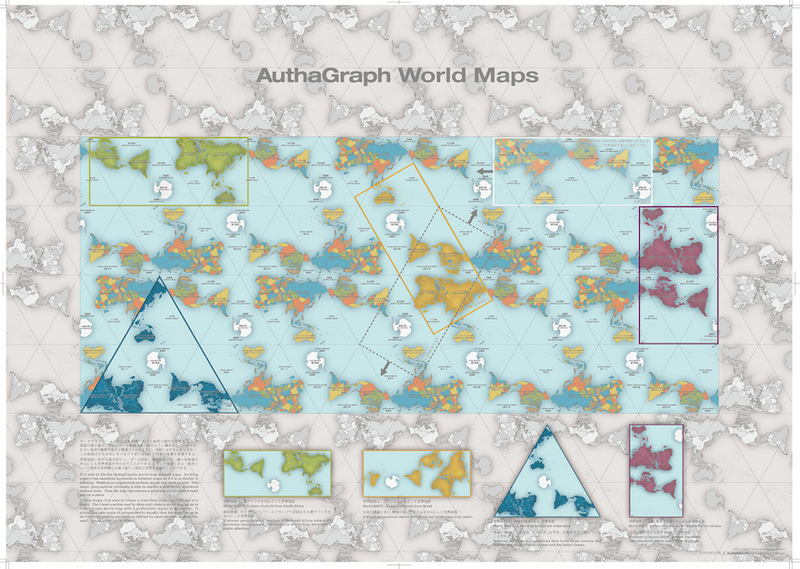
I was exposed to hundreds of map projections in school, so I'm still kind of trying to figure out what the novelty is here. It just looks like a Japan-centrerd equal-area projection. The tetrahedron is kind of neat. Projections are generally planar, cylindrical, or conical. By using a mosaic of planes, I imagine the formula for this projection would be unbelievably complex, making it much less general purpose.
When you want to represent a spheroid on a 2d surface, you have to distort one or more of shape, area, direction, distance. The objective when selecting a projection is to understand the intended purpose and audience.
If I had to make a guess, I'd say the relevance here is the exploration of what projections we most commonly use and if they're still the best choices for today's purposes and audiences.
I would love to see what Tissot's indicatrix looks like for this projection.
you nailed it. Japan has a huge love for Japan centered maps. if you look at any early nes or Sega games, all the maps are your familiar Cartesian but with Japan in the center, making the jump from ny to London look much longer than la to Tokyo.
You make it sound as if it's unusual. Of course they prefer Japan in the middle, they're in Japan! Just like Brits (I presume) have a huge love for Britain-centered maps. I'll bet not a single world map in British textbooks has the world cut in the Atlantic.
It isn't that. Or at least not only that. They are pragmatic nation. They are considering who and why would want to use the map, and then tailor it to meet the needs of an audience.
I am not sure about other countries but European maps are always oriented for north. Which works fine when you read them in book, but not necessarily when you are looking at big guide map on the street. Yes, sure, this map may show red "you are here" mark, but it is still difficult to find out your way as a map itself is always oriented to north, while you may not be.
Japanese street maps are oriented on you (most of them). When you're standing in front of it - "up" on map always means "go forward". Which might be confusing at the beginning, if you came from Europe. But the more you look at them, the more easy it is to find your way.
Hollywood Studios in Disney World had a park map where the entrance to the park wasn't at the bottom, I found it really disorienting, I think due to the effect you mentioned, I naturally want to walk 'up' to 'go forward' through the map
From my perspective, new projections are very interesting but largely irrelevant until a specific use case is defined. Just minimizing a specific type of projection error isn't typically enough, since a large amount of map comprehension is guided by the users pre-existing conception of what a map of a specific area should look like. And there are a lot of projections/coordinate systems/datums to consider, here is a source to browse through:
I'm usually working in an EPSG code, and of the 4,000+ EPSG codes I probably use 10 regularly and perhaps have used 100 in my lifetime (if anything, that's an overestimate). They are designed this way, most of them simply represent a small area of the earths surface well. Since I primarily work in the Northeast United States, I don't need to use a whole lot of them.
I'm playing loose with terms here, the EPSG codes are really 'spatial references' made up of various 'projections' and 'coordinate systems' and 'datums' and etc. I usually find it easier to just talk about spatial references because they are so commonly used as a shortcut approach as opposed to individually selecting the attributes that make up the spatial references.
Cartography includes an incredible wide body of work, defined largely by the data sets being used, the audience/purpose of the display, and the medium.
For example, if we narrow our focus to just models of the actual world this includes surveys, navigation programs, hiking maps, remote sensing rasters, etc. - all of which have very little overlap concerning data, audience, and medium.
I build geography products, but I'm not a researcher - hopefully someone with more research experience can chime in, but perhaps your questions is too broad given how deep various geography niches can run. I know I certainly haven't even started to answer your question.
I think Google has done a lot to get us away from different projections with EPSG 3857 and 4326. It's both a blessing (because you can expect most geographic data to be available in that format) and a curse (because 3857 is kind of a shitty projection and the standardization sort of disincentivizes people to learn about the intricacies of coordinate representation).
Totally agree about prevalence of 4326/3857 as a net positive. Given I still find projection/coordinate representation a little tricky, I think the chances that widespread education on the subject would ever exist to be pretty slim. Might as well just have a good default.
Displaying state/country level data using EPSG:4326 isn't great, thankfully it doesn't happen often.
There is some research on getting cartography from static 2d (print) to interactive 2d (web/devices), like always having a locally optimized projection at any given time.
While interesting, I'm not sure the actual map as pictured is a "good design":
One of the strengths and success criteria of the Mercator projection is that it allows us to largely ignore the vastness of the Pacific Ocean on our maps.
Notice how much of this map is taken up by it. While interesting from a planetary perspective, it simply isn't that important to everyday life of most map users.
The proposed design thus has too low a land area to map area ratio to be very useful.
The projection itself would be useful as a digital map (with zooming and panning) or as an icon, though.
> One of the strengths and success criteria of the Mercator projection is that it allows us to largely ignore the vastness of the Pacific Ocean on our maps.
...which would be indeed useful if your country and its neighbors are on the opposite side of the Earth from the Pacific. If your country and most of its important trade partners are sitting right around the Pacific, the "strength" is now shortcoming.
Frankly, I didn't know so many people would claim that a world map centered around Europe has some inherent virtue, instead of being the result of local convenience (nothing wrong with that). This is the same kind of feel-good story as "Fahrenheit is superior because 0 and 100 are at human level."
I live in Australia, and having a map that centres on the Pacific so that Chile is in relation to us... is not very useful. Our political, social, cultural, and economic ties have very little to do with South America. The Pacific Ocean almost literally takes up half the planet. A general-purpose map can benefit from diminishing its importance (after all, are the seas ever any other colour than a simple plain light blue on these?). The benefit of a Euro/Afrocentric map is that the split goes down the middle of the Pacific Ocean, and there's only a couple of countries there, whose tiny islands are rarely shown on maps anyway.
This equal-area map dramatically distorts the shapes of the landmasses, and they're the very thing the map is there to show. Brazil is pregnant; Australia has a tumour; China is smaller than Australia, instead of being 25% larger; Saudi Arabia is as big as India; so on and so forth. The projection lines on the map do not match up with how humans see things - this is not a map for humans to use, since the only way to make sense of it in a practical way is to interpret it with a tool.
But map should be accurate in the first place. It's not like you can just ignore things you don't want to see there just because they are naturally to big and take up too much space
Actually humans can do that. We orient ourselves using landmarks. If you look at theme park maps, ski resort maps, maps of tourist areas downtown produced by local organizations, subway maps....
All of them are wildly inaccurate in terms of proportions and distances. But notice - almost all are oriented to people not very familiar with that area. Certain big monuments may be left out (the highway that runs by water park, the big electric station across the street etc.
Harry Beck invented the schematic map in 1931 for the London Underground (the worlds first underground railway). At first it wasn't widely accepted as a good idea (because it distorted relative distances) but over time has become a design icon and repeated elsewhere.
I get what you're saying, and you are right, of course.
I'm trying to think of this not from a prescriptive position, though, but thinking of "why do people like Mercator". And I believe that people like the perceived efficiency of Mercator, in the sense that you can make a world map that fills more of its area with land mass.
Or, addressing your comment more pointedly: yes, yes you can. You can ignore the Pacific Ocean on a world map most of the time. :D
A decorative toy map like this doesn't have to be accurate. Yes, you can ignore things for convenience. If I make a map that ignores the Pacific so I can focus on landmasses, it doesn't make the actual Pacific disappear. So yes, you can absolutely ignore things you don't want.
What does it mean, "as accurately as possible"? Is that stretched-out Brazil accurate? Or that shrunk China? Pretty sure a lot of areas of this map aren't very accurate.
Do you think it may be your bias based on your entire lifetime of looking at Mercator projections? The purpose of this project is to make it an accurate representation. The observations you make are precisely why this made was made.
That's simply it. Mercator won mindshare because it was most useful for people who needed maps to do their jobs. If I'm setting a course for some destination I don't really care what the land area of Greenland is, I want to know the correct heading.
This map may solve some imaginary problem of public perception, but at the cost of losing valuable information easily gleaned from other maps,like northern and southern hemisphere, which places share the same latitude, which places share the same longitude. These are physical distinctions which matter.
>One of the strengths and success criteria of the Mercator projection is that it allows us to largely ignore the vastness of the Pacific Ocean on our maps. Notice how much of this map is taken up by it. While interesting from a planetary perspective, it simply isn't that important to everyday life of most map users.
Totally agreed!!! To say nothing about totally irrelevant places like Africa.
I've written up some of the other advantages of the Mercator projection that you've missed, here:
In short, it's the best and most useful design and nobody other than maaaaaybe some planetary geologist should possibly concern themselves with something as irrelevant as objective reality.
Normally, I don't use maps to compare the size of continents. That's what tables and lists are for. I use them to see where geographical areas are relative to one another. Others have other needs, depending on what they do with their lives.
I think you bring a nasty tone to the conversation, and you bring straw men and appeals to emotion with a rehearsed disregard for the practical issues others work with.
The comment I quoted was incredibly dismissive with "it simply isn't that important to everyday life of most map users".
In my personal opinion - and I'm not that big of a map expert - the reason Mercator projection is popular is because it makes the United States as well as Europe bigger and more prominent, and shrinks areas its users care less about. It has nothing to do in my opinion with showing where geographic areas are relative to one another, as you state. If that were the actual issue, don't you think distortion of the oceans would be a big issue? After all, that determines where these locations are relative to one another. If you look at any more modern projection (including a view like this - https://i.redd.it/iqoed05vvfux.png ) you will see that the aspect you say the projection is good for (showing where areas are relative to each other) is better-served by those more modern projections. So it can't be the reason you state.
In fact what I parodied isn't a straw man argument at all: it is the fundamental reason (in my opinion) that the Mercator projection was, and is, popular.
You don't know this, but the reason for the "nasty" tone is because until I edited it to be very, very clear in its current form, my draft read to me like I was actually making the argument! (Because people do think that way.) I had to make it 'nasty' because edited even very slightly, it no longer sounds like a parody or satire, it sounds completely earnest. Hope you can understand my perspective on this and why I chose to share it the way I did. With a little imagination, you could see that if I edited it only slightly, it would be taken to be a genuine defense of the Mercator projection for the actual reasons I stated. I wanted to avoid that.
I understand. The projection you link to here is the one I keep in my living room.
About satire and/or parody: I would try to master the form first, as well as finding out where it's effective. 'Allo 'allo and Candide are in my opinion brilliant examples. In a rational discussion it easily appears a bit like mockery, or "did you stop beating your wife".
As for the comment you replied to: I find it very credible that these things aren't so important to everyday map users. The Mercator projection does have its advantages for some applications. Other projections for other applications. Putting a sphere on a rectangular piece of paper will involve tradeoffs.
The sheer utility of a suitable projection far outweighs any notions of trying to put any particular nation or continent - for most people.
It looks like this is just another "equal area" projection. Many of these exist. Map projections are design to minimize certain distortions but at the expense of additional other distortions. Obviously since the world is round, you cannot minimize all of them. Other examples of distortions that a projection can aim to minimize are: distance, direction, scale, angle.
An example of another existing equal area projection is the Mollweide projection: [1] which you may have seen before.
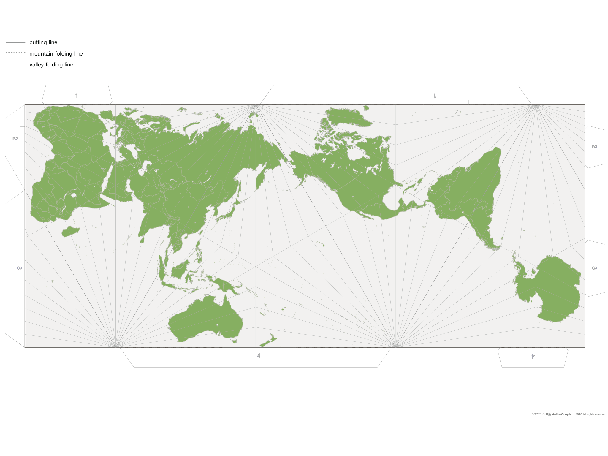
Correct, but this is one that has two important properties: It tiles, so it can be used for web maps, and you only need to rotate it to always have it point north, so it can be used for mobile maps.
Google Maps, and similar tile systems, can’t have the local area undistorted and pointed in the right direction without these properties – and this map fulfills them.
The AuthaGraph map is an equal area map, not a conformal map, so its local maps are distorted. For example, you can see that the meridians and parallels fail to meet at right angles.
The similar Lee Conformal Tetrahedric projection (http://www.csiss.org/map-projections/Miscellaneous/Lee_Confo...) has undistorted local maps, at the expense of somewhat large area differences for different regions (though perhaps not as bad as Mercator).
For one thing there is massive distortion of relative distances in southern parts... New Zealand or Australia to Antarctica is something like 4 hours flight, not halfway across the planet.
You're looking for a map where a straightish line gives you the direct path between two points? That's completely impossible. Flying from LA to Tokyo will take you over Alaska. Try to work that one out on a map.
(Yeah, you can make a map where straight lines work, but only for a chosen point of origin or antipodes around that point.)
Then why are you labeling it "completely impossible"? Here's a perfectly sensible straightish-line path between LAX and NRT, using a polar-aspect orthographic projection:
Yes, if you cherry pick the right projection for a particular route you'll get something like that, which is exactly what I said. But plot Johannesburg to Sydney on the same map.
What I said is impossible is to have a map where all routes between pairs of points look sensible. It gets worse if you optimize for other factors, like making maps equal-area, conformal, rectilinear, etc.
You can see at the bottom of the second poster that the same projection admits different framings of the tesselation plane to reflect different purposes. The one in the triangle seems ideal to reflect a focus on Antarctica and indeed conveys the fact you mention.
The only map I can think of from the sphere to the plane (and periodically tiles) uses genus 0 Riemann surfaces and quadratic differentials. And I know he didn't do that.
Nonetheless, there's a fascinating work by Anton Zorich called "Flat Surfaces" (it's a great discussion with lots of pictures))
https://arxiv.org/abs/math/0609392
The geodesics on a flat plane is the straight line -- while the geodesics on a sphere are the great arcs. So there has to be a fair amount of distortion.
I could imagine just drawing a map of the world on the surface of a cube instead of a sphere. That might come out pretty bad.
The Good Design Award is not prestigious anymore, nowadays they routinely allow about any company to feature a good design logo on all kind of ridiculous items like PET bottles and so on.
I haven't calculated the distortions yet, nor found anyone who has, but I'm guessing it's inferior to dymaxion or waterman, plus it cuts out a little bit of the map to make it fold right.
However, it's a RECTANGLE, that's huge. that means we can use it on screens and that non-map geeks would be OK with it.
Okaaay... I find this map is a terrible design in several obvious ways (obvious as hurting my eyes in a matter of seconds).
* Blue colour for lands. No comment...
* Most space, and especially the main one: center, is occupied by boring useless oceans.
* Then the remaining of the central space is occupied by the largest countries: very little information there.
* The most interesting parts, i.e. where there are plenty of small countries with fancy borders (hence mostly Europe and Africa, followed by Near-East and South America) are rejected to the side.
* To add insult to injury, those parts are the most slanted and twisted.
* Finally, there are no axes clearly remarkable, no North, no South clearly identifiable, which should be the basis of describing a planetary globe. The deformations and transformations discard or at least hide every easy bit of information, no orientation is immediately possible.
So - even ignoring the colour and the point chosen for tesselation, which your first four points address, as you say this projection is bizarre as it has awful distortions (see the width of south vs North America and how the meridian lines are spaced), and the lack of navigability bought about by the twisted axis, and absence of north and south.
You want to show the globe accurately, you show a globe.
You want a better projection - turn Mercator on its side.
Most space, and especially the main one: center, is occupied by boring useless oceans.
Most of the world is, in fact, covered by ocean. This map cleverly is centered on Japan, the country that awarded the design. It appears to be fairly well proportioned and to not weirdly distort land masses that are typically wildly distorted, such as Greenland and Antarctica.
That doesn't mean the ocean has to be given prominence on a map, the same way documentaries are not dominated by silent wide shots "because most of the time nothing interesting is happening".
It's of note that there are some ways in which a flat map can never accurately represent a spherical geometry; for example, not even any small patch of a globe can be represented on a flat map with all distances kept faithful.
ETA: I shouldn't be so quickly dismissive, perhaps; it's also noted that this "AuthaGraph" map has certain tiling properties I'll have to think about further.
It tiles, so it can be used for web maps, you can just rotate it slightly and always have it north-pointing, so it can be used for mobile maps, and it shows the world in an equal view. And it doesn’t distort the shape of continents either, only the composition.
Mercator is not area-preserving. It's angle preserving. It's perfect for things like Google Maps, because no matter where you zoom in, a small geographical area will not be distorted. It will merely be represented at a different scale. When zoomed in, there are no distortions using Mercator.
Can't you tile any projection? At least can't you nicely tile all those that have a rectangular boundary?
Rotating north-wise for close-up views would work of course, but close-up you could just use a "proper" UTM projection instead. For the global view this map feels gimmicky/artsy and not useful for everyday usage.
Disclaimer: I like this work very much and I am super happy a map won this award! I just feel that it has very little use outside of design or art.
Cutting the map in the Pacific just makes a lot more sense rather than cutting it in the Atlantic. Do we really need most of the space in the middle of the map to be water?
If you want to dynamically see how projection affects shapes, check out the Mercator Puzzle Redux (the original seems to have bitrotted). The object of the puzzle is to match the countries to their real locations, and it demonstrates the distortions as you drag the countries around.
It might be a good design work, but why does half of Sahalin island and Kuril islands which are the territories owned by Russia are marked as Japanese here. I wonder if this work would win the prize if those territories disputed only by Japan would be marked as Russian.
The projection seems closely related to some examples which use a Tetrahedron as projection surface. But according to the description of the process they used some sort of sub-tiled Triakis tetrahedron[1] as intermediate projection surface. This "inflation" process then rounds off the original tetraeders edges and mitigates maximum angle distortion to the four corners of the tetraeder, which can be conveniently placed in places where they are far way from land masses to distort.
To get the rectangular final shape one of the 4 triangular-surfaces is split into two and rotated to the neighboring sides. (Much like that one triangle south of Australia on a Dymaxion map)
[0] http://ameblo.jp/staedler-rotring/entry-11510382804.html