I honestly don't care about anything a news rag says about our nebulousy defined dire economic prospects unless they've taken out an appropriate corresponding short position against the market and have a record of making winning forecasts.
To be fair, I used to play poker professionally, so my disposition to this kind of talk is that it's useless bathroom chatter unless the writer(s) are willing to make a quantitative prediction about the distribution of likely market futures which they would make a corresponding non trivial bet on (which market anyway? The article doesn't really operationalize anything).
Professional politicians don't watch CNN because they lack information that CNN can provide. They watch CNN so they know what the public is being told.
Professional investors don't look to Bloomberg News for information. They look to know what other, lesser informed, market participants are being told.
Awareness of the ambient information supplied to the masses is valuable in both scenarios.
That's a fair point. I agree with you. The sentiment of the article, taken as a data point, probably has some useful properties insofar as it predicts market/voter/etc. behaviour. I wouldn't publish an article about it unless I'd tested that claim, though ;)
Or more nebulously, CNN and Bloomsberg is a vehicle for presenting a view of the economy so as to directly influence the awareness of other, lesser informed, market participants.
how could it be useful ? How could there be a single strategy that could be broadcast on national TV that could be profitable for literally everyone watching it ? What would such a strategy look like and how would not be self-defeating or feedback induced bubble-producing ?
I think Cramer is not only interesting but he makes learning the markets fun. He teaches noobs how to think (or at least, one possible philosophy out of many). How to act like a trader and how NOT to make stupid decisions. He's not there to make you money as your personal "pick-em" advisor. Because even if he was right the whole market would follow him and instantly correct itself.
Hes a coach telling you keep your knees bent, keep your eye on the ball, stay in shape, etc. What else would you expect from a one-size-fits-all tv program ?
>unless they've taken out an appropriate corresponding short position against the market
This, not so much. The only ethical thing for people in a position to sway the markets like this is for those people to have their wealth in a blind trust. You wouldn't want the most popular "financial guru" shorting a stock and then telling everyone it's going to tank.
Does it? If it's clearly labeled that you are writing this opinion piece and have a stake in its outcome, I think people can evaluate it on its own merits.
I think there's actually a case to be made that that sort of financial journalism would be much better than the veneer of impartiality that we have now.
I would find Bloomberg articles much more compelling if I knew that their authors had personally invested in their truth. At the very least, it'd quickly weed out the ones who are regularly wrong. And, if they cited the amount of their investment, it'd give you a proxy for the strength of their own conviction. All extremely critical data that you can never fully attain from prose alone.
All the average investor needs to know how to do is sell their shares and in four simple steps the media person/short seller makes their money:
1. Media person shorts stock
2. Media person tells viewers stock is worthless
3. Viewers holding stock get nervous, sell shares
4. Stock price goes down, media person cashes in.
I do think it is a bit unfair to say they need to hold their investments in a blind trust, but definitely agree that disclosures about their positions should clear and abundant.
The most important thing to look for when seeking financial advice of any kind is to verify that the person giving you the advice is a fiduciary. This is a legal status which means they're required to give you advice that they genuinely believe will benefit you the most rather than advice that maximizes their own quarterly bonus. Most "financial advisors" are not fiduciaries.
You're right, I didn't think carefully about the implications of having a news source manipulating the market they were betting on (the idea of which doesn't bother me at all, for some reason, that's a different topic).
I suppose what I meant by a bet was a quantified prediction about a well-defined measure of market health, with some stake in being correct (trust, if nothing else). A bet has the virtue of forcing one to be precise and to pick their claims carefully.
I don't think you can expect a buy the pound to the dollar advice from these guys.
The article is about what scares a selection of reputable market observers and does a pretty good job of telling their story.
As a casual observer I think it is obvious that we are at the end of a good long run. And I were to make a bet I would say that things will become obviously bad just after the US election.
Whether it will because of China, a rate hike, an inflation hike or some political event is really of secondary importance.
>> As a casual observer I think it is obvious that we are at the end of a good long run.
The economy has been incredibly weak for a long time.
- Economic growth has been close to zero for several years, and never above 3% in the last decade.
- The real unemployment numbers are closer to 9.7% percent when you factor in people who stopped looking for work. By comparison, Clinton's averaged around 5.1% and Bush's was around 5.3%.
- Our GDP to Debt ratio is 78% and climbing. It's at 104$ if you include external debt.
- The Budget Deficit Widened to 3.2% so far in 2016 and will continue to rise as more Baby Boomer retire and start taking social security payments.
The good news is that the dollar is getting stronger, and the housing market is finally coming out its recession which will help a vast number of industries that have been hit hard since the 08' collapse.
It hasn't been a very good run, but at this point I think it could break either way depending on how some of the above issues are addressed by a new president - regardless of which party gets in.
The opposing argument to that is that if someone takes a market position and then writes an article, they're accused of trying to make a quick buck by swaying the market. So, between you and those who are concerned about the desire to manipulate public dialog for personal gain, there's an unattainable standard.
Except this particular piece is quoting a large number of high profile investors who probably do have corresponding short positions against the market. There's hardly any author commentary in the piece.
I think he asked "what scares you", because he thought it would be clever to do just before Halloween. So all the responses are negative, because that's what he asked.
Well yes, though the OP was referring more to those making the statements not having skin in the game, not a general consensus of the market. If you asked 50 investors their views on the market a month before the '08 crash, I am guessing only a small fraction of them would have responded with negative indicators as well.
That is pretty much the position people on the trading floor take as well.
These "economists" at banks are not taking positions. Their job is to make you take positions, so they are in fact salesmen. The chatter is there to remind you that their bank exists and can be phoned up to be traded with.
> unless they've taken out an appropriate corresponding short position against the market
Depending on how doomy they are, some pundits very plausibly suggest how "everything is in a bubble" as a side effect of a ~35-year-running global sovereign bond bubble.
Maybe, maybe not, but for those it's prudent to assume shorts won't work as "the markets" won't stay functioning enough to pay out shorts while disintegrating all around everyone at the same time.
> I honestly don't care about anything a news rag says
You might have a point if this weren't entirely just quotes from people that actually work in the finance industry, with almost no commentary from said "news rag."
Then again, it's pretty hard to run a "successful fund" these days due to the overwhelming influence of the Fed which has washed out every other indicator. A lot of funds are shutting down and returning their clients' money because they can't find an edge. There is only one signal.
Relating to tech, it's definitely significantly harder to raise series A and beyond then it was a year ago. Seems like a lot of companies aren't getting the next round they were expecting to and as a result there's been a focus on building profitable businesses rather than investing hard in just user growth (eg. snapchat).
You can see this trend by the significant uptick in acquisitions and layoffs lately... If founders can't raise they have to look for an exit or downsize.
Feels like the market is still pretty spooked from oil and China in Q1 and then Brexit in Q2. Will be interesting to see what happens next!
How very unfortunate that they must now focus on "building profitable businesses". You know, there was a time when that was the very point of running a business.
Agreed, though it wasn't very long ago that growth was valued much higher than profitability. Maybe our opinion is (slowly) evolving? Perhaps growth-by-all-means is a perfectly valid play in an extremely network-effected market, while other markets might be better served by focusing on profitability?
> I love how none of these charts use 0 as a base for the y-axis. Lies, damned lies, statistics...
Articles written for an informed audience don't need to dumb down their charts by starting at zero. The authors assume the readers have eyes and can see where the charts begin and end.
For the specific article in question, the lowest value on the chart is 1.450, and dropping the axis down to zero would not add any useful information; it would just add whitespace. It's a chart with linear axes that is sized to capture the entire range of data. There is no trickery there.
Shifting the y-axis CAN be used to manipulate how the data is perceived, but that doesn't mean it ALWAYS should start at 0. In fact, that can sometimes also be very misleading.
In some of these cases they don't have to. A 2% contraction to the economy would be detrimental, but on a 0 y-axis based graph, that wouldn't seem like much.
What all of those graphs have in common is that they depict datapoints near or below zero, so they necessarily must include the zero. The only exceptions to this rule are Chen and Orlik's graph, for which the data only goes down to 1, yet they decided to start at 0, and Sen's graph, which ranges from 1.8, yet he went all the way down to 1.
For comparison, Feroli's data has a strictly positive range, but the graph starts at -5. Martin even went so far as to include two y-axes on the same graph, yet only one of them started at 0.
M2V is artificially low since ~2008 as banks recapitalized and sold assets/bonds, increasing the supply of money as calculated by M2 but not putting it into circulation, hence velocity decreasing. If you look at M2 and M2V they are nearly opposites of each other since the recession.
If capitalized reserves were not in M2 we would probably still have seen a decrease in M2V in 2008-2010, but not nearly as drastic, and it probably would be about flat since then, approximately tracking inflation.
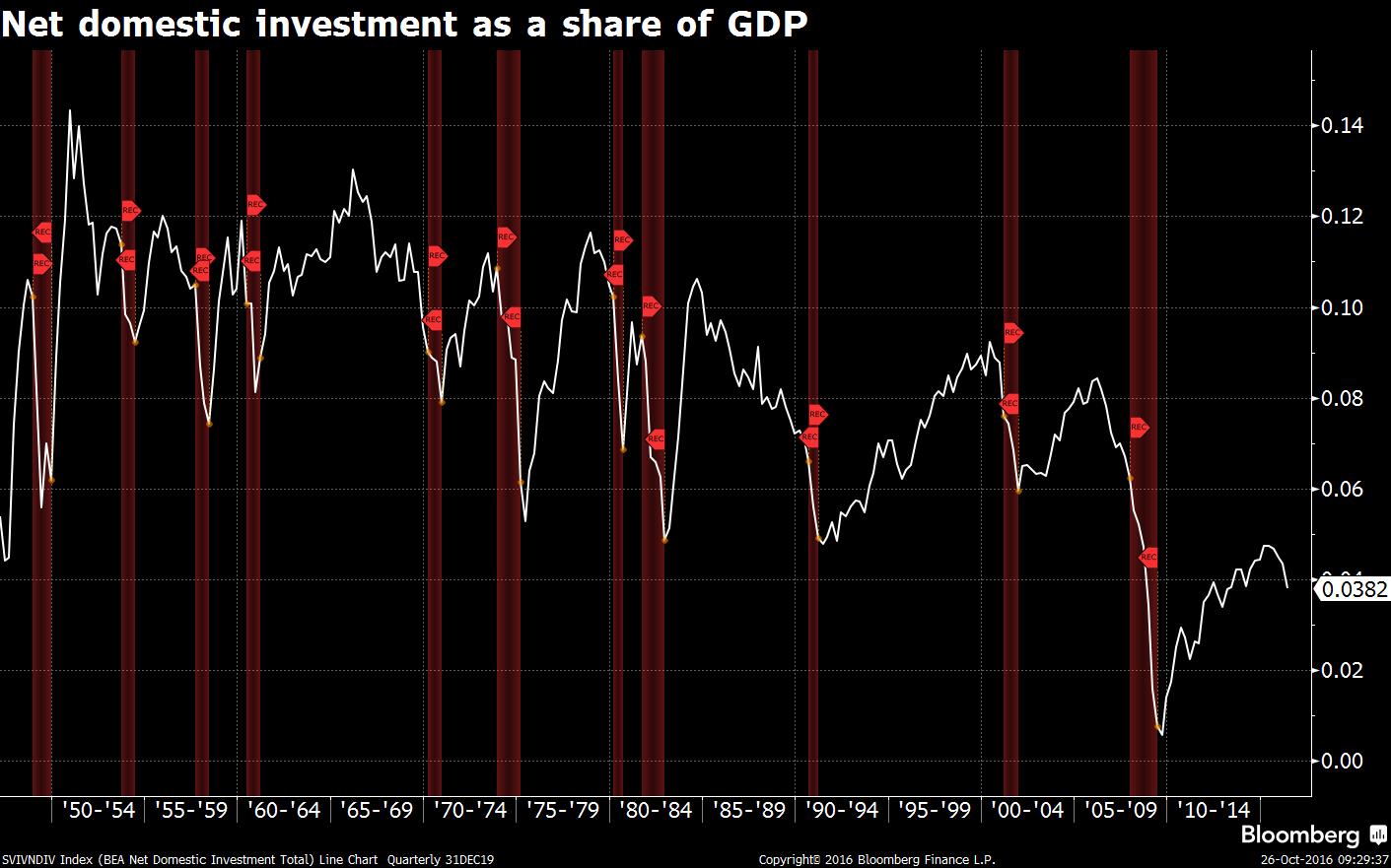
> `"We are investing less than four cents of every dollar we earn back into our nation’s productive capacity," Feroli notes. "The economic possibilities for future generations will not be promising if we stay on this path."
`
We should note the selection bias here. The author specifically asked economists for graphs that would "scare" them as part of a halloween themed post. So we are only getting the curated "scariest" charts someone could take out of all the macroeconomic data out there and not a real opinion of what they think of the market as a whole.
Often overlooked is the capacity utilization rate - at what rate is capital plant being utilized. This number has been falling since the early 1970s. On the latest dwindling bounce of the ball, it hit a peak in November 2014 with 78.9%, and has since fallen to 75.4% ( http://www.federalreserve.gov/releases/g17/revisions/Current... ).
So the 2009-2016 industrial capacity peak was 78.9%. I don't have the data in front of me, but my recollection is from World War II to the early 1970s, the industrial capacity of the US never dipped as low as 78.9%. So the modern capacity utilization peaks are less than the old historical lows.
Without much background in finance, I have a hard time knowing if these graphs are all meaningful, or if they're just cherry picked. Is there any way to tell?
There was a very good article in the London Times a week ago (paywalled sadly) which highlighted the consequences of low investment / GDP. The UK hasn't been that high in that regard for a few decades now, but it is expected to drop post-Brexit.
"With Halloween just around the corner, we asked top analysts around the world for charts about things that go bump in the night — and we're not just talking about the daily yuan fix. Here's what they said scares them."
Some of those charts do look concerning, and some of them are pretty clear, especially the delinquency rate on loans chart.
But are those three peaks all we have go off of? Does anyone know what it looked like prior to 1990 and if that era's delinquency rates too correlated with economic downturns?
"Real estate share of output near an all-time high" indicates that a new real estate crash is likely.
Median house price / median income is getting high again. Historically, that's around 2.2. Much higher, and people can't make the mortgage payments.[1] Then the mortgage default rate starts climbing. Then the bubble pops.
But it takes a long time. The time constants in real estate are many years long.
I would point out that the chart refers to Canada which never really had the real estate bubble pop in 2008 because it never had the credit crisis because banks are generally more conservative in Canada. However, the bubble is there and has been growing for a very long time, just slower than it did in the U.S..
I recently read about a house sold in San Francisco for 19.1m. This is the first time it has been on the market since 1971, when it was sold for 131k, which is 991k "inflation adjusted". Either there's more inflation than the official statistics, or there is a systemic bubble that will lead to the first default of the entire US economy in 35-40 years.
This pretty much seems reasonable. Housing demand should probably depend mostly on the amount of wealth (maybe this should be income?) in the area. It seems possible that wealth in the valley is growing at 20%.
20% growth would mean the wealth in the area would double every 3.46 years.
This morning, it was announced that the US GDP grew at an annual rate of 2.9% last quarter, accompanied by the WSJ headline "US Economy Roars Back" [1].
Oh dear, we are heading for a recession worse than the last but with even few economic instruments to recover from it and even less political will and stability.
Rates can't rise without significant damage to the economy. They've been 0 for so long for a reason. Last year they went up by 25 basis points and 2 weeks later the stock market plunged and stayed in that state for months.
It would be darkly amusing- in that "throw yourself from the nearest bridge," sense- if we ended up in another great depression in roughly the same portion of this century as we did in the last. That we have a new generation of robber barons is probably not a coincidence.
It did have a lot to do with it, but it's hardly the only problem. We didn't waste trillions in Afghanistan and Iraq because of investment bankers after all. We haven't spent the decades since Reagan gutting education and mental health infrastructures in this country because of investment bankers either.
Half that drop is solely from the reduction in coal carrying by rail in the last ten years. 1/3 of the entire coal industry in the US no longer exists vs 2006. Its biggest companies have gone or are going bankrupt. Production of coal has gone from a high of near 1.2 billion tons between 2007-2008 to maybe 800-825 million for 2016.
If you follow railroad companies or railcar builders, you know how big of an impact the drop in coal has caused.
I don't know much about investing. If I'm worried the economy is going to collapse where is the best or safest place to put my money? Just keep it in cash? Exchange it for Swiss francs? Bonds?
Unfortunately Missing: Chart (preferably Gantt) that shows how TBTF banks can be effectively broken up into loosely affiliated regional entities within the next two years.
To be fair, I used to play poker professionally, so my disposition to this kind of talk is that it's useless bathroom chatter unless the writer(s) are willing to make a quantitative prediction about the distribution of likely market futures which they would make a corresponding non trivial bet on (which market anyway? The article doesn't really operationalize anything).