Designers are ruining software in general. iTunes, the iOS music app, and Google Maps are just a few pieces of software that started out relatively usable (if not exactly stable in the case of iTunes), and have been iterated and stylized to the point where I routinely get enraged by them.
At least Google Maps has walked back that terrible accordion thing that literally drove me crazy.
I basically think design is like a cancer on the web anymore. You know what works? Craiglist, that's what works. Reddit works. Hacker News works. The old, pre-design-goober Google Apps interface worked.
I seriously want to punch a hipster every time I have to use an app that used to work and has now been designed to death.
As a designer, I agree completely. The problem is: interaction design really is a discipline in its absolute infancy. It's not graphic design. It's not engineering. It's not architecture. Pretty much anyone can just pick it up and start doing it. And the people who decide to ship shitty designs you're complaining about are more concerned with 'pageviews' or 'installs' (and in turn, their bonus) than actual usability.
Compare the process by which an app or website design makes it out into the world to how a patch makes it into an open source project. Anyone can start programming, but to be accepted as a 'good' programmer you're inevitably vetted by other, better programmers. The ad-hoc peer-review of OSS actually works reasonably well. Most importantly: it can be very critical. Most designers I meet today have laughably thin skin.
Try comparing the most successful projects on GitHub to those on Dribble. Dribble makes my skin crawl.
Anyway, you're right. Most contemporary interaction design is absolutely awful. It's going to take time for the rules of the discipline to evolve. We'd probably see this improve a lot if the apps and sites we used weren't optimized for 'engagement'. They just look like slot machines designed by Portlandia characters.
Everything you say might be right, but there is something extra to jonstokes' comment: ametures and nerds often produce more functional sites than real designers.
The mechanism here is that whatever esthetic and psychological principles are in play, an interface must also present the needed info and functionality. Craigslist and HN do that in a more-or-less bullshit free way. UX designers can get caught up in other concerns.
In fact there is a systematic bias: since we know that users don't like too much information, UX pros will want to hide info and functionality. But since no one likes boring designs, they also want to add cooling-looking (i.e. distracting) stuff.
I find that once you're trying to hide info or functionality it's because you don't know the users workflow. Understanding workflow is the key to usability, at least with LOB apps, trying to cram everyone's needs into a single table or building UI's that are essentially skins over database tables make for some awful UI's.
> cram everyone's needs into a single table or building UI's that are essentially skins over database tables make for some awful UI's
... which, after you learn how to use them, often work much faster than the alternatives.
There are anecdotes a-plenty here like our local (tiny) bank who held out replacing their terminal based with their Windows version because in tests the keyboard based, archaic, every-on-one-screen application was far more productive than the new one and this particular application is only to be used by seniors in this bank who, because of the size, are not replaced / added very often. The Windows version, although not even that well designed, has been created to be faster to learn for new employees and the screens have been designed to be aesthetically pleasing and therefor sparsely layed out over many more pages.
The old staff hates it, the new staff (not very many) is just used to this kind of easy to learn, nothing to master kind of thing.
They don't have to be exclusive though; what happened to the 'expert mode' in apps/applications? That button you ram if you are an expert and suddenly 100 screens are packed into one, keyboard navigation is switched on and I can do my work much faster than clicking HUGE easy to learn, text heavy buttons?
In a throw-away society, all this interaction design makes sense; no-one is at a job long enough to really get into software and you don't get through the trial period if you don't learn using it fast enough. In that regard you need big empty pages with videos explaining what everything does and a boned out interaction process that has been carefully thought out.
I think we need that if the budget is there, but I think we need the expert mode as well and that, as far as I have seen in my life time, (interaction) designers are not very good at packing dense nor is it needed; if you are an 'expert', you'll cope (or don't care in some cases) about the (interaction) design.
Reminds when nvidia removed their control panel and replaced it with... I'm not sure what it was. There was 2 mostly blank white highly padded pages, a spinning 3d logo, and maybe a grand total of 4 input fields to edit? It was utterly useless. Around 8 years ago you could use a RegEdit to get the original back. I hope it's still possible. The original control panel was full of features and they simply removed them all.
The expert modes of seen (no many) have kind of been examples of what I'm talking about. User is adding a widget and it needs a category but category is not. So user has to go to category page, or in expert mode hit a key combo to bring up that screen. The easiest way for beginners and experts is to allow the user to add a category in the same workflow as adding a widget.
It's hard to disagree, but I think the problem is more fundamental: way, way too many people working in tech assume that because Google and Facebook and Apple and Microsoft are huge and financially successful overall, that means they know what they're doing and should be emulated.
This has been true in recent years with the trendy but awful design. It's not just the typography. The obsession with flat design and giving up all the distinctiveness and affordances of other styles might even be worse.
It's also been going on for a long time with assuming if Google says it in its guidelines for webmasters then it must be good, as opposed to being good for Google's search engine.
It's even going on with software, specifically the various libraries and tools these organisations produce. Some of those libraries and tools are competently executed, but few are as remarkable or transformative as the hero worship might suggest.
This culture of emulation naturally leads to the kind of bland, homogeneous, poorly conceived work that is all too prevalent in our industry today. How could it not?
Ironically, I was just reading another HN post about a jobs board for older geeks, and the related discussion about the endemic problem with ageism in our industry. What we are talking about in this discussion is literally what happens when you hire a bunch of very young, very inexperienced, very untrained people, given them very snazzy hardware for their very good eyesight and their very dexterous hands to work with, give them effectively unlimited resources but very limited accountability and management, and leave them to run the show.
Anyone who wants to do better certainly can do it, just by studying relevant fields like graphic design and usability and by acquiring the necessary skill and experience (or, for businesses, by hiring people like that). But unsurprisingly, the people who are willing to go against the grain tend to be those who have been around for long enough to have other ideas and to have seen the same sorts of mistakes made before, and who wants to listen to them when you can go watch someone from the Apple team wax lyrical about their new barely legible font, someone from the React team misunderstanding basic MVC, or someone from Google who has never run a small business web site in their life telling everyone what makes good quality content?
Eh... I think that's true in part, but I've also met people who really love that flat Metro design. It's hideous in my book, but it's trendy, yes, but that's because some people like it.
More so than that, looking at website design from a monetary perspective: It's fast, cheap, and easy. It takes alot less time to put together a sleek modern website that utilizes the flat but nifty new CSS3 features than sitting down at the drawing board and creating something truly beautiful... which, when you're done, may or may not turn out how you dreamed. With websites in high demand, it shouldn't be any wonder than a typical but FAST-and-CHEAP-to-produce site will win out for the majority of cases.
I actually really appreciate Google's Material Design... That said, many of the implementations skip or gloss over some of the nuances in web interfaces, and/or overdo aspects in practice. I also like a little more flat over the bubbly/hasbro toy look that was common in the late 90's.
That said, it's about nuances... In the end, I find that starting text only, and laying things out in a text editor (like an ansi menu screen) is a pretty good place to start... If you can't fit it on an ansi screen 80x25 for desktop and 40x50 for mobile, then you need to adjust your workflow to be simpler.
You don't need everything on one screen with magic scrolling effects... by the same note, if it's a simple form, you don't need to make it a wizard across six screens either.
Not everything about Material Design is bad, but many of the implementations are bad, including many of Google's.
Problems with Material Design include:
    - overly bright/saturated colors
    - too much animation
    - obnoxious easings
    - an overly dry look -- kind of like formal stationary or plastic
    - centered text and content at the tops of pages (I don't know if the specification encourages this, but it's become more common)
    - bad usability with forms. A text input should be a box, not a line, and it doesn't need to distract users with animation when clicking on the input.
I agree on the colors, it doesn't need to be pastels, that's easy enough to change.
Animation, if it doesn't detract, or actually adds to the experience, sure, but agreed, some of it is superfluous.
Easings, that goes with the animations.
The dry/stationary look, I think is intentional, and I like it.
Centered text/content is arguable, I think it depends on the form and can vary.
As to the text inputs being lines, I actually prefer the material way, it's closer to what you'd see on paper forms... it's less intuitive compared to what we're used to on a computer, less so when you compare to many paper forms. The boxing that you get in say Bootstrap, by comparison I find a little more distracting than the placeholder->label animation you get, which is similar, but different to a paper form... and works exceedingly well for phones/tablets, though less impressive on a desktop, but that leaves room for additional details.
I don't mind pastel colors. Material Design doesn't recommend pastels -- they recommend garish, over-saturated colors.
The docs say:
"Material takes cues from contemporary architecture, road signs, pavement marking tape, and athletic courts. Color should be unexpected and vibrant."
Things like pavement marking tape, road signs, and athletic courts are not aesthetically-pleasing models of design, and it shows in the final result.
Recommended colors like #e91e63 and #ff5722 look terrible on many monitors. Looking away from the monitor leaves a reverse impression of the color in my vision.
Many sites these days don't consider that some people get disoriented by animation. If I'm trying to read an article, and parts of the page are animating with parallax effect or growing/shrinking, it pulls my attention away from the content. I don't want components to flip over, bounce, or use other "cute" easings. I sometimes stop using websites just because of that.
> Centered text/content is arguable, I think it depends on the form and can vary.
Centered text is the Comic Sans of page layout. It's one of the tools that people who don't know about design reach for first. Centered text should only be used extremely sparingly, so that the viewer doesn't really notice it. Lately, centered text is becoming the focal point of web pages. Some sites are even creating "pyramids" of focus at the tops of pages, using centered text with a user profile picture on top. It looks really bad.
> As to the text inputs being lines, I actually prefer the material way, it's closer to what you'd see on paper forms
A web page is not paper, because you can't "write" anywhere on a webpage. It should be clear where one can enter text -- a line does not communicate that well.
Also, having the line animate when clicked on does nothing useful except distract. When I click on an input, I will know that it's focused by the existence of a cursor in the text area.
The end result is that multiple areas of a page are animating at the same time. The interfaces become confusing, because animation says "look at this part of the page", but multiple areas are animating without coherent reason.
Meetup.com's new app and color scheme is a recent example of the serious problems with Material Design. Even my group's members are complaining about it.
Basically, Material Design has a very strong personality, and it's the kind of personality that many people are not compatible with. In my opinion, it might be okay for a niche product, but is not a good choice for websites aimed at large audiences.
More so than that, looking at website design from a monetary perspective: It's fast, cheap, and easy.
I'm afraid this is probably the main reason flat design caught on. It's achievable by developers with little design background, and can be implemented with little more than a bit of boilerplate from some CSS framework for a web site or the equivalent in a UI builder for an app. No need to hire anyone with digital artwork skills or experience designing more complicated UIs, and no need to prepare and serve the associated assets as part of your site/app.
Unfortunately, from a usability and accessibility point of view, current trends in design and typography are still objectively awful in various ways, and from a brand distinctiveness point of view, it's still a severely limited style to work within. There's an (actually quite reasonable) argument that a lot of designers and marketers who promote branding aren't generating particularly good returns until you get to large, well established, well known businesses anyway, but the usability and accessibility flaws hurt everyone.
I would agree that interaction design for the web is in it's infancy inasmuch as it still displays a tendency to stick it's fork in the power outlet when left unsupervised. Otherwise I disagree strongly. All of the design lessons learned leading up to the .com implosion have had to be collectively re-learned at least twice (remember jello mold layouts? eyeroll) in the last 15 years. The root problem: designers either refuse to make peace with the fact that layout and control interfaces have been largely solved problems for close to 20 years now, or they fail miserably at conveying these limitations to potential clients.
I'm not saying progress isn't happening — I'm saying that there's a big difference between a discipline and what interaction design is in 2016.
I think these incremental steps are good, but it's going to take the equivalent of the Bauhaus to solve this problem. You need a strong foundational movement to anchor people's work. You're right that the problems have been solved, but they aren't being upheld very well.
nope. it's not. everyone who studied industrial design have it down to a science. what happens is that webdesigners and silicon valley ued/UX people came from graphic design. so it's new to them. and the industrial design people are shunned away just like system analysts are on the coding side.
Designer here, how can we solve this? I'd love to have my work peer reviewed because design is so subjective and I feel like I'm probably making elementary mistakes despite learning for years.
Serious suggestion... Open up a text editor, and lay out your functionality in 80 columns wide, and 25 lines high... This is how it was in the really old days with text interfaces... everything comes up fast, you can create boxes to isolate information, but literally can only fit so much text on the screen... Now, take this, and turn it into a relatively scaling gui... for mobile, go 40x50.
There is something to be said from experience as an ansi artist and a sysop in the bad old days before the web.
One big problem I see is, that power users need something quite different than first time users. You can make some compromise by tucking away advanced features without removing them, but in general it's still an issue.
First time users are probably what you focus on, the rest just has to be a tad better than the competitors. First time users need to be convinced by pretty design and a super simple linear workflow that solves just one problem.
Power users couldn't care less about design (SAP is still alive). They love it feature packed and want to access as many options as possible with few clicks. The extremes are icons without labels, color coded shortcuts on every keyboard key¹ or command line interfaces.
But it's easy enough to initiate those behind menu options, with hotkey combinations available in general... That's how advanced usability options are usually done. You don't have to show it all onscreen at once.
I have no idea where to look on that page (meaning the Drudge Report website).
Maybe once you're "used to it" it becomes easy to parse but I've just spent a minute looking at it and I'm not even entirely sure what the site is about? It's compared to mainstream news sites so is it meant to be a news site?
For example the main headline right now is "TONIGHT: HEAVYWEIGHT CHAMPIONSHIP!" What does that even mean?
Everywhere? It's a page full of selected news headlines. You're not supposed to look at some particular place (except the big letter, highlighted few headlines that are presented as the most important), just to check which ones you want to open.
So, not totally unlike the first page of HN.
>For example the main headline right now is "TONIGHT: HEAVYWEIGHT CHAMPIONSHIP!" What does that even mean?
That tonight is the big battle between Hillary and Trump?
The front page of HN is a single list with headers at the top of the page and a footer at the bottom. It is a numbered list which shows me the title of the article, #votes, #comments, the domain name, who submitted it and the time since posted. At the bottom of the page there is an FAQ to explain to me what the page is if I've never been there before. Even if I've never heard of it before the title "Hacker News" gives a good indication of what it is.
The drudge report has none of that. What are the three columns? Why is there a single column of content above that? How is the content divided / presented, is it just random? How fresh is the content? Where do the links lead? Are the links user submitted or is it run by someone? There is precisely zero context on who the page is by or what the site is. In addition, in the few places where I am given a picture for context which is clearly linked to a story I can't even click on the image to take me to the story.
Baffling that someone could think this is a well designed site.
Edit: After searching on Wikipedia to discover what the Drudge Report actually is I'm still far from impressed. For an example of what I'd consider to be a good "aggregation site" here is one http://www.jimmyr.com/
Because it doesn't need most of them. It doesn't have comments or voting -- just suggests stories the Drudge guy likes.
>What are the three columns?
Just 3 columns.
>Why is there a single column of content above that?
Because those are the "headline" stories -- as evident by the larger font too.
>How fresh is the content?
Quite fresh/breaking.
>Where do the links lead?
To news stories. Just clicking one or two makes that evident.
>Are the links user submitted or is it run by someone?*
It's the Drudge Report -- so, we can assume it's Drudge's report.
These questions are basically just questions someone just landing there might have. Not issues that hurt the actual readers of the site -- like the one's the original post complaints about.
> I'll bite: what kind of news website you don't fine overwhelming?
Traditional blog-like fromats, e.g. Slashdot, where each headline comes with the top para, which you can skim. If you don't skim it, then it's welcome filler spacing out the headlines.
Of course, content matters more than presentation. HN is better than Slashdot, and probably needs to keep its denser format.
>>BTW: I assumed "heavyweight championship" referred to boxing, not to politics. See the problem?
> That's not about the site's design though, just the phrasing of some particular headline.
The problem is inadquate info on the front page. I.e. only getting a headline.
I had to confirm, but Drudge is still unreadable to me. It looks too much like Facebook.
Both of them emulate tabloid newspapers (Drudge at least does it on purpose). But that's why I don't like to read them. Small bits of information everywhere, unsatisfactory individually, yet too disorganised to be treated collectively.
On my S7 Edge, the page is too small to read (except for the headline, obviously).
However, I can pick a column and double-tap it. The Android browser smart-zooms, and I can read the content just fine. If something's too small, I can finger-spread.
For instance, it's easy to smart-zoom the link list in the center column, scroll down to a columnist, finger-spread to increase the target size, and click through to his latest.
The cancer has now spread to each professional, industrial, each institutional site I use. One after another, they fell into the mobile-friendly but desktop-unfriendly and any-real-use-unfriendly fad: white space everywhere, flat design, white text; the amount of information on a screen has been divided by 2, by 3, by 4, I don't know, with wide spaces on the sides, with huge vertical space between each line of information, and each 'cell' containing fewer pieces of information. Oh, and bloody fat flat meaningless icons everywhere.
Was it at least to add features? to improve features? No, there are less features, it takes more operations to achieve the same features, and there is a whole new set of bugs, while the previous set had been corrected along the years.
Moreover, the result is generally more sluggish and ressource-consuming than the previous version.
There are practical reasons for it. My business website gets 98% mobile traffic. Pretty much anything I'll do about it, I'll do with mobile on mind. If the original design wasn't responsive by default, I don't think I'd even implement a different view for the desktop.
No, it's a landing page and virtually all visits are from mobile devices. It's the first click of unique visitors - they didn't have the choice of the platform.
I agree with you. But what I find hilarious about it is that in the 90s, there was a meme that software engineers cannot do usability very well, and you need specialized designers.
I think it all comes down to humility. Think about and respect the user. Do usability studies and follow their results, like Microsoft used to do in 90s. Don't let your notions of aesthetics overrule the needs or wishes of the users, and especially wish for things not to change.
Not saying this is always the case but I wonder if, in some of the cases, this is what makes it hard for designers to get accepted in open source:
the fact that many of the developers are also users and as such are pretty opinionated while the designers that come to open source might often be very eager to "set their mark" on something?
I doubt there are many designers working on OSS who don't also use it.
I' even doubt the premise that there are terrible open source UIs created by designers. The vast majority of OSS GUI apps were probably styled by programmers, and I think they proved quite well over last 20 years that they chose well when not becoming designers.
The problem with design is also that it doesn't work very well in the "bazaar" style of development. Consistency is possibly the single most important feature of good design, and it gets hard to achieve without central authorities.
GNOME employs professional designers and produces consistently the worst designs in open source: kill features left and right in the name of "simplicity" then add excessive padding to what's left all in service of achieving that "ugly but useless" state that everyone loves.
Gnome 2 and KDE 3 were IMHO the best - well designed for usability, traditional, consistent, with good guidelines. I think those prove that it can be in OSS.
However, I don't think users care that much about consistency, unfortunately (even though I think it's important aspect of design). Look at web, every website is different and it's considered a good thing by designers. There is no consistency on web and yet desktop apps struggle to compete.
OSS interface design is really crazy, IMHO. Even quite popular software such as GIMP and InkScape, which I myself use all the time, have some (again, IMHO) absurd UI mistakes.
With GIMP it's the sliders in the tool options. Once you have them figured out (the trick is, they behave differently when you drag on the top half of the slider or the bottom half ... it's indicated by the cursor changing, but still) they're kind of usable, but still awkward. If you don't know how they work (and they're quite unlike any other GUI widget I've encountered), you click and now your brush size is 1233.12 pixels, so you just decide to enter the value manually by keyboard. There's a couple of truly useless default values for some tools. Third, if you want to adjust or create a new brush, or gradient, the workflow has about 2 popup dialogs too many. I could go on ...
In InkScape, my main beef is the gradient editor. The old one was awkward and counter-intuitive when adding new stops. Then they made some huge upgrades (honestly, a lot of great improvements btw), also changed the gradient editor. Now it's slightly less awkward and slightly less counter-intuitive, but not much.
These are two great pieces of software and I love using them for the most part (although GIMP really needs to grow up and support 16 bit colour), it's just that these are some really odd choices for a couple of UI widgets that get a serious amount of use in most workflows. And I don't understand why, they could literally implement a design based on any vaguely similar control widget in other software and it would be 10x easier to use. Yet they choose to roll their own very unique behaviour that honestly just doesn't work very smoothly.
I wouldn't judge designers this way. I think they are users too, but they have a certain aesthetics, that can be even more subjective than, say, software architecture. And in OSS you cannot really do usability studies, it's expensive (although commercial companies don't do them much today either, I think).
I think the problem really is lack of humility of some designers, which was trend-set by Steve Jobs. SJ didn't do what users wanted, he had a very strong sense of his own aesthetics (lack of buttons, for instance). This IMHO works if you can create fashion trend around it, but otherwise, it leaves a lot of people (maybe even majority) in the cold.
Apple was working on the tablet project (iPad) long before they were working on the phone project. First iPhone designs indeed had physical buttons like iPods of the time. Then they decided to marry the phone project and the tablet project. Hence a phone with a multi-touch screen.
Of course all of these are marketed as if Steve Jobs was a genius and everything was so obvious to him from the beginning. That's just not true.
You're right. And I am one of the people criticizing ribbon, because I think menus and toolbars have different purposes that shouldn't be conflated (menu is for all possible UI actions with no possibility for user to customize, while toolbar is for most common UI actions and other interactive elements with possibility to customize). With ribbons, the possibility of customization is gone.
But to the point, I think the "more to it" is simply inertia of existing user base. Which is no small consideration apart from just usability.
Addendum: Actually, lack of customization in modern software is also very interesting topic for a discussion.
Anyway, I don't understand your distinction there, since every part of software can be customized however you like. Most users don't customize, and don't have any need to if the the software was properly designed for their use-case.
Two reasons. First, you don't want to, just like you don't want to customize main menu. There should to be a place that has every option, which you cannot unintentionally mess up.
Second, ribbons are very carefully designed for looks, and it makes them hard to customize. I think it could be done, it's just not trivial.
So, for example, in MS Office, they don't bother with customization. If you want to look at how customizable software looked like in the past, look at for instance AMI Pro. You could redefine keyboard shortcuts and toolbars any way you liked.
And we are not even talking about software like Emacs, which can be customized very deeply.
I think some users would customize, it's very paternalistic to think that they wouldn't, and it would make them more productive. But it's just not in the fashion right now.
> Most users don't customize, and don't have any need to if the the software was properly designed for their use-case.
I don't think it's possible to design general purpose software like word to any specific use case. There are simply too many users and too many use cases, from grandma writing a letter to professionals doing mail merges (or whatever people do with word).
Why, because people complain about it? Aren't you just questioning the value of usability studies by employing vague usability anecdotes, which when collected would form a study?
In other words, we used to have developers who don't respect users, now we have designers who don't respect users. The users are pretty much where they were before, plus we get to have arguments between developers and designers. If the average farm was run like the average software company, all the animals would be dead within a week except for one cow/chicken/tractor hybrid optimized to maximize karma on HN.
> But what I find hilarious about it is that in the 90s, there was a meme that software engineers cannot do usability very well, and you need specialized designers.
I think what's changed is that engineers do not work in a vacuum anymore. You can follow Apple's or Google's UI well-known guidelines with a little branding and your app will be fine. Of course, that requires humility as well.
It's also true. But really the core of it is that usability is hard. A lot of ux designers cargo cult it, a lot of techies don't give it a second thought and now we are all in this mess.
To be clear though ux designers are often better than non-ux people but people confuse "designers" with ux designers.
Today, it is not a requirement of designers to build something usable. A lot of designers don't even build something interactive, just a Photoshop design that has to look good.
The necessity of good ux on a site is as apparent to somebody that doesn't know ux as the necessity of a test suite is to someone who has never programmed.
The usability issues compound when that page was created with 1.2MB of JS (and another 2MB of ads), and I have to see a loading spinning wheel when it could have been easily been static content.
...And then when the page loads, I accidentally click an ad instead of a link because the ad moved over the content that I was reading to offer me 10% of joining the exclusive mailing list.
This is literally the reason why I use ad block. I don't mind ads, but I can't stand webpages where the ad drops in an changes the whole layout. Congrats, you win 0 revenue from me!
Ditto - especially when I'm halfway through the first paragraph of an article and it slides it down offscreen, so I scroll down to keep reading, then the ad goes away and the place I was reading goes back up off screen. It's criminal.
Further, on my phone especially, I like to read articles while on the train. My trip has cell signal at every stop along the way, but not between stations. Before Apple allowed adblockers in Safari, I'd have about a 1/10 chance of actually getting the article to load before I lost signal. Now, it works great just about every time.
> I seriously want to punch a hipster every time I have to use an app that used to work and has now been designed to death.
Me too. In fact, it concerns me how angry stupid decisions make me these days. I just want to sit folks down in a chair and ask them why they hell they broke something that needed no fixing. It wasn't a problem, and now it is. I want to quote the 90s classic Billy Madison at them:
> Mr. Madison, what you’ve just said is one of the most insanely idiotic things I have ever heard. At no point in your rambling, incoherent response were you even close to anything that could be considered a rational thought. Everyone in this room is now dumber for having listened to it. I award you no points, and may God have mercy on your soul.
I read websites on a daily basis where image loading is broken without JavaScript, and where focusing the page takes over a second while it loads images — when HTML has supported images for over two decades. I read websites where even with every blocker I know of used at once can't keep them readable. I use software clearly designed to only be usable by a teenager with perfect vision and thirteen thumbs. Why do people do this?
> Me too. In fact, it concerns me how angry stupid decisions make me these days.
Are you me? I'm the epitome of the old grumpy programmer. I have this love/hate relationship with technology. One the one hand I still love it, on the other hand I hate 99.9% of the tech I come into contact with because it's always shit for some reason or other.
Me too. I had a true rage moment when I open the Clock app on iOS 10 and discovered some weasel of a designer had changed the colors to some orange / black scheme for no reason. It's harder to read and clownish looking.
It freakin' is!! Well crafted, semantically rich markup can be a beauty to behold. It's a shame webapps have obscured the craft behind an opaque veil of nested `<div>` tags.
> "Designers are ruining software in general. iTunes, the iOS music app, and Google Maps are just a few pieces of software that started out relatively usable"
Did it ever occurs to you that they had far less functionality when these examples were created? Backend programmers kept piling functionality into these apps and at some point no matter how good a designer is it just gets overwhelmed.
> Backend programmers kept piling functionality into these apps and at some point no matter how good a designer is it just gets overwhelmed.
Wow that's the first time I have heard the problem phrased this way. Usually it's the other way around -- the designers and product leads want to pile on so many features and the backend devs can't keep up, so the codebase turns into a rotten pile of shit.
There was a lot of functionality added so to address this, they reduced the contrast of all the fonts? Nope. A more likely story is, as they added more functionality they delegated what could have done by people with less skills than a programmer because there are not enough of them. The end result is the people who care about well something works are just working on the program. The rest of the hangers on are trying to make their mark by using uber cool typography. I'll be the first to admit the lighter fonts look cool but they don't help you with your real job.
How that story goes seem to be a cultural thing depending on the org culture. I've seen places where the loop goes:
1. BizDev and/or Sales identify a feature set that would enable a deal or broaden the market suitability.
2. Dev team tasked with adding feature XYZ.
3. Designer brought in to figure out how to add the feature to the UI with minimal effort.
4. Repeat.
I think this version is much more common in enterprise software and less so in mass consumer stuff. As we all know, enterprise software is unsexy and not worthy of YC/Startup culture. High touch sales also favors fewer deals with more customer leverage and really fat commissions for sales people.
Yup. I don't know how many times we've shoe-horned in a feature because it is a "must-have" for some prospective customer, and they either don't end up purchasing, or they purchase, but the must-have feature never gets used. It lingers on, forever, in ratty old functions and crufted-up database tables, and cognitive load.
I've been at a few companies that have failed because they were letting customers design their product. As in sales reps would meet with customers who would buy the product if we added x, y and z which they found absolutely critical.
Customers don't have to consider things like applicability to other customers, stability, performance or maintenance.
~10 years ago UX was all about adding animations, glow effects and colors as hints to the user. Colors are still used (but much more sparingly) and animations and glow effect have fallen out of fashion.
You sure you are not confusing campaign sites with actual digital tools and resources? It's never been a trend by designers to want to overcomplicate the design. The strive for whitespace runs so deep in most designers that you simple don't get the used car salesman mentality where every little pixel left untouched is one to much.
Not confusing it with campaign sites, I'm talking business/productivity apps.
It's entirely possible my experience was atypical, the I did a lot of reading about UX at the time and this seems to be what the "best practice" was at the time.
So if a dialog was shown the best way to do it was to have the dialog expand from the clicked element for instance. Now dialog's are frowned upon.
I've been involved in a handful of projects that fell into a situation were UI development was much slower than backend development.
Specifically, one was primarily a visualization tool. It was trivial to add various data transformations. However, the UI to render and interact with any one of those transformations would take substantially longer.
I haven't seen any new functionality in iTunes or Google Maps in years. I'm sure there are new features, but the basics have been the same for going on a decade now. Seems like they are just redesigning the UI to piss people off, just like every other clueless company out there. If you can't figure out how to make a clean map or music player interface, you're not a designer.
I doubt that was the case. I'm not familiar with those specific cases, but typically in my experience when the padding increases, the usability and feature count drop exponentially.
iTunes 12.0 was the worst update to the iTunes UI ever, and its only new feature was support for Family Sharing, which is mostly a backend/store feature. It was 100% a pointless UI overhaul.
Or, is it that designers making decisions in a vacuum are ruining software in general?
One huge problem with interface design in industry segments for which I am a heavy/detailed user is that the major design choices are made by people who have never actually used the system in question and seek no input from those who have (e.g. Focus Groups, or simply observant-to-potentially-annoying-degrees users like myself).
Case in point: ticket management and sales systems. Example 1: Ticketmaster's mobile resale interface that was replaced in 2014 or so. It was so stupid that if you were seeking, say, 3 tickets for an event, it would show you all listings offering 3 or more... even if you could not possibly purchase 3 from those sets! Many customers unknowingly bought more tickets than requested.
Any knowledgeable user would have spotted that; I did in 10 minutes. It remained unchanged and without warning until the whole site was redone.
Example 2: Tickets.com "My Tickets" account interface. In the general case, a given ticket has a barcode; they changed the mobile site to display the barcode when you drill down to ticket detail. Nice idea, since you could then just show your phone at the gate if you forgot your hard tickets. Anyway, also, in many cases, a ticketholder may want to make a note pertaining to a given ticket, e.g. "Given to Dave and Carolyn for anniversary; don't resell these, you idiot."
So, in Spring of 2014 (I think), they decided to have the desktop system allow display of barcodes as well. Um, OK. However, they implemented this by having that overlay/replace the Notes, so therefore you could not only not see any given note, you could not even see that any note had ever been entered. See the hazard here? Poor Dave and Carolyn get shut out at the gate and embarrassed because you later resold their tickets because your careful notation was silently disposed of.
Anyway, after I pointed that out to them, their solution was to roll back and give up on the barcode display feature altogether, rather than provide access to both.
All of these problems (and many others) could have been avoided simply by inviting and encouraging feedback from your power users before tearing out your load-bearing walls of code.
Changing for the sake of change as the primary reason usually never works well with an established user base. Other examples are the Nike+ web and mobile interface, Blizzard's Battle.net 2.0 (labelled by the community as 0.2), the hotmail email client portal, and the Windows 8 UI in it's entirety.
I haven't updated my iphone because I read the notes and one of the things it does is give me a "new and improved" maps application.
The last time apple did that to me I stopped being able to turn randomize on and off in the music app (they did eventually bring it back, but I was floored that it was ever removed in the first place).
The thing is, I have exactly 0 complaints about the map app. They can only make it worse.
So I'm avoiding the entire update because I'm afraid they're going to do to the map app what they did to the music app.
You know what I really hate about reddit? The inconsistency of the links. If the link is a self.subreddit link, it goes to the discussion thread, if it was a submitted link to a location outside of reddit, the link goes to that page and to see the discussion thread you have to click on the small 'comment' link.
I wouldn't say reddit works any more than a 'designed to death' site, just that it hasn't been 'designed to death.' It is full of it's own problems.
But the link does not always go the the same place. I personally am always clicking on external links when I meant to go to the discussion page. I would have the main link always go to the discussion page, if there is an associated external link, have it listed under the main link. Lets see if I can get this to show what I mean (grabbed from the front page)
    What is the most 2000s thing you can think of?
    submitted 5 hours ago by enormous-radio to /r/AskReddit
    4741 comments share

    Police vehicle rams protesters at anti-U.S. rally in the Philippines
    Link: somewhere.latimes.com
    submitted 7 hours ago by wilson_rawls to /r/news
    561 comments share
The main target is consistent, there is a clear external link if it exists. Probably could drop the Link: part.
The way I think of it is that clicking on the title is taking you to the content. For a self-post, the content is posted on reddit itself, so the content location is the same as the comments page.
That being said, they've made a few steps toward something closer to your suggestion in some places. For example, if you do a search, the search results behave this way, where clicking the title always takes you to the comments and there's a separate link (with a chain-link icon) to go to the linked content.
It's not "designers" ruining software, it's wrong or misaligned incentives and goals. Most software isn't designed with (only) the user in mind or even just with respecting the user at all. With many free software products it's a commonly accepted view that you're not the customer but the product. In case of music apps licence restrictions are involved as well. It's probably not entirely wrong to say that apps like iTunes are in part designed to meet the requirements of lawyers, which in most cases won't align with those of the users.
Moreover, developers are ruining software as well, just in different ways. Many developers focus on getting the internal design (design patterns, architecture, database design, whatever) of a software product right but tend to neglect the external, user-facing design because "UI is just a minor detail" real engineers can't be bothered with. Just have a look at applications like SoapUI or pgAdmin. They do a great job in terms of functionality but it's obvious that good usability wasn't exactly one of their requirements.
While I agree we're overdoing design nowadays, I don't think it's just for the sake of it. I think the problem is there are too many goals a site has to achieve and being readable is just one of them.
I would prefer to focus on specific group of people and cater to them, but very few businesses do this. Instead they want email subscribers, social engagement, comments, ads, CTA clicks, Sign ups, everything. So you end up with a mess, BUT the site satisfies measurable goals. Newsletter modals sure piss of a lot of people, but they work if your goal is getting subscriptions.
Is it the stylization, or is it feature-overload and overall "bloat" of software and web apps?
Or, is it the overload of 3rd party scripts meant to harvest your information and sell it off to affiliate marketers?
Or is it some of all of the above?
I think some of the newer age design techniques, such as responsive design, are very elegant compared to any slight performance costs of some of CSS3's new features.
As another example, iTunes was really soul-killing at its introduction of Apple music, making most of its tabs functioning related to Apple music. You can tell the Value decision was to make Apple Music take more precedence over management of one's own music.
From a "stylistic" or aesthetic standpoint, the Desktop iTunes hasn't changed in its overall "design" from iTunes 3 to iTunes 11 (bit of an opinion here). Now, more recent versions did add more icons which makes the UX more miserable, but my take is iTunes/iOS music app was killed off by its feature overload.
:ED: clarification on final <p>.
Oddly enough, Reddit becomes much more usable with RES and keyboard navigation. It's primarily a consumption site, which makes the ability to expand images inline and navigate with the keyboard very valuable. The vanilla experience where you're constantly linking off to other heavy-weight sites and frequently reloading the reddit page when you come back (a trend I wish modern web browsers would burn) is rather negative.
With that in mind, it seems that simple text and links is perhaps not the optimal experience for every web site.
Have you ever compared the page load times of reddit with and without RES? It's horrific. And adjusting the settings? they have search functionality for the settings because there's so many settings.
The only things I use from RES are the account manager and the subreddit manager. I hate the never ending reddit with a burning passion, and don't even get me started on the highlighting posts that you've clicked on crap.
It is very slow indeed. And I have the feeling it continues consuming resources even when the page is finally loaded and stabilised, because my browser gets somewhat slower when I have reddit+RES in a tab, even though I haven't switched to that tab in a while.
> My particular hobbyhorse in that regard is _nix desktop environments.
Oh yes, that reminds me: GNOME now pops up a message bar informing one that one has no messages every time one's mouse hits the bottom of the screen, and steals focus from the currently-running app. Why? I never used to worry about messages, I still have none, and I keep on dying while I'm playing computer games because suddenly the game no longer responds to my input.
I realised long ago that the GNOME developers neither like, nor respect, nor indeed care for their users (c.f. the fact that after a decade it still hasn't added the ability to properly configure the screensaver), but even this seems a little much.
I have heard, basically from the horses mouth, that users are idiots. The Gnome devs apparently did some usability testing, and came away with that opinion...
Dunno about KDE, they seem to be following in Gnome's footsteps these days. As for XFCE and Cinnamon, they have limited options as more and more Gnome assumptions gets baked into GTK (vanishing scrollbars anyone?). Our best bet may be XLQT, but they were lacking in manpower.
I've been a happy user of i3 for years now. I preferred KDE until 4 came out. From my perspective it was horrible and I went looking for an alternative.
I found a home in i3 and would never go back, even if KDE went back to the old desktop. When in Windows land I use virtuawin, but it doesn't touch i3.
LXQt is still going and still lacking in manpower. I used to do UX for it and still do when I have spare time but the project needs more people. If anyone wants to help, email me, jerome at leclan dot ch
I listen to less music in my car because iTunes is such a pain in the butt to listen to your own music on the device. Audible has an acceptable interface so I listen to more audio books. I'm starting to think the people working on iTunes hate music. Never mind replacing the rating I spent years setting with a friggin like button.
Although I think it's trivial to disable Apple Music's service in the app, thereby putting the focus on local content, you should try Ecoute, an alternative iOS music player that shows your music in an easy to understand grid, uses your existing library and is consistent with the play state of the default app so that you can use both apps interchangeably.
Disabling Apple Music doesn't fix the UI. Its truly horrible and uses the space poorly. I thought apps got rejected for duplicating functionality of provided apps? I think I shall try my hand one weekend at doing a classic music player.
I don't find it to be a feature. I find it infantilising. "Other users didn't like this post, so we'll make it hard to read". I think it was a terrible design decision on an otherwise very clean site.
Hmm, since the appearances of low-quality answers on SO are so different from the others, I usually end up moving the mouse over them impulsively to read them. Had SO not greyed out such postings, I would have simply ignored them and saved plenty of my time.
It's a feature I don't want and I use custom CSS to avoid it. It would be preferable if I didn't have to use client-side fixes for broken websites. If there is text being displayed by a website, it should be legible. Always. If you don't want me to read it, don't send the text to my browser.
This invites a kind of trolling. Imagine a bunch of people down-vote a comment quickly (justified or not), making it hard to read. Later readers who may have different opinions are discouraged from expressing them (up-voting) because the comment has become so hard to read it may not get read.
Yeah, but it sucks, because instead of just indicating that people have made it low-quality it makes it hard to read even if you would like to go ahead and brave reading a downvoted comment.
> You know what works? Craiglist, that's what works. Reddit works. Hacker News works. The old, pre-design-goober Google Apps interface worked.
I agree completely. Take a look at sites like Craig's List, Google, Amazon, Ebay, Reddit, and Hacker News. Fancy design doesn't make a website good, but it often makes a website bad.
Two of the worst trends at the moment are bright colors and senseless animation.
1. Whats good design is very differend thing for hard geek power users vs regular people. Complain as you want, there is thousands of ones like you and milions of the regular users. Products are made for the mass.
2. Good interface is not about amout of clicks or even time spend. Its about how easy it is to use. Its about pace and how much you have to think about it.
3. There are so many bad designers out there. Its same for programming, but you wont necessary see the bad code. The percentages will be similar. The pitfall is that self educated designers dont seem to see the depths of the problems. When you have good educated designer they almost forsee the future and are extremely aware of the big picture. Self educated programmers tend to be much more modest and aware of their capabilities because the skill is more visible. The design gets reduced to skin part of design which is marginal.
4. Design is what made all the ios android jobs. The startup boom is driven by design. Design is going to stay.
There is so much hate on the Apple Music app, but for me the reality is that it is the application where Apple has shown the most humility recently. On iOS they have back-pedalled a lot and now it has just huge text and large thumbnails. Visible local state indicators and huge buttons for control (albeit accessible from a not so obvious three dot button - which is large and red)
Id imagine designers are well aware of the issues of unreadable text for those with vision problems.
Some of these apps are targeting a younger demographic exclusively. If you do stuff that pisses off 25% of your base or makes your app unusable, the complaints will be swift..... then management is on your ass.
I run a few online store..... know exactly when the payment proccessing app or cart is having issues/ unusable becuase my customers will call me.
If that's what you got from my article you didn't read it very well. Design is very important, and thoughtful designers will make good use of type. The cargo culting of design looks by people who don't understand them is much more of a problem.
It’s true that many designers tend to look at text more like a texture. Instead of making it large and distinct they will make it small and light colored when it's in fact the only valuable thing on the screen.
It's an unfortunate consequence of so much design today going minimal and more typographic, which makes it's hard to differentiate elements any other way than to start evening out the contrast. If everything that is text was just black you would loose the hierarchy.
There er of course plenty of ways to get around it and most experienced designers know how to deal with it. I don't think it's going to be a lasting problem though.
Also important to notice that retina screens make a big difference between what is readable and not. You can get away with much more finesse when you design for retina screens. And I think a lot of designers unfortunately use only that when they design.
If you look at print typography you will find a lot of small text sizes because print is crisp enough to be readable. So technology will take care of most of it IMO.
> Instead of making it large and distinct they will make it small and light colored when it's in fact the only valuable thing on the screen.
But modern web design is the contrary. Large big webfonts, distinct ones for headlines and text as beautiful as possible. Yes, sometimes the text is then made grey and oftentimes this is just bad design, but I don't think the texture comaprision is accurate.
Here for example, in the appengine dashboard screenshots, the grey text in the menu is used to create hierarchy. I would also argue that the greying of the text has another function here: By making most of the menu labels less visible, you can focus the attention to the parts of the page that are the most prominent. Not sure hat worked very well sincethat does nto seem to be used here, but it sure has another effect than the prior design where almostevery element was screaming for attention.
19" monitors are like the smallest you can still buy, and have been for some years. But sure, Browsers are not always maximized, and there are small laptops and tablets and smartphones… but modern webdesign has with responsive design really a good answer here that takes that into account, and that also considers the font size. So yes, that can be aggravating, but not in modern webdesign per se, only in bad design in general.
Most designers are frankly awful at typography. I would argue most design elements on a page can be simply removed if they properly used hierarchy of text to call out important areas for example.
Sure just like you don't need insane convoluted frameworks with a billion dependencies to develop 99% of the web-apps out there yet thats what most developers end up with.
This is about self-expression and it's a small price to pay (and easily fixable by just forcing your own style sheet) for getting a vibrant and diverse jungle of content and ways to express it. The rest we can deal with.
> This is about self-expression and it's a small price to pay
Is that a small price to pay for worsening the experience of anyone older than maybe 26? I can't even imagine trying to walk my elderly neighbour through installing her own stylesheet, nor trying to explain why none of her sites look right now, even if they are more legible.
Go back 15 years the web look wastely different and has actually improved quite a lot.
It's certainly very different. Whether it has improved a lot is debatable.
Perhaps more relevant is that I don't think there is any doubt that the web of today is worse than the web of five years ago. The majority of the browser plugins I routinely use today exist entirely to undo some part of that damage, and that includes having a custom stylesheet set up for almost every major web site I use.
15-20 years ago, GUI interfaces tended to suck, generally because you kept having to click through confirmations and do other such mouse dances. Nowadays UIs try to get out of your way more. Good.
But in those days, web-sites were actually better. HTML limited the in-your-face interactivity that spoiled the rest of the desktop.
People who wanted to put truly awful UI on the web had to use Flash. Now they don't.
It's a rant not the truth. There are plenty of well designed websites out there which doesn't actually make those mistakes and I believe the rant to be saturating the actual reality.
Pointing to a few examples are nothing but anecdotal evidence.
Ummm, I'm sure you're technically correct about there being folks here who were online before I was born (although there almost certainly aren't a whole lot — I'm pretty old), but my comment was against discriminating against folks based on age-related conditions like declining eyesight.
If you're annoyed that I used my elderly neighbour as an example of someone I wouldn't want to explain stylesheets to: she is an actual person, not a rhetorical device; she's a smart person, but not gifted with computers; she has failing eyesight; I help her with computer questions; I honestly wouldn't want to try to explain custom stylesheets to her.
It'd be better if folks would build accessible pages from the get-go.
Ah it seems to redirect HN users to [0]. Sorry, it worked in my search so I didn't know about that. You can just search for "color typography" and read an alternate link or try clicking into that one from Google/the address bar mode since it seems to rely on reading the referrer. On a sidenote, the whole book is great so if you do read it and find it useful, I would pay for it.
When I wrote the comment it wasn't even redirecting -- it was plain not loading at all. It's loading now, albeit with the redirect you mentioned. Guy's got a point in a way and he's free to do as he wishes with his own content of course but still I don't like those kinds of redirects, since I am not planing on reading the whole book anyway, just the particular page you linked. Also, if he wanted me to pay for the book, he should provide me with an ePub copy of the book. If I don't get a copy then it is absolutely certain I'm not paying for it. I don't read books on my monitor, I read them on my eReader, and only in DRM-free ePub. Author of the page is never going to see this comment but I felt like expressing this anyway.
To echo your point, the screen shots from the original article bare this out. The new App Engine interface does express information hierarchy through type, but it does so badly. The side menu uses all three of spacing, text size and colour to indicate hierarchy, to the point where the lower-level items are nearly illegible. Skimming it, I got the feeling the designer was saying "You don't need this", rather than "You won't need this often" or "Y is a specialisation of X" (which was probably the intent).
Similar thing stands for programmers: they should work on workstations
with 1GB RAM and Pentium 4 or older. If their code doesn't work well in this
environment, it shouldn't be put into production. Especially if these
programmers write for web.
Speaking of pedantic, what is the difference between "high resolution screens" and "high DPI screens"? Assuming, of course, that screen and display mean the same thing.
High DPI refers to a high pixel density. High resolution refers many pixels.
If I have one million pixels on a 10cm by 10cm screen, and one million pixels on a 100cm by 100cm screen, they both have the same resolution because they both have the same number of pixels.
However, the 10cm screen has a much higher pixel density because the pixels are much smaller and closer together in order to fit on such a small surface.
The effect of a high pixel density is that you cannot tell pixels apart because they are so small and clustered, even up close. This results in a much more fine looking image.
'Retina' is just a marketing term for high DPI displays.
That's correct, but only within our narrow jargon.
In optics, when I say "resolution", I mean the smallest distance (either angular or linear) beween two points that can be distinguished by the apperatus. E.g. "The CCD resolution is 10 microns per pixel". Not how many distinct points there are ("The CCD has 1024x786 pixels").
Sometime in the computer age, "resolution" became used for the latter meaning and so DPI had to be used where "resolution" was previously meant.
But don't blame people if they still use the original meaning.
"High resolution" could mean any display >= 1080p or so, whatever size (6 inches, or 6 feet).
DPI, being "dots per inch" relates to resolution for a given physical size, so a "low resolution" 720p display that was only 1 inch across would have a high DPI (in this case, 720 dots per inch), but a "high resolution" 4k display at 50 feet across would have a low DPI.
Generally speaking, the higher the DPI the harder it is to discern individual pixels, and the better for viewing fine details.
High resolution screens have lots of pixels and high DPI screens have many pixels per inch.
If you look at an Ultra HD (3840x2180) 40" TV close up versus a 5" phone screen (say 1334x750) viewed from the same distance you'll notice the phone screen is sharper despite having fewer pixels.
Subjective though it may be, there are a lot of people who find black-on-white unpleasant to look at. I greatly prefer sites that don't use it, regardless of what they do with font and size.
This could just be a case of conflicting preferences, but I don't think it has to be. Clear contrasts are achievable without insisting on #000/#FFF web design.
- The most obvious improvement is simply keeping an eye on contrast. The article mentions using #333 over #000, but none of the unreadable samples provided are anywhere near that dark. #333 is approximately "light black" to the eye, and I suspect would give little trouble on a white background.
- Another trick is to vary one of background and text. Both Google and Apple violate this guideline by placing dark grey text on a light grey background. Again subjective, but offering a visual 'endpoint' seems to preserve clarity in a way that multiple shades of grey do not (perhaps it just encourages more careful design).
- Finally, we can choose colors which are not strictly grey. The HN background is a rather usable 244/244/235 - not far outside of light grey, but tan enough to provide more contrast than the pure brightness would imply. The vote/name options here are emphatically grey-on-grey, but it is at least a design choice to minimize their distractingness.
>Finally, we can choose colors which are not strictly grey. The HN background is a rather usable 244/244/235 - not far outside of light grey, but tan enough to provide more contrast than the pure brightness
The key for HN readability is that the foreground text color is #000 -- pure black. (Pressing F12 in the web browser shows css style ".c00 {color = #000000;}").
Like dredmorbius previously mentioned, shifting the background from pure white to a subtle shade of tan doesn't kill readability when you keep the text at #000. It's when designers make the text itself a light gray that makes it unreadable.
I actually custom style HN just a little because I find the solid black text to be way to stark on the background. I use #222 instead and find the experience a lot more pleasant.
I think this is a preferences thing. For me, solid black text almost always looks jarring, and is almost universally a worse reading experience than a dark grey.
Largely agreed - my second bullet was about only ever shifting one of text/background. I'm not certain that darkening backgrounds is more readable than lightening text, but it wouldn't surprise me.
And in a broader design sense, darkening backgrounds is better for the sort of dark room reading Flux helps with, so it seems obviously preferable on that level.
This is a great point. I realized that changing both colors, like Apple did, was awful. I underestimated the degree to which changing background feels better than changing text.
Honestly, I don't think "too much contrast" is my biggest problem with black-on-white. It's the sea of #FFF that's unpleasant (with or without text), so something like HN's ~#EEE background feels way better to look at.
I'm spending a lot of time going through Internet Archive books (the one indicated has relevance to the whole advertising-supported nature of the Internet as well, I submitted it as an HN article earlier today). So I'm somewhat attuned to the visual appearance.
Different paper ages differently, and I believe that much of the highly-yellowed paper is high-pulp content, as opposed to archival-quality, acid-free rag. The degree of yellowing can vary, and in some cases it's rather more than I'd prefer for comfortable reading. In modest amounts, it's not bad though.
Yes, my intent was to emphasize that lower-than-maximum contrast through paper (and not grey ink) is typical of most high-quality printing, to avoid giving the impression that it implies age, wear, or low quality (pulp/newsprint), which designers probably want to avoid.
(There was an 18th-century fad for extremely high contrast, but fortunately it passed. And current printer/copy paper is excessively bright (often even using fluorescent brighteners), but no one considers photocopies to be the height of good taste.)
From what I've gathered from some (admittedly not in depth) research, the effective contrast of ink on paper for books tends to be around 12:1, and for long form text that tends to be what I shoot for. I find the as-high-as-you-can go contrast of pure black on pure white to be a (tiny) bit of a strain when I'm reading a sufficiently long article.
I see these "all the text on the web is a sea of grey" articles come up every so often, and I agree that the kind of bananas low contrast sites that they point to are problematic. But when I look around, these honestly seem to be outliers. Sites like the New York Times, Washington Post, The AV Club, CNN, and so on tend to be in that 12:1 contrast range or even higher. There are exceptions--Vox is only around 7.5:1 contrast ratio (which surprised me, since I find it pretty readable, but they're using big text in a highly legible typeface). But the worst offenders I find often seem to be sites that I suspect are driven more by engineering departments than designers: Google App Engine and Apple's system documentation are the big examples in this article, for instance. (Apple's consumer-facing web sites tend toward noticeably higher contrast type than the linked fiasco.)
I find a white background (for commonly used black text) to be quite harsh on my eyes and don't like it much. So when I had to redesign the UI for an application, I went from a pure white background to a more grayish background (a bit further from #ffffff, in the #eX series), which had a good level of contrast with the text color (a very dark blue) while not appearing blinding.
Contrast is very important for all (and also from the accessibility point of view), and the article shows some really awful contrast levels in the screenshots.
I think it's more complex than that (although most monitors are too bright).
For pure black on pure white, my 'pleasant' brightness is somewhat lower than my 'easy to read' brightness. I'm reading in a space with high ambient light, and the contrast stays obnoxious until it becomes difficult to use. (I wish E-ink monitors were a thing.)
For something like HN's color scheme, or a strong Flux setting, I can find a comfortable middle ground of readable and relaxing. I'm not sure why, but adding a bit of tan/yellow to the background makes a huge difference for me.
I think that a lot of it comes down to designers needing/wanting to justify their job.
If a designer or typographer does good work, it goes largely unnoticed, since navigating the page and reading the text is easy and fluid. This can lead clients to believe that the designer is not doing much at all, when in fact they are doing their job exceptionally well.
This leads to designers adding unnecessary ornamentation (often at the clients behest), just to make it seem as though they are providing more of a service.
As others have pointed out, no one is sitting in meetings reading the boiler plate text on designs, they are just looking at the overall page to see if it 'pops' or whatever. So really, it's as much the clients fault as the designers, although a good designer should be able to communicate why the flashiest, most cutting edge choices are not always the best.
Also, I'd like to recommend this book, The New Typography. It's an old book, but they do a really great job of explaining the goals of typography, and how one can be creative without sacrificing readability, etc. https://www.amazon.com/New-Typography-Weimar-Now-Criticism/d...
I think it's a broader problem - too much css fluff, far too much javascript; even the simplest webpages now seem to feel the need to be miniature apps in their own right, instead of just serving the damned content already. I often websurf using an old 1st gen iPad and it's a massively frustrating experience just how many sites nowadays just crash the damned browser.
The typography problem the article discusses is just a subset of a generic problem where design decisions are made without any care for people who do not share the designer's exact use case.
Good point. In this case it shouldn't be about rebelling against an established order, but rather about establishing order (i.e., nice, clean, high-contrast standards) out of an unreadable chaos (i.e. the low-contrast free-for-all).
Greg Lutz of GM once commented that GM's designers had fallen in love with Bang and Olufsen design from the 1980s.[1] Bang and Olufsen was (and still is) big on black-on-black design, with controls so subtle that they're barely visible. This makes for great photos, but not usable cars. He, as head of GM, had to restrain them from making inscrutable dashboards. This mindset seems to have reached the Web.
For an alternative design paradigm, see Olivetti industrial design of the 1960s and 1970s.[2] Bright colors, strong contrast, and materials nice to touch. Any good museum of modern art will have some Olivetti devices of that period. Those are worth a look. They had contrast without clutter.
I'm so surprised that all attempts at solutions for "readability" so far seems to have addressed the actual article or post content only. I don't just want to read a sane looking web, I want to browse a accessible and sane looking web.
I'd like to be able to activate a browser mode that cleans up not only the content of the site, but also the structure by creating simple and accessible navigation (perhaps according to html and css rules that I can write myself).
Many sites have a similar type of structure (/about/, /contact/ etc). HTML5 sites with <nav> will hopefully have made this endeavor much easier.
Sites with more complicated structure could perhaps be analyzed by AI and OK'd and corrected by a collective of users (via a browser extension). When the sites has been "solved" by AI and/or it's users, it can be added to a shared database (think something like https://userstyles.org/) that will be automatically queried when you use the site.
Reminds me that Opera's Mini browser (a proxy browser that originated on J2ME enabled featurephones) have a single column option. This will attempt to rearrange a page so that everything is a single column that fits the width of the device screen.
I have a vague memory of this from my late feature phone days. I remember I actually enjoyed using it considering how limited the possibilities were on these phones.
Reader mode only really handles main article or post content, though. It does a great job at it, but that's not what the parent poster was talking about.
That would be insanely cool, but near impossible to get even a fraction of website providers on that board. I mean, RSS has died for a reason. People (generally) don't make money from cleaned up and ad free content.
Part of the problem is that a lot of companies use web developer agencies that deliver 'PDF' static pages of 'design' that is full of lorem-ipsum text in light grey.
This 'design' process is not about how it works, it is purely about how it looks. To designers that means not having to worry about what happens when links are clicked and not having to worry about people who look at the design on anything other than a high end Mac (with its non-standard gamma). Certainly do not take interest in the product, hence the rigid adherence to 'lorem ipsum'. In this world text is just shapes on a page, not something that needs to be right.
A design process should be about getting it to work with a focus on content, then, after that, the kids that only know Photoshop (and not a bit of HTML or SVG or CSS) can be called on to provide a little bit of their artwork. Tragically though the process is far too often wrong, with these static PDF images casting in stone what the website will look like, even if the content is illegible.
Far too many people in design are 'poseurs' rather than true creatives. Consequently they can lack true confidence and merely imitate, hence, if Apple are doing spider-grey text in nano-font sizes on a grey background then that just gets appropriated.
There is no user testing in this far too common dev process, it is just whether the guy paying the bills likes the PDF files, then some developers have to deliver this vision without questioning it.
I agree that the contrast on App Engine could be bumped up. But in their defense, most of the text/labels on that page are not meant to be read as if they are prose. As much I like Google's old-school blue aesthetic, the underlined hyperlinks in the sidebar were, IMHO, something that had to go away, as it's mostly obvious that every label, except for the bolded subheads, in the sidebar is a nav-item meant to be clicked.
In terms of font-size, I think it's a difficult tradeoff to make. I'm a bit impressed that the designers didn't try iconifying things and instead stuck with pure text. Again, as the admin page is not meant to be read like an article, the advantage of having small text is that at least it's possible to fit more things onto the page, in consistent locations, rather than forcing the user to scroll.
That's not to say that maybe some of the issue can be mitigated by reconsidering what needs to be on the page. I find myself being mostly OK with the typography on the App engine page because 95% of the content doesn't require my attention, and so making everything #000, as it was in the older version, has limited value to me.
I do prefer the older version's simple-table-list layout. I find Google Cloud Platform to be unusable because of its multi-column boxes-everywhere layout.
I have worried about this a lot, but basically now try to get inspiration and take example from webs that I consider highly readable. I also developed a set of internal rules; for instance, my maximum "black" is #333 (#333333) and my minimum "white" is #eee (#EEEEEE). Anything going further than these to the middle should have a real reason and not just because it's prettier.
Edit: #333 over a #eee (worst-case scenario with my guideliness) gives a 10.9:1 ratio, while #333 over #fff gives a 12.6:1 ratio, both totally acceptable. So I am not sure how the author concludes that #333 is not good enough and we should use #000;
Why should the people who is doing it right and pleasant change it because few others are using ridiculous colors as in the examples? It's like saying you shouldn't eat any sugar at all because many people is fat when you are perfectly healthy.
Why are you throwing away so much of the gamut like this? You are ensuring that the best possible ratio is 10.9:1 rather than 21. Now, what happens if your user is outside and the ambient light on the screen makes what was dark much lighter? What happens when screen dimming kicks in and reduces screen brightness.
You are likely designing on a very bright desktop monitor, effectively staring into a lightbulb all day. Turn down your monitors brightness instead of forcing everyone else to turn theirs up to match.
For some reason, the article itself uses #333333 for its text. (Because of antialiasing, most of the pixels that make up the text are actually (much) lighter than this, at least on my system...)
Don't worry about it. You seem to be doing it right. The author just used #333333 as an example because people tend to just think "I can't use pure black" rather than still being conscious of their contrast. You seem to give thought towards it and pick shades that still retain readable contrast.
I am using in a still under construction pc a CRT screen.
Two things became obvious:
1. CRT contrast is amazing, specially black levels. DOOM 4 is utterly gorgeous.
2. Yet CRT is now mostly unusable because questionable design decisions, I keep stumbling in new games and websites that presume you have a 4k monitor (seriously, I saw some games where the UI on my screen ended with letters unreadable without a loupe...) and presume you have a specific type of lcd, and thus rely heavily on subpixel anti alias that beside obvious looking outright broken on crt with deformed letters, also look wrong on panels that aren't classic lcd or have a unusual pixel organization (for example a panel that instead of rgb in horizontal is gbr, or vertical, or a triangle, or those cheap mobile panels with less blue pixels)
One of the things that most piss me off are windows new default font, that was designed to only look good on lcd. And all those custom web fonts, sometimes gigantic, so you see for example a newspaper article load with all images, then suddenly the text disappear and only come back 2 minutes later and with some funky unreadable font.
Some may argue as well that you can obtain better contrast in LCD but I'm no expert in that matter - I have just learned why CRTs are bad due to working as a programmer.
I used to get eyestrain after about an hour of using a CRT. I can (and do) sit and look at an LCD all day without eye strain. I still get eyestrain if I'm using a monitor with PWN brightness control. That's easily fixed by turning up the brightness to max, or choosing a well-designed LCD from the start.
Does anyone know what the contrast ratio for black ink on white paper roughly is? I was once a big fan of black-on-white on my computer screen, until I read that Solarized aimed for the contrast of "shaded paper" [1] and realized that the contrast ratio on a computer screen was much greater than the contrast ratio in printed material.
Also, it seems to me that monitors have improved in being able to display more contrast than was previously possible. Is that true? Is that another reason why lower-contrast designs have become more popular?
I happen to have an almost brand-new LCD screen here with LED backlight and high resolution, and a low-resultion over-a-decade-old LCD screen.
And guess what?
A website that looks totally fine on the old one is so blindingly bright on the new one that it hurts.
It literally hurts to look at.
This can be useful, as it provides a higher dynamic range, which can be used to recreate the blinding brightness of an explosion when watching a movie.
But it also means that websites have to use less contrasts.
The overall problem is:
We specify sizes in the web independent of the actual monitor size, with rem and em and pt and so on.
Why can’t we specify colors independent of the monitors actual contrast ratio, too?
Why can’t I have a website where the text seems to have the same contrast on and old and a new monitor, while that gif of an explosion is as blindingly bright as possible?
There is a good reason why most serious monitor reviews/guides recommend adjusting the brightness waay down. I think the common standard is around 120cd/m², which should be comfortable in typical indoors ambient lightning.
This is also one of the reasons why "HDR" is sort of a thing now. It enables utilization of the high brightness that modern displays are capable of in a controlled fashion, somewhat like what you are asking. Pure sRGB white on a (properly configured) HDR display should not be eyewateringly bright, while media can still show even brighter colors/"superwhite" for effect.
Essentially the problem boils down to color management. The fundamentals for it have existed for decades, but it hasn't really broken through outside some professional contexts. I think the historical reason for this is that people were so happy to have any colors at all on their computers that very few stopped to think if the colors should be controlled in some fashion.
Same way that HiDPI displays has forced software and systems to be more resolution-independent, I think HDR displays will force some degree of color management to mainstream. I doubt we will be getting professional-grade factory calibration everywhere, but just having workable system-wide color management and any sort of display profiles, even if it is accurate only in the broad strokes.
Incidentally the poor color management support in software is the main reason not to by so called "wide-gamut" (=AdobeRGB) monitors, unless you know what you are doing. Despite typically having better factory calibration etc and overall color capability, tons of stuff will look cartoonishly garish because software (like browsers) are not properly accounting for the expanded colorspace.
On the other end of the spectrum you have people with 10 year old LCDs or crappy business displays that look similarly bad. On these displays even decent contrast is difficult to read.
> Why can’t we specify colors independent of the monitors actual contrast ratio, too?
I wonder if the CSS4 color-gamut media query work will be a good enough proxy for this? E.g.
    body { color: #fff; }

    @media (color-gamut: p3) {
      body { color: #eee; }
    }
Essentially the assumption is that a high gamut display will also be high contrast. I wonder how bad that assumption is going to be.
I was suspecting the same thing, that the "too little contrast" trend is a sort of overcompensation for monitors that are way too bloody bright by default.
I turn my brightness and contrast down to sane levels, which means pure black on white/white on black becomes comfortable, but then lower contrast text becomes much more difficult to read.
Solution? Everyone should be taught to turn down the "vividness" on their monitors instead of trying to compensate (poorly) for this in software.
If it hurts to look at your monitor set to white, turn down the brightness. Get some room lighting so it's not the only light in the place. Stop doing this to yourself, but don't ruin everyone else's readability because your screen is too bright for your conditions.
The issue is that you might want to be able to display both – a darkness so deep that the nightsky looks bright, a brightness so bright that the sun looks dark, and at the same time a white that always looks like a page of a book, and a black that always looks like ink.
As said, it would be best if we had a way to specify colors in specific color spaces.
Then I could make a website that looks consistent no matter how bright the monitor is.
> Why can’t we specify colors independent of the monitors actual contrast ratio, too?
We do that already by default. Your displays are probably not calibrated and poorly configured. Sadly, manufacturers rarely bother to provide decent ICC profiles.
The latest web design trends feel like they are trying to make things "readable" for people who don't actually want to read. At the expense of people who want to read. I am so happy when I see a simple page with text and pictures I can scroll through without things reloading or things jumping around.
I used to help myself with simply highlighting the text position with click-and-drag with my mouse.
I had to stop doing this after too many sites think it's acceptable to:
1) hijack highlighting in order to display "Tweet this excerpt" or similar stuff (some even did a "Copy this excerpt" - as if the users were too stupid to press Ctrl+C!)
2) replace the highlight color without taking care that it works on all site parts, it's not really nice if text and highlight colors are the same
3) append their own custom text when pressing Ctrl+C (e.g. appending [source: newspaper.com].
Dear (web) devs: don't f...ing mess with behaviour provided by the system. Just don't.
I'd like to see some evidence that today's sites are less readable than those that went before us. Otherwise, it just looks like nostalgia for the 'good old days'.
Well I remember the 90s when we there were plenty of unreadable sites, ugly monstrosities with unreadable typography and garish colour schemes. Meanwhile, much of the web is now dominated by sites like Facebook, Google, BBC, etc - all of which are extremely readable.
Both then and now, the reason for the bad sites is that they are made by amateurs. They're the same people that make those terrible leaflets with 20 fonts and loads of clipart. Just because they exist, it doesn't mean the web is getting worse. My anecdotal experience is that it's improving.
>I'd like to see some evidence that today's sites are less readable than those that went before us. Otherwise, it just looks like nostalgia for the 'good old days'.
Usually evidence is only really needed when there is no direct empirical validation.
>Both then and now, the reason for the bad sites is that they are made by amateurs. They're the same people that make those terrible leaflets with 20 fonts and loads of clipart. Just because they exist, it doesn't mean the web is getting worse. My anecdotal experience is that it's improving.
Your complaint seem to be about amateur sites and designs. The concerns of the post and most here are about sites and apps done by handsomely paid designers and large companies. It's more about great UI paradigms being buried under designy graphics and hipster aesthetics than about tacky or 200-fonts bonanza issues.
I actually find the 'after' example an improvement for legibility - something about the spacing I think is the improvement; I don't find the colour a noticeable disadvantage at all.
In terms of layout, font choice, etc yeah I agree it's an improvement, but the shades could be given a bump in darkness without resorting to full black and have a general improvement.
As another commenter pointed out Apply/Google seem to set design trends, as evidence of this take a look at OmniFocus (a professionally built Mac App). It loves to use grey text on white. I used to use this program extensively, but found my eyes grew tired while using the app.
Note, I raised this with the Omni team and their response was to add theming support. Sigh, so now I can customize a better contrast. What about all those other folks that simply don't know why their eyes get tired after using these beautiful displays.
My own personal pet hate on this is the m.countdown.tfl.gov.uk website. This used to be super usable on a phone, pretty plain text, urls where I could use the "text" number on each bus stop to jump straight to where I wanted to go by altering the address.
The new version is awful doing requests to the web for each keystroke into a search box (doesn't work well on a bus when signal drops out) urls for a bus stop no longer have any relationship to the SMS text number. Loads of ads so making it slower.
AND my biggest pain is that I can't filter by multiple buses at a bus stop. Once upon a time I had the north bound Monument stop with a filter for the four buses that go from there past my office (There are 13 bus routes on that bus stop).
It does look a bit prettier but when I'm out and about I want low bandwidth functionality.
</rant>
Note to self: Go and see how hard the tfl API is to use....
I wanted to make a simple, fast loading site to put essays on. I thought, "Surely modern browsers render html 5 with these fancy new article tags on any device in a readable format, right?"
Nope. Not at all. Shockingly bad.
"But at least there's a CSS way to limit paragraph width to a reasonable number of words or letters that works on any device and that degrades gracefully without resorting to Javascript, right?"
No again.
LaTeX does this exact thing and has for years. Why is this so damn hard?
I do this on my personal site and it seems to Just Work. I specify a max-width for my content, specify font sizes in em values, and it looks fine on every browser I've ever tried, even a shitty Chinese cellphone (not smartphone).
If a user sets their default font size to 26px, then a max-width of 600px may be too small... if a user sets their font size to 10px then 600px may be too wide. A value of 35em would scale the container based on the user's selected font size.
the core knuth-plass line breaking algorithm is probably less computationally intensive than whatever nuttery is being performed by the CSS layout engine.
So much for Microformats (http://microformats.org) which people were once crazed about but I never see developers concerned or interested in. :(
Maybe it's my perspective that it's not widely implemented or talked about in blogs, though I see WordPress has plugins for it. We (the web community) should (should have) pushed more towards a larger usage -- it's not too late folks.
Internet Archive is a very good example of how a fantastic website can be completely ruined by "design".
The site was organized and simple to use, but everything good must come to an end, so one day the maintainers announced the site would be completely rebuilt, because the look had not changed in years, and we all know that old is bad.
Time went on and the unavoidable day arrived were the new "improved" design became mandatory instead of an option.
I still cry when I visit Internet Archive at a rare occasion. What before was a organized site useful for research, has turned into an slow bloated unorganized "mobile first" abomination, to further rub salt into the wound they decided that infinite scrolling was a great idea.
I'm so glad that I am not alone in this. Over the last few years I have seen people tuning down the font-weight and putting #BBB text on an #FFF background, and I felt like I was the only one who noticed or cared. It's nice to know that I'm not crazy.
The premise: A web browser aimed at information presentation, largely textual. It will offer a standardised format, non-Javascript, uniformly presented readable Web page, not intended for apps, but a sane set of presentation defaults for a given site.
Site-offered CSS would be ignored (or at best strongly deprecated). Straight-bog HgsML 1, 2, / HTML5 sites would render best. User could opt for specific client-side stylesheets, e.g., night mode, large/small font, etc.
Content industry doesn't really care that much about few nerds scraping the content for themselves as long as it remains small enough minority. And if they do something, it'll most likely follow the tracks of other anti-adblock tech instead of doing something as stupid as prerendering text.
Reader view isn't perfect yet, which is probably why (useful as it is) most people don't use it.
Also, as more readers use it, the ad industry will try to circumvent it, e.g, by tricks like turning part of the text into images, et cetera.
Eventually, you will probably be better off by OCR'ing the rendered webpage (i.e., as the user sees it), and using AI to only keep the relevant text and images.
Unfortunately, I think this is the case. Look at DuckDuckGo. It works for 90% of searches, but for that last 10% you really need Google. As a result, people use Google for all their searches.
I think this is another case of poor discover-ability. If you "discover" and understand how the bang syntax works, you can easily use DDG for your 90% of searches and only dispatch to Google when you need to. (e.g. "!gi dogs").
DuckDuckGo is great, but unlike Google which has immense brand momentum and recognition, it lacks the marketing to drive users to the service.
Less fluff content perhaps but I remember lots of people wrote great content before ad networks were easy to include on a site. I write content, I'm biased I like my own stuff, but I don't expect revenue and I know plenty of other people would continue to blog without revenue from ads.
How so? Without ads, the same money will be looking for ways to be spent.
The overall efficiency will go up as we'd save the overhead for ads, be less manipulated, can trust the information better ("is this an ad?") and a few shitty business practices will go away.
We had this. It was amazing. It was called textmode.org. You pasted the URL after the slash and it would give you just the text, e.g., http://textmode.org/http://website-a-b-c.com
To make matters worse (i.e. take away even more contrast) users might be using f.lux, twilight or similar which will move the threshold of illegibility nearer.
(and there are valid reasons to use these, indeed I have them on phone and desktop).
    > users might be using f.lux, twilight or similar which
    > will move the threshold of illegibility nearer.
Not with the author's example at least - I just tried it with f.lux to be sure, and the white background turns red (viewing it in the middle of the day I can barely believe it looks natural at night!) leaving the grey pretty much unchanged.
While we're on this topic may I also point out that some CSS settings on some sites (e.g. transform: translateZ(0)) causes Chrome to switch to grayscale anti-aliasing [1] which also drives me and my eyes absolutely nuts. Anyone know why no one seems to care or want to fix it? Even the article linked to here has this problem!
While the article touches on some great points I think there can actually be a balance when displaying certain types of information.
Like in reporting interfaces it's easier to highlight the data that you know the user is going to be looking at consistently - it helps with moving through the document as well as keeping your place. Sometimes information isn't required but if the user were wanting to go back and verify that information or use it to calculate something else they could do so easily (generally in my designs whenever I make something with less contrast I will also add an action for on focus/hover the item fades back in if the user may require that data more but still not as much as the main bits and pieces).
Places that this doesn't work great are articles and journals, big paragraphs of text (such as comments).
Balance, and the right use can make this technique useful in web page design but the author is very correct in that the vast majority doesn't understand the proper use and balance.
For we are not artists nor editor-in-chiefs so to say.
edit Should note that the reporting interfaces he is displaying do not do this well at all.
I love Safari's reader mode exactly because it gives me a larger font black text on a white background. I'm not even that old (mid thirties) but years of monitors and glasses have taken their tolls on my vision. Low contrast, small prints strain my eyes. And when encountered and reader mode isn't an option, I usually close the site/page and go elsewhere if at all possible.
It's easy: put a magazine close to your screen (monitor, tablet, phone, whatever) and check what's easier to read. Do that in good light conditions to be fair to paper which can't backlit :-) Almost everytime the magazine wins even with smaller text. Play with the brightness control of the display. Sometimes it gets OK but only if the white background is to bright to watch.
"between ambient light and backlight leakage, by the time a color makes it to a screen, not even plain black (#000) is pure; instead it has become a grayer shade."
This is changing. The best phone displays display "pure" black. If you open a black image on the screen, you cannot tell if the screen is on or off, even in pitch darkness.
I love pure blacks in my apps and Web pages, contrary to the author.
The point is not everybody has a phone with an advanced amoled or similar deep, pure black display. It may be changing, but the majority of the people still has to look at a mediocre screen at best.
I love amoled displays, but I realize I'm a bit privileged.
That’s an issue I also mentioned in another comment.
If a user wants to get a 7:1 ratio on a modern screen, they have to heavily compromise – as newer screens can often times have hundreds of times the contrast ratio of older ones.
If you get 7:1 on a brand-new screen, you might only get 2:1 on an older one.
If you get 2:1 on a decade old screen, the contrast will be actually painful on a brand-new screen.
I'm the author, and I like pure blacks too, but it's only pure black as long there isn't any other light on it. Thats what i meant about ambient light.
I regurarly copy paste URLs into Pocket to be able to read the content, not even for storing it long term. Pocket became the ultimate readability vendor for me over the last year, for those reasons the author listed in his post and for some other reasons (like advertising for example) too.
Same thing here, but mostly because I tweaked Pocket's CSS to fit my needs (font, font size, colors, and article width IIRC). Now I feel as comfortable as I can be while reading from it.
Going back to adjusting to a different style for the every single article I read is just not an option. Sure, I can do it if the article is short, but if it's >1000 words, I'm reading it in Pocket.
I click the first one and then the second one almost every time I find something long to read on the web (HN comments threads included). It works 95% of the time.
It'd be nice if we saw more work on the part of browsers to just force the text into readable formats. iOS Reader and the Android "mobile view" are steps in the right direction, although not specifically intended for this use case.
Front-end web experts: please describe what a user of the web can do to increase legibility. (All the comment I've seen so far are addressed to web-site owners or their agents.)
In particular, how can I configure my web browser to override low-contrast text colors? Is a userscript the best way? What is the most convenient way to override font-lightness settings under 400?
Preferably, a single change in the configuration of my browser would result in changes across many web site -- as opposed to my having to make a separate change for for every web site I care about.
The example from Apple's own documentation (asking people to use a minimum 7:1 ratio rendered at 5.5:1 on their own web site) is a wonderful gotcha! :)
Edit: and I found the bold option for my iPad. Yay!
For readability you want big text and max contrast. The black text on white background will make the eyes focus more, and might explain why some people feel eye strain. Also the black sucks up the light in the room. You can use colors (both text and background) to draw attention, instead of text contrast suggested in modern guides. Remember to always design for content and readability first!
Here's a handy tool for checking whether contrast between text and background colors meets the Web Content Accessibility Guidelines (WCAG) 2.0: http://webaim.org/resources/contrastchecker/
I have grown to really love Pocket because it makes reading online articles so much easier and more enjoyable. And bumping up font sizes on unreadable sites is such a common habit of mine now.
I like to work with designers who, like me, have worked on interfaces for nuclear power plants, air traffic control systems, and stock trading systems. Others, IMHO, need not apply.
I don't. And a quick Googling of "usability design for mission-critical systems" didn't come up with much. But here's some of the salient points I have learned:
1. Minimize different fonts and colors. Perhaps three fonts and 8 colors (and I don't mean font families)
2. Screen should be intelligible from 5 feet away
3. No "chart junk" or equivalent [1]
4. Dark grey backgrounds (very dark grey is superior to black)
You will find those characteristics to be true in the systems I mentioned.
Good read. Will credit Apple for beginning to move away from this trend. Take the Apple Music app in the iOS10 release...thick, chunky, bold headers, much better contrast.
I don't really agree that the advice not to use black-on-white implies using light-grey-on-white. It's possible for designers to interpret that advice poorly, as the author shows.
Think of Knuth's warning against "premature optimization" and all the dumb decisions that have been justified on the basis of a poor interpretation of Knuth.
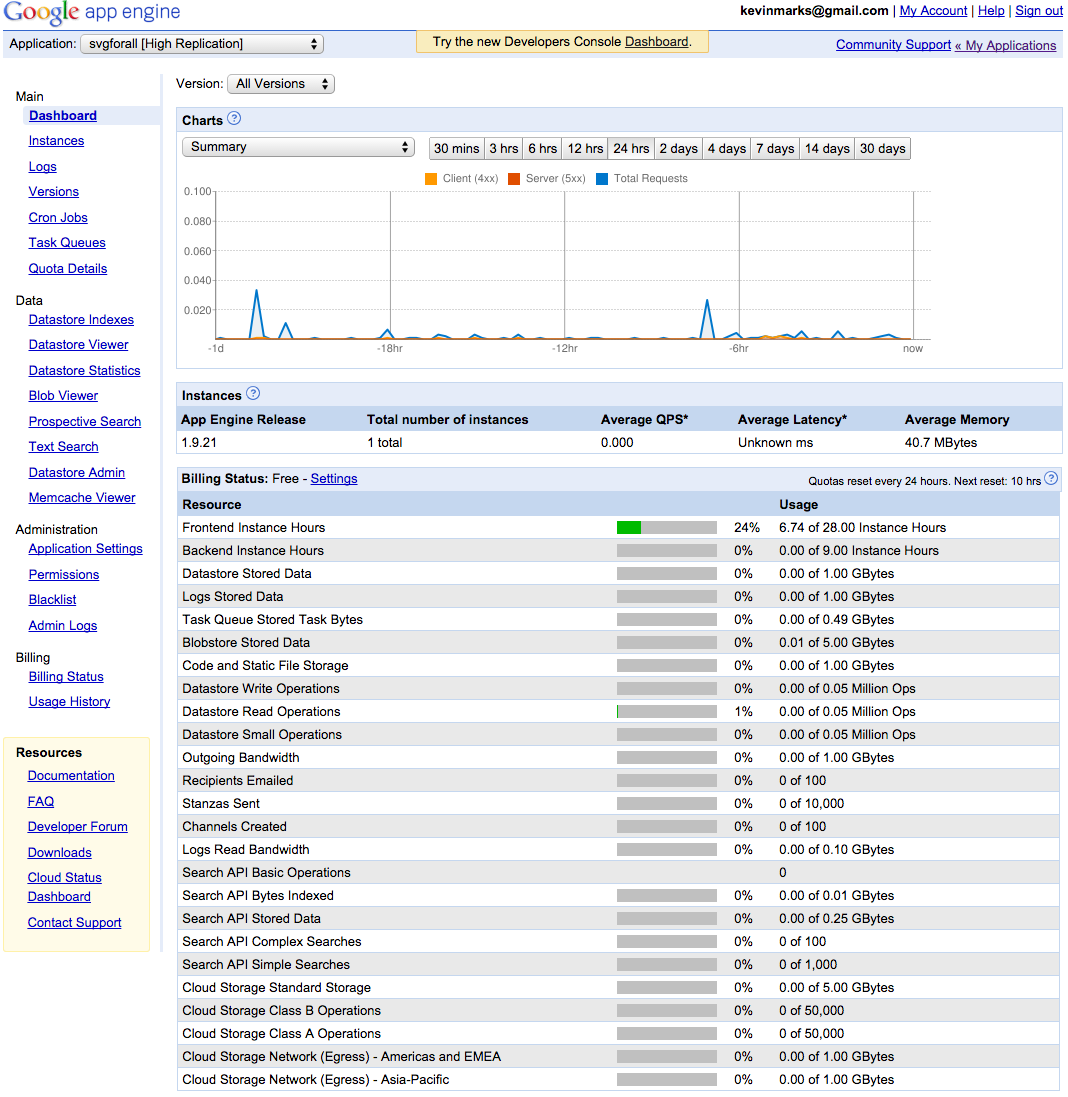
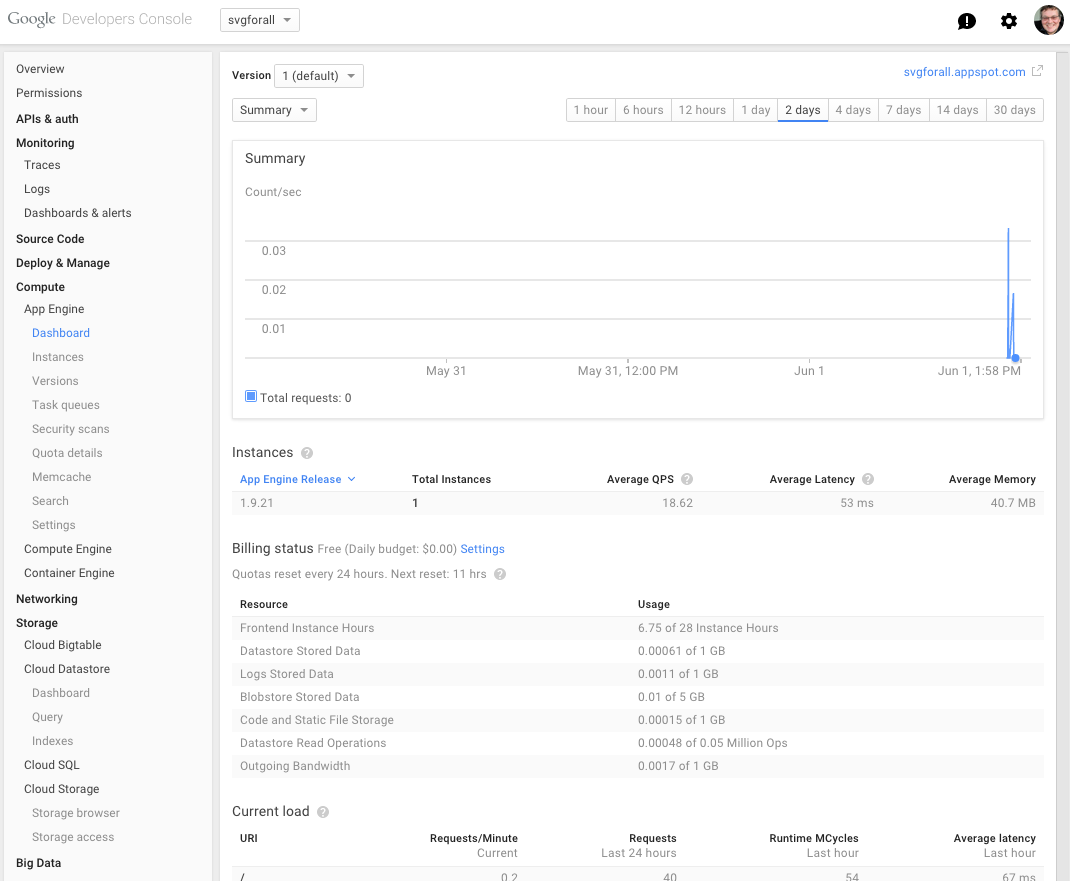
At least Google Maps has walked back that terrible accordion thing that literally drove me crazy.
I basically think design is like a cancer on the web anymore. You know what works? Craiglist, that's what works. Reddit works. Hacker News works. The old, pre-design-goober Google Apps interface worked.
I seriously want to punch a hipster every time I have to use an app that used to work and has now been designed to death.