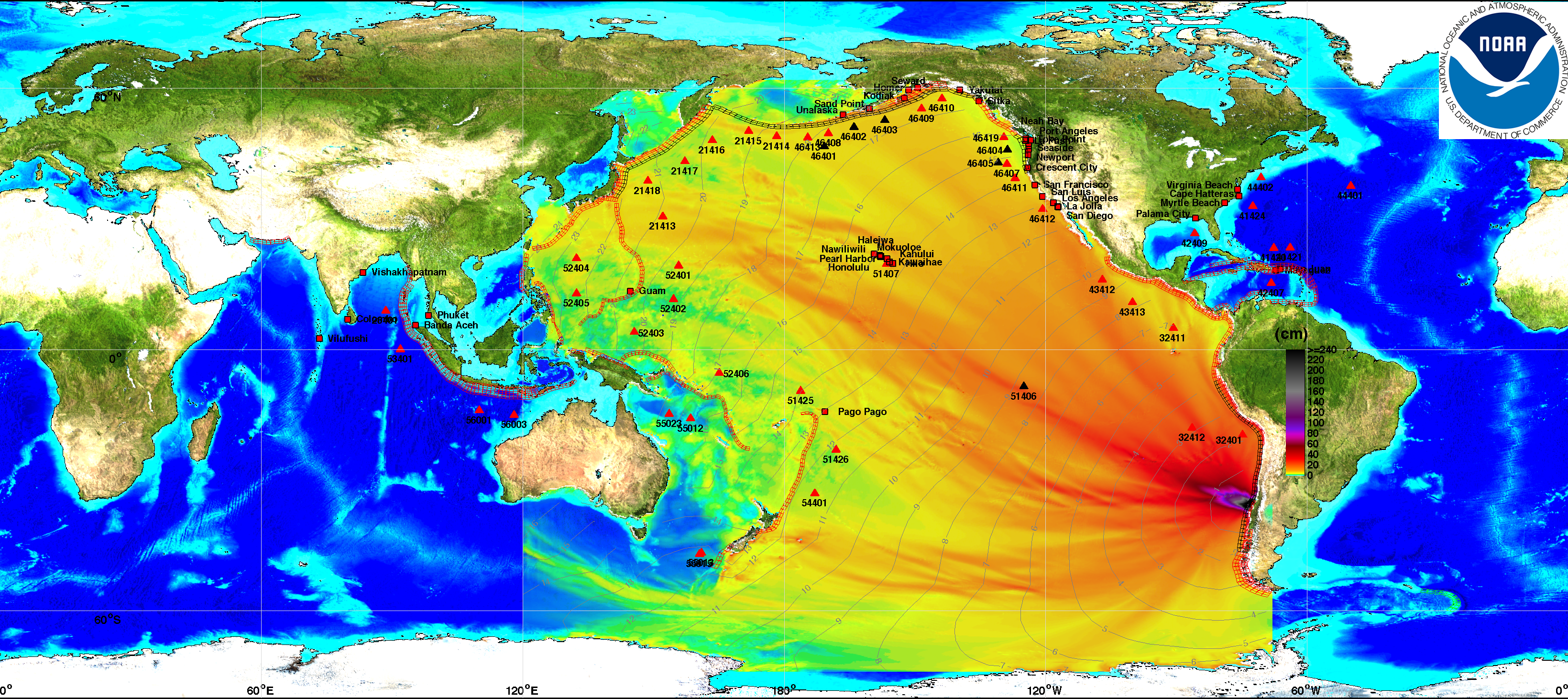
Data collected from Deep-ocean Assessment and Reporting of Tsunamis (DART) and modeled with the Method of Splitting Tsunami (MOST) model.
http://nctr.pmel.noaa.gov/Dart
http://nctr.pmel.noaa.gov/model.html
What do the red and black triangles represent, and what are the numbers next to them?
Data collected from Deep-ocean Assessment and Reporting of Tsunamis (DART) and modeled with the Method of Splitting Tsunami (MOST) model.
http://nctr.pmel.noaa.gov/Dart
http://nctr.pmel.noaa.gov/model.html